
1 Introduction
Modern data accumulation techniques have led to the rapid growth of datasets, and consequently, data repositories have expanded significantly. The FAIR (Findable, Accessible, Interoperable, and Reusable) data principles (Wilkinson et al., 2016) emphasize the importance of making data Findable and Accessible or findable and accessible. However, this becomes challenging with large repositories containing datasets from various interconnected domains and in different formats. This further inhibits data accessibility for the scientists and ultimately impacts their research output (Holzner, Igo-Kemenes and Mele, 2009; Tenopir et al., 2011).
Traditional search environments rely heavily on keyword or full-text search, as revealed by a survey on 98 data repositories by Khalsa, Peter and Mingfang (2018). Consequently, dataset discovery is frequently implemented using search interfaces originally designed for document retrieval. Numerous studies (Kern and Mathiak, 2015; Krämer et al., 2021) have repeatedly highlighted the fundamental differences between these two types of searches, underscoring the need for novel approaches and tailored solutions for data search (Borst and Limani, 2020).
Furthermore, typical data search environments are designed to support two types of search tasks (Borst and Limani, 2020), i.e., lookup and exploratory tasks. However, they often overlook the importance of providing an overview of the collection. An overview task provides quick feedback on the user queries while presenting a high-level view of the filtered search space. Additionally, for data managers and administrators, it provides a direct snapshot of their collection and consequently supports the overall quality assurance of the repositories. Another crucial search task that is often neglected is the representation of both implicit and explicit relationships among metadata entities, which can further enhance understanding and discovery.
Above, we have highlighted three challenges in the traditional and current data search systems:
Heavy dependence on keyword- and text-based search;
Missing overview of the data collection;
Limited representation of implicit or explicit relationships among search entities.
These challenges emphasize the need for improved data discovery tools, with user-friendly platforms that provide new concepts of discovery. In our efforts to address these challenges, we developed a software application VESA (visualization-enabled search application) (Figure 1), that leverages the visualization techniques to provide an exploratory dataset search environment by connecting metadata attributes to different visual dimensions.
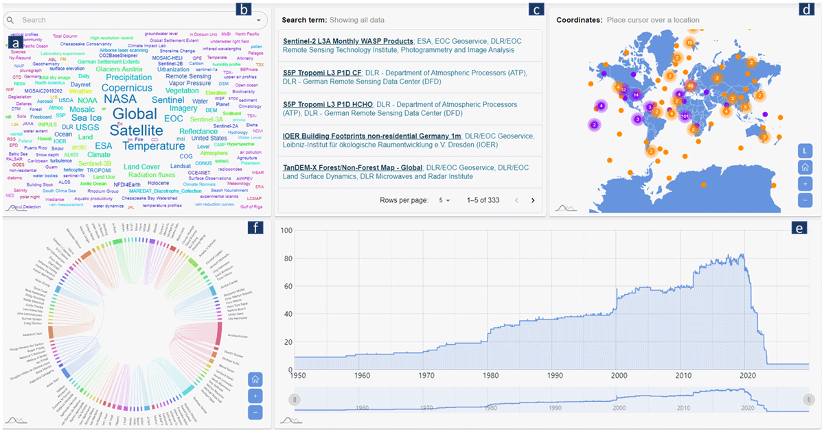
Figure 1
The frontend of VESA. Various visualizations help in multidimensional data search. They are: (a) word Cloud for contextual search, (b) autocomplete search bar also for contextual search, (c) list showing search results and links to the data sources, (d) map for spatial search, (e) line charts for temporal search, and (f) chord diagram showing common authorships.
1.1 Contribution
This paper makes the following contributions:
It introduces VESA that supports exploratory dataset discovery by representing search results across multiple coordinated visual perspectives. The system enables exploration of metadata along thematic, spatial, temporal, and relational dimensions, providing both dataset-level discovery and repository-level overview. This directly addresses key limitations of current data search systems, including reliance on keyword-based search, lack of overview, and limited support for representing relationships among metadata entities.
It proposes a backend-agnostic architecture that integrates heterogeneous repositories through an adapter-based approach. Repository-specific adapters map metadata with different schemas to the common visual dimensions, enabling consistent exploration without dependence on a specific data model or infrastructure.
We provide an open-source implementation of VESA, including adapters for two repositories, and demonstrate the feasibility of the approach through Earth System Science (ESS) deployment and evaluation by domain experts. The repository is available as open-source software at https://github.com/DLR-SC/VESA2 and archived via Zenodo (Malikathazham and Betz, 2026).
Based on literature and our own system design, we derive a set of guidelines and requirements for building effective data search systems tailored to scientific datasets.
Currently, VESA’s capabilities are demonstrated through provided adapters for two repositories, which users can directly explore. Alternatively, users can create adapters for their own repositories using the provided documentation and adapter template. Furthermore, VESA is deployed for an ESS use case, where a knowledge graph backend is used to harvest and harmonize metadata from two repositories. This prototype version is available to explore at https://vesa.webapps.nfdi4earth.de/.
The remainder of this paper is structured as follows. First, in section 2, we reviewed the related work from different perspectives and examined the challenges identified in the empirical studies. Then, we introduce VESA, along with its theoretical grounding and architecture in section 3. In section 4, we provide details about the system implementation, frontend design, and usage scenarios, and in section 5, we present the use case of VESA for the ESS domain. Then in section 6, we present the results of our evaluations done with the ESS domain scientist. In section 7, we present the guidelines for the construction of an effective data search application. Finally, discussion and conclusion in section 8.
2 Related Work
Our system builds on research in data search services, user behavior, and visualization systems. Previous studies highlight challenges in data discovery, including distributed data access, user sensemaking, and intuitive result exploration. The following sections examine these challenges and existing solutions.
2.1 Challenges in data search services
Scientific data discovery has received increasing attention from both academic and infrastructure communities. This is reflected in the expansion of the coordinated efforts of organizations like the Research Data Alliance (RDA) (https://www.rd-alliance.org/), Go FAIR (https://www.go-fair.org/), and OPEN AIR (https://www.openaire.eu/) initiatives. All of which promote data sharing, interoperability, and the development of discovery-focused infrastructures aligned with FAIR principles. Despite that, most current systems continue to apply search paradigms originally designed for document retrieval, without accounting for the fundamental differences between documents and datasets. Several studies (Kern and Mathiak, 2015; Krämer et al., 2021) have pointed out that dataset discovery involves unique challenges—such as interpreting structured metadata, handling incomplete or ambiguous coverage descriptions, and supporting exploration across spatial, temporal, and relational dimensions. Unlike documents, which can often be interpreted through title and full-text analysis, datasets require contextual understanding of their attributes, provenance, and use cases. Nevertheless, the dominant approach in existing systems remains keyword-based querying, resulting in limited relevance, insufficient overview, and a frustrating user experience when large numbers of results are returned (Dörk et al., 2008). Khalsa, Peter and Mingfang (2018), in their survey of 98 repositories, found that the majority of data portals still rely on basic keyword search interfaces, which present results in long, paginated lists. These interfaces provide little insight into how datasets are distributed or related, and users are often left to click through each entry to assess relevance. Additionally, studies from Wu et al. (2019) and Borst and Limani (2020) emphasize the growing demand for domain-agnostic solutions that can bridge disparate repositories and facilitate cross-domain data discovery.
2.2 User behavior and sensemaking in data discovery
Understanding user behavior in data discovery is critical for designing effective data search systems. Unlike traditional information retrieval, dataset search is a more cognitively demanding process—as users often lack precise knowledge of available data and must iteratively refine their queries. In a study conducted by Krämer et al. (2021), researchers are shown to engage in iterative, exploratory search processes, often refining queries multiple times and frequently using filters to locate relevant datasets. Koesten et al. (2021) further emphasize the sensemaking challenges users face, noting that dataset discovery involves evaluating the context, provenance, and relationships of data attributes and entities. This highlights the need for tools that support users not only in finding datasets but also in understanding them. The importance of navigation and sensemaking is echoed in earlier work by Fox et al. (1993) and Pérez-Montoro and Nualart (2015), who demonstrate how visual navigation aids comprehension when users must move through large information spaces. In this context, studies in human–computer interaction (HCI) and information visualization suggest that coordinated multiple views (CMVs)—where interacting with one visual component updates others—can enhance exploratory tasks and promote deeper engagement (Heer and Shneiderman, 2012; Shneiderman, 2003).
2.3 Visual analytics for data discovery
Visualization systems have proven to be of significant value in information retrieval. Particularly by enabling users to identify previously unknown patterns and insights (Saraiya, North and Duca, 2005) within complex data collections. Despite its potential, the adoption of visual analytics tools in scientific data discovery remains limited, especially when compared to their widespread use for data analysis, result presentation, and data exploration in scientific domains (Kaur, Klan and König-Ries, 2018). There are some notable efforts, such as GFBIO’s VAT (Beilschmidt et al., 2017), which provides a powerful environment for search of similar datasets in the biodiversity domain. However, it is constrained to their own data repositories and specific schema, limiting the broader applicability and scalability. Similarly, domain-specific systems such as eBird (Auer et al., 2024), Ocean Data View at https://odv.awi.de/, or Vertnet at https://vertnet.org/ provide detailed visual querying and mapping capabilities, but only within specific data domains. Other platforms, including ARIADNE portal at https://portal.ariadne-infrastructure.eu/ for archaeological datasets and Germany’s national Geoportal at https://www.geoportal.de/, provide interactive map views, timelines, or thematic filters to support data discovery. While these systems allow users to explore datasets through different visual perspectives, the initial search process typically remains text- and keyword-driven. Users are therefore required to formulate explicit queries before any meaningful visual context is presented, limiting opportunities for exploratory discovery. Moreover, the visual views provided in these systems are often disjointed—meaning the different components (e.g., map, list, metadata details) operate in parallel and lack strong interactivity or coordination. Actions taken in one view (e.g., selecting a geographic region) may not dynamically update the others, reducing the effectiveness of the interface for sensemaking or multidimensional exploration.
Consequently, there remains a lack of visualization-enabled search systems that support exploratory dataset discovery through tightly integrated, coordinated visual views across multiple metadata dimensions.
2.4 Comparison among other data search repositories
To position VESA with respect to existing visual data discovery environments, we inspected five established platforms: Geoportal (https://www.geoportal.de/), NASA Earthdata Search (https://search.earthdata.nasa.gov/), the ARIADNE portal (https://portal.ariadne-infrastructure.eu/search), BCO-DMO (https://www.bco-dmo.org/search/dataset), and the GFBio VAT (https://vat.gfbio.org/#/). The aim of this comparison was not to evaluate these platforms as competing systems, but to clarify how their discovery workflows differ from the metadata-level visual search approach implemented in VESA.
Geoportal provides a strong geospatial catalog and map-layer exploration functionality. Users can search for geodata and geoservices, select thematic map layers, and interact with spatial visualizations. However, its workflow is mainly organized around exploring a dataset’s content rather than searching for a dataset. This differs from VESA, which shows a coordinated overview of repository metadata across several discovery dimensions. Geoportal users typically begin by choosing a theme or searching for a known geospatial resource. In VESA, users can first inspect the thematic, spatial, temporal, and authorship-related structure of repository content before formulating a precise query.
The ARIADNE portal is closer to a research data search platform and provides dedicated support for archaeological data discovery. It offers spatial and temporal search together with additional facets and catalog-based refinement. Most metadata dimensions beyond space and time are primarily exposed through facets, filters, or catalog structures rather than through coordinated visual views. The temporal and spatial components support search refinement, but they are not tightly coupled visual components in which interaction within one view immediately reveals changes across other views. VESA therefore differs by treating metadata entities as coordinated discovery dimensions within one visual search environment.
NASA Earthdata Search is a mature discovery environment for Earth observation and environmental data. It supports keyword search, browsing by broad Earth science topics, and refinement through spatial and temporal facets. It also allows users to inspect individual data collections and their spatial or temporal characteristics via map and temporal bars. Its visual assistance is mainly connected to map-based filtering and data content inspection. Users who are unfamiliar with the repository still need to select a broad topic, use predefined filters, or formulate an initial search term. VESA addresses this cold-start problem by presenting prominent keywords and visual summaries of repository content as its default screen.
BCO-DMO provides rich domain-specific metadata and supports discovery of oceanographic datasets through keyword search, facets, metadata descriptions, and spatial distribution information. This is highly valuable for users searching within the marine and oceanographic domain. However, the discovery process remains largely catalog-, keyword-, and facet-driven, with a spatial map that provides useful geographic orientation. VESA differs by showing each dimension visually and connecting them as linked components of the search process.
The GFBio Visual Analysis Tool provides stronger visual analytics support than many conventional repository search interfaces. It allows users to select biodiversity data and then visualize, transform, and analyze these data in a geospatial environment. Its visual functionality is mainly applied after an initial data selection has been made. At the discovery level, the search process still begins with keyword search or map-based selection. VESA places visualization earlier in the discovery workflow by using coordinated visual components to support repository-level exploration before and during search refinement.
2.5 Summary
In summary, while prior work advanced dataset indexing, metadata standardization, and visual exploration techniques, these efforts remain largely disconnected in practice. Existing data search systems predominantly rely on keyword-based, facet-based interfaces and list-based result presentations, offering limited support for exploratory discovery. At the same time, visual analytics approaches have demonstrated the effectiveness of coordinated, multi-perspective exploration, but the few systems available in scientific repository settings are typically tightly coupled to specific domains and repository infrastructures, which limits their reuse and broader applicability. Moreover, as also discussed in the previous section, their visualization abilities are primarily for raw data exploration rather than for data search. VESA differs by focusing on coordinated visual search at the metadata level. It provides users with an initial overview of repository content through multiple discovery dimensions and allows interactions in one dimension to update the others. This approach is especially useful for exploratory search situations where users do not yet know the terminology, scope, or structure of a repository.
3 Visualization-Enabled Search Application
The conception of VESA is inspired by the work of Marian Dörk et al. in VisGets (Dörk et al., 2008), which introduced a set of interactive visualization widgets whose manipulation dynamically constructs Web queries. VisGets was designed to support information seekers in gaining a casual understanding of large and evolving collections of web resources, such as news articles and blog posts, by enabling exploration through multiple coordinated visual perspectives. Rather than requiring users to formulate precise textual queries upfront, the system allowed them to interactively refine their search through visual components representing different data dimensions. While VisGets demonstrated the value of visualization-driven query construction for web resources, dataset discovery poses a different challenge. In web-oriented information spaces, individual dimensions such as keywords or publication time can already provide meaningful cues on their own, for example, by revealing trending topics or bursts of activity. In dataset discovery, however, users rarely judge relevance from a single metadata attribute in isolation. A dataset becomes meaningful only through the combination of several metadata dimensions, such as what it is about, when it was collected, where it applies, and who produced it. For instance, knowing that a dataset relates to climate is insufficient without also understanding its temporal coverage, spatial extent, and provenance. Meaning therefore emerges not within a single view or dimension but across the intersections of multiple metadata dimensions. This makes structured metadata exploration not simply a matter of showing more attributes, but of supporting multidimensional reasoning. As a result, dataset discovery requires stronger support for coordinated exploration, where interactions in one dimension are immediately reflected in the others, allowing users to preserve context, understand dependencies, and iteratively refine the search space in a coherent manner.
The exploration logic in VESA is further grounded in the notion that users formulate information needs through implicit analytical questions, often expressed in natural language as W-questions such as what, when, where, and who/why. This aligns with established models in information seeking and journalism, where the 5W1H framework (who, what, when, where, why, and how) is used to structure understanding of complex information spaces. In the context of scientific datasets, these questions are important to describe and identify a dataset, and thus these questions are encoded into different metadata dimensions (Madin et al., 2008) (e.g., when and where the observation was taken and who recorded it). Such contextual information is typically embedded within the dataset’s metadata, as shown in this reference (https://doi.pangaea.de/10.1594/PANGAEA.958479). For instance, what relates to thematic attributes such as keywords or variables, when to temporal coverage, where to spatial extent, and who or why to provenance such as authors, institutions, etc. VESA adopts this question-driven exploration model by structuring its interface around metadata dimensions that implicitly correspond to these analytical questions. As users interact with different visual components, they progressively refine their queries through a sequence of question-oriented interactions, enabling a more natural and exploratory form of dataset discovery.
The question-driven exploration model in VESA is not limited to a specific domain and can be generalized as a mapping between any analytical question types and related metadata dimensions. These analytical questions map to the metadata dimensions, which further map to related metadata attributes and then to suitable visual representations, such as maps for spatial attributes, timelines for temporal coverage, and categorical distributions for thematic information. These visual components are coordinated, meaning that interactions in one view dynamically update the others. This coordination enables users to explore relationships across multiple metadata dimensions and progressively refine the dataset subset through interaction. All views operate on the currently filtered dataset, ensuring consistency across perspectives and supporting iterative exploration. In Table 1, we have generalized these mappings from questions to their visual representations. Visualization literature (Kaur and König-Ries, 2017) has established that different analytical questions require distinct visual representations, such as bar charts for categorical distributions, timelines for temporal data, etc. By aligning metadata dimensions with these well-established visualization mappings, VESA leverages existing visualization principles to support effective metadata exploration. Table 1 shows an example of such mapping from different analytical questions to their relevant chart types and metadata attributes.
Table 1
Mapping of analytical questions to metadata dimensions and corresponding visual representations.
| QUESTIONS | METADATA DIMENSIONS | EXAMPLE ATTRIBUTES | CHART TYPE (EXAMPLES) |
|---|---|---|---|
| What | Thematic/Context | keywords, variables, topics, categories | Word Cloud |
| When | Temporal | time ranges, time stamps, frequency | timeline, histograms |
| Where | Spatial | coordinates, regions, bounding boxes | map, heatmap |
| Who | Categories and Relationships | authors, institutes, projects | Treemap, Network graph |
3.1 Architecture
In Figure 2, we show the domain-agnostic architecture of VESA. To enable VESA to work on their repository, it is a pre-requisite that a data manager creates a proxy API (Application Programming Interface) or repository adapter (User Provided Repositories Endpoint), which serves as a schema translator or a mapper. The reasoning behind it and more detail about this adapter is given in section 4. The link to the adapter endpoint is provided through Source Configuration, which is a frontend component. As shown in Figure 3, through source configuration page, user provides endpoint and other configurable parameters about the repository. Using this information, the system makes connection with the source repositories and fetch the metadata records. During this process, Synchronization and Ingestion Services helps VESA to make a persistent connection with the Sources and retrieve the records based on the standard defined in the user-created repository adapter. Thus, the core VESA remains independent of heterogeneous schemas, data formats, and repository-specific constraints, and it only interacts with the clean, translated output. The records are then stored in VESA’s Database Storage. This database is implemented as an Arango-based graph database with three document collections (dataset, author, and keyword) and two edge collections: hasAuthor, linking datasets to authors, and hasKeyword, linking datasets to keywords. Application Logic connects the backend database layer with the visualization transformers. It executes queries (e.g., using Arango Query Language) to retrieve relevant data and prepares it for downstream transformation. The extracted information is then forwarded to the Visualization Transformers in appropriate formats. Visualization transformers consist of algorithms that define the data processing templates required for each visualization, because each visualization expects data in a specific structure. For example, a word cloud requires keyword frequency, co-occurrence relationships, and associated dataset identifiers, while a map requires spatial coordinates and dataset density per region. In the same way, a Map needs information about the datasets and its spatial coordinates or regions and frequency of datasets in the specific region. The Data Access Interface acts as a unified point between the backend system and the frontend application. They expose processed and transformed data generated by the Application Logic and Visualization Transformers. Each endpoint is designed to serve data tailored to a specific visualization, such as spatial distributions, temporal trends, or keyword relationships. By abstracting the backend complexity, API endpoints ensure that the frontend remains decoupled from the underlying data storage and processing mechanisms. Interaction handling manages user-driven actions within the frontend, such as filtering, selecting, or exploring datasets across different visual components. It interprets user interactions and translates them into corresponding queries or filtering operations. These interactions trigger updates in the underlying data requests via Data Access Interface and ensure that all visual components remain synchronized. This mechanism enables CMVs, allowing users to iteratively explore and refine their search in an interactive manner. Visualization Views represent the visual interface through which users explore and interpret the data. These include multiple coordinated visual components such as maps, timelines, chord diagrams, and word clouds. Each view presents a specific perspective of the dataset (e.g., spatial, temporal, or relational) and remains dynamically linked to each other. Updates triggered by interaction handling are reflected across all views, enabling seamless exploratory analysis and supporting sensemaking through visual analytics techniques.
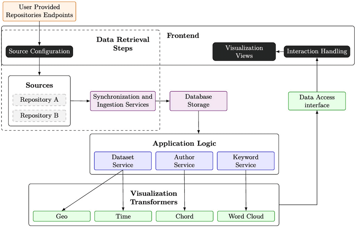
Figure 2
VESA Architecture.
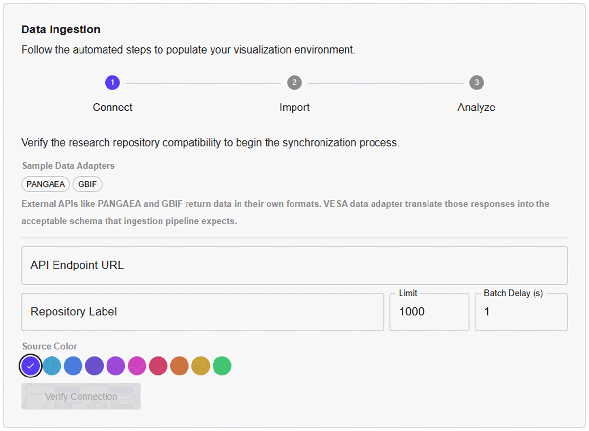
Figure 3
VESA’s Data Ingestion Pipeline. Currently, there are two built-in data adapters for PANGAEA and GBIF repositories for demo purposes. Repository label is a unique name of the data repository; Limit is the maximum number of datasets that need to be fetched. Batch Delay is the number of seconds a pipeline waits before fetching the next batch. Source Color is the assigned color to the repository that will appear in the Map’s Legend.
4 System Implementation and Usage
This section describes the backend-agnostic design of VESA, which is achieved through a modular adapter-based architecture. In VESA, adapters act as a bridge between the original metadata structures of individual repositories and the discovery dimensions used by the VESA system. In the current implementation, VESA supports four main discovery dimensions: spatial, temporal, contextual, and authorship-related information. To visualize these dimensions, VESA needs access to the corresponding metadata elements in each connected repository. However, repositories often describe similar information using different metadata structures and field names. For example, PANGAEA describes spatial and temporal information under the broader term of coverage, which includes spatial properties median latitude and median longitude, and temporal properties Date/ Time Start and Date/Time End. DLR STAC metadata provides temporal information through datetime property and spatial information through proj:bbox property. In GBIF metadata, this information appears under Temporal Coverage –> CalendarDate property and Geographic Coverage –> westBoundingCoordinate, eastBounding Coordinate, southBoundingCoordinate, northBoundingCoordinate. For VESA, these differently named and structured metadata elements need to be mapped to the spatial and temporal discovery dimensions used by the system.
This mapping is handled by adapters. Repository managers or developers create repository-specific adapters, or custom APIs, based on the IDataAdapter.ts interface provided in the VESA software repository. This interface defines a minimal metadata contract that specifies the information VESA needs for seamless ingestion and visual exploration. The contract consists of three top-level elements: dataset, authors, and keywords:
Dataset: The primary record containing an ID, title, abstract, temporal information, and spatial coordinates.
Authors: A list of individuals credited with the work.
Keywords: A list of thematic tags primarily from the keyword section of the metadata file.
The dataset element contains the main descriptive and access-related information of a record, including its identifier, title, abstract, URI, publication date, source repository, and spatial and temporal information. Spatial information is represented through the coordinates west, east, south, and north, while temporal information is represented through start and end. The authors element contains the individuals credited with the dataset, and the keywords element contains thematic tags that are extracted from the keyword field of the metadata.
Adapters map heterogeneous source metadata to this contract by extracting, normalizing, and restructuring relevant metadata fields. For example, an adapter converts different bounding-box representations into the west, east, south, and north structure, and aligns different temporal attributes to the start and end structure. The adapter itself can be implemented using any suitable technology, as long as it provides JSON output that follows the structure expected by the IDataAdapter interface.
The transformed metadata records are then processed by Synchronization and Ingestion Services (see Figures 2 and 3). These services systematically fetch the records from the source repositories and stores into VESA’s central database. The Ingestion Service is responsible for retrieving metadata from external repositories and transforming it into a unified representation suitable for exploration. Given the heterogeneity of data sources, this process includes resolving identifier conflicts across repositories, extracting relevant metadata entities (datasets, authors, keywords), and structuring relationships between them. The ingestion process ensures that metadata from different sources can be interpreted consistently by mapping repository-specific schemas to common dimensions based on the mappings provided in the adapters. The Synchronization Service manages the lifecycle of metadata integration by coordinating periodic updates from connected repositories. It ensures that newly available or updated datasets are incrementally incorporated into the system without disrupting ongoing exploration. This process includes validating data sources, retrieving metadata in manageable batches, and tracking the progress of data integration. By maintaining synchronization between external repositories and the internal representation, the system supports up-to-date and scalable dataset discovery.
To demonstrate this approach, adapters for PANGAEA and GBIF repositories are implemented and provided as an example in our code repository. During the first run, user can connect these adapters according to the screen instructions and test the functionality and behavior of this system. These examples illustrate how different metadata schemas can be harmonized within the VESA framework. Additional repositories can be integrated by implementing corresponding adapters without modifying the core system.
4.1 VESA frontend
Current software only shows four visualizations and a Table view. For the future, the plan is to include a visualization library so that users can include custom visualizations based on their own repository needs.
Word Cloud (Figure 1a) is linked to the keywords in the metadata. The size of the word shows the frequency of that term referred to in different datasets. Thus, the higher the frequency, the more prominent that term is in the collection. Selecting one keyword further shows the related keywords in the Word Cloud and consequently filters the other related attributes and datasets in the connected visualizations. For the construction of this Word Cloud, the keywords were extracted, normalized, and validated to include only those that are in textual form. Numbers and special characters are rejected in this process. As we were not using any semantic checks via ontologies or strict vocabularies of this domain, this step was important to keep the list clean for further processing. To show only relevant and important keywords, their weights were derived via Term Frequency and Inverse Document Frequency (TF/IDF) metric, where the number of documents are the number of metadata files in which the keyword is available. Based on the weights of TF/IDF, keywords with the top 30% of high scores were then filtered and displayed in the visualization. The threshold was selected based on tuning and testing mechanism, and 30% was the best selection for us. For future versions of this software, user can decide this threshold as per their choice. So, as not all keywords from the data store were shown directly on the word cloud, a provision is made to search for all of them in our data store via running a search from the Autocomplete Search Bar (Figure 1b) component.
Map (Figure 1d) enables filtering based on the spatial coverage of the datasets. Every repository label is assigned a color during the Software Configuration phase (see Figure 3), which shows up as different colors of dots in the Map. Hovering over the dot also shows its coordinates on the top bar of the map canvas. The selected dot gets highlighted in red. User can select more than one dataset by directly clicking on them. The dots or points on the Map that get clustered when a user zooms out of the Map or when the Map is at its default position. Then, on the clustered ball, user can see the number of datasets related to the clustered region. At the left corner, different icons in blue colors are placed. “L” is to enable and disable Legend, Home icon brings the map back to its default position, “+” is for zooming in and “-” is for zooming out of the map. When a user is in the zoom-in position, she can also select a CLEAR button at the top to come back to the default position.
Line Chart (Figure 1e) shows the temporal coverage of the datasets. The default X axis shows the temporal range, which is defined by the maximum and minimum date range of all the datasets available in our data store. The Y axis shows the number of datasets. The Line Chart below helps in zooming in and filtering through the years and then the result is shown on the Line Chart above. From here, one can filter datasets based on years, months, and dates. Hovering over the line on this chart shows the number of datasets that belong to the specific date. Brushing over the Line chart zooms in to the brushed time periods and shows the related frequencies.
Chord Diagram (Figure 1f) illustrates co-authorship frequency in the filtered datasets, with thicker chords indicating more frequent collaboration between pairs of authors.
List View (Figure 1c) in the middle presents the filtered results. It shows the title and the authors of the filtered datasets. Clicking on the title will take user to their actual DOI or source page. This view also shows the count of the retrieved datasets, based on user-activated visual filters.
4.2 Usage scenarios
In the following, we illustrate the relevance and applicability of the proposed system through two use cases from two different users of a data search system.
4.2.1 User searching for a dataset
Consider a scientist named Dr. Smith researching climate change impacts. He might start by clicking on the keyword “temperature” in the Word Cloud visualization. This action would show other related keywords such as “climate” and “precipitation,” and filter the datasets accordingly across the other visualizations (see Figure 4-1). Selecting a keyword “precipitation” (Figure 4-2) would further refine the results to show datasets related to precipitation measurements on the Map, the relevant time periods in the Line Charts, and the authors involved in these studies in the Chord Diagram (see Figure 4-3,4) respectively. By this iterative process, a user can efficiently refine their search and can quickly identify the most relevant datasets without the need for multiple separate queries. This streamlined approach saved Dr. Smith time, eliminating days of manual searches and enabling him to compile a comprehensive and relevant dataset for his research.
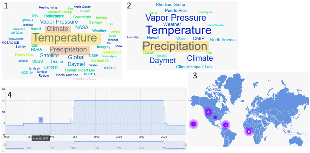
Figure 4
Screenshot from running the use case 1 on VESA.
4.2.2 Decision maker (data manager, principal investigator, or funding institutions)
A funding Institution (FI) seeks to assess the extent of past research conducted on ocean studies. To achieve this, they use VESA. By clicking on “Ocean” in the Word cloud, they first gain insights into the various research themes related to ocean studies. The related keywords indicate connections to Ocean Temperature, Geochemistry, Climate, Nutrients, and Global observations (which are not linked to specific geographical locations). From the List View, they know that in total 10 datasets are produced with their funding. Out of which two are stored in PANGAEA repository and eight at DLR Geoportal. Moreover, they observe a notable increase in dataset production starting in 1970, peaking between 1988 and 2020, after which no further observations were recorded. Furthermore, their exploration identifies two key scientists who have played a major role in generating these datasets. This information may help decision-makers evaluate past research efforts, identify areas of stagnation, and make informed decisions on future research directions and funding priorities.
5 ESS Use Case
To demonstrate the applicability of VESA in a real-world setting, we present an ESS use case, as shown in Figure 1. This deployment represents an earlier version of VESA, which was developed for domain-specific data integration using a knowledge graph-based database backend. The knowledge graph connects two repositories: PANGAEA (Felden et al., 2023) and DLR Earth Observation (api available at https://geoservice.dlr.de/eoc/ogc/stac/v1/collections/). It allows the exploration of the collection and the search results on a visualization dashboard via four perspectives: Word Cloud for contextual, Map for spatial, Line Charts for temporal, and Chord Diagram for inter-relationships (common authorship). While this implementation is not backend-agnostic, it provides a concrete example of how VESA can support exploratory dataset discovery in practice. The software tool is available to explore at https://vesa.webapps.nfdi4earth.de/. This deployment demonstrates how VESA can support dataset discovery and exploration in a domain-specific setting. While this implementation utilizes a knowledge graph backend for metadata integration, the underlying principles of VESA—namely metadata-driven exploration and coordinated visual interaction—remain independent of the underlying data infrastructure. The following section shows the evaluation of this deployment to assess the effectiveness of VESA’s visual exploration approach.
6 User Evaluation
The evaluation is conducted on the ESS deployment described in the previous section. To assess the usability and effectiveness of our system, we conducted an evaluation using an online questionnaire (see Annex 1 in supplementary material). The survey was designed using Google Forms and aimed to capture both quantitative and qualitative feedback from domain experts and potential end-users. Those, in our case, were eight researchers or scientists in the field of ESS and other related domains. The responses were taken anonymously and participants were asked to only identify their scientific domain, age group, and frequency of interaction with data visualizations. Though there were eight participants; however, they were all domain experts who might be the potential end users of this system. As per established practice in visualization and HCI research (Ceneda et al., 2024; Isenberg et al., 2013; Vasileiou et al., 2018), smaller samples can be appropriate when participants are domain experts or representative end-users. In such studies, the value of the evaluation lies less in the number of participants and more in the relevance of their expertise, the richness of their feedback, and the transferability of the findings to users with similar tasks and domain needs.
To evaluate participant performance in interpreting the interface, the questionnaire included a short experimental task. Participants were asked to read specific information from four different visual components of the interface. Their responses were then compared against the correct reference values. The number of errors made by each participant was recorded, with fewer errors indicating higher performance. These correctness-based tasks are a commonly accepted method for objectively assessing user performance in visualization and interface studies, as they provide measurable evidence of how effectively users can interpret and interact with visual elements (Purchase, 2012). Further open-ended questions were focused on whether the visualization components facilitated deeper insight, triggered further exploration, or led to the formulation of new queries. Participants were also asked to compare their experience with VESA to other data search tools they typically use. The questionnaire concluded with a five-point Likert scale evaluating the overall perception of the system across dimensions such as intuitiveness, clarity, design aesthetics, ease of use with limited training, and good in capturing interest.
Ethical consideration: The study was conducted as an anonymous online survey to evaluate the usability and usefulness of the VESA system. Participation was entirely voluntary, and participants were informed about the purpose of the study prior to responding. They were also instructed not to provide any personally identifiable information in their responses. No personally identifiable or sensitive data were collected. Demographic information was limited to age, which was recorded in predefined ranges to prevent the identification of individual participants. All responses were stored and analyzed in an aggregated and anonymized form. All the data collected in this study were used solely for this study and are reported in aggregated form in this publication. According to Article 4(1) and Recital 26 of the General Data Protection Regulation (GDPR) available online at https://gdpr.eu/Recital-26-Not-applicable-to-anonymous-data/, data that cannot be linked to an identifiable individual do not constitute personal data. As our study collected only anonymous, non-identifiable information, the dataset falls outside the scope of the GDPR. Given the minimal-risk nature of the study, formal ethical approval was not required according to established German research ethics guidelines for Social and Economic Data Council (Rat für Sozial- und Wirtschaftsdaten (2017), RatSWD). Such anonymous, non-sensitive surveys are considered exempt from formal ethics review procedures.
6.1 Results
All eight participants who took part in this survey were within the age groups varying primarily from 25 to 64 years. Data visualization interaction frequency ranges from “Rarely” to “More than once a week,” suggesting different familiarity levels with data visualization tools. As shown in Figure 5, users in age groups under 55 years use visualizations more frequently for their work (more than once a week and month).
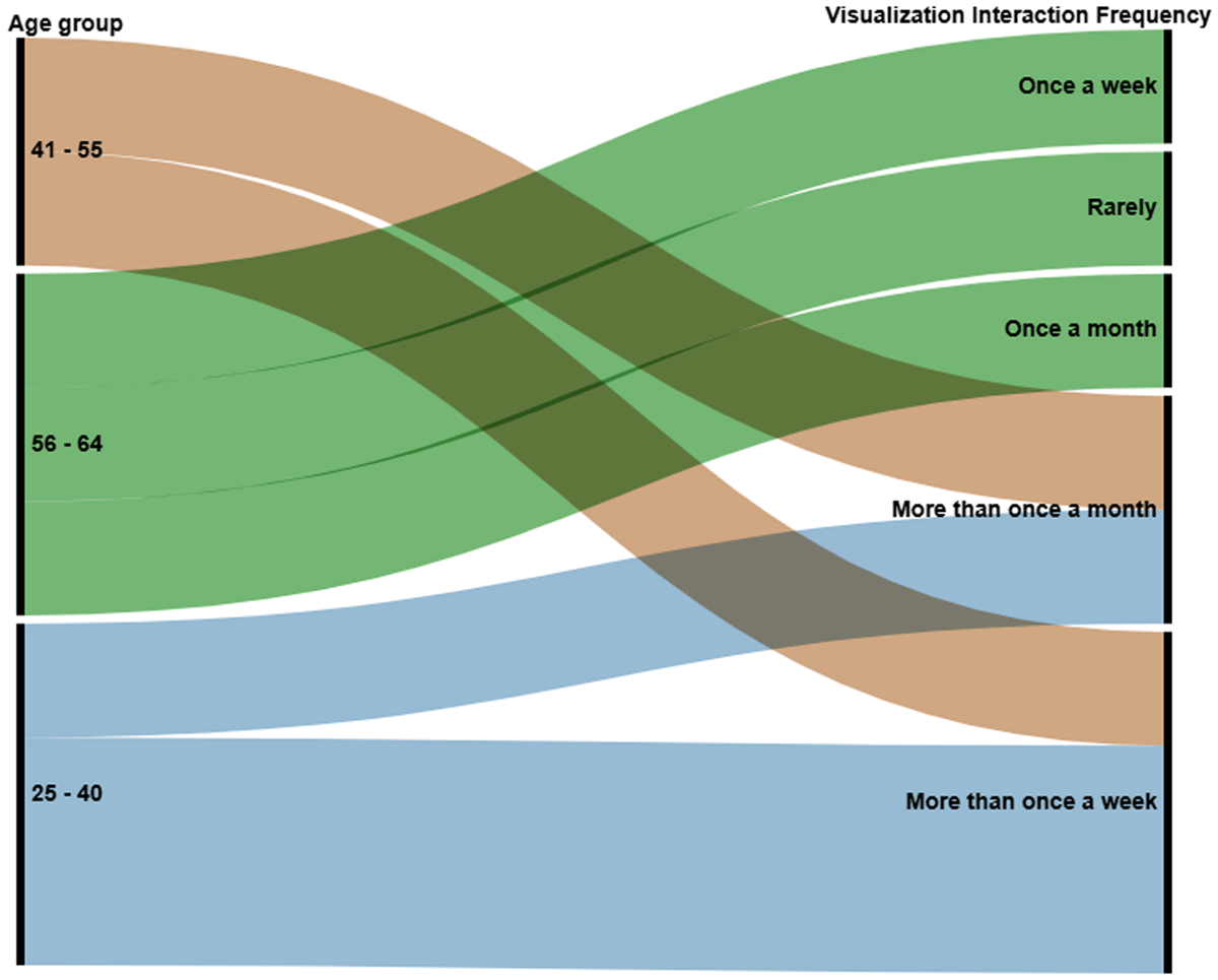
Figure 5
An alluvial diagram showing age group by visualization interaction frequency. The bands are layered by the number of respondents in each age group, with the highest frequency shown at the bottom.
6.2 Participants performance with the experimental tasks
Due to the inherent nature of the survey, no prior training or walkthrough was possible. Therefore, it was essential to assess the correctness of the responses to determine whether participants were able to independently understand and interpret the visualizations, regardless of their prior experience with such charts. If participants could correctly read the information presented in each visual component, they would also be able to use that component to support metadata exploration in VESA, which is the overall objective of this work. The evaluation focused on four visual components: the word cloud, list view, line chart, and map view. Results showed high levels of accuracy across all views: 100% correct responses for the word cloud, list view, and line chart, and 87.5% for the map view. In total, only one error was observed across 32 individual responses, indicating a strong overall understanding. Thus, the participant performance in this task was approximately 95.83%, demonstrating that the visual components of the interface were largely correctly interpreted without requiring prior training.
6.3 Comparison with other tools
Our participants used a variety of data search applications, with the majority using PANGAEA and Google Dataset Search, while others used BASE, DataCite Search, WDCC, ECMWF, R, and interfaces provided by their own repositories. When asked to rank our search application in comparison to their usual one, 50% consider it better, 38% consider it the same, and 12% consider it worse. Further, for the questions on “If the overview of the datasets from the two repositories is clear to understand and intrigued any new insight or further search queries?”, the reaction was mixed. Some appreciated the visual exploration and noted interesting trends (e.g., dataset growth over time) and the relationships between authors and publications. Others found the interface initially overwhelming and requested more onboarding or guided navigation.
6.4 Usability evaluation
Furthermore, we summarized the results of the Likert-scale questions related to the expressiveness and usability of the user interface (see Figure 6). The majority of participants consider this tool as aesthetically designed, which needs no to limited training, is good in capturing the interest and is easy to interact with. On the topic of application being cluttered or not, participants had mixed reactions. Figure 6 shows that around 50% answered it could be false; however, comments pointed word placements in word cloud to be cluttered and could be fixed. In word cloud, algorithm places the terms randomly based on the frequency of its occurrence. On the other hand, some considered this visualization intriguing and somewhat intuitive. When we tried to understand the reason, we realized that many participants had major issues with no description, tutorial or help available for the tool. As one said “as first time user, I dont get sense of the lower two frames. I would need more labels and explanations.” Moreover, as this tool was based on limited data sources and datasets, many were not able to find their datasets, leading to further more doubts.
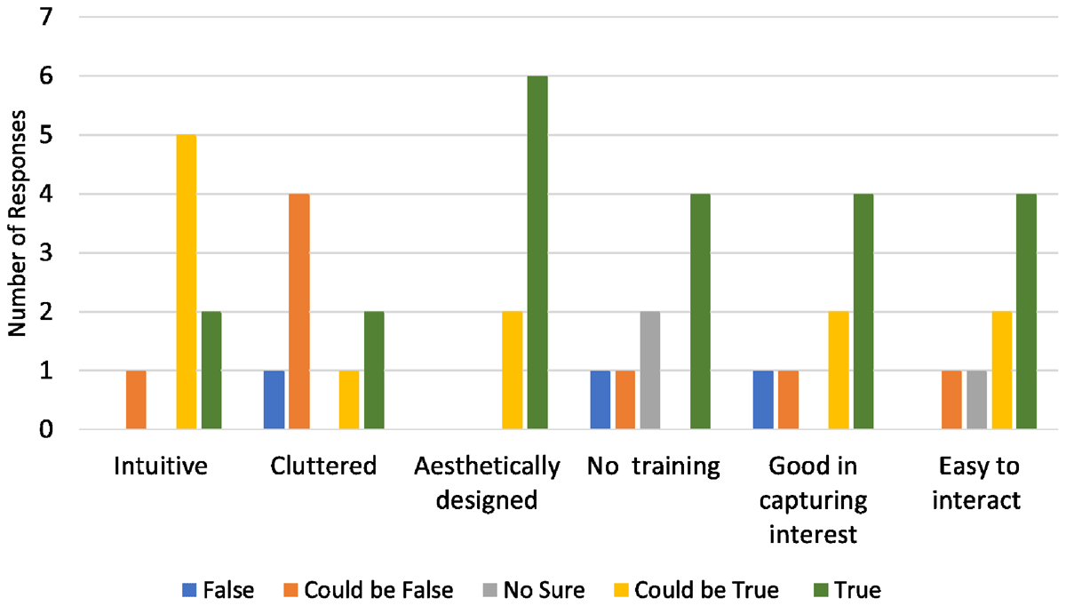
Figure 6
Results on evaluation of the VESA interface. The clustered bar chart shows user perception across six key dimensions: intuitiveness, interface being cluttered, aesthetically designed, no training needed, good in capturing interest, and easy to interact with.
6.5 Qualitative analysis of the user responses
Overall, it was a positive response. As one mentioned “it is a modern approach and enable a play factor, which keeps interest.” Others said “It certainly looks intriguing. The keywords are nicely displayed. The interaction of the authors shown.” They liked to drill down the search through different aspects and can visually see the result. Also liked the overview of available datasets at a single glance. However, throughout their comments, it was found that some level of training is required either in the form of manual or a tutorial. Furthermore, we were able to track down some areas of improvement, which are: adding more datasets and data sources, options to rearrange different frames, and a color palette. Some issues were related to the missing data and metadata quality, as one said “I get a landsat result with a location shown in the map - landsat data should be over a region.”
6.6 Summarizing results
In summary, the survey results indicate a generally positive reception of our system among participants from ESS and related domains. Most users found the system to be aesthetically designed, easy to interact with, and capable of capturing interest. Despite no prior training, participants performed remarkably well in understanding the visualizations, with a 95.8% overall correctness rate across four visual components: word cloud, list view, line chart, and map. Qualitative feedback highlighted appreciation for the visual exploration features and interface design, while also pointing out areas for improvement such as clearer labeling, help documentation, and reduced complexity for first-time users. In comparison to their usual search tools, the majority rated the application as either equal to or better, suggesting strong potential for adoption, particularly with minor usability enhancements. These findings support the system’s effectiveness as a visual search interface and provide a strong foundation for future iterations. However, the findings are based on a limited sample size and limited datasets (333 datasets), which may constrain the generalization and statistical significance of the results. While the insights provide encouraging early evidence of the system’s usability and effectiveness, a large-scale user study would be necessary to draw more definitive conclusions.
7 Guidelines for the Development of an Effective Data Search System
In the following, we have summarized and listed some of the requirements for an effective data search tool for the research data management environment. These guidelines are derived from the literature analysis and observations from the design and evaluation of VESA. These requirements could be considered as guidelines before one starts in building search systems for data management.
Support for lookup, exploratory, and overview Tasks: Effective data search tools must cater to both specific lookup tasks and open-ended exploratory tasks, as also highlighted by Krämer et al. (2021). Users should be able to locate precise datasets efficiently (lookup tasks) while also having the capability to explore broader patterns, trends, and relationships within the resultant filtered view (exploratory tasks). Apart from that, studies have indirectly emphasized the need to show a comprehensive overview of the collection. This further helps orientation and context-building from the filtered search space (Koesten et al., 2021). As shown in subsection 4.2 second use case, such overviews are also critical for data managers, institutions, and funding agencies for repository evaluation and strategic planning.
Multidimensional search and visualization: Search application should enable search via different concepts (Khalsa, Peter and Mingfang, 2018) and should present search results across multiple dimensions (Blazevic et al., 2021). Although the selection of dimensions is very domain-specific, there are always some common dimensions in each domain that can be used to create a base system. For example, studies have tried to understand some basic dimensions for observational datasets (Madin et al., 2008; Otegui and Ariño, 2012), which for our work we identified as spatial, temporal, relational, and contextual. This list can further be altered and enhanced based on the specific data domain. Semantic technologies can further enhance this list by automatically categorizing the search dimensions from the metadata and datasets. Interactive visualization techniques can then assist in showing these dimensions via various chart types.
Domain-agnostic systems: During the earlier presentation of VESA in ESS events, we were repeatedly requested to make it work for other data repositories, especially the small databanks. Our literature analysis also shows that traditionally search engines are tightly coupled with their own data domains and repositories. Therefore, we consider that domain-agnostic search systems and solutions are really needed for the research data management. Wherein, data search systems should not be limited to a single repository but should enable exploration across multiple data sources to support combined knowledge discovery. This requires mapping heterogeneous metadata schemas, allowing consistent interpretation and interaction. This can be achieved, for example, via repository-specific adapters as in the case of VESA or through KG-based harmonization. Such interoperability is essential for enabling reuse of data across repositories, in line with FAIR principles.
User-centric design and intuitive interfaces: Even the most powerful tool is ineffective if people can’t figure out how to use it. Data Search tools must prioritize usability and intuitive interfaces (Jeong, 2011; Nowell, France and Hix, 1997). Features like autocomplete search bars, linked visualizations, and cross-filtering reduce cognitive load. Furthermore, inferring from the results of our evaluation study, labeling, captioning, and contextual narratives throughout the interface can play a crucial role in growing user understanding. Moreover, built-in guidance, such as tooltips, onboarding wizards, or walk-through tutorials, can lower the learning curve. These features are especially helpful in complex search environments where users may need to understand multiple filters or interactive components.
Support for sensemaking: Sensemaking is about helping users understand and interpret what they find. Tools must assist users in interpreting and deriving meaning from search results (Angelini et al., 2017). This requires integrating features that reveal relationships, summarize search results for easier comprehension, highlight key attributes, or even provide automated suggestions.
FAIR principle alignment: Search tools must adhere to the FAIR data principles—Findable, Accessible, Interoperable, and Reusable. For modern search systems, particular emphasis should be given to the aspects of findability, interoperability, and reusability. This includes enabling users to locate datasets easily, ensuring metadata compatibility across repositories, and providing clear links to dataset sources for provenance and reuse.
Evaluation and feedback mechanisms: Tools should include mechanisms for evaluating their effectiveness and incorporating user feedback. In Seebacher et al. (2017), the author emphasizes that iterative evaluation and adaptation improve the alignment of tools with user needs. This is possible via adopting a participatory design approach (Jänicke et al., 2020) with iterative development and regular feedback sessions.
Furthermore, we present Table 2 that shows how VESA fulfills the derived requirements presented above. The table shows that, except for the point on an inbuilt feedback mechanism, it partially fulfills all the tasks within the derived requirements. To make it more user-centric and configurable, we need more evaluations and more use cases. Furthermore, for summarization of the datasets, a separate tool is needed which then would be integrated with VESA.
Table 2
Evaluating VESA based on the derived guidelines. We scored it 1, 2, and 3, where 1 is all, based on whether it fulfills all, some, and none of the tasks in each requirement.
| REQUIREMENT | SCORE | EXPLANATION |
|---|---|---|
| Support for Lookup, Exploratory and Overview Tasks | 1 | VESA provides multidimensional exploration and overview of the datasets in store. It assists in lookup and exploration of the filtered datasets. |
| Multidimensional Search and Visualization | 1 | It provides visual search in four dimensions. |
| Configurable and Domain-Agnostic Functionality | 2 | Through adapter-based repository integration, VESA is domain-agnostic; however, it is not much configurable at the frontend. |
| User-Centric Design and Intuitive Interfaces | 2 | VESA has an intuitive design; however, more user studies need to be done for conformity and to enhance its usability. |
| Support for Sensemaking | 2 | Currently, it only supports Lookup, Exploration, and Overview tasks and does not summarize the search datasets. |
| FAIR Principle Alignment | 1 | It can be used for any repository and it assists in finding the datasets and provides the source data link. |
| Evaluation and Feedback Mechanisms Tools | 3 | No online and live evaluation and feedback mechanism are built in yet. |
8 Discussion and Conclusion
This work presents VESA that addresses the problem of how dataset search results can be represented beyond traditional ranked lists. VESA introduces a coordinated visual representation of search results across multiple metadata dimensions. This allows users to explore and refine search results interactively, while also providing an overview of the repository or filtered collection. This overview perspective is important not only for dataset seekers but also for repository managers and decision-makers who need to understand the structure, coverage, and gaps of a dataset collection.
VESA was originally developed for the ESS domain using a knowledge graph backend, where metadata from two repositories were integrated into a unified structure. While effective, this system was tightly coupled to a specific data domain. This led to the need for a more flexible design. A key contribution of this work is the transition to a backend-agnostic framework based on repository-specific adapters that map heterogeneous metadata to a common set of search dimensions. This decouples data access from exploration and enables consistent interaction across different data sources.
The feasibility of our system is demonstrated through both the ESS deployment and the implementation of adapters for multiple repositories. User evaluations revealed positive reception, emphasizing the framework’s ease of use, low learning curve, and ability to uncover meaningful relationships within data. While the results are promising, they are based on a limited number of datasets and participants. Future work will focus on extending integration to additional repositories, enhancing scalability and configuration of the system.
Additional File
The additional file for this article can be found as follows:
Supplementary Materials
Evaluation form and raw data from evaluation results. DOI: https://doi.org/10.5334/dsj-2026-034.s1
Acknowledgements
We express thanks to all student developers and others who supported the development of VESA through their valuable feedback, guidance, and encouragement.
Data Accessibility Statement
All supplementary materials containing the raw data from evaluation study are in a zip folder with this submission. An open-source repository is available at https://github.com/DLR-SC/VESA2.
Author Contributions
Pawandeep Kaur Betz: Conceptualization, funding acquisition, investigation, project administration, user survey and analysis, drafting, writing and revising the paper, and accountability of this work.
Tobias Hecking: Funding acquisition, investigation, and writing.
Hudaif Mohammad Malikathazham: Assistance in conceptualization of the architecture presented in the paper and software implementation. Andreas Gerndt: Final approval of the paper version.