
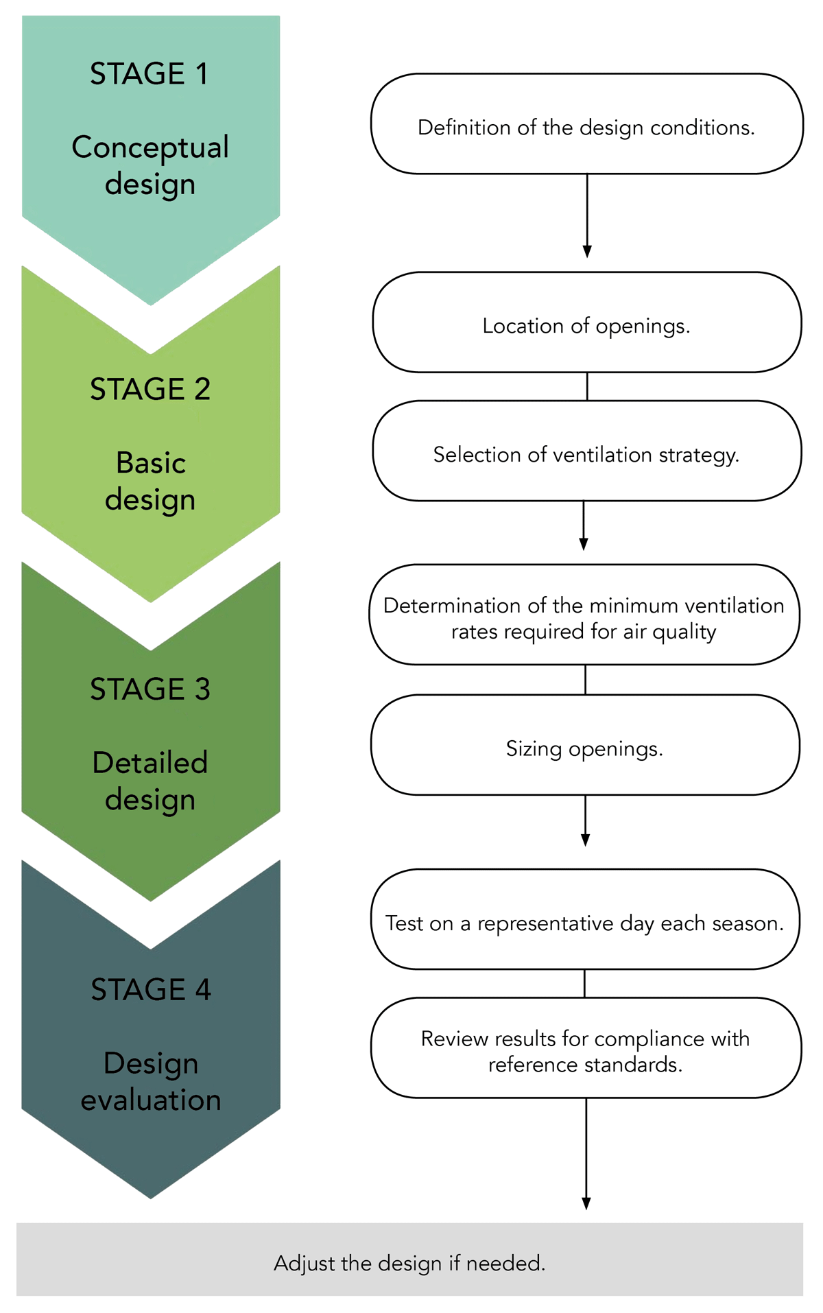
Figure 1
Flow diagram of natural ventilation design.
Table 1
Performance of the selected simplified models for airflow.
| DRIVING FORCE | VENTILATION LAYOUT | EXPECTED % OF TIME CO2 > 1000 ppm | MODELa | AREA (m2) | % OF TIME CO2 > 1000 ppm (CONTAM) |
|---|---|---|---|---|---|
| Wind | Single-side, one opening | 6.68% | Warren | 1.80 | 0.02% |
| Wang and Chen | 1.36 | 0.02% | |||
| Buoyancy | Cross-ventilation | 0.01% | Warren | 0.32 | 2.22% |
| Li and Delsante | 0.22 | 9.59% | |||
| Combination of forces | Single-side, one opening | 0.01% | Warren | 0.96 | 0.82% |
| EN 16798-7:2017 | 0.79 | 6.18% |
[i] Note: The included models were selected through a review of the literature.
aFor models, see Table S1 in the supplemental data online.
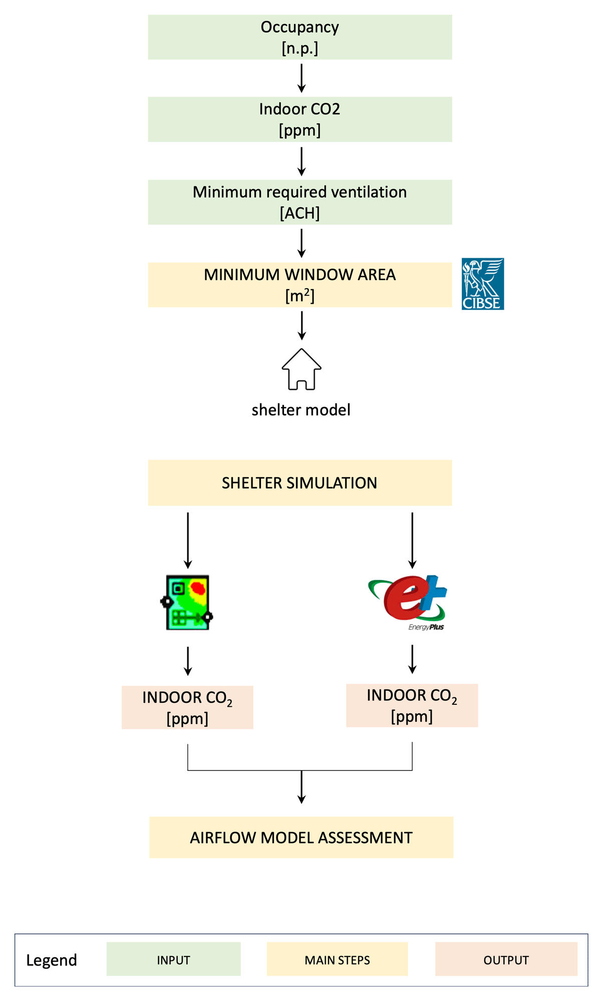
Figure 2
Framework for assessing opening area sizing for adequate ventilation.
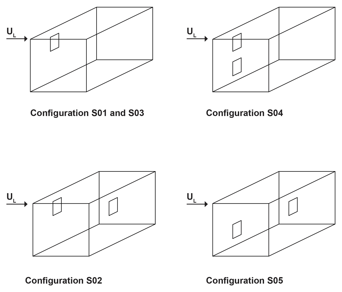
Figure 3
Opening configuration for key natural ventilation mechanisms in shelters.
Note: UL = local wind speed (m/s).

Figure 4
Cumulative distribution of (a) local wind speed (URef); (b) the mean between outdoor and indoor temperatures () (the indoor temperature is calculated by summing 3 K to the outdoor temperature in the weather file); and (c) the difference between the wind pressure coefficients (ΔCP) of the two openings in the cross-ventilation, wind-driven case (S02).
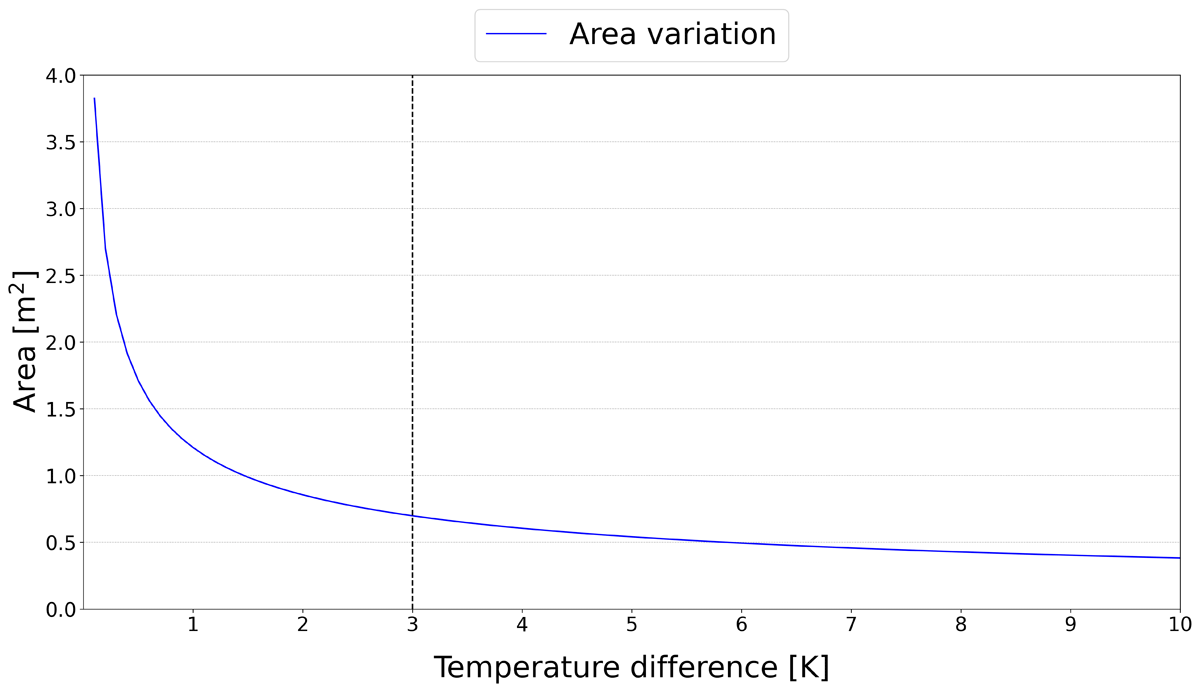
Figure 5
Opening area variation under different temperature differences (Δθ).
Note: The vertical line shows the selected temperature difference of 3 K.
Table 2
Opening areas for each natural ventilation scenario.
| DRIVING FORCE | CASE SCENARIO | AREA: CO2 (m2) | AREA: COVID-19 (m2) |
|---|---|---|---|
| Wind | S01 | 1.80 | 3.36 |
| S02 | 0.67 | 1.25 | |
| Buoyancy | S03 | 0.96 | 1.30 |
| S04 | 0.30 | 0.60 | |
| S05 | 0.32 | 0.58 |
[i] Note: Each area was calculated according to the Warren model. The results provide practical guidance for practitioners, enabling them to select appropriate opening areas based on local conditions and design priorities.
Table 3
Model data for shelter geometry and ventilation.
| ITEM | UNIT MEASURE | DESCRIPTION |
|---|---|---|
| Plan dimensions, l × b | m | 4.8 × 3.2 |
| Height—roof eave | m | 2.3 |
| Height—roof ridge | m | 3.3 |
| Door, l × h | m | 0.9 × 2.0 |
| Total doors | – | 1 |
| Window, l × h | m | 0.6 × 0.8 |
| Total windows | – | 1 |
| Window orientation | – | South facade |
| Ventilation schedule | – | Window and door open from 06.00 to 19.00 hours |
[i] Note: b = breadth; h = height; l = length.
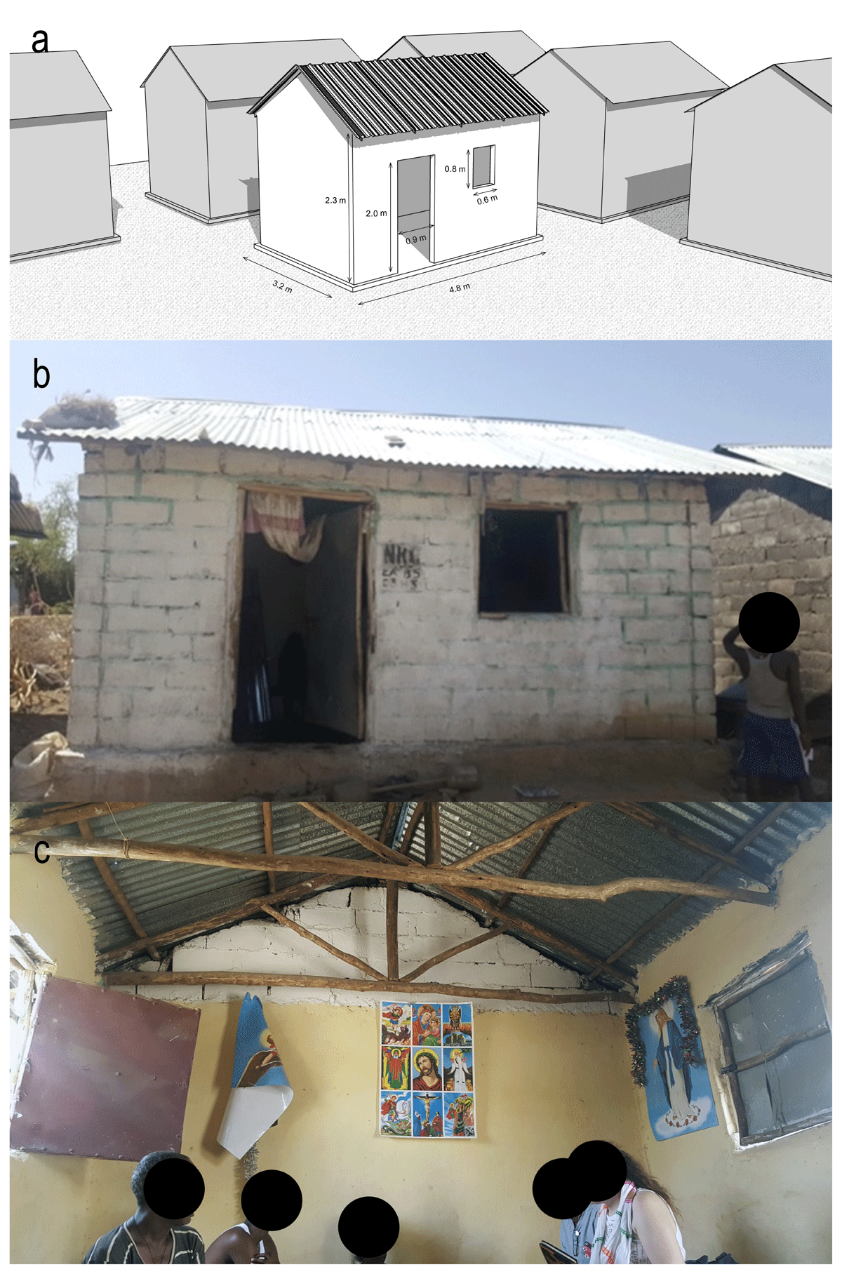
Figure 6
A shelter in Hitsats refugee camp: (a) three-dimensional (3D) model; (b) outdoor view; and (c) indoor view.
Table 4
Scenario S01 results: percentage of time CO2 is expected to be above the threshold of 1000 ppm in the selected airflow models.
| AIRFLOW MODEL | % OF TIME CO2 > 1000 ppm | % OF HOURS EXPLAINING HOURS WHEN CO2 > 1000 ppm | |
|---|---|---|---|
| UL< 0.5 m/s | WIND DIRECTION ≠ 180° | ||
| WR | 6.68% | 6.68% | 0% |
| CN | 0.02% | 25% | 100% |
| EP AFN | 0.56% | 11% | 98% |
[i] Note: AFN = airflow network; CN = Contam; EP = EnergyPlus; WR = Warren model.
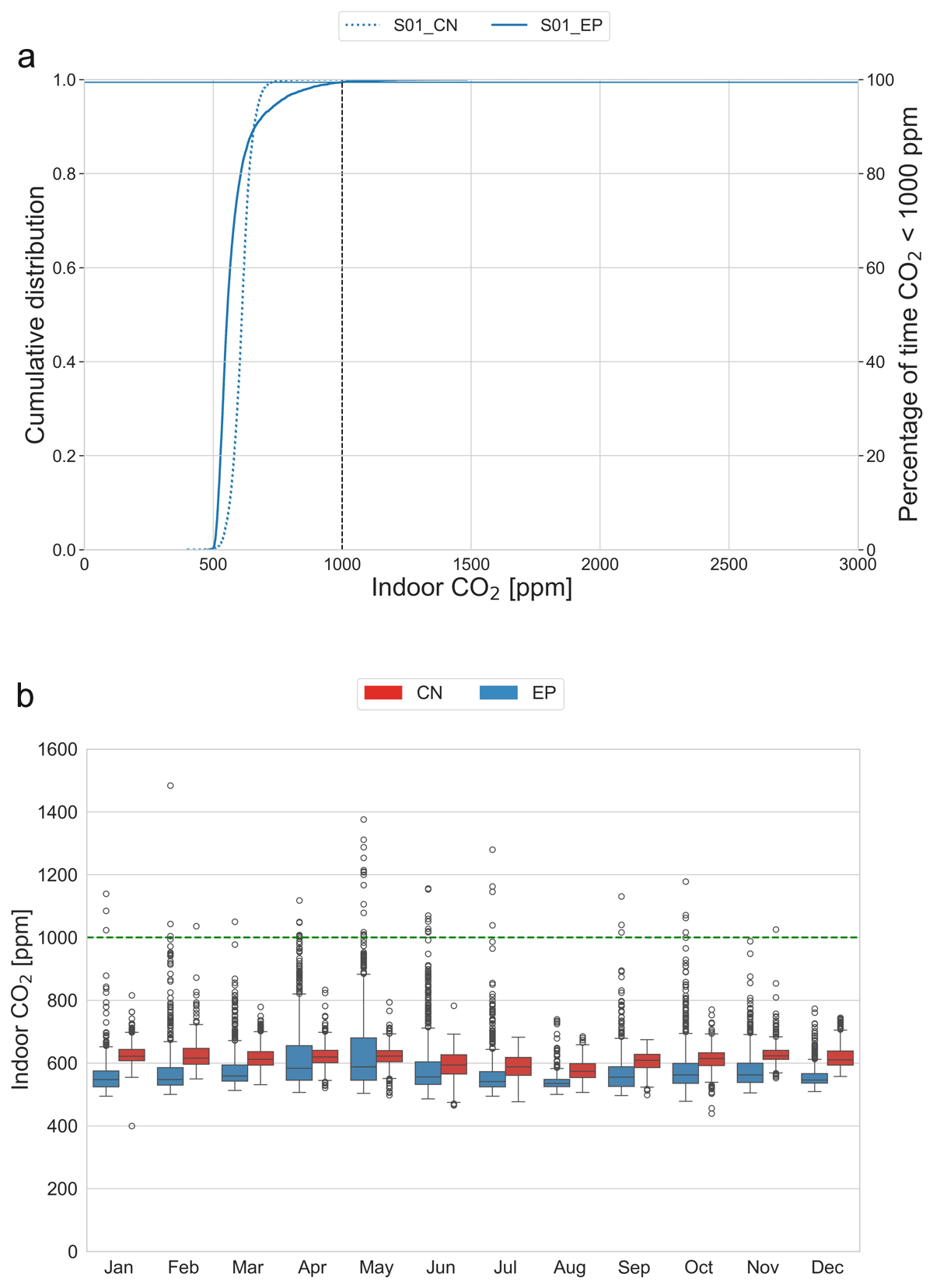
Figure 7
Scenario S01 results: (a) cumulative distribution of indoor CO2; and (b) monthly indoor CO2.
Note: Horizontal lines show the percentage of time CO2 is < 1000 ppm for EnergyPlus (EP) and Contam (CN).
Table 5
Scenario S02 results: percentage of time CO2 is expected to be above the threshold of 1000 ppm in the selected airflow models.
| AIRFLOW MODEL | % OF TIME CO2 > 1000 ppm | % OF HOURS EXPLAINING HOURS WHEN CO2 > 1000 ppm | ||
|---|---|---|---|---|
| UL< 0.5 m/s | WIND DIRECTION ≠ 180° | ΔCp < 0.1 | ||
| WR | 6.68% | 6.68% | 0% | 1.55% |
| CN | 0.00% | 0% | 0% | 0% |
| EP AFN | 0.78% | 68% | 68% | 100% |
[i] Note: AFN = airflow network; CN = Contam; EP = EnergyPlus; WR = Warren model.
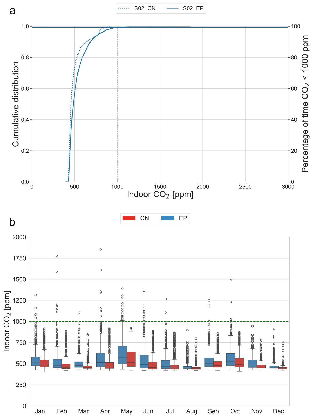
Figure 8
Scenario S02 results: (a) cumulative distribution of indoor CO2; and (b) monthly indoor CO2.
Note: Horizontal lines show the percentage of time CO2 is < 1000 ppm for EnergyPlus (EP) and Contam (CN).
Table 6
Scenario S03 results: percentage of time CO2 is expected to be above the threshold of 1000 ppm in the selected airflow models.
| AIRFLOW MODEL | % OF TIME CO2 > 1000 ppm | % OF HOURS EXPLAINING HOURS WHEN CO2 > 1000 ppm | |||
|---|---|---|---|---|---|
| Δθ < 3 K (%) | AVERAGE Δθ (K) | WIND SPEED = 0 (%) | WIND DIRECTION ≠ 180° (%) | ||
| WR | 0.01% | 0% | n.a. | 0% | n.a. |
| CN | 0.82% | 0% | n.a. | 11.11% | 100% |
| EP AFN | 6.52% | 100% | 0.27 | 0% | 0% |
[i] Note: AFN = airflow network; CN = Contam; EP = EnergyPlus; WR = Warren model; n.a. = not applicable.
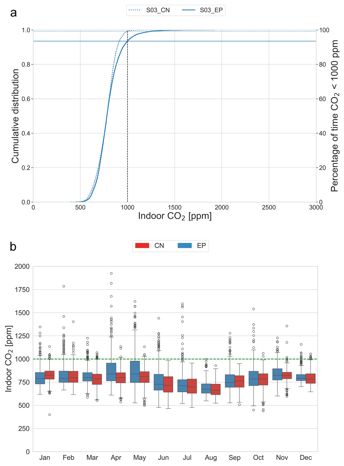
Figure 9
Scenario S03 results: (a) cumulative distribution of indoor CO2; and (b) monthly indoor CO2.
Note: Horizontal lines show the percentage of time CO2 is < 1000 ppm for EnergyPlus (EP) and Contam (CN).
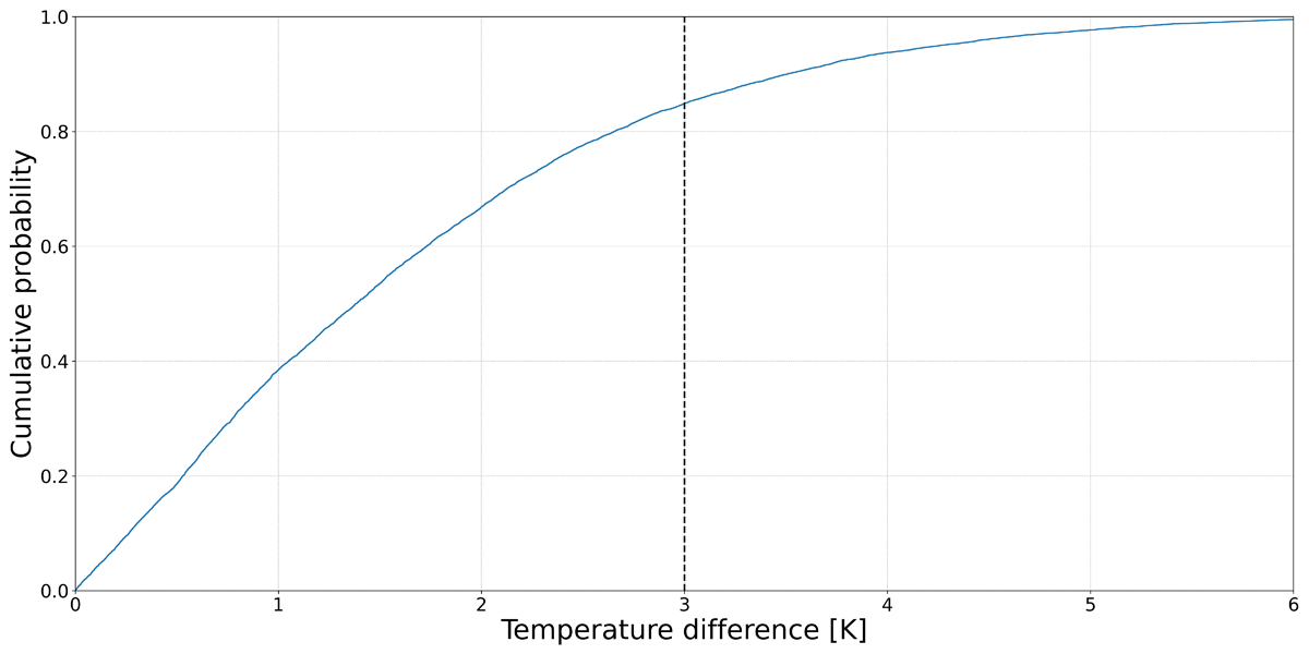
Figure 10
Distribution of the temperature difference in an annual simulation with EnergyPlus (EP) for case S03.
Note: The vertical line shows the selected temperature difference of 3 K.
Table 7
Scenario S04 results: percentage of time CO2 is expected to be above the threshold of 1000 ppm in the selected airflow models.
| AIRFLOW MODEL | % OF TIME CO2 > 1000 ppm | % OF HOURS EXPLAINING HOURS WHEN CO2 > 1000 ppm | |||
|---|---|---|---|---|---|
| Δθ < 3 K (%) | AVERAGE Δθ (K) | WIND SPEED = 0 (%) | WIND DIRECTION ≠ 180° (%) | ||
| WR | 0.01% | 0% | n.a. | 0% | n.a. |
| CN | 2.2% | 0% | n.a. | 5.70% | 100% |
| EP AFN | 5.27% | 100% | 0.27 | 0% | 0% |
[i] Note: AFN = airflow network; CN = Contam; EP = EnergyPlus; WR = Warren model; n.a. = not applicable.
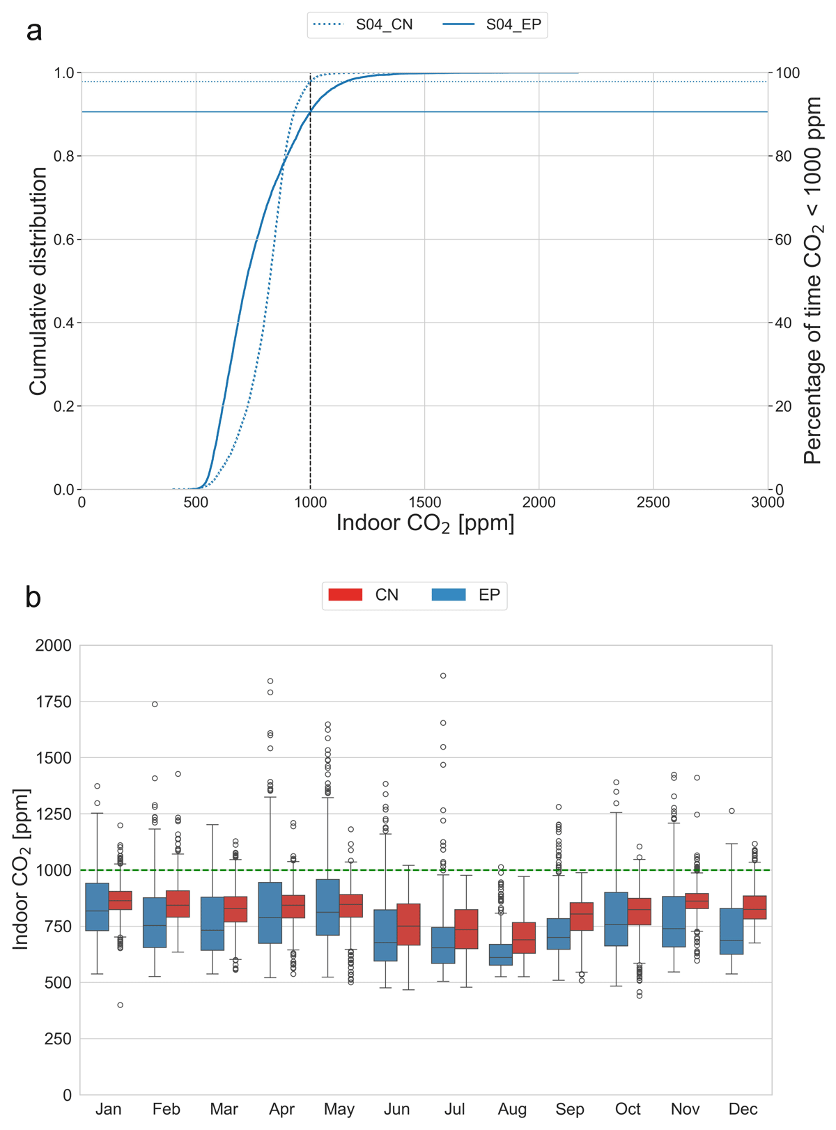
Figure 11
Scenario S04 results: (a) Cumulative distribution of indoor CO2; and (b) monthly indoor CO2.
Note: Horizontal lines show the percentage of time CO2 is < 1000 ppm for EnergyPlus (EP) and Contam (CN).
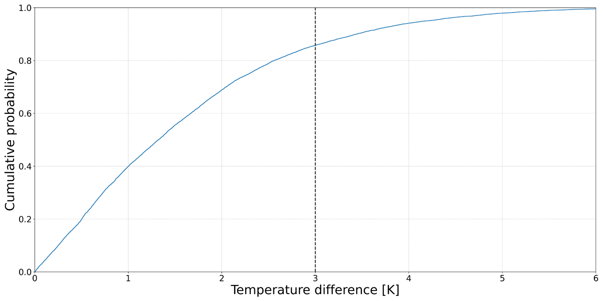
Figure 12
Distribution of the temperature difference in an annual simulation with EnergyPlus (EP) for case S04.
Note: The vertical line shows the selected temperature difference of 3 K.
Table 8
Scenario S05 results: percentage of time CO2 is expected to be above the threshold of 1000 ppm in the selected airflow models.
| AIRFLOW MODEL | % OF TIME CO2 > 1000 ppm | % OF HOURS EXPLAINING HOURS WHEN CO2 > 1000 ppm | |||
|---|---|---|---|---|---|
| Δθ < 3 K (%) | AVERAGE Δθ (K) | WIND SPEED = 0 (%) | WIND DIRECTION ≠ 180° | ||
| WR | 0.01% | 0% | n.a. | 0% | n.a. |
| CN | 2.2% | 0% | n.a. | 5.70% | 100% |
| EP AFN | 5.27% | 100% | 0.27 | 0% | 0% |
[i] Note: AFN = airflow network; CN = Contam; EP = EnergyPlus; WR = Warren model; n.a. = not applicable.
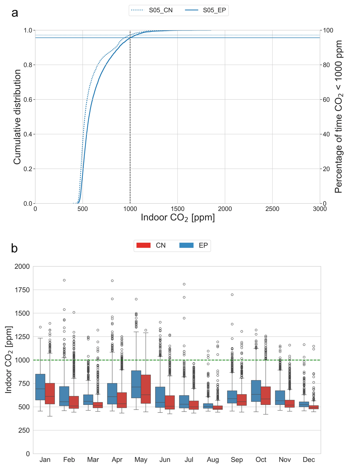
Figure 13
Scenario S05 results: (a) Cumulative distribution of indoor CO2; and (b) monthly indoor CO2.
Note: Horizontal lines show the percentage of time CO2 is < 1000 ppm for EnergyPlus (EP) and Contam (CN).
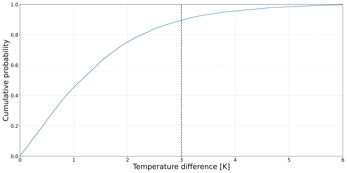
Figure 14
Distribution of the temperature difference in an annual simulation with EnergyPlus (EP) for case S05.
Note: The vertical line shows the selected temperature difference of 3 K.