Table 1
Overview of data sample from Twitter and Instagram
| Platform | Year | Date | Related political events | Posts with images |
|---|---|---|---|---|
| 2015 | 29 November–28 December | COP21: 30 November–12 December | 169,220 | |
| 2016 | 29 October–27 November | COP22: 7–18 November | 31,931 | |
| 2017 | 18 May–16 June | US withdrawal from Paris Agreement: 1 June | 46,567 | |
| 2017 | 4 October–2 November | US withdrawal from Paris Agreement: 1 June | 14,375 |
[i] Comments: Twitter data is collected through Twitter Capture Analysis Tool (TCAT) and Instagram data is collected through Netlytic. All four data samples are collected from the criteria that all posts must contain either #climatechange or #globalwarming. Posts without images or other media content like video have been excluded from the datasets.
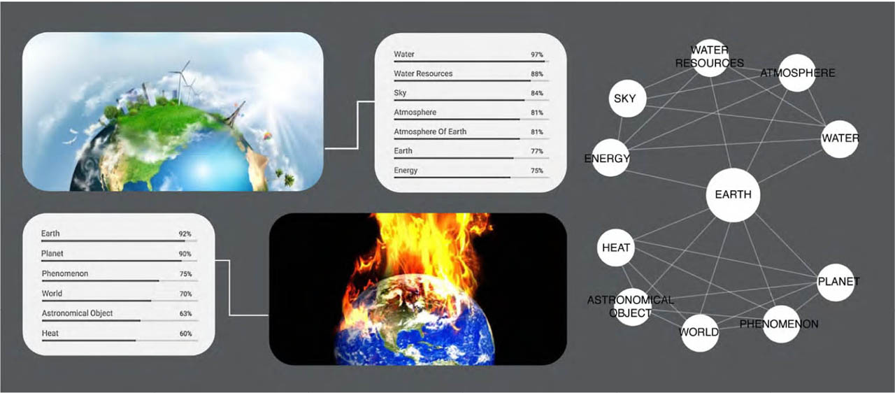
Figure 1
Creating a network graph with images annotated by Google Vision AI
Comments: The figure shows how Google AI might annotate image-objects in two images and recognise “Earth” in both them. If we map this as a network (as seen on the right side of the illustration) it becomes easier to grasp that across these images, the motif Earth is a shared visual object. Qualitative examination shows it is framed differently in the two images: in one, Earth is related visually to “sky” and “energy”, causing a frame of a sustainable world with clean wind energy; in the other, it is visually depicted as a burning world, creating a more dystopian framing. The network helps us see overall patterns in how these image-objects appear together and structure our analytical gaze to, for instance, zoom in on “Earth” as a potentially disputed object. Our quali-quantitative analysis is thus enriched and informed by how the network makes legible the appearance of image-objects across multiple images.
Source: Authors’ conceptual illustration
Figure 2
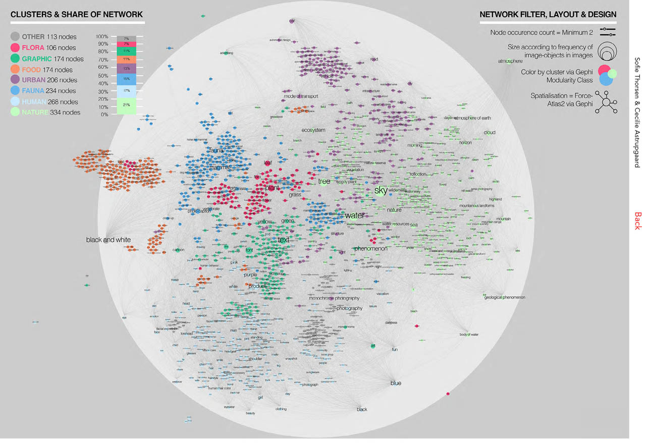
Network of image-objects and their co-appearances in Instagram images
Comments: The network consists of 1,607 nodes and 24,211 edges, where the nodes represent image-objects detected in the dataset of 14,375 Instagram posts. The network is computed in Gephi and spatialised with the ForceAtlas2 algorithm, filtered by setting occurrence count to minimum 2 and adding the Giant Component filter. Sizes of nodes reflect the frequency of the image-objects in the Instagram data, and nodes are clustered by a Modularity Class algorithm.
Source: Instagram data, visualised with Gephi
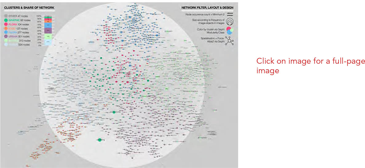
Figure 3
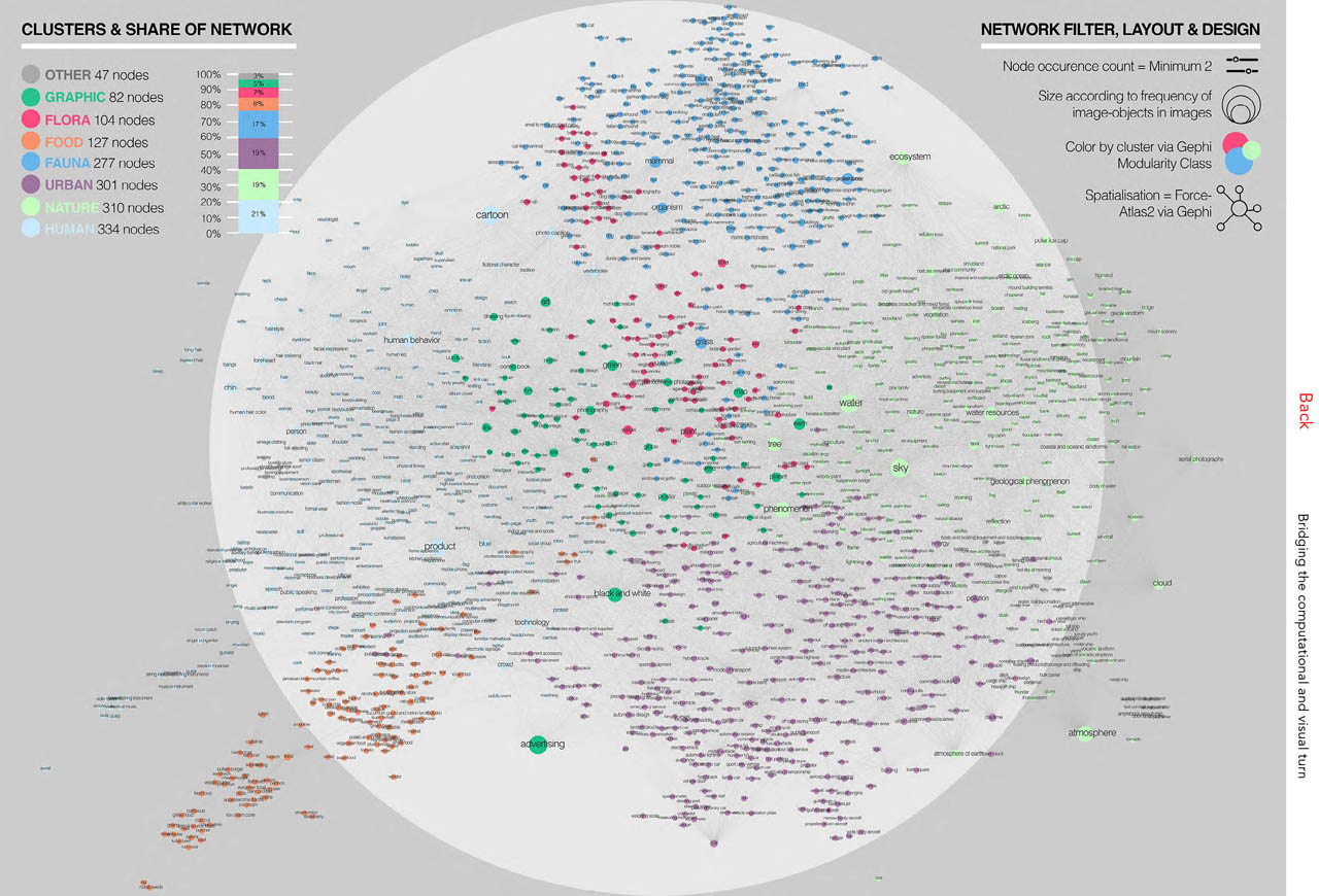
Network of image-objects and their co-appearances in Twitter images
Comments: The network consists of 1,582 nodes and 24,142 edges, where the nodes represent image-objects that have been detected in the 2017 dataset of 46,567 Twitter posts. The network is computed in Gephi and spatialised with the ForceAtlas2 algorithm, filtered by setting occurrence count to minimum 2 and adding the Giant Component filter. Sizes of nodes reflect the frequency of the image-objects in the Twitter data, and nodes are clustered by a Modularity Class algorithm.
Source: Twitter data, visualised with Gephi
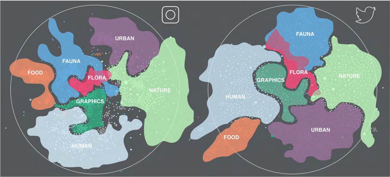
Figure 4
Twitter and Instagram network clusters
Comments: The figure illustrates the clusters identified in the Twitter and Instagram networks recognised with the Modularity Class algorithm in Gephi, also shown in Figures 2 and 3. The illustration shows the seven main clusters in each network, and how they are positioned relative to each other. Clusters are highlighted by coloured polygons placed over the nodes, outlining each cluster. Cluster titles are based on qualitative readings of the visual theme of each cluster.
Source: Authors’ interpretative illustration
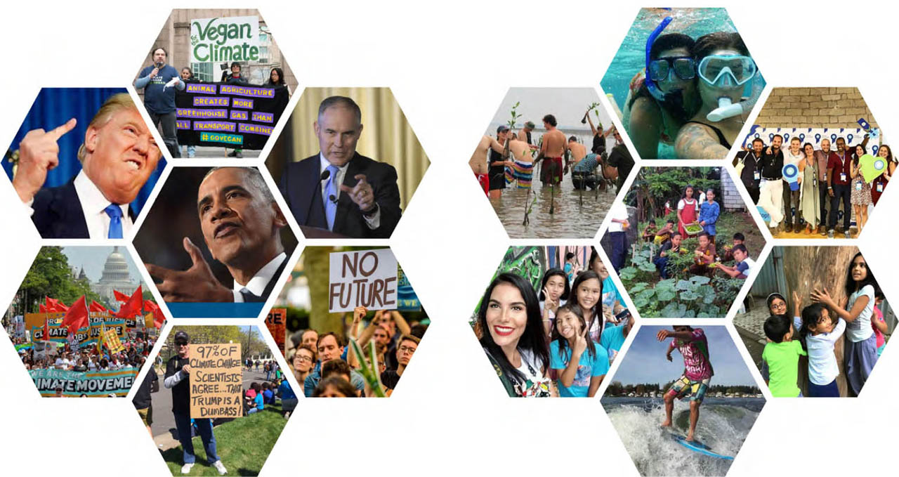
Figure 5
Twitter images annotated with  demonstration, protest, speech, profession, official, and diplomat (left) and Instagram images annotated with fun, eisure, vacation, and community (right), 2017
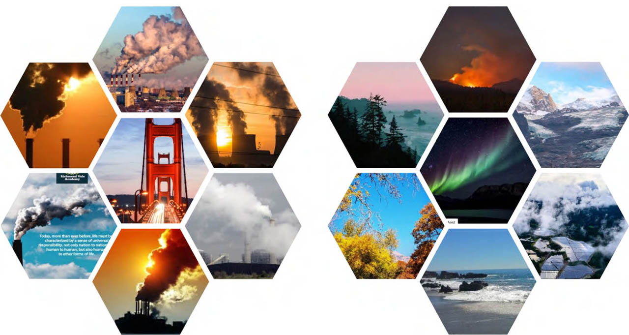
Figure 6
Twitter images (left) and Instagram images (right) annotated with sky, 2017
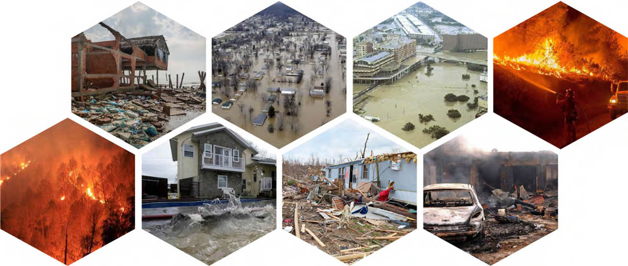
Figure 7
Twitter images annotated with disaster, natural-disaster, wildfire, or earthquake, 2017
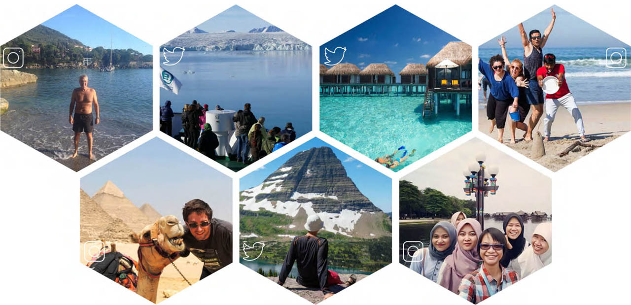
Figure 8
Instagram and Twitter images annotated with tourism, 2017
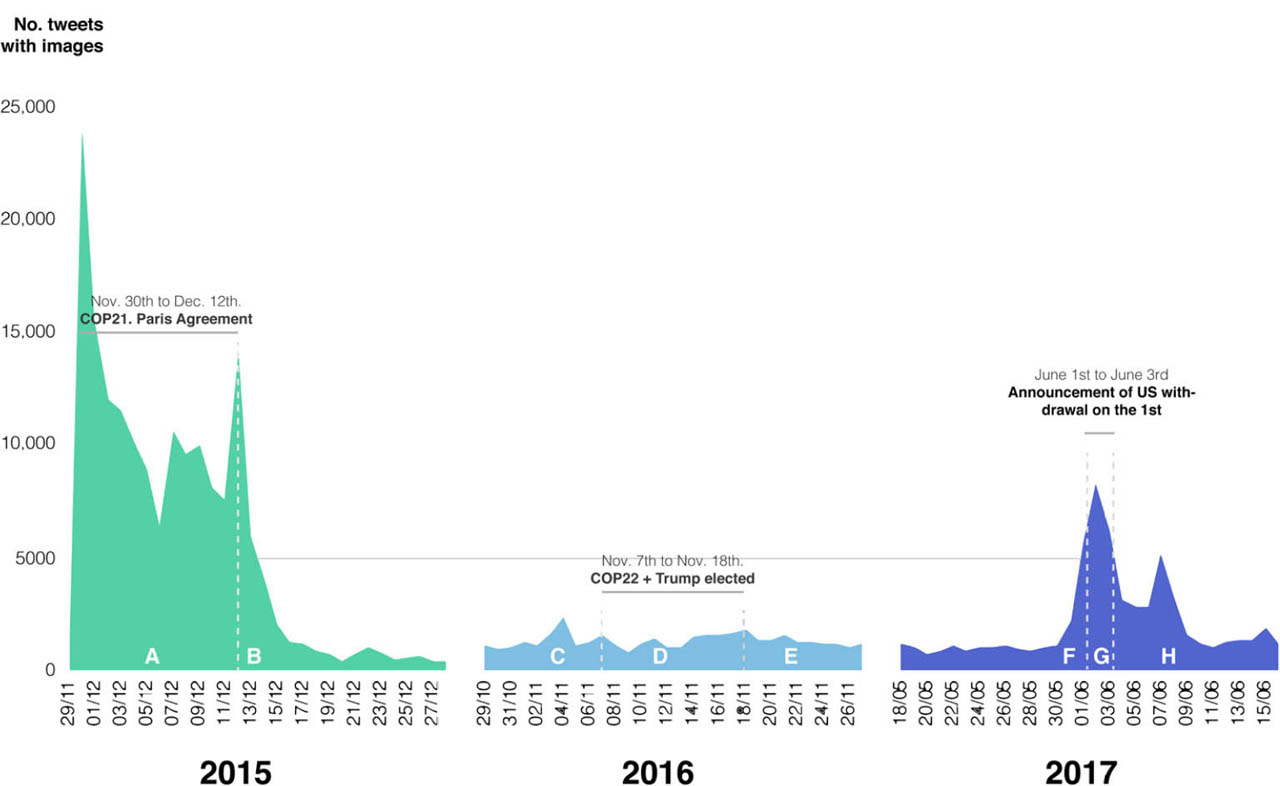
Figure 9
Twitter data samples divided in eight periods, 2015, 2016, and 2017
Comments: The data is the three Twitter samples from Table 1 mapped in an area graph displaying the number of daily tweets with images containing either #climatechange or #globalwarming. The figure illustrates how the three data samples from 2015, 2016, and 2017 have been divided in eight sub-periods (A–H) around the climate-related political events.
Source: Twitter data, plotted in Excel
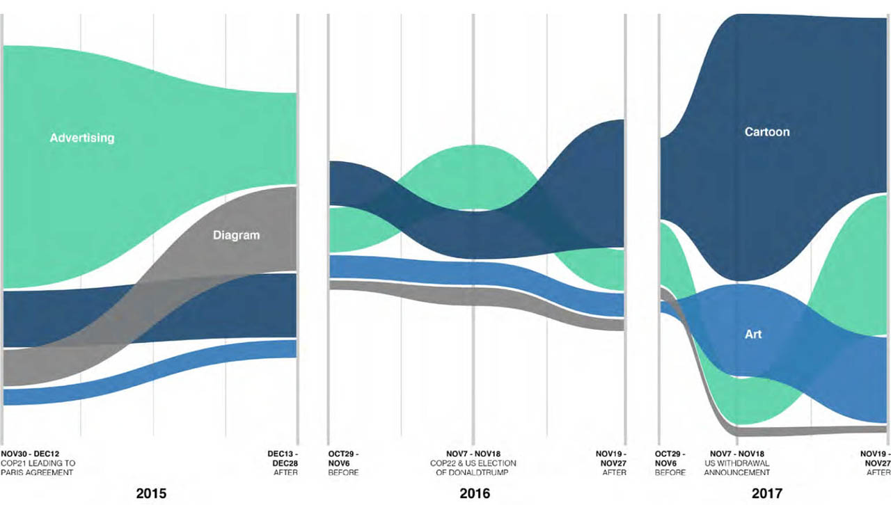
Figure 10
Streamgraph of four genre-related image-objects on Twitter, 30-day intervals 2015–2017
Comments: Data is all images from Twitter containing one of the four image-objects cartoon, advertising, diagram, or art from all data samples. The sorted streamgraph is made with Raw-Graph, which normalises the number of images in each period to make time periods comparable, and places the image-object that appears most in each period on top.
Source: Twitter data, plotted via RawGraphs (Density Design Research Lab, 2013)
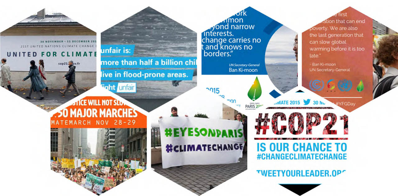
Figure 11
Twitter images annotated with advertising, two 30-day periods 2015
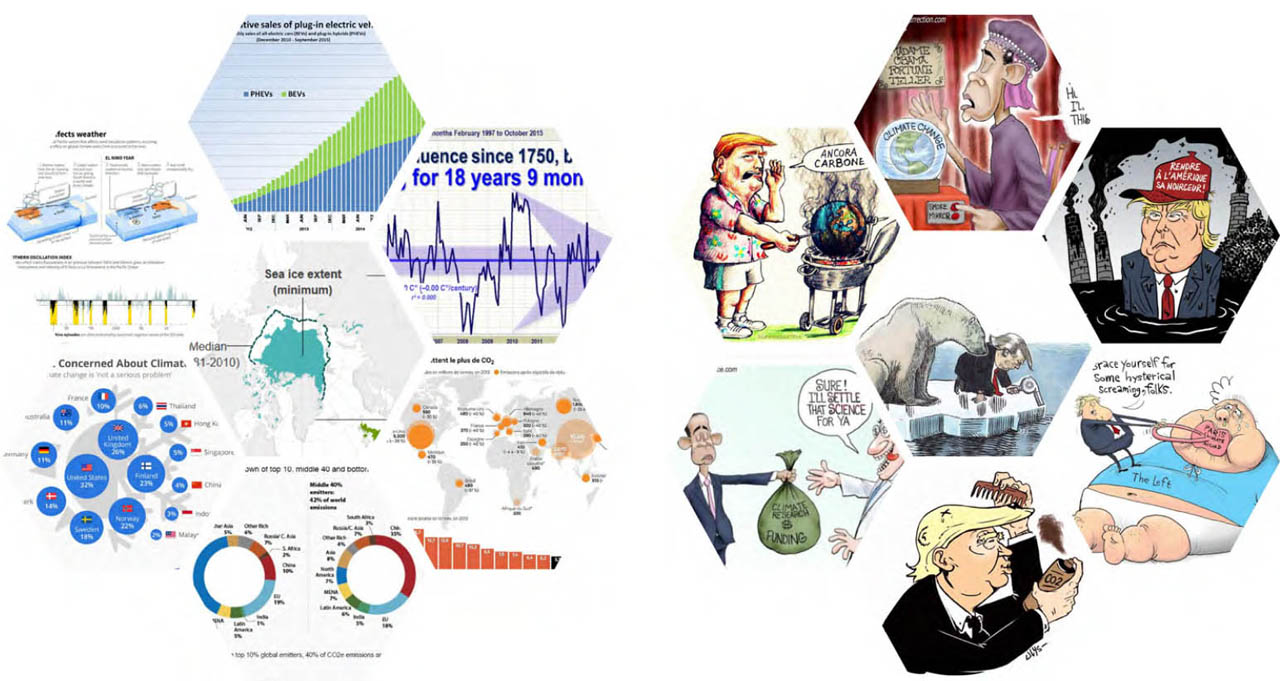
Figure 12
Twitter images annotated with diagram (left), 2015, and cartoon (right), 2017
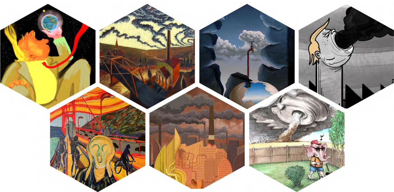
Figure 13
Twitter images annotated with art, 2017