
Table 1
Results of the Study.
| No. | Handwriting Characteristic | Number of samples | Percentage of samples |
|---|---|---|---|
| 1 | Use of a circle for an i-dot | 2 (1) | 0.5% (0.3%) |
| 2 | Use of circles for punctuation - periods or colons | 5 (1) | 1.3% (0.3%) |
| 3 | The letters "n" or "m" displaying an introductory stroke | 1 (0) | 0.3% (0%) |
| 4 | A short staff to the letter "d" | 260 (89) | 68.1% (23.3%) |
| 5 | Lowercase letters being almost similar in height as uppercase letters | 245 (148) | 64.1% (38.7%) |
| 6 | Mixture of handprinting and cursive writing | 165 | 43.2% |
| 7 | Use of all handprinting rather than cursive writing | 189 | 49.5% |
| 8 | Great amount of variation in the writing | 19 | 5.0% |
| 9 | Round-hand (bubble) writing | 0 | 0% |
| 10 | Use of decorative numeral "1" | 57 (16) | 14.9% (4.2%) |
| 11 | Use of the copybook form of the uppercase "Y" | 155 (123) | 40.6% (32.2%) |
| 12 | Use of the printed form of the letter "a" | 34 (13) | 8.9% (3.4%) |
[i] Note: Numbers in parentheses excluded mixtures i.e. referring only to the “all-positives”. “All-positives” are not applicable for characteristics 6 to 9 as these are “macro” characteristics based on the overall appearance of the handwriting. The remaining eight characteristics had both “all-positives” and “mixtures”.
Table 2
Comparison of Results from Different Studies.
| No. | Handwriting Characteristic | Masson | Cusack & Hargett, Town A | Cusack & Hargett, Town B | Yang et al. |
|---|---|---|---|---|---|
| 1 | Use of a circle for an i-dot | 17% | 11% | 17% | 0.5% |
| 2 | Use of circles for punctuation - periods or colons | 27% | 14% | 12% | 1.3% |
| 3 | The letters "n" or "m" displaying an introductory stroke | 5% | 5% | 4% | 0.3% |
| 4 | A short staff to the letter "d" | 30% | 21% | 16% | 68.1% |
| 5 | Lowercase letters being almost similar in height as uppercase letters | 6% | 5% | 16% | 64.1% |
| 6 | Mixture of handprinting and cursive writing | 20% | 43.2% | ||
| 7 | Use of all handprinting rather than cursive writing | 8% | 49.5% | ||
| 8 | Great amount of variation in the writing | 4% | 5.0% | ||
| 9 | Round-hand (bubble) writing | 21% | 18% | 0% | |
| 10 | Use of decorative numeral “1” | 14.9% | |||
| 11 | Use of the copybook form of the uppercase “Y” | 40.6% | |||
| 12 | Use of the printed form of the letter “a” | 8.9% |
[i] Note: A grey cell indicated that the characteristic was not considered in that particular study.
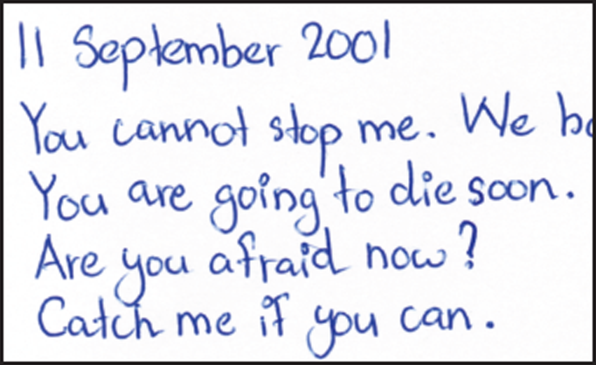
Figure 1
Sample (191-2) showing the use of circles for both i-dots and punctuation.
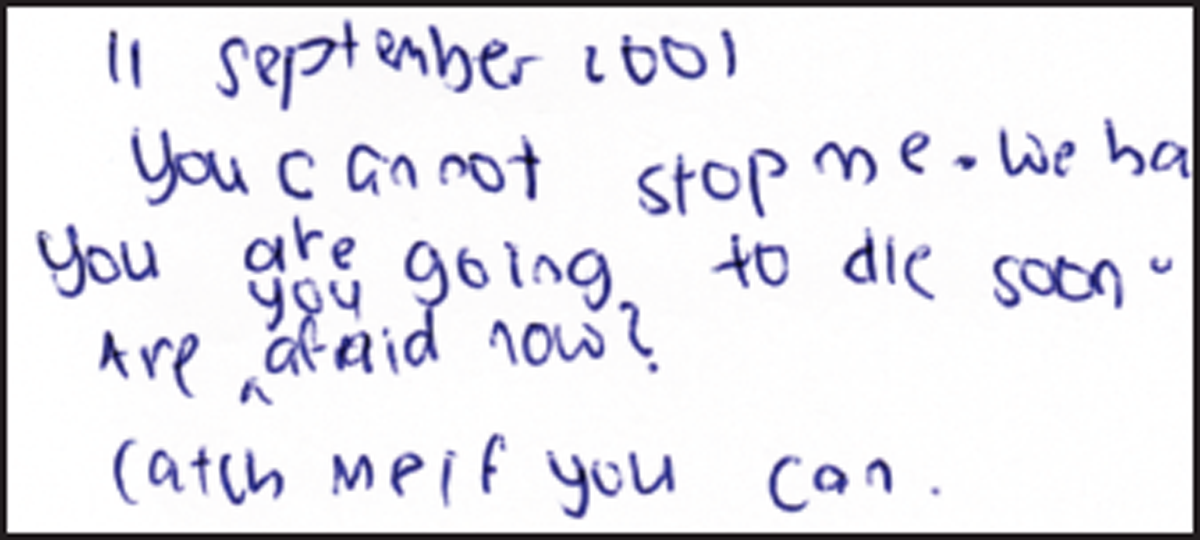
Figure 2
Sample (24-3) showing the use of circles for punctuation.
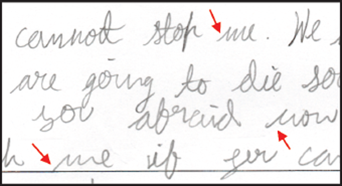
Figure 3
Sample (51-2) showing the introductory stroke for the letters “n” or “m” (indicated by arrows)
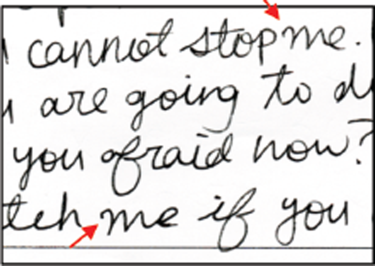
Figure 4
Sample (362-3) not considered as a “positive” in this study.
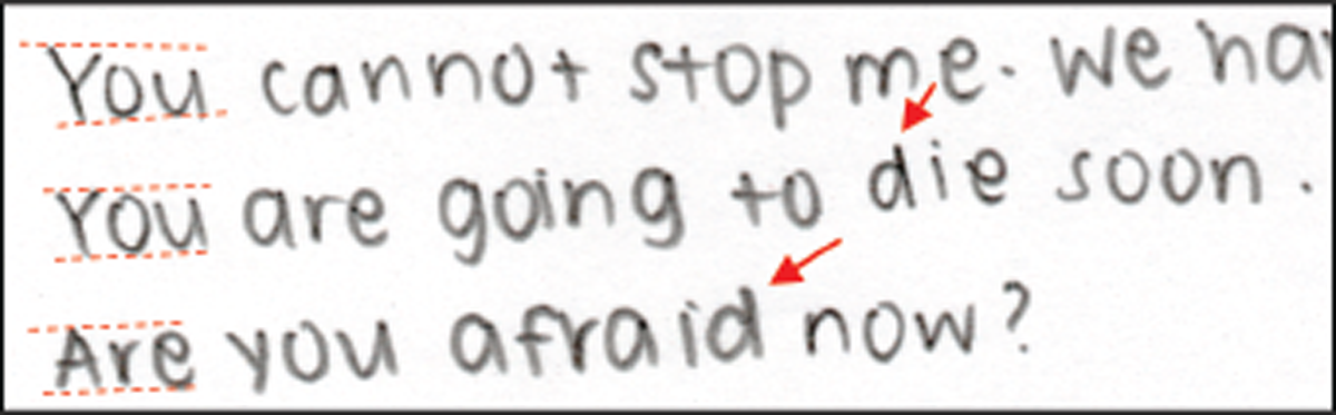
Figure 5
Sample (5-3) showing an example of a writer exhibiting both a short staff to the letter “d” (indicated by arrows) and lowercase letters being almost similar in height as uppercase letters (indicated by dotted lines).
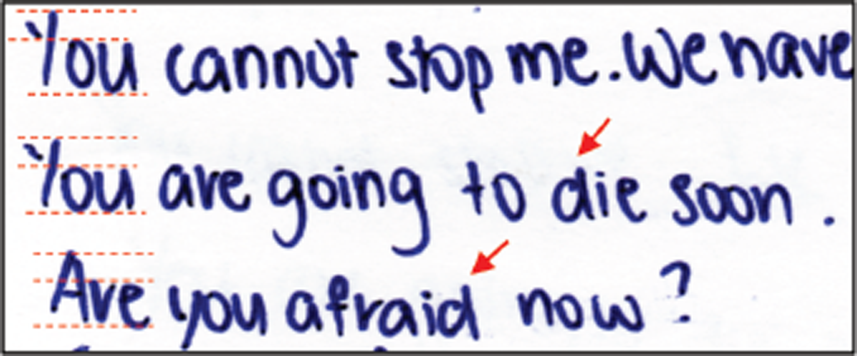
Figure 6
Sample (230-1) showing an example of a writer exhibiting a short staff to the letter “d” (arrows) but not lowercase letters being almost similar in height as uppercase letters (dotted lines).
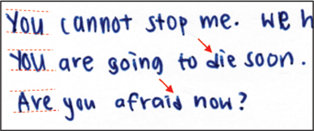
Figure 7
Sample (360-3) showing an example of a writer exhibiting lowercase letters being almost similar in height as uppercase letters (dotted lines) but not a short staff to the letter “d” (arrows).
Table 3
Observed values.
| Lowercase letters not similar in height as uppercase letters | Lowercase letters almost similar in of height as uppercase letters | Total no. samples | |
|---|---|---|---|
| No short staff to the letter “d” | 77 | 45 | 122 |
| Short staff to the letter “d” | 60 | 200 | 260 |
| Total no. of samples | 137 | 245 | 382 |
Table 4
Expected values.
| Lowercase letters not similar in height as uppercase letters | Lowercase letters almost similar in height as uppercase letters | |
|---|---|---|
| No short staff to the letter “d” | 43.75 | 78.25 |
| Short staff to the letter “d” | 93.25 | 166.75 |
Table 5
Individual Chi-square values
| Lowercase letters not similar in height as uppercase letters | Lowercase letters almost similar in height as uppercase letters | |
|---|---|---|
| No short staff to the letter “d” | 25.27 | 14.13 |
| Short staff to the letter “d” | 11.85 | 6.63 |
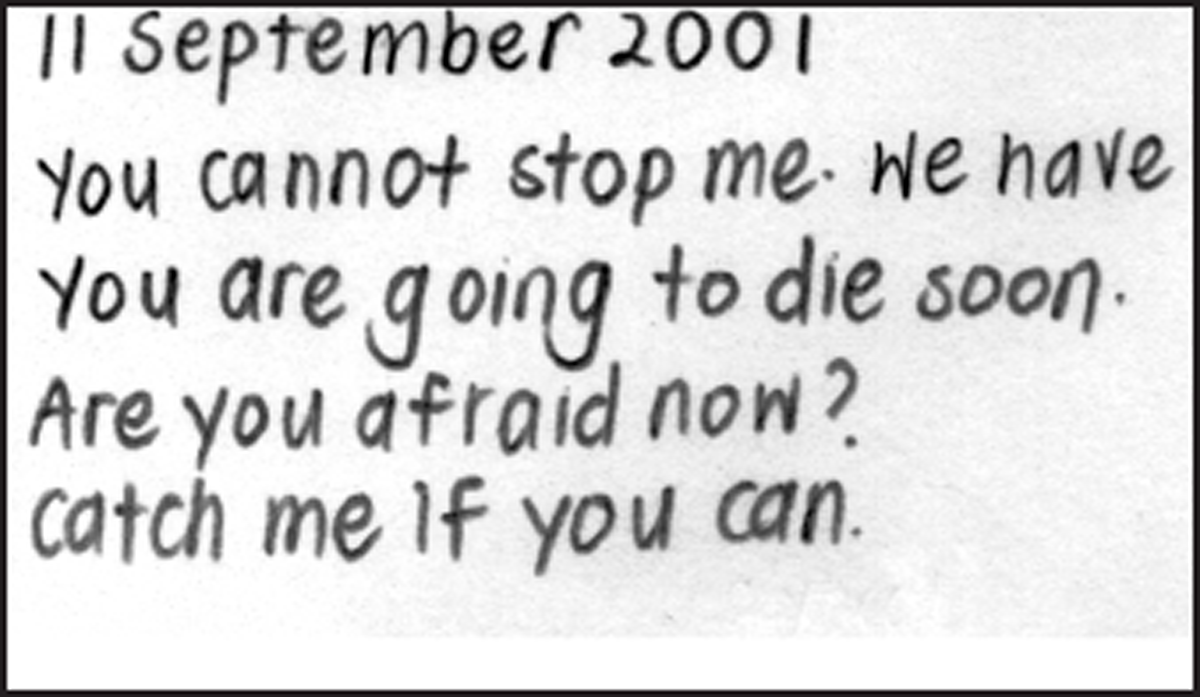
Figure 8
Sample (31-1) showing an example of “all handprinting”.
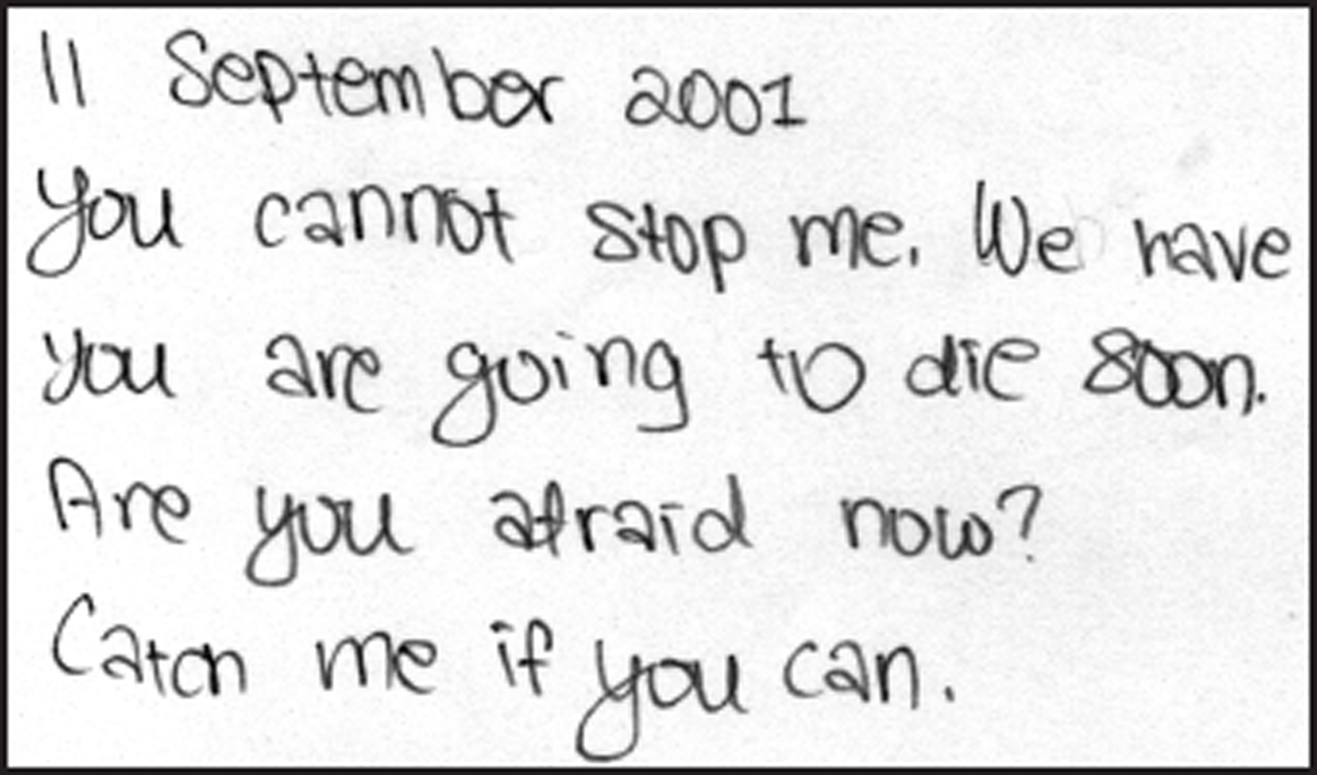
Figure 9
Sample (49-2) showing an example of “mixture of handprinting and cursive”.
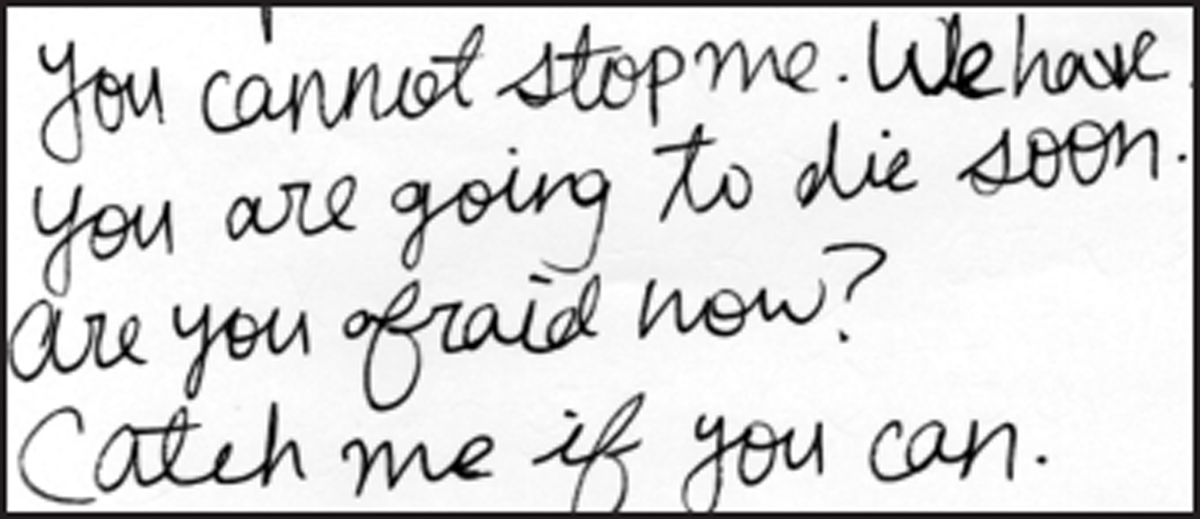
Figure 10
Sample (362-2) showing an example of “cursive only”.
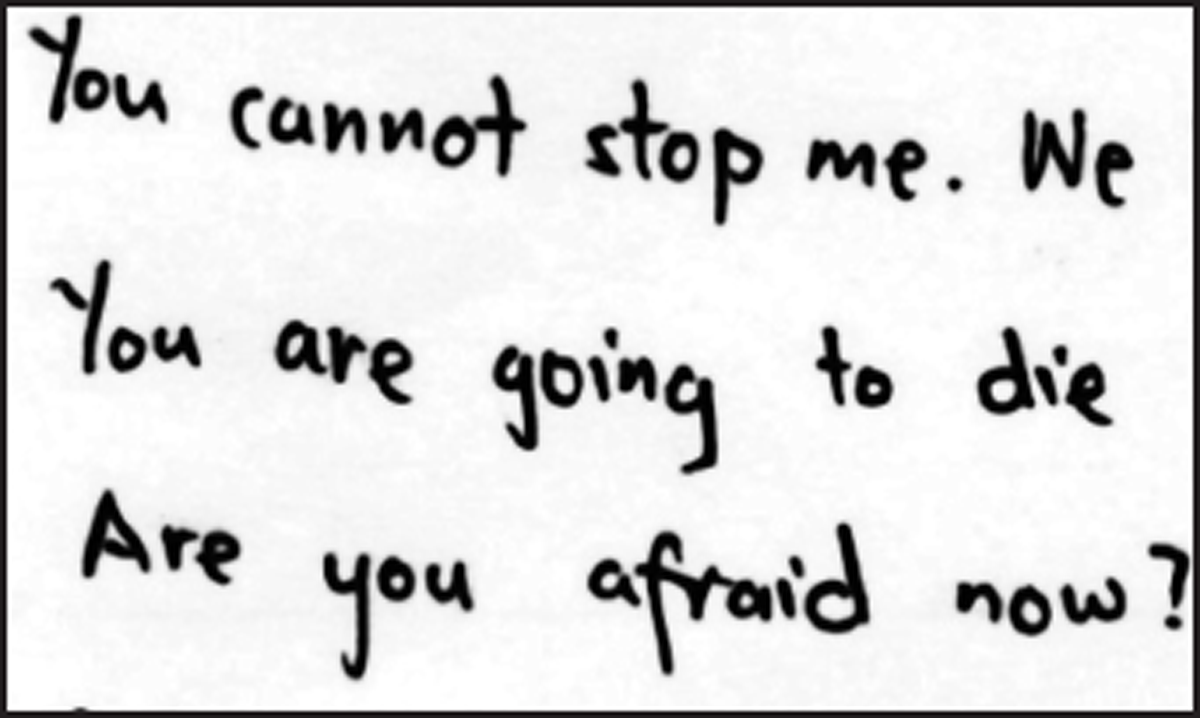
Figure 11
Sample (344-1).
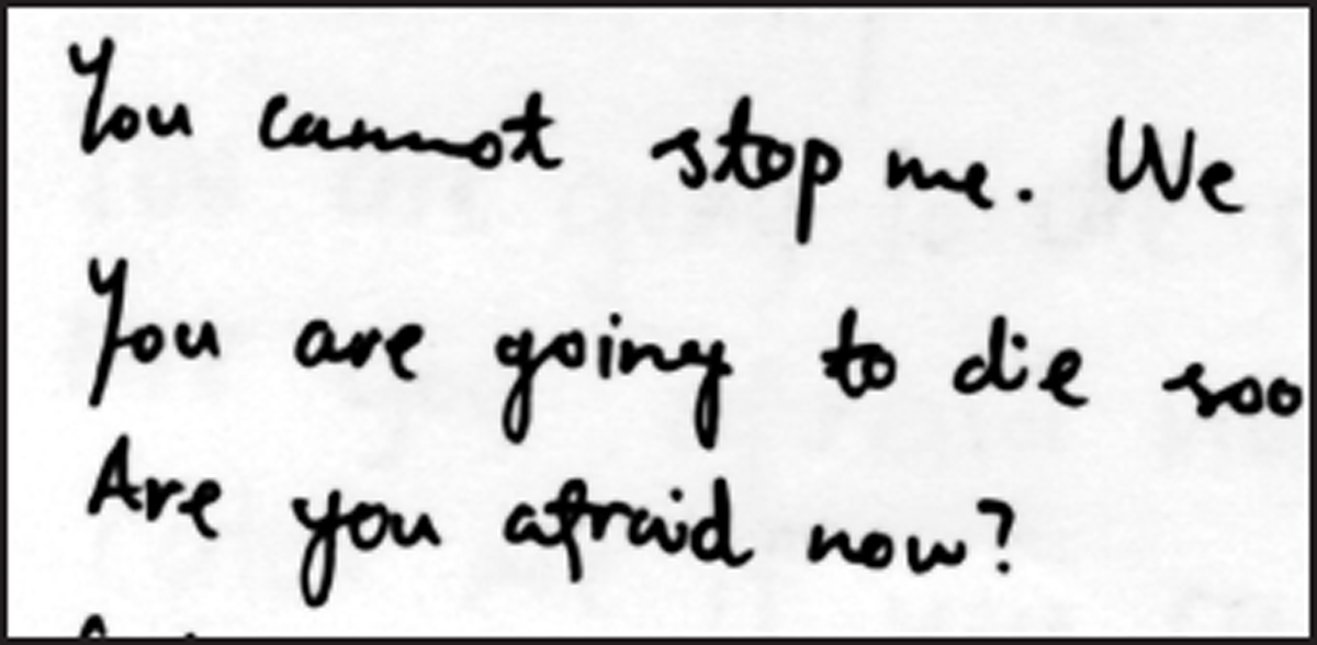
Figure 12
Sample (344-2).
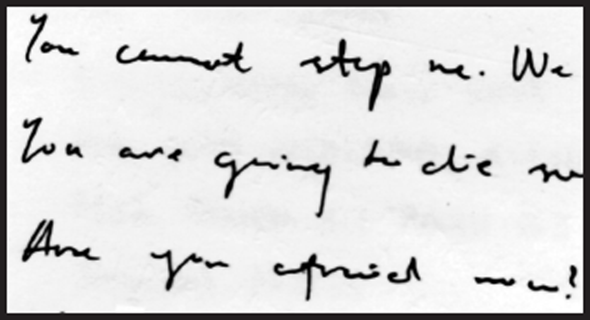
Figure 13
Sample (344-3).
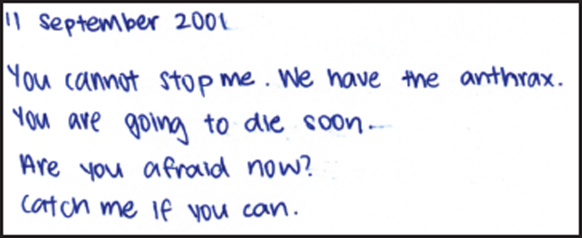
Figure 14
Sample (139-1).
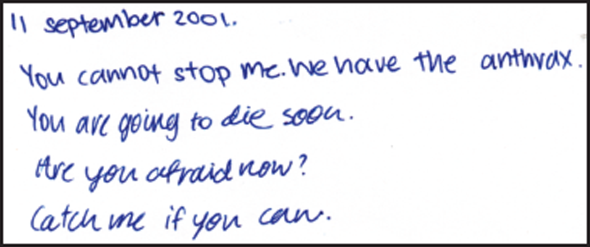
Figure 15
Sample (139-2).
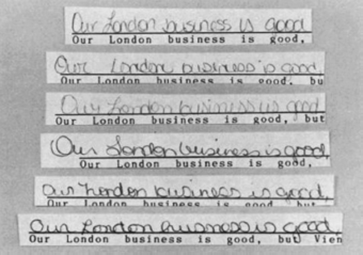
Figure 16
Examples of handwriting from six modified rounded style writers.
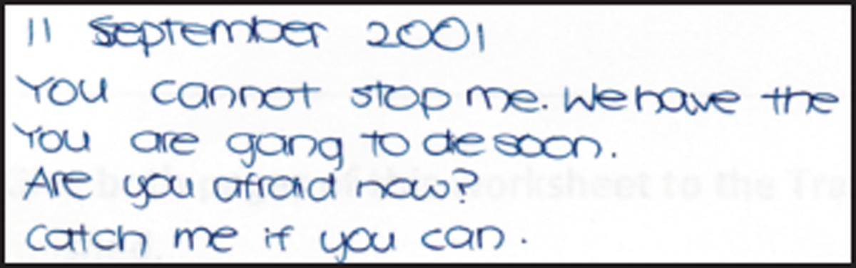
Figure 17
Sample (77-2) showing an example of roundish letters but not round-hand writing.

Figure 18
Sample (32-1) showing the numeral “1” with a commencing stroke.

Figure 19
Sample (28-2) showing the numeral “1” with a commencing stroke and lower serif.

Figure 20
Sample (28-2) showing the use of the copybook form of the uppercase “Y”.
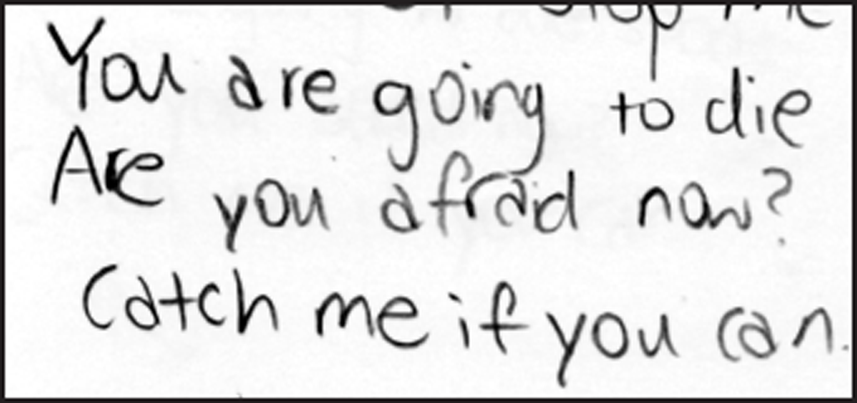
Figure 21
Sample (294-3) showing the consistent use of the printed form of the letter “a”.
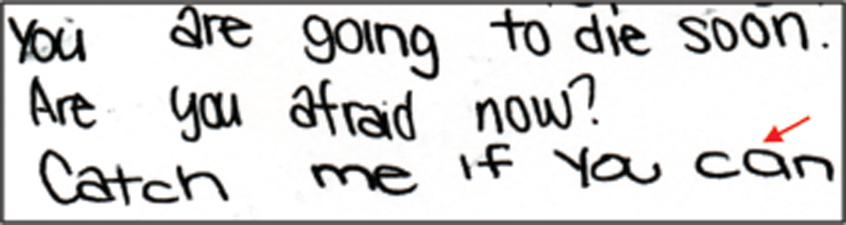
Figure 22
Sample (147-1) showing the use of the “normal” form of the letter “a” as indicated with an arrow, amidst the mostly printed form of the letter “a”.