
Introduction
Adolescence is the period when a number of pronounced changes usually occur in the handwriting of the average writer before the writing matures and stabilises in adulthood. A number of studies on the handwriting of adolescents have been conducted in the past. Most of these studies were undertaken in the United States (US) and Canada, and one study was also conducted in England.1,2, 3, 4, 5, 6, 7
Masson1 conducted a survey on the handwriting of 171 teenagers between the ages of 13 and 19 in Houston, US, and concluded that “there are writing styles which are used by some adolescents, although use of these styles is certainly not restricted to teenagers” and that “some handwriting characteristics and letter formations which might be considered highly unusual by the document examiner are in fact not quite so unusual among teenage writers”. Based on her findings, she reiterated “the importance of having an abundance of genuine handwriting and an abundance of caution when attempting to identify the handwriting of an adolescent”.
The following were the ten handwriting characteristics considered by Masson in her study:
Use of 8 which is made with two separate circles
Use of a circle for an i dot
Use of circles for punctuation—periods or colons
Formation of an “n” or “m” with an extra beginning stroke
Unusually short staff to the letter “d”
Making lower case letters such as “a”, “c”, “e”, and so forth almost as tall as upper case letters
Use of a printed form of the “b” within words where the remaining letters are cursive forms
Use of many printed forms along with cursive forms
Use of all printed or manuscript forms rather than cursive forms
Unusually great amount of variation in the writing
Cusack & Hargett2 conducted a similar study on 293 students from two US towns (146 students from Town A and 147 students from Town B) aged between 14 and 18+. The study was based on the following nine handwriting characteristics, of which the first seven were drawn from Masson’s survey and the remaining two were chosen by the authors:
The numeral eight made with two separate circles
A circle i-dot
Circles for colons and periods
An extra beginning stroke on the letter ‘n’ and/or the letter ‘m’
An unusually short staff to the letter ‘d’
Making lower case letters almost as tall as upper case letters
A printed form of the letter ‘b’
Failure to execute a defined connecting stroke between the letter ‘w’ and the letter ‘r’
Modern round-hand ‘bubble’ writing
A third study, also from the US, was conducted by Ramsey3 on the evolution of handwriting from one class of students spanning from grades 3 to 6, using the same set of ten handwriting characteristics as the Masson study. At the end of the four years, 14 students had completed the study.
Other related studies included those by Brown4, Tolliver5, MacInnis6 and Crane7. Brown’s study investigated the handwriting from a mixed ethnic group including children of immigrants in inner-city England. Tolliver conducted a study on the evolution of her own signature over 30 years, beginning with the time when she was initially taught the manuscript form of writing. MacInnis focused on investigating whether adolescent handwriting of Indigenous writers could be distinguished from that of the non-Indigenous writers in Saskatchewan, Canada. Crane’s work focused on the frequency of round handwriting among students in Alberta, Canada.
More recently, Hanson8 conducted an initial three-year study on the development of individual handwriting characteristics of students in the US. It would be interesting to compare our results with that of Hanson’s when published. In the Asia-Pacific region, similar research is limited. A recent pilot study by Joyce9 investigating the influence of technology use in the classroom on the handwriting of students in Melbourne, Australia, found that the use of the technology appears to have affected the level of exposure to handwriting. This has in turn affected the fluency of the students’ handwriting. The author also concluded that “the document examiner of the future will be expected to examine printed writing as an overwhelming majority to that of cursive writing”. Similarly, comparative studies in adolescent handwriting across different geographical locations or between time periods is limited.
In Singapore, English was not widely spoken in the 1950s and 1960s. This has changed over time, as changes in government policies reflected the growing importance of English as the main working language. Written English is now included as part of the English language syllabus in primary (elementary) schools. 10 The current 2010 syllabus covers penmanship skills such as adopting appropriate writing posture and hand grip, and using regular and appropriate spacing (Primary 1 to 2; 7 to 8 years old); printing lowerand upper-case letters neatly and legibly, with attention to consistent letter size and height, direction of strokes (e.g. dots, tails, crossbars, curves) and differences in letter orientation (e.g. ‘d’ and ‘b’) (Primary 1 to 3; 7 to 9 years old); as well as writing in cursive script to increase writing speed and fluency (Primary 3 to 6; 9 to 12 years old). It is also stated in the syllabus that “as handwriting style is personal and individual, no particular style of handwriting is preferred”. 11
Nowadays, it is increasingly common for children to become acquainted with the letters of the alphabet before they enter primary school, either through learning at pre-school classes or copybooks purchased by their parents. Copybooks available here are published locally12 or from countries such as the United Kingdom. 13
In 2014, one of the authors of this paper conducted a preliminary study with sixty 12- and 13-year-old Secondary 1 students in Singapore14. This was expanded to 382 students in the present study. The objective was to provide information on the handwriting styles and characteristics of adolescents in the current local context, and make comparisons with previous studies. Since the manner in which handwriting is taught can vary significantly across geographical locations, the resultant writing styles and prominent characteristics of the local population are likely to be different from those previously reported. This study attempts to verify if this is indeed the case, and provides findings on the similarities and differences in the handwriting styles and characteristics.
Methods and Materials
Handwriting samples were collected from 382 students from three secondary schools in Singapore between 2013 and 2015. The students were asked to copy the following threat letter three times in their normal handwriting:
11 September 2001
You cannot stop me. We have the anthrax.
You are going to die soon.
Are you afraid now?
Catch me if you can.
Using the earlier studies conducted by Masson and Cusack & Hargett as a basis, one of the authors of this paper had previously conducted a general examination on 60 handwriting samples in 2014 to determine if there were other prominent handwriting characteristics besides the 12 used in the Masson and Cusack & Hargett studies. Of these 12 characteristics, <Use of 8 which is made with two separate circles> and <Failure to execute a defined connecting stroke between the letter “w” and the letter “r”> were omitted as our handwriting samples did not contain the required numeral or letter combination and were therefore not applicable. In their place, two new characteristics <Use of decorative numeral “1”> and <Use of the copybook form of the uppercase “Y”> were added.
The 2014 list of handwriting characteristics was re-visited for this study and further refined. The handwriting characteristic >Use of a printed form of the “b” within words where the remaining letters are cursive forms> was replaced with <Use of the printed form of the letter “a”>, as most of the samples were not cursive writing and a number of them had the printed form of the letter “a”.
The 12 handwriting characteristics selected for this study are as follows:
Use of a circle for an i-dot
Use of circles for punctuation – periods or colons
The letters “n” or “m” displaying an introductory stroke
A short staff to the letter “d”
Lowercase letters being almost similar in height as uppercase letters
Mixture of handprinting and cursive writing
Use of all handprinting rather than cursive writing
Great amount of variation in the writing
Round-hand (bubble) writing
Use of decorative numeral “1”
Use of the copybook form of the uppercase “Y”
Use of the printed form of the letter “a”
The 382 samples, which included the 60 samples from the 2014 preliminary study, were examined in greater detail for the occurrence of each of the 12 characteristics. If a characteristic occurred in a handwriting sample at least once, it was recorded as a “positive”. If this characteristic occurred in the handwriting in every instance, this was known as an “all-positive”; if not, it was known as a “mixture”.
Results and Discussion
The results were summarised in Table 1.
Table 1
Results of the Study.
| No. | Handwriting Characteristic | Number of samples | Percentage of samples |
|---|---|---|---|
| 1 | Use of a circle for an i-dot | 2 (1) | 0.5% (0.3%) |
| 2 | Use of circles for punctuation - periods or colons | 5 (1) | 1.3% (0.3%) |
| 3 | The letters "n" or "m" displaying an introductory stroke | 1 (0) | 0.3% (0%) |
| 4 | A short staff to the letter "d" | 260 (89) | 68.1% (23.3%) |
| 5 | Lowercase letters being almost similar in height as uppercase letters | 245 (148) | 64.1% (38.7%) |
| 6 | Mixture of handprinting and cursive writing | 165 | 43.2% |
| 7 | Use of all handprinting rather than cursive writing | 189 | 49.5% |
| 8 | Great amount of variation in the writing | 19 | 5.0% |
| 9 | Round-hand (bubble) writing | 0 | 0% |
| 10 | Use of decorative numeral "1" | 57 (16) | 14.9% (4.2%) |
| 11 | Use of the copybook form of the uppercase "Y" | 155 (123) | 40.6% (32.2%) |
| 12 | Use of the printed form of the letter "a" | 34 (13) | 8.9% (3.4%) |
[i] Note: Numbers in parentheses excluded mixtures i.e. referring only to the “all-positives”. “All-positives” are not applicable for characteristics 6 to 9 as these are “macro” characteristics based on the overall appearance of the handwriting. The remaining eight characteristics had both “all-positives” and “mixtures”.
The percentages were then compared with those reported in the previous studies by Masson and Cusack & Hargett as shown in Table 2. In the Cusack & Hargett study, separate figures were given for Town A and Town B.
Table 2
Comparison of Results from Different Studies.
| No. | Handwriting Characteristic | Masson | Cusack & Hargett, Town A | Cusack & Hargett, Town B | Yang et al. |
|---|---|---|---|---|---|
| 1 | Use of a circle for an i-dot | 17% | 11% | 17% | 0.5% |
| 2 | Use of circles for punctuation - periods or colons | 27% | 14% | 12% | 1.3% |
| 3 | The letters "n" or "m" displaying an introductory stroke | 5% | 5% | 4% | 0.3% |
| 4 | A short staff to the letter "d" | 30% | 21% | 16% | 68.1% |
| 5 | Lowercase letters being almost similar in height as uppercase letters | 6% | 5% | 16% | 64.1% |
| 6 | Mixture of handprinting and cursive writing | 20% | 43.2% | ||
| 7 | Use of all handprinting rather than cursive writing | 8% | 49.5% | ||
| 8 | Great amount of variation in the writing | 4% | 5.0% | ||
| 9 | Round-hand (bubble) writing | 21% | 18% | 0% | |
| 10 | Use of decorative numeral “1” | 14.9% | |||
| 11 | Use of the copybook form of the uppercase “Y” | 40.6% | |||
| 12 | Use of the printed form of the letter “a” | 8.9% |
[i] Note: A grey cell indicated that the characteristic was not considered in that particular study.
With regard to the characteristics listed above, details of the results are as follows:
1. Use of a circle for an i-dot, 0.5%
2. Use of circles for punctuation—periods or colons, 1.3%
The very small percentages of samples displaying these 2 characteristics indicated that the use of circles for i-dots or punctuation appeared not to be “in fashion” among adolescents in Singapore today. (See Figures 1 and 2 for examples.)
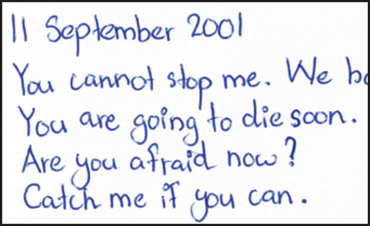
Figure 1
Sample (191-2) showing the use of circles for both i-dots and punctuation.
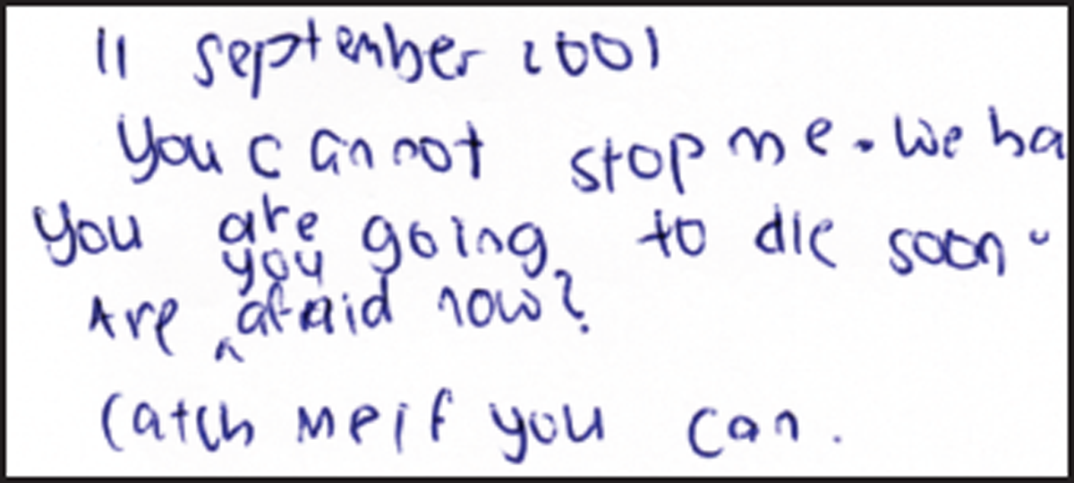
Figure 2
Sample (24-3) showing the use of circles for punctuation.
3. The letters “n” or “m” displaying an introductory stroke, 0.3%
This feature appeared to be related to characteristics 6 and 7. The very small percentage of samples containing the formation of the letters “n” or “m” with an introductory stroke could be attributed to the lack of familiarity with cursive writing. (See Figures 3 and 4 for examples considered “positive” and “not positive” respectively.)
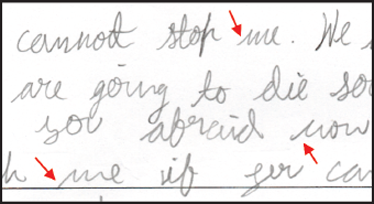
Figure 3
Sample (51-2) showing the introductory stroke for the letters “n” or “m” (indicated by arrows)
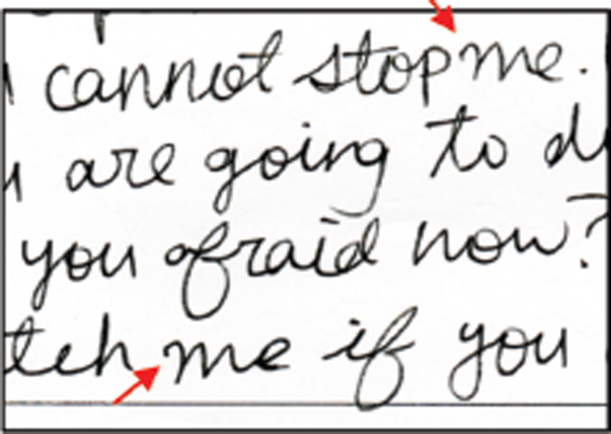
Figure 4
Sample (362-3) not considered as a “positive” in this study.
4. A short staff to the letter “d”, 68.1%
5. Lowercase letters being almost similar in height as uppercase letters, 64.1%
Characteristics 4 and 5 occurred in more than 60% of the handwriting samples surveyed. There appeared to be some correlation between these two characteristics. Out of the 260 samples with <a short staff to the letter “d”>, 77.0% of these writers also recorded “positives” for <lowercase letters being almost similar in height as uppercase letters>. Further, out of the 245 samples with <lowercase letters being almost similar in height as uppercase letters>, 81.6% also recorded “positives” for <a short staff to the letter “d”>. (See Figures 5, 6, 7 for examples.)
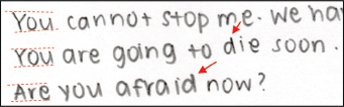
Figure 5
Sample (5-3) showing an example of a writer exhibiting both a short staff to the letter “d” (indicated by arrows) and lowercase letters being almost similar in height as uppercase letters (indicated by dotted lines).
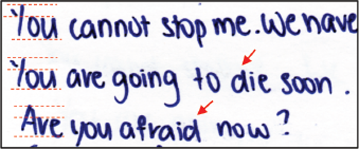
Figure 6
Sample (230-1) showing an example of a writer exhibiting a short staff to the letter “d” (arrows) but not lowercase letters being almost similar in height as uppercase letters (dotted lines).
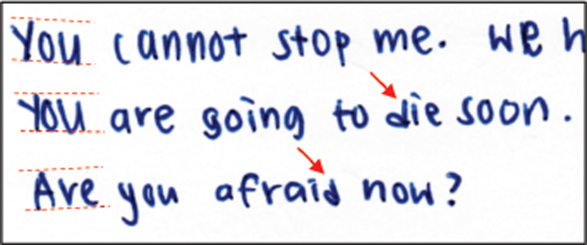
Figure 7
Sample (360-3) showing an example of a writer exhibiting lowercase letters being almost similar in height as uppercase letters (dotted lines) but not a short staff to the letter “d” (arrows).
Based on the percentages reported in the previous studies, there appeared not to be any correlation between these two characteristics: Masson (30%; 6%) and Cusack & Hargett, Town A (21%; 5%). Although the figures were comparable for Cusack & Hargett, Town B (16%; 16%) and such a correlation could be possible, it was not known how many of the samples that were positive for <a short staff to the letter “d”> were also positive for <lowercase letters being almost similar in height as uppercase letters>, and vice versa.
Correlation between <a short staff to the letter “d”> and <lowercase letters being almost similar in height as uppercase letters>
A Chi-square test was used to determine if the two characteristics <A short staff to the letter “d”> and <Lowercase letters being almost similar in height as uppercase letters< were indeed correlated. The null hypothesis, H0, held that these two characteristics were independent. The overall Chi-square (χ2) value was 57.88 and the p-value for the calculated χ2 value was less than 0.05. The null hypothesis was thus rejected and it was concluded that the two characteristics were dependent. (See Tables 3, 4, 5.)
Table 3
Observed values.
| Lowercase letters not similar in height as uppercase letters | Lowercase letters almost similar in of height as uppercase letters | Total no. samples | |
|---|---|---|---|
| No short staff to the letter “d” | 77 | 45 | 122 |
| Short staff to the letter “d” | 60 | 200 | 260 |
| Total no. of samples | 137 | 245 | 382 |
6. Mixture of handprinting and cursive writing, 43.2%
7. Use of all handprinting rather than cursive writing, 49.5%
The majority of the students surveyed used either all handprinting (49.5%) or a mixture of handprinting and cursive (43.2%), leaving less than 10% who wrote in only cursive forms. This could be due to their lack of familiarity with cursive writing. (See Figures 8, 9, 10 for samples from three writers of “all handprinting”, “mixture of handprinting and cursive”, and “cursive only” respectively.)
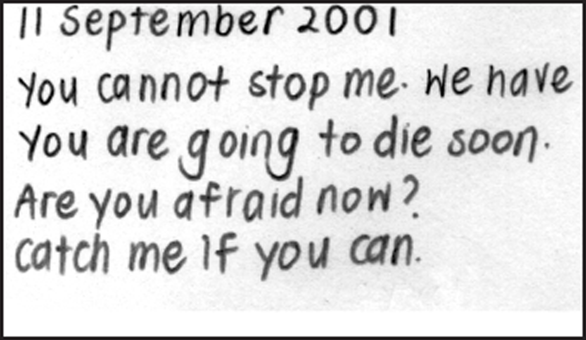
Figure 8
Sample (31-1) showing an example of “all handprinting”.
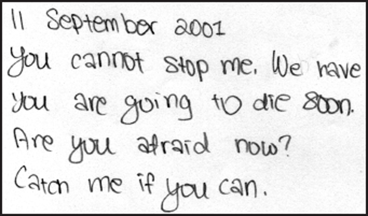
Figure 9
Sample (49-2) showing an example of “mixture of handprinting and cursive”.
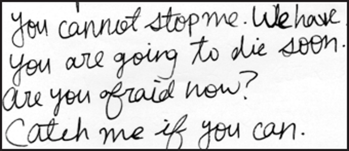
Figure 10
Sample (362-2) showing an example of “cursive only”.
8. Great amount of variation in the writing, 5.0%
Most of the writers exhibited consistency in their handwriting, with only 5% showing a great amount of variation in their writing. Variations in style, size and slant were observed. It was possible that some of the variations could be due to deliberate modifications despite instructions to the students to write in their normal handwriting. (See Figures 11, 12, 13 for examples showing variation in style from one writer, and Figures 14 and 15 for examples showing variation in slant from another writer.)
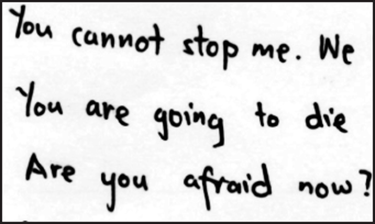
Figure 11
Sample (344-1).
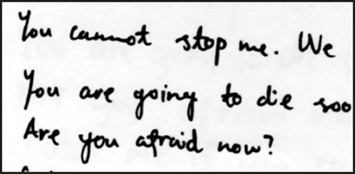
Figure 12
Sample (344-2).
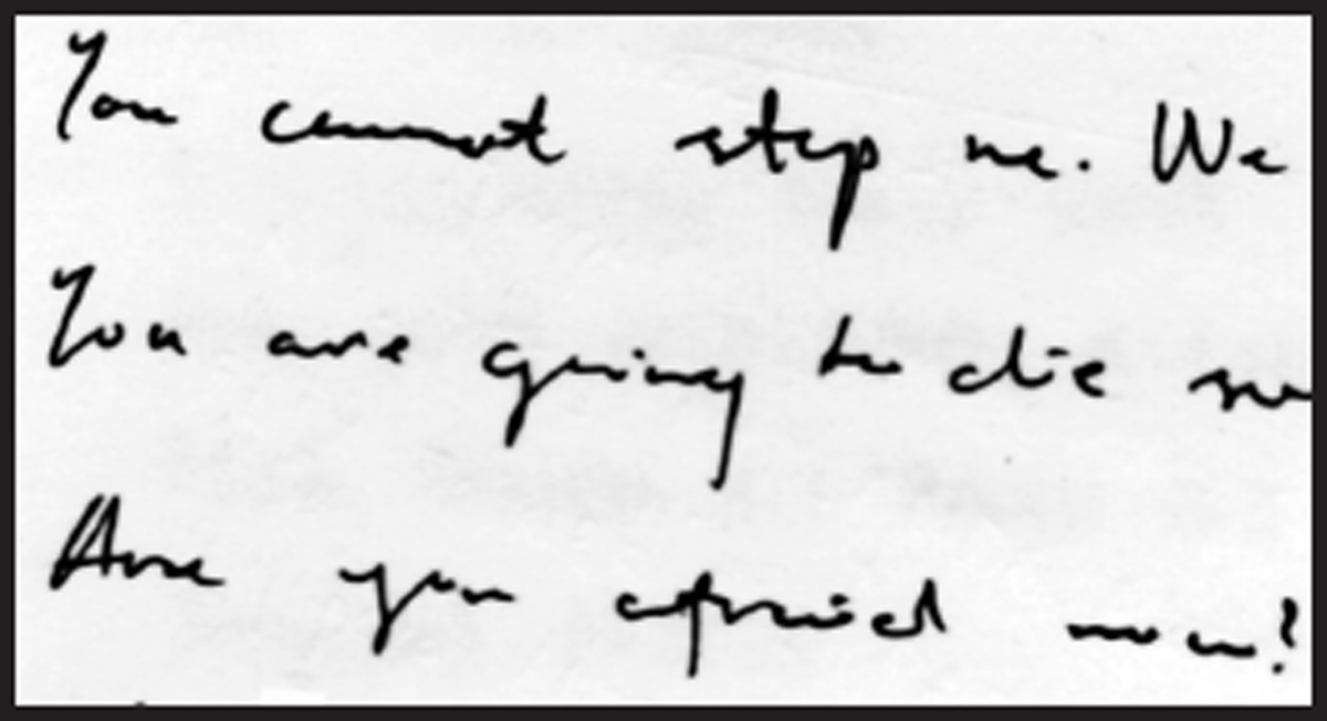
Figure 13
Sample (344-3).
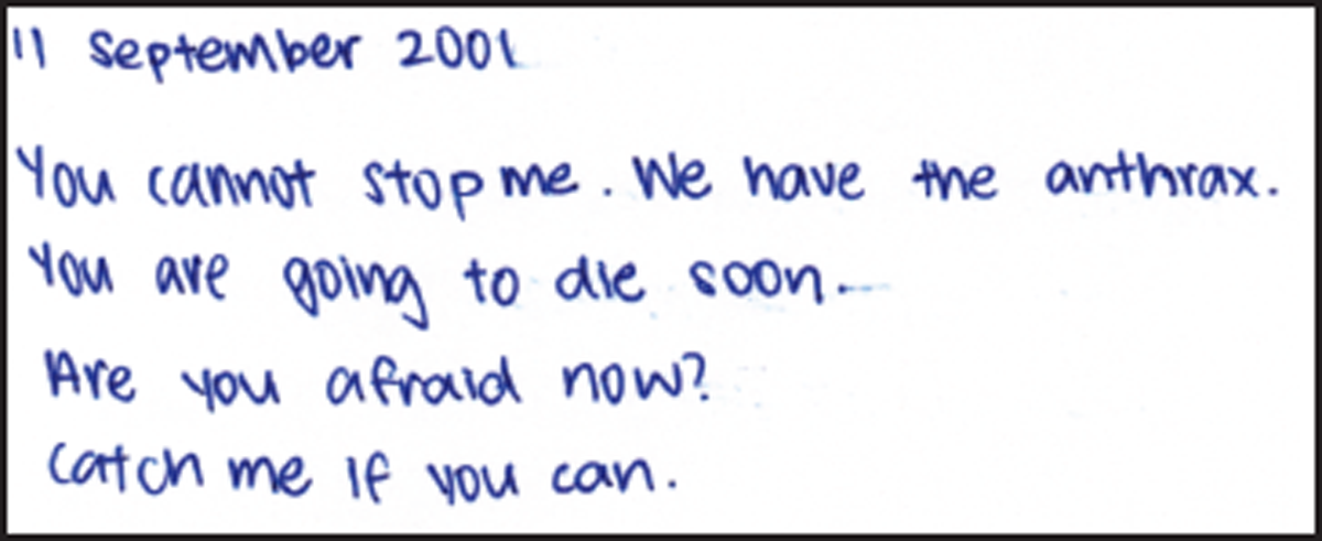
Figure 14
Sample (139-1).
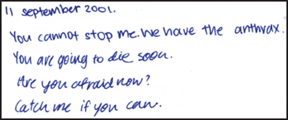
Figure 15
Sample (139-2).
9. Round-hand (bubble) writing, 0%
“Rounded writing” was described by Masson1 as follows:
“Writing in this style is large, upright (perpendicular to the baseline) and very rounded. The words are written compactly, with letters often touching or overlapping…”
None of the 382 writers exhibited round-hand (“bubble” or rounded) writing. Although some of the samples comprised roundish-letters, they were not considered to be round-hand writing as they were not written in cursive and had a markedly different appearance when compared to the examples cited by Masson and Cusack & Hargett. (See Figure 16 for examples of “modified rounded writing”, and Figure 17 for an example of writing comprising roundish-letters that was not considered round-hand writing in this study.)
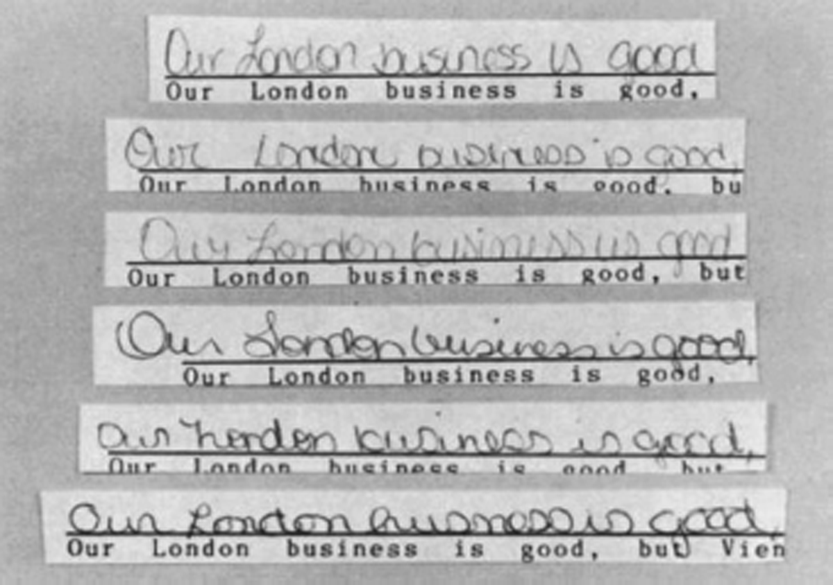
Figure 16
Examples of handwriting from six modified rounded style writers.
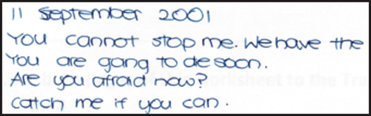
Figure 17
Sample (77-2) showing an example of roundish letters but not round-hand writing.
Reproduced with permission from J. F. Masson, “A Study of the Handwriting of Adolescents”, Journal of Forensic Sciences, Vol. 33, No. 1, Jan. 1988, pp. 167-175, copyright ASTM International, 100 Barr Harbor Drive, West Conshohocken, PA 19428.
10. Use of decorative numeral “1”, 14.9%
Most of the writers wrote the numeral “1” as a vertical stroke. Approximately 15% of the students surveyed wrote it in a more decorative manner with serifs. (See Figures 18 and 19 for examples of a decorative “1” from two writers.)

Figure 18
Sample (32-1) showing the numeral “1” with a commencing stroke.

Figure 19
Sample (28-2) showing the numeral “1” with a commencing stroke and lower serif.
11. Use of the copybook form of the uppercase “Y”, 40.6%
Approximately 40% of the writers used the copybook form of the uppercase “Y” in their handwriting. (See Figure 20 for an example.)

Figure 20
Sample (28-2) showing the use of the copybook form of the uppercase “Y”.
12. Use of the printed form of the letter “a”, 8.9%
Close to 9% of the students surveyed demonstrated the use of the printed form of the letter “a”. Some of these, especially those with mixtures, could be due to deliberate modification. (See Figures 21 and 22 for examples.)
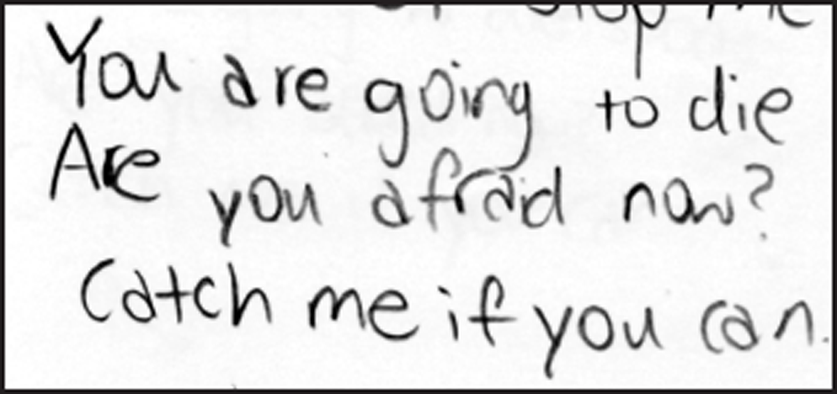
Figure 21
Sample (294-3) showing the consistent use of the printed form of the letter “a”.
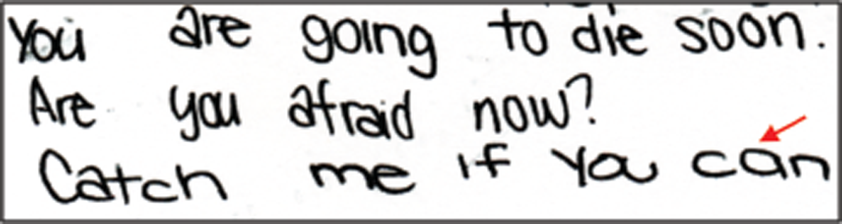
Figure 22
Sample (147-1) showing the use of the “normal” form of the letter “a” as indicated with an arrow, amidst the mostly printed form of the letter “a”.
Comparing the findings from this study against those from previous studies in the 1980s and 1990s, the only similarity observed was that a small percentage of adolescents exhibited an unusually great amount of variation in their writing (Masson 4%; Yang et al. 5%). For the other handwriting characteristics compared, there appeared to be vast differences in writing styles and characteristics. These differences could be attributed to the different geographical locations and/or different time periods during which the surveys were conducted.
In recent years, with the advent of the digital age, people are generally writing less and typing or texting more on their computers and mobile devices. With increasing reliance on technology, the teaching of handwriting has evolved greatly over the past few decades, with less emphasis being placed on good penmanship and the teaching of cursive writing. Hence it was not surprising to find that there were few writers comfortable with writing in cursive, with most choosing instead to handprint or use a mixture of handprinting and cursive.
Conclusions
The study conducted on the handwriting of 382 secondary school students in Singapore indicated that adolescents in Singapore prefer handprinting, or a mixture of handprinting and cursive. About two-thirds of those surveyed write their lowercase letters at a similar height as their uppercase letters, and the letter “d” with a short staff.
Many differences in the writing styles and characteristics were observed between this study and previous studies reported in the United States in the 1980s and 1990s. These differences may have resulted from one or more of the following factors:
Difference in time period of nearly 30 years;
Differences in geographical locations;
Differences in culture; and/or
Use of technology with less emphasis on penmanship.
A more effective study could be achieved by comparing adolescent handwriting between countries within the same time period, or adolescent handwriting in the same country over time.
Despite the limitations, the data on handwriting characteristics of adolescents in Singapore should provide a useful resource to the forensic document examiner, and be a starting point for data collection on handwriting in Asia.
Acknowledgement
The authors would like to thank all participants for contributing their handwriting samples.