
Table 1
Effective Aid Targeting as a Function of Clustering and Poverty.
| Concentrated Poverty | Diffuse Poverty | |
|---|---|---|
| Low Donor Clustering in Areas of: | Ineffective | Effective |
| High Donor Clustering in Areas of: | Effective | Ineffective |
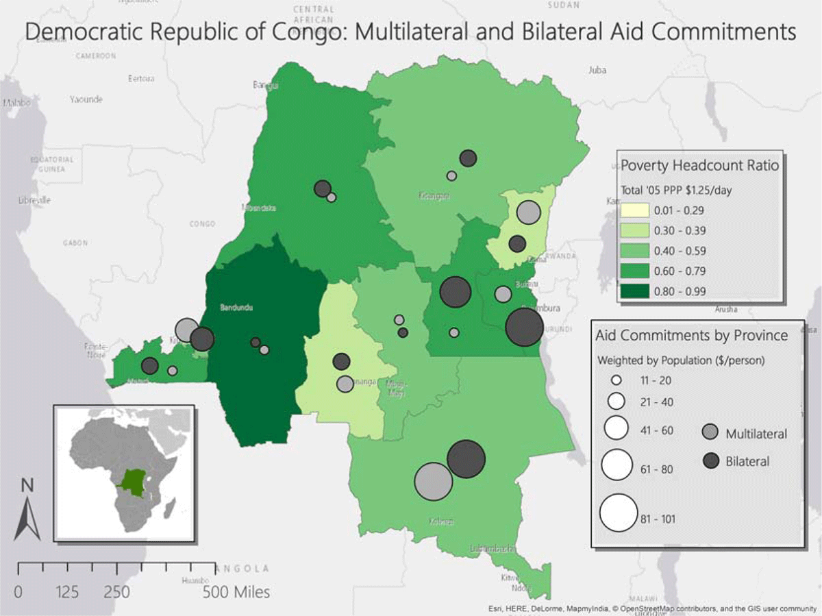
Figure 1
Map of Aid Activity in DRC.
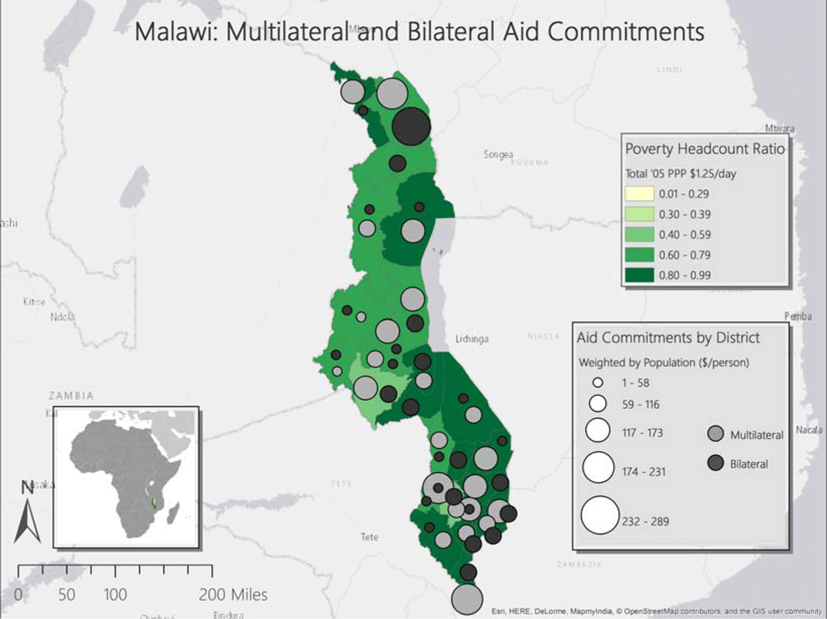
Figure 2
Map of Aid Activities in Malawi.
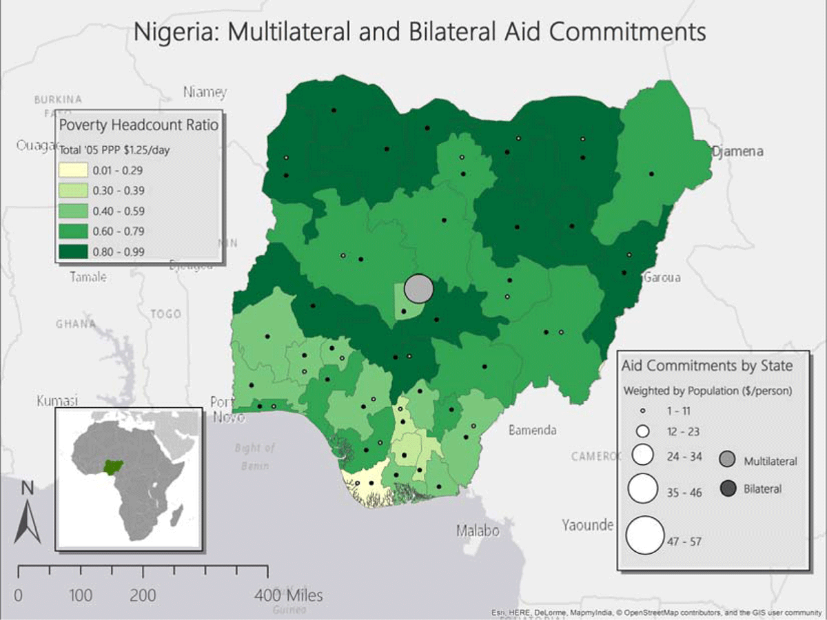
Figure 3
Map of Aid Activities in Nigeria.
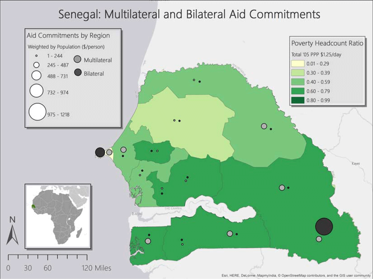
Figure 4
Map of Aid Activities in Senegal.
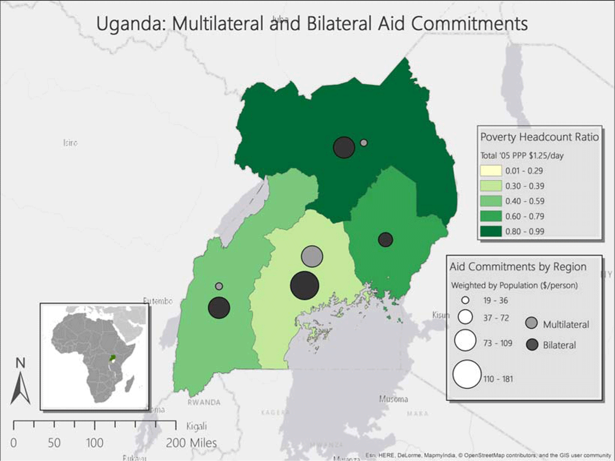
Figure 5
Map of Aid Activities in Uganda.
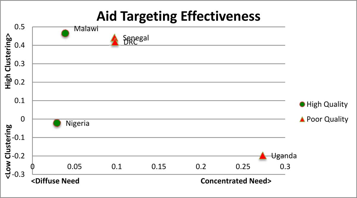
Figure 6
Quality of Aid Targeting by Clustering of Activities and Concentration of Need.
Note: This figure shows the overall effectiveness of donor coordination within the country. As need becomes more concentrated (graph moves farther right), donors should cluster together more (graph moves farther up), provided that they are clustering in the right parts of the country. The icons indicate a rough classification of how well the donors are targeting the need within the country (as measured by aid-poverty correlation and concentration ratios) with a green circle indicating effective targeting by both measures, while red triangles indicate good targeting by one measure.
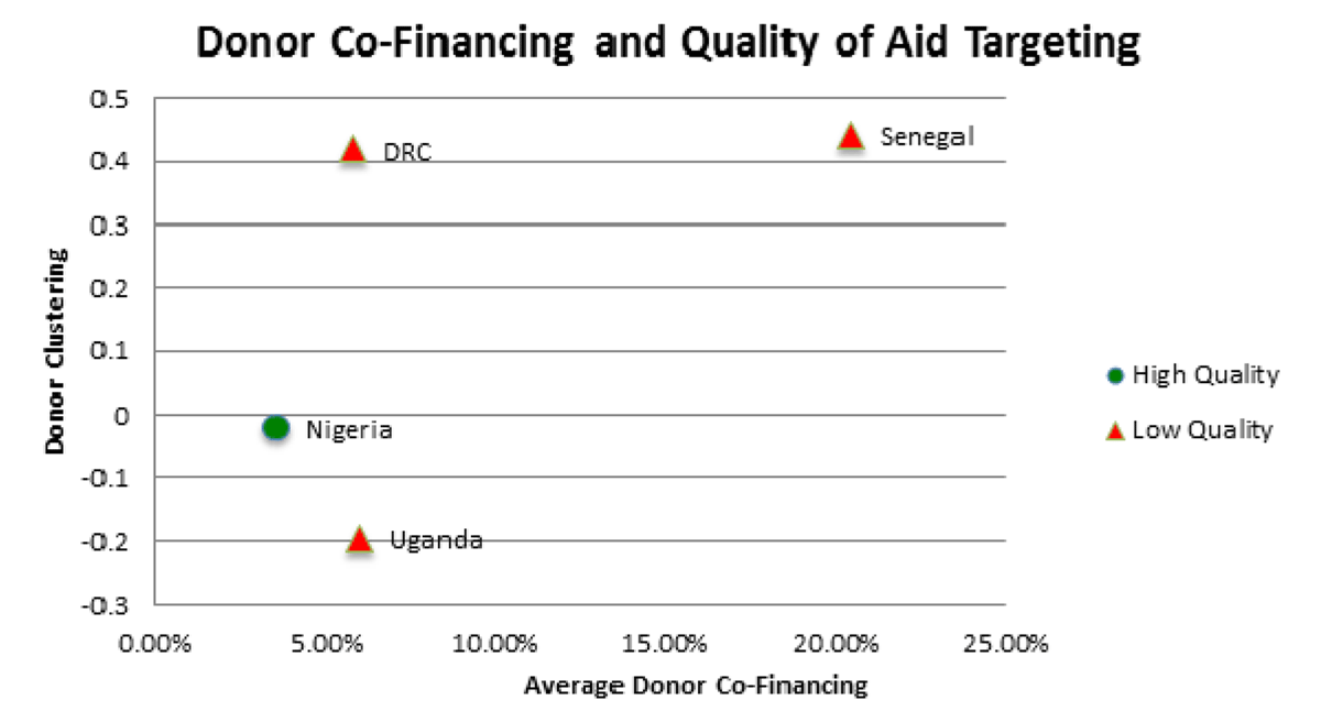
Figure 7
Donor Co-Financing Frequency and Correlation of Donor Activities.
Note: This figure shows the relationship between the incidence of co-financing and the quality of coordination between the two donors. The icons indicate a rough classification of how well the donors are targeting the need within the country (as measured by aid-poverty correlation and concentration ratios), with a green circle indicating effective targeting by both measures, and red triangles indicating good targeting by only one measure. Malawi is not included due to a lack of information on co-financing of aid projects.