
Table 1
OECD Fragile States List, 2015.
| East Asia & Pacific | Europe & Central Asia | Latin America & Caribbean | Middle East & North Africa | South Asia | Sub-Saharan Africa | ||
|---|---|---|---|---|---|---|---|
| Kiribati* | Bosnia and Herzegovina | Haiti | Egypt, Arab Rep. | Afghanistan | Burundi | Guinea | Nigeria |
| Korea, Dem. Rep. | Kosovo | Iraq | Bangladesh | Cameroon | Guinea-Bissau | Rwanda | |
| Marshall Islands* | Libya | Nepal | Central African Rep. | Kenya | Sierra Leone | ||
| Micronesia, Fed. Sts. | Syrian Arab Republic | Pakistan | Chad | Liberia | Somalia | ||
| Myanmar | West Bank and Gaza | Sri Lanka | Comoros | Madagascar | South Sudan | ||
| Solomon Islands | Yemen, Rep. | Congo, Dem. Rep. | Malawi | Sudan | |||
| Timor-Leste | Congo, Rep. | Mali | Togo | ||||
| Tuvalu* | Cote d’Ivoire | Mauritania | Uganda | ||||
| Eritrea | Niger | Zimbabwe | |||||
[i] *These countries are not included in the International Futures model and have, therefore, been excluded from this analysis.
Source: OECD (2015).
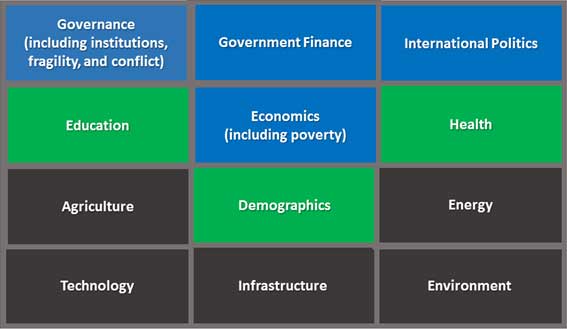
Figure 1
Models Within the IFs Forecasting System.
Source: (Hughes and Hillebrand 2008).
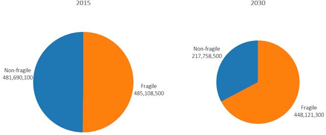
Figure 2
Developing World Poverty in 2015 and 2030.
A comparison of extreme poverty in fragile states versus non-fragile states in 2015 and 2030.
Source: Authors’ own calculations; IFs v7.21 Beta.
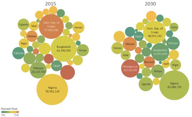
Figure 3
Fragile States Poverty and Distribution, 2010 and 2030.
A comparison of the number and percent of poor in fragile countries in 2015 and 2030. Color of the bubble shows percent poor at $1.90/day. Size of the bubble is proportional to the number of poor at $1.90/day.
Source: IFs v7.21 Beta.
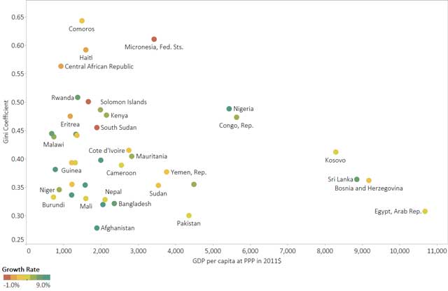
Figure 4
Diversity of Situations in Fragile States.
This graphic shows GDP per capita data at purchasing power parity in 2011 constant USD. Gini coefficients are 2010 estimates from the International Futures model (based on World Bank data). Libya and Iraq are excluded from this graphic because of high year-on-year fluctuations in their GDP. The latest World Bank data shows Libya’s GDP per capita at PPP as $23,000 and Iraq’s as $14,500.
Source: IFs v7.21 Beta, World Bank.
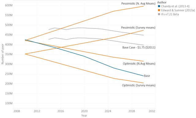
Figure 5
Fragile State Poverty Forecasts.
Poverty forecasts for fragile states from different authors in terms of number of people living in poverty (by author – results by earlier authors have not been adjusted for the new poverty line).
Source: Chandy et al. (2013 – 4), Edward & Sumner (2013a), and IFs v7.21 Beta.
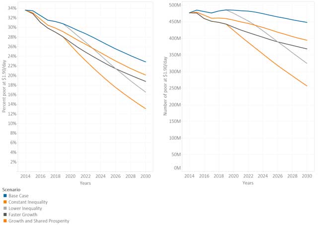
Figure 6
Poverty Rate and Headcount, Growth and inequality Scenarios.
Figure 6 shows five forecasts under different economic growth and inequality assumptions in terms of percent poor (left) and number of poor (right).
Source: IFs v7.21 Beta.
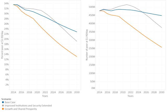
Figure 7
Poverty Rate and Headcount, Alternative Scenarios.
Figure 7 shows three optimistic forecasts in terms of percent poor (left) and number of poor (right).
Source: IFs v7.21 Beta.
Table 2
Countries with the Largest Reductions in Poverty in 2030 as a Result of the IISE Interventions.
| Highest poverty headcount reductions, IISE vs. Base Case, 2030 | ||||
| Nigeria | Bangladesh | Dem. Rep. of Congo | Niger | Pakistan |
| –16,610,430 | – 7,320,340 | – 5,088,860 | – 4,975,260 | – 4,698,328 |
| Greatest change in poverty rates, IISE vs. Base Case, 2030 | ||||
| Guinea | Niger | Liberia | Madagascar | Somalia |
| – 23.2 % points | – 14.5 % points | – 13.9 % points | – 12.9 % points | – 10.0 % points |
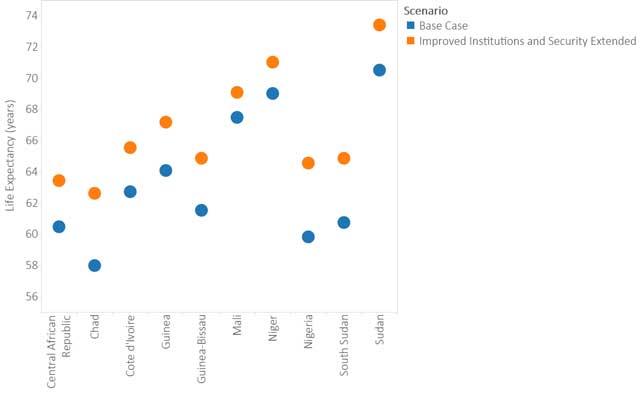
Figure 8
Changes in Life Expectancy as a Result of IISE Scenario, 2030.
Figure 8 shows the average forecasted lifespan by country in select fragile countries.
Source: IFs v7.21 Beta.
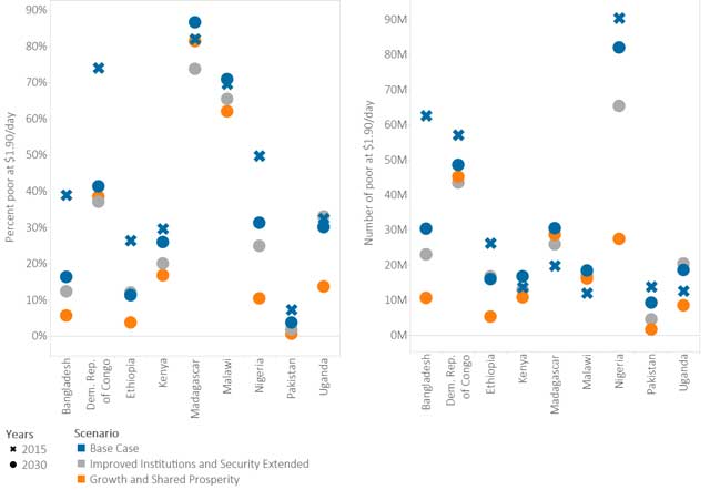
Figure 9
Poverty Rate and Headcount, Alternative Scenarios in 2030.
Figure 9 shows the change in percent and number of poor between 2010 and 2030. The ‘X’ marks the Base Case poverty value in 2010. Blue marks represent the Base Case, orange marks show the Growth and Shared Prosperity scenario, and gray marks show the Improved Institutions and Security scenario.
Source: IFs v7.21 Beta.