
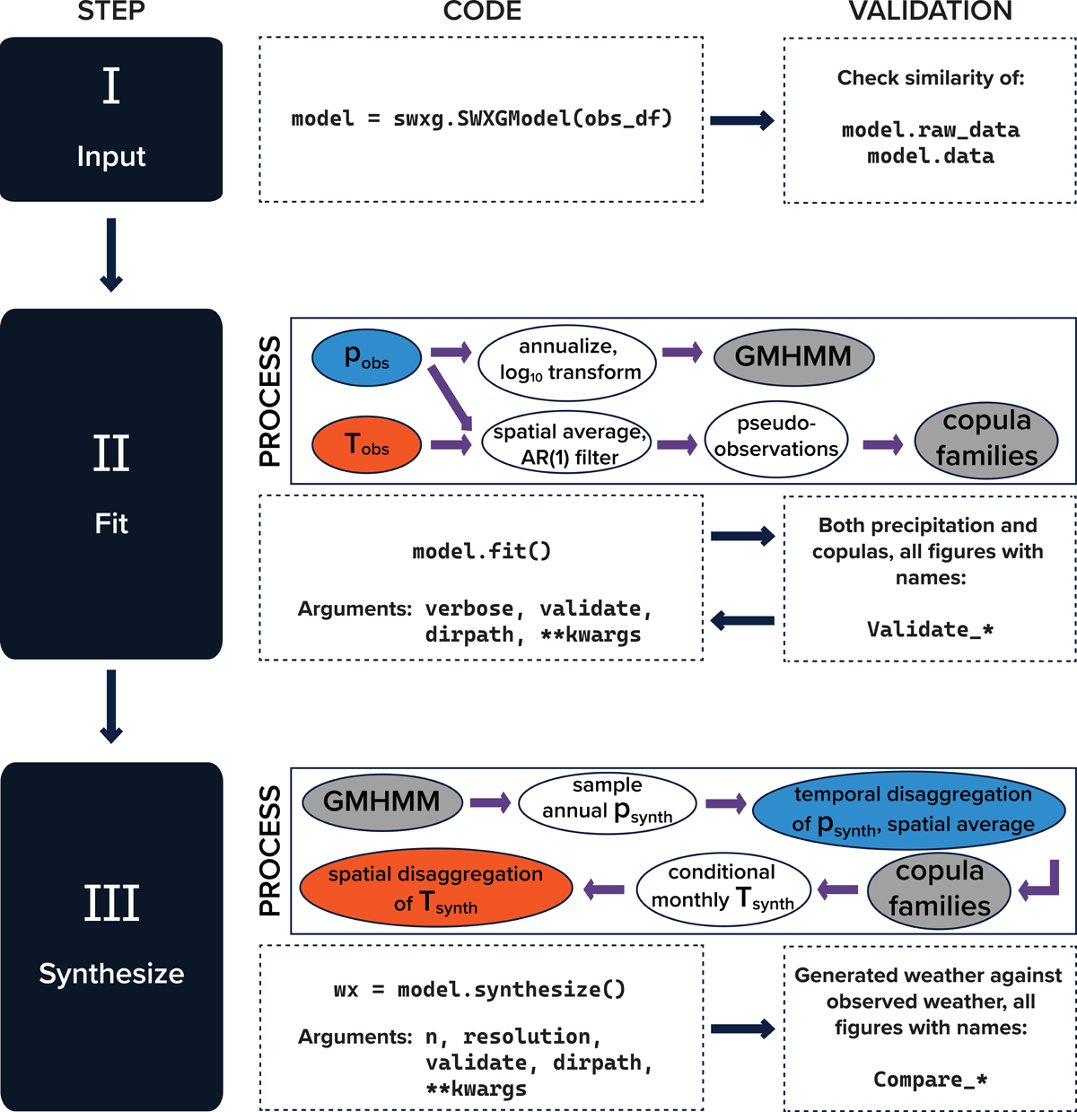
Figure 1
Generalized workflow—including the graphical and programmatic representation of critical methods, as well as arguments and validation checks—for the swxg library to move from input observations to generated weather. Workflow moves from left to right, top to bottom.
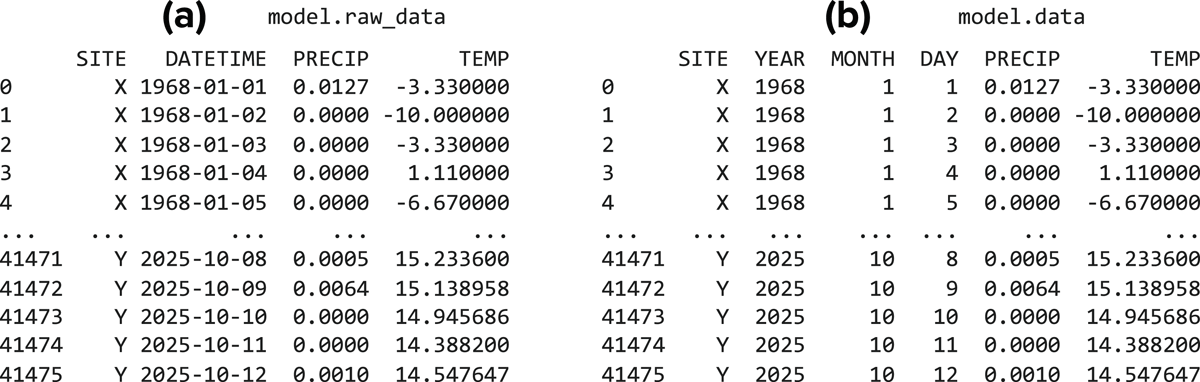
Figure 2
The daily dataset both as (a) raw input and (b) formatted input, where years, months, and days have been separated into their own columns.
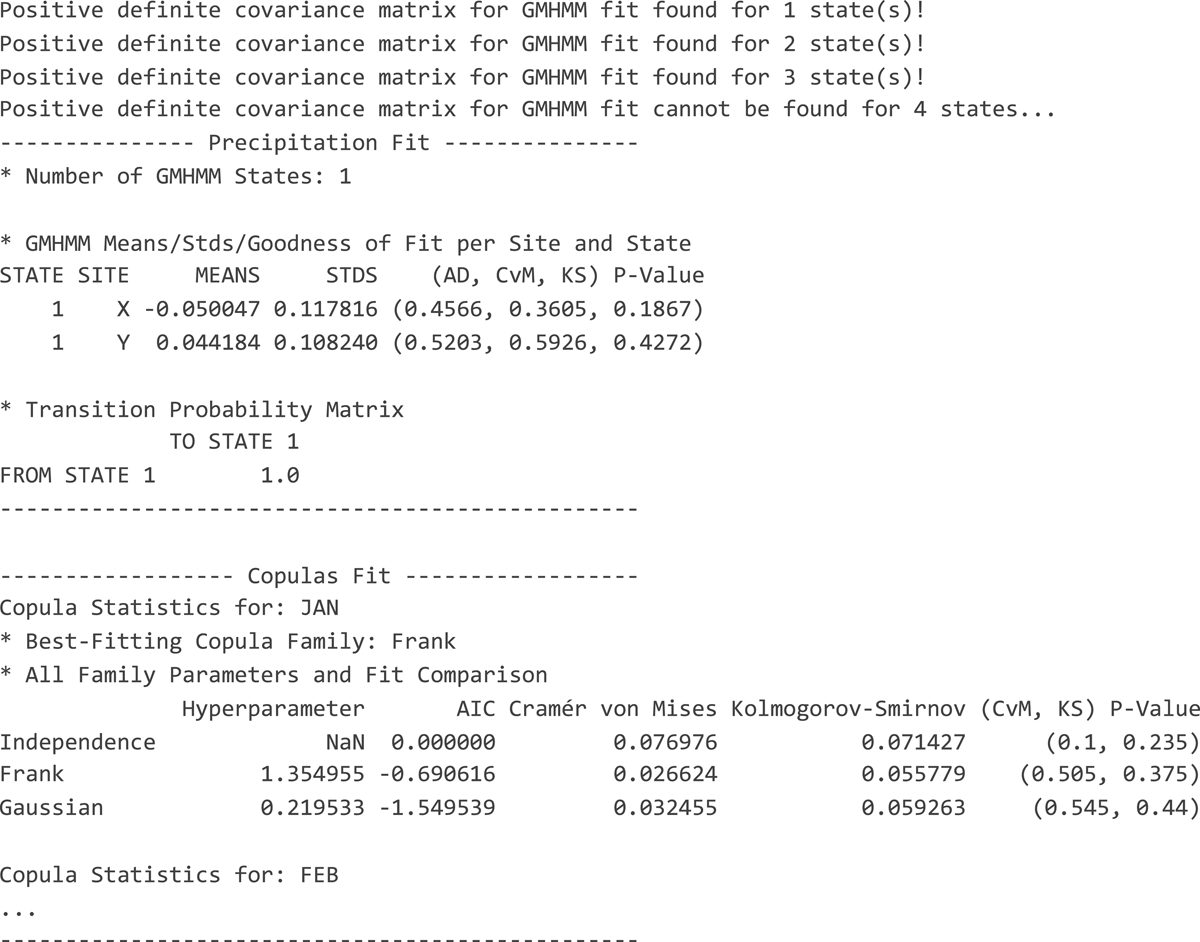
Figure 3
Initial fit statistics of daily data. No keyword arguments refining the fit have been used. Copula statistics for February through December have been truncated for this figure but will appear when run. Note that p-Value columns are bootstrapped and therefore may vary slightly between executions.
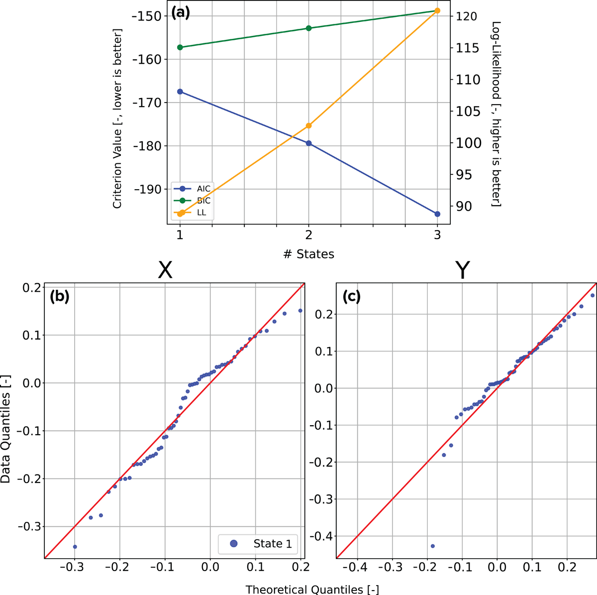
Figure 4
Validation of (a) the number of GMHMM states and (b–c) the normality of the log10-transformed annual precipitation data for both stations via Q-Q plots, using the best-fitting number of states based on BIC.
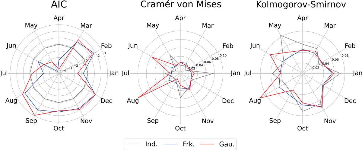
Figure 5
AICs (left), Cramér–von Mises criteria (middle), and Kolmogorov–Smirnov tests (right) for each copula family for each month. Families included are Independence (gray), Frank (blue), and Gaussian (red). Radially outward represents worse fitness.
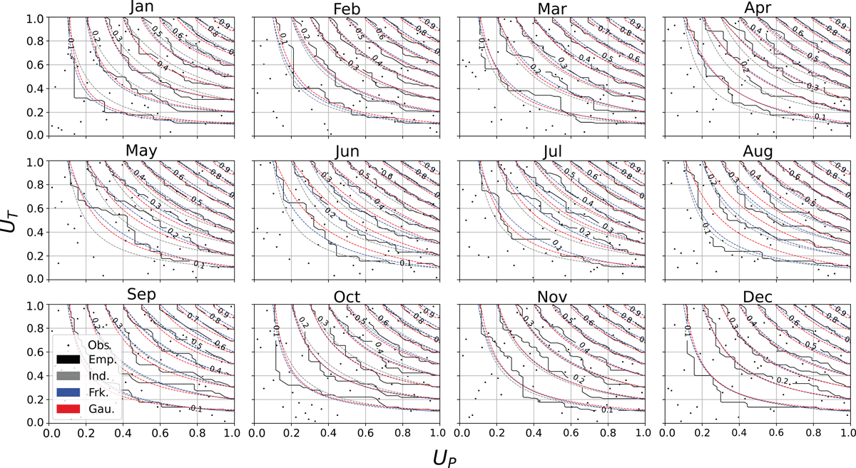
Figure 6
Theoretical copula families compared to the empirical copula (black lines) created from pseudo-observations of spatially averaged precipitation and temperature (black dots) for each month. Families included are Independence (gray), Frank (blue), and Gaussian (red).
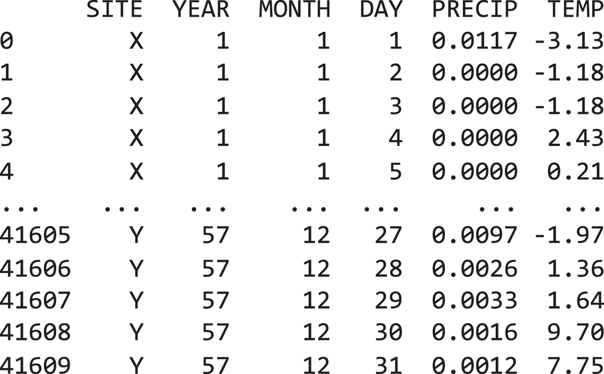
Figure 7
The generated dataset at the daily resolution. Values for precipitation and temperature are unique to this instance, but can be fixed by setting a local random seed.
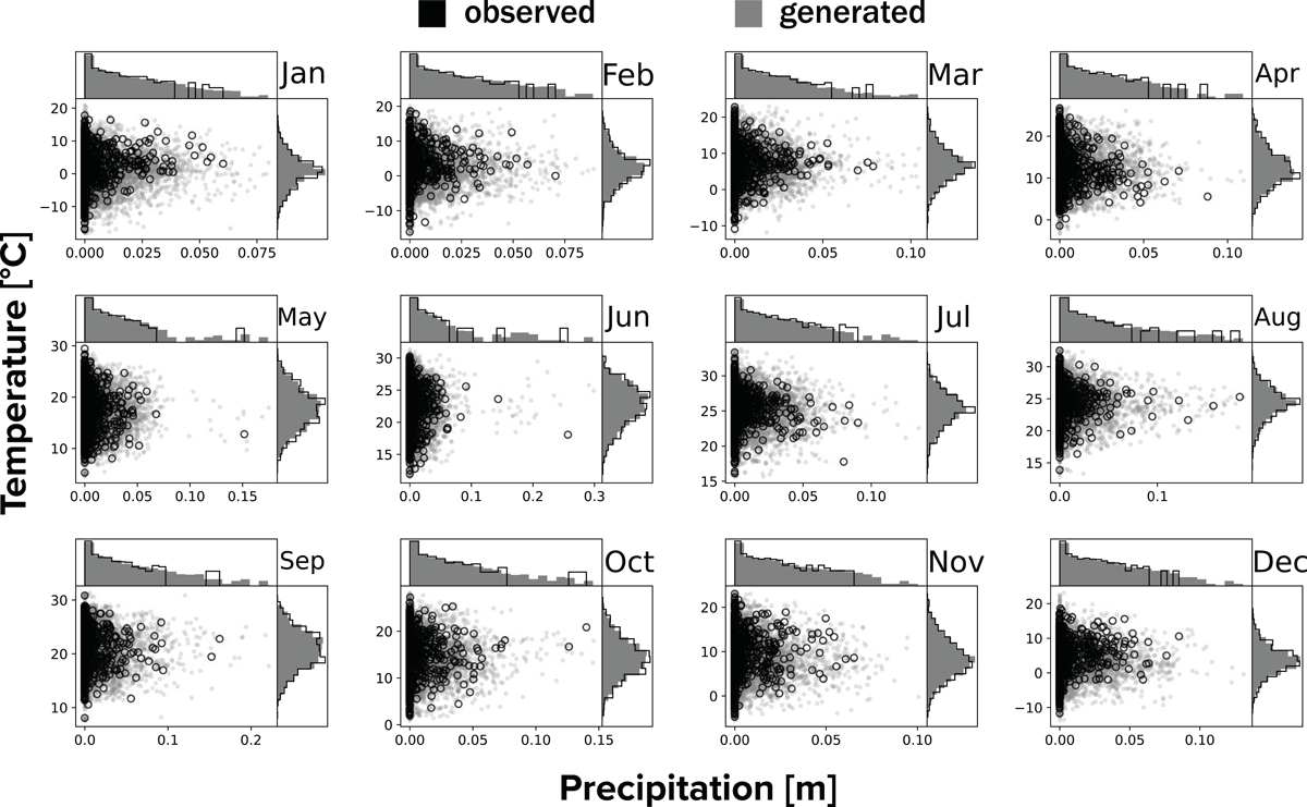
Figure 8
Statistical validation of synthetically generated precipitation and temperature across months for site X. Black symbols—open circles in the scatterplot and lines in the histogram—represent the swxg.test_wx.daily dataset from the years 1968–2025. Gray symbols—points in the scatterplot and bars in the histogram—represent the synthetic values sampled by the SWG.
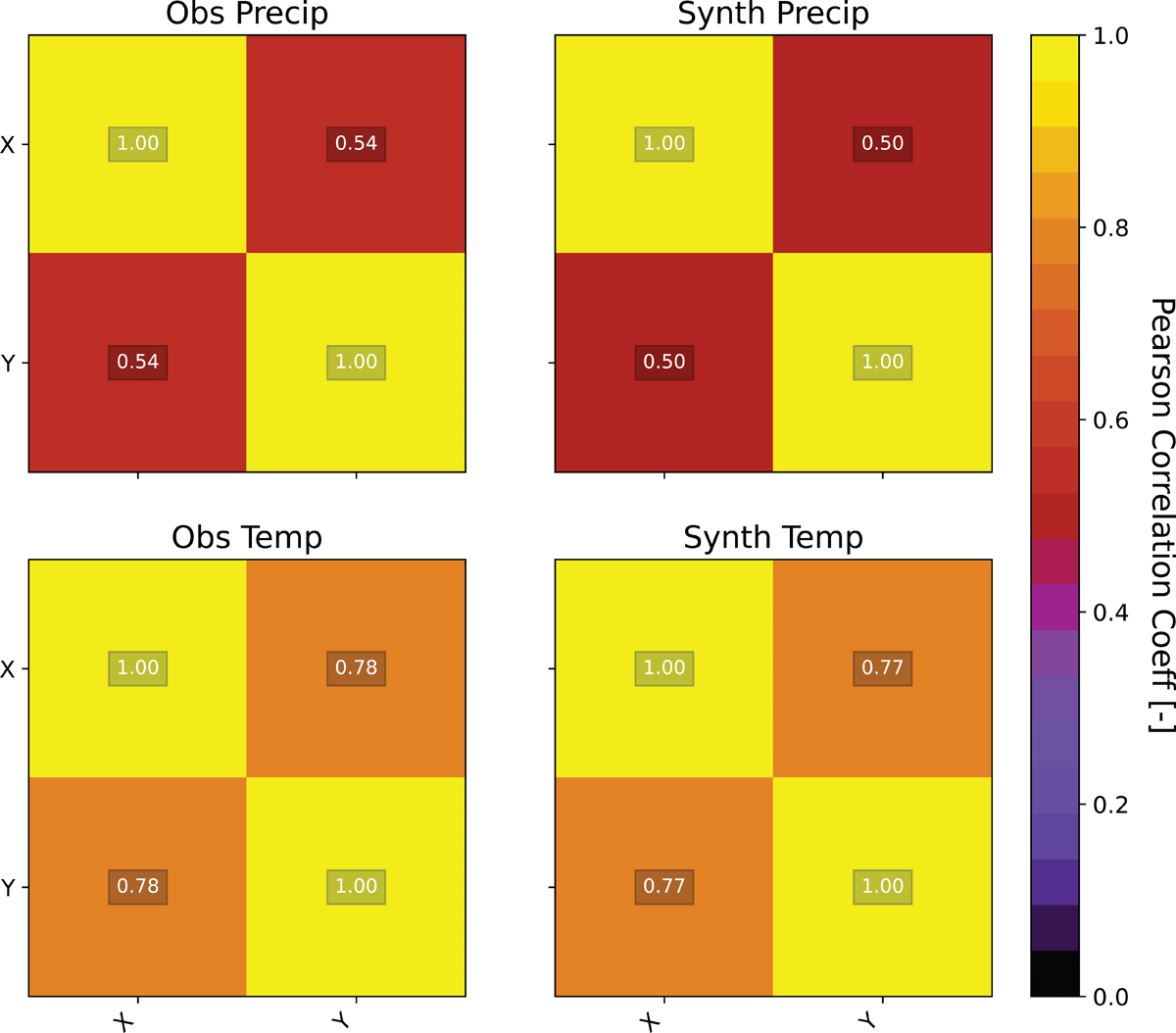
Figure 9
The preserved spatial correlations in the month of January between both observed and generated precipitation and temperature. Values centered in each box correspond to the color and value of the Pearson correlation coefficient. Note that the correlation across all months is symmetric, and the number of cells increases with the number of sites squared.
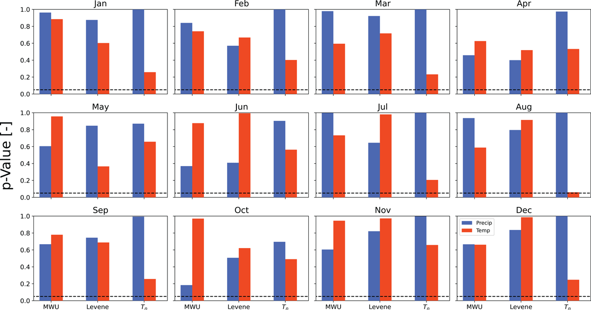
Figure 10
The complementary numerical fitness metrics plot to Figure 8. Each panel corresponds to a month at site X, and each color corresponds to either precipitation (blue) or temperature (red). Each test is listed on the x-axis, which are the Mann–Whitney U test (MWU), Levene’s test (Levene), and Kolmogorov–Smirnov test (Tn), and that test’s corresponding p-value is shown on the y-axis. Bars below the dashed black line represent those distributions for which the null hypothesis can be rejected.