
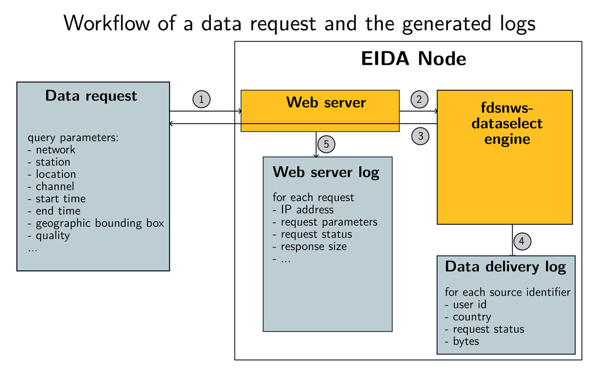
Figure 1
Illustration of how a request is logged in an EIDA node: (1) a request with a set of constraints arrives to the web server; (2) the request is transmitted to the fdsnws-dataselect engine that analyses the constraints, finds the matching data; (3) the data are delivered; (4) the data shipped are analysed in order to write a data shipment report; (5) the web server logs the request. Note that in the webserver log, the response size is a global value that cannot be attributed to source identifiers, while the data delivery log provides the number of bytes delivered for each source identifier.
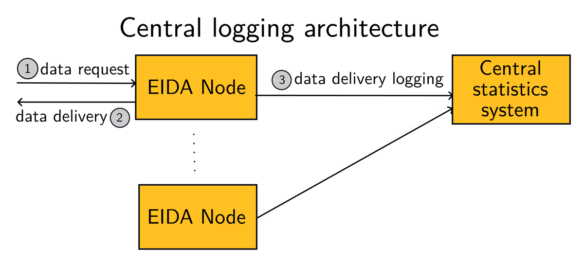
Figure 2
In a central logging architecture, each EIDA node, for each request, sends the information to the central system.
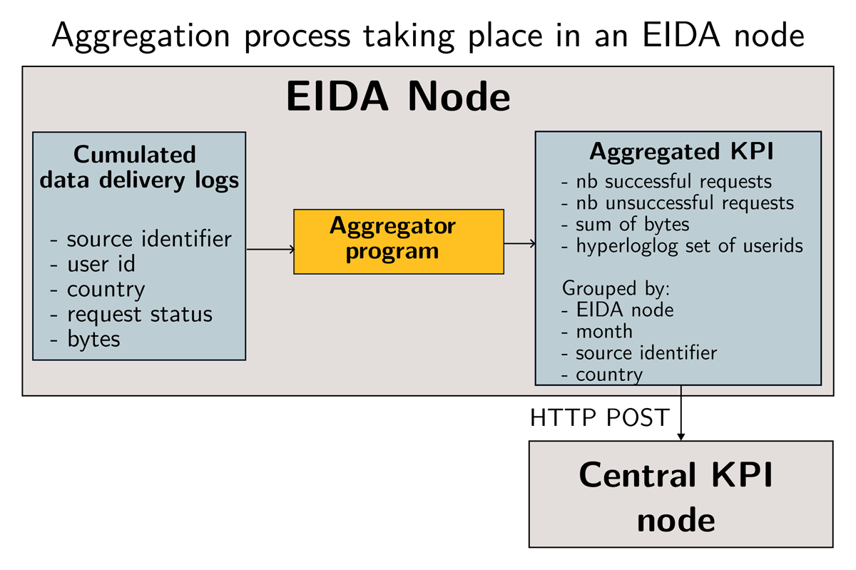
Figure 3
Workflow of building data usage indicators from initial logs. The Aggregator program transforms a set of data delivery events into aggregated values where a subset of individual values is grouped by month, source identifiers and country of origin of the requests. The Aggregator program adds the EIDA node as additional metadata. The aggregated logs are sent to the central service as a payload. The central KPI system ingests the payload by aggregating it to the existing values.
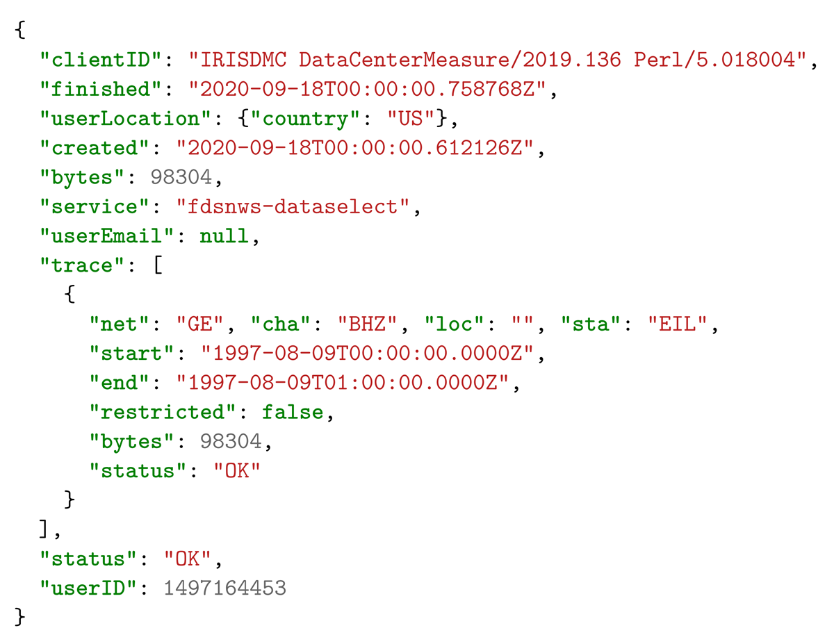
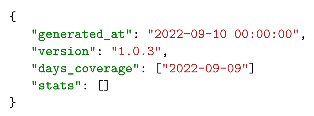
Listing 1
Example of information available at an EIDA node after each data delivery.
Listing 2
Metadata provided by each EIDA node in the JSON format.
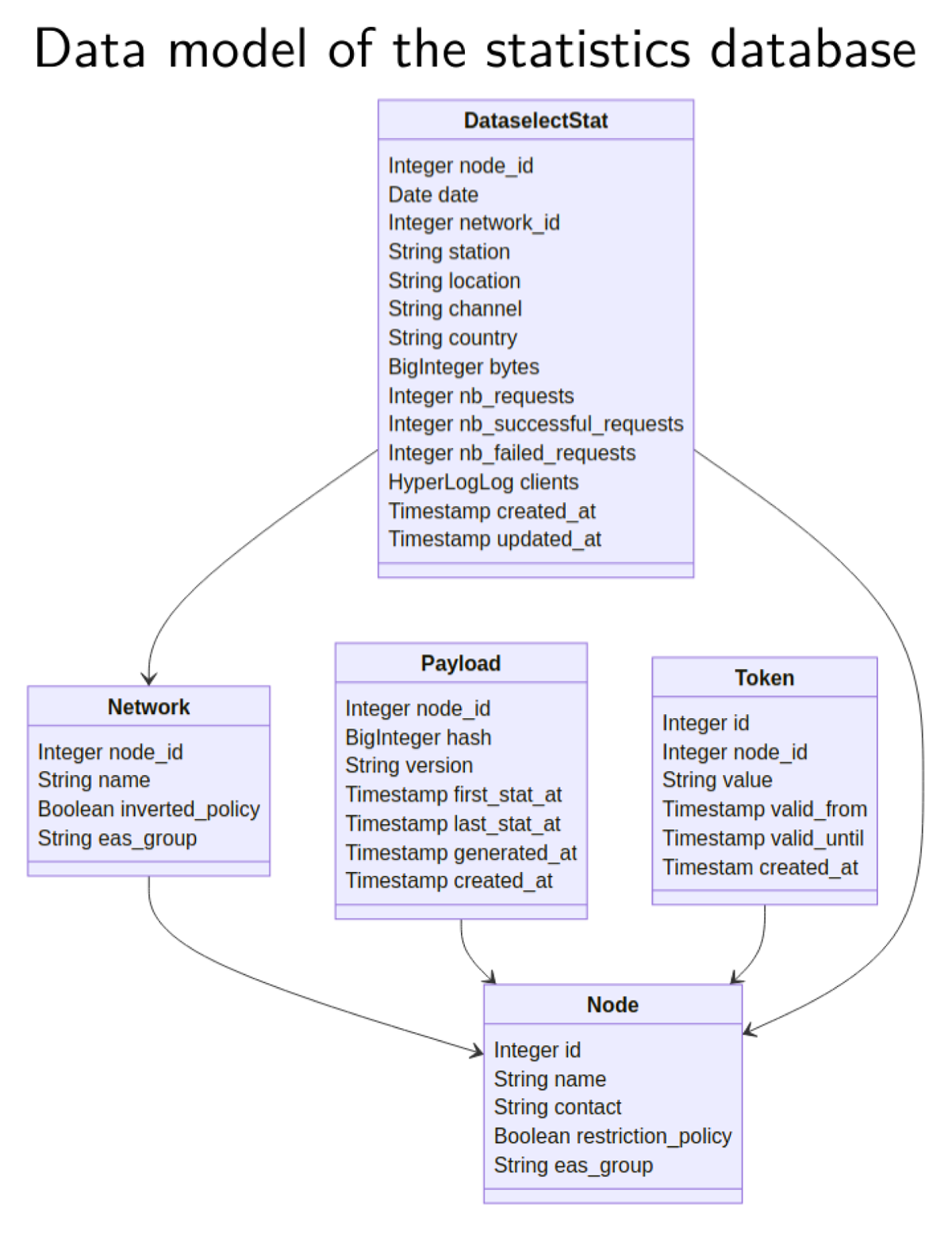
Figure 4
Data model of the KPI database.
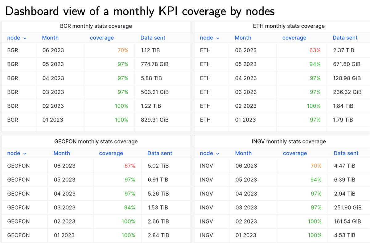
Figure 5
Example of a view for EIDA node operators, presenting monthly KPI coverage for four of the 12 EIDA nodes in June 2023. The coverage for June is not complete because it is the ongoing month.
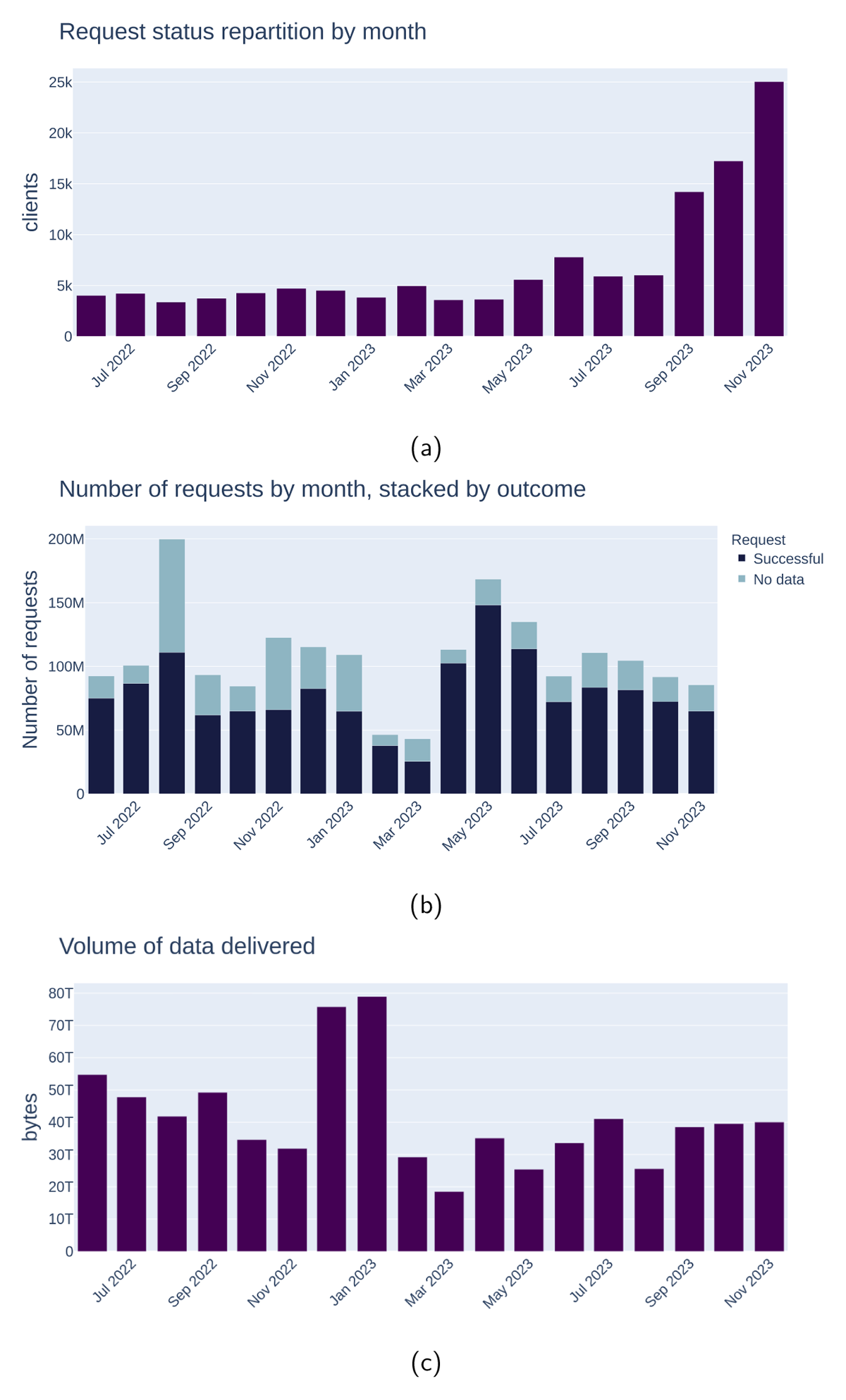
Figure 6
Examples of figures generated programmatically using the web API, illustrating three monthly KPIs across EIDA between June 2022 and November 2023. (a) shows unique users, (b) shows data requests (successful and unsuccessful) and (c) shows the volumes of data delivered.
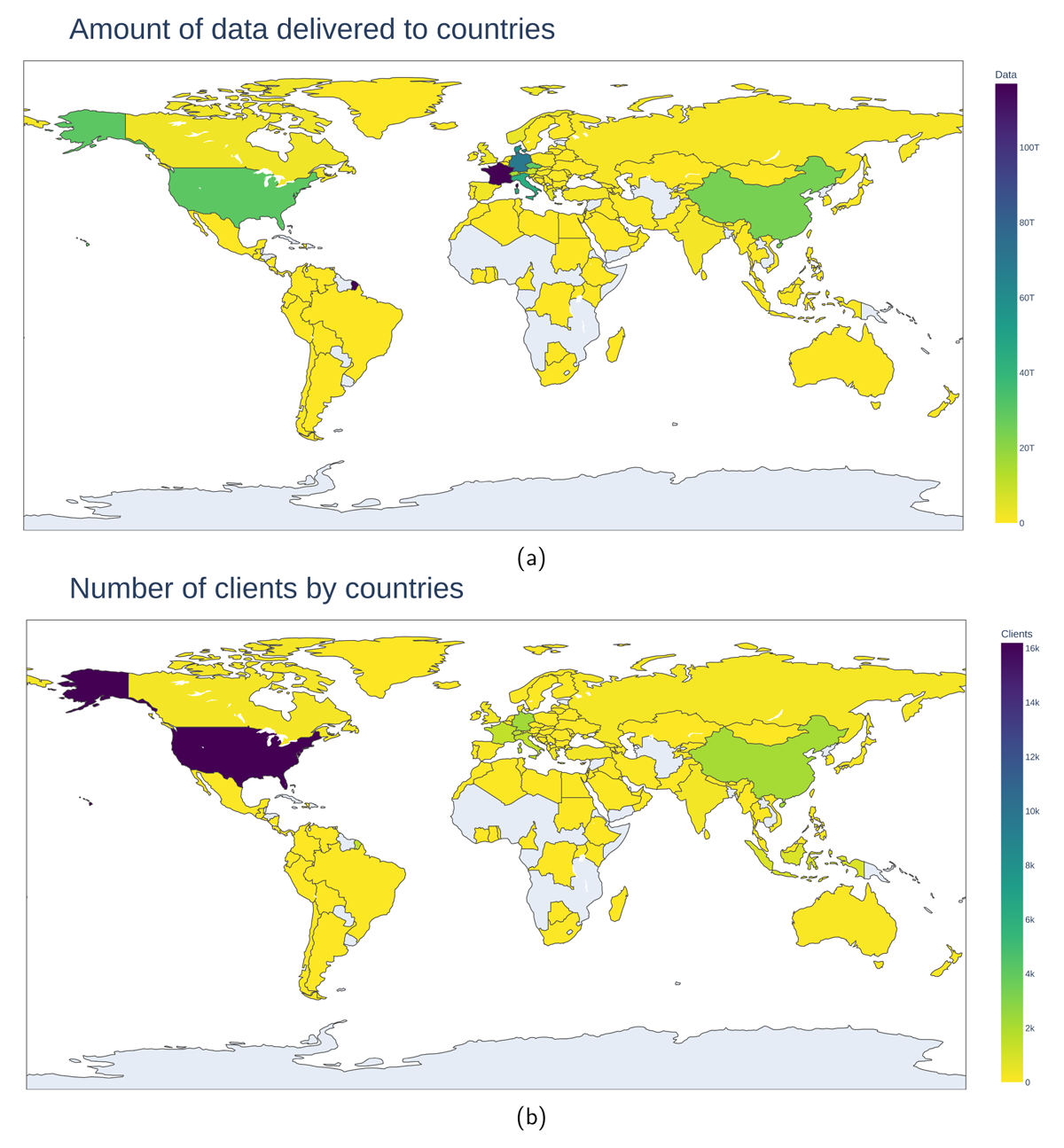
Figure 7
Figures showing worldwide repartition of some KPIs in 2022. (a) is the volume of distributed data and (b) is the number of clients. Similar figures can be produced via the API, for example, using the code snippet at https://gitlab.com/-/snippets/2529969.
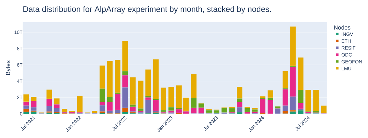
Figure 8
Cumulated data delivery for AlpArray across EIDA nodes using EIDA’s statistics web service. AlpArray data is distributed across 6 EIDA nodes. Figure produced by the code in Listing 3 using the statistics API.
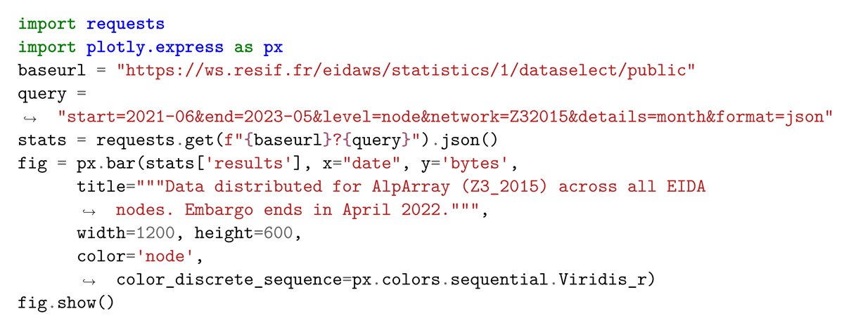
Listing 3
Example program producing Figure 8 using the Plotly library (Plotly, 2023), Code available as a snippet at https://gitlab.com/-/snippets/2530688.
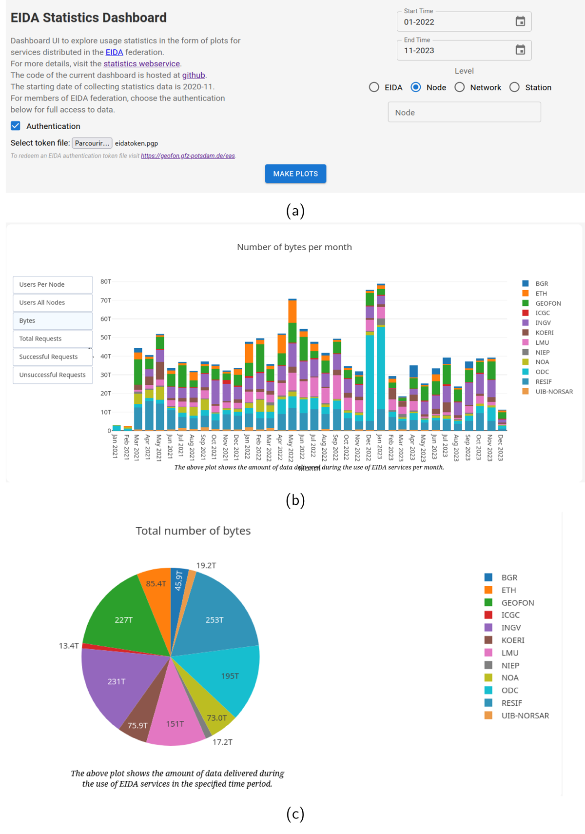
Figure 9
Screenshots of the dashboard. (a) is a view where the user can select time spans, level of visualisation and narrow down to node or networks. It is also possible to provide a token in order to be authenticated and access indicators for networks with restricted KPI access. (b) is a screenshot of one of the possible graphical visualisations provided by the web interface. (c) is a screenshot of another possible visualisation (pie chart).