
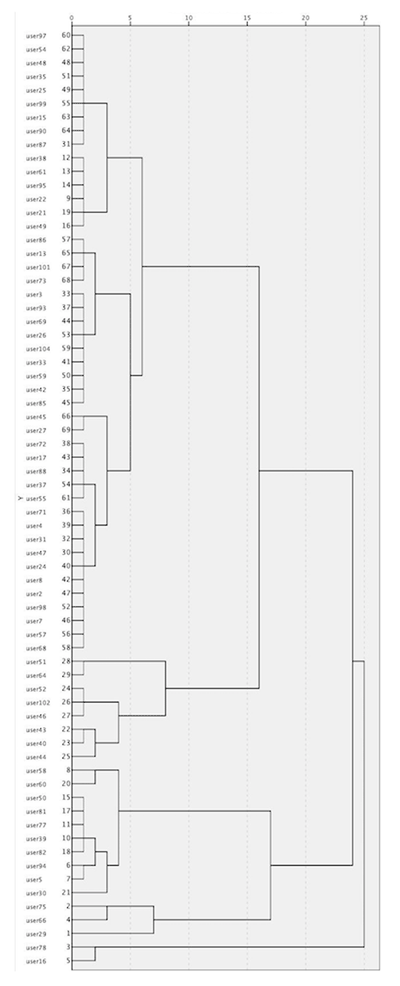
Figure 1
Dendrogram showing the participants of the study (the “visitors” category is excluded).
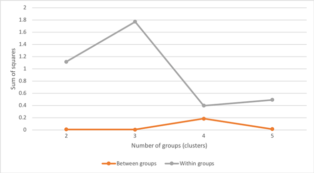
Figure 2
Similarity between clusters (bottom line) and within clusters (top line).
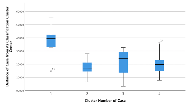
Figure 3
Box-plots presenting differences amongst the four clusters. (Note: “51” indicates one participant who did not fit in any of the clusters.)
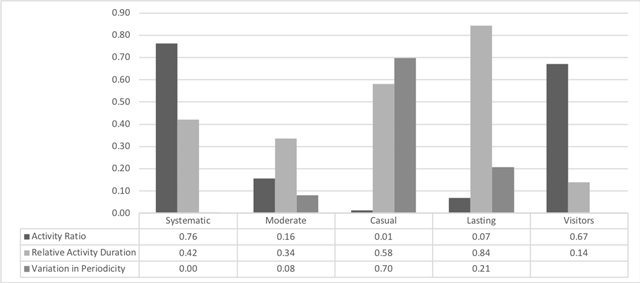
Figure 4
Engagement profiles of young people in Zooniverse.

Figure 5
Examples of participants from each cluster (Q = Quarter of a year; e.g., 2015 Q3 = third quarter of 2015).
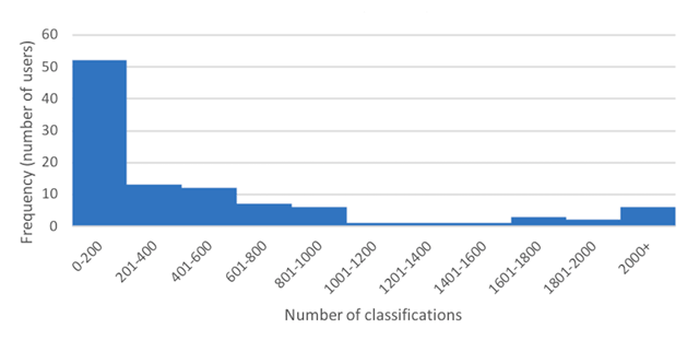
Figure 6
Allocation of Zooniverse classifications amongst participants.
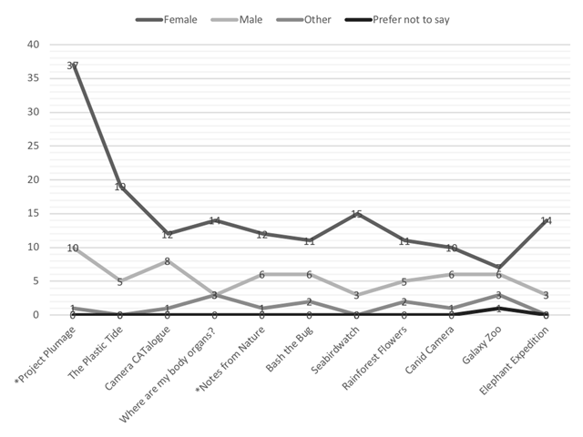
Figure 7
The 11 most popular Zooniverse projects that young people joined analysed by gender.
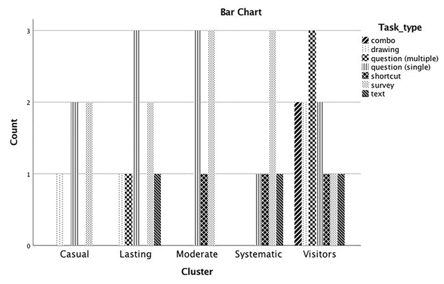
Figure 8
Number of task types within each cluster (most popular projects only).
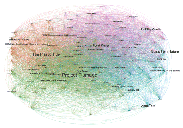
Figure 9
Zooniverse projects chosen together by participants.