
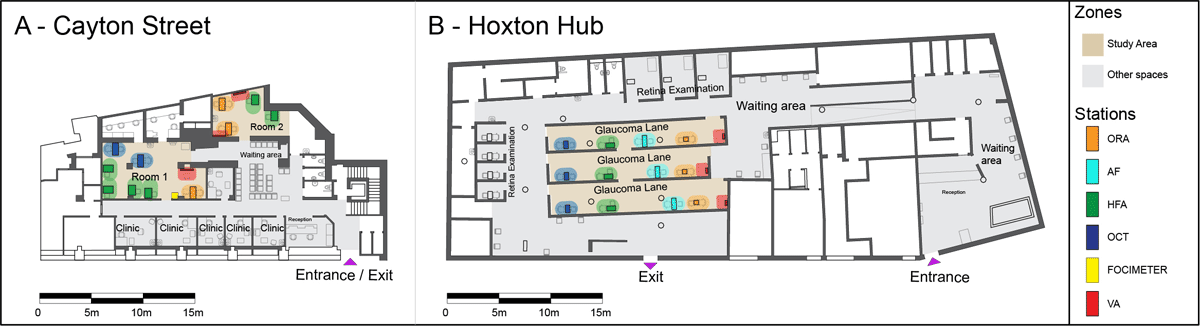
Figure 1
Annotated floor plans of the two clinic layouts.
Note: The focus area of the study is shown in light brown, spaces outside of it in grey. The five different types of stations are highlighted by coloured dots: orange = ocular response analyser (ORA); cyan = autorefractor (AF); green = Humphrey field analyser (HFA); blue = optical coherence tomography (OCT); yellow = focimeter; and red = visual acuity.
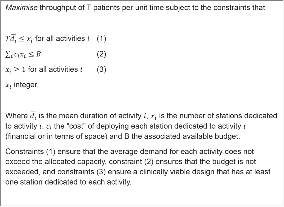
Figure 2
Overview of the analytical optimisation approach used to determine what would constitute a balanced allocation of resources across the five different activities if constrained to a maximum total number of stations.
Table 1
Mean depth (MD) statistics showing minimum, mean, maximum MD and standard deviation (SD) of Cayton Street and the Hoxton Hub.
| CLINIC | MINIMUM MD | MEAN MD | MAXIMUM MD | SD MD |
|---|---|---|---|---|
| Cayton Street | 1.7 | 2.4 | 3.7 | 0.4 |
| Hoxton Hub | 1.9 | 2.7 | 4.9 | 0.4 |
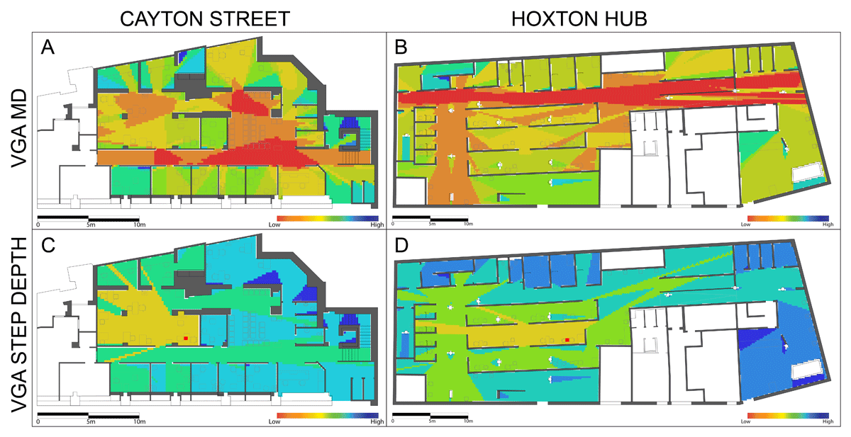
Figure 3
Visibility graph analysis (VGA) diagrams of the spatial logic of the two clinics in Cayton Street (a, c) and the Hoxton Hub (b, d).
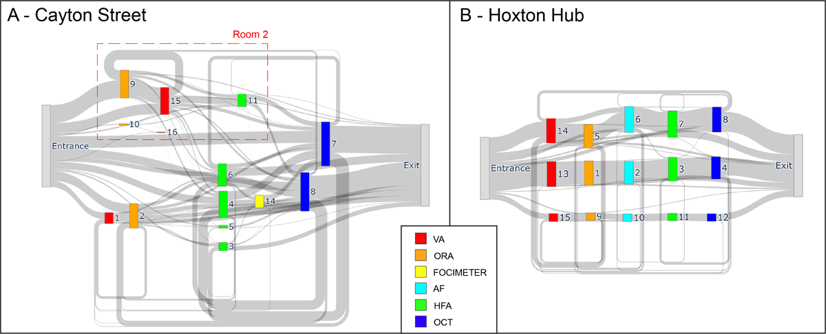
Figure 4
Sankey diagrams of patient flow in (a) Cayton Street and (b) the Hoxton Hub.
Note: The thickness of the grey lines corresponds to the number of patients being transferred from one station to the other. Room 2 in Cayton Street is marked with a dotted red line.
Table 2
Duration of diagnostic activity by station type (95% trimmed range) showing the minimum, mean, maximum and standard deviation (SD) (all min) for Cayton Street and the Hoxton Hub.
| CAYTON STREET | HOXTON HUB | t-TEST | |||||||
|---|---|---|---|---|---|---|---|---|---|
| MINIMUM | MEAN | MAXIMUM | SD | MINIMUM | MEAN | MAXIMUM | SD | p-VALUE | |
| Visual acuity (VA) | 1.4 | 3.6 | 7.1 | 1.5 | 2.6 | 6.4 | 14.6 | 2.6 | < 0.0001* |
| Focimeter/autorefractor (AF) | 0.3 | 0.8 | 1.6 | 0.4 | 0.9 | 1.9 | 5.2 | 1.0 | n.a. |
| Ocular response analyser (ORA) | 1.0 | 2.8 | 6.0 | 1.4 | 0.7 | 2.5 | 6.2 | 1.4 | 0.184 |
| Humphrey field analyser (HFA) | 8.6 | 14.2 | 21.3 | 3.1 | 8.1 | 14.2 | 22.5 | 3.5 | 0.987 |
| Optical coherence tomography (OCT) | 3.3 | 8.1 | 18.9 | 3.4 | 3.0 | 6.1 | 14.9 | 2.8 | < 0.0001* |
[i] Note: The t-test p-values show significant differences between the two sites (see file S3 in the supplemental data online for a comparison of full and 95% trimmed ranges).
n.a. = Not available.
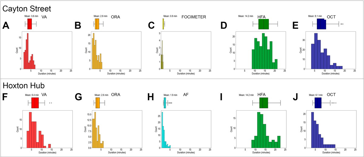
Figure 5
Distribution of the duration of diagnostic activity (95% trimmed range) by station type in Cayton Street (a–e) and the Hoxton Hub (f–j) on the same scale axis.
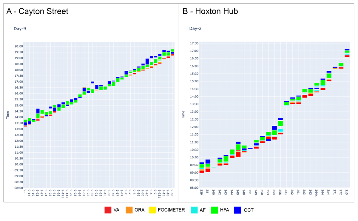
Figure 6
Bar charts of patient flows for selected days in (a) Cayton Street and (b) the Hoxton Hub.
Note: Patient ID is shown on the x-axis; time of day on the y-axis. Each column represents a single patient for a selected day of observations with activities coloured according to the stations.
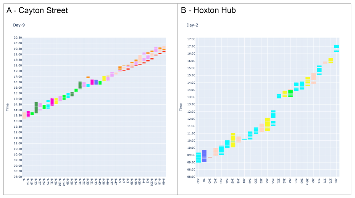
Figure 7
Bar charts of patient flows in (a) Cayton Street and (b) the Hoxton Hub.
Note: Patient ID is shown on the x-axis; time of day on the y-axis. Each column represents a single patient for a selected day of observations with activities coloured according to the technician serving a patient.
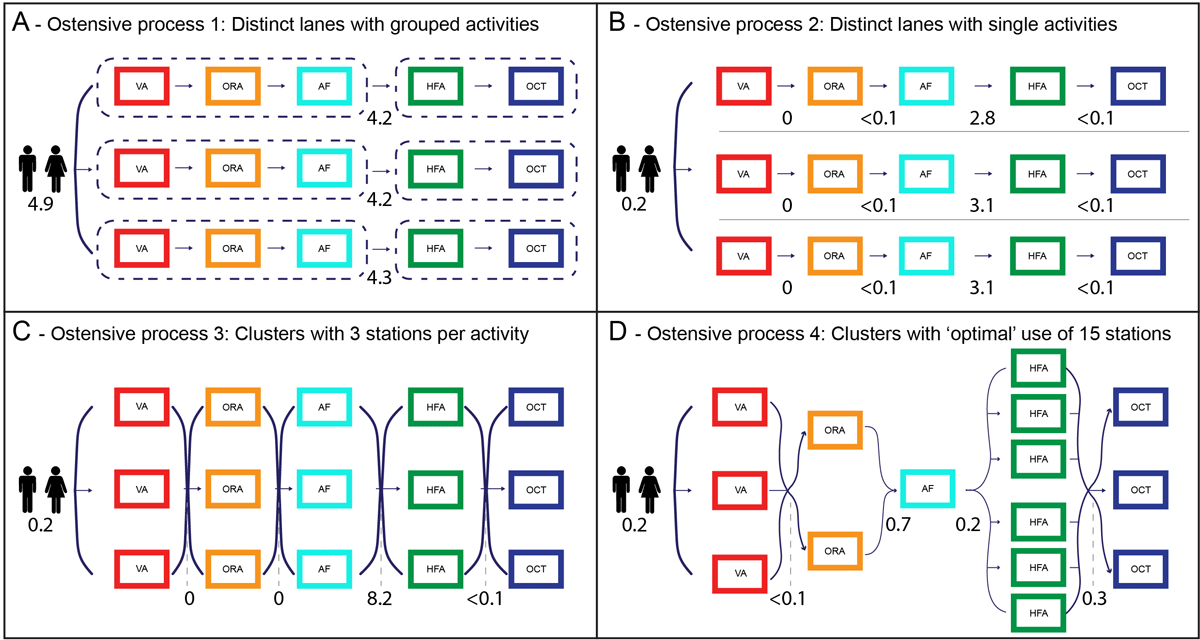
Figure 8
(a–d) The four ostensive process flows considered in the queuing simulations.
Note: Numbers denote average queue sizes in simulation experiments with 60 patients arriving in batches of three every 10 min.
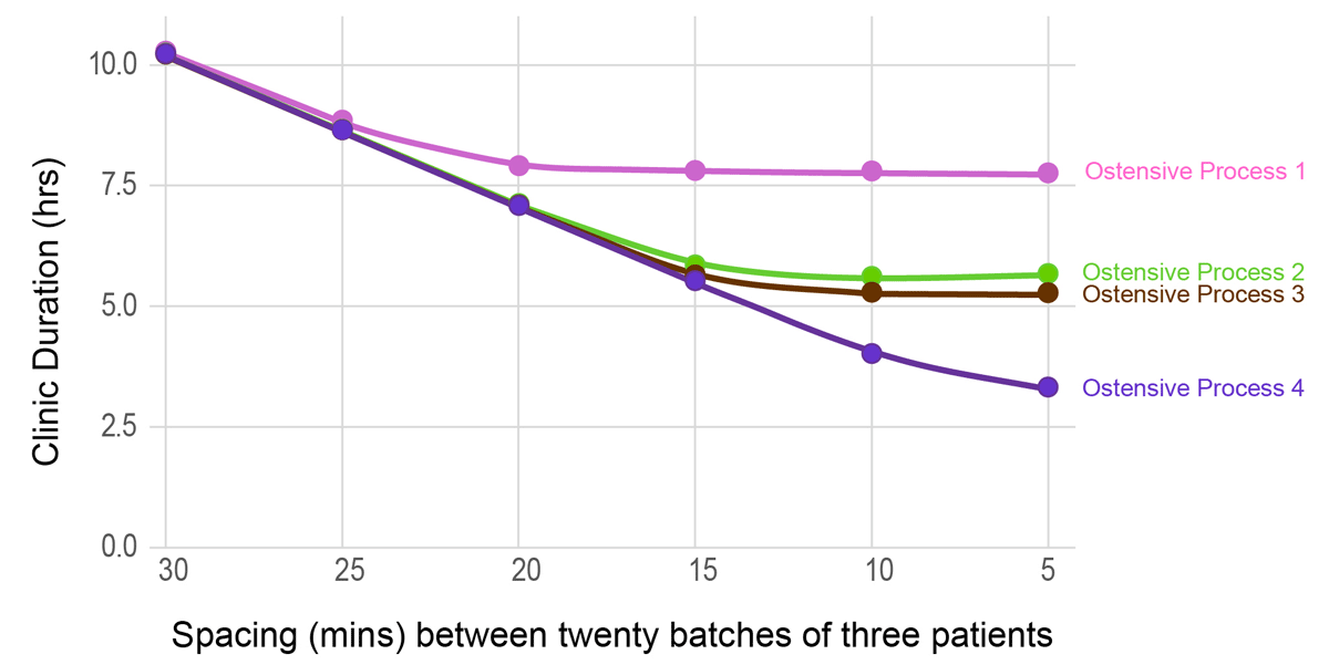
Figure 9
Plot of overall clinic duration for the four ostensive processes for different appointment spacing times.