
1. Introduction
In the context of the COVID-19 pandemic, there is unprecedented attention and an emerging, controversial debate about how the urban built environment affects infectious disease dynamics. In some news articles (CNN et al. 2020; Goldberg 2020; Mizutori & Sharif 2020), cities and urban areas have been recognized as the epicenters with the fastest and largest outbreaks of the pandemic. As a result, many urban dwellers sought to quit big cities and relocate to small towns (Paybarah et al. 2020). Meanwhile, other reporters and writers (Grabar 2020; Smith 2020) argued that there is a lack of evidence that city life leads to an inevitably higher level of virus transmission, primarily based on the fact that many metropolitan areas worldwide have been able to control the spread of the disease during the ‘first wave’ of the pandemic.
As the US slowly emerges from its second wave of the pandemic that peaked in January 2021, there remain surges and spikes in COVID-19 cases in many urban areas, especially among the unvaccinated (Johns Hopkins Medicine 2020). To recover from the current crisis and contribute to improved future urban resilience, there is an urgent need to rethink and transform cities to respond to the reality of the COVID-19 and potential future pandemics (United Nations 2020). It is imperative at this point to review existing public policies and different planning paradigms and juxtapose them with data that have been collected during this pandemic in order to help urban designers, planners, and other decision-makers understand the underlying dynamics of urban design attributes and how they relate to pandemic response, recovery, and the long-term urban resilience goals.
This paper discusses four key urban design attribute (KUDA) categories that can be measured at scale by the available data and have been commonly addressed in discussions in relation to the COVID-19 case rates in New York City (NYC):
urban density and crowding
urban mobility
urban activities
urban inequality.
1.1 Urban density and crowding
The COVID-19 pandemic arrived at a time when there is a lack of consensus about the effect of urban density on the spread of infectious diseases (Teller 2021). Prior published research contended that densely populated urban areas in cities provide optimal conditions for the spread of pathogens (Neiderud 2015). Thus, one strategy to decrease epidemic risk is to promote a more horizontally distributed urban development (Megahed & Ghoneim 2020). Other studies have countered this narrative, most of which addressed the negative relation between density and COVID-19 in terms of death rate, which is likely confounded by factors as varied as the increased availability of healthcare resources and higher income in urban areas. Fewer studies showed the insignificance of the population density on the infection rate (Hamidi et al. 2020), or its negative effects on the spread of COVID-19 in the early stage of the epidemic (Liu 2020). Jamshidi et al. (2020) highlighted the complexity of this association by showing that urban density may have multiple temporal roles in the spread of the virus, being a promoter of spread initially but then diminishing in importance as the pandemic grew.
There are many ways to measure density. In addition to the urban density that is commonly measured as the ratio between total population and the total area of a city or neighborhood, crowding has been used as a separate metric in housing studies (Blake et al. 2007; Forsyth 2003). Overcrowding refers to the perception that there are too many residents per building, per room, or per floor area. Studies such as the American Community Survey (ACS) define overcrowding as more than one person living in a single room (Blake et al. 2007). Density and crowding are related yet distinct concepts because highly populated urban districts are not necessarily crowded (Angel et al. 2021). Several pandemic studies have used crowding to identify epidemic hotspots (Emeruwa et al. 2020; Rader et al. 2020). However, further investigations are needed about different density and crowding indicators and their relationship to COVID-19 case rates or pandemic resilience in general.
1.2 Urban mobility and commute patterns
Another controversial topic is the epidemic risk associated with urban mobility and different commute modes in particular. There is a notion that public transport systems are major disseminators of viruses and ‘have seeded the massive coronavirus epidemic’ in NYC (Harris 2020). But some critics argue against this (Gordon 2020; PedestrianObservations 2020), stating that public transit is not necessarily a health hazard in the pandemic as many cities that rely heavily on public transit do not show higher infection rates than others. Scientific evidence supports that successful distancing and the use of face masks can effectively reduce infection risks in public transportation (Tirachini & Cats 2020).
Meanwhile, changes in urban commute patterns are already occurring. Public transit ridership and revenue plummeted around the world during the COVID-19 outbreaks (United Nations 2020). In large cities such as NYC, these trends can be quantified using large and openly shared data, such as the Citi Bike systems data (Citi Bike NYC 2020) and Metropolitan Transportation Authority’s (MTA) turnstile data (MTA 2020). Between January and July 2020, the total count of Citi Bike ridership has risen by 58%; the average duration of Citi Bike ridership has increased by 98%; and subway turnstile-use counts have shrunk by 73%. Further investigation is needed to understand how these commute modes are related to pandemic resilience, and which mobility strategies are suitable for the short-term rapid pandemic response and long-term mobility planning.
1.3 Urban activities and points of interests (POIs)
Population visits to POIs have been used to represent urban activities responding to the pandemic risk and the associated policies (Google 2020; Li et al. 2021). However, the impacts of the density and spatial distribution of POIs have been rarely considered in pandemic-related research. One reason for this may be that it is very difficult to capture the spatial distribution of urban activities and translating them into straightforward statistics. To the best of the authors’ knowledge, the only study that has integrated POIs’ visiting data into a Susceptible-Exposed-Infectious-Removed (SEIR) model proved that neighborhoods with more populated POIs are likely to have higher infection rates (Chang et al. 2020). To understand the relation between POIs, urban activities, and pandemic resilience, and to effectively inform urban design and planning practice, further investigations are needed that directly consider the diversity, density, and spatial distribution of POIs in the urban fabric.
1.4 Urban inequality
In addition, many of the denser US cities face a considerable amount of income inequality and related spatial segregation (Glaeser et al. 2008). This segregation has led to spatial disadvantages, including problems associated with the previously described KUDAs density and crowding, accessibility to mobility services, and allocation of diverse POIs. These problems result in systematically disproportionate pandemic vulnerabilities, as shown in the substantial variation of COVID-19 hospitalizations and deaths between different boroughs in NYC (Wadhera et al. 2020).
To consider pandemic resilience in future urban design practice, a deeper understanding of the spatial distribution of social inequalities and their impact on public health is needed. The current pandemic has brought health equity to the forefront of discussions in the design, planning, and science communities (Forsyth 2020; World Bank 2020), and the emerging urban data sets that record public health indicators and COVID-19 cases in a high spatial resolution provide a unique opportunity to understand and tackle this question.
1.5 Research questions
The aim of this paper is to understand the relationship between the four previously described KUDA categories and the COVID-19 case rates. From the perspective and scale of urban design and planning, the research goal is to leverage the zip code tabulation area (ZCTA) data for NYC to answer four main research questions in the context of NYC:
How does urban density and crowding affect the infection rate, and what are their differences?
How does the commuting environment relate to pandemic resilience?
How do allocations of POIs impact the infection rate?
How do evident inequalities in a city influence vulnerability during a pandemic?
2. Methods
2.1 Data collection and aggregation
Publicly available urban data from the US Census Bureau, NYC Department of City Planning, NYC MTA, US Environmental Protection Agency (USEPA), NYC OpenData, SafeGraph, and Google Maps Platform were collected. These data were aggregated them modified zip code tabulation areas (MOD-ZCTA) resolution that concords with COVID-19 data from the NYC Health Department. The data at the Census Block Group (CBG) level are aggregated into the ZCTA tile that contains the geometrical center of the CBG. Table 1 summarizes all urban variables used throughout the study, including the COVID-19 daily case rates, the sociodemographic variables, and the explanatory variables grouped by topics of density, crowding, mobility, and activity. The full sample size (i.e. the total number of MOD-ZCTAs in NYC) is 177, but some categorical groups have fewer observations because of missing data in certain tiles.
Table 1
Variables included in the study.
| VARIABLE | DESCRIPTION | SOURCE |
|---|---|---|
| COVID-19 case rate (CR) | Average number of daily new COVID-19 cases per 10,000 population | |
| Daily CR in P1a | Phase 1 (January 20–March 22, 2020), initial outbreak | ZCTA Level Coronavirus Data (NYC Health Department 2020) |
| Daily CR in P2 | Phase 2 (March 23–April 5, 2020), first two-week lag of the NYC lockdown | |
| Daily CR in P3 | Phase 3 (April 6–June 7, 2020), NYC lockdown | |
| Daily CR in P4 | Phase 4 (June 8–July 19, 2020), NYC started reopening | |
| Daily CR in P5 | Phase 5 (July 20–August 26, 2020), NYC reopening concluded | |
| Sociodemographic | ||
| Age | Average age of the population (years) | Aggregated from CBG Level ACS 5-Year Estimates (US Census Bureau 2018) |
| Income | Average annual income of the population (US$/year) | |
| Household size | Average number of people per household | |
| Rent | Average contract rent (US$/month) | |
| % No-health insurance | % of the population without health insurance | |
| Density and crowding | ||
| Residential building density | Total residential building floor area/total ZCTA land area | Aggregated from Lot-Level PLUTO-20v4 (NYC Department of City Planning 2020) |
| Office building density | Total office building floor area/total ZCTA land area | |
| Retail building density | Total retail building floor area/total ZCTA land area | |
| No. units per building | Average number of housing units in the same building | Aggregated from CBG Level ACS 5-Year Estimates (US Census Bureau 2018) |
| No. occupants per room | Average number of occupants per room in occupied housing units | |
| Mobility | ||
| % Work commute by PT | % of the population who commute to work by public transit (PT) | Aggregated from CBG Level ACS 5-Year Estimates (US Census Bureau 2018) |
| % Work commute by walk | % of the population who commute to work by walking | |
| % Work commute by bike | % of the population who commute to work by bike | |
| % Work commute by car | % of the population who commute to work by car | |
| Work commute time by PT | Average minutes of work commute by public transit | |
| Turnstile usage count | Average persons per hour passing through a turnstile in the Metropolitan Transportation Authority (MTA) systems | Aggregated from Station Level Turnstile Data (MTA 2020) |
| % of reduced turnstile usage | % of reduced turnstile compared with P1 | |
| No. jobs within 45 min by PT | Number of jobs within a 45 min transit commute, distance decay (walk network travel time, general transit feed specification (GTFS) schedules) weighted | Aggregated from CBG Level Smart Location Database—v2 (USEPA Smart Growth Program 2014) |
| % Pop work from home | % of the population (mobile devices) who do not show full-time (spending more than 6 h at a location other than home between 8 a.m. and 6 p.m.) or part-time (spending 3–6 h at one location other than at home between 8 a.m. and 6 p.m.) work behavior | Aggregated from CBG Level Social Distancing Metrics (SafeGraph 2020) |
| Activity | ||
| Accessible SPMK area per cap | Accessible supermarket (SPMK) area, unit area per capita | Urbano.io (Dogan et al. 2020) trip-sending simulation with: Parks Shapefiles—Open Space (NYC Open Data 2018); SPMK and SHPL Locations—Google Places API (Google Maps Platform 2018); population data—ACS 5-Year Estimates (US Census Bureau 2018) |
| Accessible SHPL area per cap | Accessible shopping mall (SHPL) area, unit area per capita | |
| Accessible PK area per cap | Accessible park (PK) area per m2 per capita |
[i] Notes: a The COVID-19 outbreak started during early to mid-February 2020. The first confirmed COVID-19 case was reported on February 29, 2020. Surveillance data are available after March 27, 2020.
ACS = American Community Survey; CBG = Census Block Group; ZCTA = zip code tabulation area.
Daily new COVID-19 case rate (DCR) is used as the dependent variable and is retrieved separately for five phases in the timeline of the ‘first wave’ of the NYC pandemic. Phase 1 (P1, January 20–March 22) is the initial outbreak; Phases 2 (P2, March 23–April 5) and 3 (P3, April 6–June 7) represent the first two-week lag and the rest of ‘NY on PAUSE’ lockdown period (New York State 2020); Phase 4 (P4, June 8–July 19) is when NYC started to reopen; and Phase 5 (P5, July 20–August 26) is when the reopening process concluded and the city entered the ‘new normal’. March 27 is the earliest available date for the COVID-19 data from the NYC Health Department (2020). Thus, Phase 1 is discarded from all following analyses due to the complete lack of case data. It is also worth noting that the data collection ends on August 26 because the DCR has remained to be consistently low by then (an average of 3.34 daily new cases per 10,000 population), indicating a temporary halt in the case increase. Sociodemographic variables, including age, income, household size, rent, and health insurance, are key indicators to discuss social equity and its spatial differences in this study. Density variables, including building densities of the residential, office, and retail use, describe the urban construction density. Contrarily, crowding variables examine the people density within a confined space at the architectural level, which consists of building-level crowding (number of units per building), and room-level crowding (number of occupants per room). Mobility variables include population-level mobility behavior recorded before the pandemic (e.g. census data). This includes commute modes (percentage of the work commute by public transport (PT), walk, bike, car), commute time (work commute time by PT), and commute destinations (number of jobs within 45 min by PT). In addition, the mobility context during the pandemic as control variables (percentage of the population working from home, turnstile usage count, percentage of reduced turnstile usage) is included. The percentage of the population working from home is derived from SafeGraph (2020), a platform that provides mobility data aggregated from cell phones. It considers mobility patterns that are derived from typical full- or part-time work behavior, i.e. spending a specified amount of time at one location other than home within the time window from 8 a.m. to 6 p.m. The turnstile data come from the NYC MTA (2020).
2.2 Activity data generation
Activity variables aim to describe the spatial allocation of key POIs, including supermarkets, shopping malls, and parks. The common metric, such as the per capita number of POIs in each ZCTA tile, was not used. This type of simple aggregation measure entails a misrepresentation problem as the travel behavior of urban dwellers seldomly adheres to zip code boundaries and thus will be different for each location within a tile, especially when the location is close to the tile boundary. This data problem is particularly vital for studies using small-scale spatial tiles, such as ZCTAs, because the human activity radius often surpasses a single tile, as shown in Figure 1a.
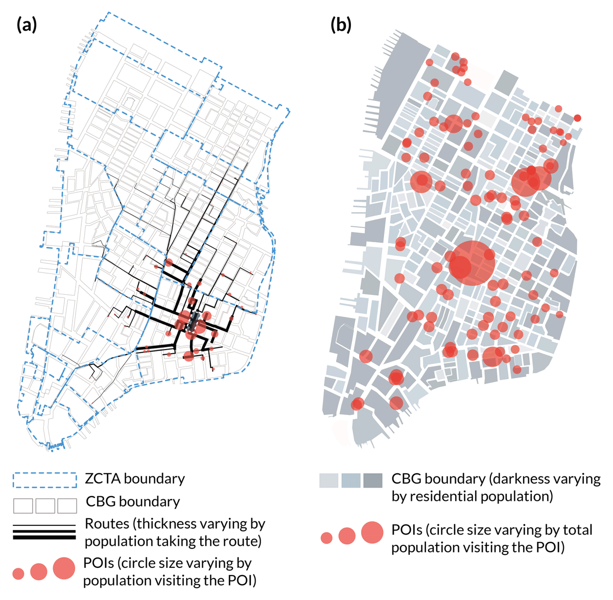
Figure 1
Simulation-based data-generation process of the accessible points of interests (POIs) area per capita.
Thus, the accessible POI area per capita was generated using the mobility simulation tool Urbano.io (Dogan et al. 2020). For each CBG i, its residential population pi can go to all accessible POIs on the map with more people using the closer ones and fewer people choosing the distant ones. The population going from CBG i to POI j is denoted as wij, which follows the distribution of a distance-decay function Fij (Figure 1a) (equations 1 and 2). After sending the populations of all CBGs to their POI destinations, the total spatial catchment of user count for each POI vj can be estimated (Figure 1b) (equation 3). Assuming each POI’s area is known as sj, how much area of individual POI destination j it occupies as wijsj/vj is then derived for each CBG i. By summing all occupied areas of CBG i and dividing it by the CBG population pi, one can obtain the accessible POI area per capita denoted as xi (equation 4):
where m is the number of all accessible POIs for the CBG i; Fij is the distance-decay function referenced from National Cooperative Highway Research Program (NCHRP) Report No. 716 (National Academies of Sciences, Engineering, and Medicine 2012); tij denotes the network walking time between ij; and n is the number of CBGs that have residents going to the POI j.
It is worth noting that the same unit area sj = 1 is assumed for all supermarkets and shopping malls because there are no data specifying the individual area of these POIs from Google Maps Platform (2018), and there is a limited range of differences in the area of these indoor places. However, for parks, the real area sj is used. This is based on the shapefile from NYC Open Data (2018) as the outdoor green areas vary considerably and thus are more relevant. Note too that this method only considers spatial catchments of total users but ignores the temporal variances such as visiting frequency and visiting schedule. Although the latter factors are important to evaluate actual visitor density in POIs, there are no data that could inform detailed spatiotemporal POI visiting patterns at CBG or zip code resolution.
2.3 Statistical data analysis
The primary outcome of this study is the average daily new COVID-19 case rate (DCR) for each phase. Means and standard deviations are computed for each variable in each phase as descriptive statistics. Pearson’s correlation coefficient is obtained to determine pair-wise correlations among explanatory variables. Multiple linear regression (MLR) is performed in two steps to assess the contributions of the exploratory variables to DCR outcomes. Step 1 is to construct and examine DCR prediction models including all exploratory variables within each categorical group and for each phase. Step 2 is to construct and examine DCR prediction models including selected variables based on the result of Step 1 for each phase and by using a backward elimination stepwise regression approach (level of significance for staying in the model = 0.1) (Kohavi & John 1997). Potential multicollinearity is also eliminated in the MLR analysis.
All descriptive data analysis and the MLR analysis are performed using Stata 16.1 (StataCorp LLC 2019) and SPSS 26 (IBM 2020). Data processing and Pearson correlation were conducted in Python (Python.org 2020). The mobility simulation for activity data and the spatial plots for case studies were created in Rhino 3D and Grasshopper (Robert McNeel & Associates 2020). For all statistical tests, a two-sided type 1 error probability ≤ 5% is considered as the level of significance.
3. Results
Table 2 presents the summary statistics of the mean (standard deviation) for all variables included in the study. Table 3 presents the means of selected variables within the mobility and activity categorical groups for each phase, which shows significant changes in the mobility and activity patterns among the four phases. The MLR results for each group are shown in Table 4, with dependent variables in columns and explanatory variables in rows. Coefficient denotes the estimated coefficients; beta denotes the standardized coefficients; and p denotes the significance. Table 5 is the final MLR models of the selected variables predicting the DCR.
Table 2
Descriptive statistics of all variables at baseline and the zip code tabulation area (ZCTA) levels.
| CHARACTERISTICS | N | MEAN | STANDARD DEVIATION |
|---|---|---|---|
| COVID-19 case rate per 10,000 population, March–August 2020 | 177 | 10.37 | 10.38 |
| Sociodemographic | |||
| Age (years) | 177 | 38.52 | 3.38 |
| Income (US$/year) | 177 | 86,452.18 | 27,685.68 |
| Household size | 177 | 2.49 | 0.44 |
| Rent (US$/month) | 177 | 1,489.82 | 477.85 |
| % No-health insurance | 177 | 7.56 | 3.64 |
| Density and crowding | |||
| Residential building density | 177 | 0.47 | 0.44 |
| Office building density | 177 | 0.14 | 0.34 |
| Retail building density | 177 | 0.04 | 0.05 |
| No. units per building | 177 | 26.82 | 17.53 |
| No. occupants per room | 177 | 0.56 | 0.08 |
| Mobility | |||
| % Work commute by PT | 177 | 25.83 | 8.68 |
| % Work commute by walk | 177 | 5.38 | 6.04 |
| % Work commute by bike | 177 | 0.59 | 0.74 |
| % Work commute by automobile | 177 | 13.65 | 9.30 |
| Work commute time by PT (min) | 177 | 50.05 | 7.55 |
| Turnstile usage counts in P1 | 122 | 1,330.34 | 1,077.64 |
| % Reduced turnstile in P2 | 122 | 65.20 | 56.96 |
| No. jobs within 45 min by PT | 177 | 99,703.12 | 101,284.80 |
| % Pop work from home in P2 | 177 | 92.68 | 10.13 |
| Activity | |||
| Accessible SPMK area per cap | 168 | 0.006 | 0.007 |
| Accessible SHPL area per cap | 166 | 0.004 | 0.005 |
| Accessible PK area per cap | 166 | 0.316 | 0.417 |
[i] Note: For abbreviations, see Table 1.
Table 3
Descriptive statistics of New York City (NYC) residents’ mobility at zip code tabulation area (ZCTA) level during COVID-19 pandemic periods.
| MEAN ± STANDARD DEVIATION DURING THE COVID-19 PANDEMIC PERIOD | P-VALUEa | ||||
|---|---|---|---|---|---|
| P2 (MARCH 27–APRIL 5) | P3 (APRIL 6–JUNE 7) | P4 (JUNE 8–JULY 19) | P5 (JULY 20–AUGUST 26) | ||
| COVID-19 case rate per 10,000 population, N = 177 | 9.36 ± 3.35 | 24.80 ± 10.78 | 3.96 ± 1.59 | 3.34 ± 1.10 | <0.001 |
| Turnstile usage count, N = 122b | 489.53 ± 1,115.84 | 190.91 ± 130.17 | 364.04 ± 328.15 | 410.00 ± 306.19 | <0.001 |
| % Reduced turnstile, N = 122 | 65.20 ± 56.96 | 82.80 ± 7.90 | 69.44 ± 11.52 | 65.24 ± 11.78 | <0.001 |
| % Pop work from home, N = 177 | 92.68 ± 1.32 | 93.20 ± 1.37 | 91.52 ± 1.37 | 90.77 ± 1.45 | <0.001 |
[i] Notes: a Analysis of variance for mean comparisons.
b Average turnstile usage count in P1 was 1,330.34 ± 1,077.64.
Table 4
Multiple linear regression (MLR) models within each focused group.
| EXPLANATORY VARIABLES | OUTCOME VARIABLES | |||||||||||
|---|---|---|---|---|---|---|---|---|---|---|---|---|
| DAILY CR IN P2 | DAILY CR IN P3 | DAILY CR IN P4 | DAILY CR IN P5 | |||||||||
| COEFFICIENT | BETA | P-VALUE | COEFFICIENT | BETA | P-VALUE | COEFFICIENT | BETA | P-VALUE | COEFFICIENT | BETA | P-VALUE | |
| Sociodemographic | ||||||||||||
| Age | 0.09 | 0.09 | 0.25 | –0.30 | –0.09 | 0.17 | –0.11 | –0.24 | 0.01 | –0.12 | –0.36 | <0.01 |
| Income (US$/year) | <0.01 | 0.26 | 0.22 | <–0.01 | –0.00 | 0.99 | <–0.01 | –0.52 | 0.02 | <–0.01 | –0.50 | 0.03 |
| Household size | 2.85 | 0.38 | 0.00 | 7.26 | 0.30 | <0.01 | 0.09 | 0.03 | 0.80 | –0.24 | –0.10 | 0.31 |
| Rent (US$/month) | <–0.01 | –0.23 | 0.22 | –0.01 | –0.46 | 0.01 | <0.01 | 0.16 | 0.41 | <0.01 | 0.03 | 0.88 |
| % No-health insurance | 14.68 | 0.16 | 0.16 | –23.55 | –0.08 | 0.41 | –7.75 | –0.18 | 0.13 | –6.05 | –0.20 | 0.06 |
| Intercept | –2.64 | 0.54 | 35.79 | <0.01 | 10.38 | <0.01 | 10.51 | <0.01 | ||||
| Adjusted R2 | 0.194; p < 0.001 | 0.424; p< 0.001 | 0.160; p < 0.001 | 0.27; p < 0.001 | ||||||||
| Density and crowding | ||||||||||||
| Residential building density | –1.67 | –0.22 | 0.04 | –9.09 | –0.37 | <0.01 | –1.41 | –0.39 | <0.01 | –0.51 | –0.20 | 0.06 |
| Office building density | –1.04 | –0.11 | 0.34 | –9.73 | –0.31 | <0.01 | –0.07 | –0.02 | 0.90 | –0.02 | –0.01 | 0.96 |
| Retail building density | 3.92 | 0.06 | 0.62 | –11.86 | –0.06 | 0.60 | –0.81 | –0.03 | 0.83 | –0.11 | –0.05 | 0.68 |
| No. units per building | –0.05 | –0.28 | 0.01 | <–0.01 | 0.00 | 0.96 | 0.02 | 0.25 | 0.02 | 0.13 | 0.21 | 0.05 |
| No. occupants per room | 5.50 | 0.12 | 0.08 | 15.29 | 0.11 | 0.09 | 4.30 | 0.20 | 0.01 | 4.27 | 0.29 | <0.01 |
| Intercept | 8.48 | <0.01 | 22.45 | <0.01 | 1.66 | 0.05 | 0.91 | 0.13 | ||||
| Adjusted R2 | 0.192; p < 0.001 | 0.355; p < 0.001 | 0.138; p < 0.001 | 0.121; p < 0.001 | ||||||||
| Mobility | ||||||||||||
| % Work commute by PT | –4.26 | –0.11 | 0.40 | –10.60 | –0.07 | 0.43 | –2.35 | –0.10 | 0.42 | –0.11 | –0.00 | 0.96 |
| % Work commute by walk | –5.01 | –0.11 | 0.53 | –45.89 | –0.28 | 0.03 | 5.17 | 0.20 | 0.27 | 3.37 | 0.20 | 0.30 |
| % Work commute by bike | 33.95 | 0.09 | 0.46 | –51.66 | –0.04 | 0.67 | 39.86 | 0.18 | 0.13 | –26.25 | –0.18 | 0.14 |
| % Work commute by car | 10.46 | 0.24 | 0.18 | –30.60 | –0.19 | 0.15 | –12.99 | –0.52 | <0.01 | –8.41 | –0.51 | 0.01 |
| Work commute time by PT | 0.09 | 0.21 | 0.50 | 1.13 | 0.73 | <0.01 | 0.23 | 0.96 | <0.01 | 0.05 | 0.31 | 0.37 |
| Turnstile usage counts | <–0.01 | –0.07 | 0.58 | 0.01 | 0.09 | 0.16 | <0.01 | 0.00 | 0.97 | <0.01 | 0.03 | 0.74 |
| % Reduced turnstile | –0.44 | –0.09 | 0.51 | –51.27 | –0.38 | <0.01 | –4.96 | –0.34 | <0.01 | –1.55 | –0.16 | 0.12 |
| No. jobs within 45 min by PT | <0.01 | 0.06 | 0.83 | <0.01 | 0.32 | 0.12 | <0.01 | 0.17 | 0.56 | <–0.01 | –0.29 | 0.36 |
| % Pop work from home | 17.89 | 0.08 | 0.39 | –31.09 | –0.04 | 0.54 | 7.24 | 0.06 | 0.51 | 10.39 | 0.14 | 0.16 |
| Intercept | –11.71 | 0.53 | 44.89 | 0.33 | –9.16 | 0.35 | –6.09 | 0.36 | ||||
| Adjusted R2 | 0.212; p < 0.001 | 0.62; p < 0.001 | 0.214; p < 0.001 | 0.143; p= 0.002 | ||||||||
| Activity | ||||||||||||
| SPMK area per cap | 28.71 | 0.05 | 0.59 | 257.71 | 0.13 | 0.10 | 34.77 | 0.12 | 0.17 | 4.54 | 0.02 | 0.80 |
| SHPL area per cap | –142.47 | –0.23 | 0.01 | –942.85 | –0.48 | <0.01 | –93.38 | –0.32 | <0.01 | –51.03 | –0.26 | <0.01 |
| PK area per cap | 1.66 | 0.19 | 0.01 | 7.92 | 0.29 | <0.01 | –0.05 | –0.01 | 0.88 | –0.16 | –0.06 | 0.46 |
| Intercept | 9.34 | <0.01 | 25.51 | <0.01 | 4.15 | <0.01 | 3.59 | <0.01 | ||||
| Adjusted R2 | 0.063; p = 0.0047 | 0.245; p < 0.001 | 0.062; p = 0.005 | 0.046; p= 0.016 | ||||||||
[i] Note: For abbreviations, see Table 1.
In Table 5, higher residential building density significantly relates to a lower DCR in all phases, and higher building-level crowding (number of units per building) significantly relates to a higher DCR in P3–P5. Contrarily, both office and retail building density, and also room-level crowding, do not show significance. Among mobility variables, after controlling for behavioral changes due to the pandemic (e.g. percentage reduced turnstile counts), the PT commute time is a dominating positive regressor in P3, while the PT mode choice variable (percentage work commute by PT) is a negative regressor in P2 and P4. Among activity variables, more shopping mall area per capita significantly relates to a lower DCR in P2 and P4. More park area per capita also significantly relates to a lower DCR in P3.
Table 5
Summary of multiple regression analysis for variables predicting the COVID-19 daily new case rate.
| VARIABLES | MODEL 1 (P2) | MODEL 2 (P3) | MODEL 3 (P4) | MODEL 4 (P5) | ||||||||
|---|---|---|---|---|---|---|---|---|---|---|---|---|
| COEFFICIENT | SE | B | COEFFICIENT | SE | B | COEFFICIENT | SE | B | COEFFICIENT | SE | B | |
| Income (US$/year) | <0.01** | <0.01 | 0.30 | |||||||||
| % No-health insurance | 29.1** | 8.8 | 0.32 | |||||||||
| Residential building density | –1.9** | 0.6 | –0.26 | |||||||||
| % Work commute by PT | –9.4** | 3.2 | –0.24 | |||||||||
| SHPL area per cap | –132.4** | 48.6 | –0.21 | |||||||||
| Intercept | 7.7** | 1.6 | ||||||||||
| Residential building density | –4.7** | 1.8 | –0.20 | |||||||||
| No. units per building | 0.1* | 0.1 | 0.16 | |||||||||
| Work commute time by PT | 0.8** | 0.1 | 0.50 | |||||||||
| % Reduced turnstile | –59.3** | 8.7 | –0.43 | |||||||||
| PK area per cap | –5.9** | 2.2 | –0.17 | |||||||||
| Intercept | 34.9** | 12.8 | ||||||||||
| Income (US$/year) | <–0.01** | <0.01 | –0.31 | |||||||||
| Residential building density | –1.3** | 0.4 | –0.37 | |||||||||
| Office building density | 1.0 | 0.6 | 0.21 | |||||||||
| No. units per building | 0.03* | 0.01 | 0.25 | |||||||||
| % Work commute by PT | –6.2** | 2.1 | –0.27 | |||||||||
| % Work commute by bike | 64.7** | 20.2 | 0.32 | |||||||||
| % Reduced turnstile | –4.4** | 1.2 | –0.31 | |||||||||
| SHPL area per cap | –81.9* | 33.2 | –0.30 | |||||||||
| Intercept | 10.0** | 1.0 | ||||||||||
| Age | –0.1** | 0.03 | –0.28 | |||||||||
| Income (US$/year) | <–0.00* | <0.01 | –0.25 | |||||||||
| Household size | 0.5 | 0.3 | 0.19 | |||||||||
| Residential building density | –0.5* | 0.2 | –0.21 | |||||||||
| No. units per building | 0.4** | <0.01 | 0.49 | |||||||||
| % Reduced turnstile | –0.5 | 0.8 | –0.05 | |||||||||
| Intercept | 8.9** | 1.8 | ||||||||||
| Adjusted R2 | 0.214 | 0.646 | 0.438 | 0.361 | ||||||||
| F-statistics | 9.97** | 43.68** | 12.21** | 12.39** | ||||||||
[i] Notes: For abbreviations, see Table 1.
* p < 0.05; ** p < 0.01.
Figure 2 shows the matrix of Pearson correlation coefficients. By reading the correlations between urban attribute groups, higher urban densities are found to correlate with more PT and active transportation users, more jobs within close proximity, and significantly shorter PT commute time. However, higher residential density also correlates with less accessible park area per capita. In addition, closer job–home proximity (number of jobs in 45 min PT) and shorter PT commute time correlates with more percentage reduced turnstile, increased commuting by walking and biking, and decreased commuting by car.
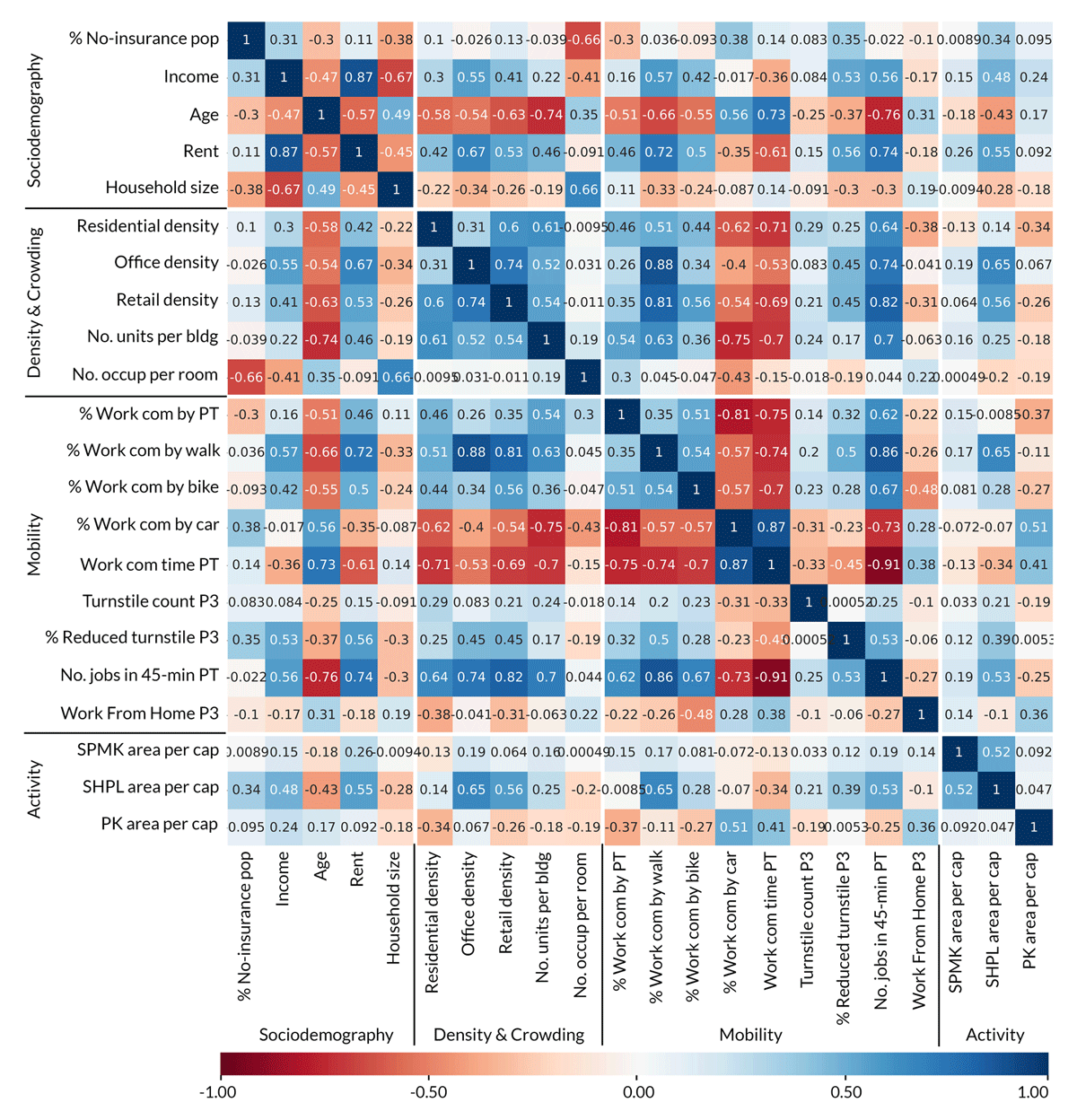
Figure 2
Matrix of the correlation coefficients from Pearson correlation analysis, with variables ordered in explanatory groups and high correlations highlighted with more saturated blue (positive) or red (negative) colors.
By reading the correlations between urban attributes and the sociodemographic variable group, it is found that lower rent areas mostly accommodate the low-income population, and large households tend to have lower urban density, lower PT services accessibility (percentage work commute by PT), significantly longer commute times, fewer transportation alternatives (percentage work commute by walk, bike), and much less accessible shopping mall area per capita. A notable trend with great relevance for pandemic response is that crowded houses (by number of occupants per room) appear to accommodate younger, lower income people with little to no health insurance.
The spatial distributions of DCR and other explanatory variables are plotted in Figures 3 and 4, with two case study areas highlighted as The Bronx (A) and Hell’s Kitchen Manhattan (B), both of which have a higher relative DCR than their neighbors. Some MLR results can be reiterated in case studies. For example, Hell’s Kitchen (B) has the lowest residential density (plot 6) but the highest DCR in Manhattan, which is consistent with the negative sign of residential building density in MLR. Also, by comparing The Bronx (A) and Hell’s Kitchen (B), which have similar work-from-home population percentages (plot 3), it is found that The Bronx (A) with a much longer PT work commute time (plot 14) turns out to be more vulnerable in the pandemic, even though Hell’s Kitchen (B) has a higher reliance on the PT system in general (plots 15 and 16). This supports the MLR result that longer PT commute time relates to a higher DCR, but a higher percentage of the population commute by PT does not.
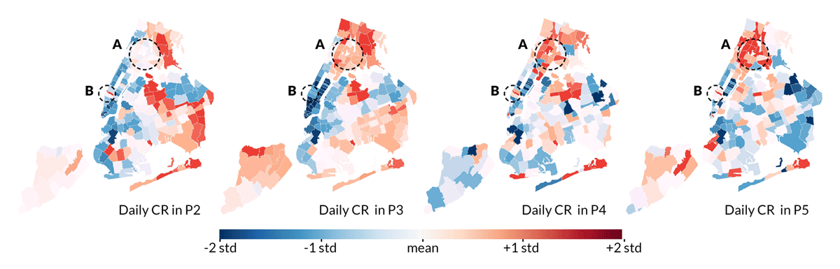
Figure 3
Spatial plots of the daily new COVID-19 case rate (DCR) distribution in standardized z-scores.
Note: A = The Bronx and B = Hell’s Kitchen (the Midtown west side of Manhattan).
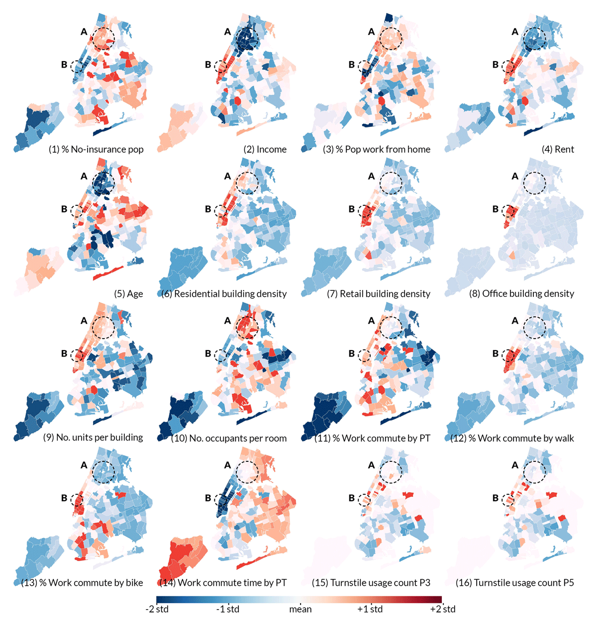
Figure 4
Spatial plots of the distribution of the explanatory attributes in standardized z-scores.
Note: A = The Bronx and B = Hell’s Kitchen (the Midtown west side of Manhattan).
Some trends are observed that can expand MLR results. Though MLR results do not show significant impacts of room-level crowding variable at the city-wide level of analysis, the case study shows that the pandemic hotspot in The Bronx (A) has extremely high room-level crowding (plot 10) within young and low-income communities (plots 1, 2, 4 and 5). This implies that crowded living conditions likely interact with other factors—such as income and age—to particularly impair the pandemic resilience of disadvantaged population groups. In addition, despite that MLR models do not show the benefits of walking and biking mode choices, it is observed that very limited areas in NYC have successfully accommodated active mobility as alternative commute modes (plots 12 and 13), and the majority of these areas, mostly lower Manhattan, have proven to be some of the most resilient urban areas in the current COVID-19 crisis.
4. Discussion
The final MLR model in P3 shows the highest adjusted R2 value (0.646; p < 0.001), suggesting that the residential building density, building-level crowding, work commute time by public transit, reduced turnstile usage, and park area per capita could contribute at least 64.6% to the variation of the COVID-19 daily case rate during the NYC lockdown period. P3 is also the period when the complexity of human activities is minimized due to state- and city-mandated non-pharmaceutical interventions (NPIs), which allows the built environment attributes to dominate the factors of the transmission. Owing to inadequate COVID-19 testing capacity in the early days of the pandemic, the DCR data from P2 are most likely an undercount, with many undetected cases. In P4 and P5, human activities became less predictable due to behavioral changes related to modification of the NPIs, and the dependent variable DCR became less sensitive because it had declined acutely by then. Based on the presented results, the research questions are discussed below. Based on these findings, future planning strategies and design approaches are then proposed.
4.1 How do urban density and crowding affect infection rates?
This study clarifies how urban density and crowding represent two related but different concepts in pandemic-resilient design and planning theory (Forsyth 2003, 2020; Batty 2009) by identifying the specific effects of density and crowding on NYC’s 2020 COVID-19 epidemic.
High residential building density appears to be consistently advantageous for pandemic resilience in all phases in NYC. One reason is that high residential density often entails other beneficial urban features such as closer jobs, shorter commute time, and thus better mobility conditions as shown in the correlation matrix. After considering all relevant variables in Table 5, residential building density still has significant negative coefficients, which may be explained by other possible advantages mentioned in the literature such as effective pandemic prevention measures, well-informed dwellers, as well as good access to the internet and communication technologies (Forsyth 2018). Office and retail building density does not show significance in the present MLR analyses, which could be attributed to the high work-from-home percentage throughout the studied period as well as the less active business environment during the pandemic (Table 3). However, it is worth noting that high office and retail density in NYC are extremely concentrated in a few areas, as shown in Figure 4 (plots 7 and 8), which is concerning because it may entail high interzonal transmissions after in-person work and activities entirely resume.
Results further reveal the need to investigate crowding indicators at the architectural level. Building-level crowding appears to be an unfavorable urban feature in almost all phases in the pandemic, probably because many residents sharing the confined circulation space and facilities in buildings (e.g. elevators and hallways) can facilitate disease transmissions. Room-level crowding also appears to seed the surge of the infection in vulnerable communities such as The Bronx according to the present case study. However, statistical evidence is needed in future studies for a more profound understanding about the effects of these crowding indicators and their potential interaction with other factors such as income and age (Ghosh et al. 2021).
Given the evidence, developing compact cities with well-mixed land use remains a desirable planning paradigm as opposed to sprawl, as it provides a high-density living environment that can support overall better infrastructures for pandemic response, and sustain advantageous urban features such as proximities of jobs and services. However, to avoid potential ramifications of overcrowding, architects and developers should develop more resilient apartment building typologies, e.g. by offering flexible apartment layouts with enough rooms to facilitate occupant isolation, by providing safer congregate space through spatial thresholds and physical barriers (CDC 2020), or by offering alternative, well-ventilated and sun-exposed circulation routes. Especially in vulnerable, low-income communities such as The Bronx, such design strategies could help to mitigate existing overcrowding. For example, a newer development in The Bronx, Via Verde (Kimmelman 2011), with such resilient and affordable housing typologies, is located in the area that has a relatively lower case rate than the rest of The Bronx. Meanwhile, better data are needed to relate the findings to architectural parameters that it is believed are impactful, such as building entrance type, circulation space, ventilation, and daylighting conditions, so that more specific evidence can be provided to guide future design practices.
4.2 How does the commuting environment relate to pandemic resilience?
To address concerns about public transit systems facilitating the spread of airborne pathogens, the PT-related mobility variables were investigated. Both MLR models and case studies show that—in the current COVID-19 pandemic—a long commute time by PT is a more concerning urban attribute than the percentage of people commuting by PT. Numerous studies on indoor disease transmissions can help with understanding this result. The latest research shows that for closed environments such as PT vehicles, adherence to physical distancing, high-frequency cleaning, and proper use of face masks can successfully reduce the probability of contagion (Noakes 2020; Tirachini & Cats 2020), but the total viral load and the risk of inhaling infectious aerosols both increase with time spent in a confined space (EMG-SAGE 2020; Prather et al. 2020). Additionally, short-distance travelers have more flexible mobility choices and are more likely to transition to alternative modes, as shown in the correlation matrix that shorter PT commute time correlates with a higher percentage reduced turnstile.
Thus, to ensure the long-term viability of public transit in dense cities, urban designers should consider promoting planning schemes with dense and well-mixed urban zoning to reduce commute time in general, such as the decentralized neighborhood centers (Chu 2020), the walkable city (Claris & Luebkeman 2016), and the 20-min city (Capasso Da Silva et al. 2020). Mixing land uses and creating more jobs in proximity of homes can be an effective way of realizing this goal. Besides, low-income neighborhoods should be prioritized in future PT development as recent studies stressed that PT is more critical infrastructure to them during COVID-19 compared with the high-income population (Liu et al. 2020).
There is no definite evidence from the present MLR analyses proving the benefits of active transportation modes because the current data at hand account only for work commutes and they cannot broadly represent generalized biking and walking behaviors. However, considering that Figure 4 demonstrates areas with good walkability and bikeability to be more resilient in the current COVID-19 crisis, as well as the current drop in PT ridership and the emerging trend of transitioning to active transportation (Table 3), there is a great momentum to advance biking and pedestrian-oriented mobility infrastructures.
4.3 How does the allocation of points of interest within a city impact the infection rate?
In MLR analyses, higher accessible shopping mall area per capita relates to a lower DCR both before and after the lockdown period (P2 and P4). In the correlation matrix, it is found that low-income and low-rent communities have less accessible POI area per capita in general. These findings correspond well with Chang et al. (2020) who used the SEIR model to simulate that lower income CBGs have higher infection rates in part because they tend to visit more congested, and therefore higher risk, POIs. The present paper is one of the first to study the direct link between the spatial allocations of POIs and the infection rate. The given evidence calls for the considerate planning for more essential services such as grocery stores, pharmacies, food services, and other retailers in future city development.
As for parks, it is found that higher accessible park area per capita particularly relates to a lower DCR during the lockdown period. A similar finding was reported by Liu (2020) who found a negative coefficient for the per capita green space area when predicting city-level COVID-19 case numbers in China. Besides, the present correlation matrix shows that denser residential areas tend to have a less accessible park area per person, which is probably because the compact built environment has restricted space for green infrastructure development. Prior studies pointed out that residents in dense urban centers visit parks more often and reduce their trips to parks much less during the lockdown because densely populated areas offer smaller housing units and fewer other outdoor spaces such as private yards to help residents mitigate anxiety and stress (Hamidi & Zandiatashbar 2021). Thus, outdoor green parks, though commonly referred to as ‘non-essential’ POIs, still play a critical role for the public well-being during the pandemic response.
4.4 How do evident inequalities in a city influence vulnerability during a pandemic?
Spatial inequalities for the vulnerable (e.g. low income, low coverage of health insurance) and high-risk (e.g. large household size) population are perpetuated in the pandemic. These communities tend to live in more crowded houses in areas with poor accessibility to jobs and other urban services. As a result, these communities have longer commute times and fewer transportation alternatives.
To help alleviate the current spatial disparities for vulnerable communities, several approaches from the perspectives of previous discussions can be considered. Developing more affordable housing with resilient building typologies in dense areas can help accommodate more heterogeneous populations in urban centers. Bringing more job opportunities near these neighborhoods and advancing more active transportation supports can lower their travel-related risks as well as costs. Providing adequate indoor and outdoor POIs in proportion to the resident density and demands can not only mitigate their risks in interpersonal transmissions when visiting these public places but also increase their quality of life in general.
5. Conclusions
The results from this study provide new evidence for the immediate urban response to the COVID-19 outbreaks in the short term, as well as future urban design and planning efforts to improve urban resilience to infectious disease transmission in the long term.
The analyzed area covers a broad spectrum of urban densities (e.g. from Staten Island to Manhattan) and cross-referenced evidence is used from a variety of data analyses and case studies. The conclusions about the relationships between the built environment attributes and urban resilience in the current COVID-19 pandemic are robust despite the limitations (mentioned below). Based on the presented evidence, it is proposed that a pandemic-resilient urban environment includes, notably, compact and mixed cities with decentralized urban activities, adequate affordable dwellings, resilient building typologies, good proximities between jobs and homes, restricted commute time, diverse mode choices, and balanced allocations of urban services and facilities in line with the residential density.
This study can guide short-term responses in the safe recovery from the current COVID-19 crisis, as well as long-term urban design and planning decision-makings for pursuing a resilient, inclusive, and sustainable urban environment in future public health emergencies. As reopening policies and future urban development schemes continue to be debated, it is critical to study and conclude from the first waves of the pandemic in the major city to inform decision-makers who are currently lacking relevant empirical evidence.
Some limitations in the data exist. Geographic information system (GIS) datasets may not contain all POIs available. Some variables, such as the percentage of the population who work from home, may have data bias (SafeGraph data only capture certain types of cell phone devices). COVID-19 case rates are not adjusted by the test volume because only people who already showed symptoms could take tests in earlier periods. This may lead to uncertainty and complexity in data interpretation. Potential sub-zip code tabulation area (ZCTA) heterogeneity is also dismissed because of the need for data aggregation. The presented multiple linear regression analyses only select variables about urban design attributes and some primary sociodemographic features, but do not include all contingencies that may also influence the case rate statistics, such as health facility access, community support, emergency supplies, hygienic practices, homeless populations, and pandemic-related shift in actual population density due to relocation to less dense areas (i.e. vacation homes). Future studies should consider constructing more comprehensive datasets that capture these aspects and integrating them into the analysis models.
Acknowledgements
The authors thank the Cornell Atkinson Center for funding this research.
Competing interests
The authors have no competing interests to declare.
Funding
This work was funded by the Cornell Atkinson Center (grant number 2020-RRF-tkd9).
Supplemental data
Supplemental data for this article can be accessed at: https://doi.org/10.5334/bc.130.s1
For the full dataset, see the Github repository at: https://github.com/EnvironmentalSystemsLab/OpenData