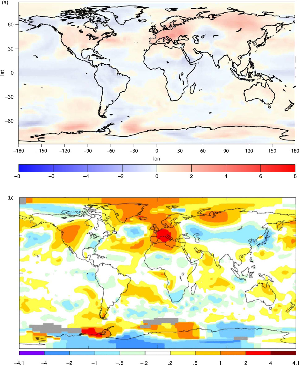
Fig. 1.
Pattern of the near-surface, annual mean temperature trend for the three 40-yr periods, (a) 1890–1930, (b) 1930–1970 and (c) 1970–2010. The global mean temperature trend values are given in Table 1. The large differences of regional trends, in particular, in the Arctic are striking. There is an indication of a positive trend correlation between the tropics and the Arctic, but there is an indication of a negative correlation with high latitudes of the Southern Hemisphere. Equally striking is the superimposed warming during the latest period. (Taken from http://data.giss.nasa.gov/gistemp/maps/)
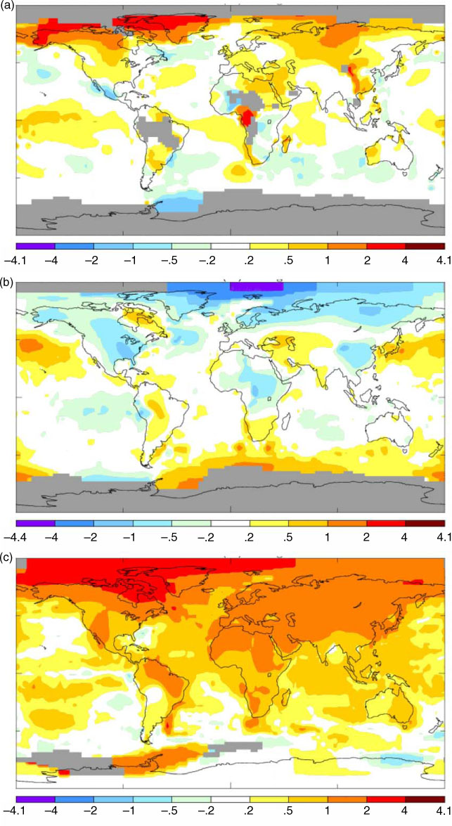
Table 1. Average temperature trend for the three 40-yr periods, 1890–1930, 1930–1970 and 1970–2010
Fig. 2.
(a) NAO from a 1000-yr pre-industrial simulation calculated by the MPI coupled climate model (Jungclaus et al., 2010). NAO has been calculated as the average surface pressure at monthly mean values between the boxes (35°N, 45°N, 10°W, 70°W) and (45°N, 70°N, 10°W, 70°W). The model includes forcing from solar variability and volcanic aerosols from known eruptions. For information, see Jungclaus et al. (2010). The variation in greenhouse gas forcing is insignificant. (b) Power spectrum for the same function with the annual cycle removed, showing values from 1 month to 50 yr (red). The central solid line is the equivalent of a first-order auto-regressive process, AR(1). Upper and lower lines indicate 95% confidence interval. The result indicates that NAO is a red spectrum (random walk noise) and is fully dominated by internal processes. It should be noted that monthly extremes exist of more than 4.5 SD.
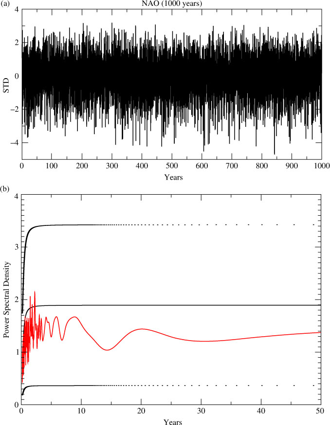
Fig. 3.
(a) ENSO determined from monthly mean surface temperature (5°N, 5°S, 90°W, 150°W), and Nino 3.4 determined from a 1000-yr simulation by the MPI coupled climate model (Jungclaus et al., 2010). The model includes forcing from solar variability and volcanic aerosols from known eruptions. For information, see Jungclaus et al. (2010). The variation in greenhouse gas forcing is insignificant. (b) Power spectrum for the same function showing values from 1 month to 50 yr (red). The central solid line is the equivalent of a first-order auto-regressive process, AR(1). Upper and lower lines indicate 95% confidence interval. There is a weak peak between 3 and 4.5 yr but for shorter and longer periods ENSO follows a random walk noise and is dominated by internal processes.
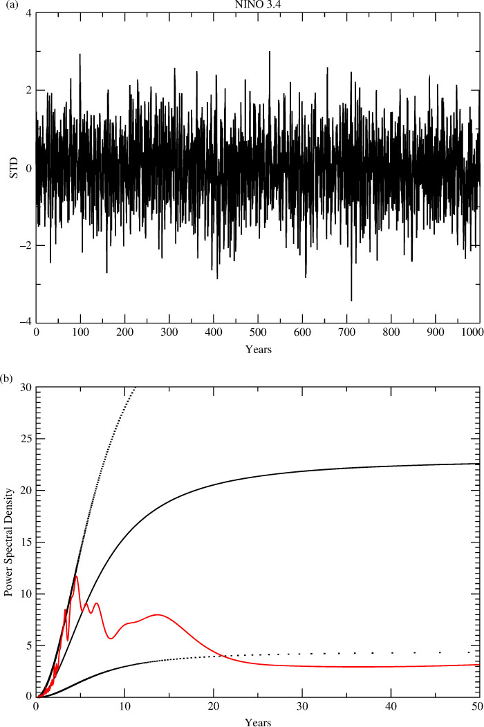
Table 2. Observed land surface temperature 1500–1900 for the area 35N–70N and for 25W–40E from Luterbacher et al. (2004). The standard deviation, SD, for the last 100 yr is 0.53, suggesting that the variance is underestimated in the earlier record. The same for the model results, ECHAM5/ MPI-OM. Results have been calculated from a 500-year climate simulation without any changes in external forcing. Values from Bengtsson et al. (2006). Values are, in both cases, average values for the whole year and winter (DJF) and summer (JJA), respectively. The actual years of the extreme temperatures are indicated (units in °C). The coldest winter in the model run corresponds to 4.2 SD and the warmest summer to 3.8 SD. The corresponding values from the observational data set are 3.3 SD and 2.9 SD, respectively
Fig. 4.
(a) The temperature anomaly of the 10 coldest winters (DJF) for a model integration over 500 yr using pre-industrial forcing conditions. (b) The observed temperature anomaly for the winter 2009/2010 relative to the mean temperature 1990–2010. The cold anomaly covers the major part of the northern Eurasia as well as the major part of US and southern and western Canada. The Arctic is warmer than normal. There are considerable similarities between the observed and model simulated pattern, suggesting similar anomaly circulation pattern. [(b) Retrieved from http://data.giss.nasa.gov/gistemp/maps/]
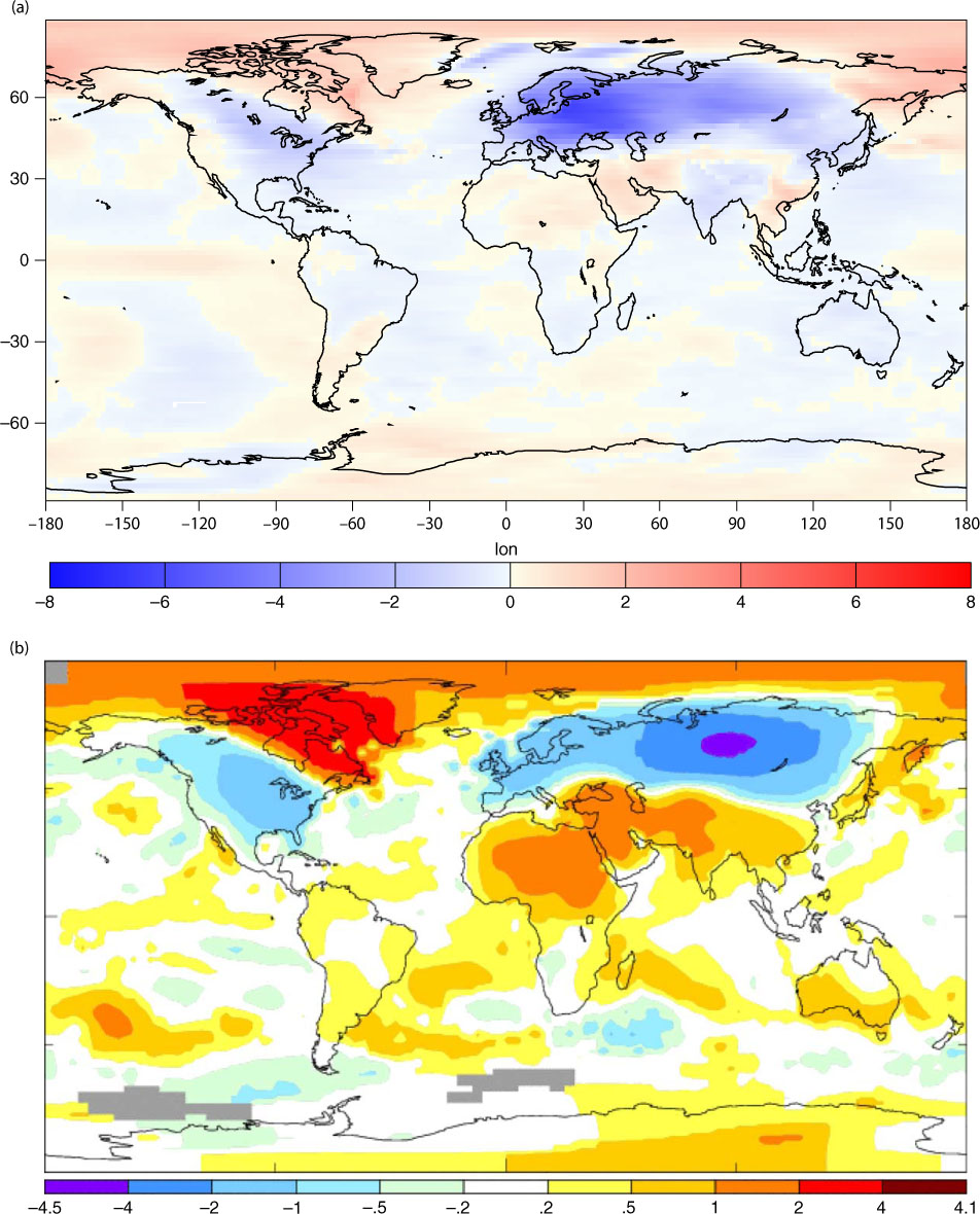
Fig. 5.
(a) The temperature anomaly for the 10 warmest summers (JJA) for the same 500-yr model integration. (b) The temperature anomaly for the summer of 2003 relative to the mean temperature 1990–2010. The extreme warm anomaly over Europe is connected to a band of warmer than normal sea surface temperatures over the central Atlantic. There is a region with colder than normal conditions over the central part of the Asian mainland. There are several similarities between the model anomalies but not as pronounced as for the winter case. [(b) Retrieved from http://data.giss.nasa.gov/gistemp/maps/]