Table 1. Classification of hurricanes using the categories of the Saffir–Simpson (SScat) based on central pressure
Fig. 1.
Tracks and intensities of (a) best tracks (1960–1990), (b) CTRL simulation of ECHAM5, (c) SCEN simulation of ECHAM5, (d) best tracks (1970–1990), (e) CTRL simulation of MRI/JMA and (f) SCEN simulation of MRI/JMA. The colours indicate the Saffir–Simpson categories (SScat).
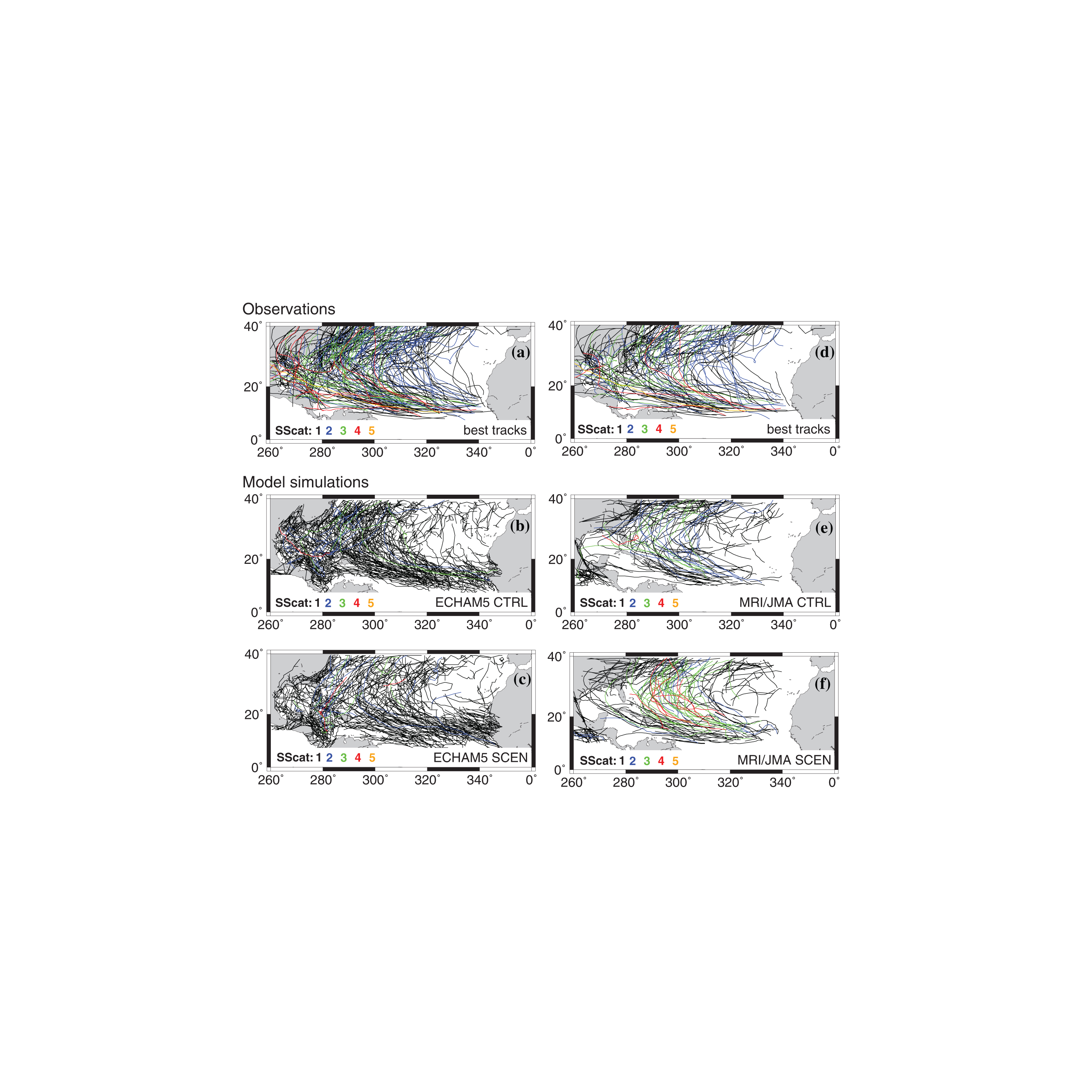
Fig. 2.
Mean difference of cyclone centre density (Number/(1000 km)2) between (a) ECHAM5 CTRL simulation and best track data for the period 1960–1990, (b) MRI/LMA CTRL simulation using 21 yr and best track data for the period 1970–1990, (c) ECHAM5 A2 SCEN and its CTRL simulation and (d) MRI/JMA A1B SCEN and its CTRL simulation.
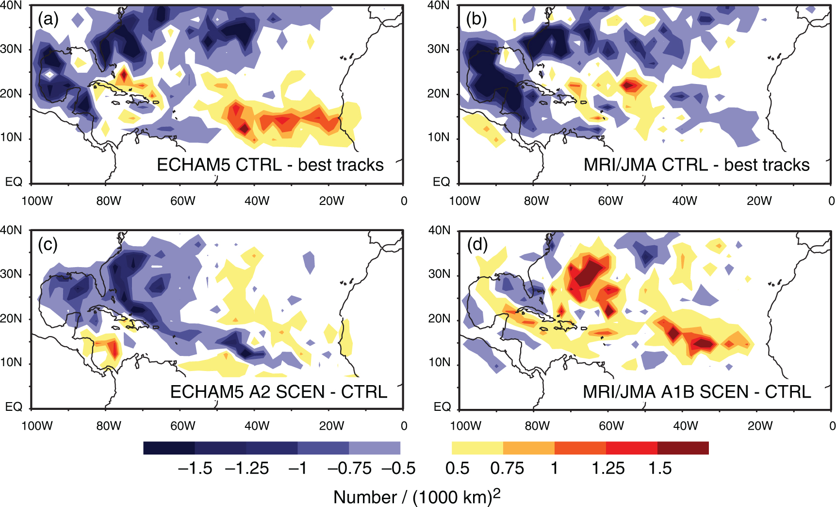
Fig. 3.
Absolute numbers of tracks of SScat 1–5 in comparison with best tracks: (a) best tracks (1960–1990) and tracks of ECHAM5 CTRL (1960–1990) and SCEN A2 simulation (2070–2100) and (b) best tracks (1970–1990) and tracks of MRI/JMA CTRL (21 yr present-day) and SCEN A1B simulation (21 yr end of the twenty-first century).
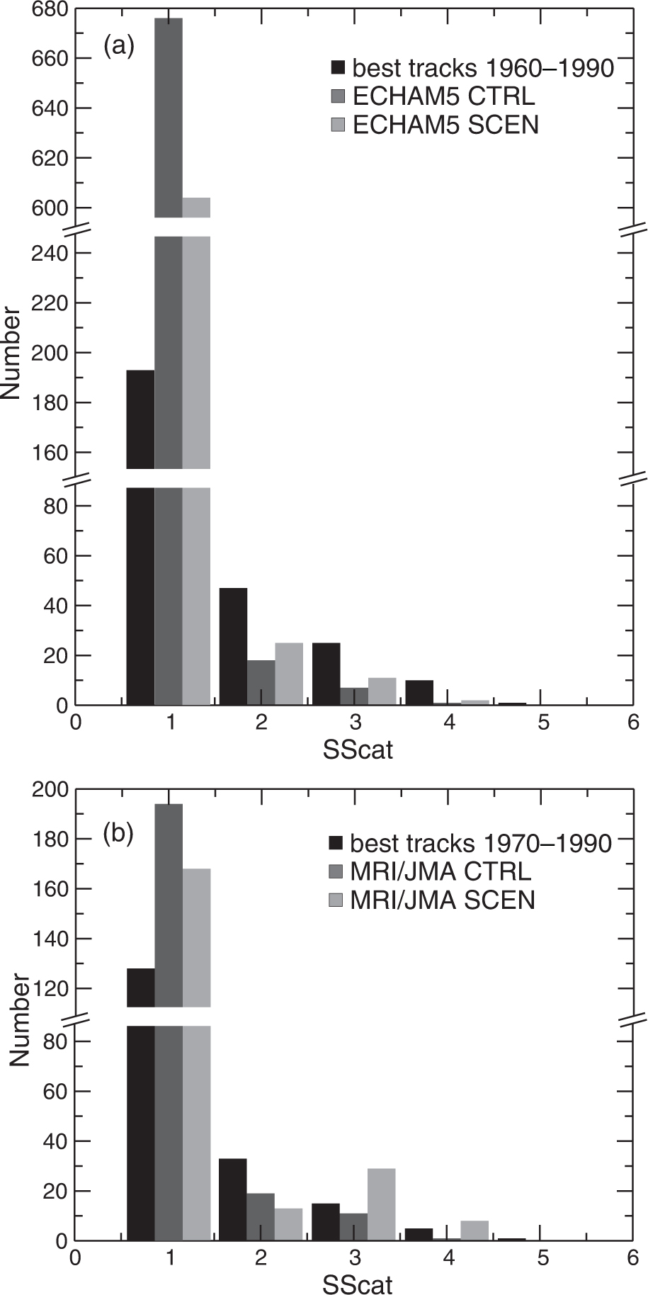
Fig. 4.
The cumulative density functions of the central pressures of best tracks and (a) ECHAM5 tracks, (b) MRI/JMA tracks, (c) scaled ECHAM5 tracks and (d) scaled MRI/JMA tracks.
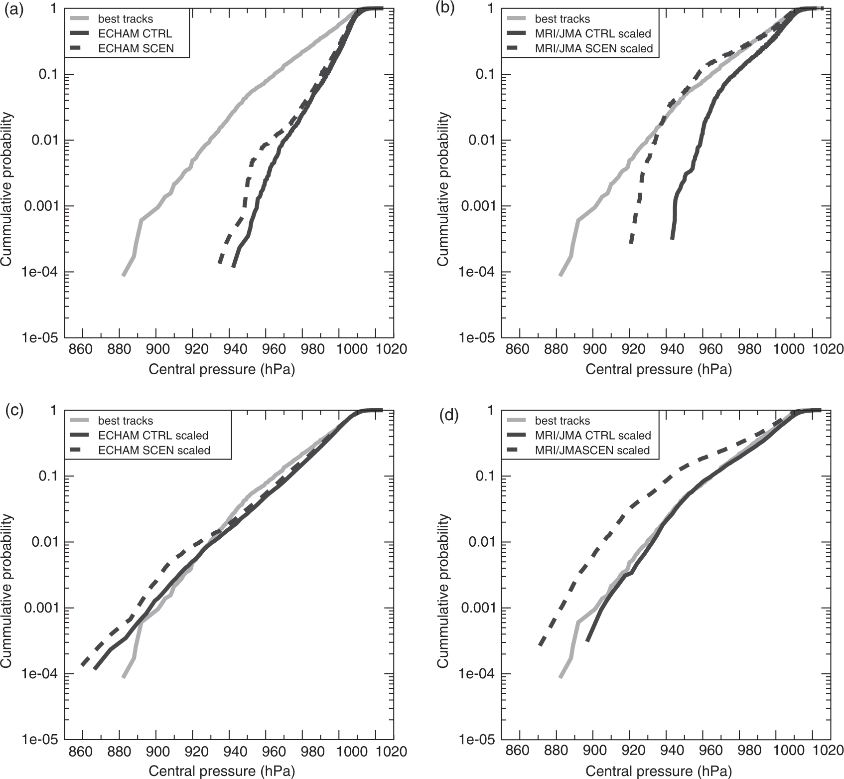
Fig. 5.
As Fig. 1, but for the scaled data, i.e. the same trajectories but different intensities due to scaling.
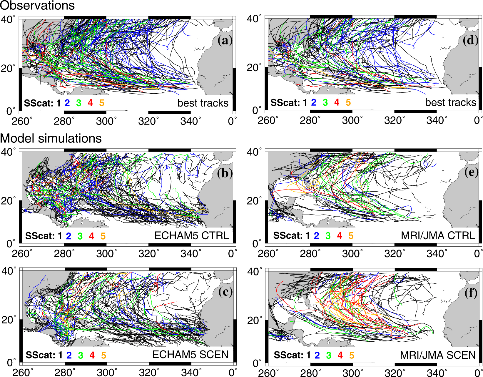
Fig. 6.
Absolute numbers of tracks with SScat 1–5 before and after scaling: (a) ECHAM5 CTRL, (b) MRI/JMA CTRL, (c) ECHAM5 SCEN and (d) MRI/JMA SCEN. The histogram is based on 31 yr for ECHAM5 and on 21 yr for MRI/JMA. Note that the y-axis is different in the upper part of the panels.
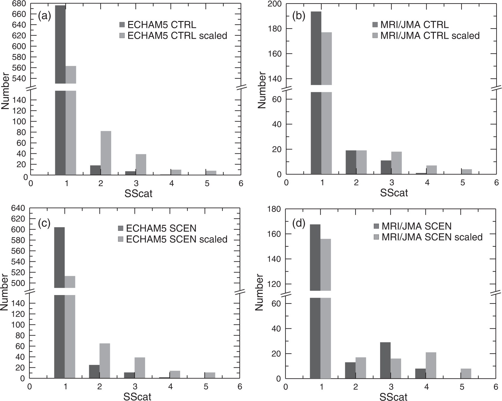
Fig. 7.
Map of rating zones in the United States (source: Swiss Re modified for this study). TC denotes tropical cyclone.
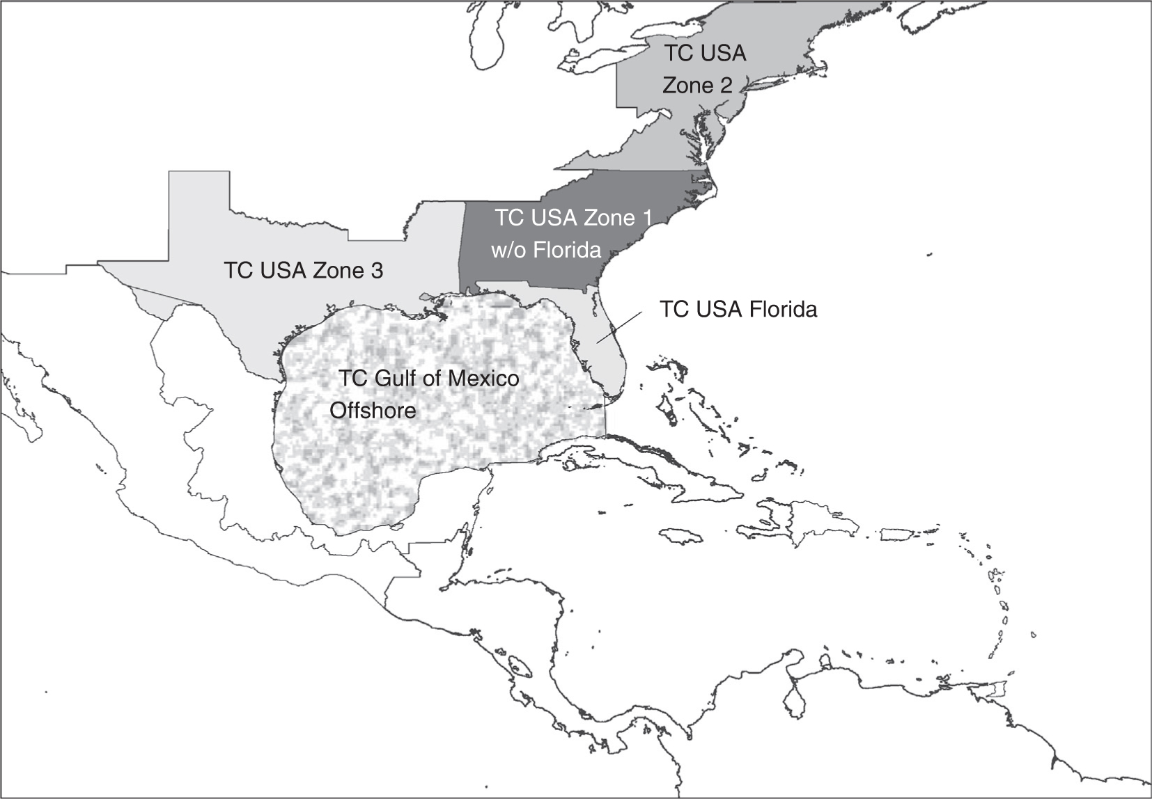
Fig. 8.
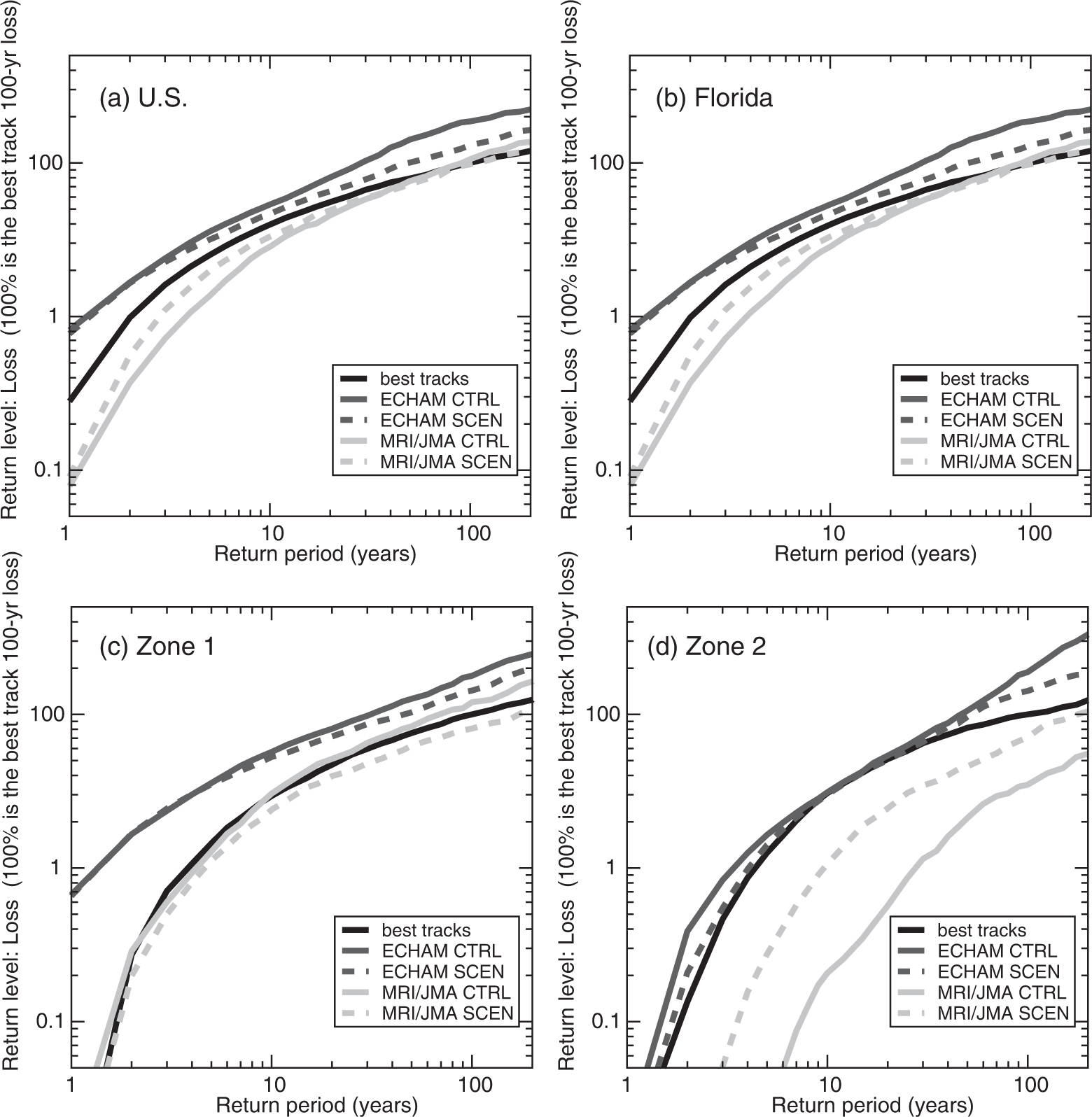
Loss frequency curves of (a) the United States (b) Florida, (c) zone 1 and (d) zone 2 for best track data, the CTRL and SCEN (A2 for ECHAM5 and A1B for MIR/JMA) simulations of both model simulations, respectively.