
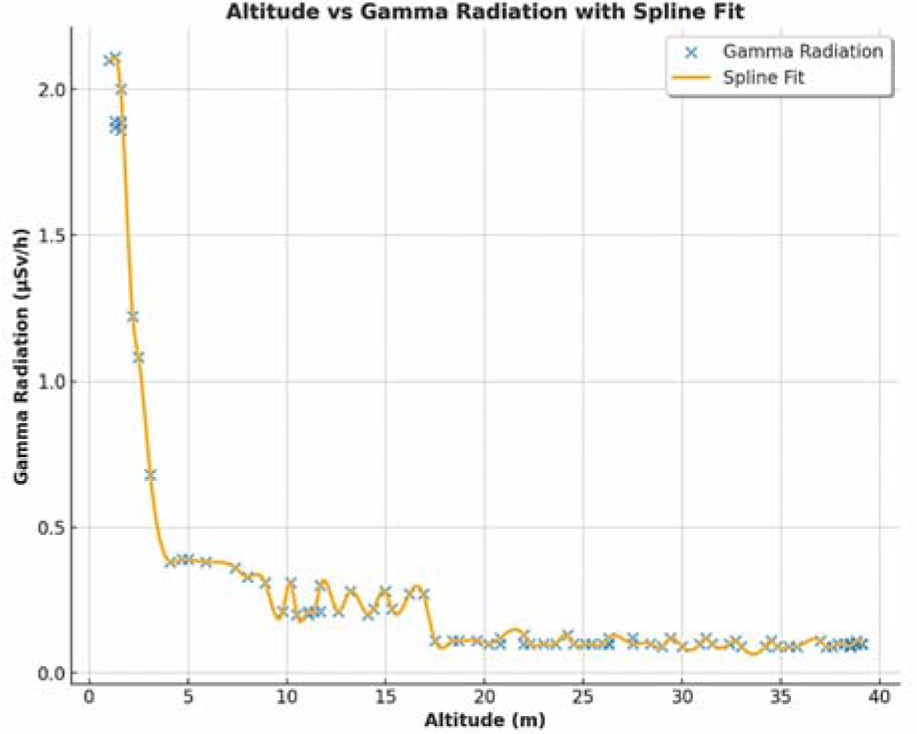
Fig. 1.
Altitude vs. gamma radiation intensity. The graph demonstrates inverse correlation between altitude and gamma radiation intensity. At altitudes above approx. 10 m, the data exhibit increased noise, and radiation resolution drops.
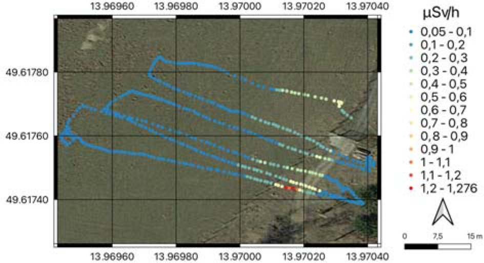
Fig. 2.
Visualization of the radioactivity distribution as measured with the UAV. Each dot represents a measurement point recorded by UAV, with the color indicating the intensity of the measured gamma radiation (μSv/h). Imagery: CNES/Landsat/Copernicus (2023).
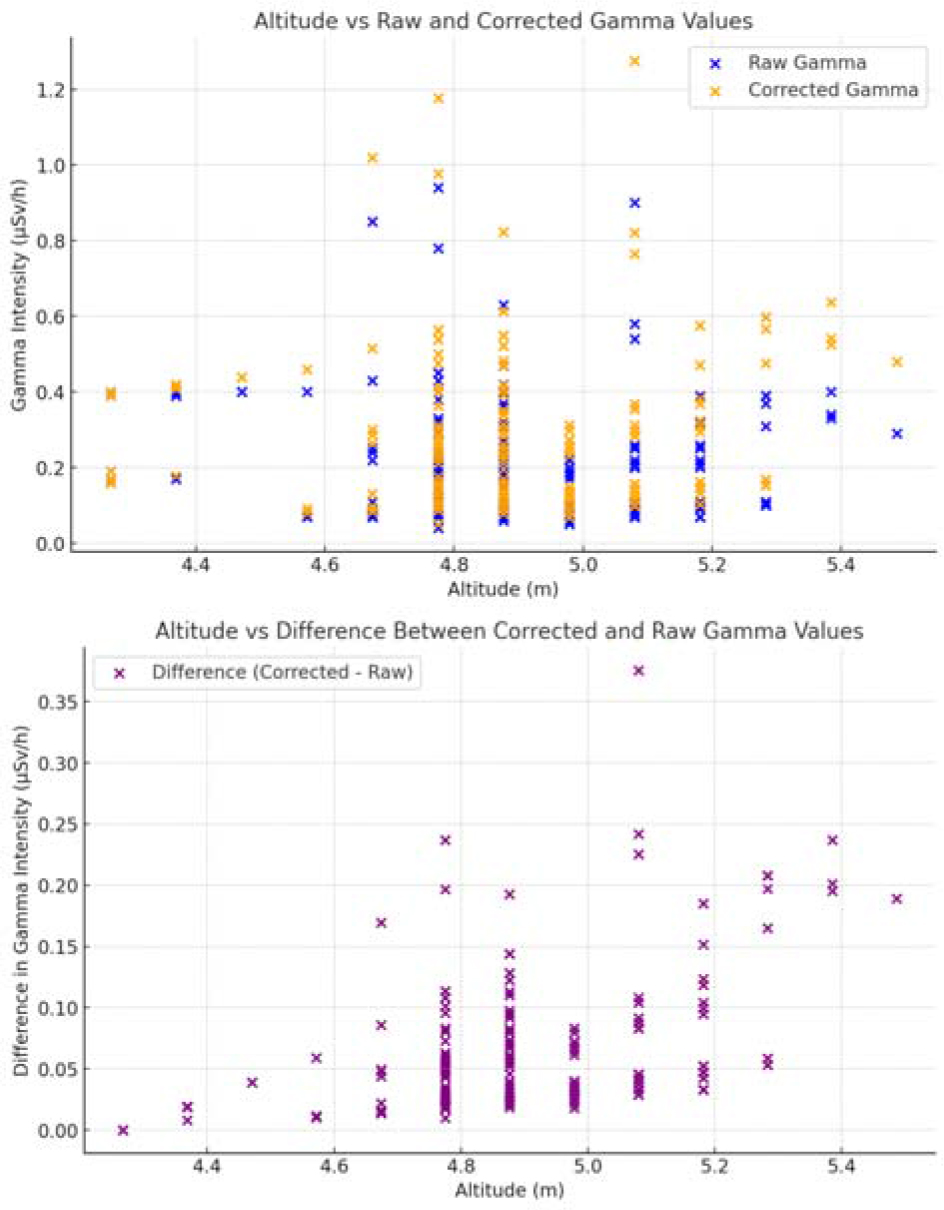
Fig. 3.
Relationship between raw and altitude corrected gamma radiation values. The upper graph displays the relationship between altitude, raw gamma values, and corrected gamma values after normalization to the lowest altitude, demonstrating how altitude correction impacts the data. The second graph shows the difference between corrected and raw gamma values, highlighting the extent of the correction applied across the dataset.
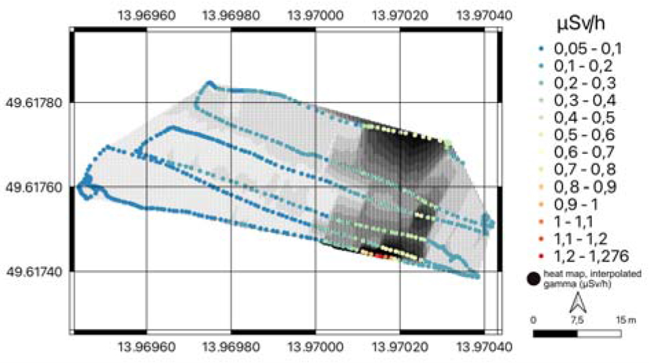
Fig. 4.
Interpolated map of gamma radiation. Black markers represent interpolated values, with size proportional to gamma levels, while colored points show actual measurements, illustrating the relationship between estimated and real data.
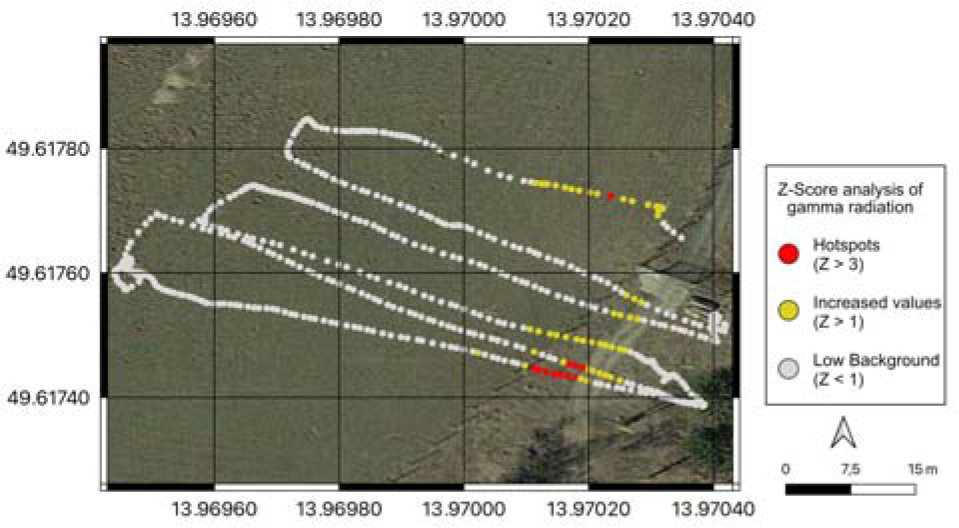
Fig. 5.
The hotspot analysis identified locations where the gamma radiation levels are significantly higher than the surrounding area, with Z-scores greater than 3. These are considered potential hotspots, and they are highlighted in red on the map. Data points with Z-scores greater than 1 are shown in yellow. Imagery: CNES/Landsat/Copernicus (2023).
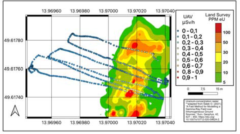
Fig. 6.
Comparison between the rapid UAV survey and a professional-grade land survey. Land survey map was adapted from Sálek [15].