
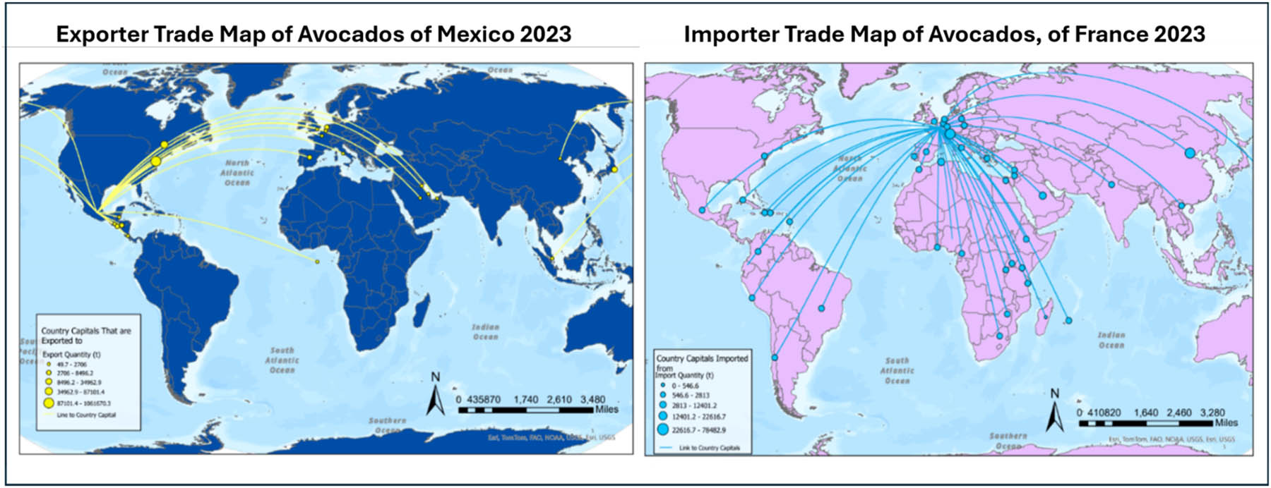
Figure 1
Example student map depicting major avocado export and import relationships. Map description by student: The export map shows that Mexico exports avocados to a wide range of countries, but most of these markets are concentrated in the Northern Hemisphere, especially in Western Europe and North America. The import map shows that France imports avocados from a highly diverse set of countries across the world, indicating a global and well-dispersed supply network.
Source: Author’s contribution.
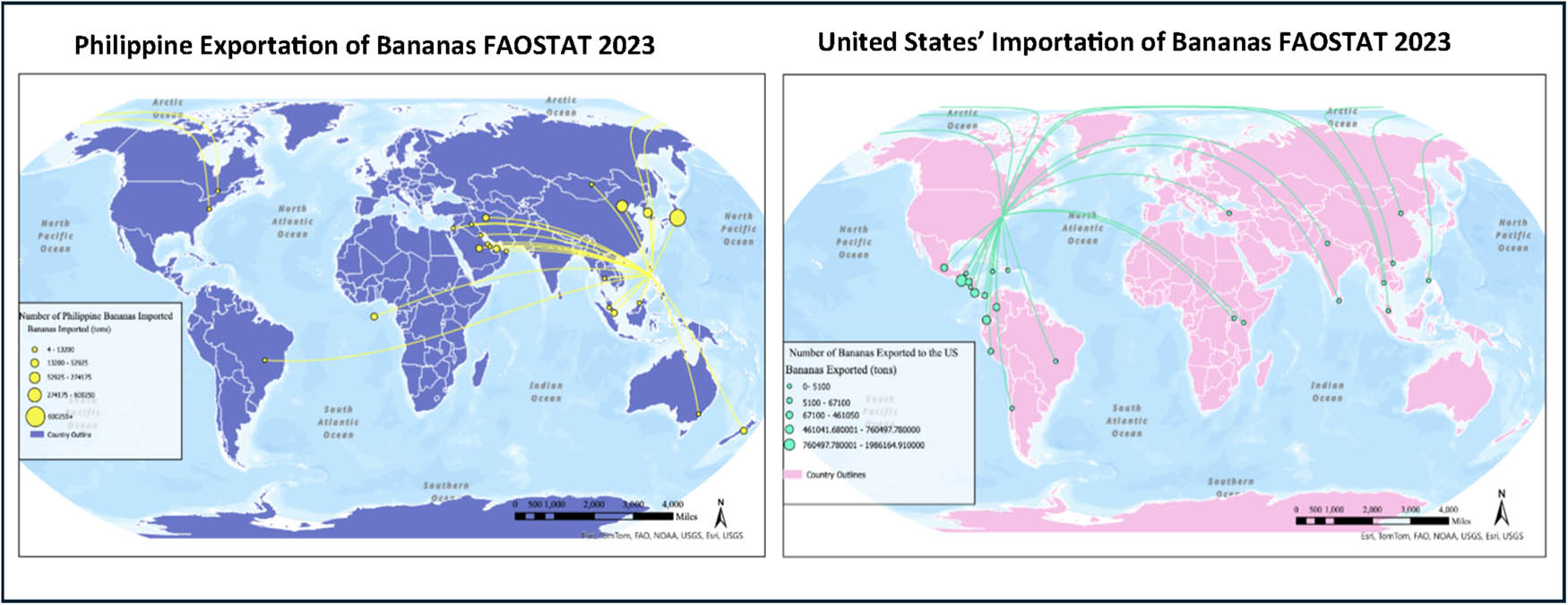
Figure 2
Example student map depicting major banana export and import relationships. Map description by student: For the map regarding Philippine exportation of bananas, one of the biggest patterns I noticed was that they tend to export bananas primarily to other East Asian countries. For example, one of the biggest recipients of Philippine bananas is Japan, likely due to established trade relations and closer geographical proximity. As for the map regarding the United States’ importation of bananas, similar to the Philippine exportation map, there appears to be a regional pattern in terms of where the United States imports bananas from. It seems that the largest exporters of bananas to the United States are primarily located in Latin and South America, with top producers such as Guatemala and Costa Rica being amongst the main countries the United States imports from.
Source: Author’s contribution.
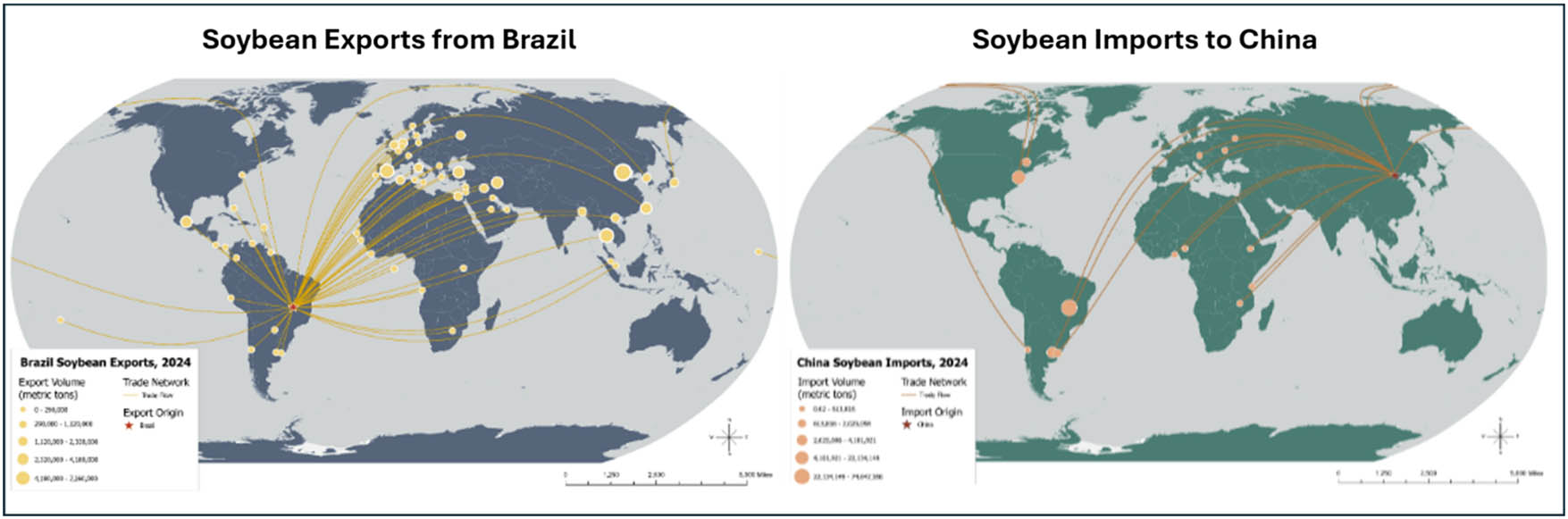
Figure 3
Example student map depicting major soybean export and import relationships. Map description by student: The exporter map of soybeans from Brazil illustrates how Brazil is a global provider of soybeans. Brazil exports soybeans to all countries in North America, many countries in South America, a lot of countries in Europe, Eastern Asia, and along Africa’s coast on the north, south, and west. The importer map of soybeans to China shows that it meets its import demands from a few sources. The largest being from Brazil and the United States of America in the 22–74 million tons range.
Source: Author’s contribution.
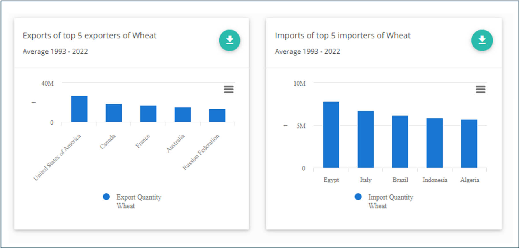
Figure 4
Top wheat importer and exporter charts (FAOSTAT). The top five exporters of wheat based on average production from 1993 to 2022 are the United States, Canada, France, Australia, and Russia. The top five importers over the same time period are Egypt, Italy, Brazil, Indonesia, and Algeria.
Source: Author’s contribution.
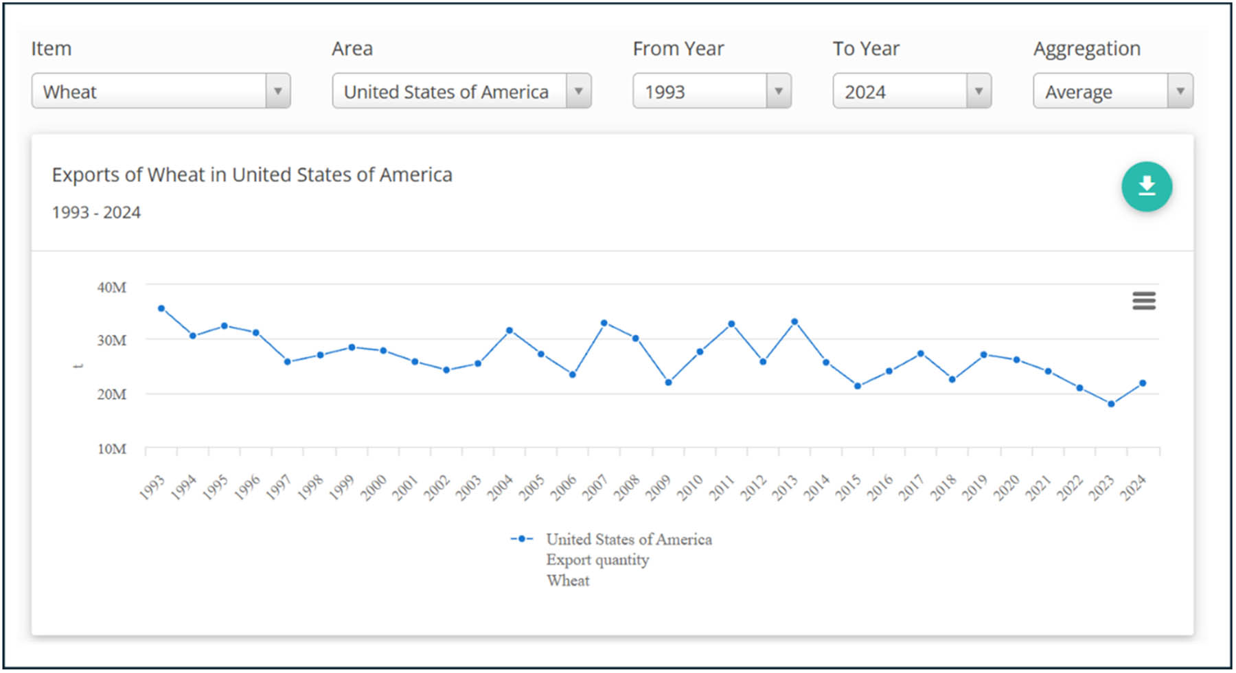
Figure 5
Visualizing change in wheat exports over time for the USA (FAOSTAT). Example student chart description: In contrast (to a chart of Egyptian wheat imports), the exports of wheat from the United States show a more variable and cyclical pattern rather than a steady trend. In the early 1990s, exports were relatively high, around the mid-30 million ton range, but they declined somewhat in the late 1990s and early 2000s. From the mid-2000s onward, exports fluctuate significantly, with periodic peaks (around 30–35 million tons) and troughs (closer to 20–25 million tons). This variability reflects changing global market conditions, competition from other major exporters, and shifts in domestic production and demand.
Source: Author’s contribution.
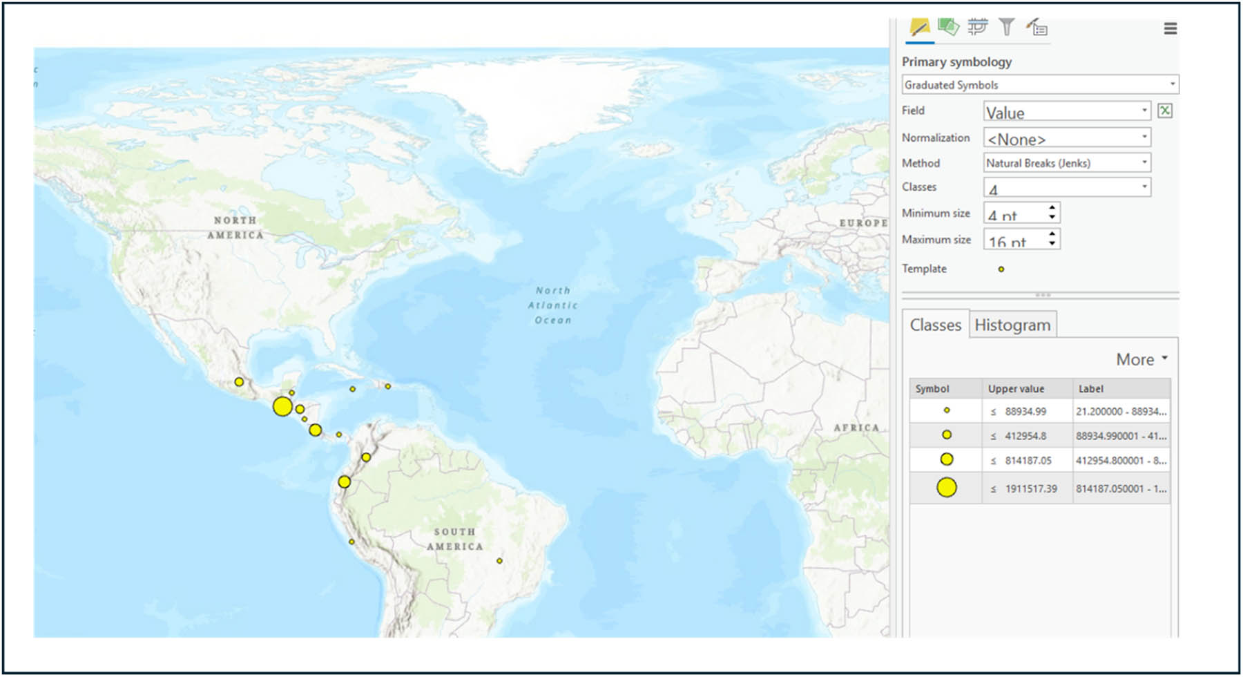
Figure 6
Example of graduated symbology for capital cities in ArcGIS Pro. Screenshot from the assignment tutorial for how the graduated symbology of the country capital cities based on import/export amount should look like.
Source: Author’s contribution.
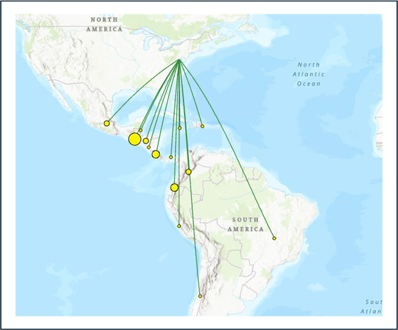
Figure 7
Example of result from using the XY to Line tool. Green lines connect the origin/destination country capital with the graduated values of the import/export partners.
Source: Author’s contribution.
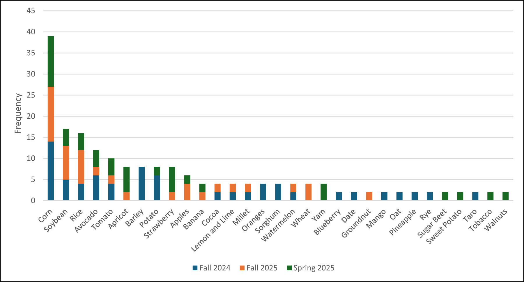
Figure 8
Crop selection choices of students by semester. While the major crops of corn, soybean and rice were the most frequently chosen by students, a wide variety of other less common crops were also chosen by students. Some interesting choices include taro, date, yams, and cocoa. The wide variety of student crop selections shows that students took advantage of the freedom in the assignment to select their own crop.
Source: Author’s contribution.