
1. Introduction
Every day we make decisions about which foods to eat, and where to buy them, often without considering the complex systems that shape these choices. Behind each food at the supermarket, there are environmental, economic, historical and geographic factors that have structured, and continue to structure, the geography of crops. One way we can explore these patterns is by using geographic mapping tools. These tools enable students to visualize and analyze the spatial patterns of the food system, fostering a deeper awareness of how geography shapes what we eat and where it comes from. Given the inherently relational nature of these patterns, network analysis constitutes a particularly appropriate methodology for representing the connections among places, commodities, and trade relationships. Through hands-on engagement with real-world trade data, this visualization activity invites students to question their assumptions and develop a richer understanding of how global crop networks connect the world.
This trade network visualization activity was designed as one of five mapping activities in a lower-level undergraduate general education course on the geography of crops. This activity has been used in both in-person and online classroom settings at a large state university. The typical course enrollment is roughly 15 students in the in-person setting and 40 students for the online setting. Since this course fulfills a general education requirement, students register from all years and a wide range of majors such as Computer Science, English, Business Administration, History, and Geography.
While this agricultural trade network activity has been tailored to this specific course format and audience, there are some common challenges and strategies learned from this activity that could be useful to other instructors. Challenges include introducing students from a wide range of backgrounds to network concepts and technical mapping skills, providing interesting and intuitive examples of networks, and overcoming technical difficulties for students using ArcGIS Pro for the first time. Strategies to overcome these challenges include scaffolding of content knowledge and mapping assignments, students autonomy in selecting the crop to investigate, and providing video tutorials rather than written instructions.
The article is structured as follows. The Goals section discusses the course background and the pedagogical approach. The Setup section outlines the recommended reading materials and discusses differences in conducting this activity for in-person vs online classroom settings. The Procedure section outlines the specific steps needed to create the visualization of an agricultural trade network using data from the United Nation’s Food and Agriculture Organization (FAO) online database and also discusses grading criteria and adaptation for more advanced students. Finally, the Lessons section discusses reflections from both students and the instructor on the activity.
2. Goals
The primary goal of this assignment is for students to construct and analyze an agricultural trade network map, developing an understanding of how global trade relationships connect places through the exchange of agricultural commodities. Using data from FAO’s FAOSTAT database and mapping tools in ArcGIS Pro, students create two maps based on a crop of their choice from the FAOSTAT database. The first map highlights the trade connections of a leading exporter for the selected crop, while the second map depicts the trade connections of a leading importer of that same crop (see examples in Figures 1–3).
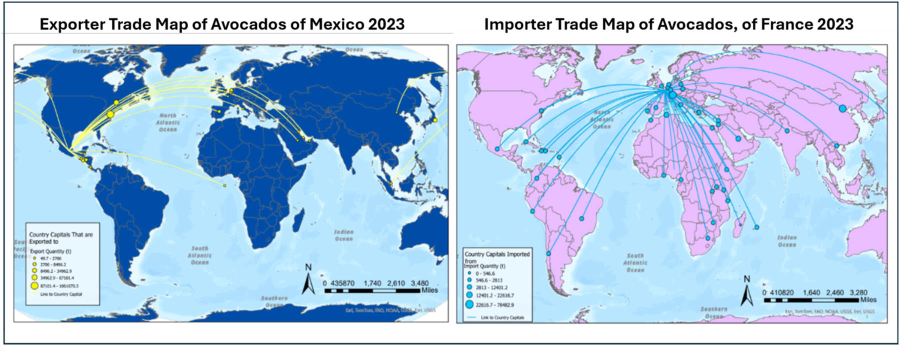
Figure 1
Example student map depicting major avocado export and import relationships. Map description by student: The export map shows that Mexico exports avocados to a wide range of countries, but most of these markets are concentrated in the Northern Hemisphere, especially in Western Europe and North America. The import map shows that France imports avocados from a highly diverse set of countries across the world, indicating a global and well-dispersed supply network.
Source: Author’s contribution.
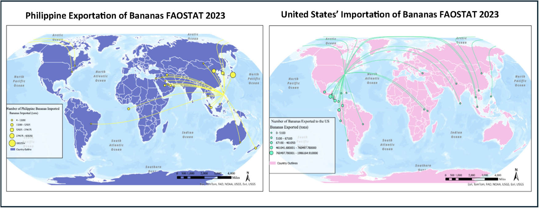
Figure 2
Example student map depicting major banana export and import relationships. Map description by student: For the map regarding Philippine exportation of bananas, one of the biggest patterns I noticed was that they tend to export bananas primarily to other East Asian countries. For example, one of the biggest recipients of Philippine bananas is Japan, likely due to established trade relations and closer geographical proximity. As for the map regarding the United States’ importation of bananas, similar to the Philippine exportation map, there appears to be a regional pattern in terms of where the United States imports bananas from. It seems that the largest exporters of bananas to the United States are primarily located in Latin and South America, with top producers such as Guatemala and Costa Rica being amongst the main countries the United States imports from.
Source: Author’s contribution.
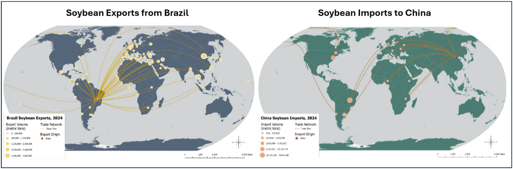
Figure 3
Example student map depicting major soybean export and import relationships. Map description by student: The exporter map of soybeans from Brazil illustrates how Brazil is a global provider of soybeans. Brazil exports soybeans to all countries in North America, many countries in South America, a lot of countries in Europe, Eastern Asia, and along Africa’s coast on the north, south, and west. The importer map of soybeans to China shows that it meets its import demands from a few sources. The largest being from Brazil and the United States of America in the 22–74 million tons range.
Source: Author’s contribution.
2.1. Course background
This trade network mapping activity was designed as one of five mapping assignments for an undergraduate general education course. The course is designed to combine learning about the biological characteristics of crops with geographic tools and concepts in order to analyze geographic patterns of agricultural production. Since the course fulfills a general education requirement, the curriculum emphasizes broad coverage of many topics rather than in-depth specialization. Over a 15-week semester, the course covers five modules starting with the basics of plant biology and geography, followed by the origins of agriculture, modern global agricultural production systems, agricultural trade networks, and food security, and finally current challenges such as climate change and agriculturally driven deforestation.
This activity has been used in both in-person and online classes at a large state university. Class sizes are approximately 15 students in-person and 40 students for the online section. Since the course fulfills a general education requirement, students from many different majors and class years take the course. Majors of past students include Computer Science, English, Business Administration, History, and Geography.
The 15-week semester is divided into five 3-week modules. This activity is assigned as part of the fourth module on agricultural trade and food security. The placing of this module is deliberate so that earlier modules build students’ knowledge of agricultural and geographic concepts. Previous mapping assignments include mapping the quantity of production, yield, and area harvested as well as the change over time for each of these statistics. These maps introduce the students to using the FAOSTAT database and ESRI’s ArcGIS Pro prior to this activity. In addition, prior to this activity, students have background knowledge on the biological features of different types of crops, how climate influences crop distribution, the places of origin and leading producers of the most important global crops, and the different types of agricultural production systems.
Due to the course emphasis on breadth over depth and the wide range of backgrounds of students taking it, this activity introduces the concept of networks in a necessarily limited way. This mapping activity allows students to visualize a network, but it does not incorporate formal network analysis. A very simple introduction to the concept of networks and network analysis is provided in the recorded lecture for the activity’s module, but further instruction in network analysis is beyond the goals of the course. Thus, there is significant room to incorporate additional network concepts into this activity if it were to be adapted for more advanced students.
2.2. Pedagogical approach
The learning outcomes for the course involve specific goals in the areas of content, critical thinking, and communication. For content, at the completion of the course, students should be able to (1) explain fundamental concepts relating to earth systems and global agriculture and its evolution over time, and (2) describe the botanical aspects of the major crop categories, their places of origin, and the geographic processes, both physical and human, that influence the geographic distribution of crops. For critical thinking, students should be able to analyze and interpret how the geography of crops relates to current food system issues and research topics. Finally, for communication, students should be able to demonstrate and apply writing, mapping, and presentation skills to the geography of crops.
In order to achieve the learning outcomes for the course, the pedagogical approach is inspired by constructivism and aims to engage with the foundational knowledge that students bring into the course (Baviskar et al., 2009). Constructivism is a learner-centered approach that promotes knowledge construction through active engagement, problem-solving, and reflection. In the post-module reflections, some students share how their understanding of the global food system has changed as a result of making the trade network visualizations (see section on Student Reflections). For example, most students are not aware of the long history of agricultural trade and how it shapes the geography of crops both past and present. Hands-on activities, which challenge these mental models, such as the mapping of agricultural trade patterns, are an important part of the teaching approach. In terms of constructivism, this type of information creates cognitive dissonance, which encourages them to update their mental models of food systems to incorporate this new information.
This activity also relates to the broader network and geographic pedagogy literature on the importance of visualization in teaching. In teaching the geography of crops, it is important to relate how the spatial patterns of agricultural production relate to spatial distribution of environmental factors (e.g., climate, weather, river systems, landforms, etc.) as well as how economic and political geography shape the patterns we observe. With the current availability of geospatial technologies and publicly available agricultural datasets, mapping tools and spatial data can be used to teach the geography of food and agriculture in an effective, engaging manner (Kerski, 2020). Similarly, studies on network pedagogy have highlighted the important role that visualization plays in teaching networks. Chyzh (2022) noted how teaching networks and network visualization cannot be mutually exclusive. The specific type of network visualization used is geographic network layout, where the network is projected onto geographic space rather than in a unitless topological space. The use of a geographic layout is consistent with the other content in this geography course, as well as the growing geographic literature on geographic networks or spatial social networks (Uitermark and Van Meeteren, 2021; Andris and Sarkar, 2022).
3. Setup
The procedure for this activity varies slightly depending on if the classroom setting is in-person or online. In both types of classroom settings, students were asked to read the recommended readings and watch the recorded lecture. For an in-person setup, the instructor can walk through the steps on the main classroom screen, provide a handout with step-by-step instructions, and check on student’s progress as needed. In addition, students were encouraged to work with their neighbors during the class period. Pairing up students, particularly with mixed levels of technical skills, can be helpful since students may be more comfortable asking peers for help. For an online setup, a video tutorial was recorded by the instructor. Students in the online class were able to attend office hours or email questions to the instructor if they needed additional help with the activity.
The instructions for this activity were designed assuming that students have no prior experience using ArcGIS Pro, which is available to students in the course through the university’s apps platform. The estimated time for students to complete the activity is between 1 and 2 h depending on their proficiency with ArcGIS Pro. The time needed for the instructor to walk through the activity is between 30 min to 1 h. The recorded video tutorial for this activity is 42 min.
3.1. Reading and lecture materials
There are three required readings and a recorded lecture in Module 4 that provide the foundation for the mapping assignment. Two of the readings focus on the geography of agricultural trade (Fader et al., 2013; D’Odorico et al., 2014), while the third reading explores how places are connected through the historical centers of origin of modern crops (Khoury et al., 2016). The D’Odorico et al. (2014) article is especially helpful for preparing students for the activity because it uses trade data from the same FAOSTAT database that students use to create their maps.
The recorded lecture is titled “How do Geographers Think About Agricultural Trade?” This lecture provides a broad introduction to both qualitative and quantitative approaches that geographers use to examine trade patterns. For the qualitative perspective, we discuss global production networks, while for the quantitative perspective, gravity models and network analysis are discussed.
When introducing network analysis, we discuss how quantitative network science emerged from mathematical graph theory and was also advanced by sociologists to examine interactions between individuals and broader social structures (Borgatti et al., 2009). Students learn how networks consist of two components: nodes and edges, which can be defined in a variety of ways allowing network methods to be used across disciplines from biology, physics, and computer science. For example, nodes can be defined as individuals, cities, countries, cells, or proteins, while edges can be defined as a binary interaction or as a quantifiable relationship such as monetary value, volume, or frequency.
In the materials to prepare students for this activity, networks are situated as one of several approaches for the study of geography and agricultural trade. Students gain a basic understanding of the origins of networks and how a network can be defined through nodes and edges. Students are also aware of the connections between places through agricultural trade and the historical movement of crops from their centers of origin over time.
4. Procedure
This section outlines the main steps needed to conduct the agricultural network visualization activity. Students start by identifying the five largest importers and exporters for their crop of choice. Then students download the trade data for one of the largest importers and one of the largest exporters to use for their maps. Next, students load the data into ArcGIS Pro and join the trade data with points of the capital cities for each country. Then students create lines connecting the importing and exporting partners. Finally, students create a map layout to export with the appropriate map elements.
Step 1: Choose crop and identify largest importers/exporters
For this activity, the first step is for students to choose which crop they will map in this activity. Students seem to appreciate the freedom to choose any crop as evidenced by varied crop choices over the past three semesters I have conducted this activity (Figure 8). Once they have selected their crop, then students open the FAOSTAT website (https://www.fao.org/faostat/en/#data) and find the section with trade data. In order to ensure that the data the students download have a sufficient number of trade connections to map, students use the visualization tools on the FAOSTAT website to identify the top five importers and exporters of their chosen crop (Figure 4).
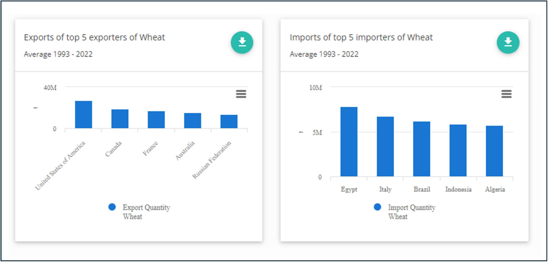
Figure 4
Top wheat importer and exporter charts (FAOSTAT). The top five exporters of wheat based on average production from 1993 to 2022 are the United States, Canada, France, Australia, and Russia. The top five importers over the same time period are Egypt, Italy, Brazil, Indonesia, and Algeria.
Source: Author’s contribution.
After identifying the largest importers/exporters for their crop, students choose one importing country and one exporting country to use for their two trade connection maps. For each chosen country, students then look at the long-term pattern in imports or exports, again using the visualization capabilities on the FAOSTAT website (https://www.fao.org/faostat/en/#data/TCL) in order to contextualize temporally the trade patterns (Figure 5). Students submit the line charts for the imports and exports along with a short description of the patterns they observe as part of the assignment.
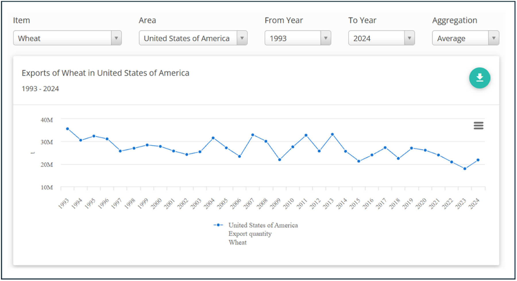
Figure 5
Visualizing change in wheat exports over time for the USA (FAOSTAT). Example student chart description: In contrast (to a chart of Egyptian wheat imports), the exports of wheat from the United States show a more variable and cyclical pattern rather than a steady trend. In the early 1990s, exports were relatively high, around the mid-30 million ton range, but they declined somewhat in the late 1990s and early 2000s. From the mid-2000s onward, exports fluctuate significantly, with periodic peaks (around 30–35 million tons) and troughs (closer to 20–25 million tons). This variability reflects changing global market conditions, competition from other major exporters, and shifts in domestic production and demand.
Source: Author’s contribution.
Step 2: Downloading datasets
While step 1 is an easy way to get a sense of the top exporting and importing countries for a given crop, it does not help us understand the network of trade relationships for top importing or exporting countries. To map the trade connections between countries, we will need to use the detailed trade matrix data again from FAOSTAT (https://www.fao.org/faostat/en/#data/TM). Students are instructed on the correct parameters to use when downloading the data. It is particularly important that they change the country code parameter to ISO2 when downloading the data. When students later perform the spatial join between the agricultural trade data and the shapefile with the capital cities for each country, the country codes need to be in the same format in order for the join to work properly. Students are also provided with the coordinates for each country’s capital city as a csv file (see activity repository link). Students are instructed to save their data files so that they are accessible when they open ArcGIS Pro.
Step 3: Join trade data with country capital points
Now that students have located and downloaded the data they can start mapping the network in ArcGIS Pro. Students are instructed to create a new project and map in ArcGIS Pro. Then they add the csv file with the coordinates of the capital cities for each country and use the “Display X Y Data” command to project these points onto the map.
Next, students add the FAO data to the map project. If they followed the directions for the FAO data and download correctly, then they can use the ISO2 country codes (which is a field common to both the FAO data and the country capital coordinates file) to perform a spatial join. However, it is common that students forget to change the country code so the spatial join attempt fails. If students get stuck here, the instructor can check the FAO data file and direct the student to redo the data downloading steps of the activity.
In the spatial join dialog box, students need to uncheck the “keep all target features” box, in order to see only the pairs of countries for which trade relationships exist. Once the FAO trade data have been joined to the country capital points, students can adjust the symbology of the points to reflect the magnitude of trade (Figure 6).
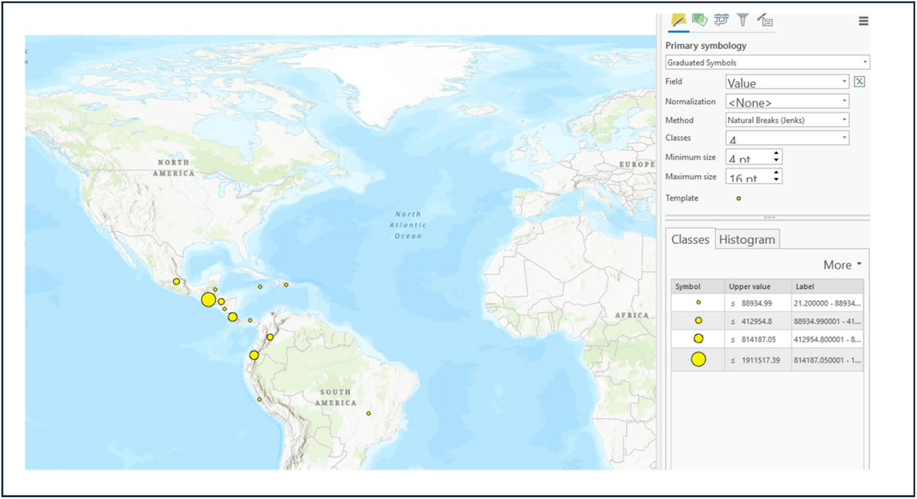
Figure 6
Example of graduated symbology for capital cities in ArcGIS Pro. Screenshot from the assignment tutorial for how the graduated symbology of the country capital cities based on import/export amount should look like.
Source: Author’s contribution.
Step 4: Create lines linking importing/exporting countries
While we can see the quantity of trade by graduating the size of circles on the map, it is still difficult to visualize the network of flows between the origin and destination countries. In order to improve the quality of the map, students need to add lines connecting the importing and exporting countries. The first step in creating the connecting lines on the network map is to add additional fields to the attribute table for the country capital layer. These fields will reflect the coordinates of the country capital for either the importing or exporting country of interest chosen by the student. Students create a field for the longitude as well as the latitude of the relevant capital city and populate the same value for all rows in the attribute table. Once those fields have been added, they can use the “XY to Line” tool. Students need to select the appropriate fields for the origin and destination of the lines. Once the “XY to Line” tool runs successfully, students will see a new feature layer appear (Figure 7).
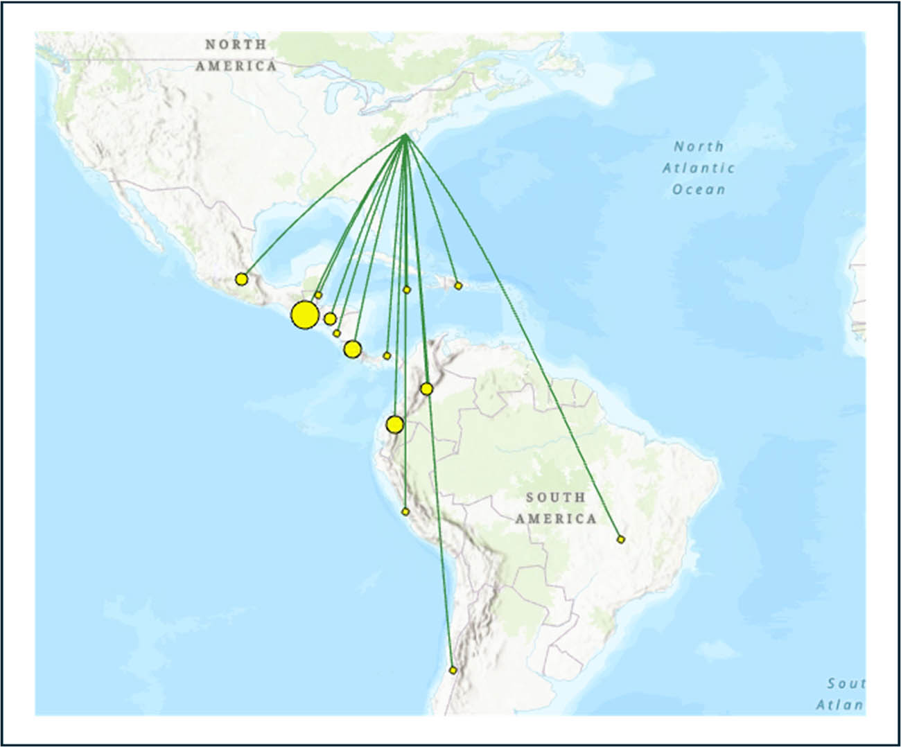
Figure 7
Example of result from using the XY to Line tool. Green lines connect the origin/destination country capital with the graduated values of the import/export partners.
Source: Author’s contribution.
Step 5: Create map layout and add map elements
Once students have successfully run the XY to Line tool, they add a new map layout page. Then they can format the map layout to include the relevant map features such as a scale bar and legend. Students repeat the same steps to create a second map of the trade network connections for the remaining importer or exporter of their crop. Finally, students export the two map images (see examples in Figures 1–3) and insert them into the assignment outline. Finally, students write their own brief description of the patterns they observe in each of the maps they created.
4.1. Grading
Grading for this assignment is based on the completion and quality of the two maps, as well as the completion and quality of the description of the patterns they observe in each map. Students are expected to make maps that are legible, correctly use the join feature in ArcGIS Pro, and include appropriate map elements (e.g., scale bar, title, legend, and unit labels).
4.2. Adaptations for more advanced students
There are several ways that this activity could be adapted to teach students about more advanced network concepts with additional materials and technical support. For example, additional lecture material could be added to discuss network concepts such as centrality, communities, and resilience to shocks. For a graduate level course, more recent scientific articles that use network analyses on FAO trade data could be included in the reading materials. Some examples of recent studies are by Jafari et al. (2023) or Dupas et al. (2022), which analyze the entire aggregated agricultural trade network, while studies by Fair et al. (2017) and Chen and Zhao (2023) examine network patterns in specific crop networks. In addition, MacDonald et al., (2015) provides an example of how changing the network weight based volume, monetary value, or calories traded changes the network patterns observed. Finally, programs other than ArcGIS Pro could be used for this activity. For example, if ArcGIS Pro licensing is not available, then QGIS could be used instead. There are also programs more specifically designed for network analysis such as Gephi, SNOMAN, or R. For an advanced undergraduate audience, the SNOMAN platform would likely be the easiest for students since it requires little training to use and allows students to compare geographic and network topology layouts side by side (Jin et al., 2025), while for a graduate-level audience, R would likely be the most appropriate. In order to examine more advanced network features such as centrality or communities, additional data from FAOSTAT on the entire trade network would need to be downloaded and processed by the instructor prior to visualization by the students.
5. Lessons
This activity is designed for undergraduate students who have not been previously introduced to the concepts of networks, so the lesson goals for the network features and processes are basic, but still important. The first lesson that an instructor can emphasize is the use of networks to describe agricultural trade patterns. By thinking of agricultural trade as a network, we can gain insights into patterns and vulnerabilities. As the amount and importance of agricultural trade increases in the future (Fader et al., 2013), these patterns may become more important for researchers and policymakers to understand.
Additionally, the network features and processes that instructors can highlight are limited by the ego-centric nature of the crop maps created by this activity. However, one pattern that is apparent for most crops is the difference between the intensive and extensive margins of trade. For the majority of crop and country combinations, exporters have a larger number of trade partners, highlighting the extensive margin of trade. On the other hand, importers tend to have fewer and more intense trade partners, illustrating the intensive margin of trade (Jafari et al., 2023).
Allowing students to choose their own crop is an important part of the pedagogical approach for this activity and students have demonstrated a large amount of diversity in the crops they choose to map (Figure 8). Individual crop networks have been shown to have a large amount of diversity in terms of their network properties such density, clustering coefficient, diameter, and centralization (Torreggiani et al., 2018). If instructors would like to highlight a specific network feature or process, the choice of crop commodity may need to be limited by the instructor.
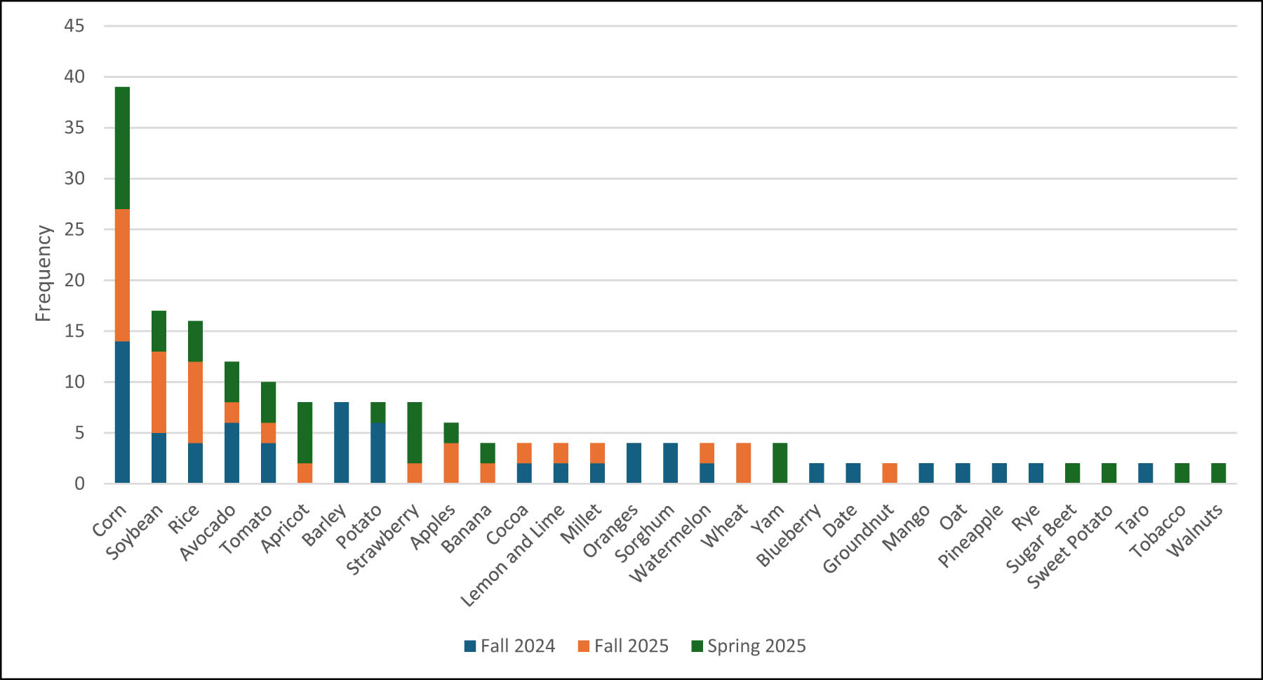
Figure 8
Crop selection choices of students by semester. While the major crops of corn, soybean and rice were the most frequently chosen by students, a wide variety of other less common crops were also chosen by students. Some interesting choices include taro, date, yams, and cocoa. The wide variety of student crop selections shows that students took advantage of the freedom in the assignment to select their own crop.
Source: Author’s contribution.
6. Reflections
6.1. Student reflections
Following the completion of the trade network visualization activity, students were asked to reflect on the content for the entire 3-week module. Students can reflect on any of the readings, lectures, or activities they choose. In these reflections, some of the students chose to discuss their experience with the mapping activity. Although it is not a systematic sample of reflections, I grouped together the student reflections on the mapping assignment by theme to illustrate what students learned from the activity.
Two main themes emerge from the student reflections. The first theme is connectivity. Students report having a basic understanding of trade connections prior to the course material and activities; however, they did not fully appreciate the density and complexity of the connections created through agricultural trade. Through the reading materials they also learn about how network connectivity can not only enhance resilience but also raise vulnerability to external shocks (student reflection 1).
Student reflection 1:
“Before starting this module, my perception of agriculture was fairly basic—I thought primarily of local farming and individual communities. I didn’t fully grasp the extent to which our global food systems are interconnected or how deeply they’re rooted in history… Previously, I thought the food trade was simply richer countries importing from poorer countries. Now I see how critical international trade is due to internal limitations like land, water scarcity, or environmental constraints. This challenged my simplistic assumptions and highlighted the complexity and vulnerability inherent in our global food systems.”
Greater awareness of the connections between places also helped students see their everyday food choices in a different light. For some students, awareness of these connections also deepened their interest in topics such as sustainability, food security, and social justice (student reflection 2).
Student reflection 2:
“What has changed most for me is my awareness of the interconnectedness of food systems. I no longer see agricultural production, trade, and access as isolated fields, but as parts of a global web shaped by a large scale of factors…Personally, this module has deepened my academic interest in sustainable development, especially in the areas of food access and environmental justice. On a daily level, it’s made me more conscious about where my food comes from, the inequalities embedded in the system, and the need for more transparent and resilient food networks.”
The second theme emerging from the student reflections is the usefulness of network visualization. By working with real data, students were able to gain deeper insights into the otherwise abstract concept of trade networks (student reflections 3 and 4).
Student reflection 3:
“The map assignment for this module allowed me to explore this idea of crop globalization and trade. By mapping the exports and imports of a crop, I was able to visualize how the crop has spread far beyond its native range and been incorporated into the diets of people far from its point of origin.”
Student reflection 4:
“Before this module, I understood trade on a basic level from economics classes, but I had never worked with real data or used maps to visualize these connections. Seeing the FAOSTAT numbers placed on maps made it easier to understand which countries depend on others and how crops move through the world.”
Networks were particularly important for helping students understand how food moves globally through trade. Students were able to understand the interdependencies created through a network of trade relationships, rather than just a bilateral understanding of trade. However, this deepening of understanding also opens the door to new questions and areas of uncertainty for students (student reflection 5).
Student reflection 5:
“Creating the maps was the most transformative part. When I mapped the exporter connections, I saw how one country can supply dozens of others across different continents. The importer map showed the exact opposite pattern, with one country pulling resources from multiple regions. Seeing these networks visually helped me understand that trade is not just about two countries but about a global web of relationships. It made me think about dependency, food security, and how distance does not limit trade the way I expected.
Before this module I never connected geography to trade in such a detailed way. What remains unclear to me is how political factors shape these patterns. I can see the connections on the map, but I still need more knowledge about the economic and policy structures behind them. Even with that gap, the module added value to my academic interests. I am now able to connect food systems, biology, and geography, and this helps me understand global issues with more depth. The module did not just give me facts. It changed how I think about the food in my daily life and how it moves across the world.”
6.2. Instructor reflection
Given the type of class and types of students this activity is designed for, I am pleased as an instructor with the quality of work and reflections of the students. While the activity is basic in how it introduces networks, it is rewarding to see in the student reflections how much just visualizing a network can expand student’s conceptualization of how places are connected through food.
There is a lot of potential to adapt this activity for more advanced students or to tweak it to enhance student learning. For example, one change I would consider for an in-person classroom setting would be to assign the video tutorial prior to the class so that students come to class with a basic network map already made. Then I would use the in-class time, which is traditionally for an in-person tutorial of the activity, to polish and improve the visual aspects of their maps. I would also instruct them to make two or three different variations of their maps and then have other students vote on which variant they prefer. This would provide students another opportunity to reflect on the use of maps as a communication tool and to discuss what surprised them in the feedback from their peers.
Although this activity was developed with this particular course format and audience in mind, the challenges encountered and strategies employed may offer valuable lessons for instructors in other contexts. Challenges I have encountered in this course include introducing students from a wide range of backgrounds to network concepts and technical mapping skills, providing interesting and intuitive examples of networks, and overcoming technical difficulties for students using ArcGIS Pro for the first time. To address these challenges there are several strategies and design principles I have used to make this activity successful.
Due to the wide range of student backgrounds, the activities in the modules prior to this one provide scaffolded opportunities for map making so that students already have some experience with maps in ArcGIS Pro prior to the activity. The food and agricultural content of the course is also scaffolded as well, starting from basic concepts and progressively adding complexity so that students are able to better engage with the concept of agricultural trade networks by this point in the semester. Specifically, in the assignment immediately prior to this activity, students are asked to use the FAOSTAT data to make maps of production, yield, and area harvested for a crop of their choice. Then they have to download additional data to calculate the change over time for each of these statistics.
A second strategy is to incorporate self-direction in student learning and to ground the network concepts in real-world data. Rather than reproducing a specific example, students can explore a crop of their own interest. While some students choose more obvious crops such as corn or soybeans, many students seemed to appreciate the freedom and chose a wide variety of crops (Figure 8). As an instructor this approach is also more interesting for me, as I often learn something by seeing maps of trade connections for crops that have not been submitted before. Additionally, grounding the concepts of networks in real-world data and using mapping visualization tools appears to make these concepts more accessible to students new to these topics. If I were to introduce more advanced network analysis techniques, I would have it come after they have already made a network visualization on their own. That way, they can build on their pre-existing knowledge as emphasized in a constructivist pedagogical approach.
A third strategy is to use video tutorials to overcome technical difficulties using software such as ArcGIS Pro. Video tutorials are much easier for students to understand than step-by-step instructions with screenshots. However, I am careful to provide the tutorial for only one map, while asking them to make another map for this assignment, so that they cannot only blindly copy the tutorial. Video tutorials are particularly critical for an online class format. In the online format, interaction with students is certainly less than in an in-person format. However, since using the video tutorials I have found the quality of maps produced by the students to be very comparable in both class formats as well as the quality of the written reflections.
Finally, the most gratifying aspect for me as an instructor is to see that students look at the foods in their daily life with a new appreciation and perspective as a result of this activity and course. My hope is that these types of insights will stay with them long after they graduate and possibly inspire their future endeavors.
Acknowledgments
I would like to thank Luca Mantegazza for providing feedback on an early draft of this manuscript as well as the reviewers whose comments improved the quality of this work.
Funding information
No funding was in involved in this work.
Author contributions
Lacey Harris-Coble: conceptualization, methodology, software, formal analysis, investigation, resources, data curation, writing – original draft, writing – review – editing, visualization.
Conflict of interest statement
The author has no competing interests to disclose.
Data availability statement
All materials necessary for this activity are available at https://lharriscoble.github.io/teaching/