
1. Introduction
Analyzing and visualizing social networks in a geographic context has become central to research across domains such as human geography, urban studies, public health, and computational social science. Such analysis can reveal the influence of geographical factors (e.g., distance) on various social phenomena; for instance, previous sociological work has demonstrated that physical proximity strongly shapes social tie formation, showing that residential closeness increases the likelihood of marriage and long-term social relationships (Abrams, 1943). More recent research in economic geography and innovation studies similarly emphasizes how geographic proximity facilitates knowledge exchange, collaboration, and network formation within regional innovation systems (Asheim & Gertler, 2006; Balland et al., 2022). Studies of political activism and transnational movements show that geographic borders shape network connectivity and the diffusion of ideas, even in ideologically cohesive groups (Copsey, 2016). Likewise, empirical analyses of collaboration networks among food organizations reveal that geographically proximate actors are more likely to form stable ties (Edwards, 2020). These studies highlight that networks are not formed in social network feature space alone, but are embedded in geospatial contexts that enable or constrain interaction. While many domains increasingly collect geographic and relational data, researchers often lack accessible tools and structured guidance for analyzing these data in an integrated manner. As a result, studies of spatial social networks (SSNs) are frequently conducted as one-off efforts, relying on ad hoc workflows that combine separate GIS and SNA tools. Such projects tend to remain peripheral rather than becoming the core of a methodological toolkit within either discipline.
In terms of training, very few formal higher education courses teach both SNA and geographic information systems (GIS) subjects. This is understandable given the depth needed to develop expertise in either. As a result, students trained in one area often lack the conceptual and technical foundations needed to engage with the other or analyze SSN data. Furthermore, students entering classrooms that teach SSNA have diverse disciplinary backgrounds, including geography, computer science, urban planning, ecology, and social sciences, and have varied training in programming, spatial analysis, statistics, and network theory. Second, existing integrated SNA and GIS tools (typically in Python and R) are typically designed for expert users and require substantial technical setup, scripting, or domain-specific knowledge before meaningful analysis can begin.
2. Goals: SNoMaN, teaching materials, and study
To address these gaps, we developed SNoMaN (Jin et al., 2025), a visual analytics tool for spatial social network analysis. We designed a learner-centered curriculum module for teaching SSNA composed of three progressive, lab-based assignments. Informed by the GIS&T Body of Knowledge and foundational SNA concepts, the labs follow a structured “cookbook” style that guides students from basic interaction and visualization toward more diagrammatic, statistical, and algorithmic analyses.
At a high level, SNoMaN integrates SNA and GIS metrics with interactively linked visualizations (Figure 1). The primary views include a configuration menu (Figure 1a), a sociogram (Figure 1b), which emphasizes the topological structure of a network, and a geographically grounded network visualization displayed on a basemap (Figure 1c). In addition, the tool provides metrics (Figure 1d) and analytic diagrams (Figure 1e) computed on the fly, such as interactive scatterplots for examining relationships between geographic and network measures, including geographic location and network centrality, geographic distance and network distance, and community-level spatial tightness and connectivity density.
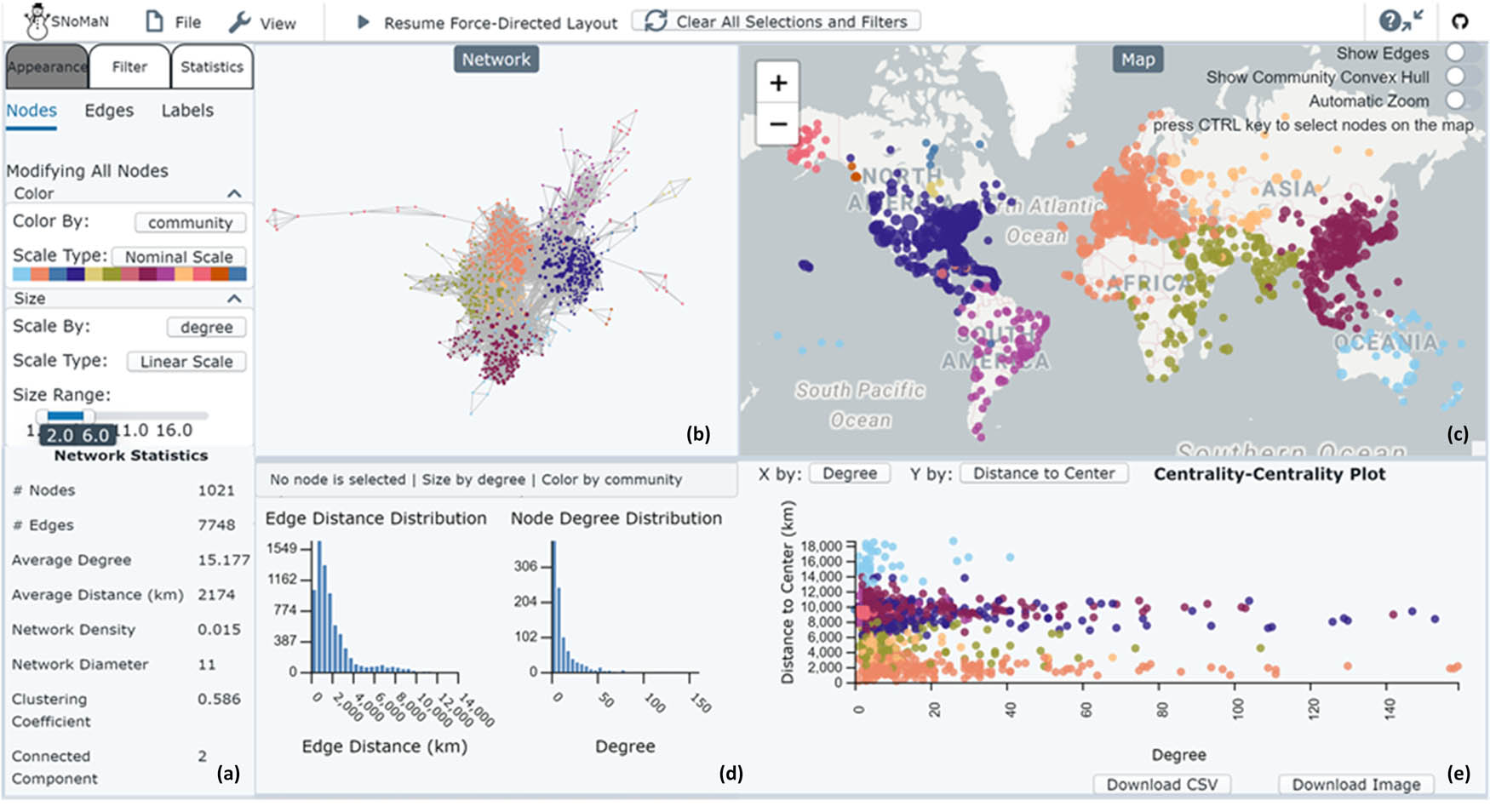
Figure 1
The SNoMaN interface, showing a world flight network of 1,022 airports (i.e., nodes) and 7,748 direct flights (i.e., edges) (OurAirport, 2017). It is subdivided into different elements: (a) is the network statistics panel, (b) is a force directed sociogram, (c) is a map where nodes in the sociogram are mapped, (d) is a panel containing two histograms, and (e) contains a scatterplot. All elements are linked and respond to brushing and filtering.
Source: data from: OurAirport. (2017). Airport, Airline and Route Data. Retrieved from https://ourairports.com/data/.
We implemented this curriculum in eight (n = 8) university courses, containing both undergraduate and graduate students across four countries, and evaluated its instructional impact from three perspectives: student learning experiences and outcomes, instructional reflections and course design, and future applications and improvements. Drawing on qualitative observations and survey-based feedback from instructors, we examined how the curriculum supports the teaching of spatial social network analysis across disciplinary boundaries. Together, these contributions advance both the pedagogy of SNA–GIS integration and the broader use of visual analytics as a learning scaffold in complex, interdisciplinary domains.
This work makes three primary contributions outside of course materials. We demonstrate that geography is a disciplinary keystone for much SSN teaching, but that learners vary by discipline (particularly across computer science, broad social sciences, ecology, geography, and urban planning). Second, we show how the SNoMaN software and companion materials can help fill gaps in curriculum and support one or more weeks of instruction in higher education. Third, we illustrate further evidence of a chicken-and-egg problem in social network analysis of teaching concepts before visual demonstration, or demonstration before concepts (which can de-abstract concepts and likely hold students’ attention). Instructors reported that the learning curve for the software was easy to moderate, and they all planned to use the software again in some capacity in teaching. While there was little evidence that the software was useful to students after classes ended, we hope to explore this in the future.
The SNoMaN software, companion instructional materials, three labs, and tutorial videos are designed to teach these users to use the available views and statistics to help them conduct their exploration and (website link: https://sites.gatech.edu/snoman/software-and-analytical-tools/snoman-software/).
The curriculum is organized around three hands-on lab documents (pdf documents created in Microsoft Word), motivated by both pedagogical considerations (Hugg & Wurdinger, 2007; Kemp et al., 1992) and the structure of foundational knowledge in geographic information science (GIScience) (Prager, 2012) and social network analysis (Carolan, 2013; Marin & Wellman, 2011; Wasserman & Faust, 1994). The labs are designed with progressive difficulty, guiding learners from introductory concepts to advanced analytical tasks. They use the US flight network as a case study; while this is not a traditional social network, we chose it because the average user has some intuition about how this network functions (e.g., the role of large cities and hubs).
3. Setup
The teaching activity can be implemented in both in-person and online formats. Instructors can either adopt the provided teaching materials and deliver the session themselves or invite a member of the SNoMaN team as a guest lecturer (e.g., via Zoom) to introduce the tool, demonstrate its features, and lead class activities. The SNoMaN project team also offers optional training sessions for instructors who wish to become familiar with the software, its applications, and the topic of spatial social network analysis (SSNA) before teaching. All instructional materials are publicly available on the SNoMaN project website (https://sites.gatech.edu/snoman/software-and-analytical-tools/snoman-software/) for instructors who would like to conduct the module themselves.
The activity requires internet access to allow students to access the web-based SNoMaN platform (https://snoman.herokuapp.com/), which runs on standard browsers and does not require any installation. To leverage hands-on interaction, students should bring their own laptops (or one laptop per student pair), or the class should be held in a computer lab.
This activity works best for small to medium-sized classes (approximately 10–40 students), where instructors can provide individualized feedback and encourage insights sharing and discussion. In larger classes, instructors can consider group work (2–4 members), which may help promote collaboration and allow students with stronger GIS or SNA backgrounds to support peers less familiar with the material.
The SNoMaN interface uses a colorblind-friendly palette to enhance visual accessibility; however, instructors should verify that all students can distinguish color encodings used in the visualizations. Alternative textual explanations of metrics or summary tables can be provided upon request for students with visual impairments.
4. Procedure
The activities are designed as a structured, hands-on lab session combining lecture, demonstration, and guided exploration. It can be conducted in a 90-minute to 2-hour class period, over multiple class periods, or even multiple weeks (with lectures interspersed), and with optional extensions for homework or final projects (Figure 2). Students can conduct the work alone, in pairs, or in small groups.
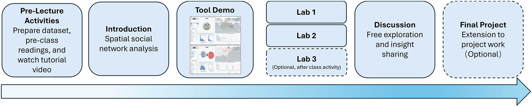
Figure 2
Course module timeline showing the instructional flow, including a preclass activity, module introduction, tool demonstration, three in-class lab exercises, a guided discussion, and an optional extension into the final project.
Source: Authors’ contribution.
These activities can be conceptualized using a “road trip model,” in which the progression may occur at a faster or slower pace. The instructor can stop frequently to explain concepts and tangents in depth (such as a degree distribution), take questions, and explore the same concept with multiple datasets. Or, the instructor can offer less guidance and curation by having students work on labs independently, following written directions. The suggested time ranges are estimated durations and ultimately the instructor can determine the overall time needed for the activities.
4.1. Pre-lecture activities
Ideally, one week prior to the session, instructors can share pre-class readings and materials, including the SNoMaN website, tutorial video, and tool paper (Jin et al., 2025). Although SNoMaN comes with preloaded example datasets, instructors may also encourage students to prepare their own geolocated spatial social network datasets in the required format (available on the website) to explore their own ties (e.g., family member connections and resident locations).
4.2. Class
4.2.1. Introduction (10 minutes to 1.5 hours)
For non-network-focused classes, it is suggested that the instructor provide a short lecture to introduce key network concepts and the motivation for studying SSNs. The instructor can explain conceptual differences between network analysis and GIS, including distinctions such as feature space versus coordinate-based models, relative versus absolute positioning, and varying definitions of terms such as neighbors, clustering, and distance – which have various meanings in spatial vs social systems.
The instructor should ensure that students understand basic network concepts such as sociograms, centrality, degree, and community detection. However, the level of understanding may vary based on the broader goals of the class.
4.2.2. Tool demonstration (15 minutes)
The instructor can then provide a live demonstration of SNoMaN (Figure 1), showing how to load datasets (directed or undirected, weighted or unweighted), navigate the interface, and perform basic interactions such as selecting, filtering, and adjusting visualization parameters. They can also show students the video associated with the tool, which uses a network of Mafia members as a case study to demonstrate key features of SNoMaN.
4.2.3. Guided lab activities (40 minutes to 2 hours total)
Students can work individually or in pairs on two structured lab exercises and a third lab is available and suggested for homework (see Table 1).
Table 1
Structure of the SNoMaN lab modules and covered sections.
| Lab 1 – Visualization Configurations and Interaction |
| Import dataset |
| Customize and interact with networks; compute network statistics |
| Visualize weighted or directed networks; identify important nodes |
| Compute statistics for selected subnetworks |
| Lab 2 – Correlation Analysis on Geographic Impact on Connectivity at Node, Path, and Community Levels |
| Node-level correlation analysis (network centrality vs location) Path-level correlation analysis (network vs geographic distance) Community-level correlation analysis |
| Detecting network communities and mapping results; visualizing community spatial expanse using convex hulls; comparing network density with spatial dispersion and size |
| Lab 3 – Advanced Statistics and Metrics on Geographic Segregation and Connectivity Efficiency |
| K-fulfillment (local connection/disconnection) |
| Flattening ratio (overall spatial tightness) |
| Data assortativity function (degree correlation) |
| Average nearest neighbor plots (community clustering) |
Source: Authors’ contribution.
Lab 1 (20 minutes – 1 hour) Students follow step-by-step instructions to learn the layout and interaction design of the SNoMaN tool and to complete guided exercise questions. To begin, they can either import their own dataset into the tool or explore a preloaded example of a geolocated social network dataset. They then calculate key network statistics (e.g., degree centrality, network density, average path length) and modify the visual encodings of the network – such as node size, color, and layout. Students can make selections, filter nodes and edges by different attributes or time, visualize edge weights and directions, calculate statistics for selected subsets, and identify important or distinctive nodes or regions. The instructor can walk around the room (or check in online) to provide assistance and answer questions while students are in exploration mode. After exploration, the class can reconvene to review and discuss results.
Lab 2 (20 minutes – 1 hour) Students perform more advanced analyses, such as running algorithms to identify social network communities and mapping the spatial extent of these communities. They also examine correlations between community size, spatial dispersion, and network density. The instructor can walk through the instructions together with the class, pausing midway to explain key terminology – such as community detection algorithms and Q-values – and to help interpret visual results, including the clustering significance and overlaps between communities in spatial service or activity areas. After the demonstration and explanation, students work independently to complete the exercises. The session concludes with a group discussion reviewing answers and student observations.
4.2.4. Free exploration and insight sharing (10–15 minutes)
The tool includes five additional example datasets about GitHub collaborations, Mafia connections, food sharing, and US Congressional ties. Students spend time applying the functionalities and features they learned in Labs 1 and 2 to explore these datasets or their own data. Instructors may collect brief written reflections or screenshots of student visualizations as assessment artifacts.
4.3. After-class activity: Lab 3 homework
Instructors may assign Lab 3 as an in-class or after-class activity. This module introduces more advanced spatial-network metrics, such as K-fulfillment and Flattening Ratio (Sarkar et al., 2019), which measure local connection and disconnection patterns and assess the overall spatial tightness of the network. It also includes algorithms for data assortativity and average nearest-neighbor plots, which analyze spatial clustering levels of communities. Because these metrics involve more complex concepts and formulas, students are encouraged to review the relevant readings and reference papers before completing the analysis. If students take the assignment home, the recommended completion time is one or two weeks.
To deepen reflection without introducing additional technical complexity, instructors can include a short discussion or reflection prompt at the end of Lab 2. For example, students could apply the same algorithm to a different dataset and document the similarities and differences they observe, as well as how geographic factors influence social connections under various scenarios (e.g., migration, transportation, or social policy interventions). Additionally, this version can be complemented with in-class discussions or short quizzes on key algorithms and metric definitions to reinforce important takeaways.
5. Overall lessons
The activities described earlier could help students develop an understanding of how geography influences social structures and, conversely, how social connections overcome or shape spatial patterns. Below are a set of example concepts that students explore through the labs.
5.1. Distance decay
Distance decay is a common phenomenon in many real-world social networks where the frequency of connections decreases as the distance between nodes increases (Lani-ado et al., 2018; Lengyel et al., 2015; Liu et al., 2017; Verdery et al., 2012). Typically, it can be illustrated using edge distance distributions. The module teaches students to interpret the distribution and distance decay patterns, recognize anomalies where long-distance connections occur, and evaluate whether geographic distance acts as a cost or a benefit in shaping network connectivity (Figure 3).
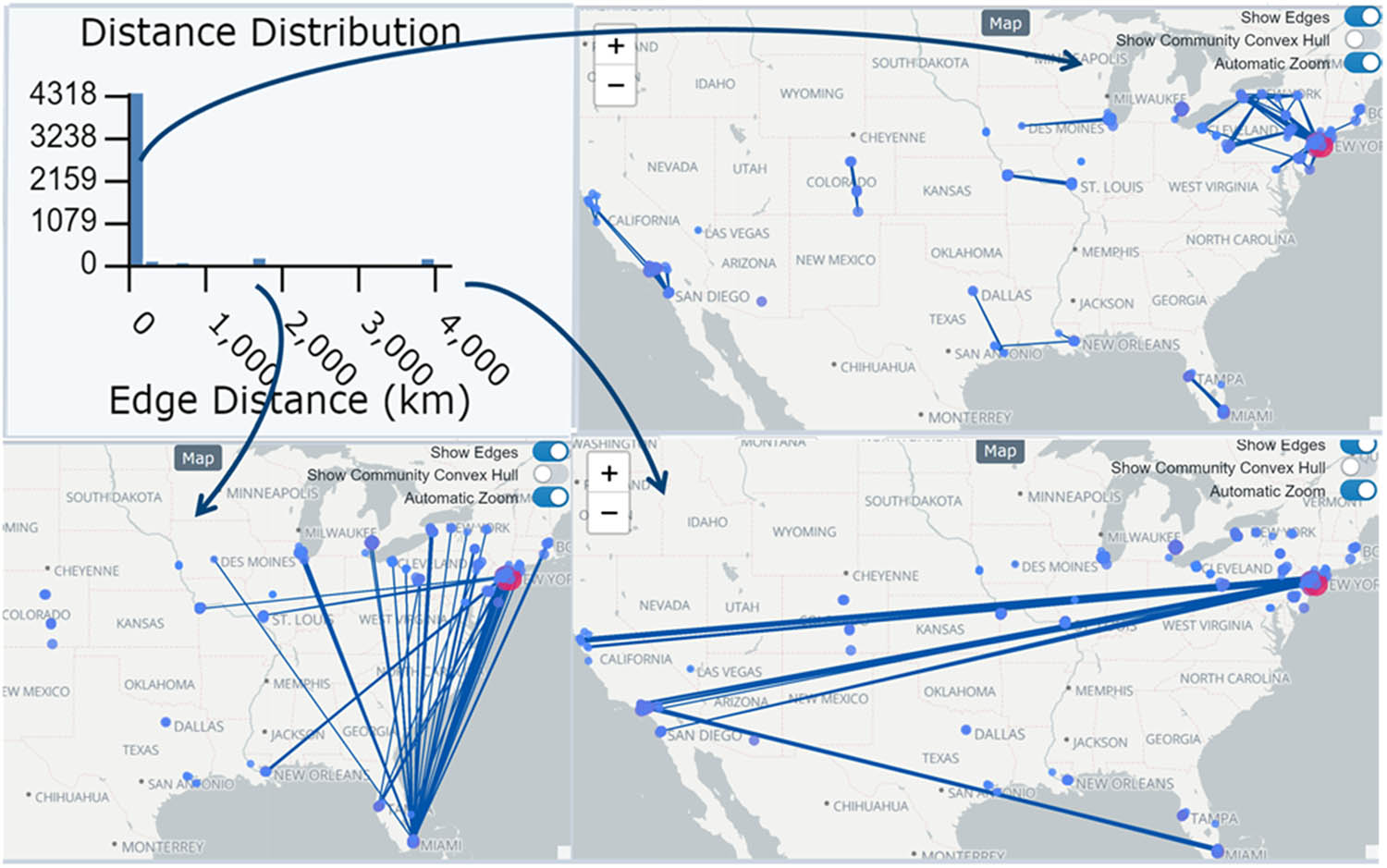
Figure 3
The distance distribution of the mafia social network (nodes represent Mafia members and edges represent criminal associations) (Andris et al., 2021) shows that connection frequency decreases as the geographic distance between members increases, illustrating the distance decay effect. By examining different distance ranges, we can see that most connections are local, with some long-distance connections between Miami and the Northeastern region, and a few rare connections spanning the East and West coasts.
Source: data from: Andris, C., DellaPosta, D., Freelin, B. N., Zhu, X., Hinger, B., & Chen, H. (2021). To racketeer among neighbors: Spatial features of criminal collaboration in the american mafia. International Journal Of Geographical Information Science, 35(12), 2463–2488. Retrieved from https://doi.org/10.1080/13658816.2021.1884869.
5.2. Geographic segregation of social communities
Social communities are often geographically segregated by natural or administrative boundaries (Andris, 2016; Takhteyev et al., 2012). For example, co-authorship networks may show that authors from the same country or language region tend to collaborate more, forming densely connected, geo-bounded social groups (Rechavi et al., 2025; Zheng et al., 2017). The module equips students with metrics and techniques to measure the significance of geographic clustering, helping them determine whether communities are more spatially segregated than expected. For instance, Figure 4 illustrates how communities in the flight network are more spatially clustered than expected. All communities show lower average distances to nodes within the same group compared to a random assignment, indicating strong geographic segregation. The map highlights regional clusters, helping students see examples of regional clusters of network communities.
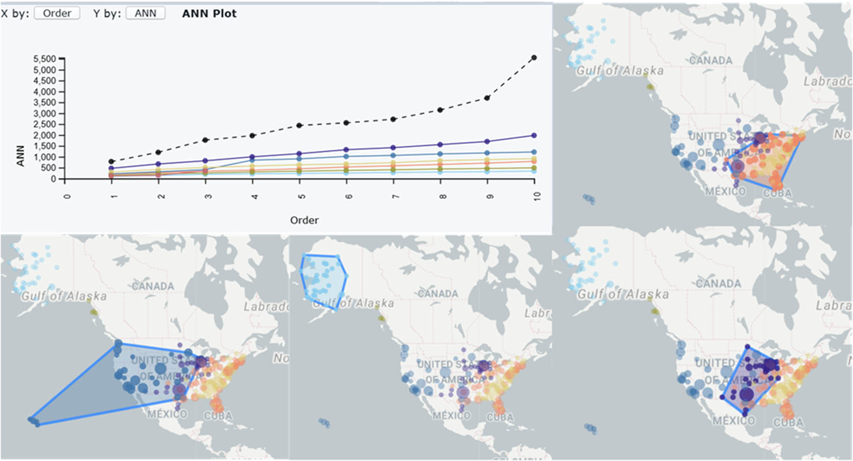
Figure 4
Example of examining geographic segregation of communities in a flight network (OurAirport, 2017) from the module. Convex hulls outline the service areas of detected communities. The Average Nearest Neighbor plot shows which communities (by color) are more or less clustered than expected (shown by position below or above a dashed line, respectively) under random community assignment.
Source: data from: OurAirport. (2017). Airport, Airline and Route Data. aRetrieved from https://ourairports.com/data/.
5.3. Spatial efficiency and local disconnection
In networks where physical distance imposes a cost, spatially efficient connections enhance communication and interaction. Students learn metrics such as k-fulfillment and local flattening ratio (Sarkar et al., 2019) to identify local disconnections and inefficiencies (Figure 5). This allows them to detect anomalies, explore how network structure can be optimized for efficiency, and examine the tradeoffs between local connectivity and overall network cohesion.
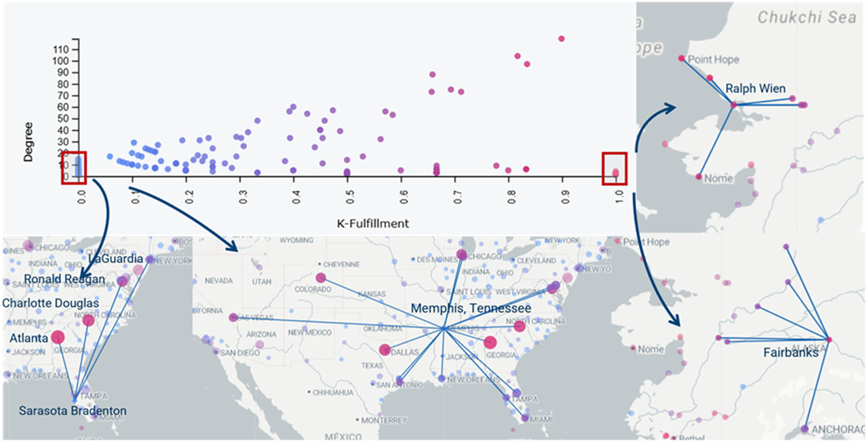
Figure 5
An example in the flight network showing that airports with high K-fulfillment scores are primarily connected to nearby airports, whereas airports with a score of zero have none of their connections to the closest airport.
Source: data from: OurAirport. (2017). Airport, Airline and Route Data. aRetrieved from https://ourairports.com/data/.
5.4. Node location and network centrality
Students can explore how node centrality relates to geographic location using features such as the interactively linked force-directed and geographic layout visualizations. They can learn to identify nodes with special roles – such as high betweenness centrality nodes acting as bridging hubs between regional groups – and analyze how these nodes’ geographic positions facilitate their roles (Figure 6). For example, nodes that serve as connectors may or may not be located in the central area.
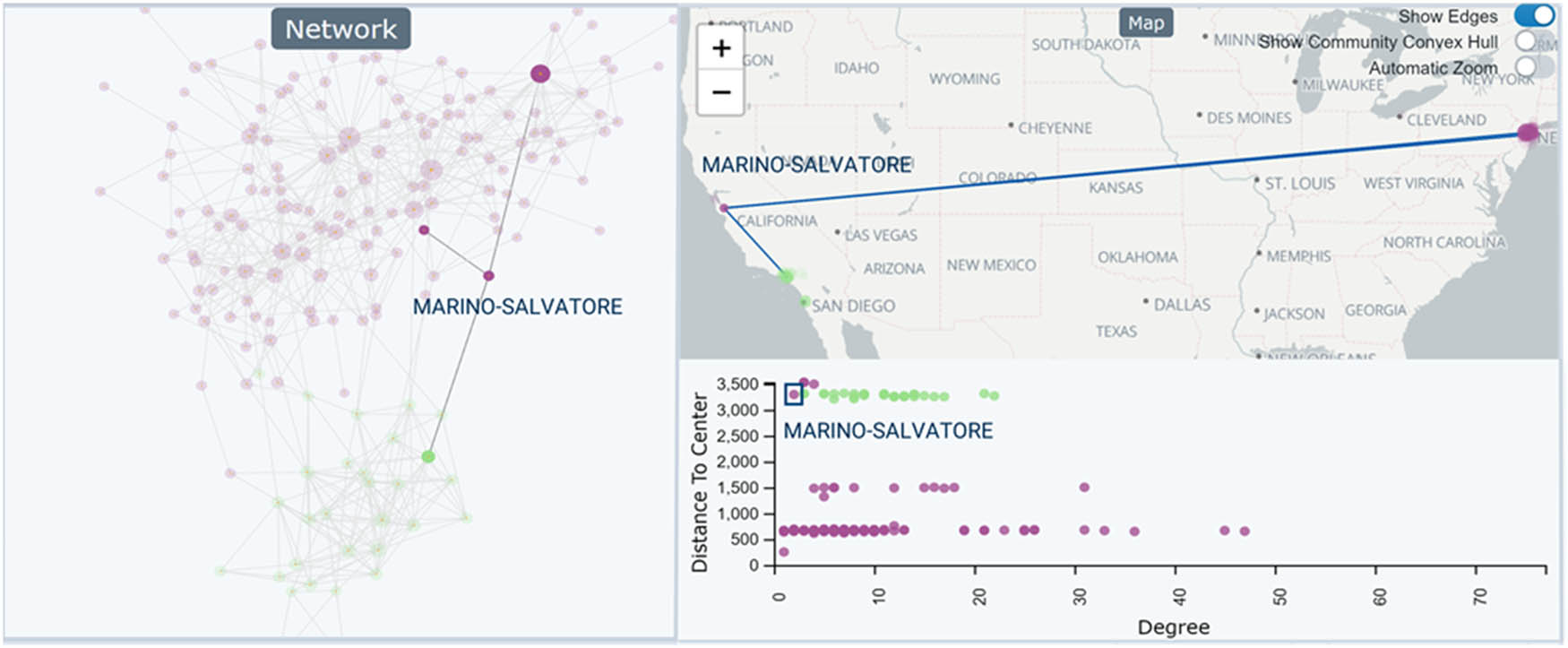
Figure 6
In the Mafia network, Salvatore Marino is identified from the force-directed layout as a bridge between two families. Selecting this node highlights its geographic location on the map: it is far from its own family base but close to the other family it connects to, suggesting a potential remote agency role.
Source: data from: Andris, C., DellaPosta, D., Freelin, B. N., Zhu, X., Hinger, B., & Chen, H. (2021). To racketeer among neighbors: Spatial features of criminal collaboration in the american mafia. International Journal Of Geographical Information Science, 35(12), 2463–2488. Retrieved from https://doi.org/10.1080/13658816.2021.1884869.
The modules include more algorithms and metrics beyond those described here; the examples above are representative of the types of analyses students can perform using the SNo-MaN tool. The overarching goal is to foster awareness of geographic impacts when conducting social network analysis, preventing partial conclusions that ignore spatial context and promoting a more comprehensive understanding of network patterns.
6. Reflections: Eight instructors’ experiences with SNoMaN
6.1. Experiments
We deployed the SNoMaN teaching module at eight universities across four countries (Table 2). Instructors became aware of SNoMaN through various channels, including the research publication (Jin et al., 2025), conference presentations, prior user studies, and professional academic networks. In each case, instructors voluntarily chose to adopt SNoMaN and integrate the module into their courses. At five universities, the course instructors taught the module independently, while at three universities, a member of the SNo-MaN team joined the class remotely via Zoom as a guest lecturer to support the instruction.
Table 2
Courses using SNoMaN teaching module across universities (ordered by first survey return date to last date).
| University | Course number & title | Department | Class size | Student level | Labs used |
|---|---|---|---|---|---|
| University of Michigan | URP 538, UT 438, URP 610 Urban Networks | Urban Planning | 15–20 | Undergraduate & Graduate | Labs 1 &2 |
| Carleton University | GEOM 3005 Geospatial Analysis | Geography | 25 | Undergraduate | Labs 1–3 |
| University of Colorado, Colorado Springs | GES 4070/GES 5070 Geovisualization | Geography & Environmental Studies | 24 | Undergraduate& Graduate | Labs 1 &2 |
| National Autonomous University of Mexico | 74236 Network Analysis in Human Geography | Geography | 7 | Graduate | Not formally completed |
| Georgia Institute of Technology | CS/CP 8803 Interactive Maps & Geovisualization | Urban Planning and Computer Science | 10–22 | Graduate | Labs 1 & 2 |
| University College Dublin | IS 41510 Social Networks Online and Offline | Information and Communication Studies | 35 | Graduate | Labs 1–3 |
| University of Florida | GIS 4113/GIS 6104 Spatial Networks | Geography | 20–25 | Undergraduate & Graduate | Labs 1 & 2 |
| Northern Illinois University | Honors 310 The Making of Modern Science: Natural History, Philosophy and Technology | University Honors Program/Division of Academic Affairs | 19 | Undergraduate | Labs 1–3 (in progress) |
Source: Authors’ contribution.
The courses were offered across a diverse set of departments, including geography, urban planning, computer science, and information and communication studies, with students’ academic backgrounds spanning GIS, geography, urban planning, social sciences, computer science, business, nursing, anthropology, and human–computer interaction. The course levels comprise two undergraduate courses, three graduate courses, and three courses with mixed undergraduate and graduate enrollment.
To evaluate the instructional effectiveness of the module, we emailed each instructor a set of postmodule survey questions, and the instructors replied with responses to each question. We developed this survey based on the SNoMaN team’s experiences deploying the labs in conference-based workshops. We solicited information on course context and learning objectives, teaching experiences, student engagement and reactions, learning outcomes and performance, as well as instructors’ reflections, suggestions, and perspectives on integrating the SNoMaN module into their curricula (Table 3). Two instructors also shared students’ assignment submissions for the lab activities and course projects.
Table 3
Synthesis of instructor feedback by evaluation aspects.
| Evaluation aspects | Findings | Major consensus | Additional findings |
|---|---|---|---|
| Student learning experiences and outcomes | Student difficulties observed | Conceptual confusion between geographic and network concepts was common | Specific barriers included confusion between geographic and network distance (n = 3); understanding community detection (n = 1); translating lab questions into network metrics (n = 1); understanding terms (n = 2); geographic coordinate notation (n = 1); language barriers (n = 1) |
| Student performance | Students generally performed well on basic visualization and interaction steps (n = 3) | Struggles included interpreting advanced metrics (assortative mixing, flattening ratios, betweenness) (n = 1); shortest path in disconnected networks (n = 1); correlation interpretation (n = 1); GIS/SNA core concepts (n = 1); certain Lab 1 and 2 questions (n = 1); some classes were still in progress (n = 3). | |
| Learning curve | No activities or labs were described as “hard” | Tool or labs described as easy (n = 3); moderate for tool/metrics (n = 4 contexts); moderate-to-hard for CS students (n = 1); one course did not formally complete labs (n = 1) | |
| Student takeaways | Only three instructors reported clear takeaways | Students noted networks and geography can mix (n = 1); found SNo-MaN fun and intuitive (n = 1); applied learning to thesis and publication (n = 1); observed geographic influence on network disconnections (n = 1); three courses were in progress | |
| Instructional reflections and course design | Lab modifications | Four instructors reported no major structural changes | One instructor divided the labs into smaller pieces for timing; another collated all three labs into a single assignment and removed steps to allow exploration |
| Proposed instructional adjustments | Timing adjustments were a recurring theme | Introduce earlier (n = 1); introduce later (n = 1); pair students for discussion (n = 1); move to advanced GIS course and follow with R (n = 1); two 75-minute sessions instead of one (n = 1) | |
| Learning objectives using SNoMaN | Geovisualization and network analysis were common objectives (n = 4) | Three instructors emphasized understanding network–geography interplay; one highlighted software design–oriented learning | |
| Alternative teaching approach | Instructors would still teach spatial social networks without SNoMaN (n = 4) | Alternatives included Flowmapper, R with igraph, Python with Net-workX; two instructors would remove SSN modules | |
| Future applications and improvements | Future use | Seven of eight instructors indicated future use | One instructor did not use it in 2025 due to lack of student preparedness but may adopt it in the future if GIS prerequisites improve |
| Suggested improvements | Improve lab clarity and expand support features | Clearer wording (n = 1); more open-ended questions (n = 1); additional built-in datasets (n = 1); more theoretical resources (n = 1); improved map functionality (n = 1); multilingual versions (n = 1); alternative questions for varied backgrounds (n = 1) |
Source: Authors’ contribution.
6.2. Results
Instructor feedback is organized into three overarching themes: student learning experiences and outcomes, instructional reflections and course design, and future applications and improvements (Table 3).
6.2.1. Student learning experiences and outcomes
Students were introduced to SNoMaN with familiar datasets such as friendship ties, co-authorship networks, or community groups. Three instructors observed that using familiar social network examples helped students connect abstract metrics to real-world intuition. Five instructors noted that Lab 1, which introduced basic visualization and simple metrics, was easier for beginners, while Lab 2 presented more challenges as students encountered advanced metrics, such as assortative mixing and centrality measures (Table 3).
In addition, visualization emerged as a central element of student engagement. Four instructors reported that students appreciated the interactive visual feedback provided by SNoMaN, including force-directed layouts, community highlighting, and spatial overlays. One instructor noted that the parallel visualizations of network graphs, geographic maps, and statistical summaries allowed students to see patterns that would be difficult to grasp from tables of numbers alone, such as communities, shortest paths, or bridges in the network. By mapping abstract metrics like centrality onto visual elements, making it easier for students to reason about why certain nodes were influential or why specific communities formed. As previous work notes (Chyzh, 2022; Keena et al., 2016), visualization acts as a cognitive aid in teaching network analysis, making complex relationships more intuitive and facilitating conceptual understanding. One instructor noted that SNoMaN was fun, intuitive, and more accessible than coding in R, reinforcing the role of visual engagement in motivating learning (Table 3). In this way, SNoMaN’s visual analytics supported students’ mental models of network dynamics before formal definitions or mathematical expressions were introduced. This finding aligns with previous educational research suggesting that visualization creates a foundation for a deeper understanding of abstract theoretical constructs (Shatri & Buza, 2017).
Assessments of lab submissions from five instructors indicate that students generally demonstrated a strong understanding of visually grounded network concepts, but encountered difficulties with abstract or algorithmically complex metrics. Across courses, students performed well on tasks of communicating the spatial expansion of social communities, identifying “near strangers” and “far friends.” In contrast, questions involving more advanced concepts, such as standard distance and assortativity, were more frequently answered incorrectly (Table 3).
Seven out of eight classes used Lab 1 and Lab 2 (n = 1 in progress). Three out of the eight classes reported using Lab 3 already or expect to in the future. One class did not use any of the materials, but only introduced the software (Table 3). Instructors were asked to rate the overall student difficulty in terms of learning the tool, completing the labs, and understanding the metrics and algorithms from a range of Very easy, Easy,
Moderate, Difficult, Very difficult. Instructors referred to the tool in general (n = 2), lab 1 (n = 1), and the labs (n = 1) as easy.
They referred to the tool and metrics (n = 1), lab 2 (n = 1), the tool in general (n = 1), and GIS students’ experience (n = 1) as having a moderate learning curve. In one case, moderate-to-hard was used to describe the learning curve experience of the CS students (Table 3).
Differences in students’ disciplinary backgrounds likely affected learning trajectories. Three out of five courses taught in GIS and CS/HCI show students were comfortable interpreting maps and spatial overlays, but frequently struggled to distinguish geographic distance from network distance or to reason about non-spatial network properties such as density or connectivity (Table 3). Conversely, students in the social network course with stronger prior exposure to network concepts were better able to reason about network structure. These observations reflect well-documented challenges in interdisciplinary education (Klaassen, 2018), where students bring uneven prior knowledge and disciplinary assumptions that shape how they interpret shared representations and analytical concepts.
Evidence of behavioral impact emerged through students’ adoption of SNoMaN in course projects and exploratory research tasks. Although only three instructors provided explicit statements about major student takeaways, this limited reporting appears largely attributable to courses still in progress or instructors not yet observing definitive outcomes (Table 3). Nevertheless, qualitative evidence from project-based applications and reported findings in research papers suggests that students developed a more integrated understanding of how geographic and relational structures interact.
In the course CS 8803 Interactive Maps & Geovisualization, students were asked to “create your own geospatial (network) data on a topic that you know well, visualize the geospatial network, and report findings.” Students used SNoMaN to visualize and explore personal social networks and spatial–social relationships that had previously been implicit or unexamined. One student visualized a small personal friendship network (Figure 7a) and reported several insights related to identifying friendship clusters, disconnections, and bridging relationships, noting, “I didn’t realize before mapping it that my Europe-based friends appear as geographically close but lack edges connecting them... the map shows them as near-strangers – close in space but socially disconnected.” Another student created a visualization (Figure 7b) and said: “Using both the network diagram and map allowed me to see that the fully connected components of my friendship networks were concentrated near my residential area.”
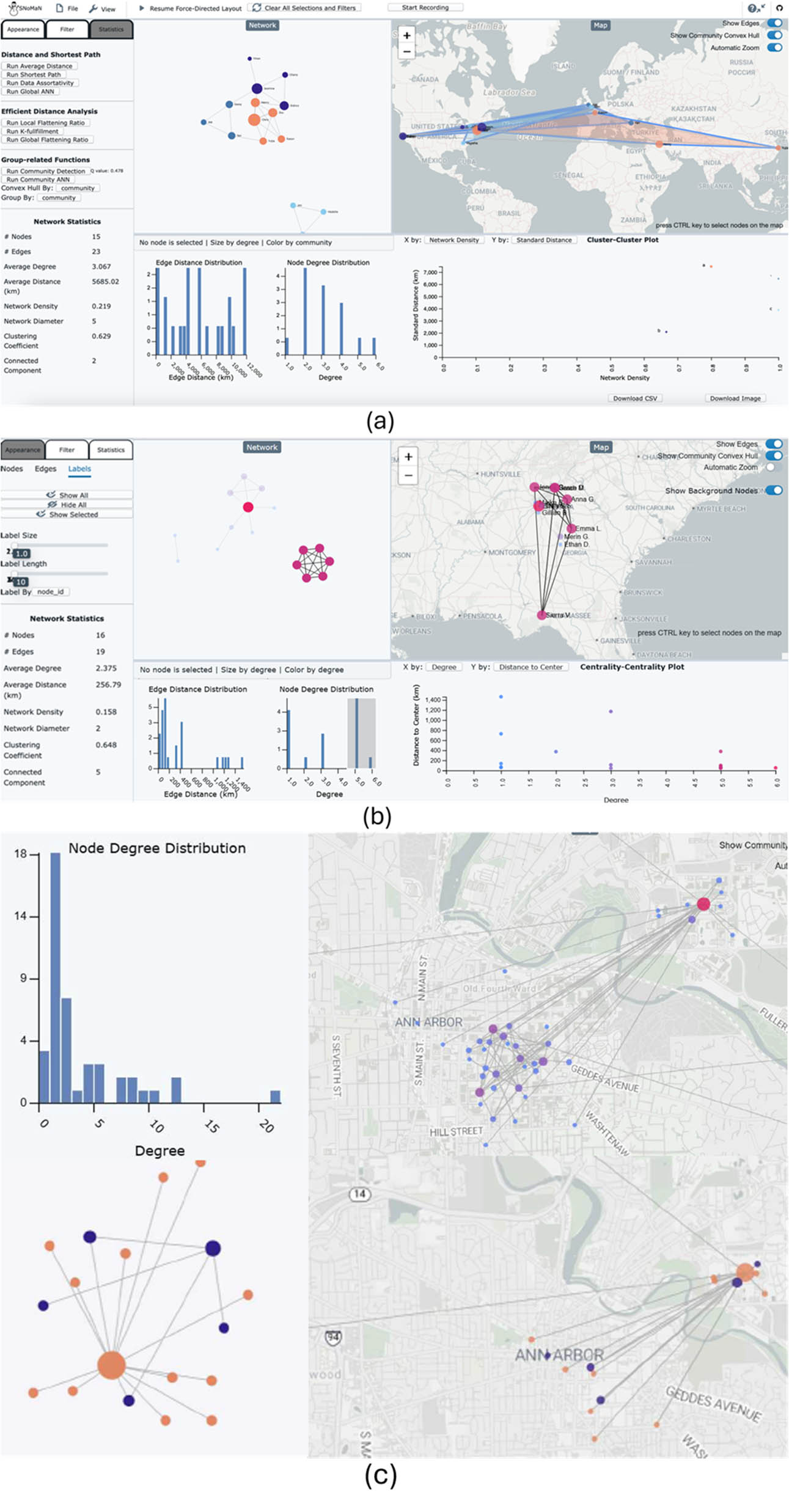
Figure 7
Screenshots of SNoMaN provided by students who used the software outside of the three written labs (for an in-class project on personal friendship networks (a and b) and an open-ended final project (c).
Source: Authors’ contribution.
In the course URP 538 Urban Networks, one student used SNoMaN in their final project to find out answers to discover “the spatial relationship between event advertising boards and student life at the University, and how that relationship affects who experiences all parts of the Michigan campus.” Their visualization outputs, supported by computational metrics, showed that North Campus at the University of Michigan was disconnected from social events hosted on Central Campus – contrary to their initial expectations (Figure 7c).
The integrated design of SNoMaN – combining force-directed network layouts, geographic maps, and statistical summaries within a single interface – was repeatedly identified as a key advantage over multitool workflows by instructors. As one instructor summarized, “Several students remarked that they did not know networks and geography can mix like this and appreciated learning about it.”
6.2.2. Instructional reflections and course design
To address students’ difficulties in understanding SSNA-specific terminology, metrics, and interdisciplinary concepts, four instructors mentioned they would introduce the module later in the syllabus, after they taught foundational GIS or social network analysis concepts (Table 3). One instructor also suggested that providing terminology support earlier in the course, implementing glossaries or printed reference sheets, or moving advanced metrics to homework assignments or projects would help students.
In addition, one benefit of including hands-on activities is to support conceptual consolidation rather than rote memorization (Dumschat et al., 2019; Hooper & Rieber, 1995). However, balancing structured guidance with independent exploratory learning emerged as a critical factor for effective learning. One instructor noted that step-by-step guidance and exercise questions helped students understand the applications of metrics and the algorithms. One instructor divided the labs into smaller pieces to give students more time to work on each section, while another instructor collated all three labs into a single assignment and removed some steps to allow students to explore (Table 3). This approach appeared to foster deeper engagement for some students, particularly those with prior GIS experience, who benefited from the opportunity to test hypotheses and observe the effects of parameter changes directly.
All eight instructors said that SNoMaN aligned well with their broader course learning objectives, and seven said they would like to use it for future teaching activities. Four classes mentioned (geo)visualization as a key learning objective. Another objective was software design oriented (learning about geospatial software design), and three instructors said SNoMaN was used to help students learn about theoretical principles of how geography influences social connections.
Instructor feedback provides consistent evidence that this teaching module effectively reduced technical barriers associated with teaching spatial and social network analysis and effectively increased students’ engagement. All three network courses also used Gephi. Two of these courses used GIS software (ArcGIS and QGIS, respectively). R and Python were used in the urban technology course, and a wide range of tools were explored in the geovisualization course. Three instructors explicitly contrasted SNoMaN with alternative approaches used in prior years, such as R-based network analysis workflows or combinations of tools including Gephi, QGIS, and custom scripts. While these approaches remain powerful, they often require substantial technical preparation and impose a steep learning curve, particularly in courses with limited instructional time or students from non-computational backgrounds (Table 3). As one instructor noted, “For an intermediate level GIS course with many other topics, without SNoMaN, I would not have been able to teach SSNs as all other methods require coding and specialized packages.” Three instructors said that the ability to compute and visualize social network metrics without requiring programming skills lowered technical overhead and allowed them to allocate more instructional time to interpretation, discussion, and critical reflection.
6.2.3. Future applications and improvements
If SNoMaN was not available, two instructors (of urban planning/technology and geospatial analysis) said they would not teach modules on SSNs (Table 3). This is likely due to the peripheral nature of social networks in those courses (however, urban technology teaches infrastructural networks, but it was said these datasets do not work well in SNoMaN). Four instructors said that they would still teach spatial social networks, and one of the four might use software such as the GUI-based Flowmapper (as the course does not teach coding). Looking forward, seven out of eight (87.5%) instructors said they would use the tool in the future. One instructor used the tool in 2024, but not in 2025, and they may adopt it in the future if the students have helpful GIS prerequisite skills (Table 3). While some instructors noted that SNoMaN may not replace programming-based approaches for advanced research training, they viewed it as an effective bridge between theory and computation, preparing students to engage with more technical methods later.
Two instructors mentioned the importance of early terminology support. While the provided glossaries and reference sheets for network concepts and algorithms were helpful, one instructor assigned students a pre-software task of creating a glossary. Another instructor suggested pointing students to social network theories and external readings to connect hands-on activities with foundational social network analysis (SNA) literature.
Moreover, instructors suggested expanding the set of built-in datasets to include examples from multiple domains – such as transportation, sociology, or infrastructure networks – to support comparative learning and promote interdisciplinary transfer. From a teaching perspective, instructors also recommended extending the module to incorporate more group-based activities that encourage collaborative problem-solving, peer explanation, and reflection. In addition, one instructor also suggested developing multilingual versions of SNoMaN – such as in Spanish and Chinese – to better support instruction in non-English-dominant contexts.
7. Conclusion
Spatial social network analysis (SSNA) represents an increasingly important yet still fragmented area at the intersection of social network analysis and GIS. Despite growing interdisciplinary interest, barriers in tools, pedagogy, and training continue to limit integrated spatial–network reasoning. To address these challenges, we developed SNoMaN and a structured, learner-centered set of labs that support simultaneous geographic and network teaching.
The software was used by eight different instructors in three countries, and they reported that its highly visual nature and its similarities to existing software (such as Gephi) made it relatively easy to use. In particular, the first two labs were most useful, potentially because the third lab introduced concepts that may have been too esoteric for each class. Also, SNoMaN may be taught relatively quickly (i.e., as a small component of a course) because the topic of spatial social networks may be a small portion of a broader class. System drawbacks include its inability to analyze large infrastructural and mobility network data, but no major usability issues arose. The system was useful for both graduate students and undergraduate students.
Our study’s drawbacks are manifold, including a limited set of instructors. The instructors are also from a subset of instructors whom the developers contacted through professional ties (although no instructor who used SNoMaN was purposely left out of this study). Furthermore, the study lacks direct student feedback (e.g., quotations), the precise deployment procedures across classroom settings, and standard performance metrics on learning. In addition, none of the courses that we examined were specifically on social network analysis, which may produce different results.
Future work includes extending our studies to more classrooms, adding more SN data to the system, and collecting student feedback and project screen captures. We also would like to potentially convert the labs to WikiLab style to allow instructors to make communal changes and suggestions, and add their own creative modules to the labs.
In conclusion, through a multi-institutional implementation and evaluation, our work demonstrates how a visual analytics approach can scaffold SSNA learning and help bridge disciplinary divides in both research and education with a free, open-source tool.
Acknowledgments
The authors wish to thank Swasti Hire-mani and other students for sharing their course assignment submissions, which helped us better understand how students engaged with the module and informed improvements to the curriculum. They wish to thank Max Hill for providing curriculum grading assistance.
Funding information
This work was supported by the National Science Foundation under Award SBE-BCS-2045271. During the course of this study, Sarkar was also supported by the NSERC Discovery Grant (DGECR-2024-00279) and the SSHRC Insight Grant (435-2026-0222). In addition, the authors acknowledge support from University College Dublin through the OBRSS scheme (Grants R21650 and R20825) and from the National Council for Scientific and Technological Development (Grant 406504/2022-9).
Author contributions
MB, YH, SJ, XL, CN, DS, JW, and FY contributed data and conducted experiments; SJ analyzed data; and SJ and CA designed the research and wrote the report.
Conflict of interest statement
Authors state no conflict of interest.
Data availability statement
All teaching instruments and materials necessary for this activity are available at https://sites.gatech.edu/snoman/software-and-analytical-tools/snoman-software/.