Figure 1
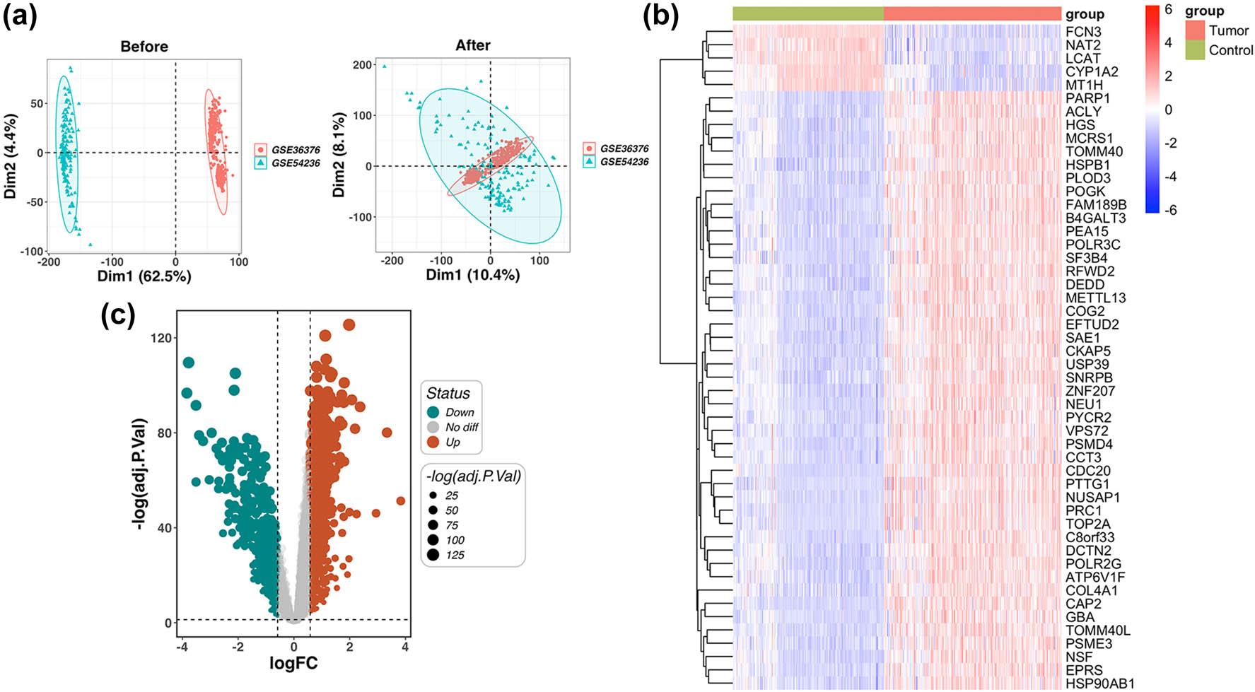
Figure 2
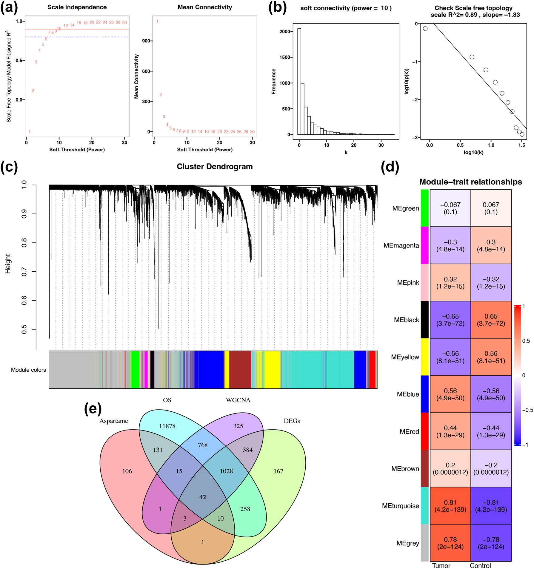
Figure 3
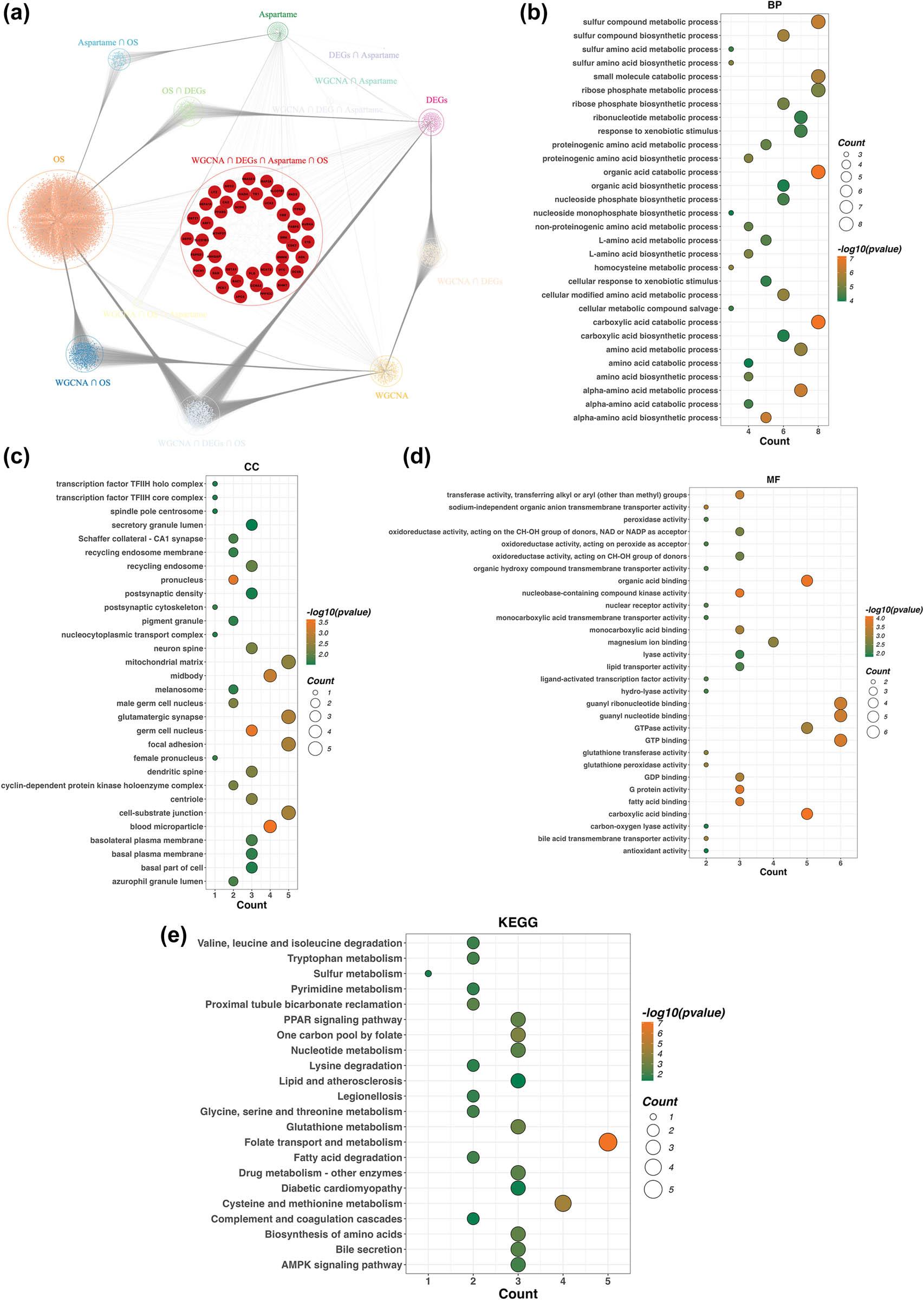
Figure 4
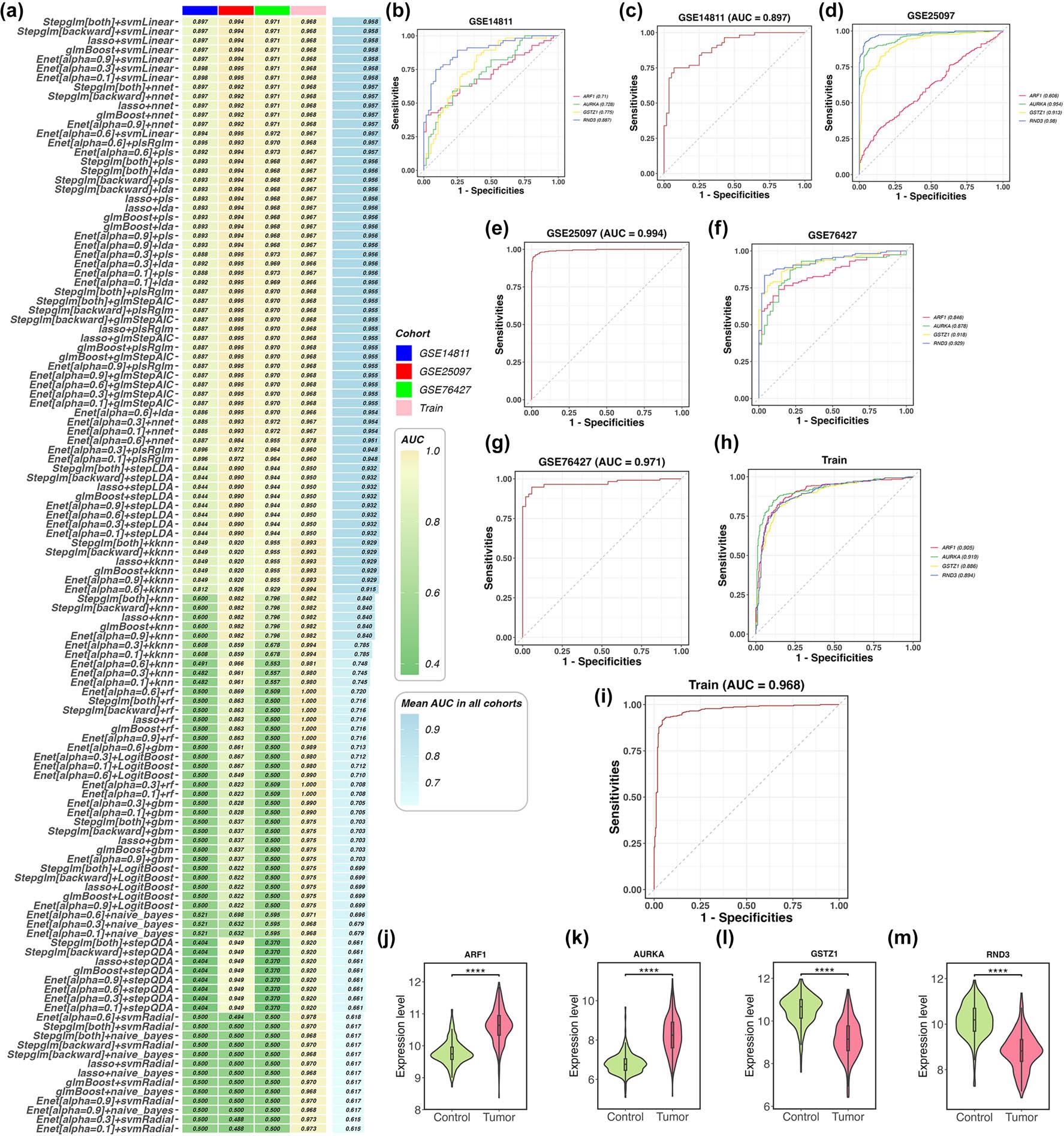
Figure 5
Figure 6

© 2026 Zhou An, Xianhua Wang, Yuyun Jia, published by Hirszfeld Institute of Immunology and Experimental Therapy
This work is licensed under the Creative Commons Attribution-NonCommercial-NoDerivatives 4.0 License.