
Figure 1
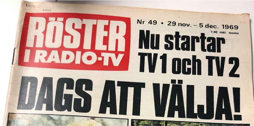
Image from the popular media magazine “Röster i Radio-TV”, 1969. The heading enhances the idea of competition: “Time to choose!”
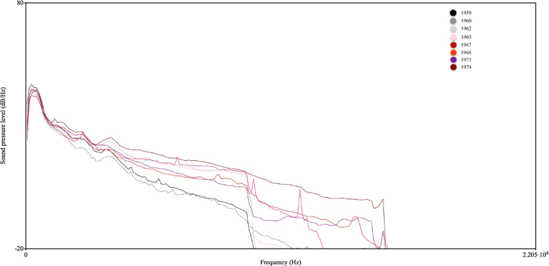
Figure 2
LTAS from each respective year in the Aktuellt sample set. Long Term Average Spectrum (LTAS) is a method of representing the frequency distribution in audio data. The Y axis indicates the power at a certain point on the frequency spectrum displayed on the X axis. Each year corresponds to one line, from darker colors in the early decade to brighter colors towards the end of the decade. The sample set demonstrates a gradual increase, both in overall power, and in the frequency range.
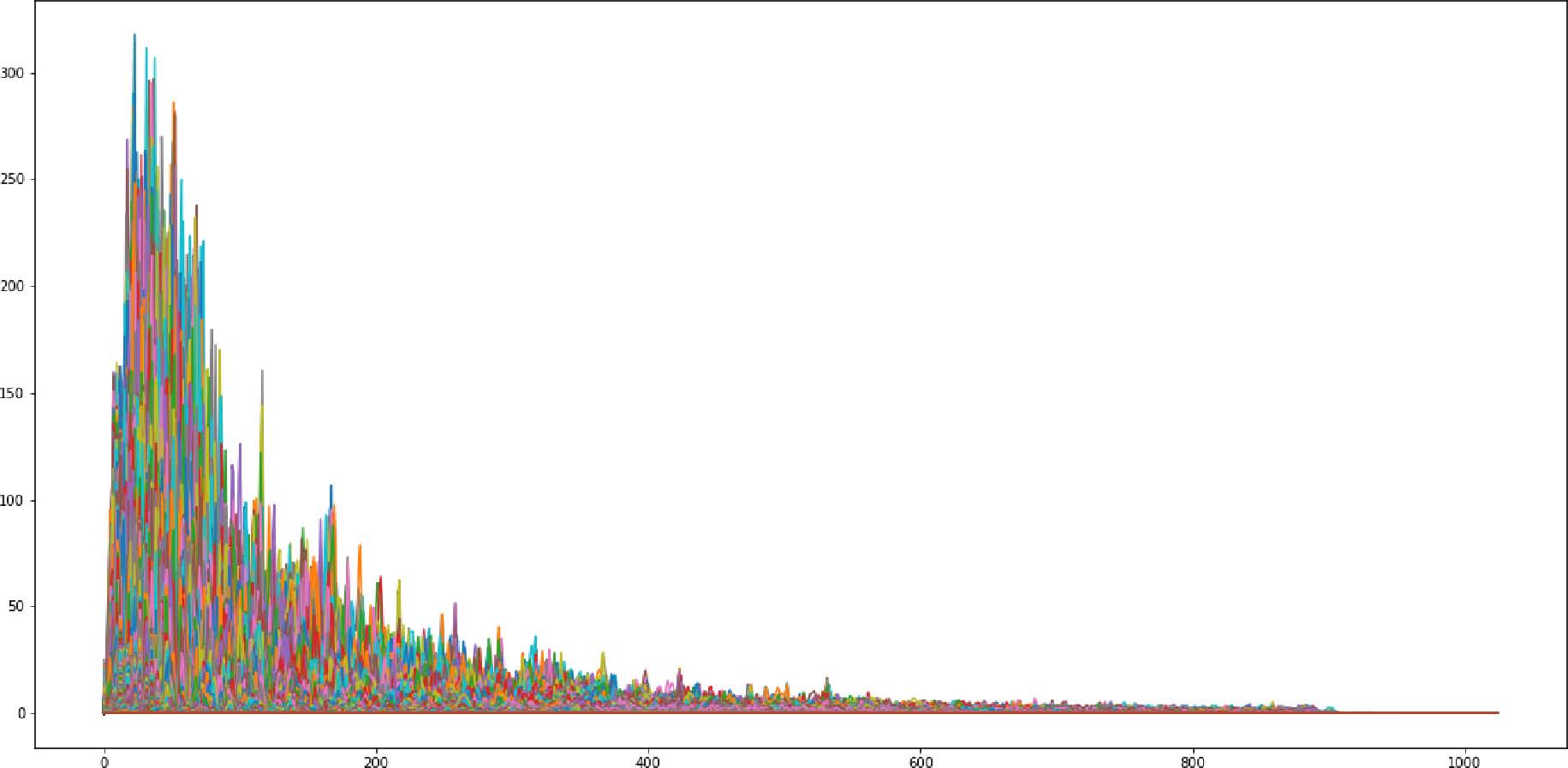
Figure 3
Spectral density plot of the total Aktuellt sample set from 1959 (above) and 1975 (below) respectively. The y-axis designate magnitude, and the x-axis correspond to the frequency in Hz. Each peak corresponds to fundamental frequency activity. The later data demonstrate an increase in activity in the entire spectrum, with a concentration between 100 and 200 Hz.
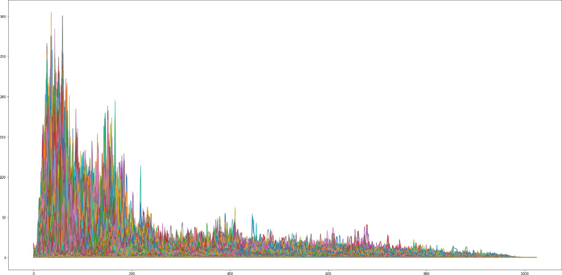
Figure 4
Spectral density plot of the total Aktuellt sample set from 1959 (above) and 1975 (below) respectively. The y-axis designate magnitude, and the x-axis correspond to the frequency in Hz. Each peak corresponds to fundamental frequency activity. The later data demonstrate an increase in activity in the entire spectrum, with a concentration between 100 and 200 Hz.

Figure 5
Picture displaying the explorative utilization of a microphone in television news context. The image is collected from the document “Allt hände i Aktuellt” (Borås: Independent Entertainment, 1998).
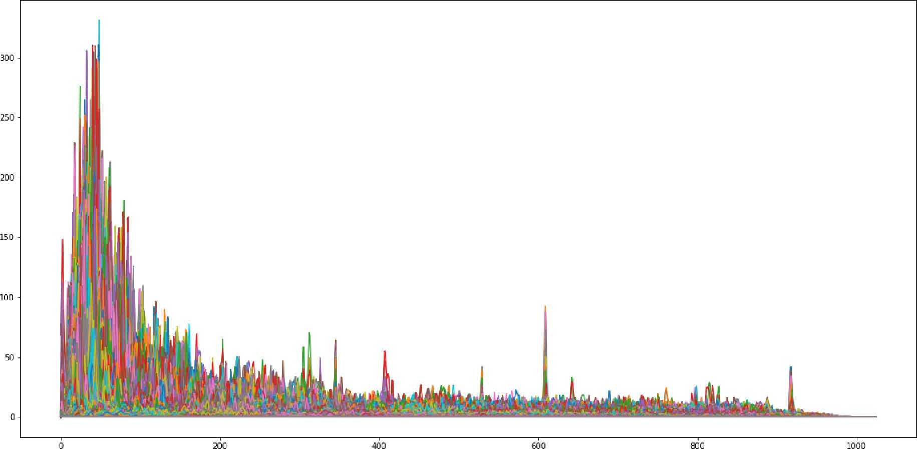
Figure 6
Spectral density plot of the total Aktuellt sample set from 1968 (above) and 1972 (below) respectively. The data from 1972 displays a significant increase in activity between 100 and 400 Hz.
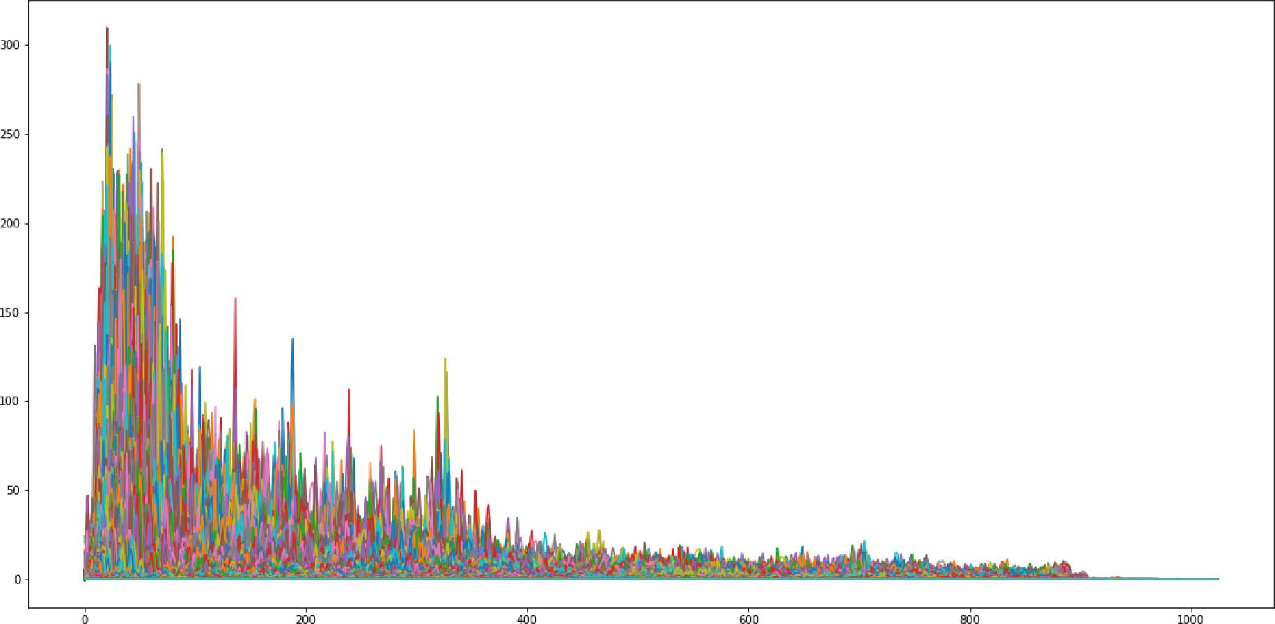
Figure 7
Spectral density plot of the total Aktuellt sample set from 1968 (above) and 1972 (below) respectively. The data from 1972 displays a significant increase in activity between 100 and 400 Hz.
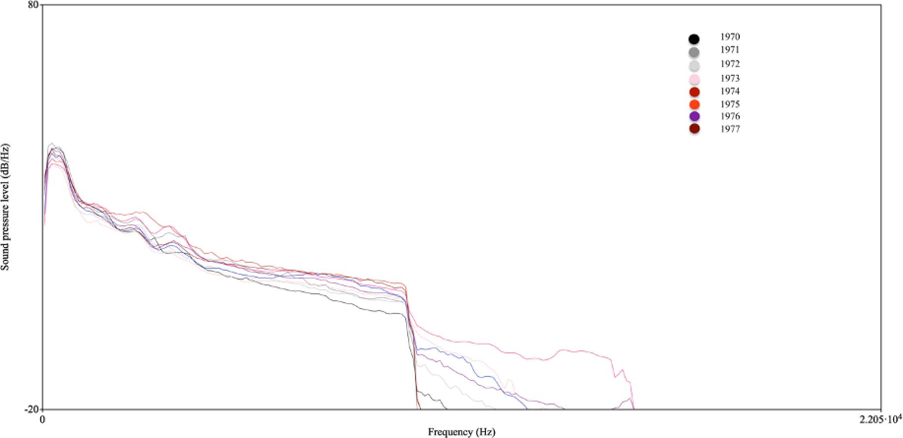
Figure 8
LTAS from each respective year in the Rapport sample set. Each year corresponds to one line, from darker colors in the early decade to brighter colors towards the end of the decade. Whilst the overall power increases for each year, the effect is focused around an invariant part of the spectrum. The exception appears in the data from 1975, indicated by the red line.
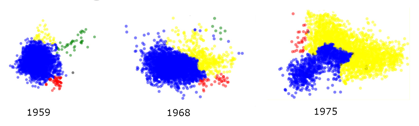
Figure 9
Visualization of the audio content by Edyson. Sample data from 1959, 1968, and 1975 has been disassembled into two second segments and arranged according to similarity. The outcome can be interpreted as a map of the sonic features in the data where a more condensed cluster indicates more homogenous acoustic content. Color-coding has been done by manual listening and designates four categories of sound. Blue nodes are segments that only contain one voice, and yellow nodes contain both voice and other acoustic content. Green nodes correspond to musical content and red notes are environmental sounds.