
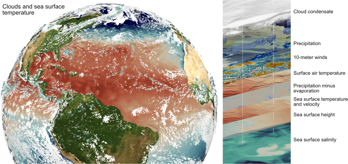
Figure 1
Snapshot of sea surface temperature and clouds in the coupled ICON-Sapphire experiments. Left is the North Atlantic region with sea surface temperatures displayed in colors from warm (red) to cold (blue) and a three-dimensional volume rendering of clouds. To the right is a layered display of various variables in the model. Note that several of these are defined at the surface.
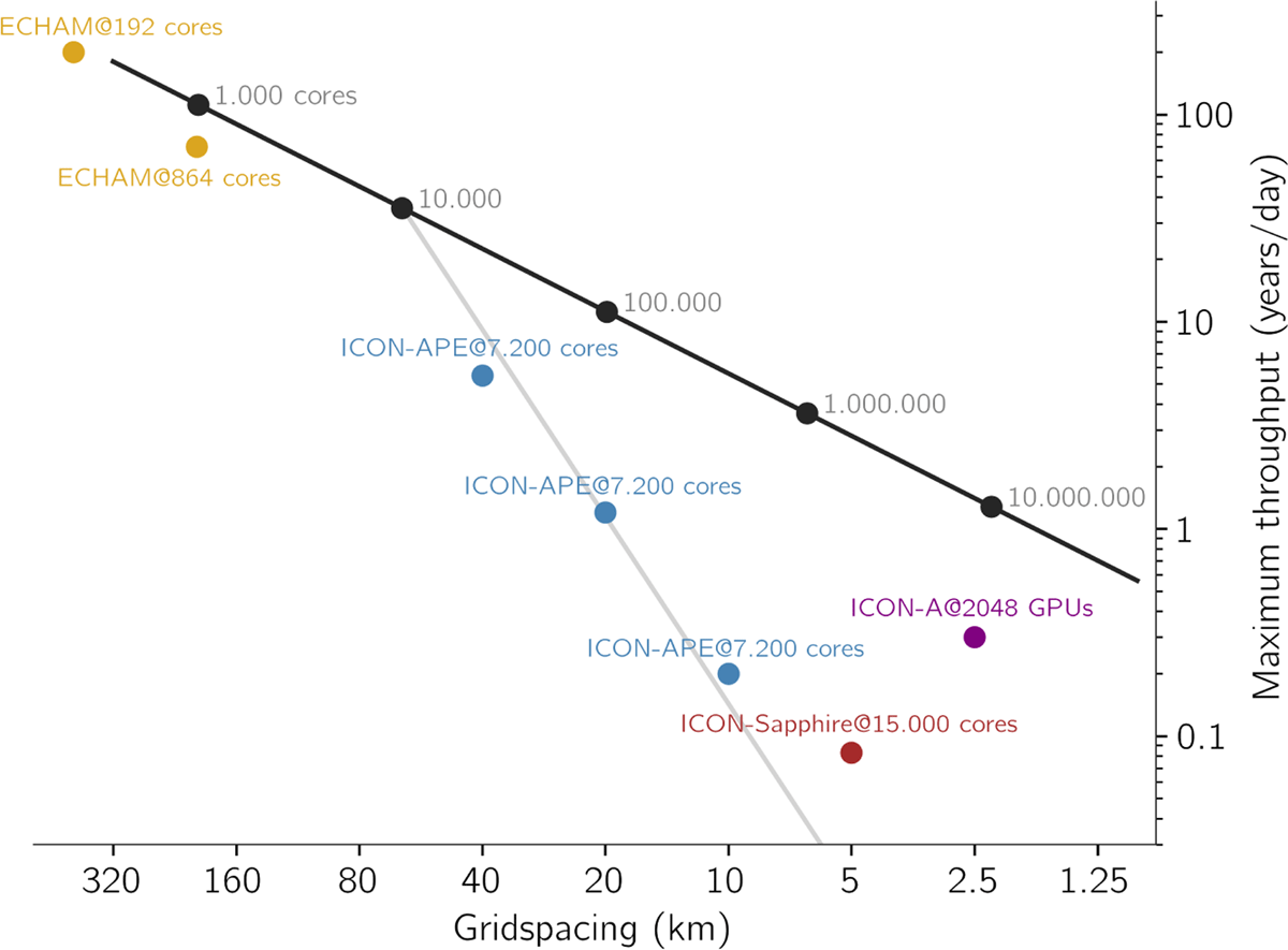
Figure 2
The maximum throughput in years per day as a function of horizontal grid spacing. Thick black line is the estimated maximum with recent technology, here the Intel Xeon E5-2695V4 Broadwell processor based Mistral supercomputer built 2015 at the Deutsches Klimarechenzentrum (DKRZ). The slope of this line is determined by the time step length at a given resolution. Dots and numbers along that line indicates the approximate number of compute cores needed to reach that level of performance as extrapolated from the low-resolution experiments. Grey line shows the approximate performance for a given number of cores at increasing resolutions, as can be compared with the blue symbols: Yellow and blue symbols are for ECHAM6.3 and ICON atmosphere-only experiments carried out in 2017 without output, whereby ICON-A and ECHAM6.3 experiments were with continents and ICON-APE is idealised aquaplanet experiments. The brown symbol is for the coupled ocean-atmosphere ICON-Sapphire configuration as used in this study with twice as many levels as the aquaplanet experiments and asynchronous output. This coupled model run contains many optimisations over the earlier ICON-APE experiments, but also dedicate compute cores to an ocean and is hampered by some load unbalancing. Purple symbol is an atmosphere only experiment that has been ported to using Nvidia A100 Graphics Processing Units (GPUs) on the Jülich JUWELS Booster supercomputer.
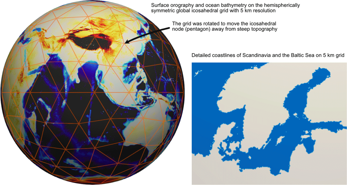
Figure 3
Illustrations of the global hemispherically symmetric 5 km resolution grid used here. Left is a global view of the ocean bathymetry and land orography. Also shown as red lines is the first refinement of the basic icosahedral grid. Note how this version of the grid is stretched to be symmetric about the equator in order to minimise imprints on tropical ocean dynamics, and also how the nodes of the original icosahedron that are surrounded by a pentagon are shifted away from the steep orography of the Himalayas. On the right is shown a zoom of the details of coastlines around the Baltic Sea.
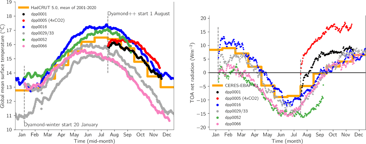
Figure 4
Evolution of temperature and radiation balance with time in the coupled simulations. Left panel shows daily global mean temperature in simulations compared with the average annual cycle from HadCRUT 5.0 reconstruction averaged over the 2001–2020 period (Morice et al. 2021). Starting dates of the experiments are marked with vertical dashed lines. The right panel shows the top of atmosphere radiation balance compared to monthly mean observed radiation balance from CERES-EBAF edition 4.1 averaged over the 2001–2020 period (Loeb et al. 2018). Note that the right panel only shows the first year of dpp0029/33, and also that dpp0005 has quadrupled CO2 and so is therefore not expected to match observations.
Table 1
Overview of experiments conducted during the project.
| EXPERIMENT ID | DESCRIPTION |
|---|---|
| dpp0001: | The first working model was based on existing components from ICON-ESM, but with advanced cloud micro physics, convection and gravity wave drag parameterisations turned off, and using a binary cloud fraction scheme. The model was still using the total turbulent energy mixing scheme (Pithan et al., 2015). The experiment was started 1 August 2016 and ran with multiple numerical crashes starting in November until 19 December. |
| dpp0005: | In the companion experiment to dpp0001 the atmospheric CO2 was quadrupled (see Section 3). |
| dpp0016: | To reduce the model warming drift the average ocean surface albedo was raised from 7 to 12 percent (Section 2.5). Also various technical improvements were made to reduce the numerical instabilities. This permitted us to raise the model top from 30 to 75 km. The experiment was started on 20 January 2020, and ran for one year. |
| dpp0029/33: | In the third step we replaced the total turbulent energy mixing scheme with the Smagorinsky three dimensional turbulence scheme (Dipankar et al. 2015). Furthermore we improved the coupling between winds and ocean currents. The run has substantially more clouds, so the ocean albedo was again reset to its default. In addition the cloud inhomogeneity factor was reduced from 1 to 0.66 to reduce solar reflection. The dpp0029 simulation was started on 20 January 2020 and after reaching one year it was extended as dpp0033 by another 9 months using more vertical resolution in the ocean. |
| dpp0052: | In this update a programming error in the surface sensible heat flux calculation was removed and a new ocean vertical coordinate whereby a bug in the ocean momentum forcing was introduced. The tuning parameters were kept the same as in dpp0029/33. |
| dpp0066: | In this update the new ocean vertical coordinate, and the associated bug, introduced in dpp0052 were removed again in order to separate its effect from other changes. The tuning parameters were again kept the same as in dpp0029/33. |
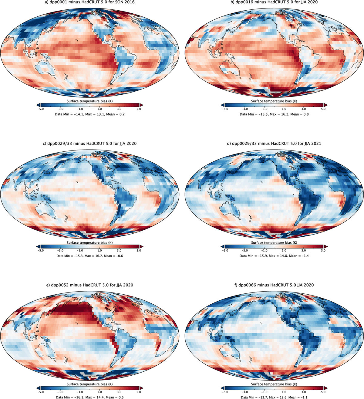
Figure 5
Surface temperature biases for June to August relative to HadCRUT 5.0 (Morice et al. 2021) averaged over the years 2001–2020. Note that panel a) shows September to November (SON), whereas the other panels are June to August (JJA). Panels c) and d) shows the bias in the first and second year of the dpp0029/33 experiment.
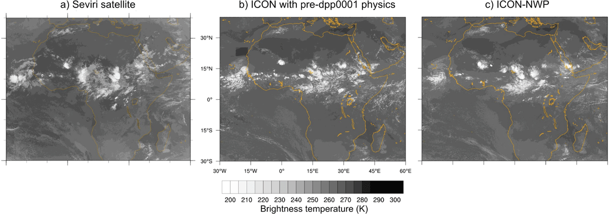
Figure 6
Comparison of infrared brightness temperature observed from the Seviri weather satellite (a), with 12-hour initialised runs from an early version of ICON-Sapphire with diagnostic cloud micro physics (b), and with the numerical weather prediction (NWP) physics package that includes prognostic cloud micro physics used by the German Weather Service (DWD) (c).
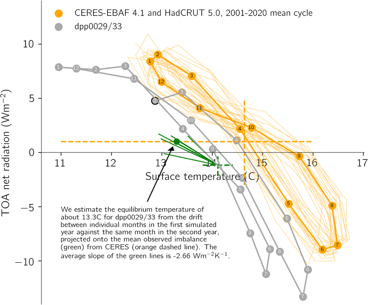
Figure 7
Evolution of temperature versus radiation balance in the two longest coupled simulations. Shown is the monthly mean temperature versus radiation balance for the two longer simulations and observations. Shown as thin orange lines are the 20 individual cycles of observations. Dashed orange lines are means of the observations, and as described within the figure we estimate the equilibrium temperature of dpp0029/33 from the drift between the two simulated years.
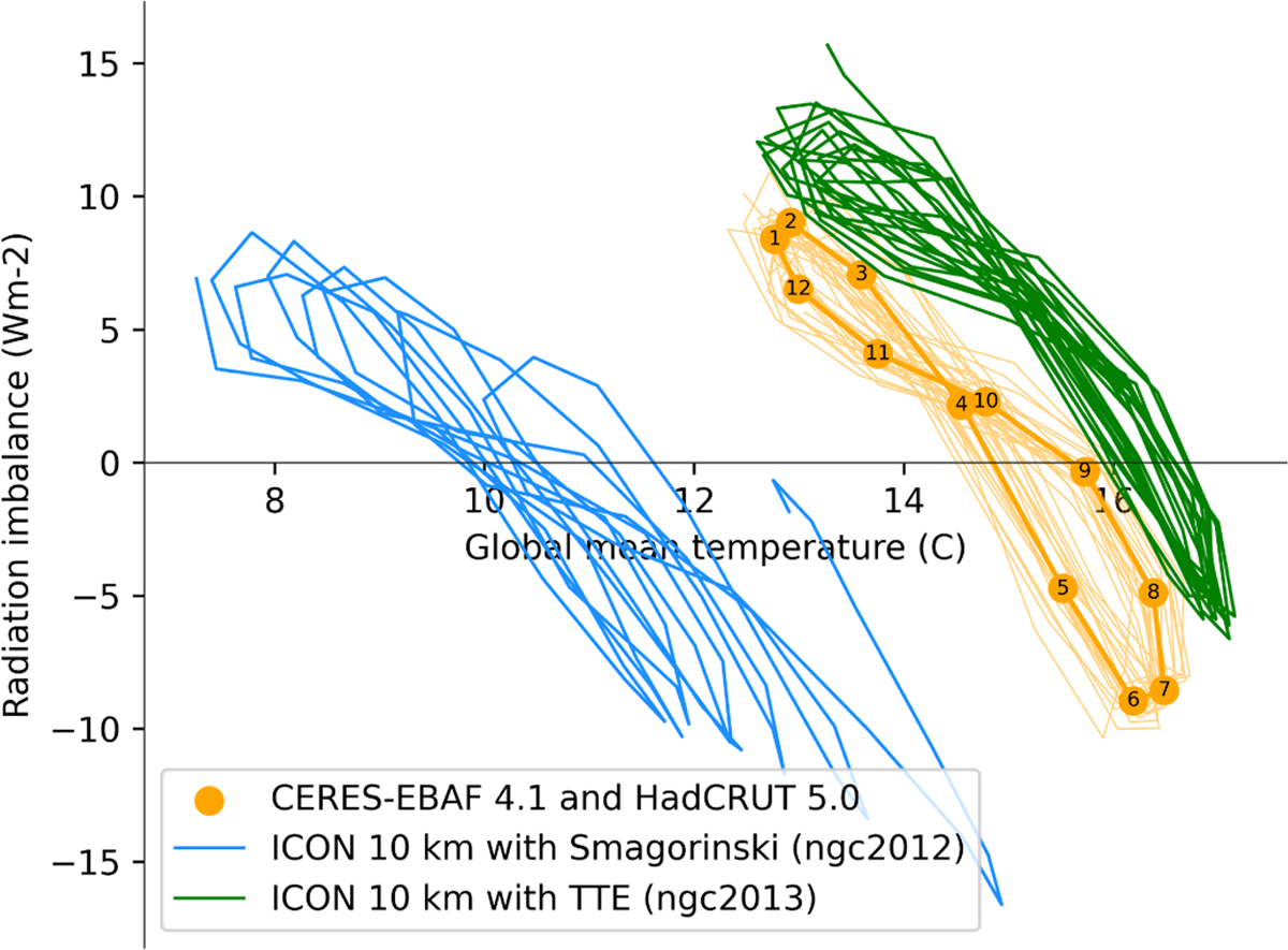
Figure 8
Two 10 year long simulations with ICON-Sapphire at 10 km resolution, as well as observations that are also shown in Figure 7. The ngc2012 simulation drifts to colder temperatures with time.
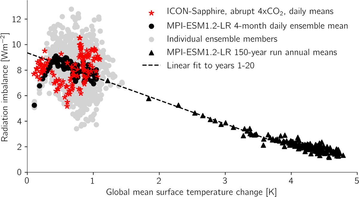
Figure 9
Top of atmosphere radiation balance versus global surface temperature in response to an abrupt quadrupling of atmospheric CO2. Shown as stars and circles are daily means from 4-month simulations starting 1 August in a single realisation with ICON-Sapphire and ten realisations with MPI-ESM1.2-LR, as well as the ensemble mean of the latter. Triangles shows yearly means from a 150-year run. The dashed line is a linear fit to the latter run years 1–20.
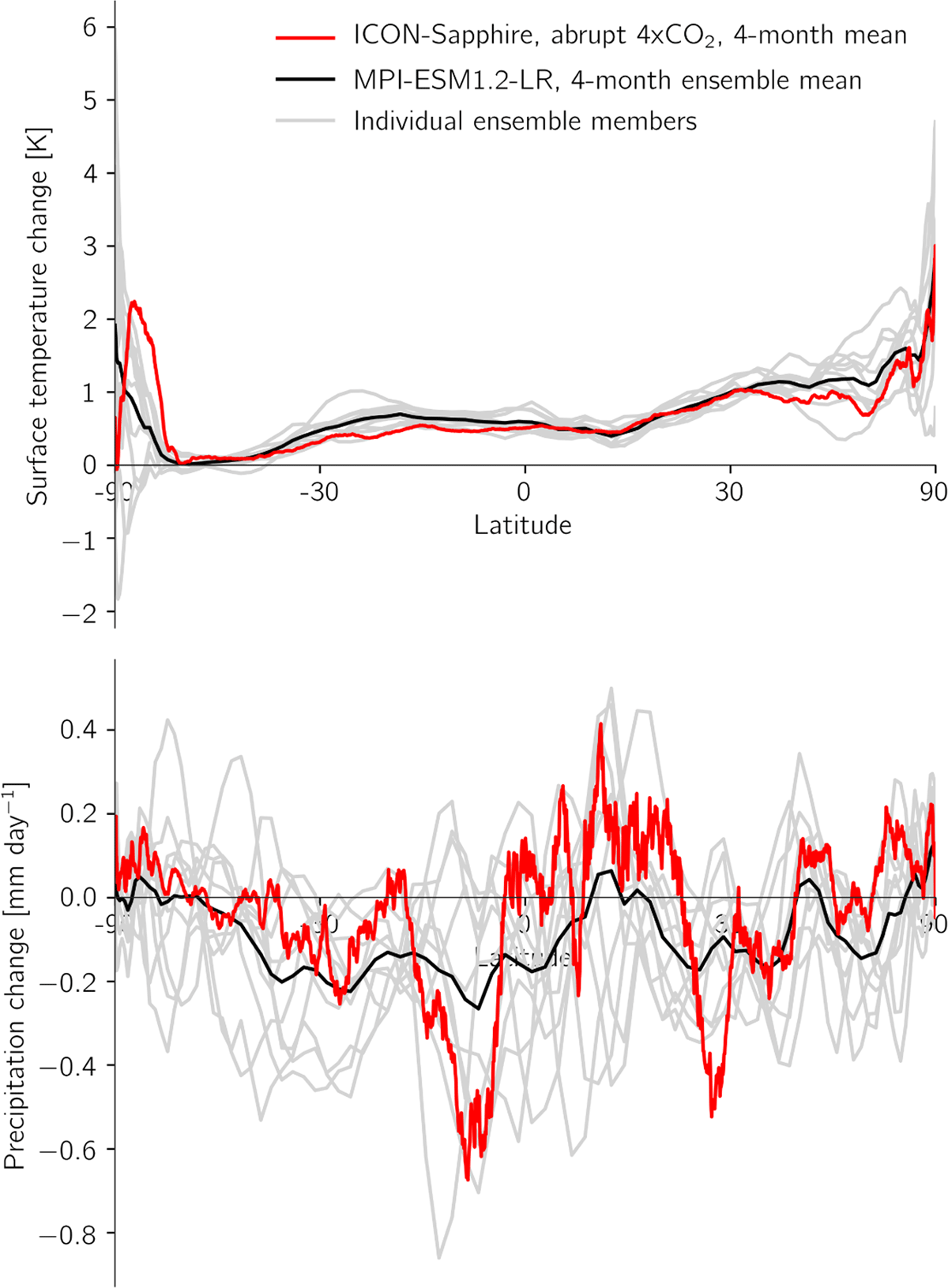
Figure 10
Zonal mean temperature and precipitation change in the first four months following a quadrupling of atmospheric CO2.
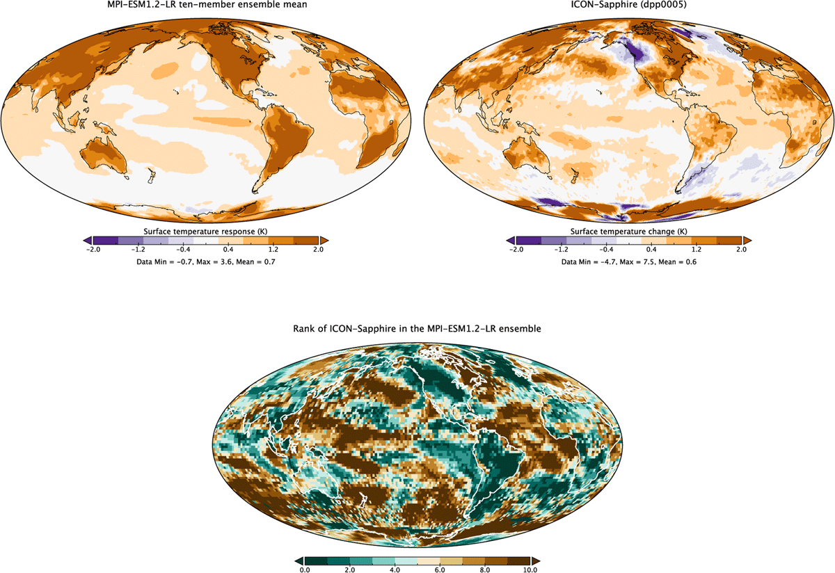
Figure 11
Mean temperature response during first four months following a quadrupling of atmospheric CO2. The upper left panel shows the 10-member ensemble mean from the MPI-ESM1.2-LR model and the right panel is from the ICON-Sapphire model, interpolated to the same T63 grid. The lower panel shows the rank of ICON-Sapphire in the MPI-ESM1.2-LR ensemble, whereby zero means it is the coldest and 10 means it is the warmest.
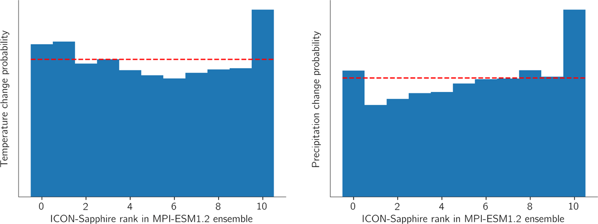
Figure 12
Rank histogram of temperature (left) and precipitation change (right) in ICON-Sapphire relative to the MPI-ESM1.2-LR ensemble in the first four months following a quadrupling of atmospheric CO2, whereby zero means it is the coldest or driest and 10 means it is the warmest or wettest.