Have a personal or library account? Click to login
Improving patient flow in free medical service by introducing a process map: a quality improvement study Cover

Improving patient flow in free medical service by introducing a process map: a quality improvement study

Open Access
|Aug 2024

Figures & Tables

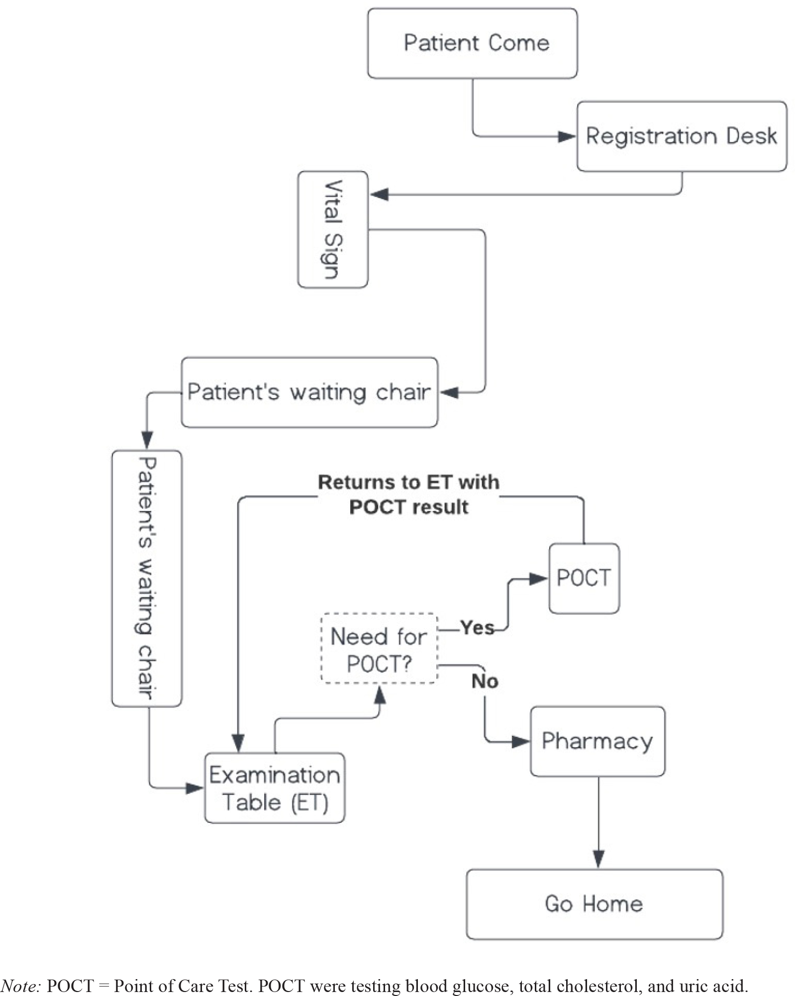
Figure 1

Process Map for The New Patient Flow.

Table 1

Number of patients, percentage, average patients (pts) per-hour, and average waiting time in each period.

PeriodNo PatientsPercentage (%)Average Pts per-HourApproximate Pts Waiting Time
I50311736 minutes
II109693617 minutes
Total159100--

[i] Note: Period I was when before process map introduced and Period II was after process map has been introduced. Average pts per-hour: (No. Patients) / (3 hours). Average pts Waiting Time: (Average Pts per-Hour) / (60 minutes) x 10.

Language: English
Page range: 45 - 49
Submitted on: Nov 22, 2023
Accepted on: Jun 3, 2024
Published on: Aug 26, 2024
Published by: Global Health Institute at William Carey International University
In partnership with: Paradigm Publishing Services

© 2024 Lucky Sarjono Buranda, published by Global Health Institute at William Carey International University
This work is licensed under the Creative Commons Attribution 4.0 License.