
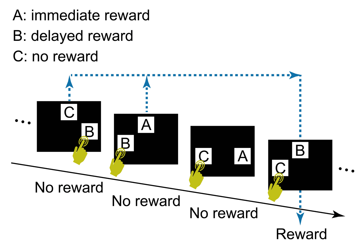
Figure 1
The task design used by Sato et al. (2023).
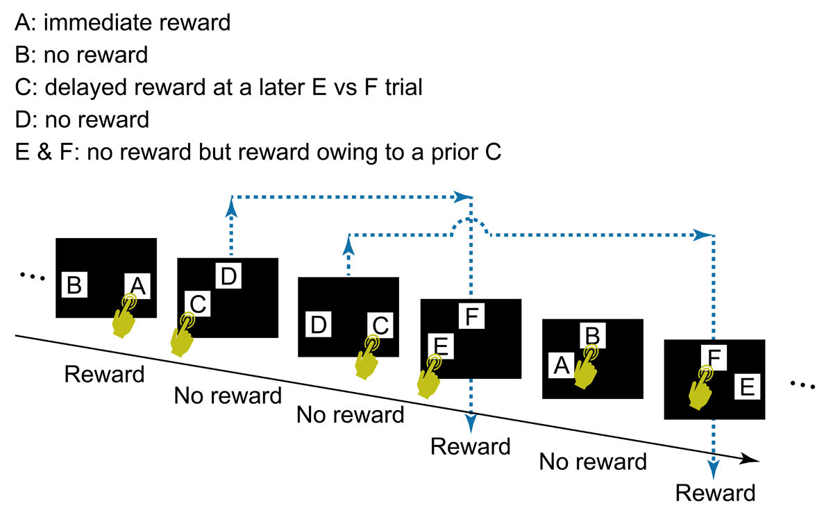
Figure 2
The general task flow and structure. In each trial, the participant touched a start button, a green rectangle that appeared at the bottom of the screen (not shown in Figure 2). The start button then disappeared and two visual stimuli (A and B, C and D, or E and F) appeared at two of three possible locations (i.e., upper center, lower left, or lower right), determined randomly. After the participant selected one stimulus by touching it, both stimuli disappeared, followed by display of the score (“+1 point” or “+0 point”) at the center of the screen for 2 s, after which the next trial began. A click sound was played for each touch of the start button and choice of a stimulus. The participant’s cumulative points total was shown continuously at the top right of the screen. Note that two C vs D trials could occur before a E vs F trial (see also Figure 3). In this case, the outcome of the E vs F trial reflects the choice in the first C vs D trial, not the second, the outcome of which is given in the subsequent E vs F trial. No more than two C vs D trials were presented before a E vs F trial.
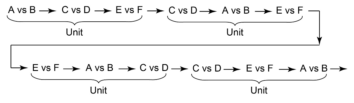
Figure 3
An example of the sequence of trials consisting of units containing three trials (A vs B/C vs D/E vs F).
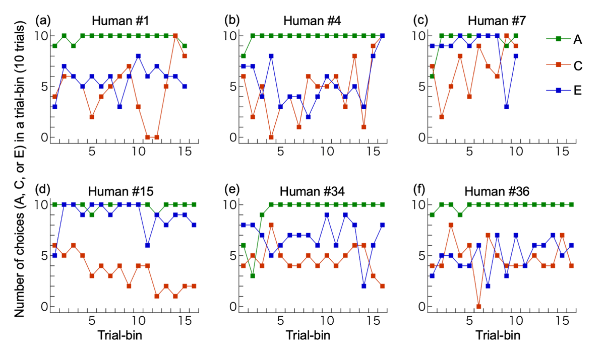
Figure 4
Examples of individual performances. (a) The participant with correct full understanding; (b) A participant with partial understanding; (c) A participant with overall bias for C, increase in C-choices in the latter half, and C-choices in ≥8/10 trials in two consecutive bins (which terminated the session). This participant did not write about the link between C vs D and E vs F trials; (d) A participant with overall bias for D, decrease in C (increase in D) in the latter half, and D-choices in ≥8/10 trials in more than two consecutive bins; (e) A participant with no bias for C or D but with a bias for E; (f) A participant with no bias for C or D and no bias for E or F. The last trial bin was not illustrated if it contained only 7 (not 10) trials: (d), (e) and (f).
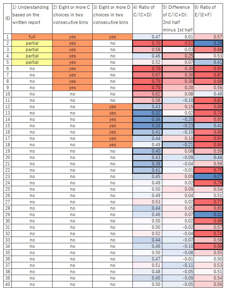
Figure 5
Graphical table of the participants’ choices. Columns 1)– 6) correspond to the categories described in the main text. For 4)–6), the intensity of the colors represents the degree of bias; red and blue in 4) and 6) mean that the value is more than 0.5 and less than 0.5, respectively; red and blue in 5) mean that the value is more than 0 and less than 0, respectively. Thick cell lines indicate a significant value in the cell (p < 0.05).
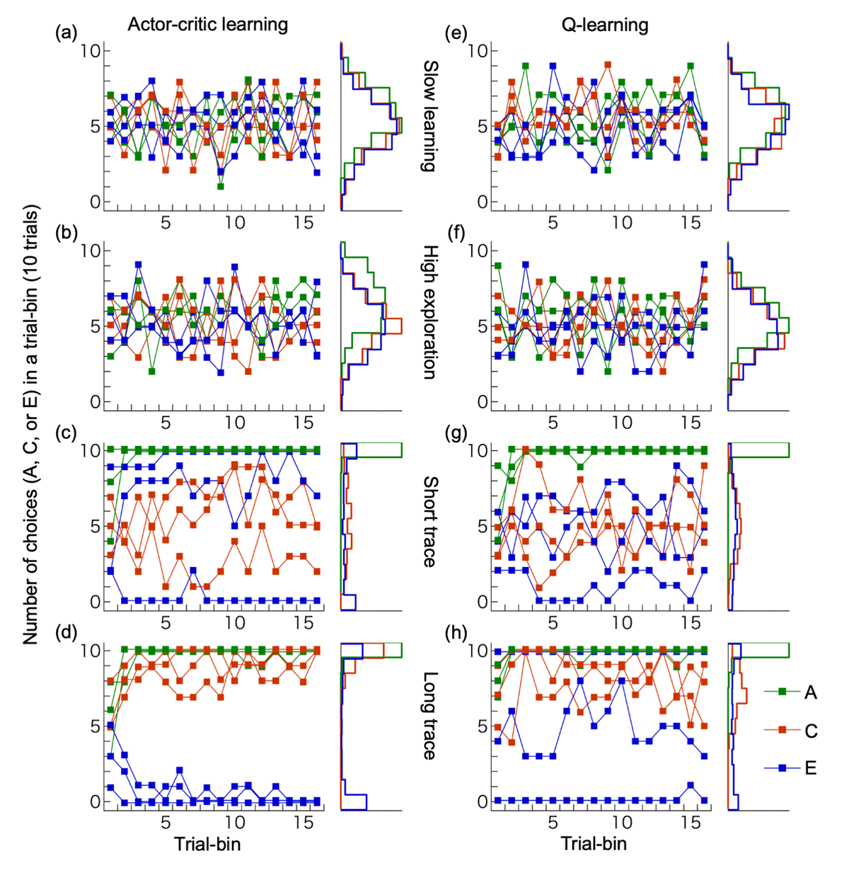
Figure 6
Performances of reinforcement learning models. (a-d) Actor-critic learning, (e-h) Q-learning. We implemented four types of learning parameters for simulations: slow learning (a, e), high exploration (b, f), short trace (c, g) and long trace (d, h). For each parameter set, three example simulations are shown, along with histograms depicting the choice frequencies of stimuli A, C, and E in the final trial bin across 200 simulation runs.
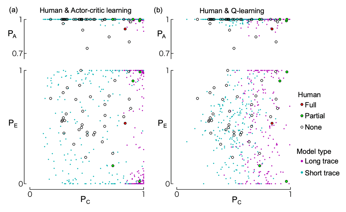
Figure 7
Distribution of choice rates during the last 30 trials. The top row shows the relationship between choice rates of C (PC) and A (PA); the bottom row shows those of C (PC) and E (PE). Choice rates are weighted averages over the last 30 trials (see Methods). Circles represent data from human participants, with different colors indicating their level of understanding of the task structure according to their written reports (i.e., full understanding, partial understanding, or no understanding; see “Written report” section in the Results). These human data are identical in panels (a) and (b). Dots indicate the results of 200 simulation runs of the actor-critic model (panel a) and Q-learning model (panel b), using either short-trace (cyan) or long-trace (magenta) learning parameters.