
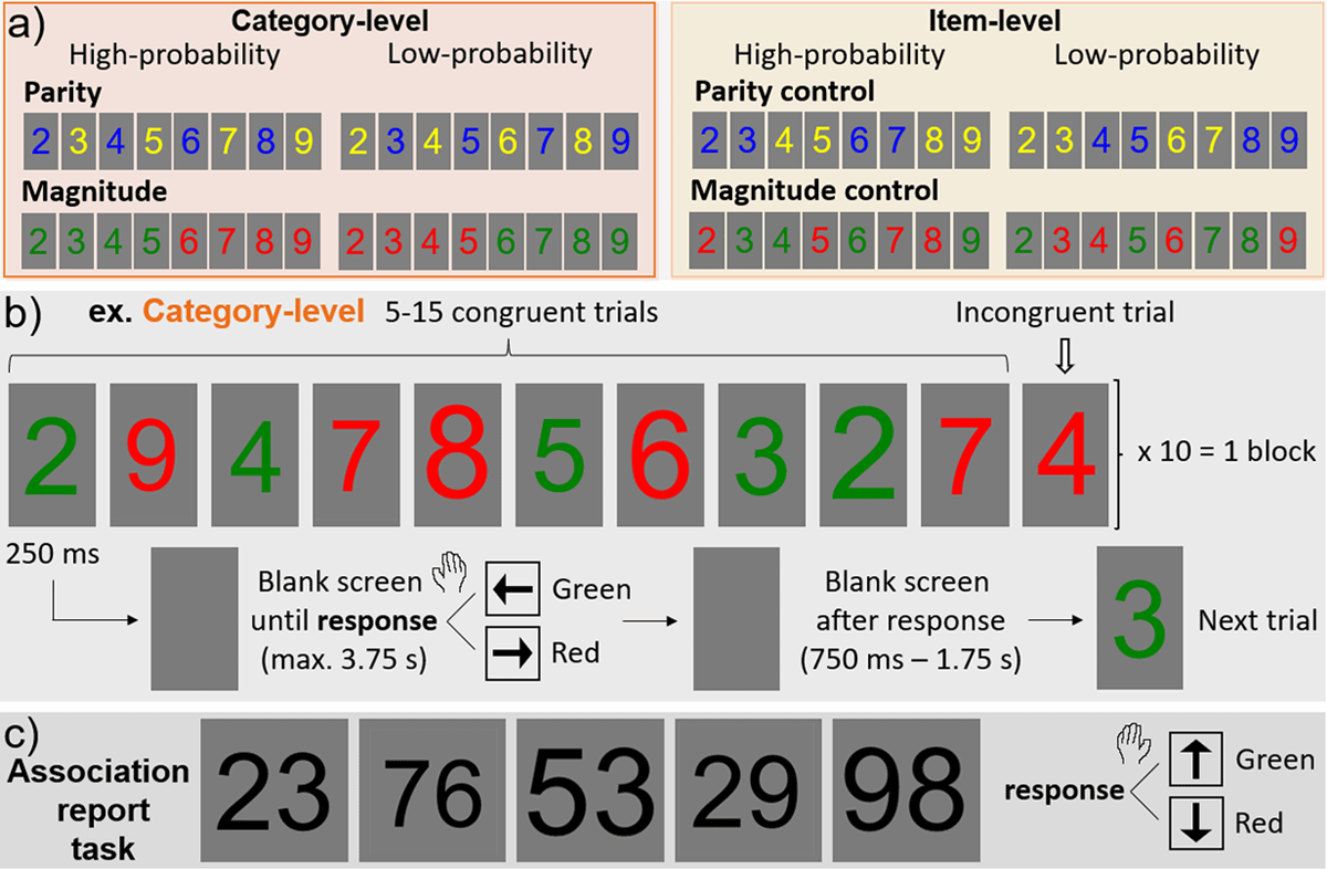
Figure 1
Experimental design. a) Parity and magnitude experiments each consisted of two versions: category-level and item-level versions, defined by their high-probability vs. low-probability color-number pairings. b) The stimulation paradigm, with an example shown for the category-level version of the magnitude experiment. c) Following each main experiment, there was a color association report task with double-digit numbers shown in black font (same trial timing as in panel b; magnitude task shown here).
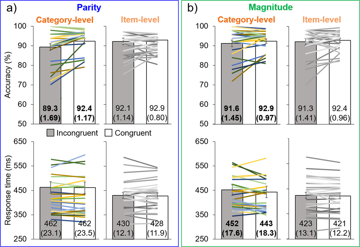
Figure 2
Main experimental results. Results for the parity (a) and magnitude (b) experiments, in terms of accuracy (top row) and response time (bottom row). Bar graphs represent the means, with error bars of ±1 SE: exact values of means and SE (in parentheses) are given on each bar, with bold font indicating significant differences between incongruent (gray) and congruent (white) trials. The superimposed lines represent individual data, with corresponding color/luminance for individuals’ accuracy and response time.
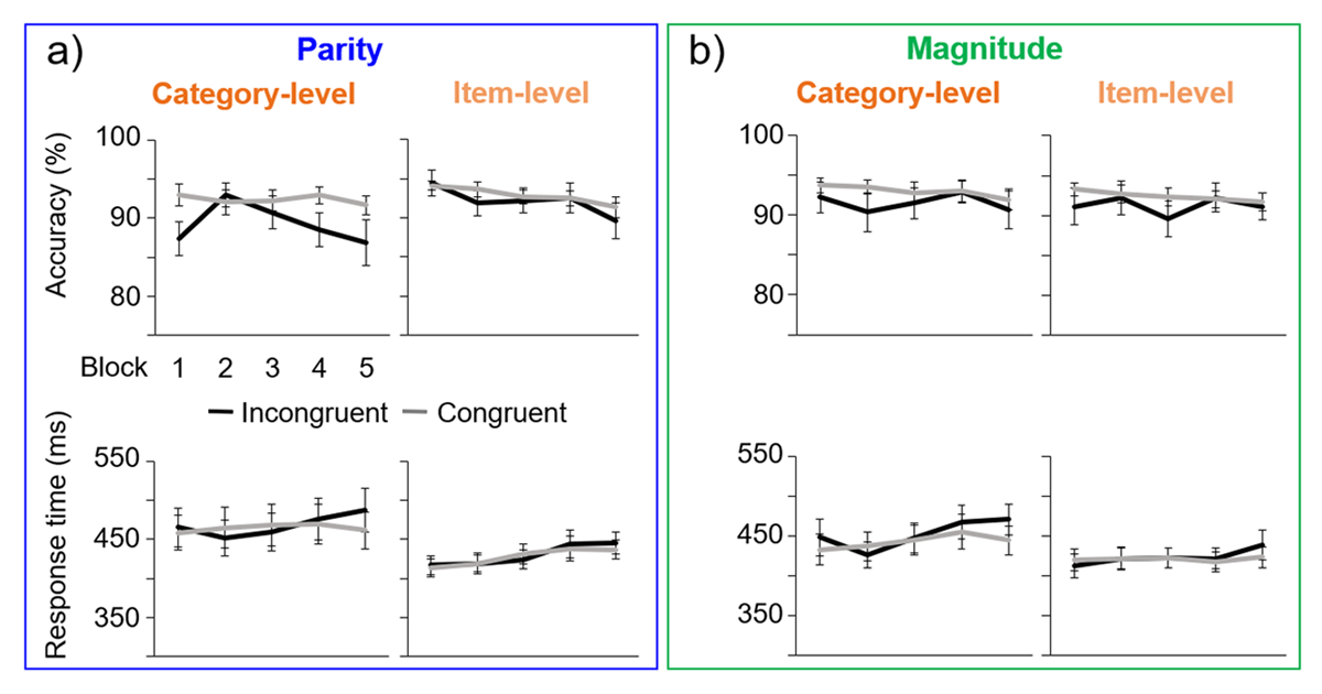
Figure 3
Mean results across blocks (1–5), with error bars of ±1 SE. a) The parity experiment, for both category-level and item-level experiment levels. b) The magnitude experiment.
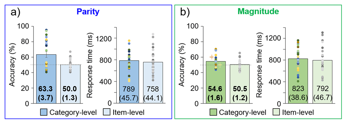
Figure 4
Explicit, color association report task results. Individual participants are represented as dots above the group-level mean bar plots, with error bars of ±1 SE (exact M and (SE) values are given on the bars). Bold font indicates a significant difference between category- and item-level experiments. Chance level accuracy is indicated with a horizontal gray line. a) Parity experiment. b) Magnitude experiment. In the magnitude experiment, the orange and yellow plus signs indicate the accuracy for congruent and incongruent double-digit numbers, respectively.