
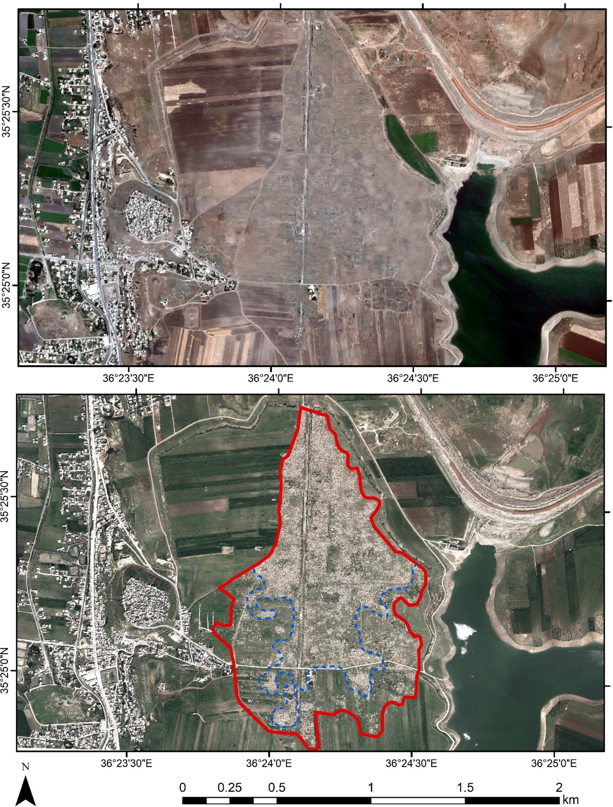
Figure 1
Apamea archaeological site on July 20th 2011 (top) and April 04th 2012 (bottom). Looted areas are highlighted on the figure April 04th 2012 (bottom) with a red polygon while the densest looting areas are visible with a blue color in the Figure (images from Google Earth Digital Globe).
Table 1
Details of the Landsat 7 ETM+ datasets used for the aims of the study.
| no | date | Period* | Notes** |
|---|---|---|---|
| 1. | 2011-01-12 | 1st period (T0) | Before looting events |
| 2. | 2011-03-01 | Before looting events | |
| 3. | 2011-06-21 | Before looting events | |
| 4. | 2011-07-07 | Before looting events | |
| 5. | 2011-07-23 | 2nd period (T1) | Looting period |
| 6. | 2011-08-08 | Looting period | |
| 7. | 2011-08-24 | Looting period | |
| 8. | 2011-09-09 | Looting period | |
| 9. | 2011-09-25 | Looting period | |
| 10. | 2011-10-11 | Looting period | |
| 11. | 2011-10-27 | Looting period | |
| 12. | 2011-11-28 | Looting period | |
| 13. | 2012-03-19 | Looting period | |
| 14. | 2012-04-04 | Looting period |
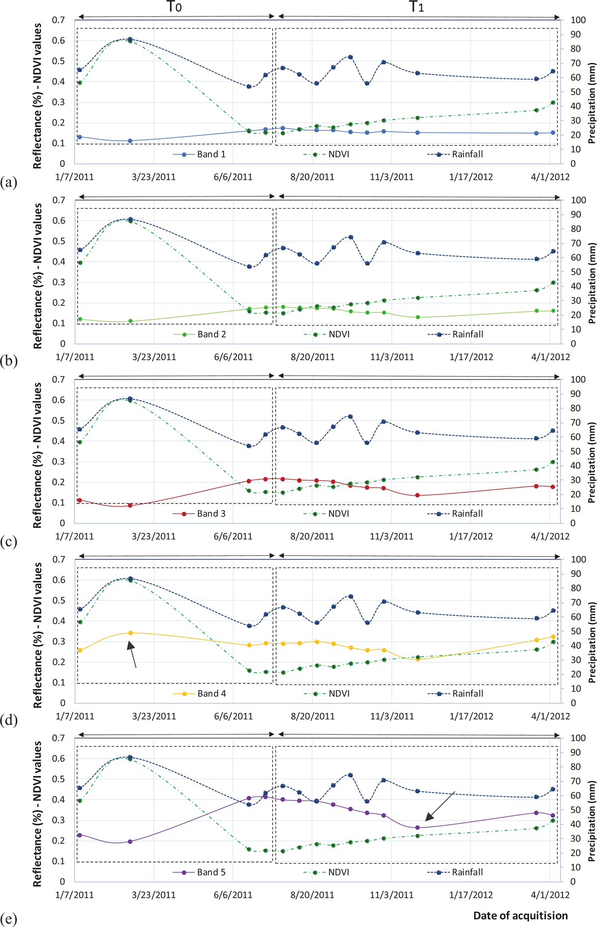
Figure 2
Spectral profile over the looted area for the first five bands (band 1 at Figure 2a; band 2 at Figure 2b; band 3 at Figure 2c; band 4 at Figure 2d and band 5 at Figure 2e).
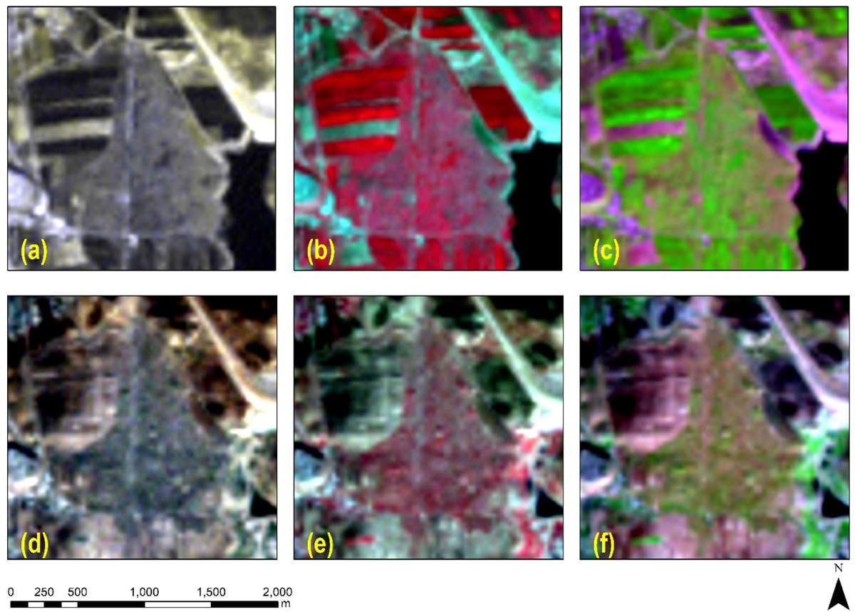
Figure 3
(a) R-G-B pseudo color composite of T0 period (date of acquisition: 2011-03-01, no.2. of Table 1); (b) NIR-R-G pseudo color composite of T0 period (date of acquisition: 2011-03-01, no.2. of Table 1); (c) SWIR-NIR-R pseudo color composite of T0 period (date of acquisition: 2011-03-01, no.2. of Table 1); (d) R-G-B pseudo color composite of T1 period (date of acquisition: 2011-11-28, no.12. of Table 1); (e) NIR-R-G pseudo color composite of T1 period (date of acquisition: 2011-11-28, no.12. of Table 1); (f) SWIR-NIR-R pseudo color composite of T1 period (date of acquisition: 2011-11-28, no.12. of Table 1).
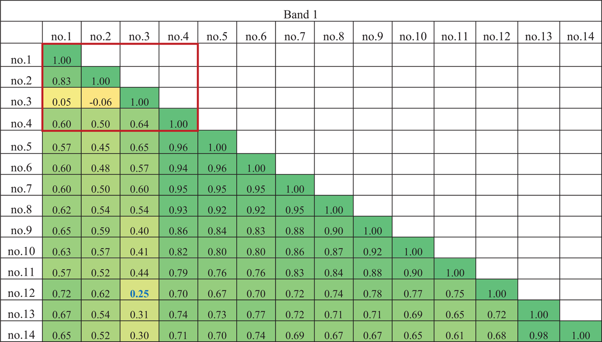
Table 2
Pearson’s correlation value (R2) for the spectral band 1. The T0 period is indicated with a red polygon (no.1–no.4).
Table 3
Pearson’s correlation value (R2) for the spectral band 2. The T0 period is indicated with a red polygon (no.1–no.4).
Table 4
Pearson’s correlation value (R2) for the spectral band 3. The T0 period is indicated with a red polygon (no.1–no.4).
Table 5
Pearson’s correlation value (R2) for the spectral band 4. The T0 period is indicated with a red polygon (no.1–no.4).
Table 6
Pearson’s correlation value (R2) for the spectral band 5. The T0 period is indicated with a red polygon (no.1–no.4).
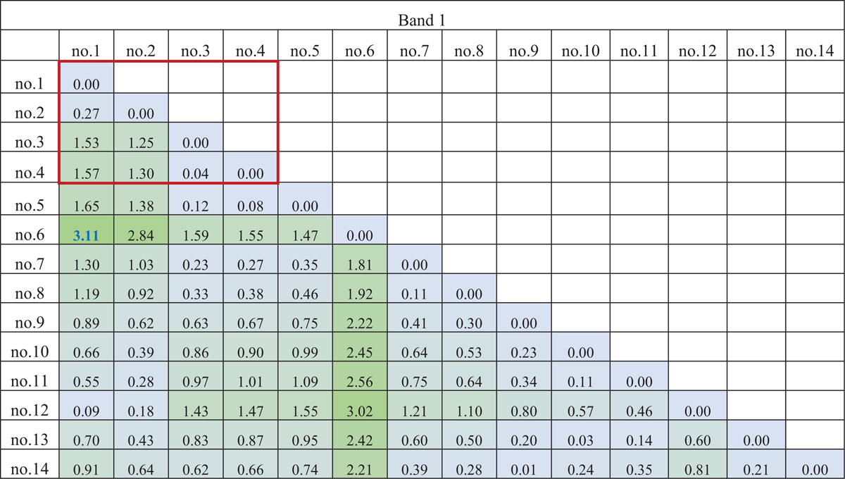
Table 7
Mahalanobis distance for the band 1. Higher values indicate higher separability between the pair-wise bands. The T0 period is indicated with a red polygon (no.1–no.4).
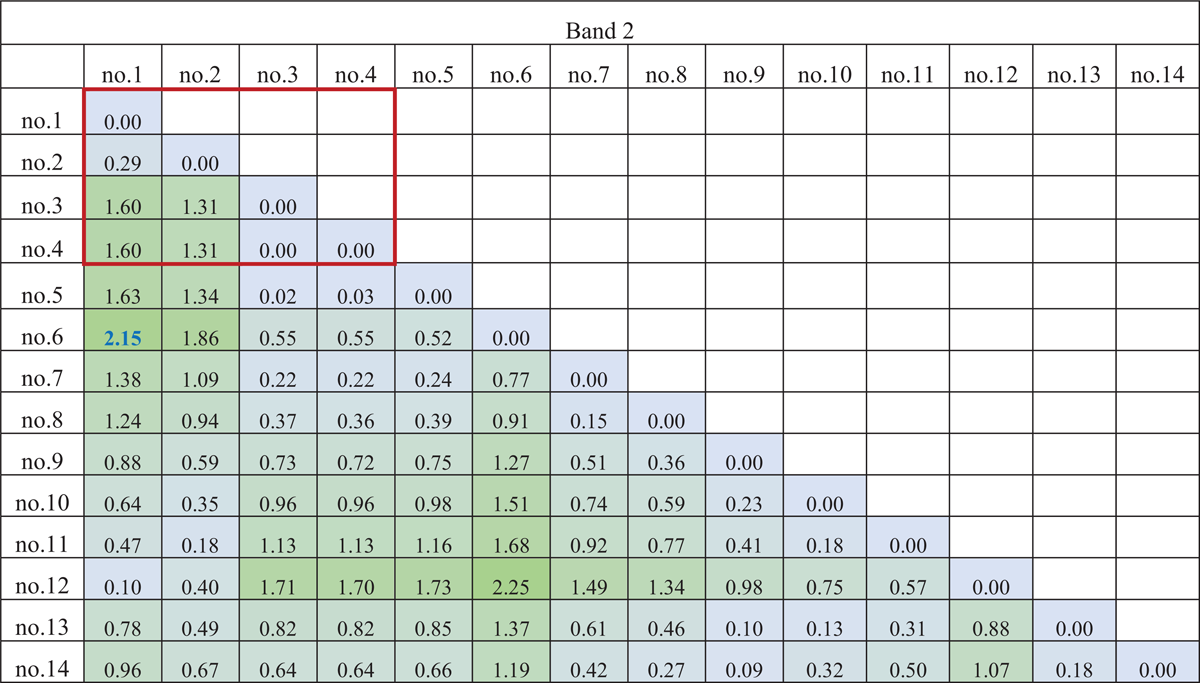
Table 8
Mahalanobis distance for the band 2. Higher values indicate higher separability between the pair-wise bands. The T0 period is indicated with a red polygon (no.1–no.4).
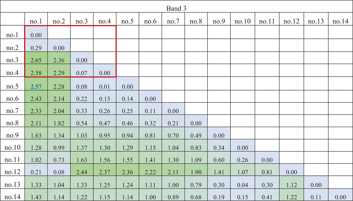
Table 9
Mahalanobis distance for the band 3. Higher values indicate higher separability between the pair-wise bands. The T0 period is indicated with a red polygon (no.1–no.4).
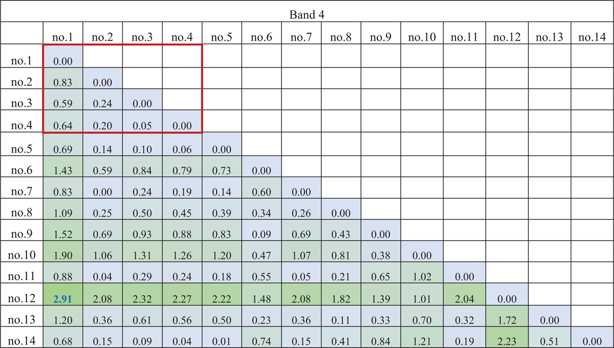
Table 10
Mahalanobis distance for the band 4. Higher values indicate higher separability between the pair-wise bands. The T0 period is indicated with a red polygon (no.1–no.4).
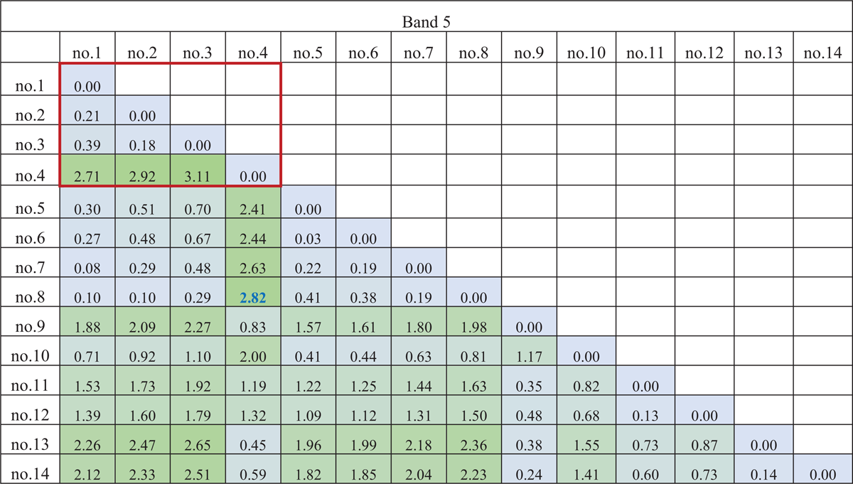
Table 11
Mahalanobis distance for the band 5. Higher values indicate higher separability between the pair-wise bands. The T0 period is indicated with a red polygon (no.1–no.4).
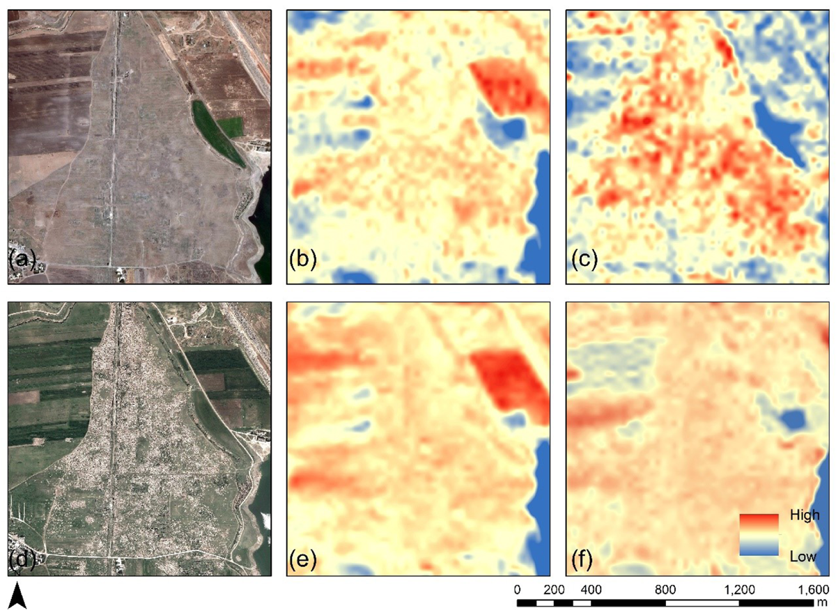
Figure 4
High-resolution image from Google Earth of the area of Apamea before (a) and after the looting event (d). The ‘Max Spectral Distance’ normalized ratio of the blue bands of images no. 3 and no. 12 (b) and no.1 and no. 6 (c) are shown on the first row. (e) and (f) show the results for the SWIR band of the pairs no. 3-no. 12 no. 4-no. 8. Changes are highlighted with red color while no significant changes with blue color.
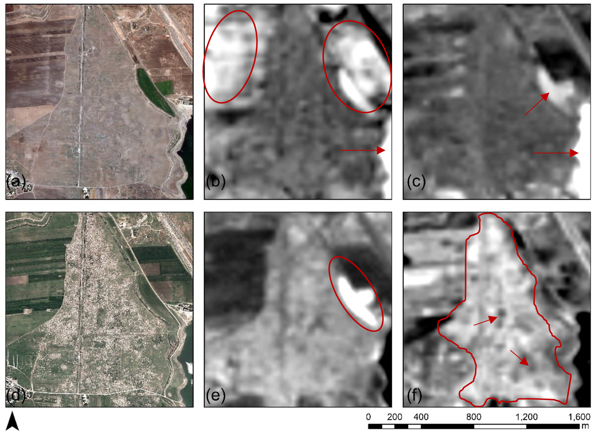
Figure 5
High-resolution image from Google Earth of the area of Apamea before (a) and after the looting event (d). (b) first principal component – PC1; (c) second principal component – PC2; (e) third principal component – PC3 and (f) fourth principal component – PC4. The looted area is highlighted with a red polygon in Figure 5f.
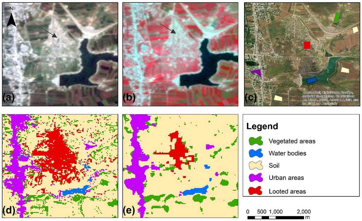
Figure 6
(a) R-G-B pseudo colour composite of the Landsat 7 ETM+ taken at 2011-11-28; (b) NIR-R-G pseudo color composite of the Landsat 7 ETM+ taken at 2011-11-28; (c) training areas used for the classification purposes on top of a high-resolution satellite base-map provided by ESRI ArcGIS Online service (d) RF classification results and (e) RF classification results after the application of a majority filter.
Table 12
Confusion matrix of the Random Forest classification algorithm implemented at the Landsat 7 ETM+ image taken at 2011-11-28 (results refer to the classification process (Class.) and post-classification analysis (Test).
| Class Name | # Points | Looted areas | Vegetation | Water | Soil | Urban | ||||||
|---|---|---|---|---|---|---|---|---|---|---|---|---|
| Class. | Test | Class. (%) | Test (%) | Class. (%) | Test (%) | Class. (%) | Test (%) | Class. (%) | Test (%) | Class. (%) | Test (%) | |
| Looted areas | 143 | 42 | 99.3 | 86 | 0.7 | 7 | 0 | 0 | 0 | 2 | 0 | 5 |
| Vegetation | 211 | 45 | 0 | 4 | 99.53 | 96 | 0 | 0 | 0.47 | 0 | 0 | 0 |
| Water | 32 | 11 | 0 | 0 | 0 | 9 | 100 | 91 | 0 | 0 | 0 | 0 |
| Soil | 779 | 131 | 0.92 | 4 | 0 | 0 | 0 | 0 | 99.08 | 89 | 0 | 7 |
| Urban | 291 | 17 | 0 | 0 | 0 | 0 | 0 | 0 | 3.29 | 8 | 96.71 | 92 |
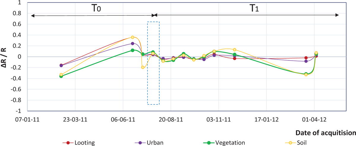
Figure 7
ΔR/R rate of change over the archaeological site of Apamea (red line) at the blue band of Landsat 7 ETM+, in comparison with other areas covered with soil (yellow line), urban areas (purple line), vegetated regions (green line) and water bodies (blue line).
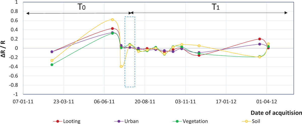
Figure 8
ΔR/R rate of change over the archaeological site of Apamea (red line) at the green band of Landsat 7 ETM+, in comparison with other areas covered with soil (yellow line), urban areas (purple line), vegetated regions (green line) and water bodies (blue line).
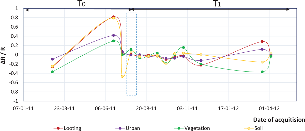
Figure 9
ΔR/R rate of change over the archaeological site of Apamea (red line) at the red band of Landsat 7 ETM+, in comparison with other areas covered with soil (yellow line), urban areas (purple line), vegetated regions (green line) and water bodies (blue line).
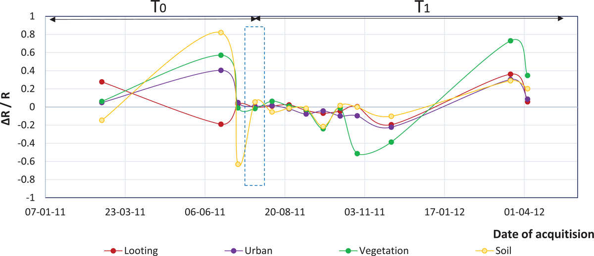
Figure 10
ΔR/R rate of change over the archaeological site of Apamea (red line) at the NIR band of Landsat 7 ETM+, in comparison with other areas covered with soil (yellow line), urban areas (purple line), vegetated regions (green line) and water bodies (blue line).
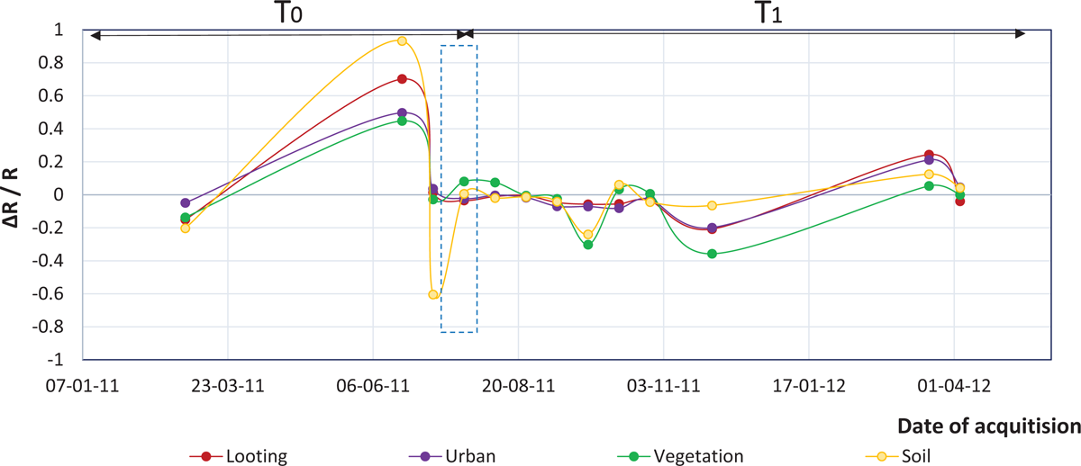
Figure 11
ΔR/R rate of change over the archaeological site of Apamea (red line) at the SWIR band of Landsat 7 ETM+, in comparison with other areas covered with soil (yellow line), urban areas (purple line), vegetated regions (green line) and water bodies (blue line).