
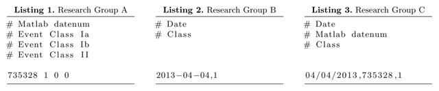
Figure 1
Conventional representation of information about NPF event classification.
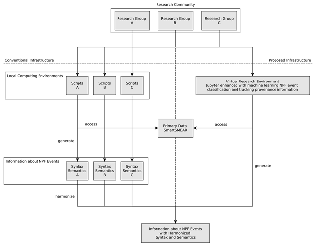
Figure 2
Schematic overview of the conventional infrastructure for NPF event detection and description contrasted with the proposed infrastructure.
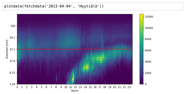
Figure 3
Fetching and visualizing particle size distribution data in Jupyter notebook for April 4, 2013 at Hyytiälä. The colour indicates the particle concentration level (cm–3). The experts are interested in the yellow (white in grayscale) shape that reflects a NPF event for aerosol with particles of initially small but growing in diameter size.

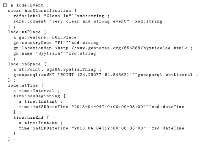
Figure 4
Recording information about the event that occurred on April 4, 2013 at Hyytiälä. It is a very clear and strong event (Class Ia) during which new particle formation was observed to start at 10 am and end at 12 pm.
Listing 4
Machine readable information about the NPF event at Hyytiälä on the 4th of April 2013.
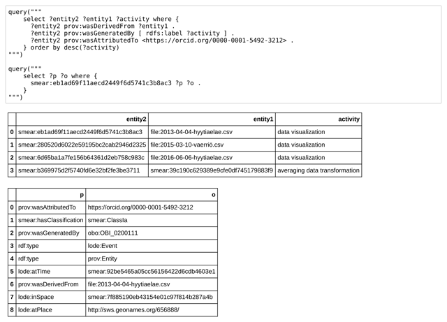
Figure 5
Interrogating provenance information acquired and curated by the infrastructure while data visualization and averaging data transformation activities are performed.
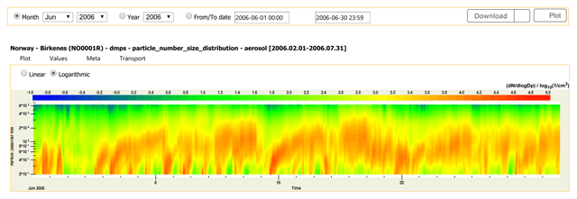
Figure 6
ACTRIS visualization of particle size distribution data for June 2006, in Birkenes, Norway. NPF events may be seen. However, information about events is implicit in the visualization. (Source: http://ebas.nilu.no/).