
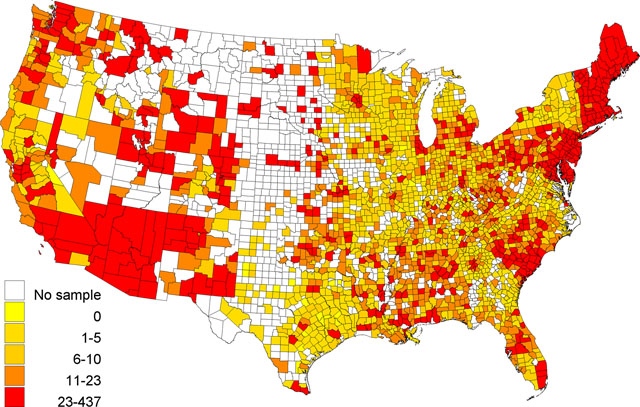
Figure 1
Geographic distribution of the number of diagnosed diabetes cases in the Behavioral Risk Factor Surveillance Survey among 3,109 U.S. counties in 2012. The color pattern was categorized by the quartiles of the number of diagnosed diabetes.
Table 1
Summary table of diabetes in the U.S.
| Diagnosed diabetes | P-value* | ||
|---|---|---|---|
| No N (%) | Yes N (%) | ||
| Age | <.0001 | ||
| 18–45 | 105446 (96.65%) | 3650 (3.35%) | |
| 45–64 | 140475 (86.91%) | 21159 (13.09%) | |
| 65+ | 105983 (80.03%) | 26440 (19.97%) | |
| Sex | <.0001 | ||
| Male | 140905 (86.67%) | 21673 (13.33%) | |
| Female | 214109 (87.72%) | 29962 (12.28%) | |
| Race | <.0001 | ||
| Non-Hispanic White | 282189 (88.27%) | 37485 (11.73%) | |
| Non-Hispanic Black | 29536 (80.34%) | 7227 (19.66%) | |
| Hispanic | 22269 (86.33%) | 3525 (13.67%) | |
| Others | 16710 (86.55%) | 2596 (13.45%) | |
[i] * Chi-square test, where 7519 missing values are excluded.
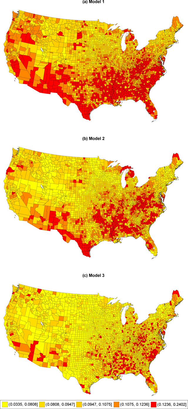
Figure 2
Comparing three SAEs of diabetes prevalence at the county level using quintiles.
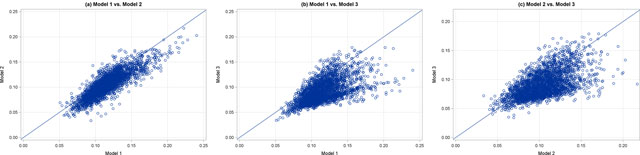
Figure 3
Scatter plots of small area estimates among Models 1, 2 and 3.
Table 2
Descriptive statistics of diabetes prevalence estimates from the three SAE models.
| Model | Mean | SD | Minimum | Q1 | Median | Q3 | Maximum | F | P-value† |
|---|---|---|---|---|---|---|---|---|---|
| All counties (N = 3,109) | |||||||||
| 1 | 0.1152 | 0.0237 | 0.0508 | 0.0986 | 0.1121 | 0.1282 | 0.2402 | 910.22 | <.0001 |
| 2 | 0.1042 | 0.0238 | 0.0335 | 0.0870 | 0.1024 | 0.1193 | 0.2171 | ||
| 3 | 0.0902 | 0.0220 | 0.0342 | 0.0373 | 0.0855 | 0.1023 | 0.1789 | ||
| Counties with samples in the BRFSS (N = 2,225) | |||||||||
| 1 | 0.1146 | 0.0222 | 0.0536 | 0.0994 | 0.1124 | 0.1272 | 0.2210 | 377.93 | <.0001 |
| 2 | 0.1034 | 0.0233 | 0.0405 | 0.0868 | 0.1024 | 0.1187 | 0.1940 | ||
| 3 | 0.0960 | 0.0226 | 0.0351 | 0.0800 | 0.0931 | 0.1097 | 0.1789 | ||
| Counties without samples in the BRFSS (N = 884) | |||||||||
| 1 | 0.1167 | 0.0271 | 0.0510 | 0.0969 | 0.1105 | 0.1311 | 0.2402 | 831.05 | <.0001 |
| 2 | 0.1063 | 0.0250 | 0.0335 | 0.0875 | 0.1023 | 0.1208 | 0.2171 | ||
| 3 | 0.0755 | 0.0105 | 0.0342 | 0.0687 | 0.0736 | 0.0806 | 0.1337 | ||
[i] Abbreviation: SD = Standard deviation; Q1 = The first quartile; Q3 = The third quartile
† The p-values were calculated from the analysis of variation.
Table 3
Mean difference comparison in the SAE of diabetes prevalence among Models 1, 2 and 3.
| Comparison | Difference | 95% CI |
|---|---|---|
| All counties (N = 3,109) | ||
| Model 1 vs. Model 2 | 0.0110 | (0.0096, 0.0124) |
| Model 1 vs. Model 3 | 0.0250 | (0.0237, 0.0264) |
| Model 2 vs. Model 3 | 0.0140 | (0.0127, 0.0154) |
| Counties with samples in the BRFSS (N = 2,225) | ||
| Model 1 vs. Model 2 | 0.0112 | (0.0096, 0.0128) |
| Model 1 vs. Model 3 | 0.0186 | (0.0170, 0.0202) |
| Model 2 vs. Model 3 | 0.0073 | (0.0057, 0.0089) |
| Counties without samples in the BRFSS (N = 884) | ||
| Model 1 vs. Model 2 | 0.0104 | (0.0079, 0.0129) |
| Model 1 vs. Model 3 | 0.0413 | (0.0388, 0.0438) |
| Model 2 vs. Model 3 | 0.0309 | (0.0284, 0.0333) |
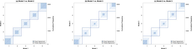
Figure 4
The observer agreement charts of categorized small area estimates among Models 1, 2 and 3.