
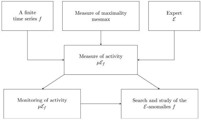
Figure 1
The scheme of the analysis of a time series using the FL methods.
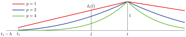
Figure 2
The global measure of closeness.
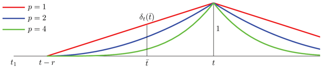
Figure 3
The local measure of closeness.
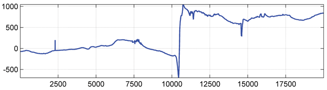
Figure 4
The function under examination.
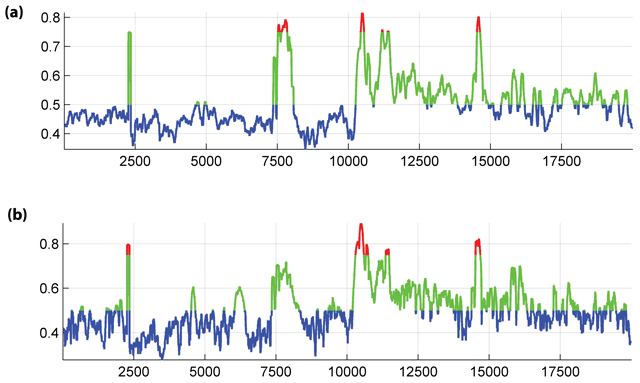
Figure 5
The measures of activity μDf(t) : a) based on (2), b) based on (3).
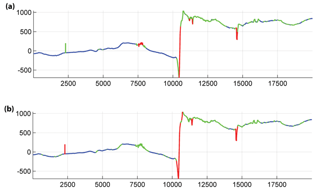
Figure 6
Anomalies marked out using the measures of activity (Fig. 5).
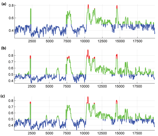
Figure 7
The measures of activity μεf(t): a) based on (7), b) based on (8), c) based on (9).
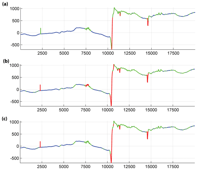
Figure 8
Anomalies marked out using the measures of activity (Fig. 7).
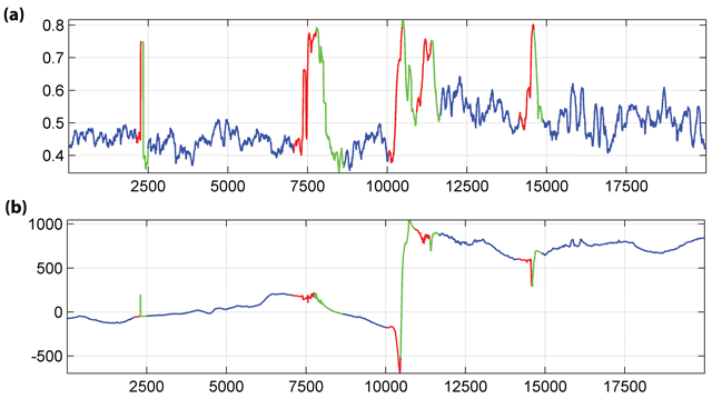
Figure 9
a) Areas of monotoneness (red is for increase, green is for decrease); b) Reduction to the initial record.
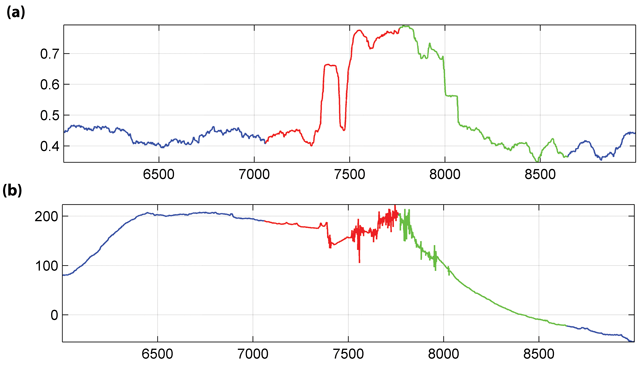
Figure 10
A fragment of initial record (Fig. 9): a) Areas of monotoneness (red is for increase, green is for decrease); b) Reduction to the initial record.
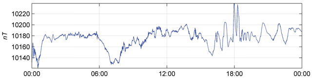
Figure 11
The initial time series.
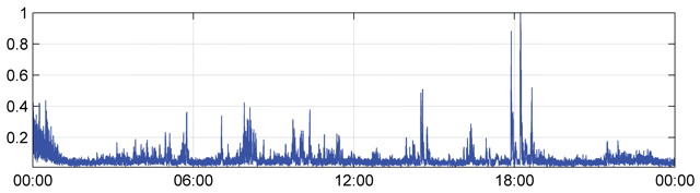
Figure 12
The corresponding activity.
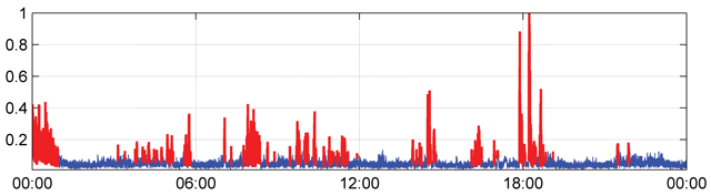
Figure 13
DPS: step 1. Results of identification of anomalies on the indicator of activity.
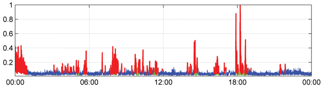
Figure 14
DPS: step 2. Clustering of the intervals.
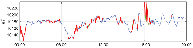
Figure 15
DPS: final result. Reduction to the initial function.
Figure 16
The massiveness of anomalies.
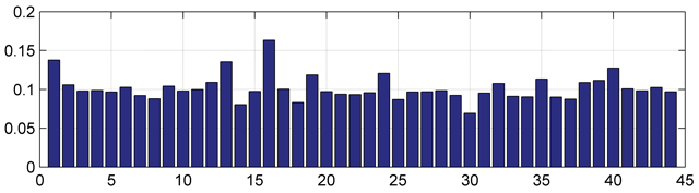
Figure 17
Mean activity of the anomalies.
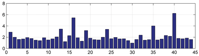
Figure 18
Mean energy of the anomalies.
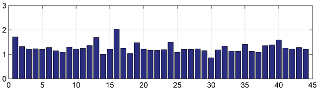
Figure 19
Mean jaggedness of the anomalies.
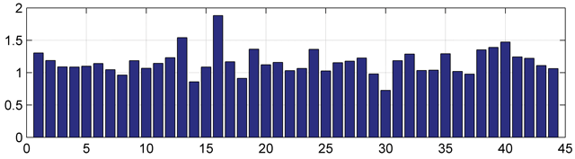
Figure 20
Mean scatterness of the anomalies.
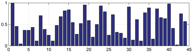
Figure 21
Index of anomalies based on massiveness.

Figure 22
Index of anomalies based on mean activity.
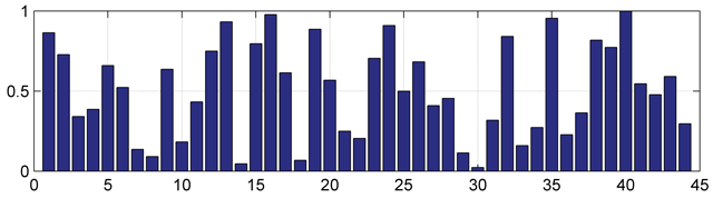
Figure 23
Index of anomalies based on mean energy.
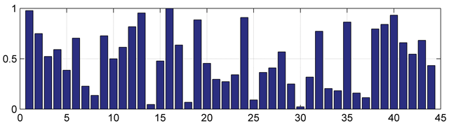
Figure 24
Index of anomalies based on mean jaggedness.
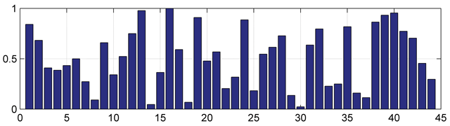
Figure 25
Index of anomalies based on mean Scatterness.
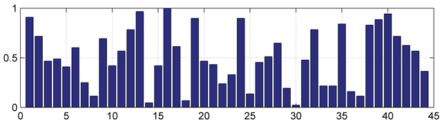
Figure 26
Complex index of anomalies.
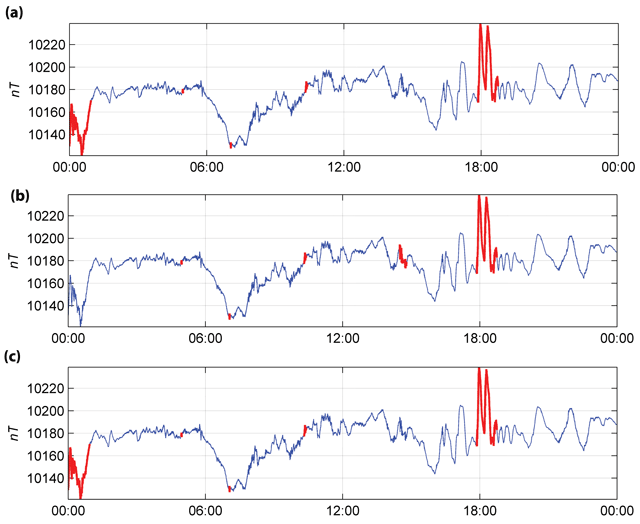
Figure 27
Anomalies marked out using: a) indLA; b) indOA; c) .
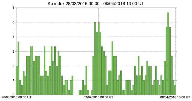
Figure 28
Planetary Kp index values for the period from 28.03.2016 to 08.04.2016.
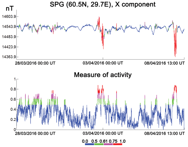
Figure 29
The results of classification of initial data into background (blue), weakly anomalous (green), anomalous (purple) and strongly anomalous (red) fragments using the measure of anomality. On the upper plot the initial record is shown, on the bottom plot the measure of anomality is displayed, calculated for this record.