Table 1
Organizations that participated in testing events with their corresponding test dates and sample sizes.
| TESTING EVENT | DATE | SAMPLE SIZE | VOLUNTEER TYPE |
|---|---|---|---|
| ORED staff | 2/26/19 | 23 | University of Idaho staff |
| Idaho commons | 3/22/19 | 23 | University of Idaho college students, staff |
| ORED open house | 4/4/19 | 11 | General college population |
| Spokane River forum | 4/16/19 | 16 | Water professionals, educators, general public |
| Columbia High School | 5/28/19 | 15 | High school students |
| Palouse Basin aquifer committee meeting | 10/10/19 | 13 | General public, water professionals, students |
| OurGem symposium | 11/6/19 | 9 | General public, water professionals |
| Idaho Water Institute symposium | 11/12/19 | 3 | Water resources graduate students, faculty |
| Idaho commons | 12/6/19 | 9 | University of Idaho college students |
| Idaho water quality workshop | 2/11/20 | 10 | Water professionals, students, general public, faculty |
| Continuum test: visual samplers | 6/24/19 | 5 | Idaho Water Institute staff and interns |
| Continuum test: app samplers | 1/24/20 | 5 | Water resources graduate students |
[i] Notes: ORED = Office of Research and Economic Development.
Table 2
Breakdown of volunteers using each quantification method using either categorical or continuous instructions to test their sample.
| NITRATE CONCENTRATION (PPM) | TOOL | CATEGORICAL INSTRUCTIONS N = | CONTINUOUS INSTRUCTIONS N = |
|---|---|---|---|
| 2 | App | 17 | 16 |
| Eye | 18 | 16 | |
| 15 | App | 17 | 16 |
| Eye | 17 | 15 |
Table 3
Test strip categories used by visual volunteers and the ranges of continuous nitrate samples placed in those bins.
| HACH© TEST STRIP SCALE (PPM) | CONTINUOUS SAMPLES ASSIGNED TO EACH CATEGORY (PPM) |
|---|---|
| 0.0 | n/a |
| 1.0 | 1 |
| 2.0 | 3 |
| 5.0 | 5, 7 |
| 10.0 | 9, 11, 13, 15 |
| 20.0 | 17, 19, 21, 23, 25, 27, 29, 31, 33, 35 |
| 50.0 | 37, 39, 41, 43, 45, 47, 49 |
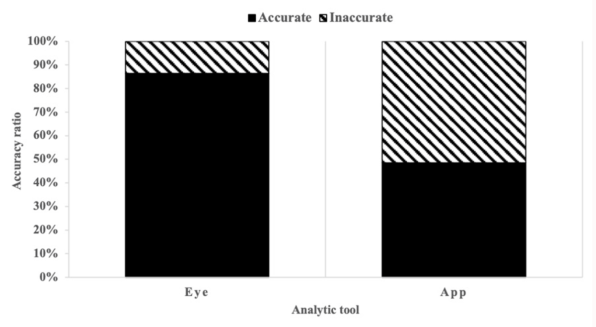
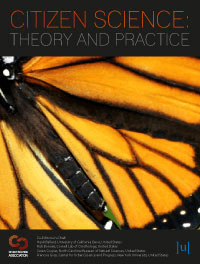
Figure 1
Graphical representation of the proportions of accurate and inaccurate responses for both analytic tools.
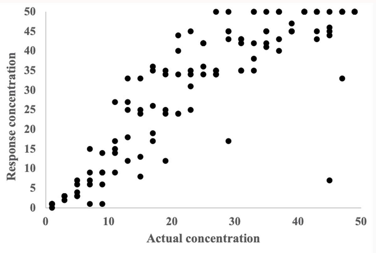
Figure 2
A scatter plot of data produced by continuous app users that compares the actual concentration of nitrate to the volunteers’ recorded values.
Figure 3
The dots represent continuous sample concentrations and their designated Hach© category bins. For example, concentrations that fall between 15.1 and 35.9 ppm (or mg/L) would be binned into category 5.
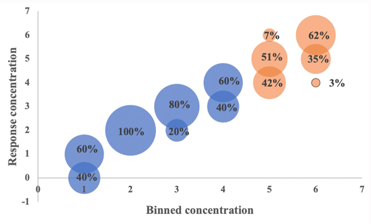
Figure 4
The relationship between nitrate concentrations and corresponding response categories produced by visual volunteers. The blue color corresponds to the samples in the lower range with smaller residuals and the orange corresponds to the samples in the higher range with residuals across three categories. The size of the circles provides a visual approximation of the proportion of samples that fall within each response concentration. In each case the total proportion equals 100%. The response concentration categories are defined by Hach as: 0 = 0ppm, 1 = 1ppm, 2 = 2ppm, 3 = 5 ppm, 4 = 10 ppm, 5 = 20 ppm, and 6 = 50 ppm.