
Table 1
Occupant time in space and workspace type by building type.
| OFFICE | HEALTHCARE | K-12 EDUCATION | HIGHER EDUCATION | LABORATORY | MULTI-UNIT RESIDENTIAL | TOTAL (%) | ||
|---|---|---|---|---|---|---|---|---|
| Time in the building | <1 year | 14,052 | 1,302 | 921 | 208 | 213 | 8 | 17.9% |
| 1–2 years | 16,094 | 921 | 1,002 | 222 | 213 | 7 | 19.8% | |
| 3–5 years | 13,091 | 488 | 805 | 217 | 141 | 8 | 15.8% | |
| >5 years | 23,571 | 1,088 | 1,315 | 140 | 50 | 6 | 28.1% | |
| n.a. | 13,221 | 663 | 69 | 1,738 | 557 | 910 | 18.4% | |
| Time at one’s personal workspace | <3 months | 8,553 | 24 | 144 | 43 | 61 | 3 | 9.4% |
| 4–6 months | 7,976 | 28 | 611 | 85 | 76 | 8 | 9.4% | |
| 7–12 months | 12,543 | 25 | 600 | 156 | 185 | 6 | 14.4% | |
| >1 year | 44,978 | 162 | 2,669 | 482 | 492 | 12 | 52.1% | |
| n.a. | 6,121 | 4,417 | 88 | 1,786 | 360 | 910 | 14.6% | |
| Time in the workspace per week | <10 hours | 4,134 | 41 | 225 | 123 | 76 | 2 | 5.0% |
| 11–30 hours | 10,520 | 65 | 531 | 104 | 98 | 13 | 12.4% | |
| >30 hours | 53,450 | 390 | 3,136 | 278 | 838 | 13 | 63.7% | |
| n.a. | 10,040 | 4,133 | 110 | 1,916 | 116 | 911 | 18.9% | |
| Type of workspace | Private | 17,545 | 71 | 586 | 442 | 269 | 10 | 20.3% |
| Shared | 4,620 | 90 | 322 | 310 | 89 | 3 | 5.8% | |
| High partition | 23,569 | 60 | 51 | 77 | 55 | 7 | 25.5% | |
| Low partition | 20,405 | 81 | 69 | 134 | 56 | 7 | 22.2% | |
| Open desk | 8,312 | 71 | 286 | 167 | 73 | 2 | 9.5% | |
| Other | 5,748 | 4,283 | 2,798 | 1,422 | 441 | 910 | 16.7% |
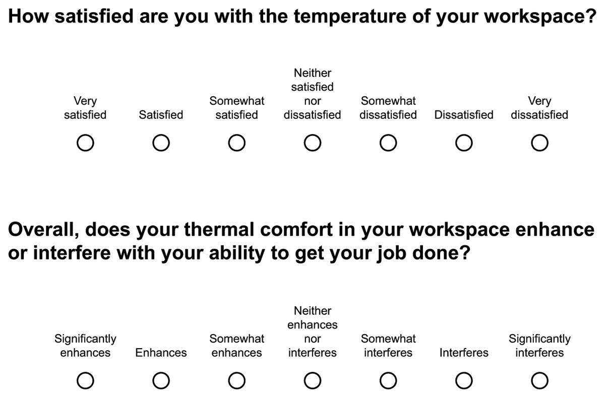
Figure 1
Example questions from the Center for the Built Environment’s CBE Occupant Survey.
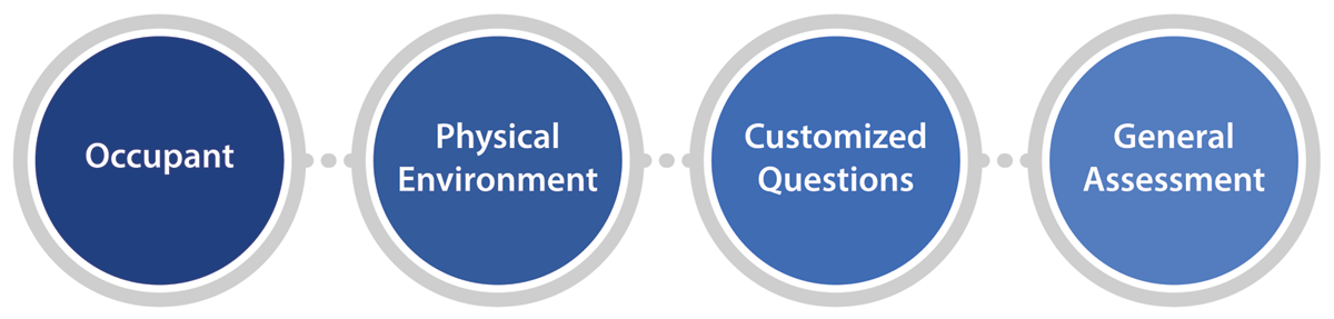
Figure 2
General structure and sequence of the CBE Occupant Survey.
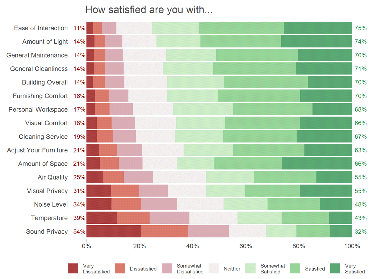
Figure 3
Satisfaction ratings by item.
Note: Votes for the 16 satisfaction items in the CBE Occupant Survey. N = 897 buildings and 84,366 respondents. Numbers colored red to the left of the bars count the percentage of dissatisfied votes (1–3); and numbers colored green to the right of the bars count the percentage of satisfied votes (5–7).
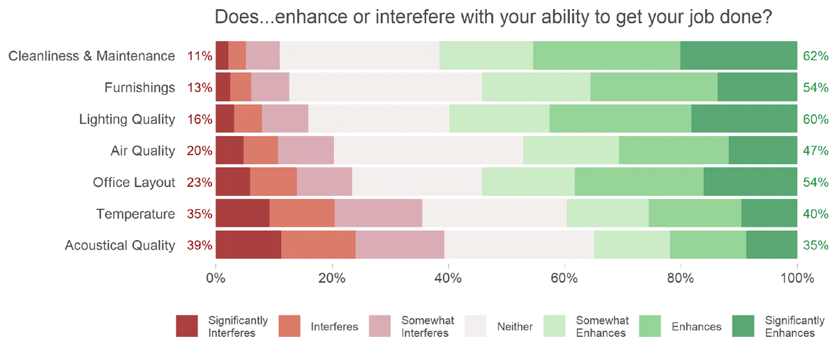
Figure 4
Self-reported productivity ratings by item.
Note: Votes for the seven self-reported productivity (i.e. ‘enhance/interfere’) items in the CBE Occupant Survey. N = 897 buildings and 79,137 respondents in the CBE Occupant Survey. Numbers colored red to the left of the bars count the percentage of votes for interfere (1–3); and numbers colored green to the right of the bar count the percentage of votes for enhance (5–7).
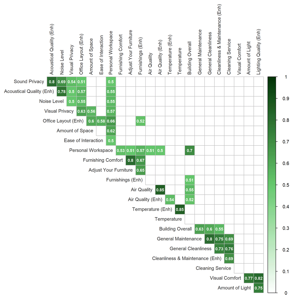
Figure 5
Correlation matrix of satisfaction and enhance or interfere items.
Note: The correlation matrix of the 16 satisfaction items and seven enhance or interfere items (labels with the ‘Enh’ suffix) are based on pairwise complete observations. Items are arranged by the angular order of eigenvectors and only moderate (0.5–0.8) and strong (> 0.8) correlations are shown for legibility.
Table 2
Principal component analysis (PCA) rotated factor loadings for satisfaction items.
| AIR | CLEANLINESS | LAYOUT | INTERACTION | LIGHTING | FURNITURE | ACOUSTICS | |
|---|---|---|---|---|---|---|---|
| Temperature | 0.88 | 0.15 | 0.11 | 0.05 | 0.12 | 0.11 | 0.13 |
| Air quality | 0.59 | 0.40 | 0.13 | 0.09 | 0.20 | 0.19 | 0.15 |
| General cleanliness | 0.13 | 0.90 | 0.09 | 0.06 | 0.11 | 0.12 | 0.08 |
| General maintenance | 0.16 | 0.86 | 0.08 | 0.09 | 0.12 | 0.12 | 0.08 |
| Cleaning service | 0.08 | 0.85 | 0.09 | 0.01 | 0.09 | 0.11 | 0.10 |
| Building overall | 0.35 | 0.56 | 0.25 | 0.22 | 0.23 | 0.20 | 0.19 |
| Amount of space | 0.13 | 0.15 | 0.85 | 0.13 | 0.12 | 0.20 | 0.11 |
| Visual privacy | 0.05 | 0.07 | 0.70 | 0.13 | 0.14 | 0.09 | 0.45 |
| Personal workspace | 0.28 | 0.31 | 0.53 | 0.22 | 0.26 | 0.29 | 0.32 |
| Ease of interaction | 0.10 | 0.14 | 0.24 | 0.90 | 0.15 | 0.15 | 0.16 |
| Amount of light | 0.12 | 0.16 | 0.15 | 0.10 | 0.88 | 0.14 | 0.12 |
| Visual comfort | 0.16 | 0.18 | 0.13 | 0.07 | 0.86 | 0.17 | 0.15 |
| Adjust your furniture | 0.14 | 0.17 | 0.15 | 0.08 | 0.15 | 0.88 | 0.13 |
| Furnishing comfort | 0.12 | 0.19 | 0.18 | 0.09 | 0.16 | 0.87 | 0.12 |
| Sound privacy | 0.12 | 0.10 | 0.22 | 0.04 | 0.10 | 0.12 | 0.86 |
| Noise level | 0.14 | 0.16 | 0.16 | 0.14 | 0.15 | 0.12 | 0.83 |
[i] Note: Rotated factor loadings for the 16 satisfaction items are from the PCA. Items are sorted by their contribution to each component. Loadings > 0.5 are grouped and highlighted for clarity.
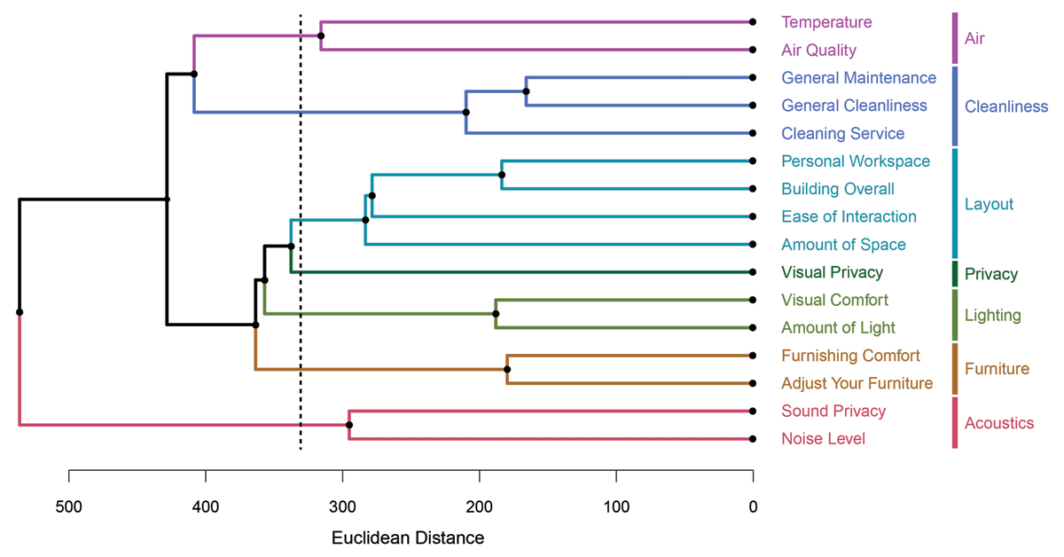
Figure 6
Dendrogram of the hierarchical cluster analysis.
Note: Dendrogram showing the results of the hierarchical cluster analysis. Colors show the cluster association based on seven clusters cut at a Euclidian distance of approximately 320 (dashed line). Similar thematic mapping of the clusters to what was reported in Table 2 is shown to the right of the dendrogram.
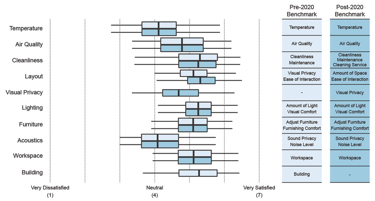
Figure 7
Comparison of pre- and post-2020 CBE Occupant Survey benchmark scores.
Note: Box plot showing the comparison of benchmark scores of the CBE Occupant Survey database calculated before the current analysis (pre-2020) and based on the results from the current analysis (post-2020). N = 881 buildings. The line in the box shows the median; lower and upper bounds of the boxes correspond to the 25th and 75th percentiles; and whiskers show the 5th and 95th percentiles. Text columns to the right show which satisfaction items were included in each benchmark score schema.
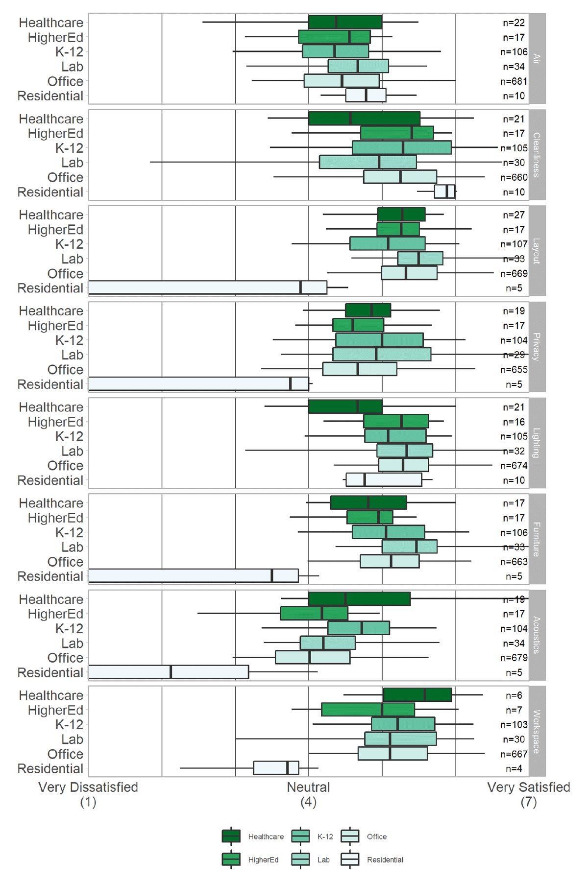
Figure A1
Benchmark scores of the CBE Occupant Survey database calculated by building type.
Note: Box plot showing the comparison of benchmark scores of the CBE Occupant Survey database calculated by building type. The line in the box shows the median; lower and upper bounds of the boxes correspond to the 25th and 75th percentiles; and whiskers show the 5th and 95th percentiles.