
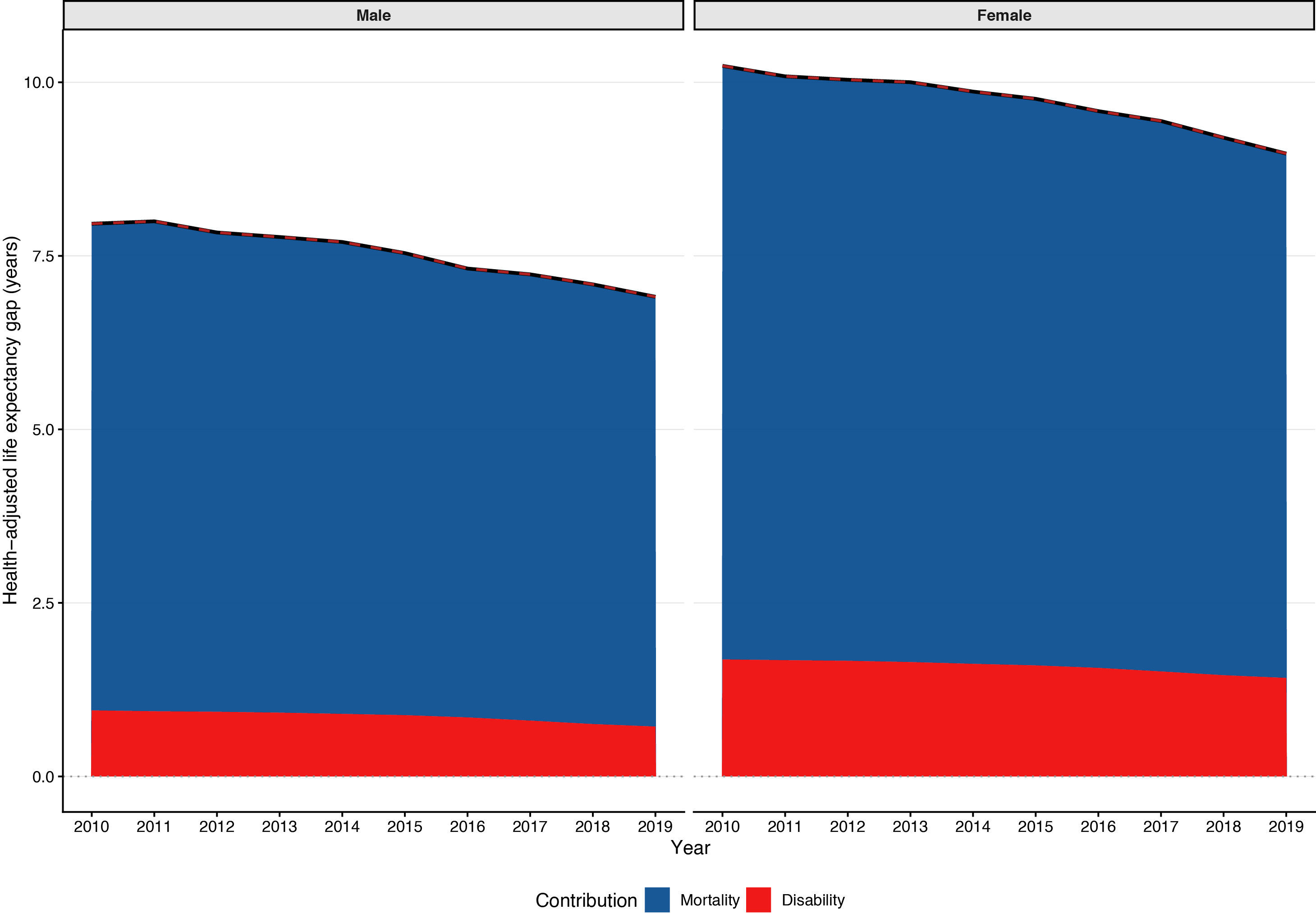
Figure 1
Decomposition of the HALE gap by sex.
Notes: Stacked areas represent contributions of mortality (blue) and disability (red) to the overall HALE gap. The dashed red line shows the long‑term trend extracted by empirical mode decomposition. Panels display results for males (left) and females (right). Positive values indicate higher HALE in higher‑income countries.
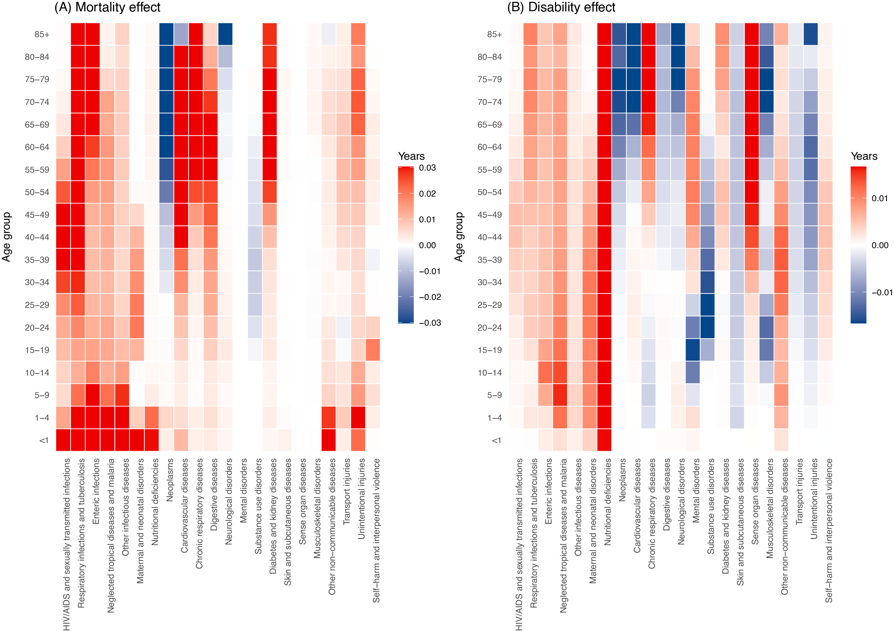
Figure 2
Heatmaps of age–cause contributions to the HALE gap between higher‑income and lower‑income countries, 2019.
Notes: Panel A (left): mortality effect; Panel B (right): disability effect. Red cells represent causes and ages that widen the HALE gap (favoring higher‑income countries), while blue cells represent contributions that narrow the HALE gap.
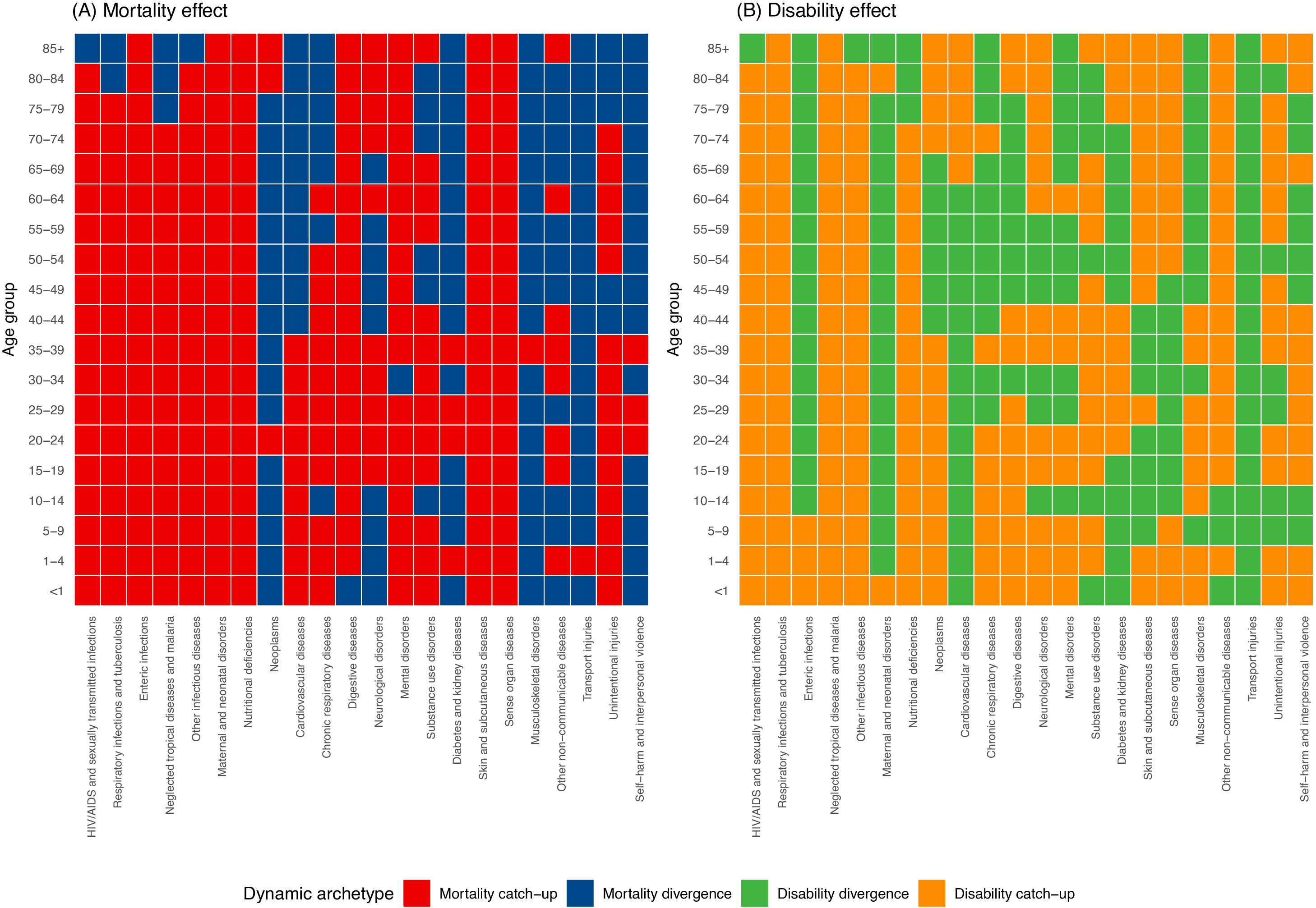
Figure 3
Dynamic archetypes of age–cause contributions over 2010–2019.
Notes: Panel A (left): mortality effect; Panel B (right): disability effect. Each cell corresponds to an age–cause combination and is colored according to its trend direction: red, mortality catch‑up (trend narrowing the HALE gap); blue, mortality divergence (trend widening the HALE gap); green, disability divergence; orange, disability catch‑up.
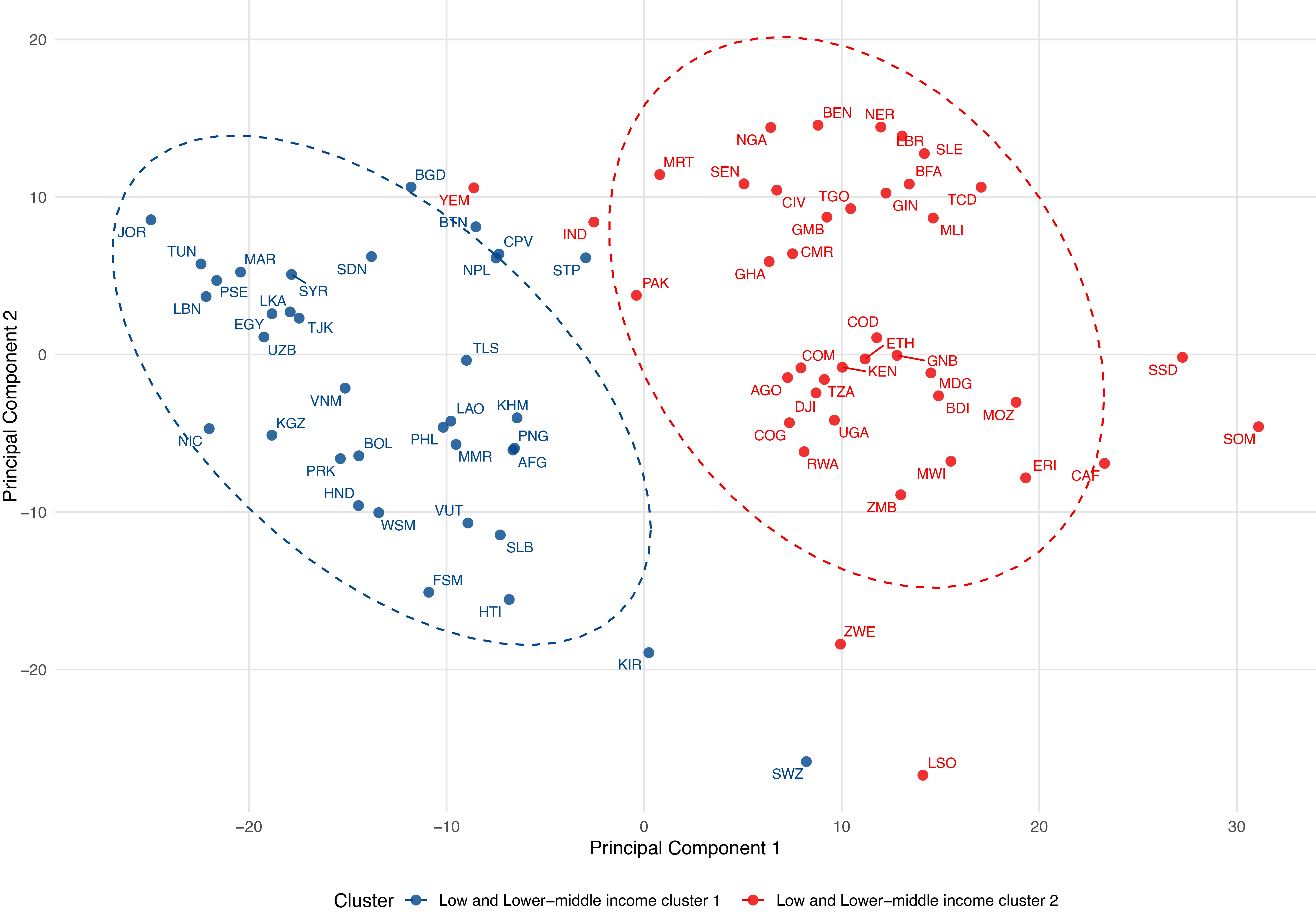
Figure 4
Clustering of lower‑income countries by age–cause contribution profiles.
Notes: Principal component analysis of lower‑income countries based on their age–cause contribution vectors. Countries are colored by cluster membership, and ellipses denote 95% confidence regions. Country labels use ISO 3166‑1 alpha‑3 codes.
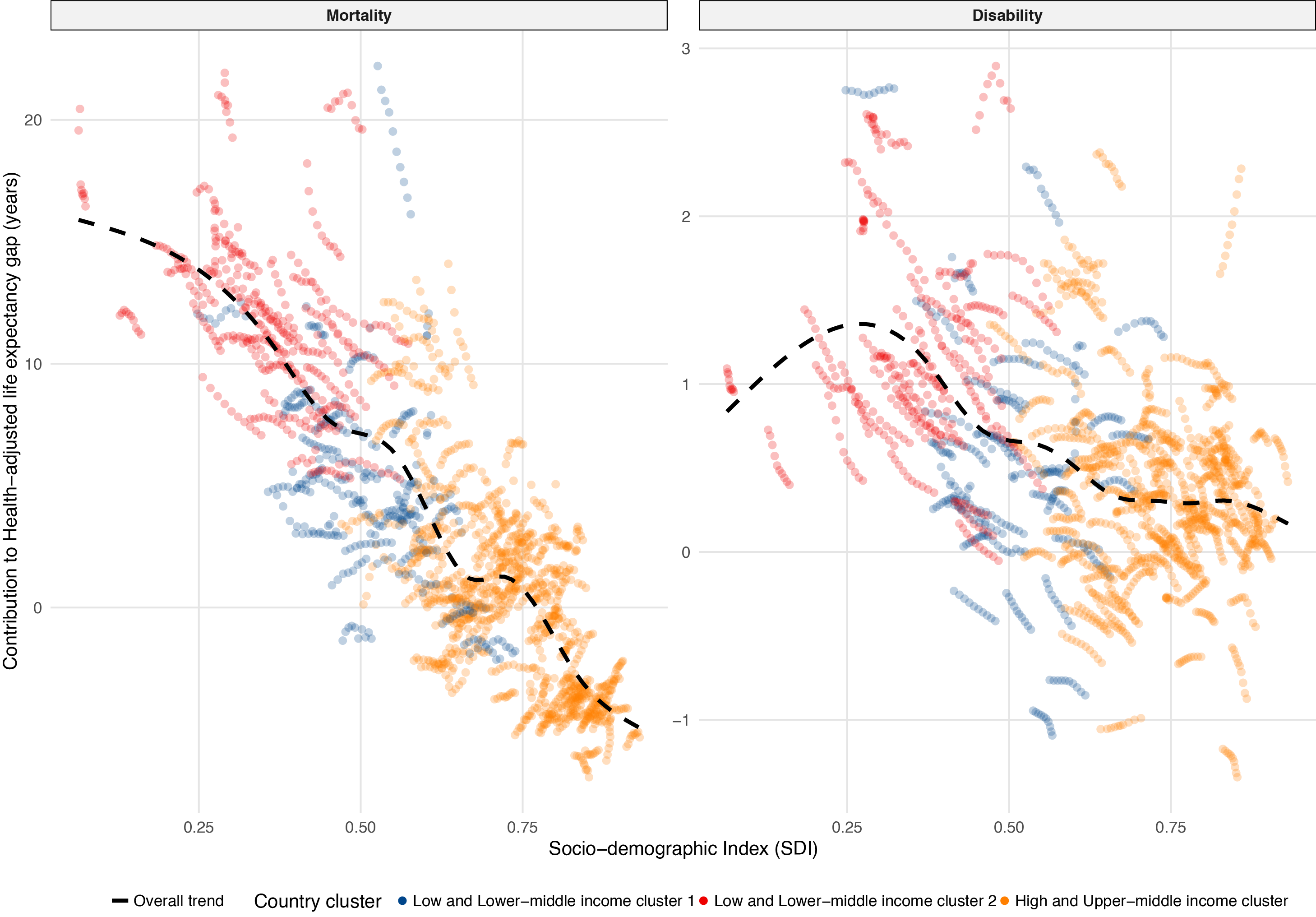
Figure 5
Mortality and disability contributions to the HALE gap as a function of the Socio‑demographic Index.
Notes: Points represent country‑year observations, colored by the clusters identified in Figure 4. Solid curves are fitted by generalized additive models, showing the overall trend.