
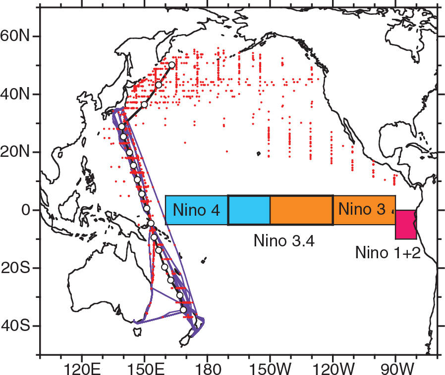
Fig. 1
Locations where the O2/N2 ratios and CO2 mixing ratios were observed. Red dots and purple lines indicate flask sampling and in-situ measurement sites, respectively. Open circles represent the average positions of the binned flask data. The black line connecting the open circles depicts the latitudinal transect, along which the observed and modelled APO values are compared. Four tropical Pacific regions for Niño 1+2 (10–0°S, 90–80°W), Niño 3 (5°S–5°N, 150–90°W), Niño 3.4 (5°S–5°N, 170–120°W) and Niño 4 (5°S–5°N, 160°E–150°W) indices are also shown.
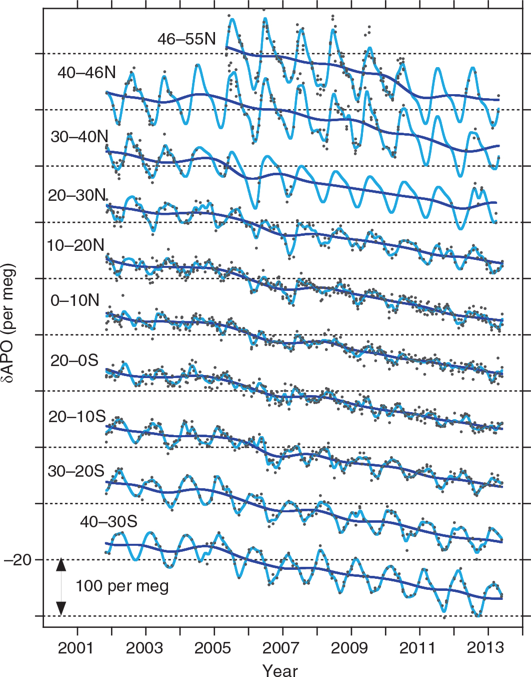
Fig. 2
Time series of APO based on the O2/N2 and CO2 flask measurements. Light blue lines indicate the smooth-curve fits to the data, and the darker blue lines indicate the trend curves. The horizontal lines correspond to −20 per meg for the crossing time series. The distance between the horizontal lines is 100 per meg.
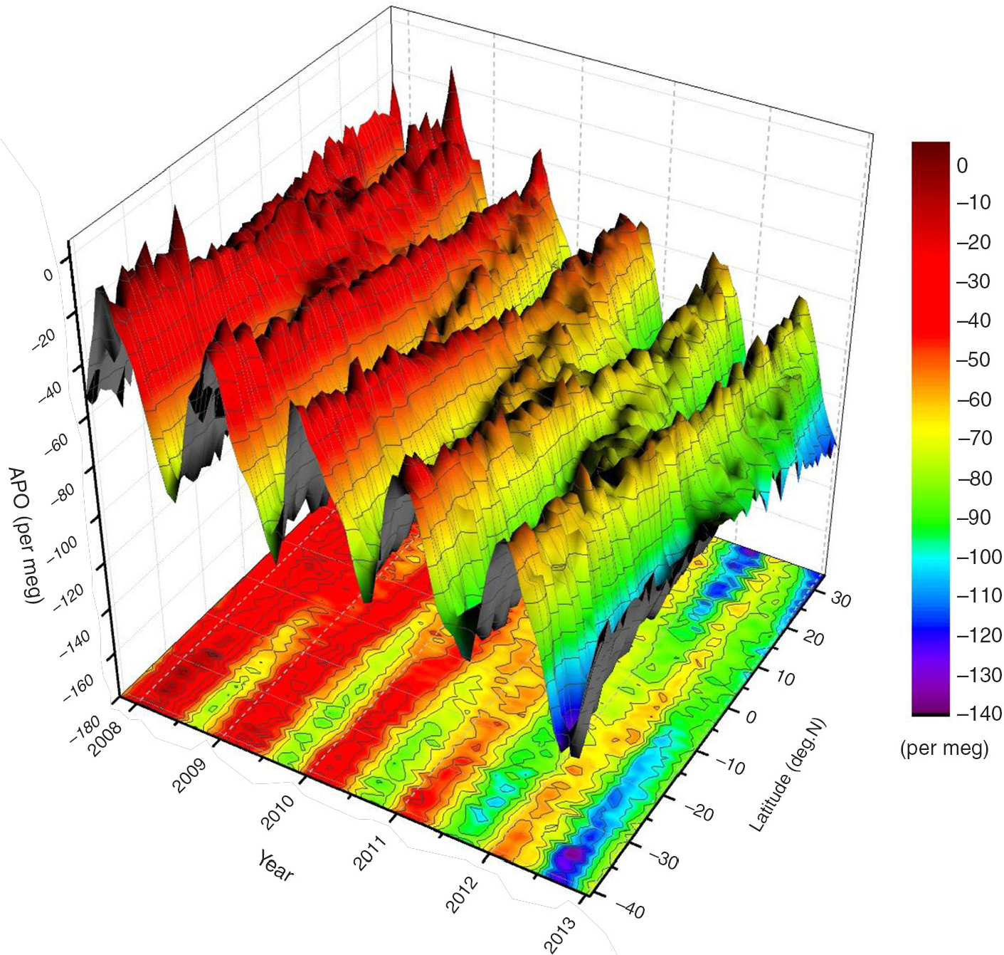
Fig. 3
Time-latitude surface depiction of monthly mean APO based on the in-situ measurements of atmospheric O2 and CO2 (Yamagishi et al., 2012) onboard VOS (TF5). The monthly means are computed for 1-degree latitude bands from the smooth curve fit to the binned data.
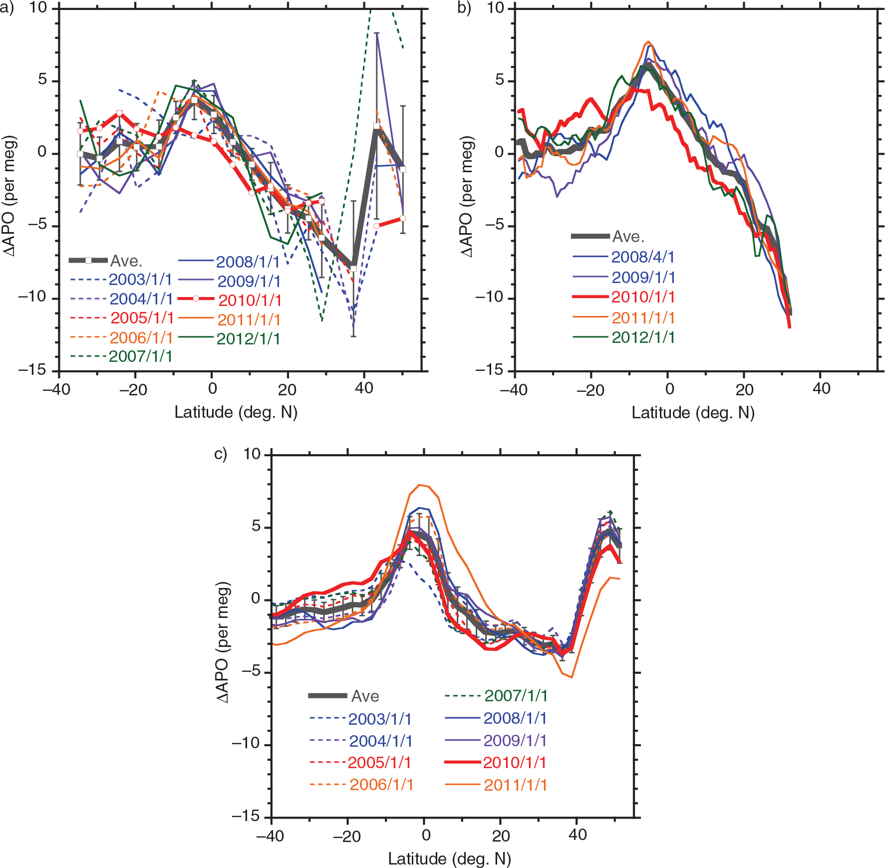
Fig. 4
Latitudinal distribution of the detrended annual mean APO based on the (a) flask measurements, (b) onboard in-situ measurements and (c) model simulations. The distributions are plotted along the latitudinal transect shown in Fig. 1. The black thick line in each panel represents an average distribution of all the values shown by the coloured lines. The red lines correspond to the distributions for the 2009/2010 El Niño period. The data labels (1 January 2003, etc.) indicate the centre of the averaging interval.
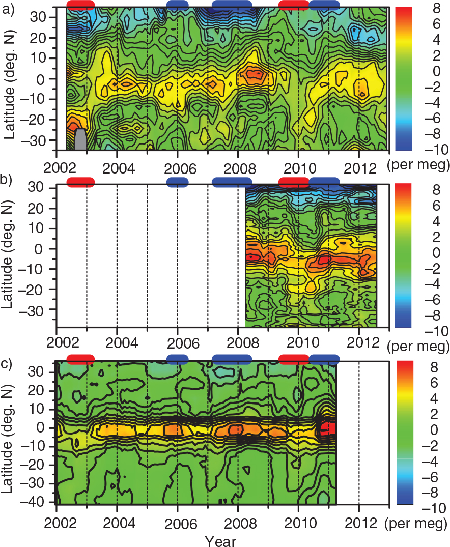
Fig. 5
Time-latitude plot of the detrended annual mean APO based on the (a) flask measurements, (b) onboard in-situ measurements and (c) model simulations. The El Niño and La Niña periods are depicted as red and blue bars, respectively, on the top of each panel.
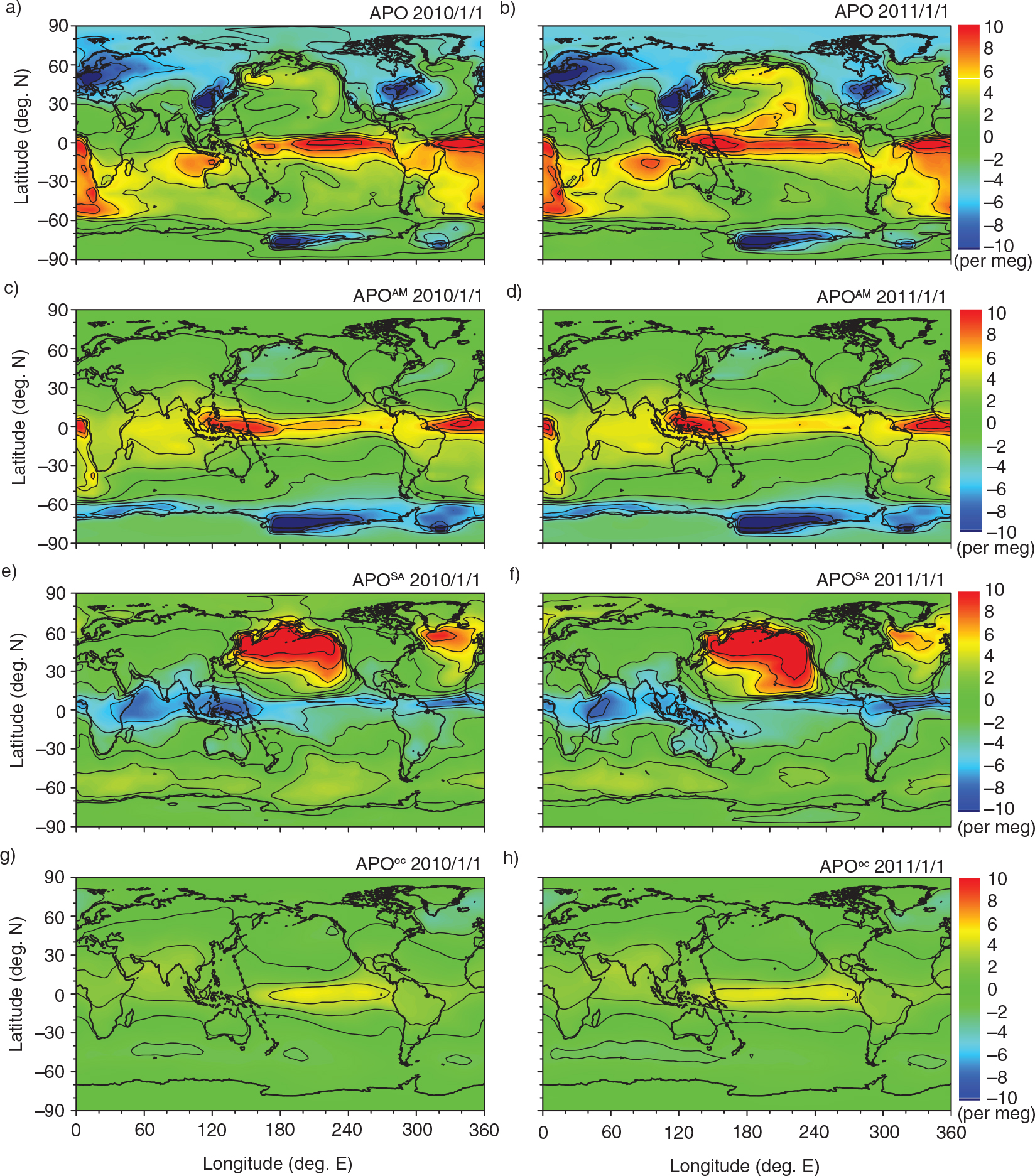
Fig. 6
Global distribution of annual mean simulations for (a, b) total APO, (c, d) APOAM, (e, f) APOSA and (g, h) APOOC. The left and right panels show the annual means centred on January 1, 2010 (El Niño period) and January 1, 2011 (La Niña period), respectively.
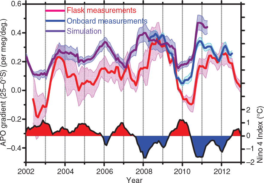
Fig. 7
Temporal changes in the latitudinal gradient of the annual mean APO between 25°S and equator (left axis). Red and blue lines represent the flask and onboard in-situ measurements, respectively, and purple line represents the simulation. The time series of the Niño 4 index is also depicted at the bottom of the figure (right axis).
Table 1. Comparison of latitudinal APO gradients based on flask measurements, onboard measurements and model simulation
Time period2002/5–2012/122008/4–2012/72001/1–2011/4Average (±1σ)a0.12±0.120.25±0.100.26±0.09Correlation coefficientb0.67 (<0.001)0.81 (<0.001)Variable ratio (±1σ)c,d0.73±0.050.79±0.08
[ii] bCorrelation coefficients of the measured and simulated APO time series for the overlapping periods are given. Values in parentheses are p-values.
[iii] cVariable ratios are calculated as regression slopes of scatter plots of APO gradients between flask or shipboard observations (x-axis) and model simulations (y-axis) by using a reduced major axis (RMA) regression analysis (Hirsch and Gilroy, 1984).
Table 2. Correlation coefficients between the APO gradients and ENSO indices
ENSO indicesZero-lagaLaggedbZero-lagaLaggedbZero-lagaLaggedb
Nino 1+20.17 (0.06)−0.34 (+10)−0.03 (0.86)−0.38 (+7)−0.26 (0.01)−0.51 (+3)Nino 3−0.28 (0.001)−0.50 (+5)−0.46 (<0.001)−0.68 (+3)−0.70 (<0.001)−0.78 (+2)Nino 3.4−0.49 (<0.001)−0.65 (+4)−0.65 (<0.001)−0.80 (+3)−0.84 (<0.001)−0.87 (+1)Nino 4−0.55 (<0.001)−0.69 (+4)−0.76 (<0.001)−0.84 (+2)−0.88 (<0.001)−0.90 (+1)
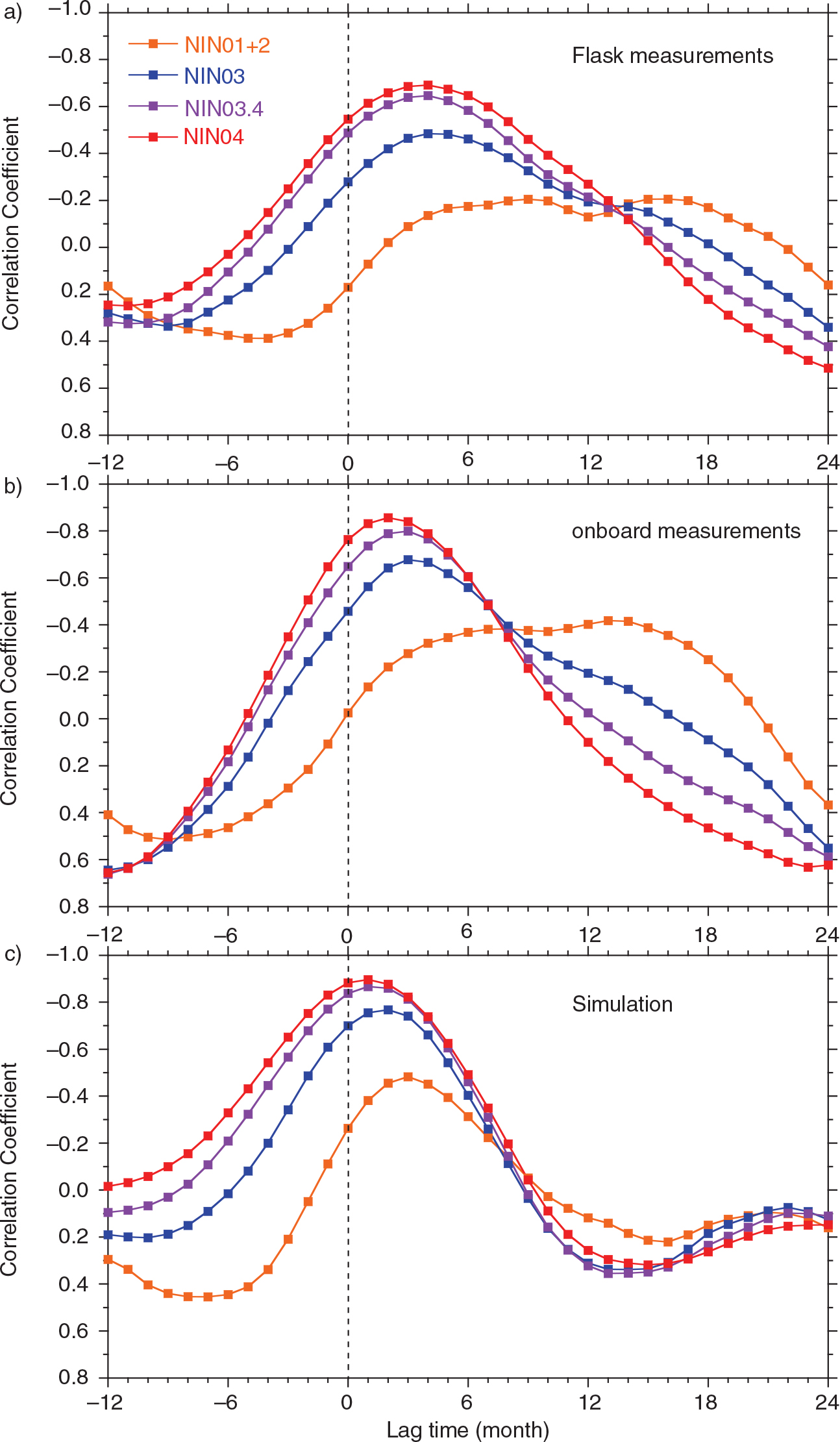
Fig. 8
Correlation coefficients between the Niño indices and the lagged APO gradients (25–0°S) based on the (a) flask measurements, (b) onboard in-situ measurements and (c) model simulation. Orange, blue, purple and red lines correspond to the Niño 1+2, Niño 3, Niño 3.4 and Niño 4 indices, respectively.
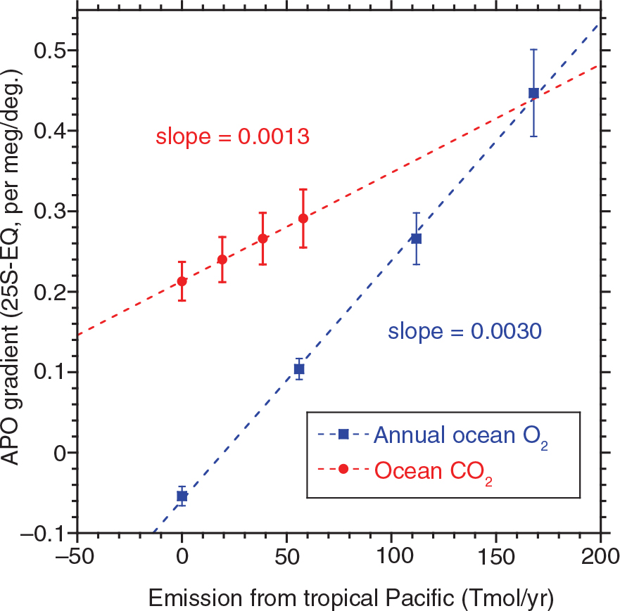
Fig. 9
Relationship between the simulated APO gradients (25–0°S) and the net O2 and CO2 emission from the tropical Pacific region (20°S–20°N and 120°E–80°W), obtained from the experimental simulations (see text). The APO gradients are the averages for the entire simulation period and the vertical bars represent the standard deviations (1σ). The broken lines are linear regression fits.