
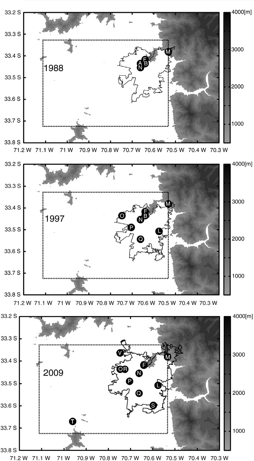
Fig. 1
Santiago's air monitoring sites (black dots) and stations symbols (white letters) for the years 1988, 1997 and 2009. The main topographic features of the Santiago basin are also shown (shading). The approximate urban–rural limit for the years 1989, 1996 and 2010 is shown in a black line (www.ocuc.cl). The area in which stations can be placed in this study is indicated by a dashed line.
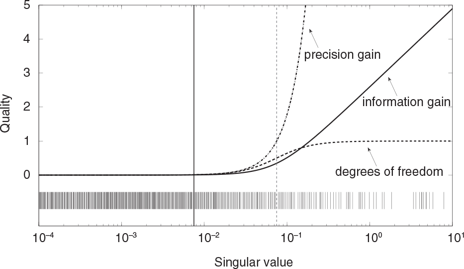
Fig. 2
Comparison of quality indicators as a function of singular values λ. The vertical continuous black line indicates the value of the parameter , and the vertical dashed grey line indicates the value of the parameter µ=0.075. The bottom of the figure shows the distribution of the 644 singular values of the sensitivity matrix for Santiago's network in 2009.
Table 1. Summary of the main quality indicators for measuring network quality
[i] See also Fig. 2 for illustration.
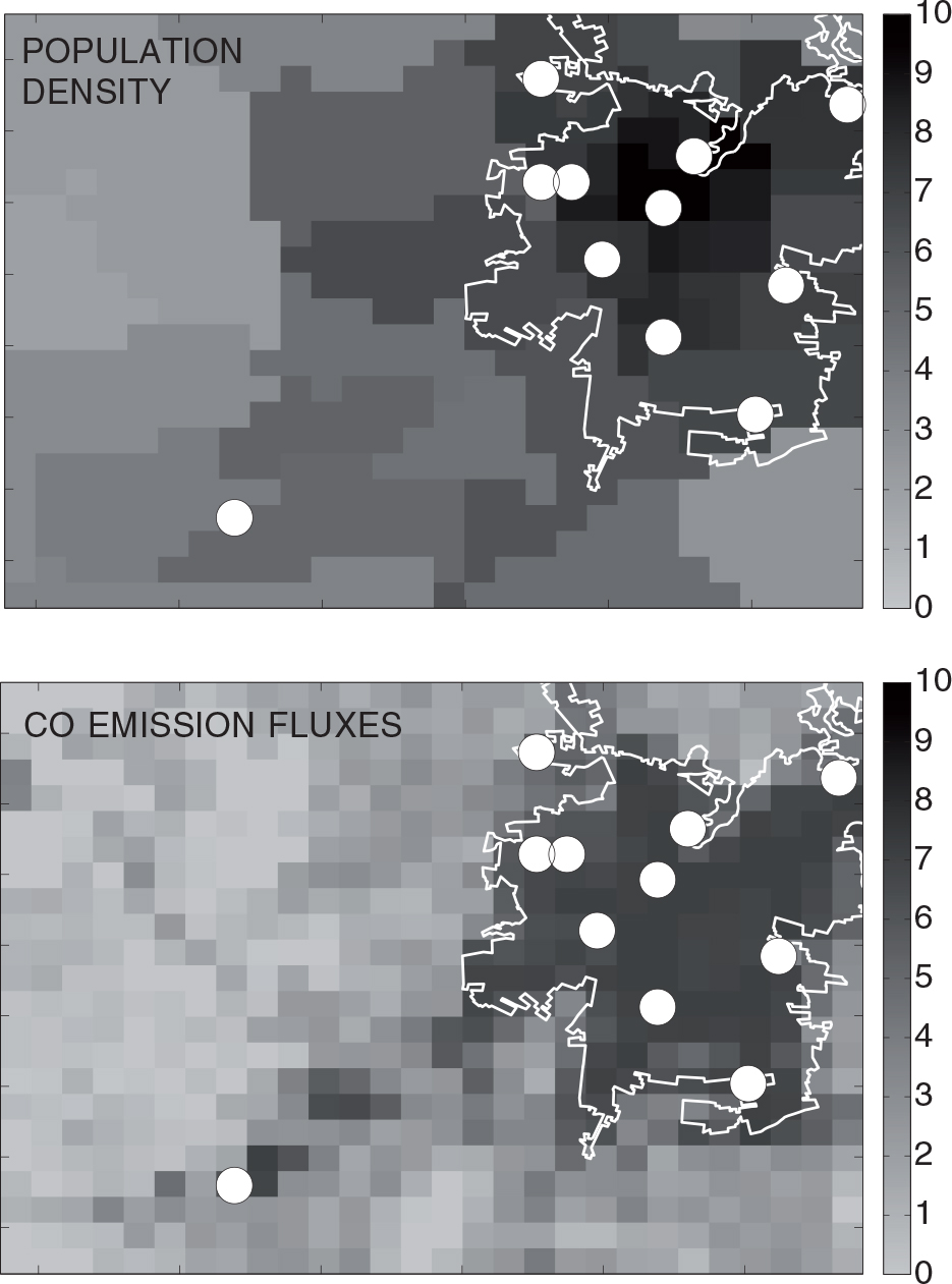
Fig. 3
Weighting functions applied in this work. The upper panel shows logarithm of population density (hab/km2). The lower panel shows logarithm of normalised CO summer emission fluxes (mol km−2 h−1). The white contour indicates the approximate urban–rural limit of Santiago in 2010. White circles show the location of monitoring stations in 2009.
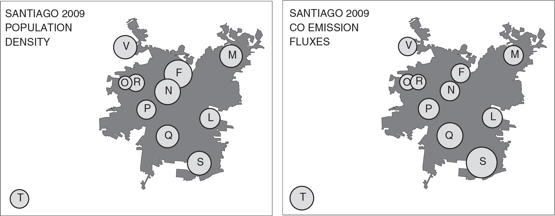
Fig. 4
Decreases in network's quality after removing stations. The centre of the circles indicates the position of the stations and each radius is a linear factor of the decrease in quality. The left (right) panel corresponds to the use of population density (emission fluxes) as weighting factors.
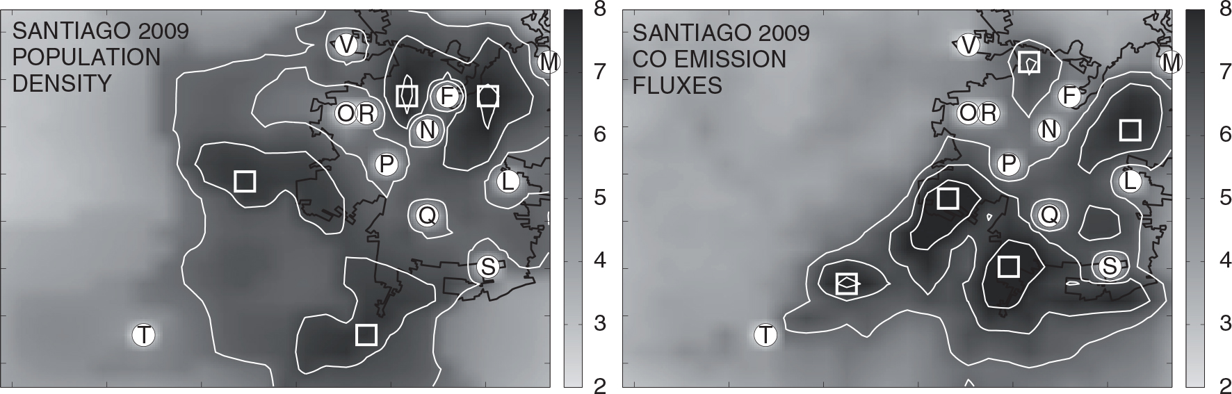
Fig. 5
Spatial distribution of increases in quality (shaded contours) for the 2009 network (white circles), after adding stations. White squares suggest the potential location of new stations coinciding with maxima in information gain. The left (right) panel shows the corresponding results using population density (emission fluxes) as weighting functions.

Fig. 6
Optimal networks according to wind pattern. Upper row: morning sensitivity weighted by population density (left), by CO emission fluxes (centre), and morning winds (right). Lower row: the same but for the afternoon sensitivity and afternoon winds.
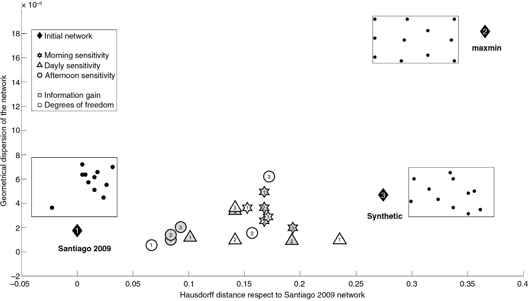
Fig. 7
Comparison among optimal networks using Hausdorff distance (in °), and geometrical dispersion (in °) for a set of 18 optimal networks for different hours of the day, initial conditions for SA and quality indicators. Black diamonds indicate the initial configurations used in the optimisation procedure: 1) Santiago 2009, 2) max–min and 3) synthetic. A sketch of each network is also shown. Stars indicate the optimal networks for morning hours, circles correspond to afternoon hours and triangles to average diurnal conditions. Networks obtained using information gain (degrees of freedom for signal) are shown by grey shaded (white) symbols.
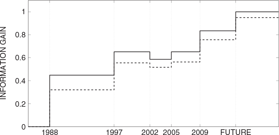
Fig. 8
Historical (dashed line) and optimal (continuous line) evolution of Santiago's air quality network using information gain and CO emission fluxes as weighting function. All values are normalised with respect to the optimal future scenario.
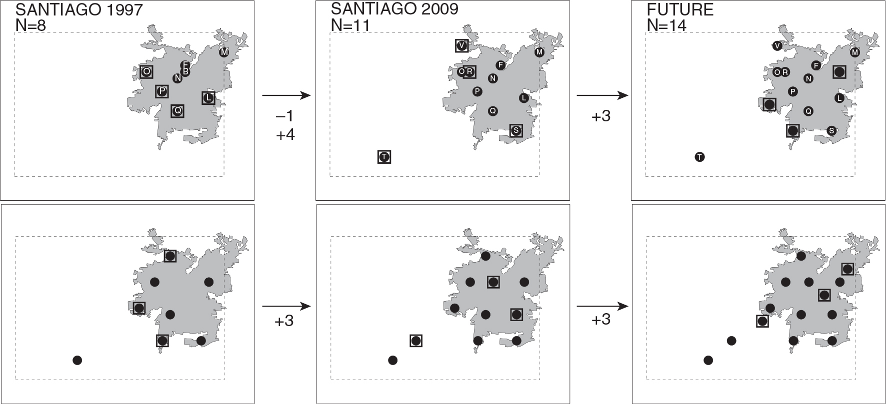
Fig. 9
Evolution of Santiago's air quality network. The upper (lower) panel shows the actual or historical (optimal) evolution. New stations are highlighted by a black square.