
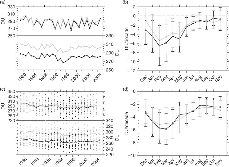
Fig. 1
(a) Time series of (top) DJF mean and (bottom) JJA mean TOMS/SBUV TCO over (black) the TP and (grey) the non-TP regions at the same latitude of the TP. (b) Seasonal variations of linear trends of monthly mean TOMS/SBUV TCO over (black) the TP and (grey) the non-TP regions for the period 1979–2009. The error bars represent uncertainties of ozone trends under a 90% confidence level. (c) The multi-model mean TCO time series averaged over all 12 CCMVal2 simulations for the period 1979–2005 (see text for details) over (black) the TP and (grey) the non-TP regions. The black and grey dots represent the corresponding values from each simulation. (d) is the same as (b), but for TCO trends derived from multi-model mean of 12 simulations for the period 1979–2005.
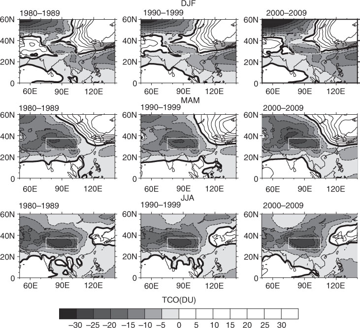
Fig. 2
Decadal mean TCO departures from the zonal mean in winter (DJF), spring (MAM) and summer (JJA) for the periods 1980–1989, 1990–1999 and 2000–2009 derived from NIWA assimilated TCO data set. The contour interval is 5 DU. Positive and negative contours are presented by the solid and dashed lines, respectively. The white rectangles represent the TP region.
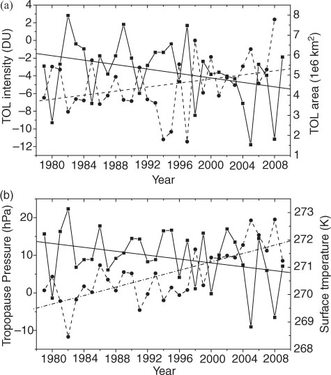
Fig. 3
(a) Time series of (solid line, left axis) DJF mean TOL intensity and (dashed line, right axis) DJF mean TOL area over the TP for the period 1979–2009. (b) Time series of (solid line, left axis) dynamic tropopause pressure differences over the TP from the non-TP regions and (dashed line, right axis) the surface temperature over the TP. The lines in (a) and (b) represent the corresponding linear trends with a 90% confidence interval of the time series for the period 1979–2009.
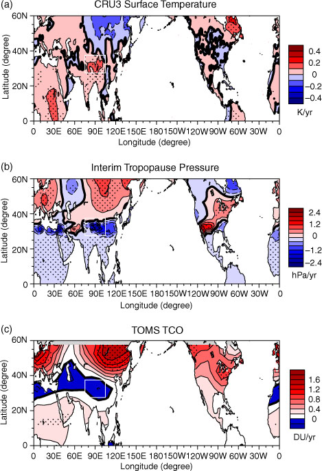
Fig. 4
(a) Linear trends of DJF mean of CRU surface temperatures over the Northern Hemisphere for the period 1990–2009. (b) Trends of thermal tropopause pressure over the Northern Hemisphere for period 1990–2009. (c) TCO trends over the Northern Hemisphere for the period 1990–2009. The dot area represents statistical significance with a 90% confidence and trends over oceans are not shown. The white rectangle in the figures represents the TP region.
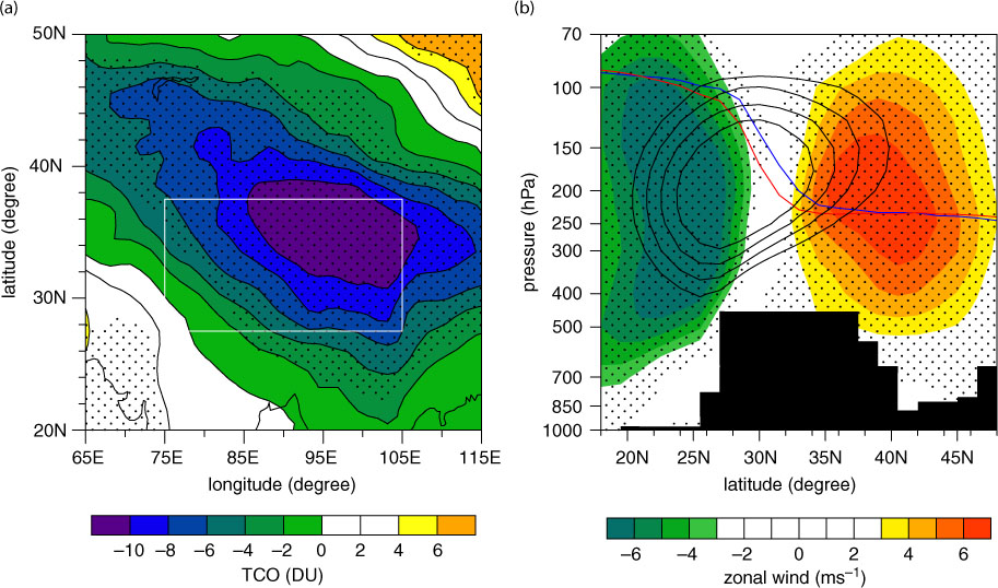
Fig. 5
(a) Differences between the warm and cold composites of DJF mean TCO anomalies (see text for more details). (b) Differences between the warm and cold composites of the zonal wind along 90°E. The composited dynamical tropopause under (blue) warm and (red) cold surface temperatures as well as climate mean (from 1979 to 2009) westerly jet (zonal winds greater than 30 m s−1 represented by black contours with 5 m s−1 interval) over the TP are also shown in (b) for reference. The dot areas in (a) and (b) represents statistical significance with a 95% confidence. The white rectangle in (a) represents the TP region and the filled dark black area in (b) represents the orography of the TP.
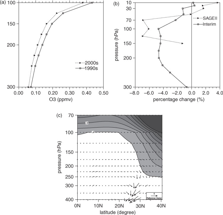
Fig. 6
(a) The decadal mean ozone profiles over the TP for the periods (solid line) 1990–1999 and (dashed line) 2000–2009. (b) Percentage differences in DJF mean of ozone differences over the TP from the non-TP between the periods 2000–2009 and 1990–1999 derived from (solid line) ERA-Interim and (dashed line) SAGE II ozone data. (c) Latitude–height cross-section of anomalous meridional circulation along 90°E between the time periods 2000–2009 and 1990–1999 (vectors in scales of 1 m s−1 for the meridional wind and 2 cm s−1 for the vertical velocity).
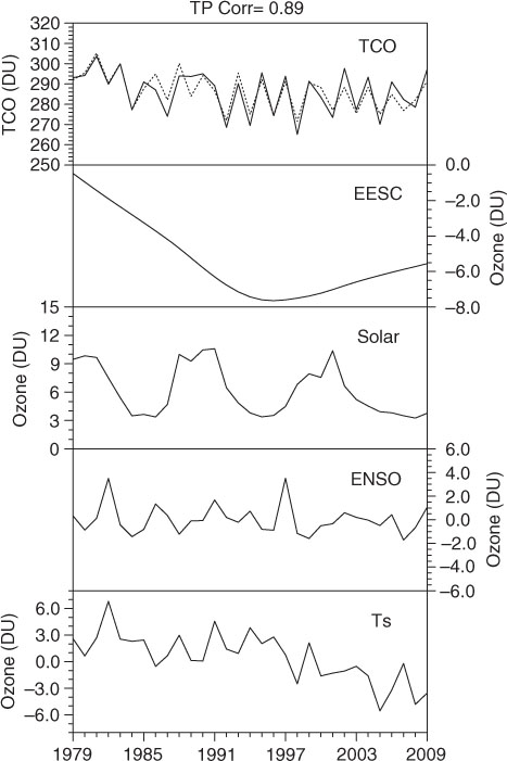
Fig. 7
Regressed (dashed line) and observed (solid line) DJF mean TCO time series over the TP. The ozone changes contributed from EESC, solar cycle, ENSO and the surface temperature are shown in unit of DU. Abbreviation ‘Corr’ shown in the top of the plot represents the correlation coefficient between the observed TCO and regressed TCO over the TP during winter.
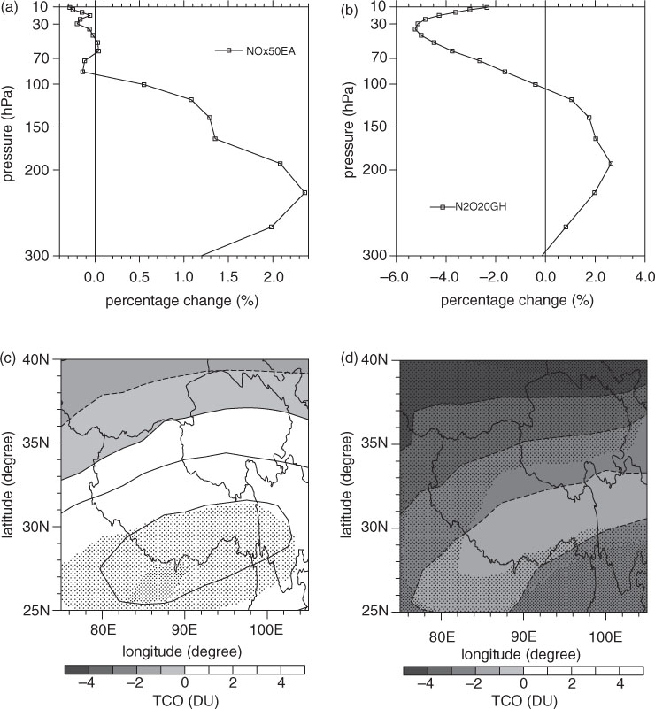
Fig. 8
(a) Percentage differences in DJF mean of ozone over the TP between runs R1 and R2. (b) is the same as (a), but for ozone differences between R1 and R3. (c) DJF mean of TCO differences between R1 and R2. (d) is the same as (c), but for TCO differences between R1 and R3. The dot areas in (c) and (d) represent statistical significance with a 90% confidence.