
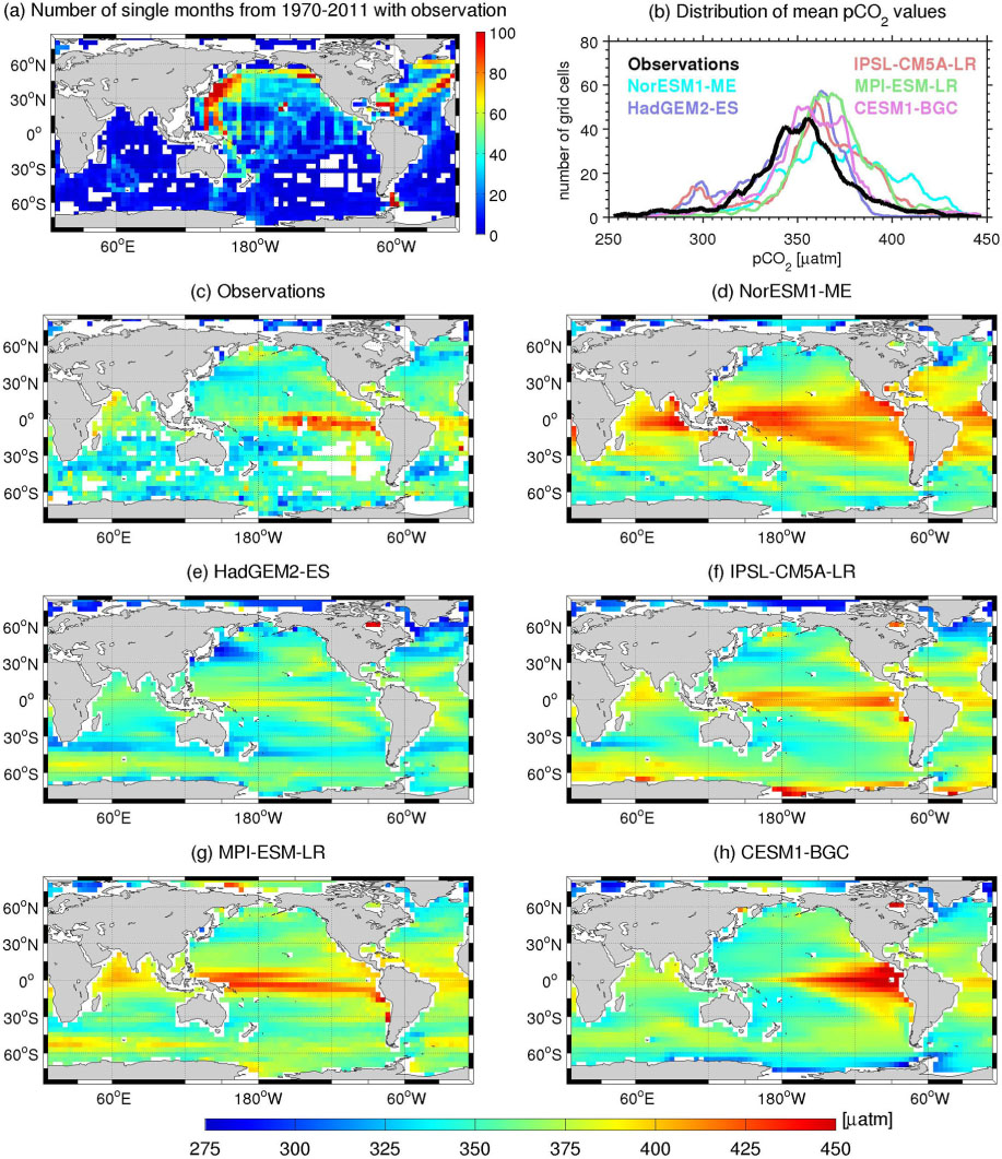
Fig. 1
(a) Number of months with at least one observation between 1970 and 2011 based on data regridded onto a 4°×4° grid (the potential maximum is 504 months; white colour represents no data). (b) Distribution of long-term mean (1991–2011) pCO2 values as number of grid cells per 2 µatm interval from the observations and all models. (c–h) Maps of long-term (1991–2011) mean pCO2 from observations and models.
Table 1. Definition of the 14 regions used to assess the large-scale trends in surface pCO2
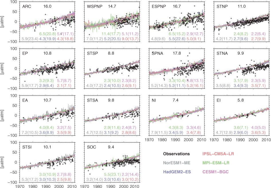
Fig. 2
Time-series of deseasonalized monthly pCO2 anomalies from observations and five CMIP5 models for the 1970–2011 period in 14 ocean regions as defined in Table 1. The coloured numbers in each panel represent the standard deviation of the detrended model and observed time-series. Those inside the parenthesis represent standard deviation when the model data are subsampled following observational spatial and temporal coverage.

Fig. 3
Regional trends of surface pCO2 computed from observations (grey squares). Blue circles (blue squares) represent multi-model-mean trend computed from the fully sampled model output (subsampled model output following observational coverage). All trends are for the 1970–2011 period. The uncertainty ranges for the observed trends represent the 95% confidence intervals whereas the uncertainty ranges for the model values represent ±1σ (one standard deviation) of the inter-model variations. The red-dashed line represents the atmospheric pCO2 trend for the same period as observed at the Mauna Loa station (data were downloaded in February 2013). The abbreviations for the regions on the x-axis are defined in Table 1 and the total number of months with observation (of potentially 504 months) available for each region is given on the top x-axis.
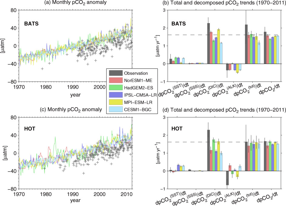
Fig. 4
Deseasonalized monthly anomalies of pCO2 fields from observations and models for (a) BATS and (c) HOT. (b,d) Decomposed annual pCO2 growth rate for the 1970–2011 period at (b) BATS and (d) HOT from observations and models. Shown here are pCO2 trends associated with long-term variations of SST ( /dt), SSS ( /dt), DIC ( /dt), and ALK ( /dt). The sum of these four components (dpCO /dt) is also shown as a comparison with the actual pCO2 trends (dpCO 2/dt). The horizontal dashed lines represent the atmospheric pCO2 trend for the same period and the vertical lines represent the uncertainty range.
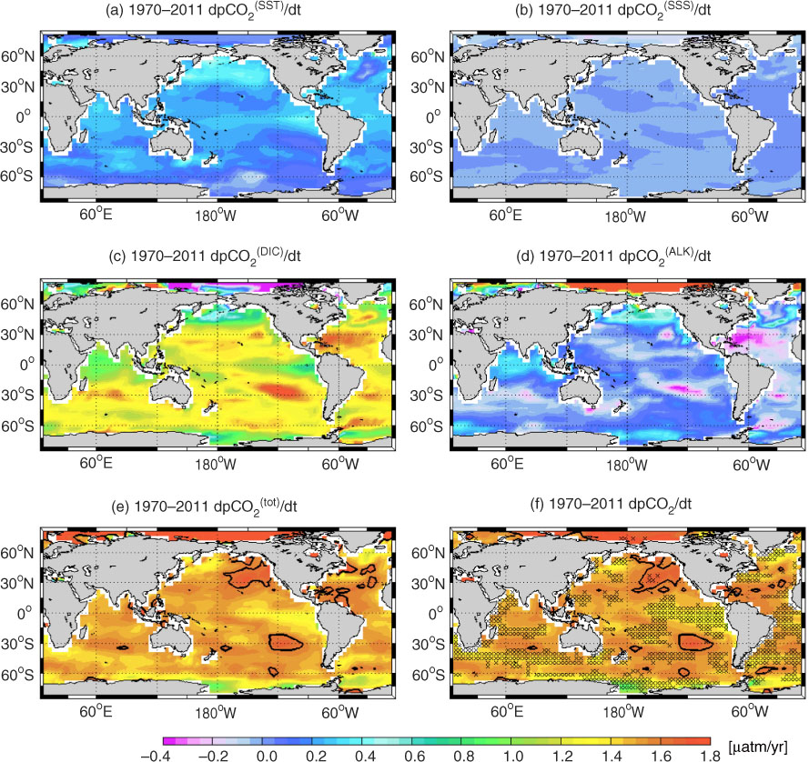
Fig. 5
Maps of model mean of (a–d) decomposed pCO2 trends due to change in SST, SSS, DIC, and ALK together with (e) sum of all decomposed trends and (f) actual pCO2 trend for the 1970–2011 period. Contour lines at ‘1.61’ in (e–f) represent the growth rate of atmospheric pCO2 for the same period. The stippling in (f) indicates regions where all five models agree whether the actual pCO2 trend is stronger or weaker than the atmospheric pCO2 trend.
Table 2. Region-averaged pCO2 trends for the 1970–2011 period associated with changes in SST ( /dt), SSS ( /dt), DIC ( /dt), and ALK ( /dt) as computed from the mean of all five models
[i] /dt is the sum of all trend components, and therefore is slightly different from dpCO 2/dt (blue circles in Fig. 3) computed from the actual pCO2 values. The uncertainty ranges represent 1σ of the inter-model spread. Unit is µatm yr−1. The numbers within parentheses represent the relative contribution of each driver to the total trend (%). The atmospheric pCO2 trend for the same period is 1.61 ppm yr−1.
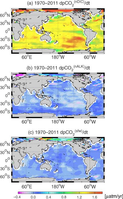
Fig. 6
Maps of model mean of decomposed pCO2 trends due to change in salinity-normalized (a) DIC and (b) ALK for the 1970–2011 period. The total contribution of surface freshwater flux on the DIC- and ALK-associated pCO2 trend (=+−−) is shown in panel (c).
Table 3. Region-averaged pCO2 trends for the 1970–2011 period associated with changes in salinity-normalized DIC ( /dt) and ALK ( /dt) as computed from the mean of all five models
[i] /dt represents the surface fresh water flux contribution (dilution of DIC and ALK) to the total pCO2 trend ( /dt= /dt + /dt− /dt− /dt). Therefore, negative (positive) dpCO /dt indicates that a change in freshwater flux reduces (increases) the overall pCO2 trend. The uncertainty ranges represent 1 σ of the inter-model spread. Unit is µatm yr−1.
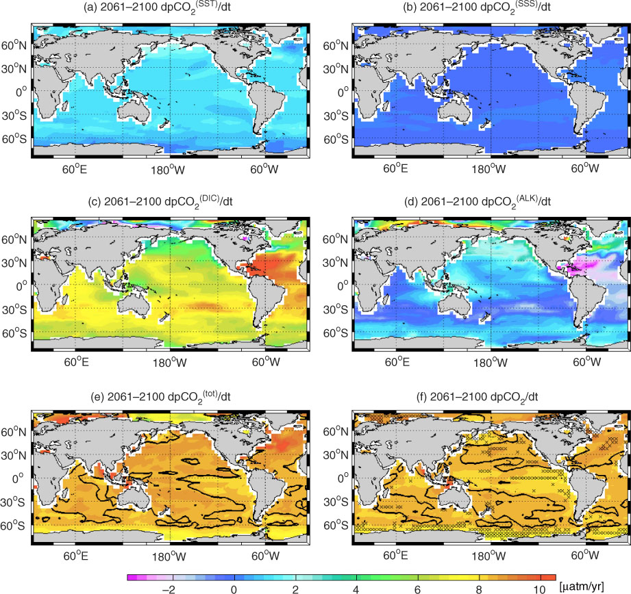
Fig. 7
Maps of model mean of (a–d) decomposed pCO2 trends due to change in SST, SSS, DIC, and ALK together with (e) sum of all decomposed trends and (f) actual pCO2 trend for the 2061–2100 period of the RCP8.5 scenario. Contour lines at ‘8.41’ in (e–f) represent the growth rate of atmospheric pCO2 for the same period. The stippling in (f) indicates regions where all five models agree whether the actual pCO2 trend is stronger or weaker than the atmospheric pCO2 trend.

Fig. 8
Maps of model mean of decomposed pCO2 trends due to change in salinity-normalized (a) DIC and (b) ALK for the 2061–2100 period of the RCP8.5 scenario. The total contribution of surface freshwater flux on the DIC- and ALK-associated pCO2 trend is shown in panel (c).
{ label needed for table-wrap[@id='UT0004'] }
Table 4. Region-averaged pCO2 trends for the 2061–2100 period of the RCP8.5 scenario associated with changes in SST ( /dt), SSS (dpCO /dt), DIC (dpCO /dt), and ALK (dpCO /dt) as computed from the mean of all five models
[i] dpCO /dt is the sum of all trend components, and therefore is slightly different from dpCO 2/dt computed from the actual pCO2 values. The uncertainty ranges represent 1σ of the inter-model spread. Unit is μatm yr−1. The numbers within parentheses represent the relative contribution of each driver to the total trend (%). The atmospheric pCO2 trend for the same period is 8.41 ppm yr−1.
{ label needed for table-wrap[@id='UT0005'] }
Table 5. Region-averaged pCO2 trends for the 2061–2100 period of the RCP8.5 scenario associated with changes in salinity-normalized DIC (dpCO /dt) and ALK (dpCO /dt) as computed from the mean of all five models
[i] dpCO /dt represents the surface fresh water flux contribution (dilution of DIC and ALK) to the total pCO2 trend. Therefore, negative (positive) dpCO /dt indicates that change in freshwater flux reduces (increases) the overall pCO2 trend. The uncertainty ranges represent 1σ of the inter-model spread. Unit is μatm yr−1.

Fig. 9
Global mean time-series of (a) prescribed atmospheric and simulated ocean pCO2, (b) simulated net air–sea CO2 flux, and (c) simulated deviation of 40-yr surface ocean pCO2 trend relative to the atmospheric pCO2 trend. The pCO2 trends are over 40-yr moving windows starting from 1970–2009 and ending with 2061–2100. Each grey line represents the simulation from one model.
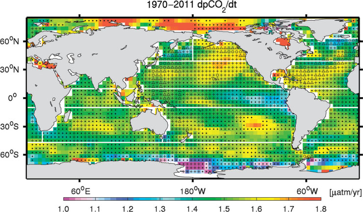
Fig. 10
Map illustrating the spatial and temporal observational coverage on top of model-mean pCO2 trend for the 1970–2011 period. The grid cells with (·), (+), (Δ), and (°) indicate that there are 1–10, 11–50, 51–100, and more than 100 monthly pCO2 observations, respectively.