Fig. 1.
The carbon monoxide monitoring stations of the BDQA network, sorted out by their official type.
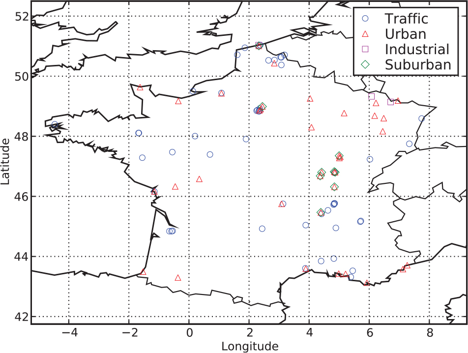
Table 1. Comparison of the observations and the simulated or analysed concentrations. is the mean concentration, is the mean observation and is the normalised bias. RMSE stands for root-mean square error. R is the Pearson correlation. FA x is the fraction of the simulated concentrations that are within a factor x of the corresponding observations. , and the RMSE are given in µg m−3
Fig. 2.
Possible physical interpretation of the subgrid model. This mesh represents the CO inventory of a spatial domain. The darker the blue shade, the bigger the emission in the grid-cell. Notice the high emission zone in the south-east corner. A zoom is performed on one of the central grid-cell (see in the magnifier). Inside this grid-cell is represented a finer scale inventory inaccessible to the modeller that may represent the true multiscale inventory. Two CO monitoring stations are considered. Station A is under the direct influence of a nearby active emission zone that represents a significant contribution to the grid-cell flux. The model, operating at coarser scales, cannot scale the influence of this active zone onto station A, even though it has an estimation of its total contribution through the grid-cell total emission. Differently, station B, which is located in the same grid-cell, does not feel the active zone as much as station A. Our subgrid statistical model assumes that the influence of the active subgrid zone onto A or B has a magnitude quantified by the influence factors ξ A and ξ B . Obviously, in this case, one has . Notice that both stations A and B are under the influence of the south-east corner of the whole domain. But this influence is meant to be represented through the Eulerian coarser ATM.
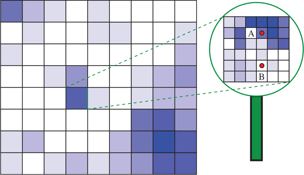
Fig. 3.
Schematic of the minimisation algorithm for the 4D-Var-ξ system.
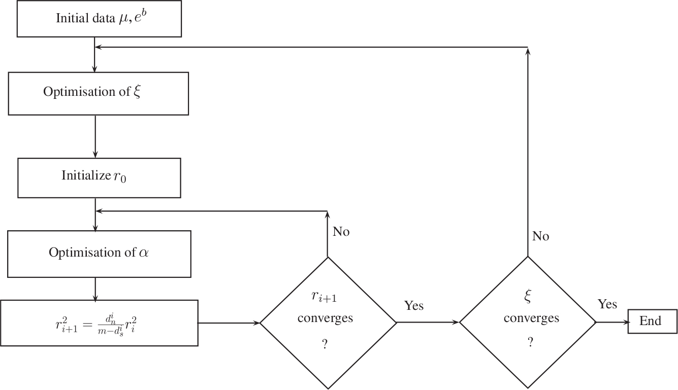
Fig. 4.
Iterative decrease of the full cost function (black lines), of the background term of the cost function (blue lines) and of the observation departure term of the cost function (red lines). For the sake of clarity, the values are to be read on the right y-axis. Two optimisations are considered: with 4D-Var (dashed lines), and joint 4D-Var and ξ optimisation (full lines), within the assimilation window of the first 8 weeks of 2005.
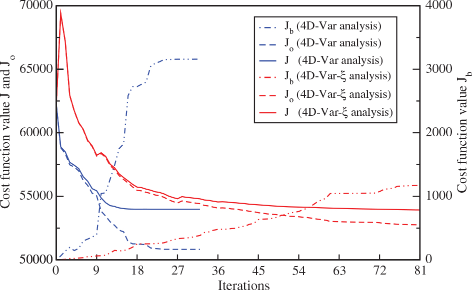
Fig. 5.
Time-integrated spatial distribution of the carbon monoxide EMEP+MEGAN inventory over the first 8 weeks of 2005.
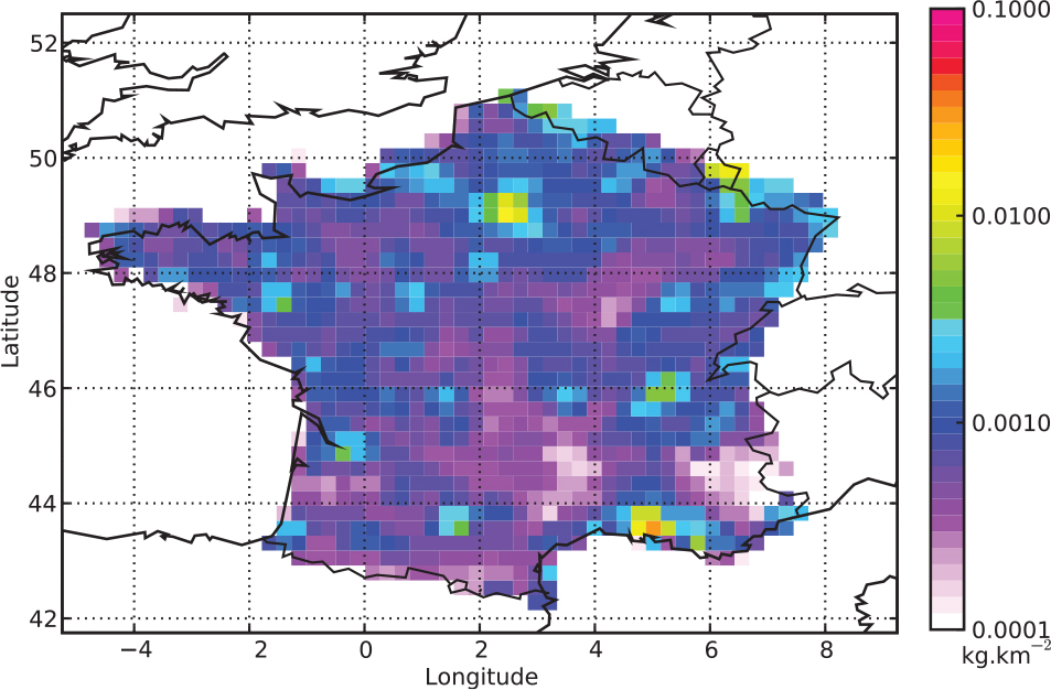
Fig. 6.
Ratio of the time-integrated CO flux retrieval to the EMEP+MEGAN time-integrated CO flux for each grid-cell, in the 4D-Var case (a) and in the joint 4D-Var and subgrid model case (b).
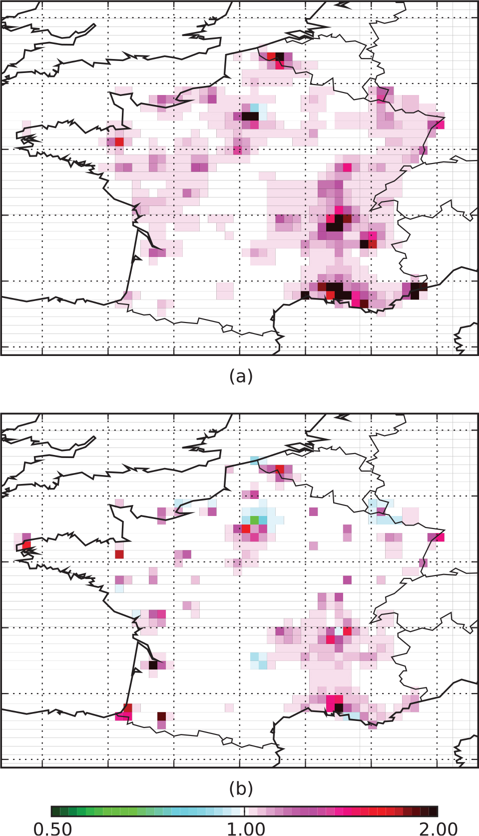
Fig. 7.
Scatterplot during 8 weeks: (a) comparison between the concentrations via the model and the observations, (b) comparison between the concentrations via the model using the a posteriori emissions retrieved from 4D-Var and the observations, (c) comparison between the concentrations diagnosed by the 4D-Var-ξ system and the observations. The colour bars show the correspondence between the blue shade and the density of points of the scatterplot. This density has been normalised so that its maximum is 1. Dashed lines are the FA5 dividing lines, and dashed-dotted lines are the FA2 dividing lines.
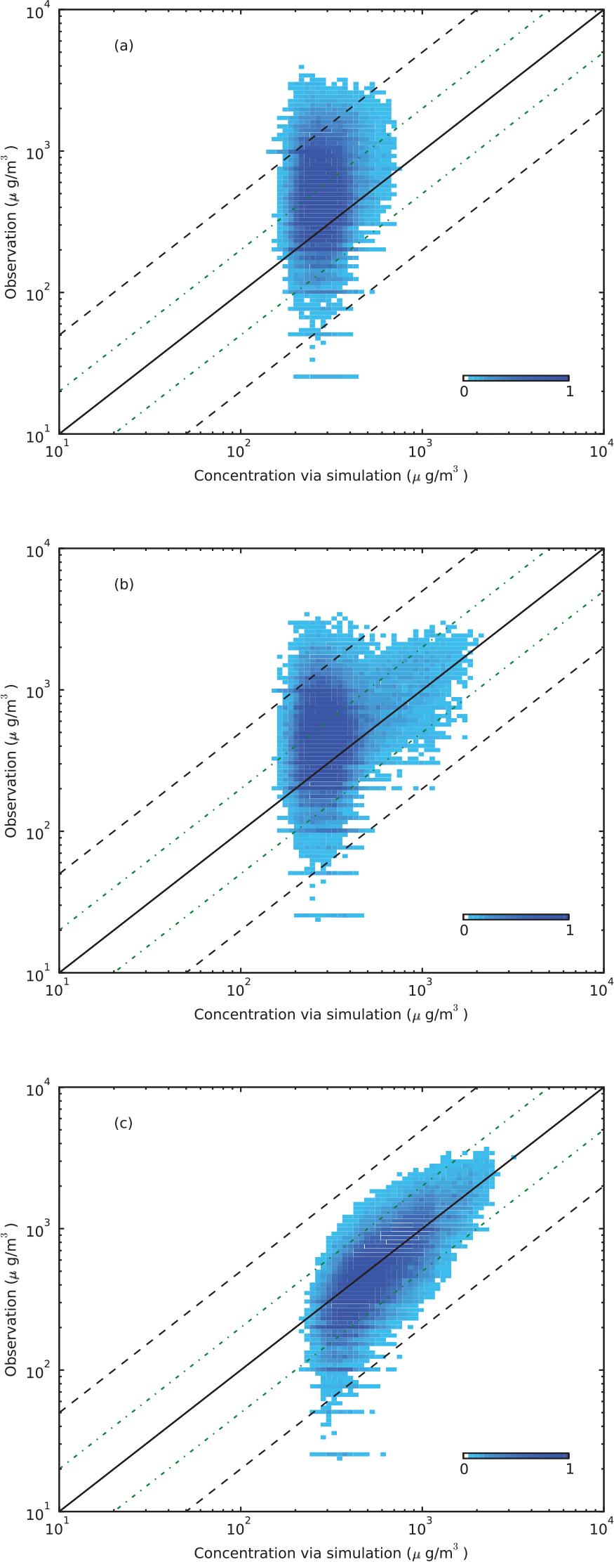
Fig. 8.
Time series of CO concentrations for the first 300 h of 2005, at four stations: observations (blue), simulation using the prior emissions (red), simulation using the posterior emissions of data assimilation (green) and simulation using the posterior emissions of 4D-Var-ξ (black) with adjusted observations using the statistical subgrid model.
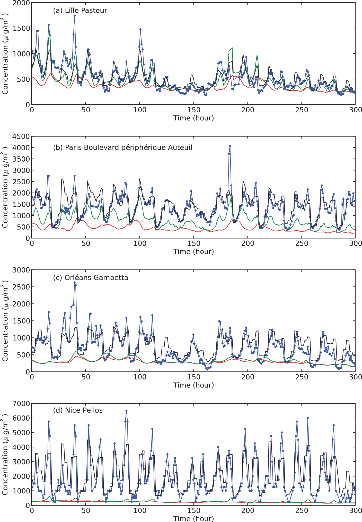
Fig. 9.
The training (triangle) and validation (circle) subnetworks that partition the BDQA stations measuring carbon monoxide. This partition is randomly generated for the cross-validation experiment.
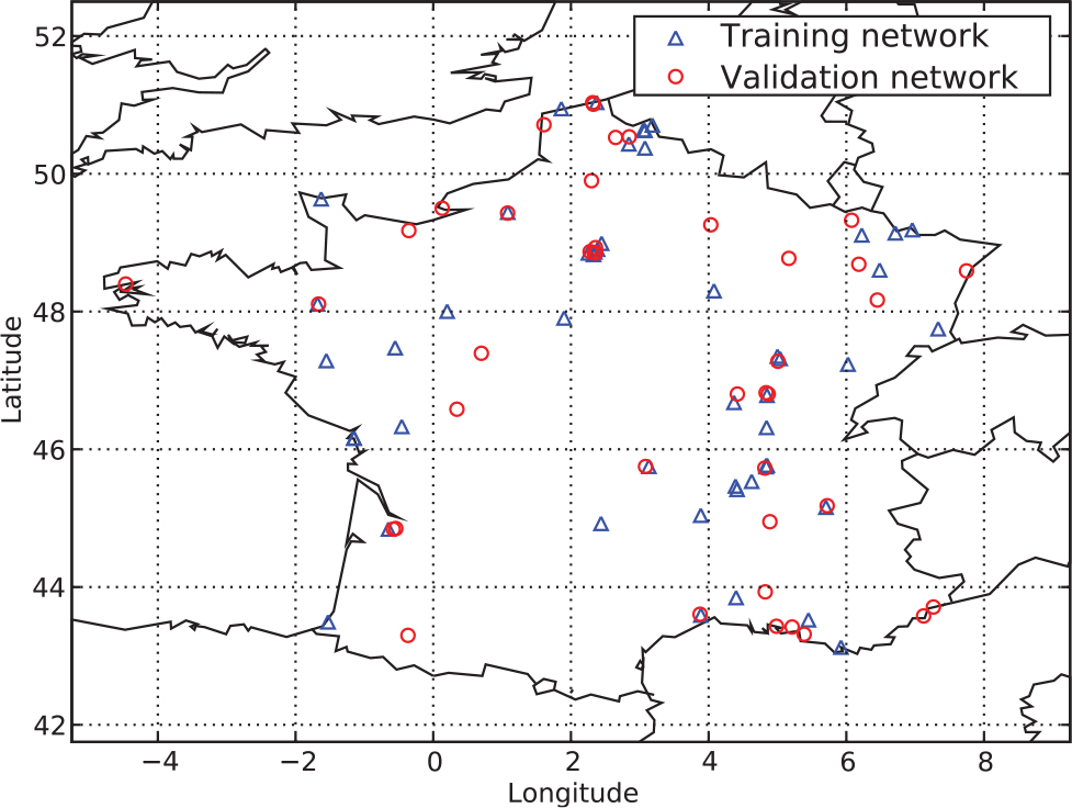
Fig. 10.
Scatterplot of the 49 ξ i of the training network inferred from either the training network or the full network (89 stations). Four ξ i =0 crosses are missing. In the four cases, they were concordantly diagnosed to be 0 by the two inferences.
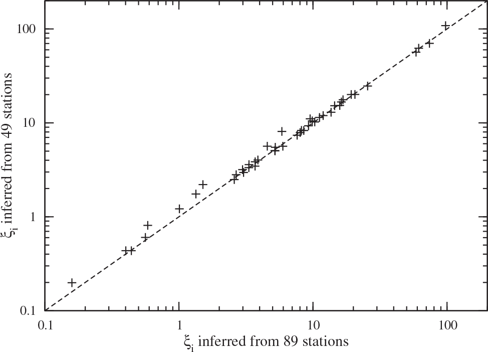
Table 2. Comparison of the observations and the forecasted concentrations on the validation network for the first 8 weeks of 2005. The statistical indicators are described in Table 1. Additionally, the total retrieved emitted mass is given (in Tg). The corresponding value for the retrieved mass using the full network is recalled in parenthesis
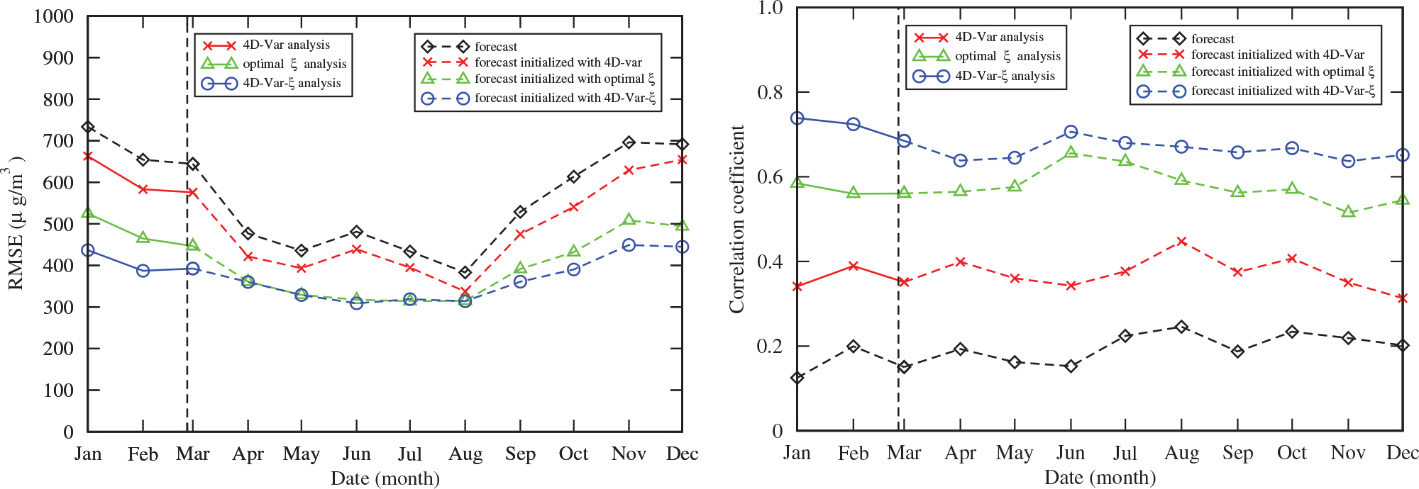
Fig. 11.
Monthly RMSE (left panel) and Pearson correlation (right panel) of four runs: a pure forecast, a 10-month forecast initialised by an 8-week 4D-Var assimilation, a 10-month forecast initialised by an 8-week window where the ξ's are optimised and a 10-month forecast initialised with an 8-week joint 4D-Var and ξ optimisation. The vertical dashed line indicates the end of the assimilation window and the start of the forecasts.