Fig. 1.
Locations of 29 geographically defined CFC-11 tracers and 29 geographically defined idealised tracers.
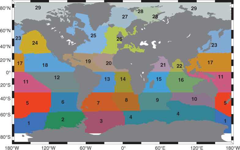
Table 1. Location of tracers in the Atlantic Ocean
Fig. 2.
(a) Long-term mean of simulated volume transport across 24.5°N in the North Atlantic (positive northward). (b) Time series of simulated monthly (thin line) and annually (thick line) mean southward volume transport in the whole water column at 24.5° and available observations (black dots, Bryden et al., 2005) from 1948 to 2004. (c) Time series of monthly mean simulated (solid line) southward volume transport in the whole water column at 26.5°N and monthly mean of continuous measurements of MOC at 26.5°N (dotted line, Cunningham et al., 2007) from 2004 to 2009.
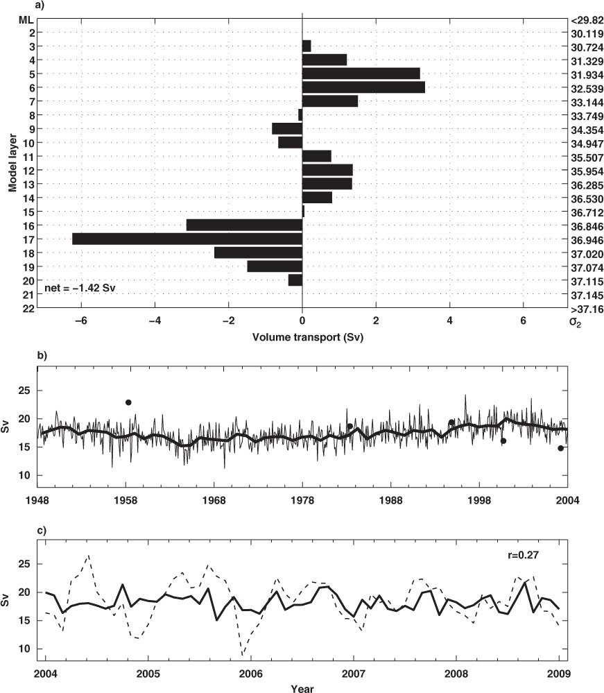
Fig. 3.
Observed CFC-11 (pmol/kg) at 24.5°N across the North Atlantic in February, 1998 (LeBel et al., 2008). Upper layers from surface to 800 m are zoomed in the upper panel, and profiles of CFC-11 concentration of selected stations close to the western boundary (denoted by different symbols at the top of axis. e.g. red dot, green square, etc.) are also shown in the left panel. The dashed grey lines denote the locations of 34.947, 35.507, 36.946 and 37.115 isopycnals.
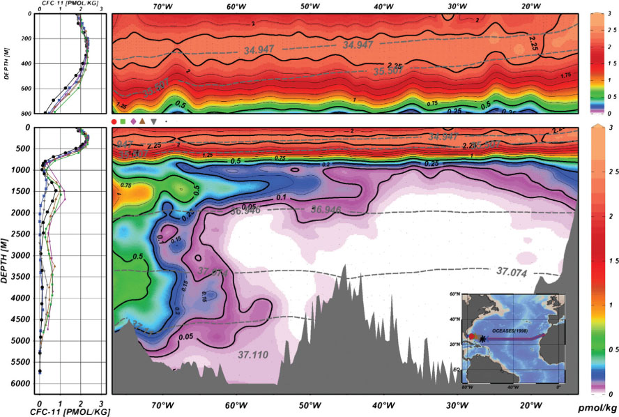
Fig. 4.
Same as Fig. 3 but for simulated CFC-11 (pmol/kg) in February, 1998.
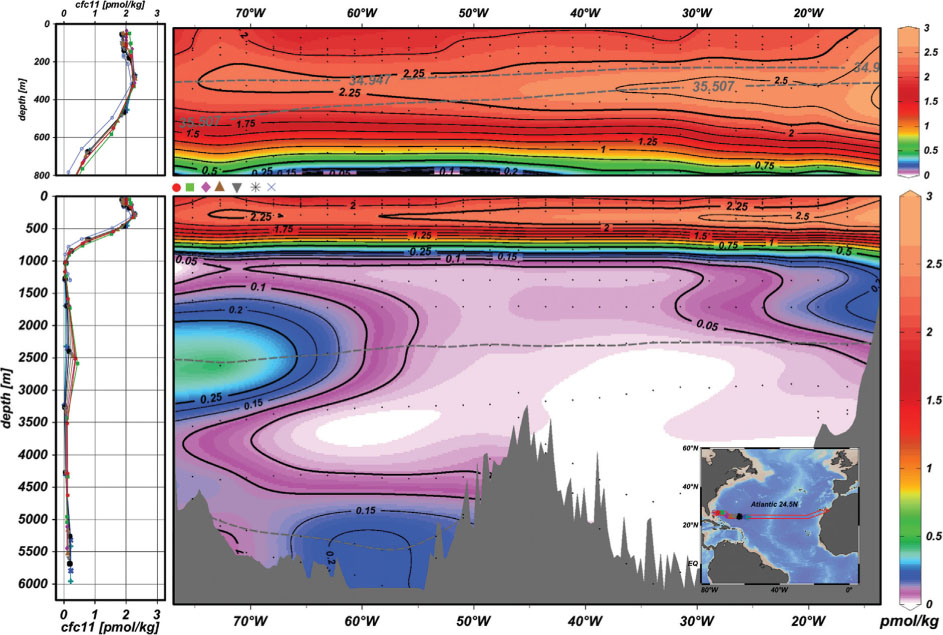
Fig. 5.
Same as Fig. 3 but for accumulated concentration (scaled to 0–3 arbitrary unit, herein after) of all 29 idealised tracers at the end of 60-yr simulation.
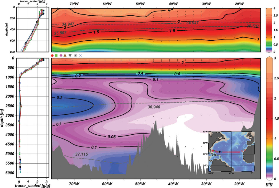
Fig. 6.
Concentration of simulated CFC-11 (pmol/kg) at 24.5°N in the North Atlantic from different source regions in February, 1998.
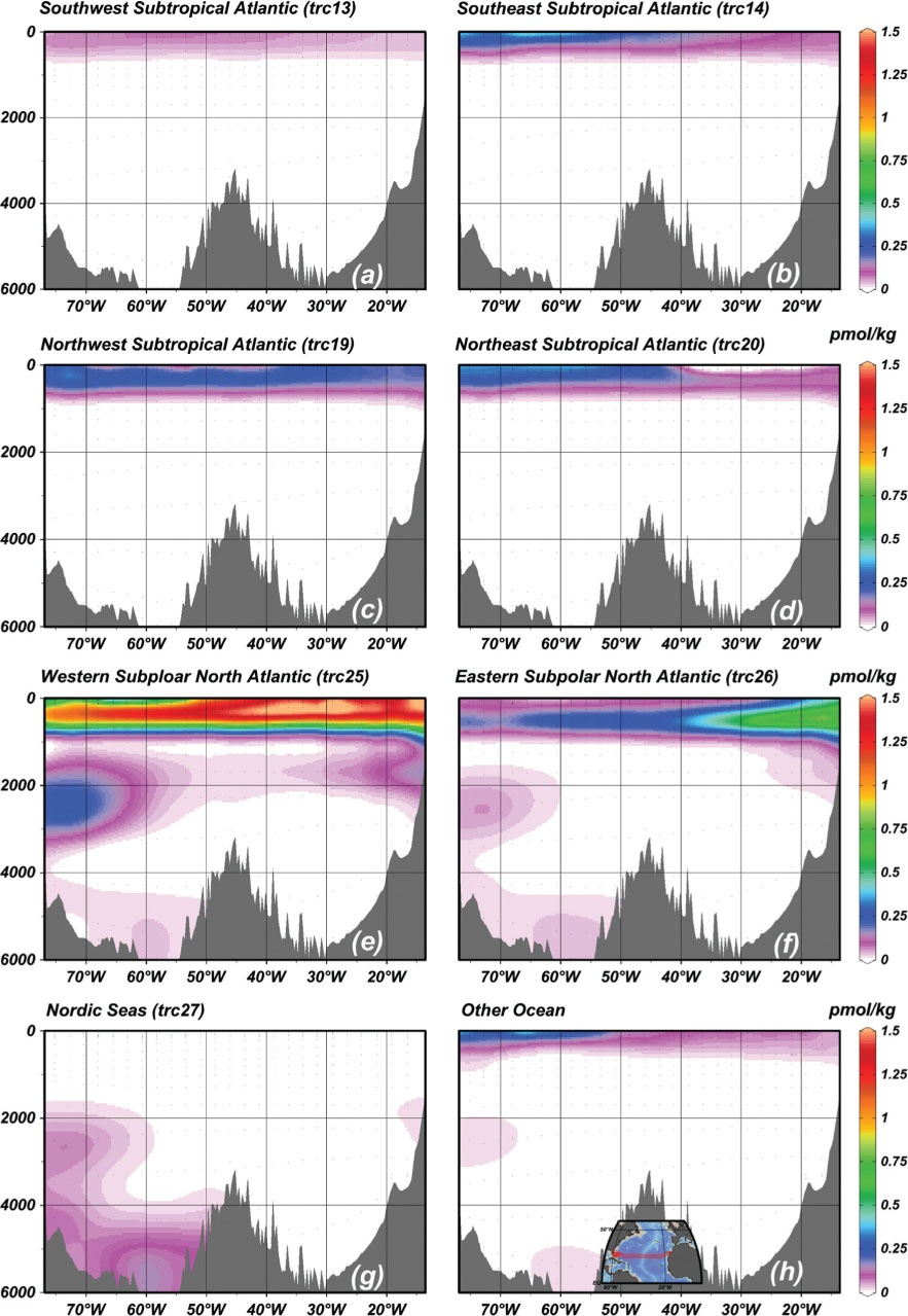
Table 2. Composition for water-mass (a) between layer 0–800 m, (b) at 2500 m of west boundary and (c) at 4500 m depth at sea floor in North Atlantic 24.5°N in February 1998 from different CFC-11 and idealised tracer sources
Fig. 7.
The simulated ocean currents (a, c, e, unit: cm/s) and CFC-11 concentrations (b, d, f, unit: pmol/kg, note b has different scale) in February, 1998 on 34.947-, 36.946- and 37.115-isopycnals. The grey lines denote the depths of isopycnals. Area between two dash–dotted curves in (b) is the long–term mean outcropping areas for the 34.947 and 35.507-isopycnals during winter (January–February–March). The black solid (grey dashed) curve shows the long–term mean winter (summer) outcropping line for 35.507-isopycnal. The red contour in (b) is the 18°C isotherm line on the 34.947-isopycnal.
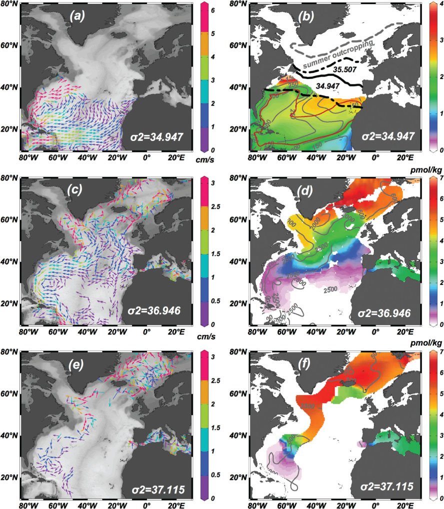
Fig. 8.
Simulated winter time maximum mixed layer potential density (a) and depth (b) in the North Atlantic during winter (January to March from 1948–2007). The potential density contours are the same as the model's isopycnals.
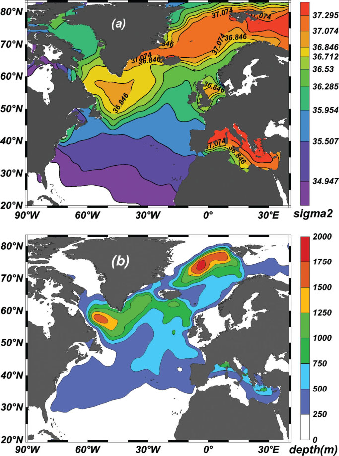
Fig. 9.
Simulated CFC-11 released from western subpolar North Atlantic (region 25 denoted in Fig. 1; left panels, unit: pmol/kg) in February 1998 and simulated apparent age (right panel, unit:year) of idealised tracer released from region 25 on 36.846-, 36.946- and 37.115-siopcyanls at the end of 60-yr simulation; contours are depth of the isopycnals (left panel) and age of tracer 25 (right panel) on isopycnals.
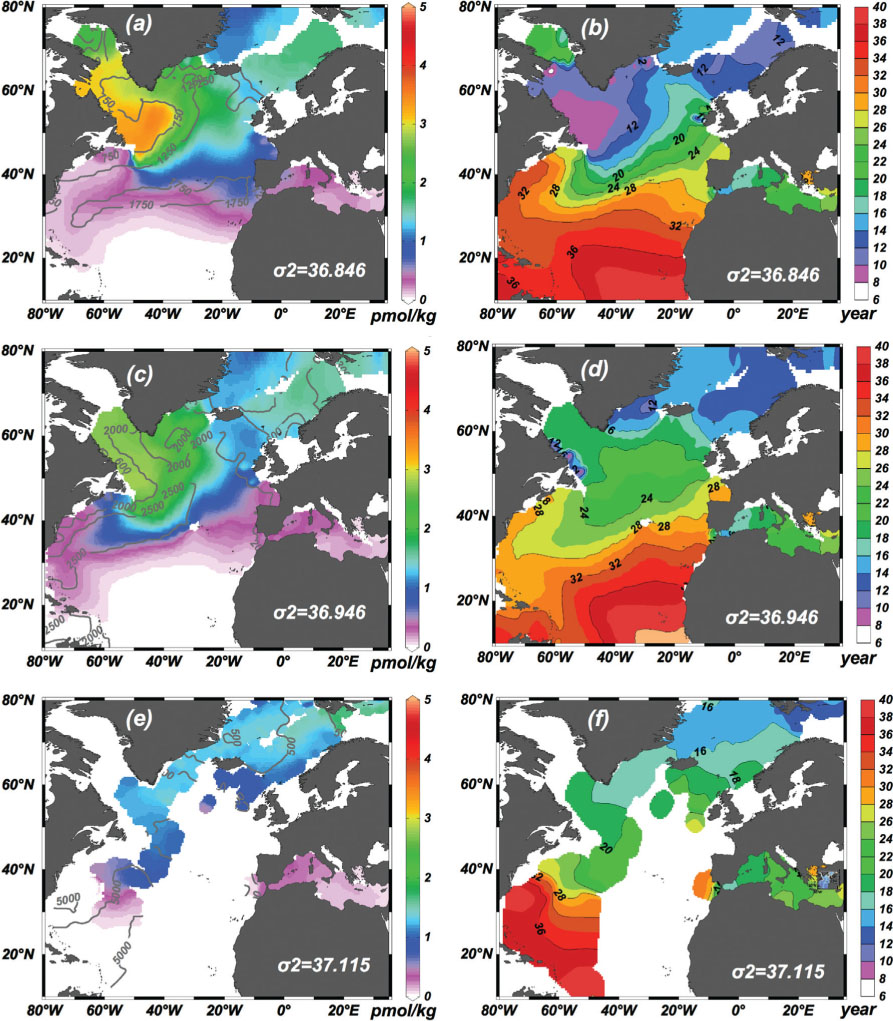
Fig. 10.
(a) Time series of simulated monthly mean CFC-11 (thick line), ideal tracer (dashed line), model isopycnic layer thickness (thin line) and ocean temperature (dash-dot line) from 1948 to 2008 for the tracer-enriched part of 36.946-isopycnal at around 2500 m depth of 24.5°N in Figs. 4 and 5. Locations of the involved model grids are also denoted as blue dots in the inset map of Fig. 11. All variables are scaled to 0–1. (b) Same as panel a, but for years from 1992 to 2000 and each variable is detrended and normalised by its standard deviation. (c) Same as panel b but years from 2000 to 2008. Correlations between different variables have been calculated and the minimum one (CFC vs. Layer Thickness) is annotated in each panel.
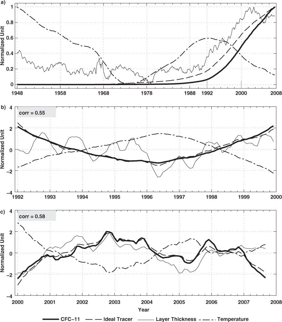
Fig. 11.
(a) Time series (smoothed by a 12-month low-pass filter) of simulated monthly mean isopycnal thickness for 36.946-isopycnal at 24.5°N (blue line, the same data as that in Fig. 10a), 40.0°N (red line) and 52.0°N (green line). Model grids selected for each section are denoted in the inset map by blue, red and green dots for 24.5°N, 40.0°N and 52.0°N respectively. Simulated wintertime (JFM) mean MLD in the Labrador Sea is also plotted with black line. The region for calculating the mean MLD is denoted by a dashed ellipse with a bold L inside. (b) Same as panel a, but for simulated ocean temperature. All the variables are normalised and the time lags (in months) between the section at 52.0°N and its downstream section at 40.0°N and 24.5°N are annotated in the top of each panel. Correlation between 24.5°N and 52.0°N is also annotated in each panel.
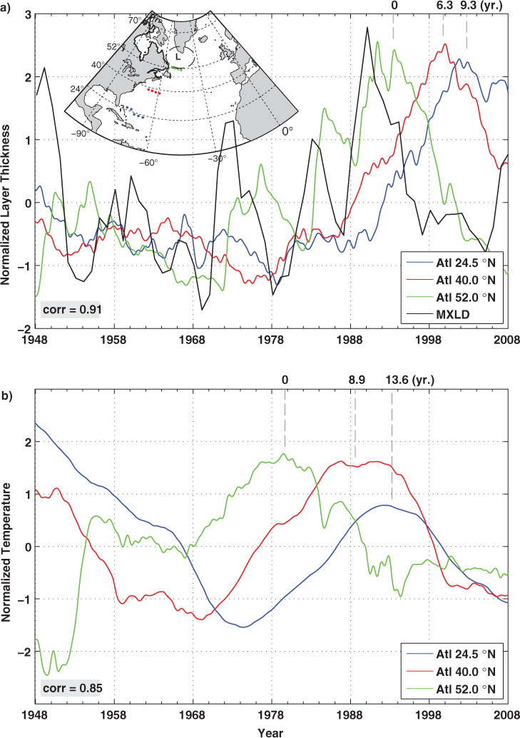
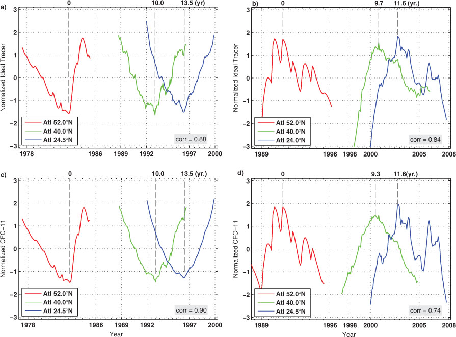
Fig. 12.
(a) Variability of ideal tracer concentrations at 24.5°N from 1992 to 2000 (blue curve) from Fig. 10b, and its upstream maximum lag-correlated variability at 40.0°N from 1989 to 1997 (green curve) and that at 52.0°N from 1978 to 1986 (red curve). (b) Same as panel a but for variability from 2000 to 2008 at 24.5°N (blue curve), together with its upstream variability at 40.0°N (green curve) and 52.0°N (red curve). (c) Same as panel a but for simulated CFC-11. (d) Same as panel b but for simulated CFC-11. Correlation between 24.5°N and 52.0°N is also annotated in each panel.