
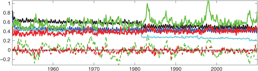
Fig. 1
Monthly RMSE (unit is in °C for all variables) of NorCPM (thick red line) and FREE (thick green line) against the assimilated SST anomaly. The contribution of the bias in the RMSE is plotted with the dashed line. The HadISST2 accuracy (i.e. the SD) is plotted in cyan. The ensemble spread of NorCPM is in blue and the black line is σ tot, as defined in eq. (7).
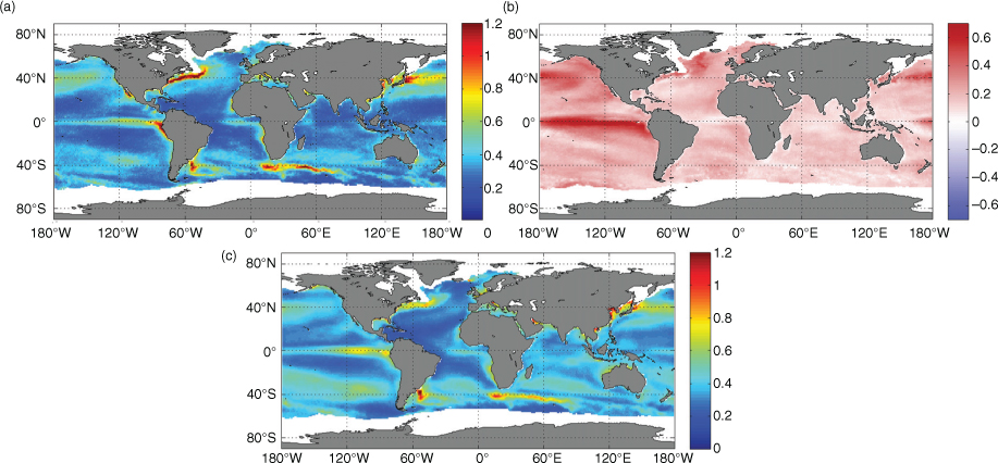
Fig. 2
Time averaged of monthly RMSE of SSTA (panel a); reduction of RMSE from FREE (panel b); time average of σ tot as defined in eq. (7) (panel c). All quantities are in °C.
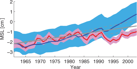
Fig. 3
Estimated global mean sea level (steric) from NorCPM (red), FREE (blue) and observations (plain grey line) for the period the period 1961–2003. The shading represents the ensemble envelope (min and max). The dashed lines represent the 95 % confidence interval of the trend in the observations.

Fig. 4
Point-wise correlation of detrended yearly SSH between NorCPM and altimetry data for the period 1993–2010.

Fig. 5
Point-wise correlation of detrended yearly heat content (upper row) and salt content (lower row) for the period 1950–2010 between NorCPM and EN4 data. The left column is calculated for the top 200 m and the right column is for the top 500 m.
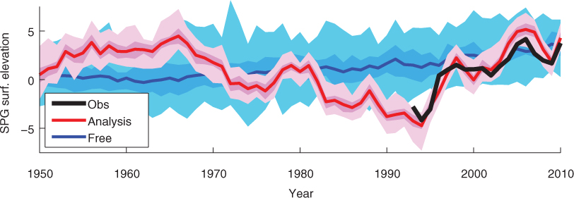
Fig. 6
Subpolar Gyre index in NorCPM (red), FREE (blue) and observations (black line). The darker shading represents the first and third quartile of the model ensemble and the lighter shading represents the ensemble envelope (min/max).
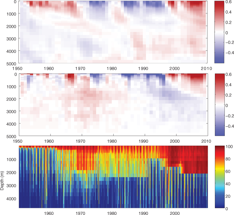
Fig. 7
Subpolar Gyre temperature anomaly in NorCPM (top), EN4 (middle) and % of observation used in EN4 analysis (bottom).
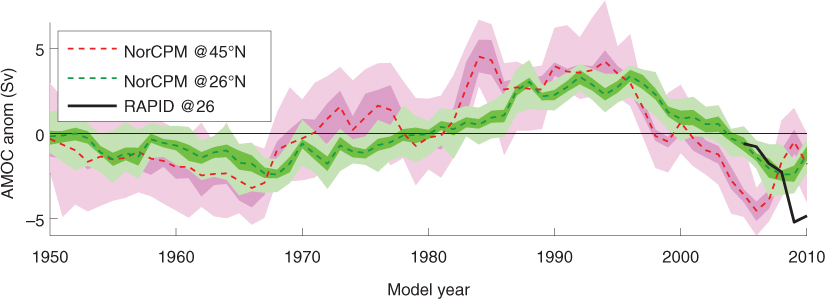
Fig. 8
AMOC in NorCPM at latitude 45°N (in red) and 26.5°N (in green). The dashed line is the ensemble mean, the dark shading shows the first and third quartile of the ensemble and the light shading shows the ensemble envelope. The black line is the estimate from the RAPID–WATCH array available from 2005 located at 26.5°N. The observed data are adjusted to match the model in 2005.

Fig. 9
Hovmöller plot of the ensemble correlation between SST and the water column properties calculated for a box in the centre of the Labrador Sea at the middle of each month in 2010. The correlations on the left are calculated in isopycnal coordinates while those on the right are calculated in z-level coordinates. The upper row is the correlation between SST and temperature, the middle row with salinity and the lower with layer thickness.
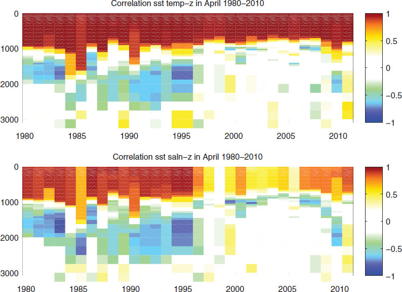
Fig. 10
Hovmöller plot of the ensemble correlation between SST and the water column properties (upper: temperature; lower: salinity) calculated on the 15th of April of each year between 1980 and 2010.