
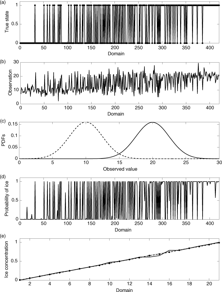
Fig. 1
True sea ice state (a), a random set of high-resolution observations (b), likelihoods of ice (solid) and water (dashed) given an observed value (c), probability of ice corresponding to the high-resolution observations (d), ice concentration derived from the probability of ice, solid line is from a single set of observations, dashed line is averaged over many sets, thick grey line is the true ice concentration (e).
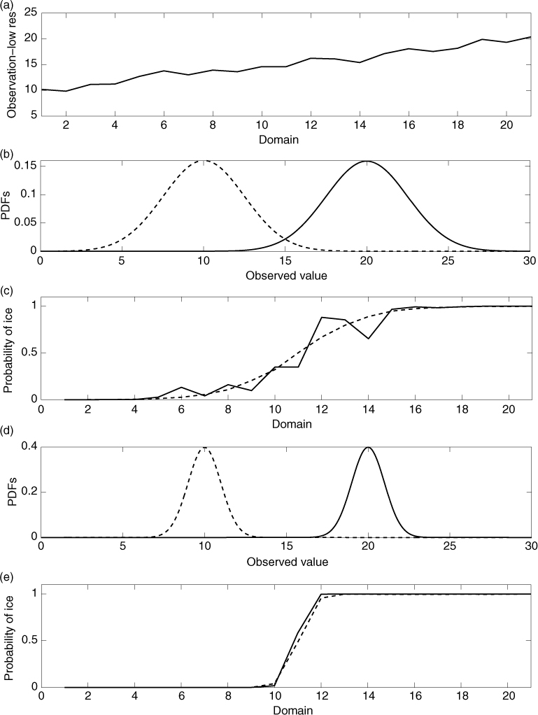
Fig. 2
A random set of low-resolution observations (a), likelihoods of ice (solid) and water (dashed) given an observed value, panel (b) σ o =0.25, panel (d) σ o =0.1, probability of ice corresponding to the low-resolution observations, solid line is from a single set of observations, dashed line is averaged over many sets, panel (c) σ o =0.25, panel (e) σ o =0.1.
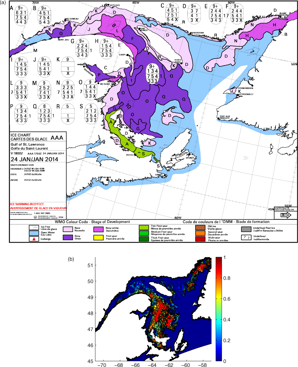
Fig. 3
Ice concentration on January 24th 2014. Panel (a) is the ice chart from the Canadian Ice Service, with colour coding corresponding to stage of development of the ice. The light pink colour corresponds to new ice (ice of thickness less than 10 cm). Panel (b) is the ASI ice concentration for January 24th 2014.
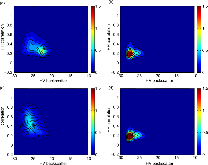
Fig. 4
Joint PDF of the probability of (a, c) ice and (b, d) water given HV mean backscatter and HH GLCM correlation over a 2.1-km window, calculated using ASI training data (a, b) and training data from image analysis charts (c, d).
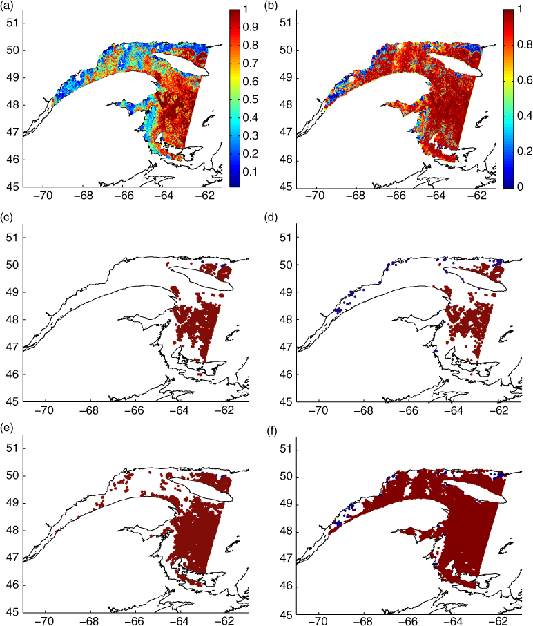
Fig. 5
Probabilities of ice for January 24th 2014 when (a) ASI data are used for training; and (b) when image analysis charts are used for training. Observations generated from the probabilities when (c, e) ASI data are used as the training data, and (d, f) when image analysis charts are used as the training data. Panels (c, d) correspond to a threshold of 0.98 and panels (e, f) correspond to a threshold of 0.90.
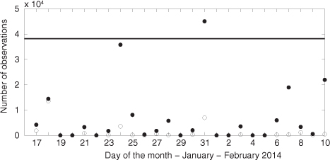
Fig. 6
Number of observations available on each day of the study. The horizontal line indicates the number of ASI observations, which is the same each day, while the circles indicate the SAR observations. Solid circles indicate the number of observations when a probability threshold of 0.90 is used, while unfilled circles indicate the number of observations when a probability threshold of 0.98 is used.
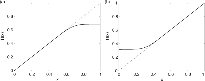
Fig. 7
Observation operator for the case when the observation is ice (a) and for the case when the observation is water (b). The linear observation operator is shown as the dotted line.
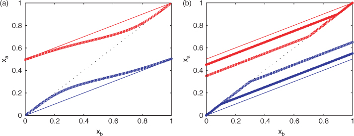
Fig. 8
Background state and analysis state for the case where water observations are assimilated (blue) and for the case where ice observations are assimilated (red). In panel (a), the solid lines correspond the linear forward model assimilating observed values of 0 and 1, and the lines with circles correspond to the non-linear forward model. In panel (b), all models used are linear, solid lines correspond to assimilating observed values of 0 and 1, closed circles correspond to assimilating observed values of 0.9 and 0.1, and open circles correspond to assimilating observed values of 0.7 and 0.3. For both figures, σ o =0.1. and σ b =0.1.
Table 1. Description of experiments carried out
EXP 1ASINoneN/ALinearEXP 2ASI+SARASI0.90Non-linearEXP 3ASI+SARCharts0.90Non-linearEXP 4ASI+SARCharts0.90Linear1EXP 5ASI+SARCharts0.90Linear07EXP 6ASI+SARCharts0.90Linear09
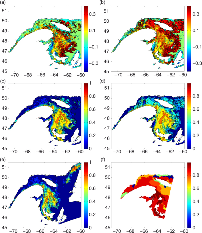
Fig. 9
Results for January 24th. Analysis increments (a, b) and analyses (c, d). Panels (a, c), ASI data used for training (EXP2) (b, d); image analysis charts used for training (EXP3) (e) analysis when only ASI data are assimilated (EXP1) (f) image analysis chart.
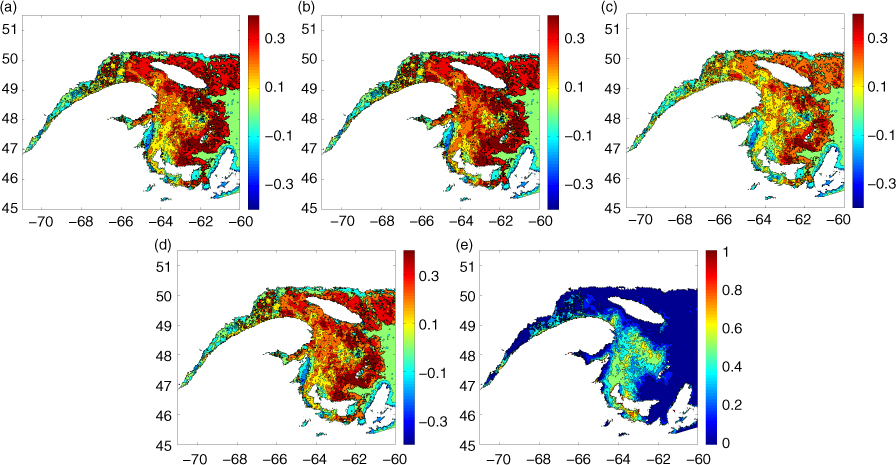
Fig. 10
Analysis increments for January 24th, impact of observation operator; (a) EXP3, (b) EXP4, (c) EXP5, (d) EXP6 and (e) background state for EXP3.
Table 2. Summary of bias (bias-b) and standard deviation (std-b) between background ice concentration and ice concentration from image analyses (values given are in%) over the study period, and bias (bias-a) and standard deviation (std-a) between ice concentration analysis and ice concentration from image analyses over the study period
EXP 1−27.69−26.7227.7526.69∅EXP 2−27.20−25.0727.7526.0624 194EXP 3−25.73−20.6426.5822.8282 344EXP 4−25.59−19.7826.6123.0182 344EXP 5−26.43−23.0727.0123.9582 344EXP 6−25.88−20.9826.7323.2282 344
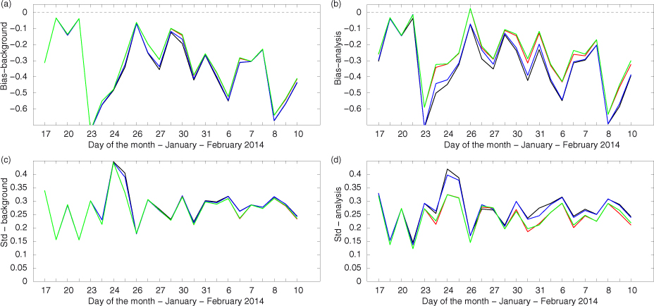
Fig. 11
Differences between ice concentration from the background state and that from image analyses, (a) bias – background state; (b) bias – analysis; (c) standard deviation – background state; (d) standard deviation – analysis state. In each panel, the black lines are results from EXP1, the red lines are from EXP2, the green lines are from EXP3 and the blue lines are from EXP4.