
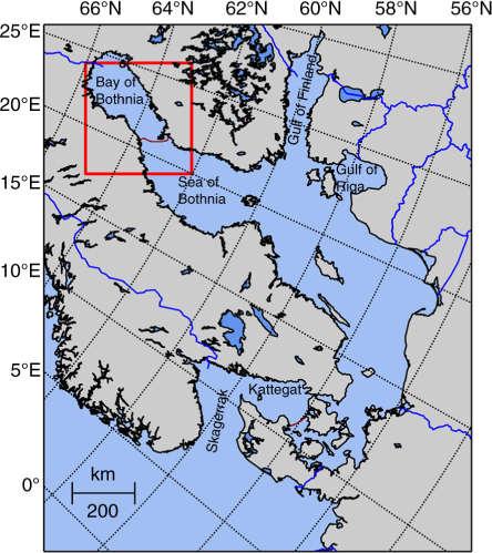
Fig. 1
The Baltic Sea area in polar stereographic projection with the projection plane at 70°N, as defined by the NSIDC (National Snow & Ice Data Center). The red box indicates the area in the Bay and Sea of Bothnia that is investigated in this study. The brownish line between the Bay and Sea of Bothnia indicates the approximate border between these areas, and the brownish line south of the Kattegat is the approximate border of the Baltic Sea, though the Kattegat is sometimes included as part of the Baltic Sea (Leppäranta and Myrberg, 2009).
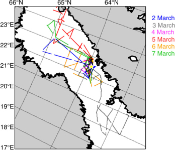
Fig. 2
Overview of all EM ice thickness flights performed in March 2011. The colours indicate the date of the flights. The yellow star indicates the approximate position of the ice salinity measurements.
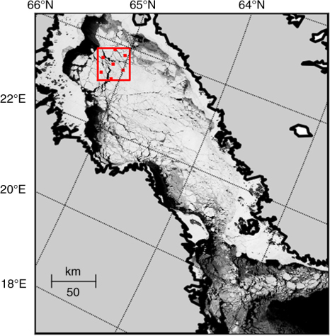
Fig. 3
MODIS image of Bay (and Sea) of Bothnia on 9 February 2011. The red square box (36 km×36 km) indicates the area selected for the comparison of simulated and SMOS-observed brightness temperatures from 1 January to 28 February 2011 (Section 4). The red points indicate the centre positions of SMOS measurements located within the box.
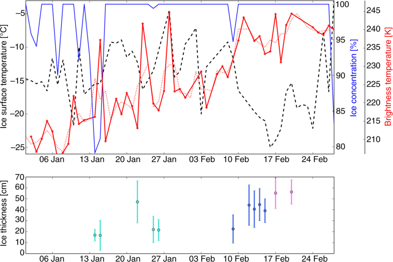
Fig. 4
Upper figure: Daily average of MODIS ice surface temperature MOD029 (dashed black), ASI ice concentration from AMSR-E with adaptation to Baltic Sea tie points (solid blue), and SMOS brightness temperature intensities (solid red) averaged over incidence angles from 0 to 40° for 1 January to 28 February 2011 for the investigated area in the Bay of Bothnia (see Fig. 3). Additionally, the 3-day-running mean of the SMOS brightness temperatures is shown (dotted red). Lower figure: Mean ice thickness (and standard deviation) in study area (50 km×50 km) as obtained from the available MODIS ice thickness maps; the three colours indicate the three different time periods.
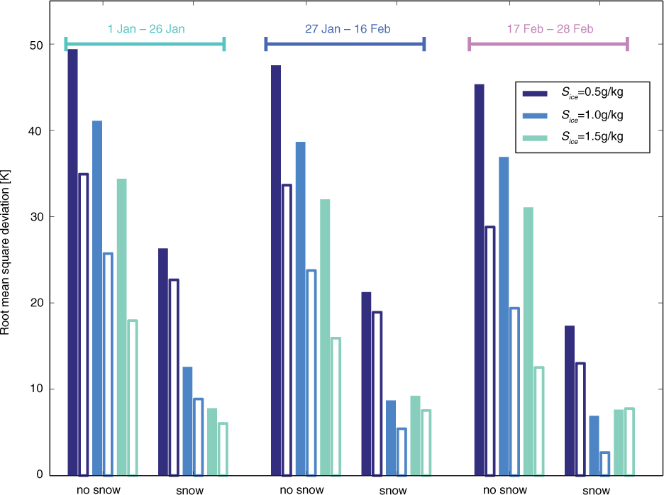
Fig. 5
Root mean square deviations between simulated and observed brightness temperatures averaged over all incidence angles. The time periods are indicated in the figure. The simulations are performed for ice without and with a snow cover (see annotation on the x-axis). The colour indicates the ice salinity assumed in the simulations (see legend). The filled bars indicate horizontal, the unfilled bars vertical polarisation.
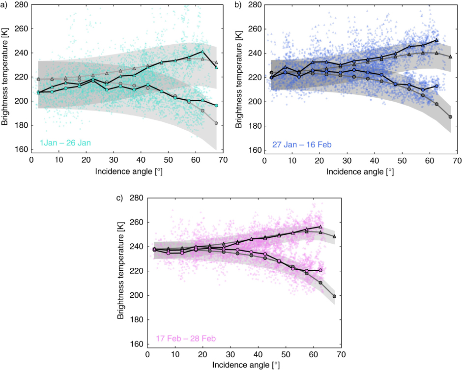
Fig. 6
Comparison of simulated (grey) and mean observed SMOS brightness temperatures (black). The uppermost figure shows the results for 1–26 January and a mean ice thickness of d ice =25 cm, the middle figure for 27 January–16 February and d ice =38 cm, and the lowest figure for 17–28 February and d ice =56 cm. Grey shaded areas indicate the model's range of brightness temperatures for ice thicknesses ±10 cm around the average value. Circles indicate horizontal polarisation, triangles vertical polarisation. The small coloured circles and triangles indicate individual SMOS measurements.
Table 1. The ice parameters that influence the simulated brightness temperature, their mean value: <r> (as used in the simulations for all parameters except for the one that is varied), the range by which the parameter r is varied: Δr (if not specified, the parameter takes values between ±0.5Δr around <r>, otherwise the range is given in parentheses), and the resulting impact on the nadir brightness temperature intensity: ΔTB
<r>ΔrΔTB [K]<r>ΔrΔTB [K]
d ice 40 cm35 cm (25–60 cm)37.240 cm30 cm (30–60 cm)21.3 T surf −15°C10 K17.0−3.7°C2 K10.1 S ice 1.0 g/kg0.5 g/kg12.40.5 g/kg0.2 g/kg8.8 d snow 8 cm6 cm6.88 cm6 cm3.4 ρ snow 275 kg/m3100 kg/m31.3310 kg/m3100 kg/m31.0 c ice 100%3% (97–100%)3.995%4%5.8 T water −0.2°C0.15 K (−0.25 to −0.10°C)0.9−0.2°C0.15 K (−0.30 to −0.15°C)2.7 S water 3 g/kg2 g/kg0.04 g/kg2 g/kg0.0∑22.515.3
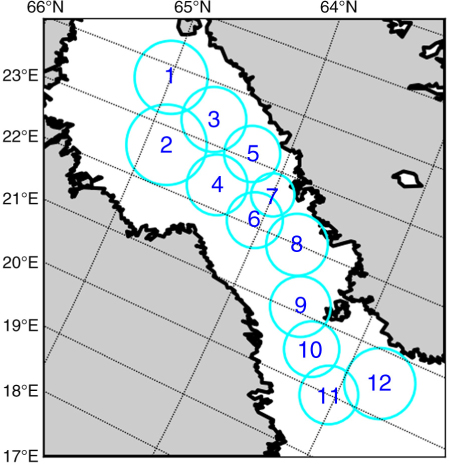
Fig. 7
Numbers of the 12 circles used for the comparison of EM and SMOS measurements. The diameters of the circles range from 36 to 66 km.
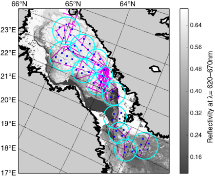
Fig. 8
Distribution of EM and SMOS measurements in the Bay and Sea of Bothnia and the 12 circular areas chosen for comparison of ice thicknesses. Pink lines indicate EM flight tracks, blue dots show the positions of SMOS measurements. These are overlaid on a MODIS image showing the reflectivities in band 1 (wavelength λ=620–670 nm) on 3 March 2011.
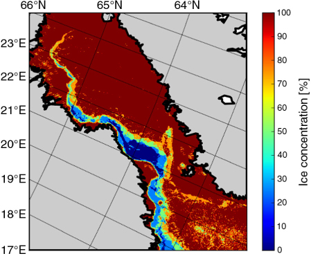
Fig. 9
Mean ice concentration for 2–7 March 2011 obtained from averaging classified MODIS images from 3, 5, 6 and 8 March. In the classification, each MODIS pixel (resolution 250 m) is determined to be covered either by water or ice (Section 2.6).
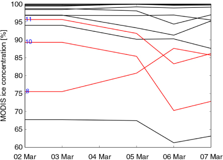
Fig. 10
Ice concentration as determined from classifying MODIS images from 3, 5, 6 and 8 March 2011 (Section 2.6) for the 12 circular areas. The ice concentration maps were interpolated to the time period of the SafeWin campaign (2–7 March 2011). The circles 8, 10 and 11, in which the ice concentration during the campaign varied by more than 10%, are shown in red.
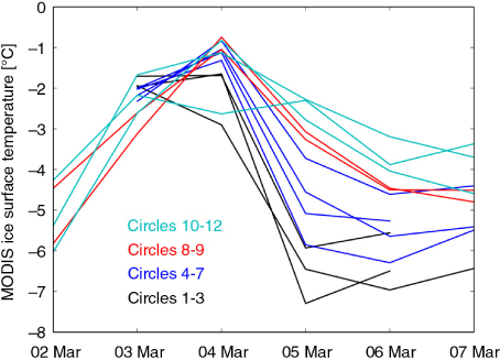
Fig. 11
MODIS ice surface temperature during the SafeWin campaign (2–7 March 2011) for the 12 circular areas depicted in Fig. 7. The curves are sorted by colours, as given in the figure, from the northernmost circles (black, circles 1–3) to the southernmost circles (cyan, circles 10–12).
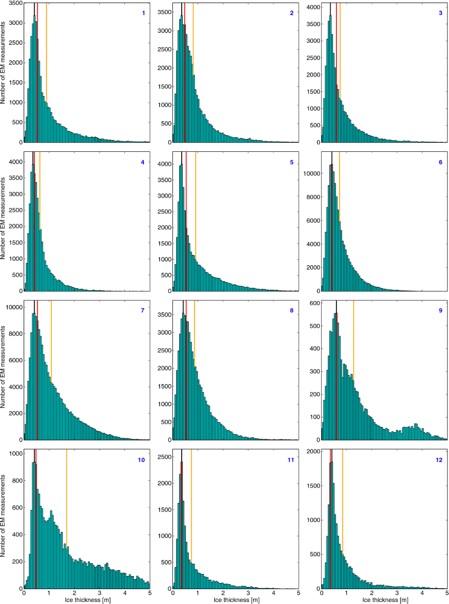
Fig. 12
Distribution of total EM ice thicknesses (i.e. sum of ice and snow thickness) within the circular areas depicted and numbered in Fig. 7. The red lines indicate total ice thickness as retrieved from SMOS brightness temperature intensities. The black lines indicate the modal values of the EM ice thickness distributions, while the orange lines indicate the EM mean ice thicknesses.
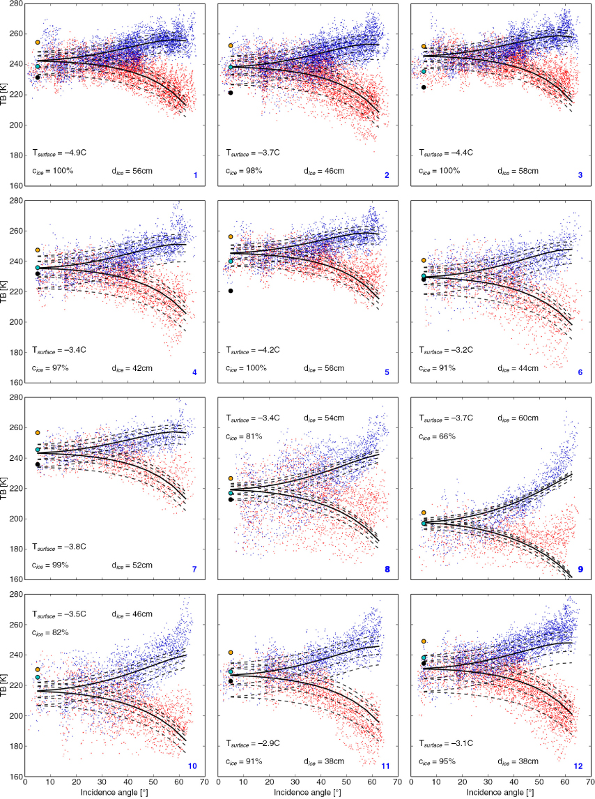
Fig. 13
SMOS brightness temperature (TB) versus incidence angle for the 12 circles. Blue dots indicate vertical, red dots horizontal polarisation. Solid black lines show the simulated brightness temperature curves with the lowest root mean square deviation from the SMOS observations. Dashed black lines show the simulated curves for the two higher and two lower ice thickness classes, respectively. Cyan circles indicate brightness temperature as simulated for the EM ice thickness distribution of the considered circle, while black circles indicate brightness temperature as simulated for the EM modal ice thickness and orange circles for the EM mean ice thickness. The mean surface temperature and the mean ice concentration as used in the simulations are given in the figures.
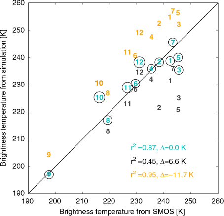
Fig. 14
Different brightness temperature simulations versus SMOS brightness temperature observations. The numbers indicate the circular areas. The colours correspond to the colours used for the circles in Fig. 13, that is, brightness temperatures simulated for the EM ice thickness distribution (cyan), for the modal EM ice thickness (black) and for the mean EM ice thickness (orange). The corresponding coefficients of determination and the mean deviations between the simulations and the observations are given in the figure.
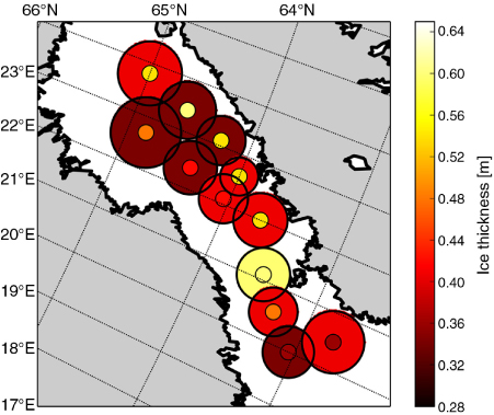
Fig. 15
Total ice thicknesses (i.e. sum of snow and ice thickness) as measured by the EM Bird and as retrieved from SMOS brightness temperature intensities. The inner circles depict ice thicknesses as retrieved from SMOS, the outer circles depict the modal values of all EM ice thicknesses measured within the corresponding circle.