
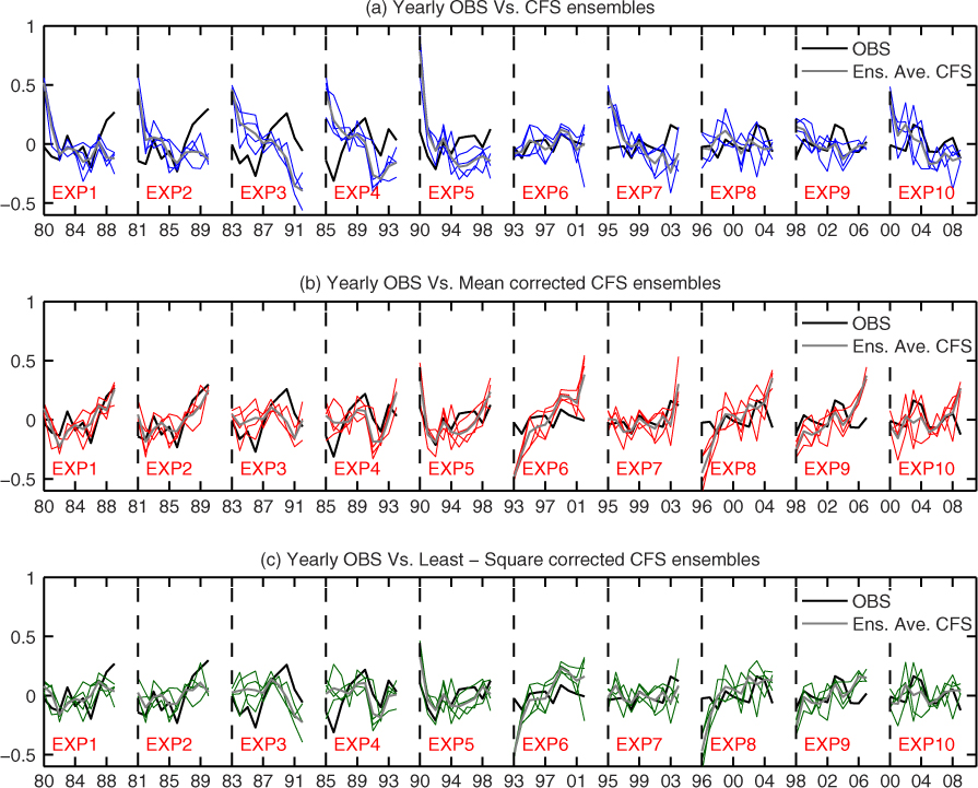
Fig. 1
Time evolution of the PAA index (°C) based on annual anomalies. (a) CFS ensembles in blue lines, (b) mean corrected in red and (c) least square corrected CFS ensembles in green lines. In all the panels, thick grey lines depict ensemble mean, and the black line corresponds to observations. X-axis shows the 10 initialised years with each initialised year separated by a vertical dashed line.

Fig. 2
Same as Fig. 1, but for seasonal anomalies.

Fig. 3
Root mean square error (solid lines) and ensemble spread (dashed lines) of the PAA index (°C). The black line corresponds to the uncorrected forecasts, red line denotes the RMSE of the corrected forecasts using the SMC method and green line represents the RMSE of the corrected forecast using the SLC method. Note that the model spread is unchanged after the correction. The grey line depicts the times the standard deviation of the observations.
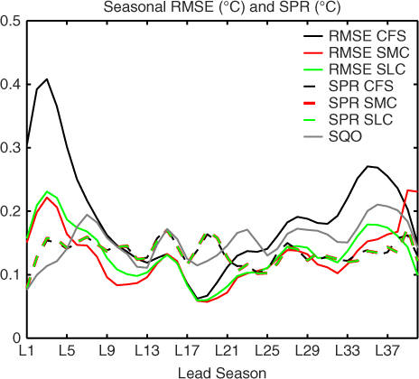
Fig. 4
Similar to three, except the RMSEs and SPRs are calculated using seasonal anomalies.
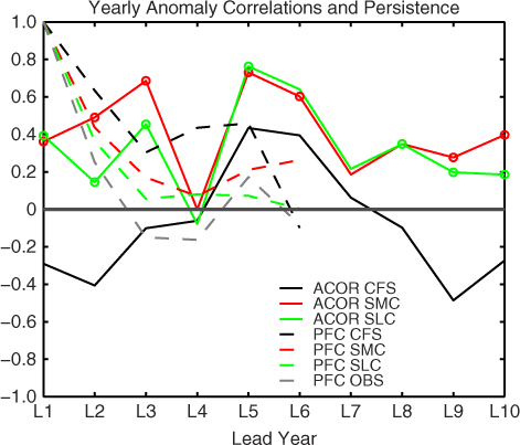
Fig. 5
Anomaly correlations (solid line) of the uncorrected forecasts (black) and corrected forecasts (SMC method in red, and SLC method in green). The circles on the red and green solid lines show the 5% significant values of the correlation difference. The dashed lines show persistence forecasts for the uncorrected ensembles in black, SMC corrected in red, SLC corrected in green and the observations in grey lines. X-axis labels show the lead years. The grey horizontal line is drawn in the plot to highlight the transformation of negative to positive correlation after employing the bias corrections.
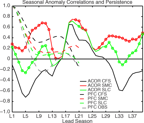
Fig. 6
Similar to Fig. 5, but for seasonal anomalies.
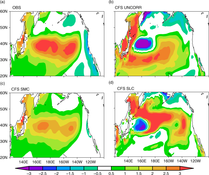
Fig. 7
Regression of SST anomalies on PAA (°C/°C) using (a) observations, (b) uncorrected forecasts, (c) SMC and (d) SLC methods.
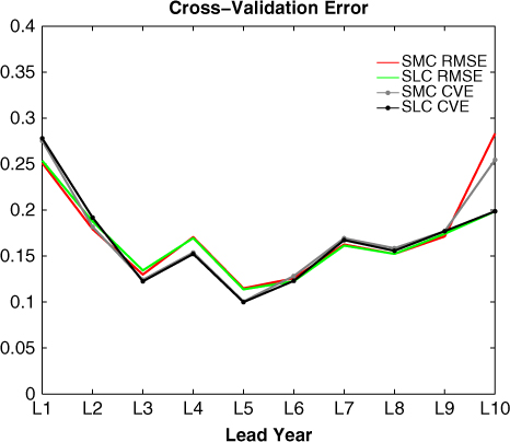
Fig. 8
Red and green lines depict the RMSE as calculated using SMC and SLC methods, and grey and black lines represent the cross validation error (CVE) for SMC and SLC methods, respectively.

Fig. 9
The black, red and green lines in left column of panels show the forecast reliabilities for the uncorrected, SMC and SLC-corrected forecasts, respectively, in lead years (a) one, (b) two, (c) six and (d) eight. The condition for the forecast probabilities is described in the text. In all the panels, the grey diagonal line corresponds to the ideal scenario for perfect reliability. The three histograms identified with corresponding colours, placed next to each panel show the number of forecast events (in that particular lead year) organised in probability bins of 0, 0.25, 0.5, 0.75 and 1.0 shown with bin numbers 1–5, respectively.
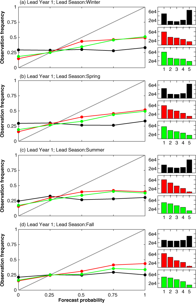
Fig. 10
Similar to Fig. 9, but the forecast reliability shown in (a) winter (DJF), (b) spring (MAM), (c) summer (JJA) and (d) fall (SON) of the first lead year.