
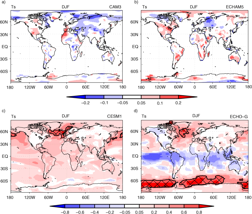
Fig. 1
Lag-1 yr autocorrelation in surface air temperature (Ts) averaged over December, January and February (DJF). Cross-hatched areas denote strong positive autocorrelation (>0.6). Autocorrelation is calculated on the long simulations in Table 2. Lag-1 yr autocorrelation represents the relationship between 1 yr and the next.
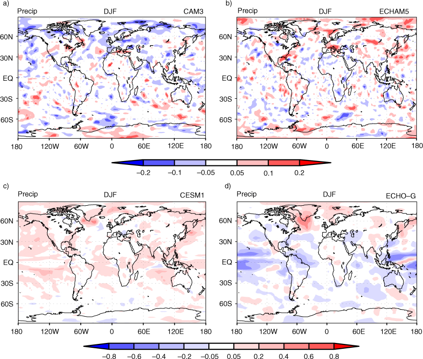
Fig. 2
Lag-1 yr autocorrelation in precipitation (precip) averaged over December, January and February (DJF). Autocorrelation is calculated on the long simulations in Table 2. Lag-1 yr autocorrelation represents the relationship between 1 yr and the next.
Table 1. Survey of 3 yr of J. Climate publications (from 2008 to 2011) where significance tests are applicable on the average over a continuous climate model simulationa
No test108 (49%)Student's t-test97 (44%)Effective sample size t-test (modified Student's t-test)13 (6%)Bootstrap test3 (1%)Moving blocks bootstrap test and pre-whitening bootstrap test (modified bootstrap tests)0 (0%)
Table 2. Climate model integrations for analysis in the present study
CAM3T42 (2.8×2.8) L26800Climatological SSTsECHAM5T42 (2.8×2.8) L31375Climatological SSTsECHO-GT30 (3.75×3.75) L19/T42 (2.8×2.8) L201000Fully coupledCESM1FV (1.9×2.5) L26/gx1v6 (1×1) L60879Fully coupled
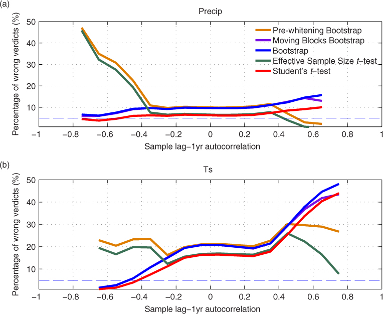
Fig. 3
Performance of the five statistical techniques in establishing the robustness of 20-yr average. Percentage of wrong verdicts refers to the probability of confidence interval not containing the truth. Since two-tailed significance tests were conducted at a 5% significance level, the correct percentage of wrong verdicts should be 5% (marked with dashed line). Autocorrelation here is the lag-1 yr autocorrelation measured in a 20-yr continuous simulation.
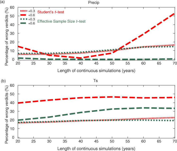
Fig. 4
Same as Fig. 3, except that the performance of the Student's t-test and the Effective Sample Size t-test is shown as a function of the integration length of the continuous simulation. In Fig. 3, only 20-yr long runs were analysed. Red curves correspond to Student's t-test, and green curves correspond to the Effective Sample Size t-test. The two curves of the same colour represent weak positive (+0.3) and strong positive (+0.6) lag-1 yr autocorrelations in the 20~70 yr long continuous simulation.
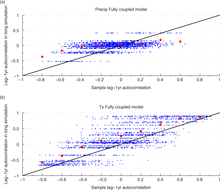
Fig. 5
Scatter plot of lag-1 yr autocorrelation in 20-yr long continuous simulations against lag-1 yr autocorrelation in long simulations. Time series of area averages from climate models, as explained in Section 2, are used. Note that red dots are shown to denote the averages for the lag-1 yr autocorrelation in long simulations as a function of the sample 1ag-1 yr autocorrelation; the results are obtained by binning the data at intervals of 0.2 in sample 1ag-1 yr autocorrelation.
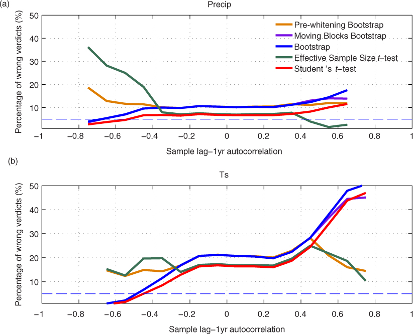
Fig. 6
Same as Fig. 3, except that the advanced techniques use the autocorrelation from the long simulation for the autocorrelation adjustments instead of using the autocorrelation in the 20-yr long sample.