
Fig. 1.
Illustrative graph of nodes in discretisation and sensor locations.
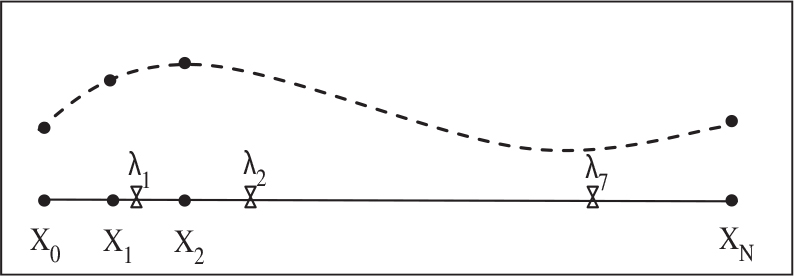
Fig. 2.
A trajectory with sensor locations.
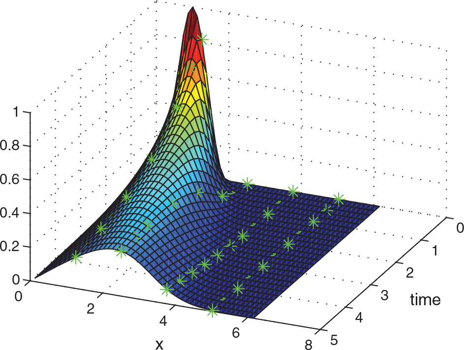
Fig. 3.
Sensor locations: equally spaced (blue) and optimal locations (red).
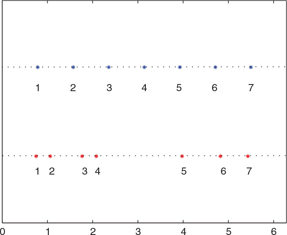
Fig. 4.
The scatter plot of ρ/ɛ vs. .
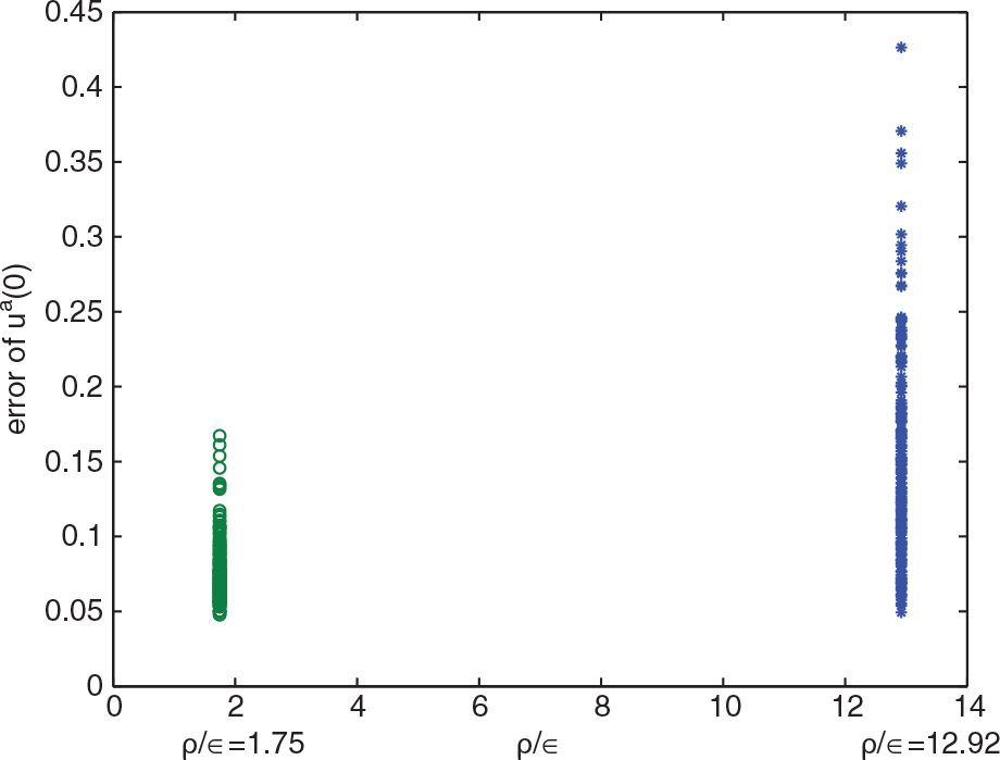
Fig. 5.
The scatter plot of ρ/ɛ vs. ..
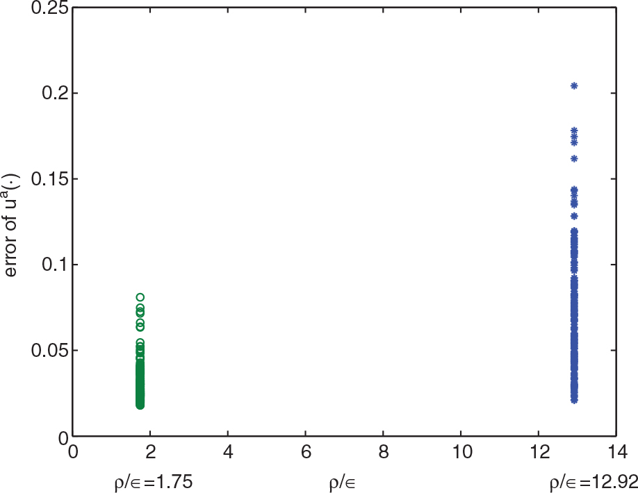
Table 1. Summary of Monte Carlo experiments
Fig. 6.
RMSE as a function of time. Curve: equally spaced sensors. Dash: optimal sensor locations.
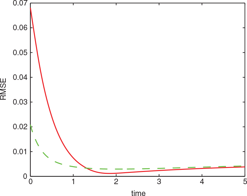
Fig. 7.
The ±2σ interval around the initial state. Curve: equally spaced sensors. Dash: optimal sensor locations.
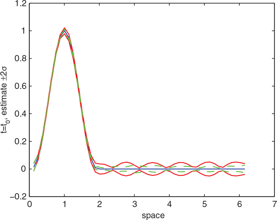
Table 2. Summary of a robustness study. The column under % represents the improvement in accuracy by using optimal sensor locations