
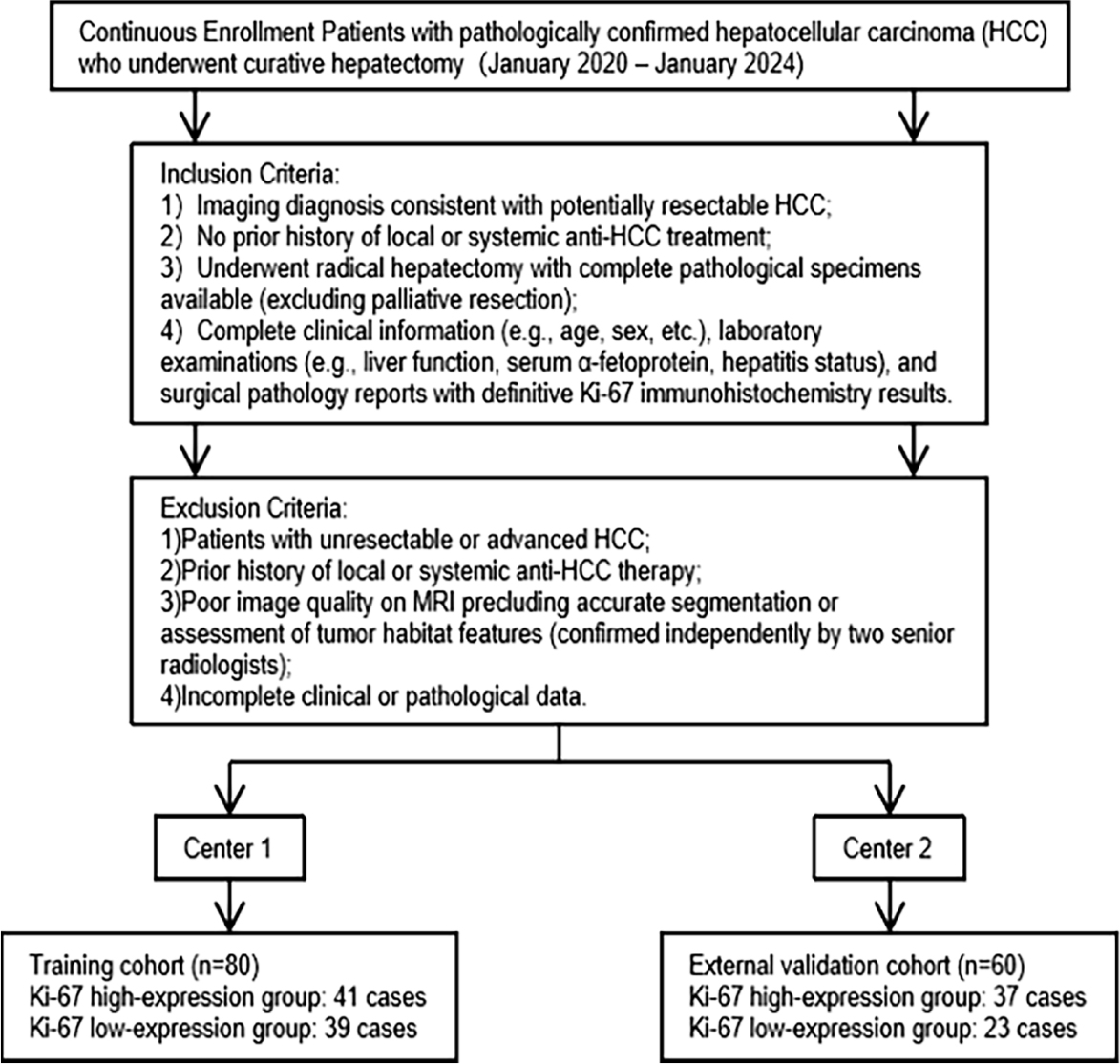
FIGURE 1.
Patient inclusion and exclusion flowchart for the hepatocellular carcinoma (HCC) dual-center study cohort.
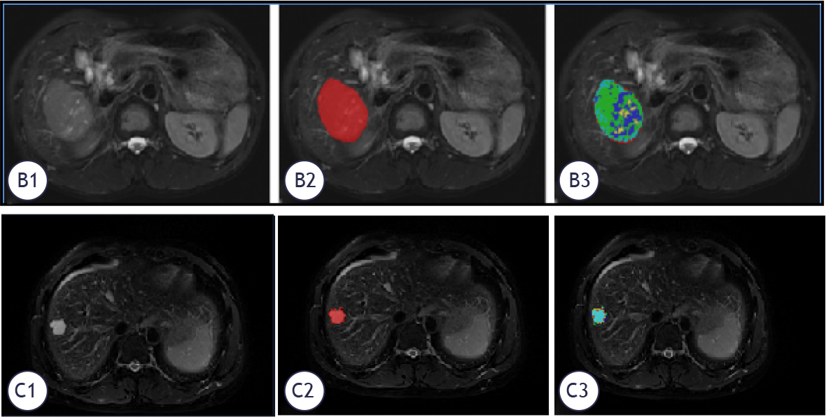
FIGURE 2.
T2WI-based habitat segmentation of hepatocellular carcinoma (HCC) and its correlation with Ki-67 expression status. (B1-B3): HCC with Ki-67 -high expression (20%); (C1-C3): HCC with Ki-67 low expression (10%). Representative T2WI images and corresponding habitat segmentation of HCC with different Ki-67 expression levels. The red area indicates the tumor high-proliferation potential region (correlated with high Ki-67 expression), and the blue area indicates the low-proliferation potential region (correlated with low Ki-67 expression).
TABLE 1.
Comparative analysis of clinical baseline data across hepatocellular carcinoma patient datasets
| Clinical Data | Training Cohort | P-value | External Validation Cohort | P-value | ||
|---|---|---|---|---|---|---|
| Ki-67 low-expression group | Ki-67 high-expression group | Ki-67 low-expression group | Ki-67 high-expression group | |||
| Age (years old ± s) | 54.03±11.45 | 54.44±11.60 | 0.873 | 55.17±12.80 | 53.76±11.91 | 0.665 |
| Sex (number of cases, (%)) | 0.901 | 1.0 | ||||
| Male | 29 (74.36) | 32 (78.05) | 19 (82.61) | 31 (83.78) | ||
| Female | 10 (25.64) | 9 (21.95) | 4 (17.39) | 6 (16.22) | ||
| HBsAg | 1006.1±266.41 | 1108.43±910.28 | 0.209 | 404.61±774.98 | 670.74±1560.00 | 0.745 |
| AFP | 237.50±456.96 | 547.53±516.66 | 0.001 | 273.98±562.51 | 4128.08±17293.40 | 0.073 |
| ALB | 37.62±4.42 | 38.16±3.60 | 0.55 | 39.75±4.34 | 39.11±4.92 | 0.61 |
| AST | 57.38±60.05 | 56.68±59.60 | 0.889 | 91.83±139.89 | 51.43±56.38 | 0.879 |
| ALT | 57.52±81.88 | 58.88±72.24 | 0.321 | 103.63±161.34 | 69.98±91.43 | 0.749 |
| PLT | 210.00±98.92 | 207.90±91.08 | 0.806 | 183.37±76.63 | 202.96±84.05 | 0.648 |
| PT | 11.99±1.35 | 12.29±2.55 | 0.942 | 12.79±1.42 | 12.67±1.27 | 0.749 |
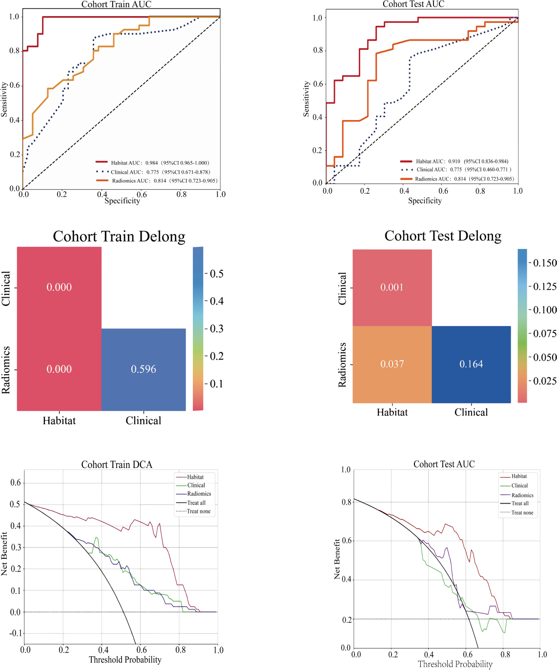
FIGURE 3.
ROC curves, DeLong test results and decision curve analysis (DCA) for evaluating the predictive performance of three models in predicting HCC Ki-67 expression. Receiver operating characteristic (ROC) curves showing the diagnostic performance of the habitat, radiomics and clinical models in the training and external validation cohorts, with key area under the curve (AUC) values labeled. DeLong test results verifying the statistical significance of performance differences between models (P values labeled) in the training and external validation cohorts. Decision curve analysis (DCA) curves demonstrating the net clinical benefit of the three models in the training and external validation cohorts; the habitat model yielded the highest net benefit across all threshold probabilities, with notable clinical value when the threshold probability exceeded 0.2. The habitat model outperformed the radiomics and clinical models in all assessments (P<0.05).
TABLE 2.
Predictive performance of various models for Ki-67 expression in hepatocellular carcinoma
| Model | Cohort | Accuracy | Area under the curve | 95% confidence interval | Sensitivity | Specificity |
|---|---|---|---|---|---|---|
| Habitat analysis | Training Cohort | 0.938 | 0.984 | 0.9647-1.0000 | 0.976 | 0.897 |
| External Test Cohort | 0.850 | 0.910 | 0.8355-0.9835 | 0.919 | 0.739 | |
| Radiomics | Training Cohort | 0.713 | 0.814 | 0.7234-0.9045 | 0.561 | 0.872 |
| External Test Cohort | 0.750 | 0.746 | 0.6102-0.8810 | 0.757 | 0.739 | |
| Clinical features | Training Cohort | 0.750 | 0.775 | 0.6715-0.8782 | 0.854 | 0.641 |
| External Test Cohort | 0.617 | 0.615 | 0.4597-0.7706 | 0.649 | 0.565 |
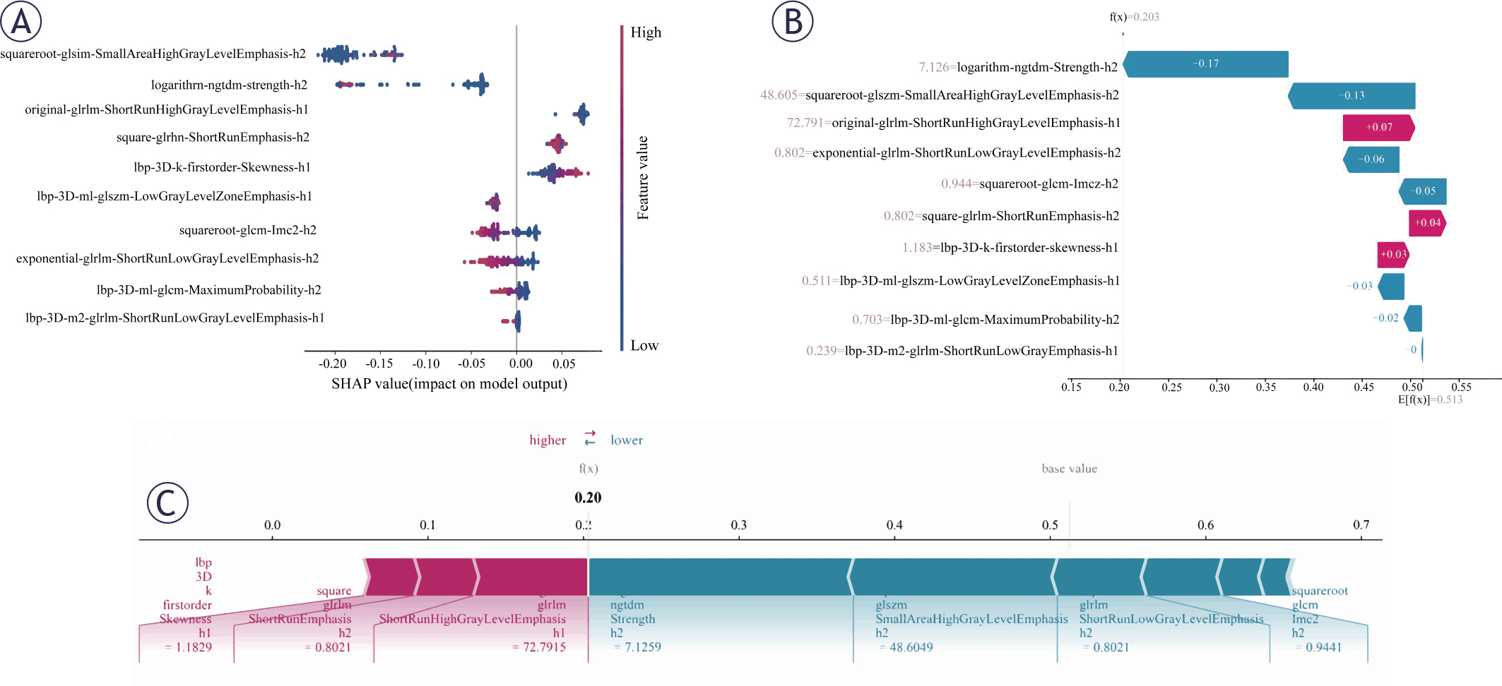
FIGURE 4.
SHAP visualizations for model interpretability. (A) SHAP summary plot (beeswarm plot) displaying feature importance ranked by mean absolute SHAP values. Each point represents a single patient, with horizontal displacement indicating the magnitude and direction of the feature’s effect on model output. (B) SHAP waterfall plot illustrating how each feature’s contribution (SHAP value) accumulates from the base value to the final prediction for an individual case. Each bar represents the magnitude and direction (positive or negative) of a feature’s contribution to the prediction. (C) SHAP force plot demonstrating how features combine to push the model output from the base value (average prediction) to the final predicted value for a specific instance. Red arrows indicate features increasing the prediction, while blue arrows represent features decreasing the prediction, with arrow length corresponding to contribution strength.