
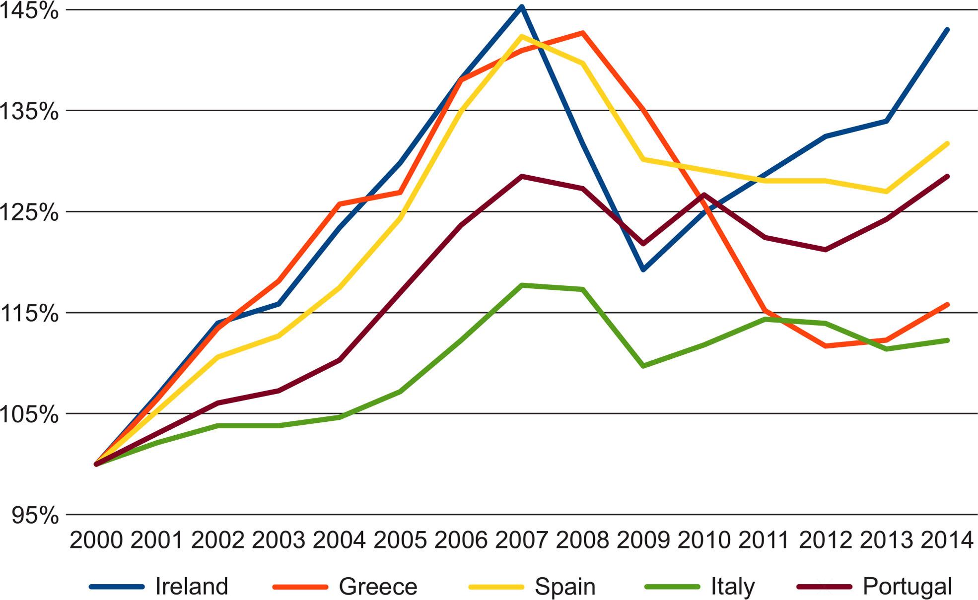
Fig. 1
Relative change in GDP per capita (PPP) for ‘PIIGS’ since 2000.
Source: own study based on Eurostat data.
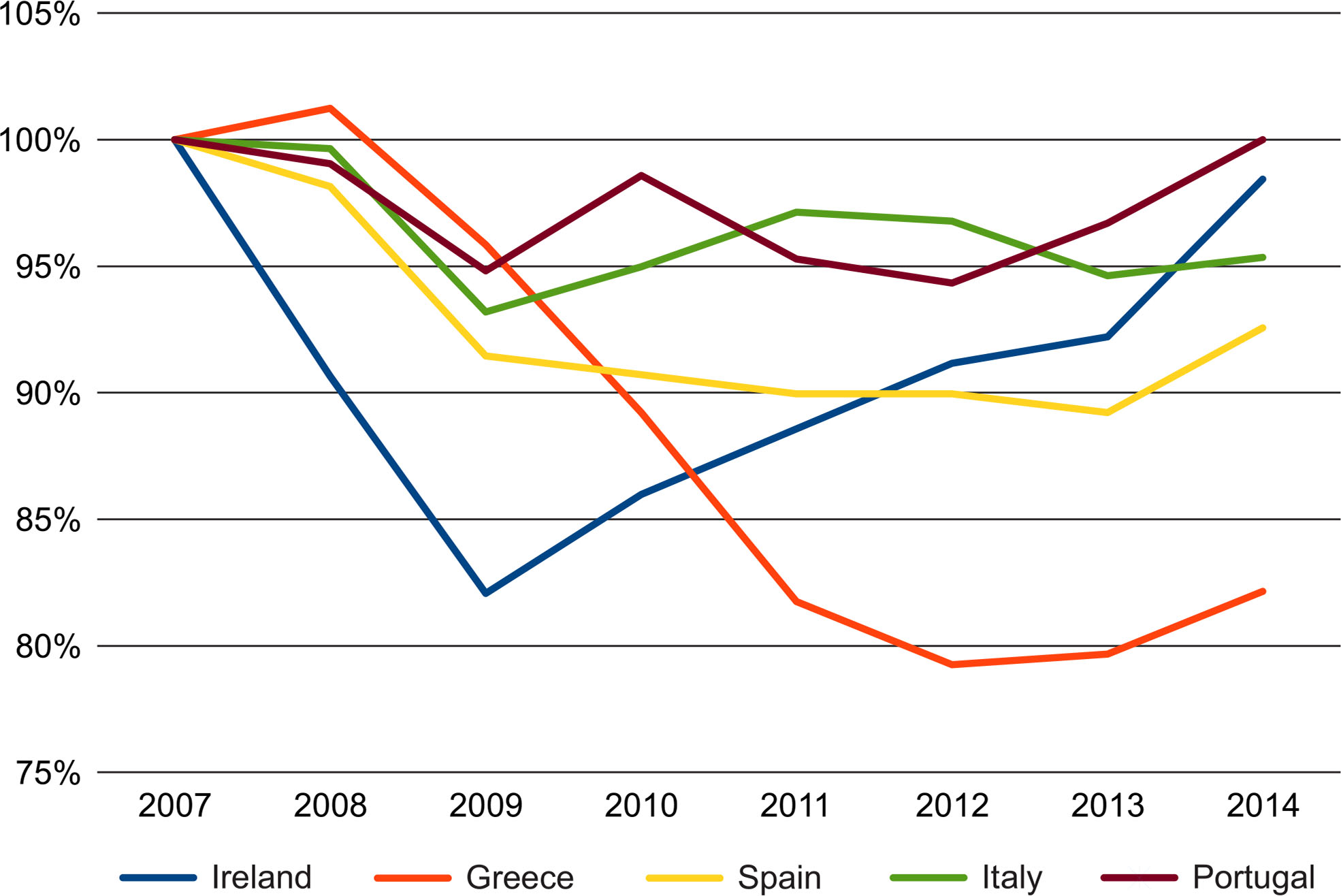
Fig. 2
Relative change in GDP per capita (PPP) for ‘PIIGS’ since 2007.
Source: own study based on Eurostat data.
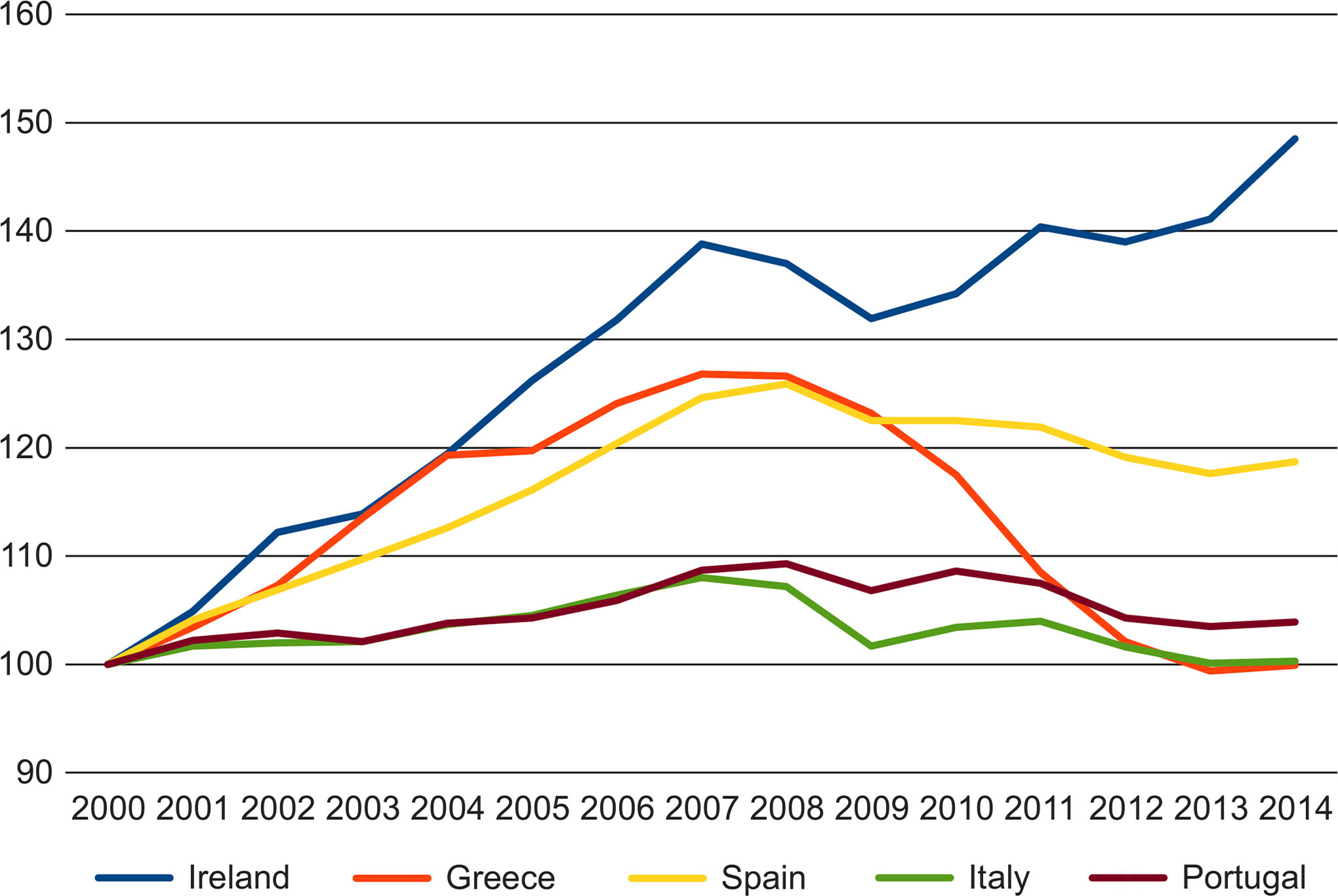
Fig. 3
Relative change in GVA for ‘PIIGS’ since 2000.
Source: own study based on Eurostat data.
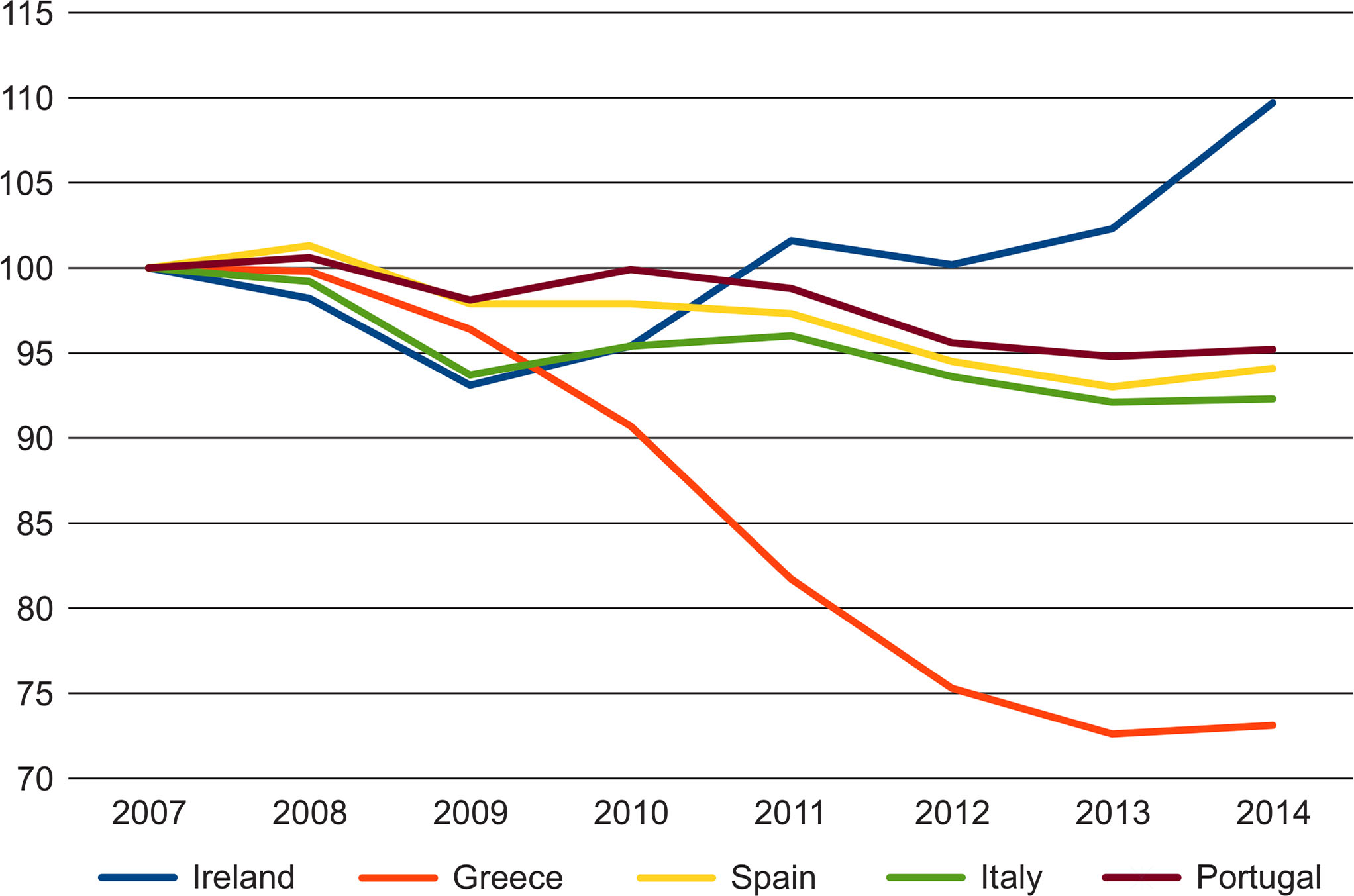
Fig. 4
Relative change in GVA for ‘PIIGS’ since 2007.
Source: own study based on Eurostat data.
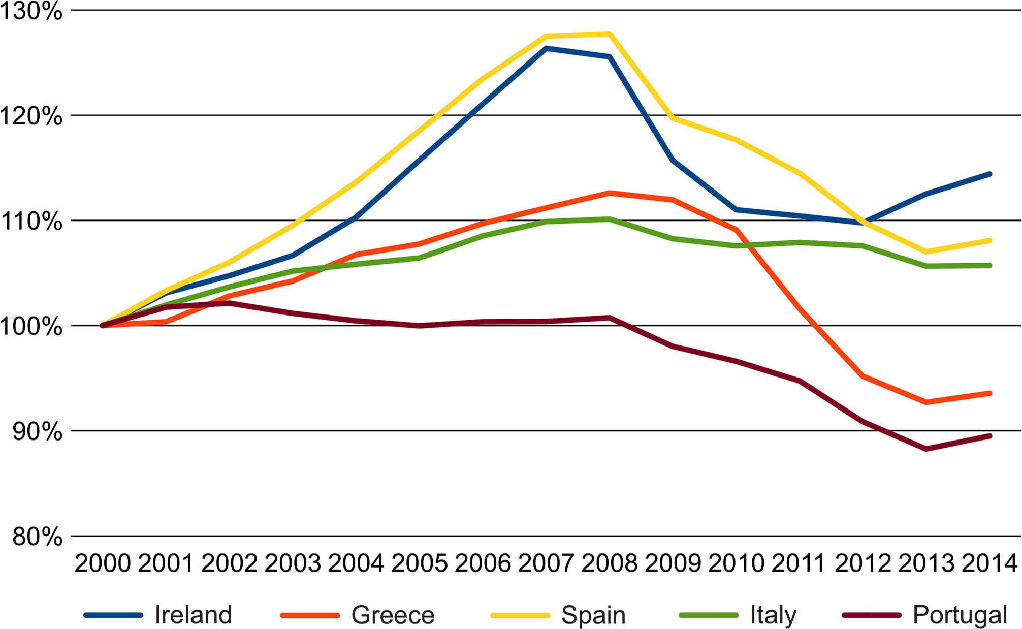
Fig. 5
Relative change in the number of employed persons in ‘PIIGS’ since 2000.
Source: own study based on Eurostat data.
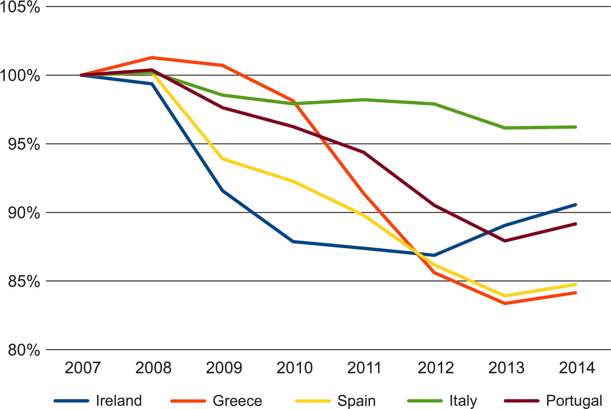
Fig. 6
Relative change in the number of employed persons in ‘PIIGS’ since 2007.
Source: own study based on Eurostat data.
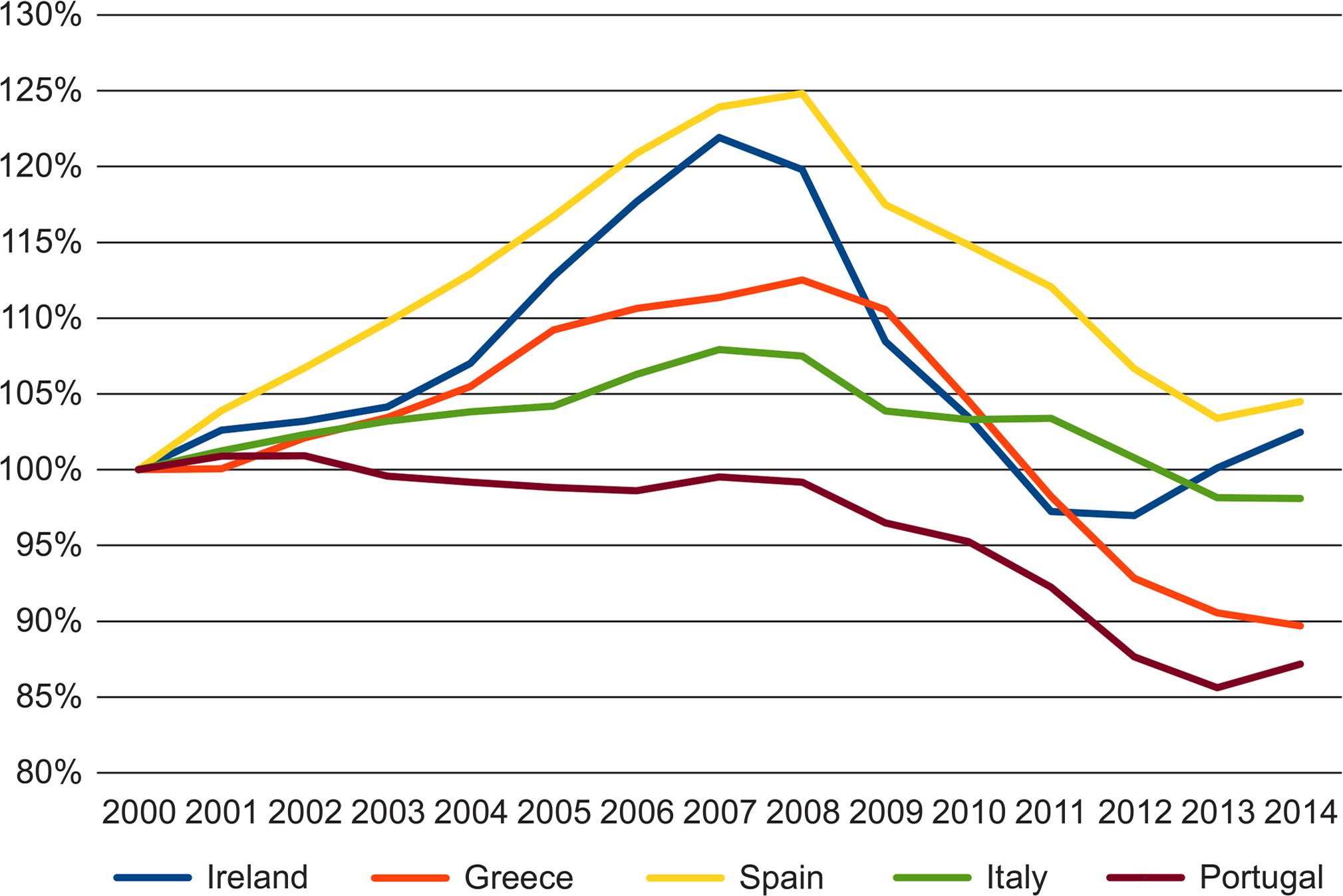
Fig. 7
Relative change in the number of hours worked in ‘PIIGS’ since 2000.
Source: own study based on Eurostat data.
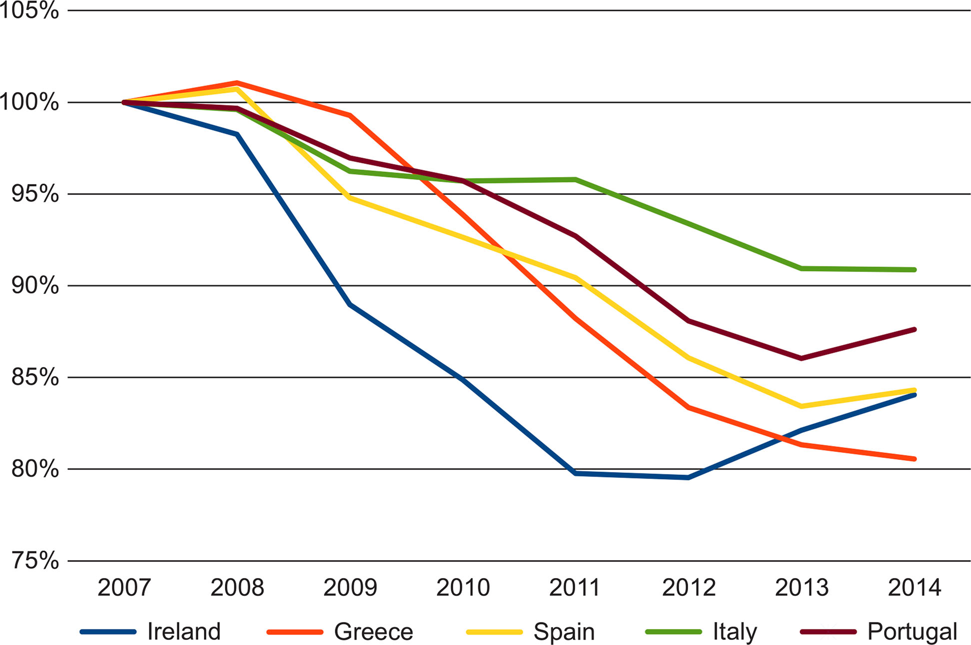
Fig. 8
Relative change in the number of hours worked in ‘PIIGS’ since 2007.
Source: own study based on Eurostat data.
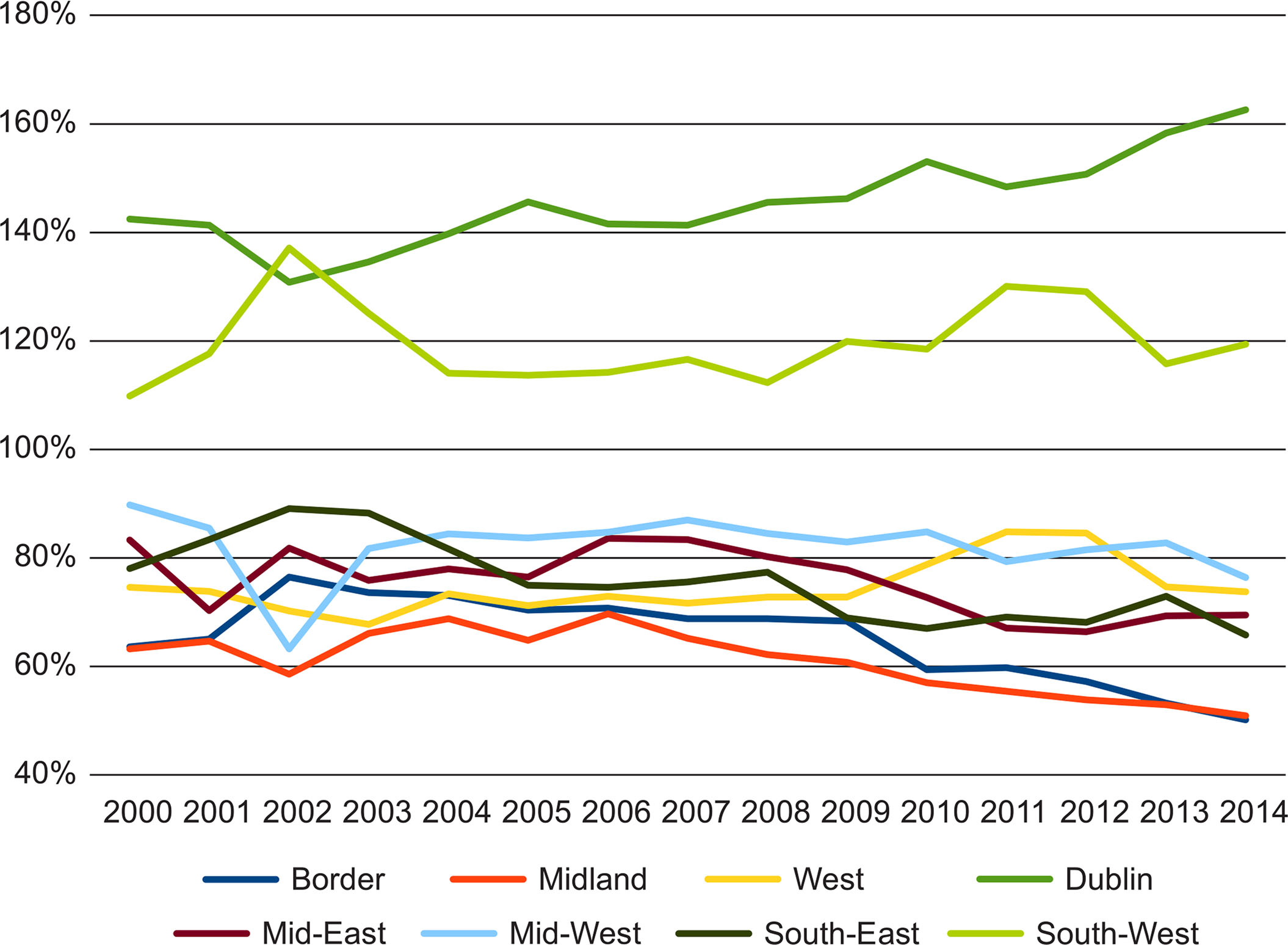
Fig. 9
Regional GDP per capita (PPP) as a percent of the national figure.
Source: own study based on Eurostat data.
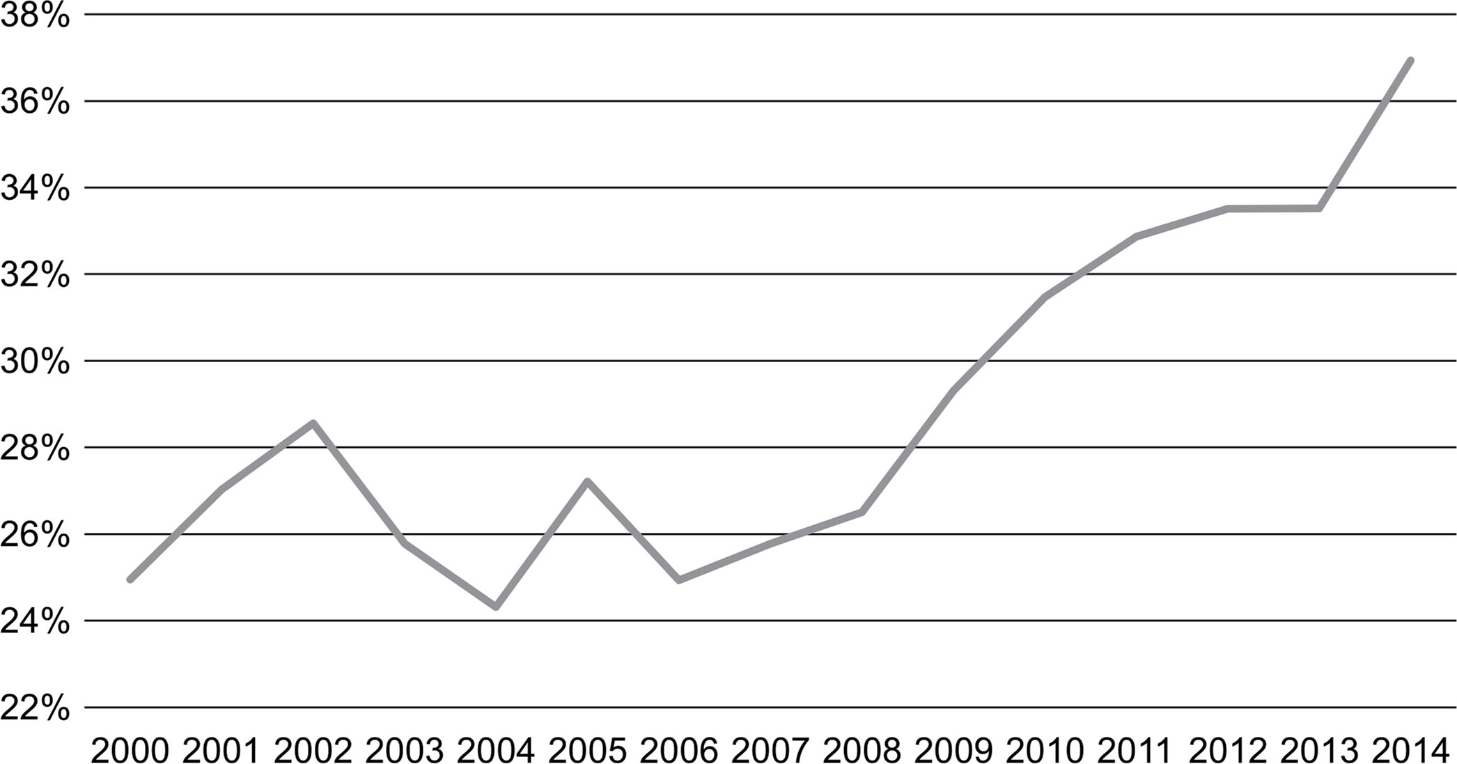
Fig. 10
Mean deviation of regional GDP per capita (PPP) from the national level.
Source: own study based on Eurostat data.
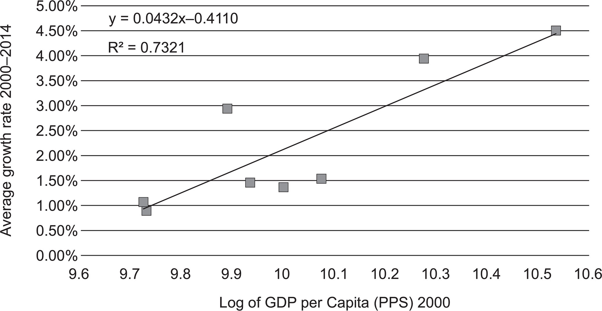
Fig. 11
Test for convergence among Irish NUTS3 regions 2000–2014.
Source: own study based on Eurostat data.
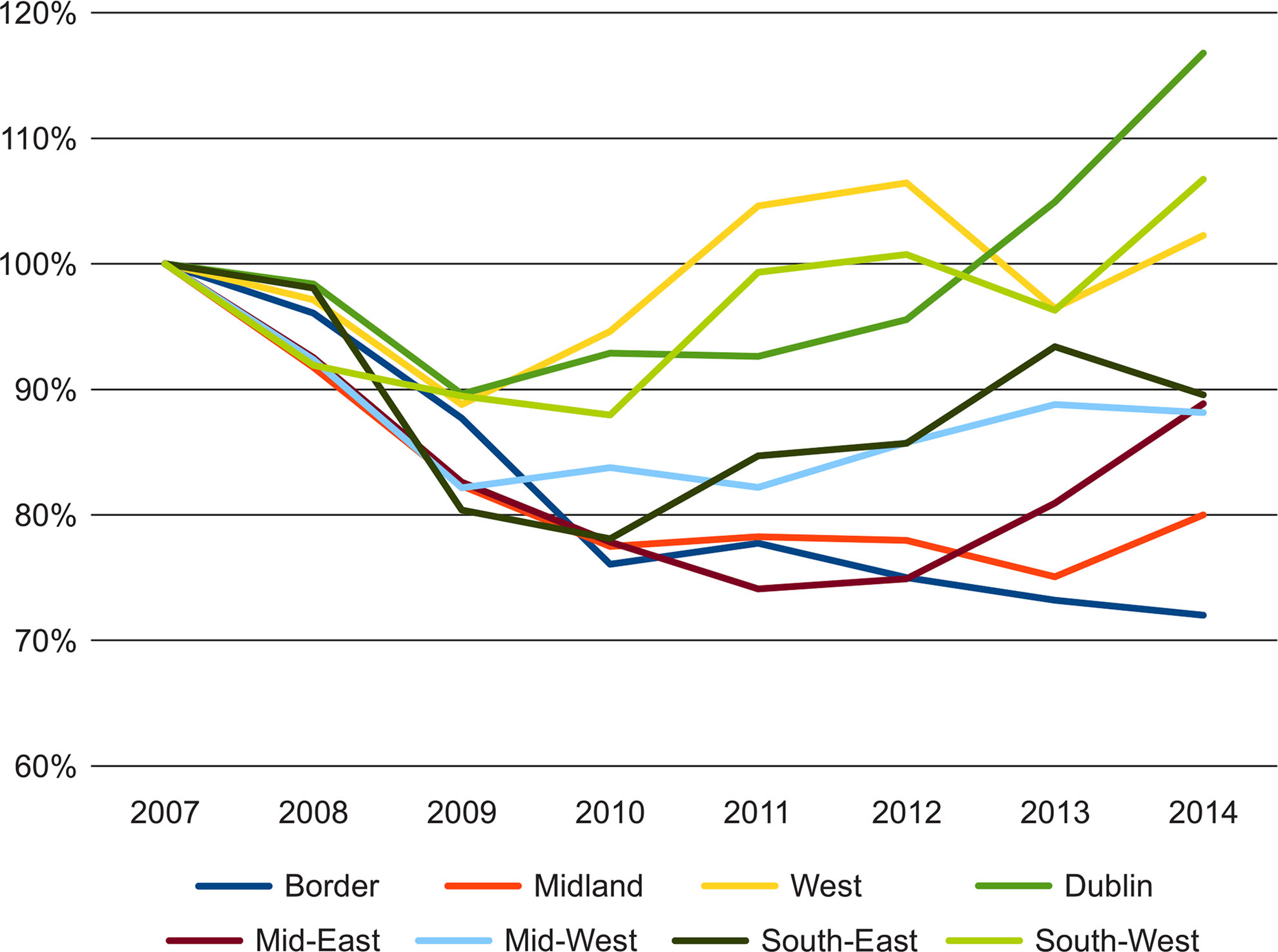
Fig. 12
Relative change in GVA for Irish regions since 2007.
Source: own study based on Eurostat data.
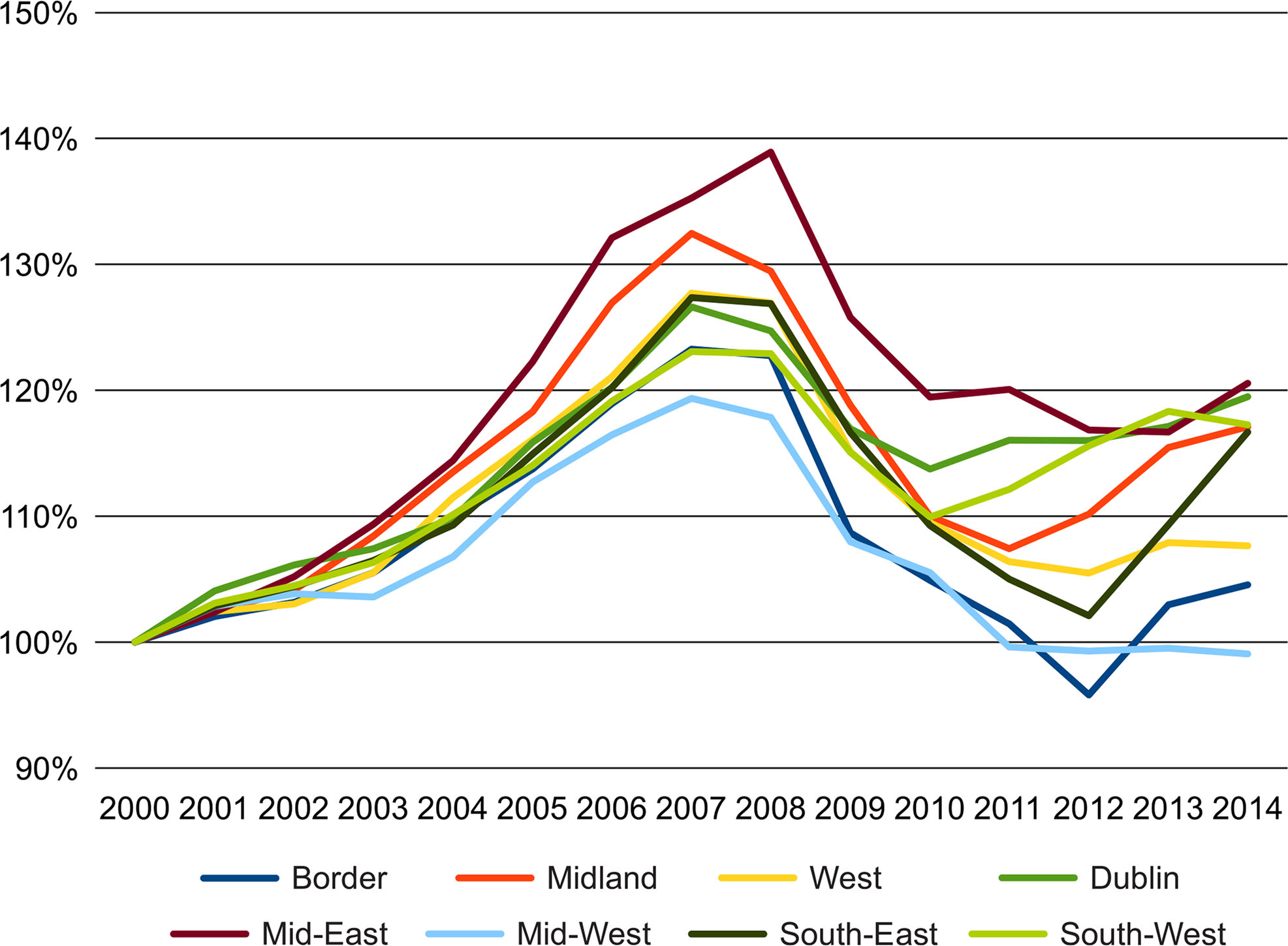
Fig. 13
Relative change in the number of people employed in Irish regions since 2000.
Source: own study based on Eurostat data.
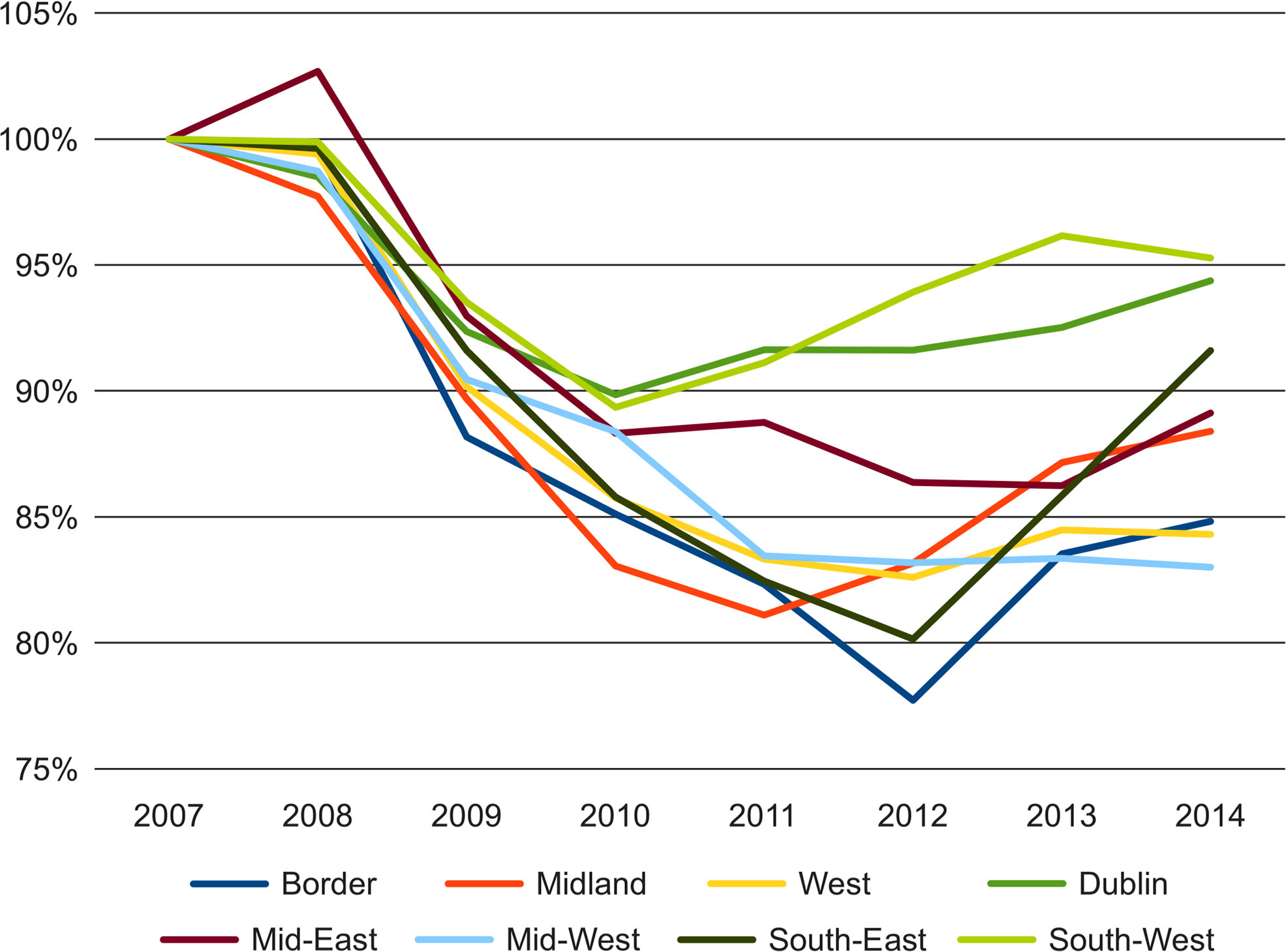
Fig. 14
Relative change in the number of people employed in Irish regions since 2007.
Source: own study based on Eurostat data.