

| Reference test (Gold standard) | ||
|---|---|---|
| Index test | Positive | Negative |
| Positive | True Positive | False positive |
| Negative | False Negative | True Negative |
The effect of prevalence on the Positive Predictive Value
| Prevalence % | VVP % | Sensitivity | Specificity |
|---|---|---|---|
| 0.1 | 1.8 | 90 | 95 |
| 1 | 15.4 | 90 | 95 |
| 5 | 48.6 | 90 | 95 |
| 50 | 94.7 | 90 | 95 |
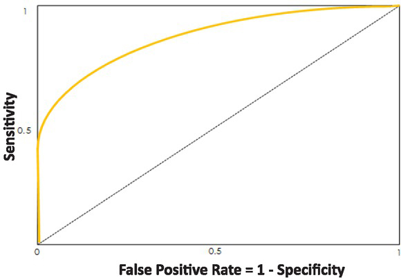
Fig. 1
The ROC curve is composed by calculating the Sensitivity and the False Positive Rate for several thresholds, and plotting them against each other. The False Positive Rate (FPR) or 1 – Specificity is a measurement of how accurate the real negatives are being recorded. The smaller the FPR, the more accurate the identification of the real negative in the data. Sensitivity is recorded on the y axis and is a measure of how accurate people who have a disease are being identified as such.
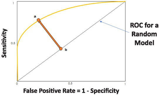
Fig. 2
Representation of the ROC for a random model
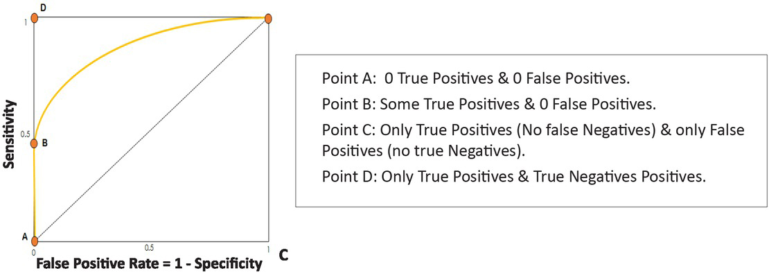
Fig. 3
Explanation of different points of an ROC curve
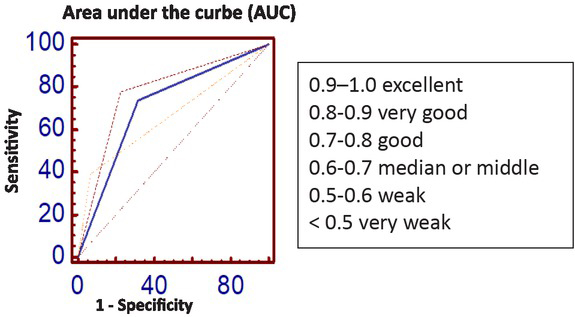
Fig. 4
The area under the ROC curve (AUC) is a measurement from values of 0.5 (random classifier) to 1 (perfect classifier). It signifies how well the model classifies the True and False data points. The greater AUC results in the ROC approaching the desired top-left corner.
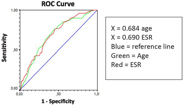
Fig. 5
An example for ROC curves of age and ESR in cancer. For age the area under the curve is 0.684, and for ESR = 0.690. It can be seen how the curves are closer to the reference line (area = 0.5) than to the upper left corner, the point of maximum accuracy of the test.