
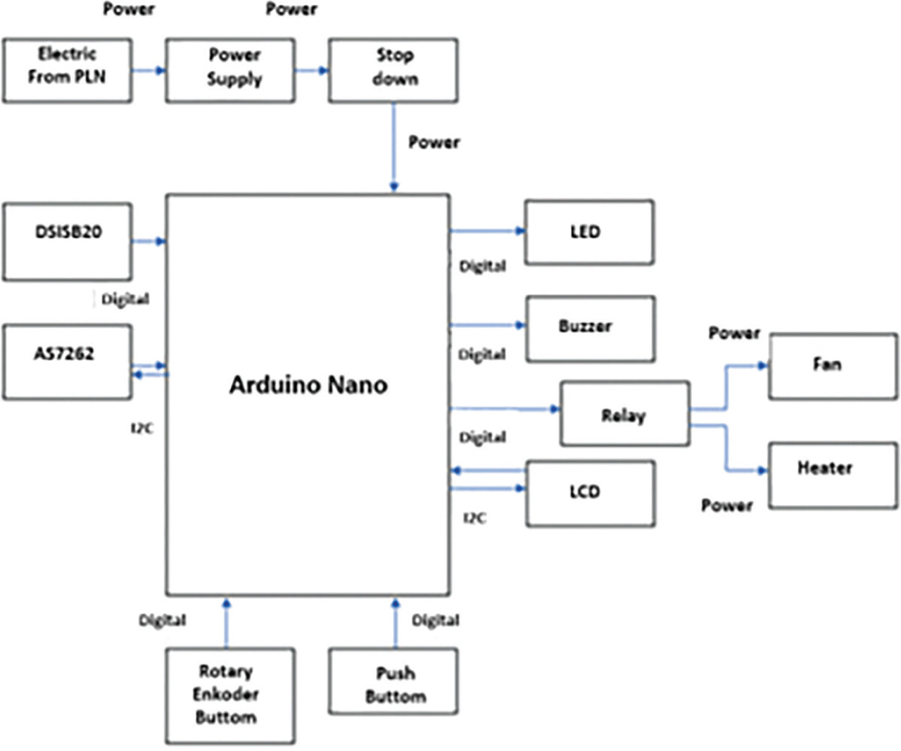
Figure 1:
Block diagram. PLN, State Electricity Company; I2C, Inter Integrated Circuit System.
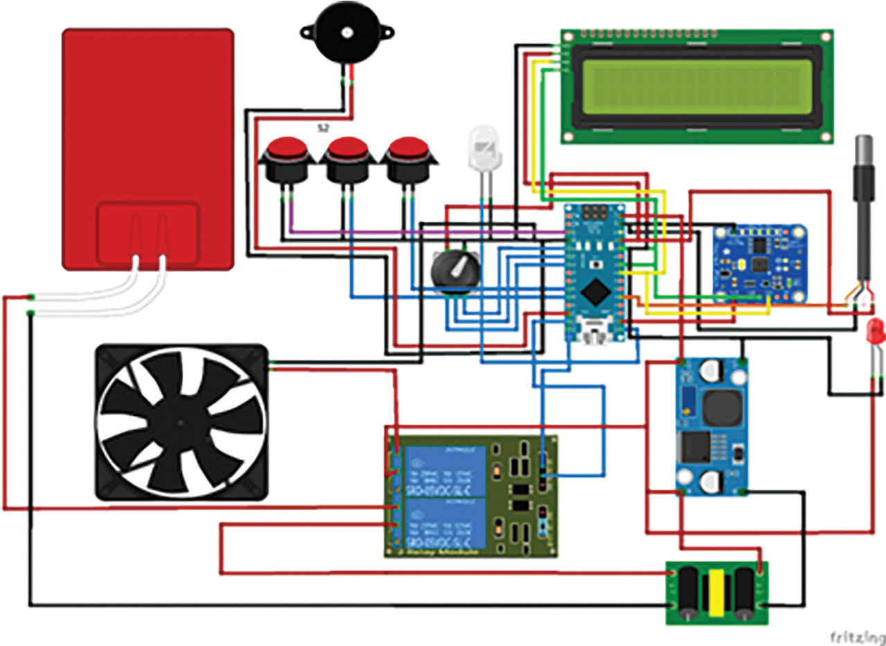
Figure 2:
Wiring diagram.
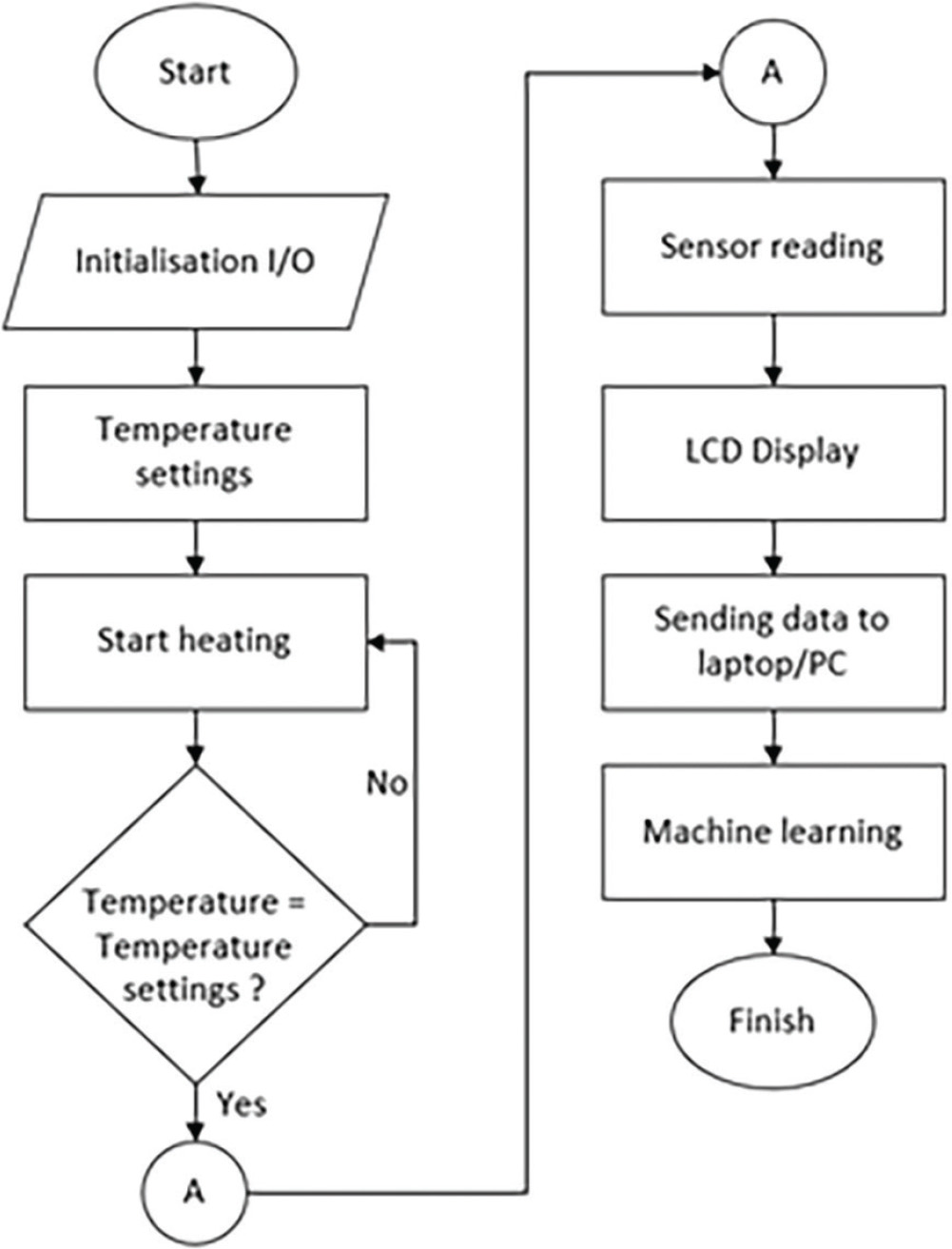
Figure 3:
Flowchart.
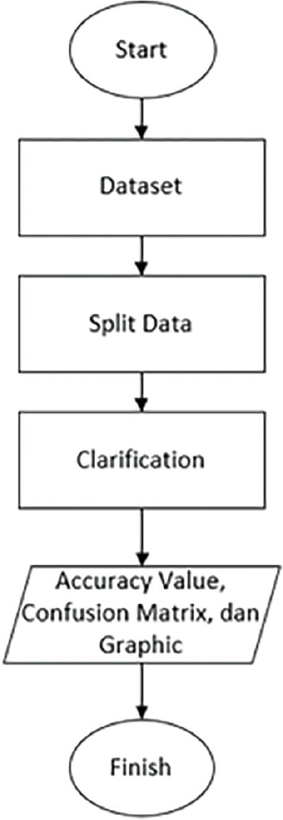
Figure 4:
Machine learning flowchart.
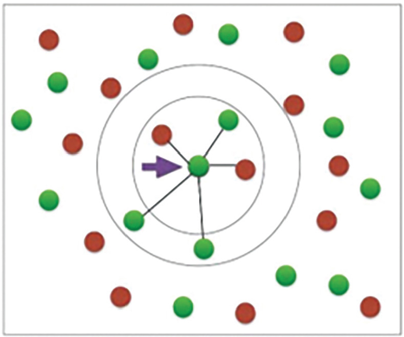
Figure 5:
K-nearest neighbor visualization.
Table 1.
Glucose characterization
| No. | Urine sample | Glucose level (%) | Glucose rate (g) | Color result | Urine positive rate (mg/dL) |
|---|---|---|---|---|---|
| 1. | Sample 1 | 0–0.5 | 0 | Slightly greenish blue and a bit cloudy | Normal |
| 2. | Sample 2 | 0.5–1 | 0.2 | Yellowish green | Positive 1 |
| 3. | Sample 3 | 1–1.5 | 0.3 | Greenish yellow | Positive 2 |
| 4. | Sample 4 | 2–3.5 | 0.4 | Slightly brownish orange | Positive 3 |
| 5. | Sample 5 | >3.5 | 1 | Slightly brownish brick red | Positive 4 |
Table 2.
Results of the data from the sensor
| Result of specimen color | Sensor color indicator | Class category | |||||
|---|---|---|---|---|---|---|---|
| Violet | Blue | Green | Yellow | Orange | Red | ||
 | 21.34 | 23.36 | 18.68 | 19.64 | 14.02 | 6.66 | Normal |
 | 14.93 | 13.53 | 24.27 | 21.48 | 19.23 | 6.53 | Positive 1 |
 | 12.19 | 10.07 | 22.63 | 24.14 | 21.87 | 9.05 | Positive 2 |
 | 11.12 | 8.21 | 16.97 | 21.91 | 26.02 | 15.74 | Positive 3 |
 | 13.68 | 9.93 | 22.58 | 20.77 | 22.58 | 10.43 | Positive 4 |
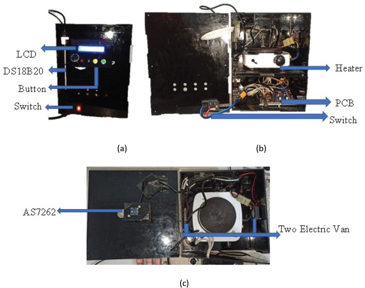
Figure 6:
Prototype: (a) front view, (b) inside view, and (c) upper view.
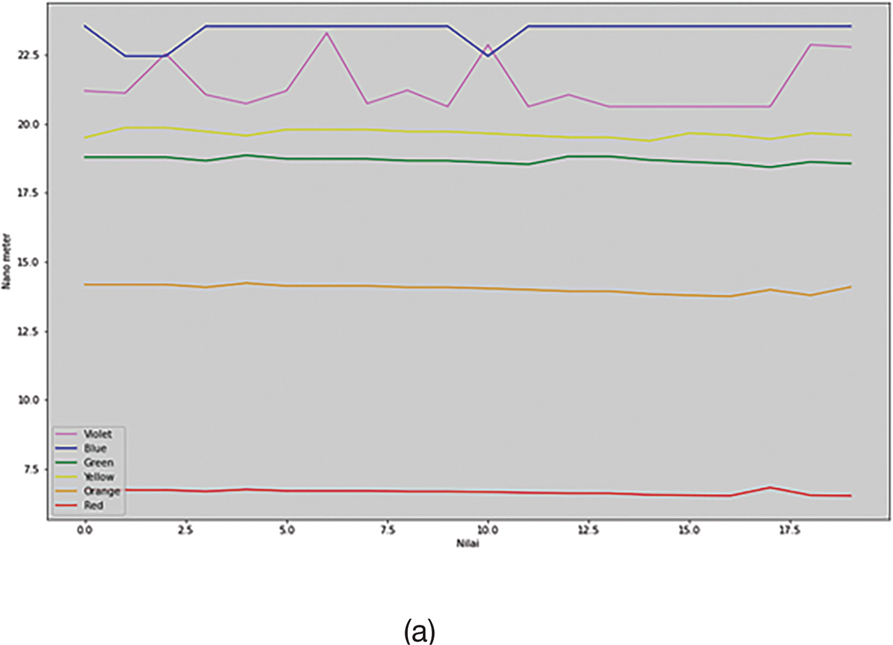
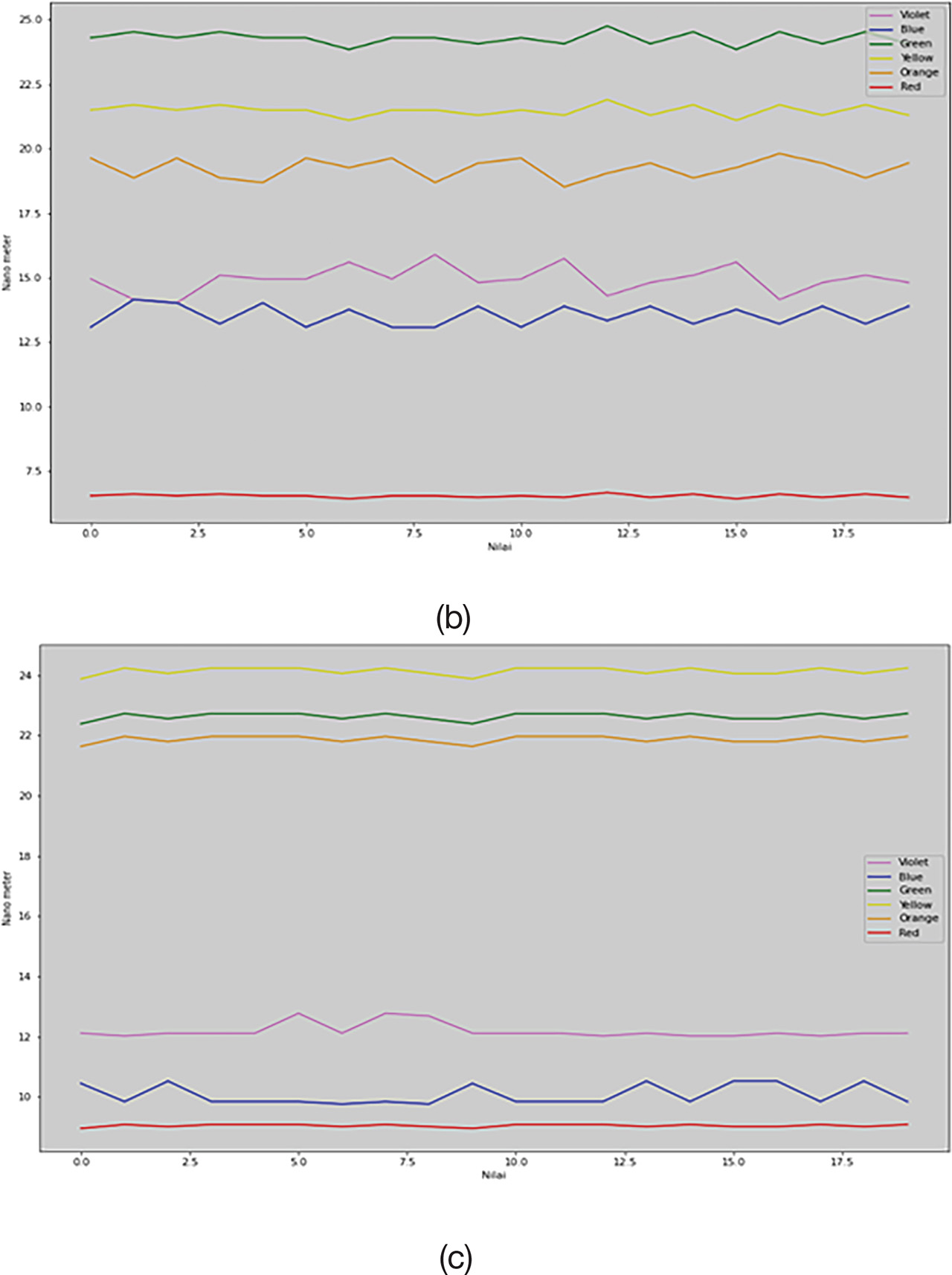
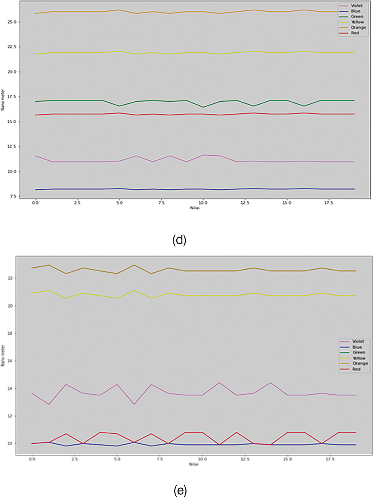
Figure 7:
Graphs of the data results: (a) Normal, (b) Positive 1, (c) Positive 2, (d) Positive 3, and (e) Positive 4.
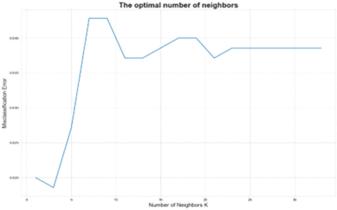
Figure 8:
K-value graph.
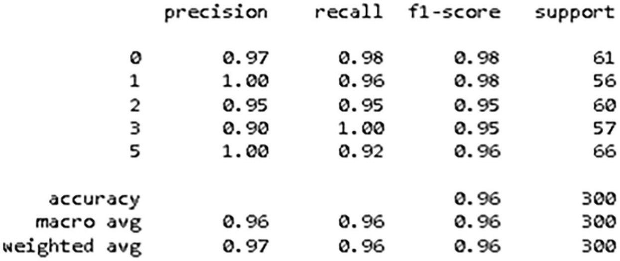
Figure 9:
KNN classification results. KNN, K-nearest neighbor.
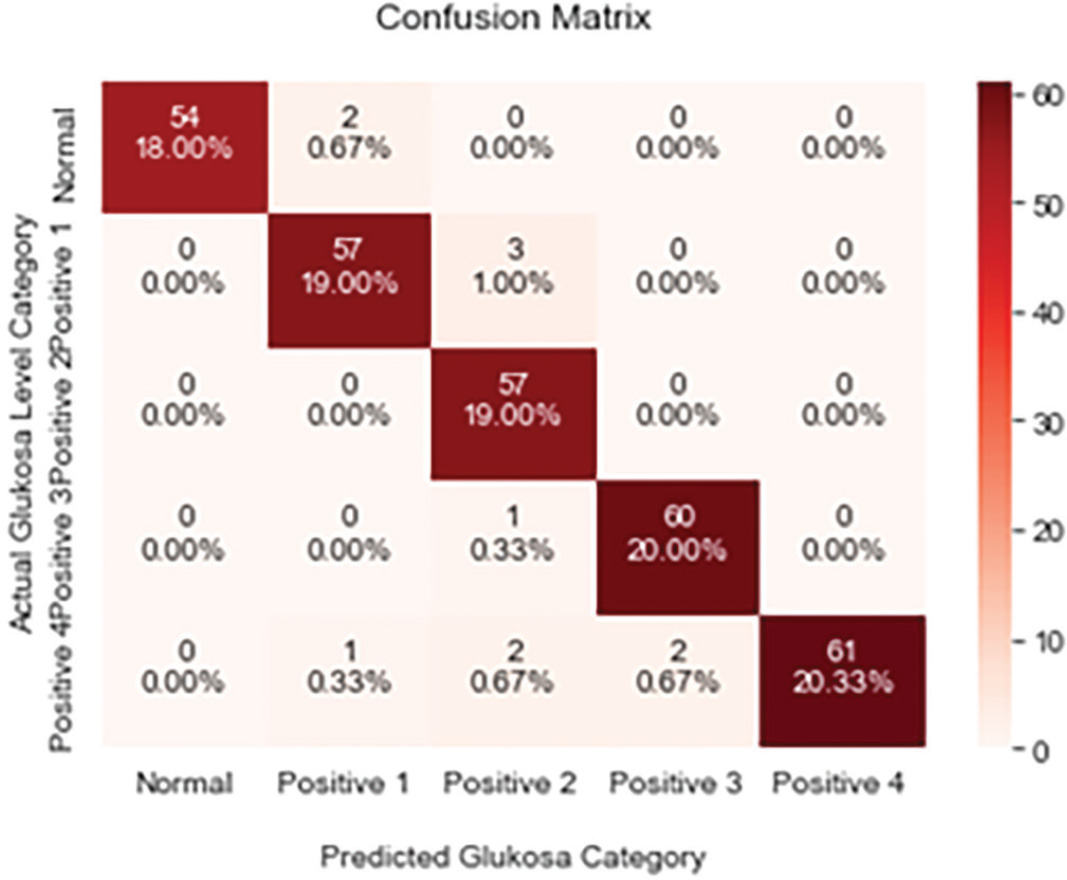
Figure 10:
Confusion matrix.