
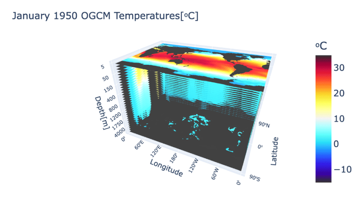
Figure 1
Ocean water temperature from the NASA JPL OGCM output for January 1950. A movable version of the figure can be found at https://ogcm-3d-visualization.herokuapp.com/ where the figure can be rotated and resized.
Table 1
Depths of 32 layers of the NASA JPL OGCM.
| 5 | 10 | 20 | 30 | 50 | 75 | 100 |
| 125 | 150 | 200 | 250 | 300 | 400 | 500 |
| 600 | 700 | 800 | 900 | 1000 | 1100 | 1200 |
| 1300 | 1400 | 1500 | 1750 | 2000 | 2500 | 3000 |
| 3500 | 4000 | 5000 | 5500 |
[i] Note: All depths are in meters.
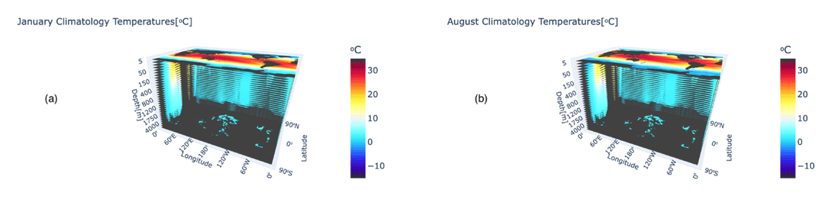
Figure 2
Climatology for January and August computed using the equation above from the NASA JPL OGCM data. Movable figures can be viewed at the website https://climatology-3d-vis.herokuapp.com/apps/clim_Jan_plot.
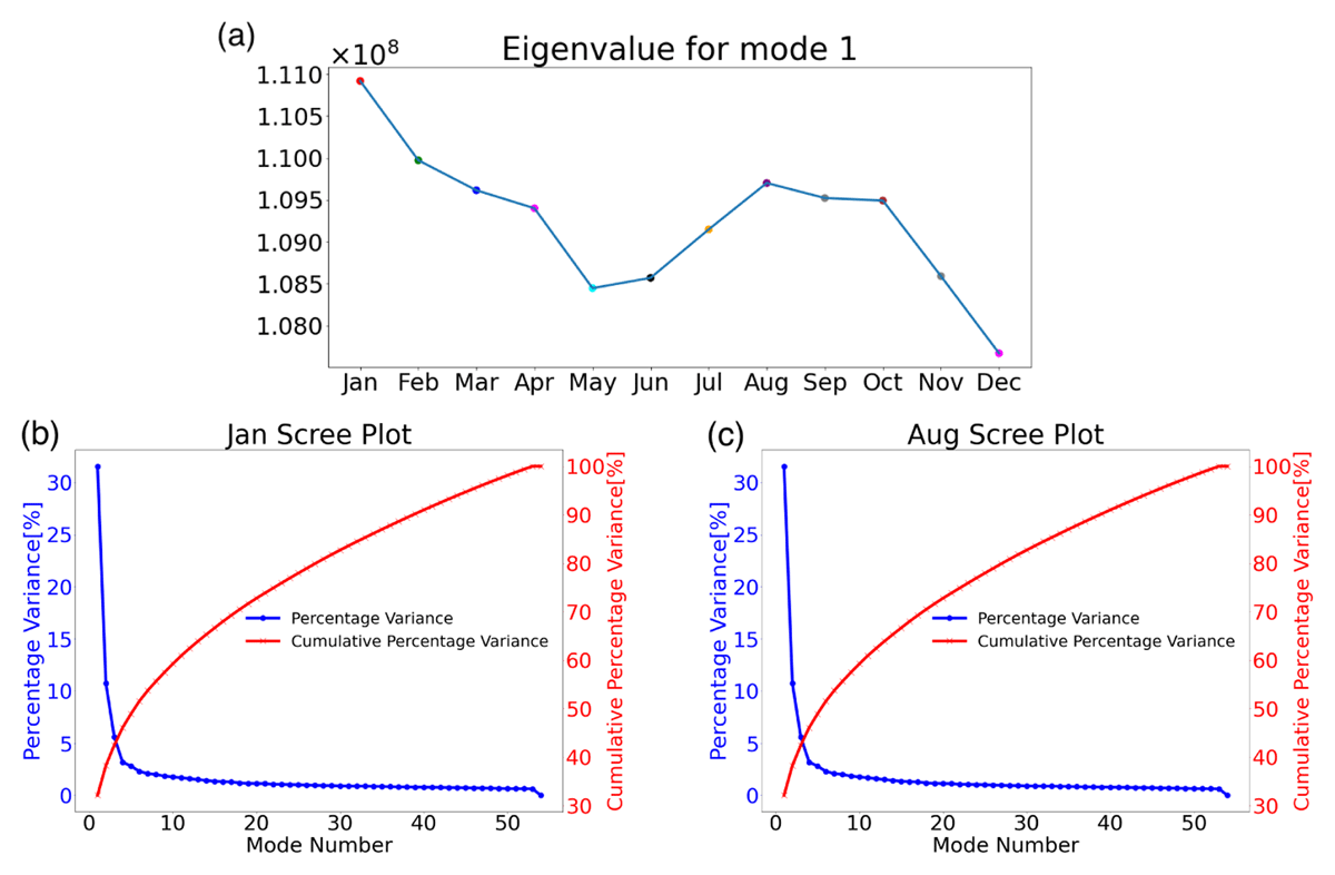
Figure 3
(a) The first eigenvalue λ1 of the temporal covariance matrix for the weighted temperature anomalies for each month from January to December. Units of the first eigenvalue are the same as the covariance matrix in equation 14. (b) The scree plot for January based on data pk and qk. (c) The scree plot for August is based on data pk and qk.
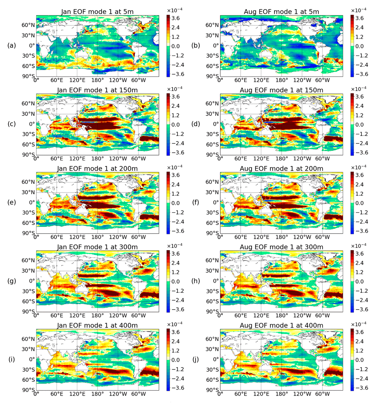
Figure 4
EOF1 for January and August showing the equatorial upwelling. Depths are chosen to show that the strong upwelling occurs at 150 meters and that the upwelling stops at a deeper level around 400 meters.
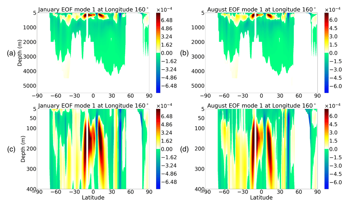
Figure 5
A north-south cross-section of the ocean taken at 160° E to show at what layers upwelling occurs. Panels (a) and (b) are the entire scope of all ocean layers. Panels (c) and (d) show the top layers up to 400 meters as this will better show where upwelling starts and stops.
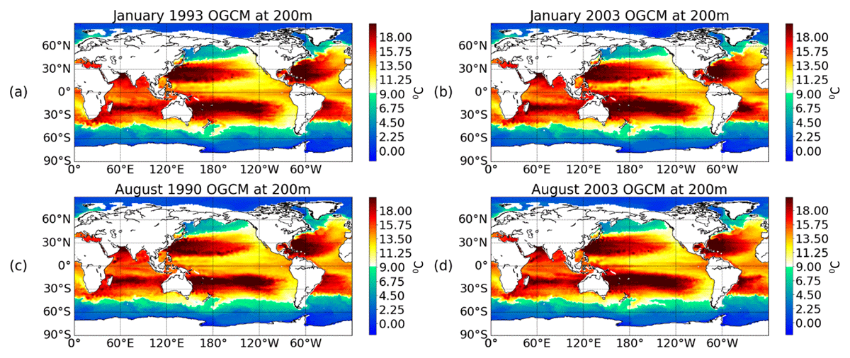
Figure 6
NASA JPL OGCM temperature for January and August at 200 meters showing equatorial upwelling. Years are chosen to reflect time with strong upwelling.
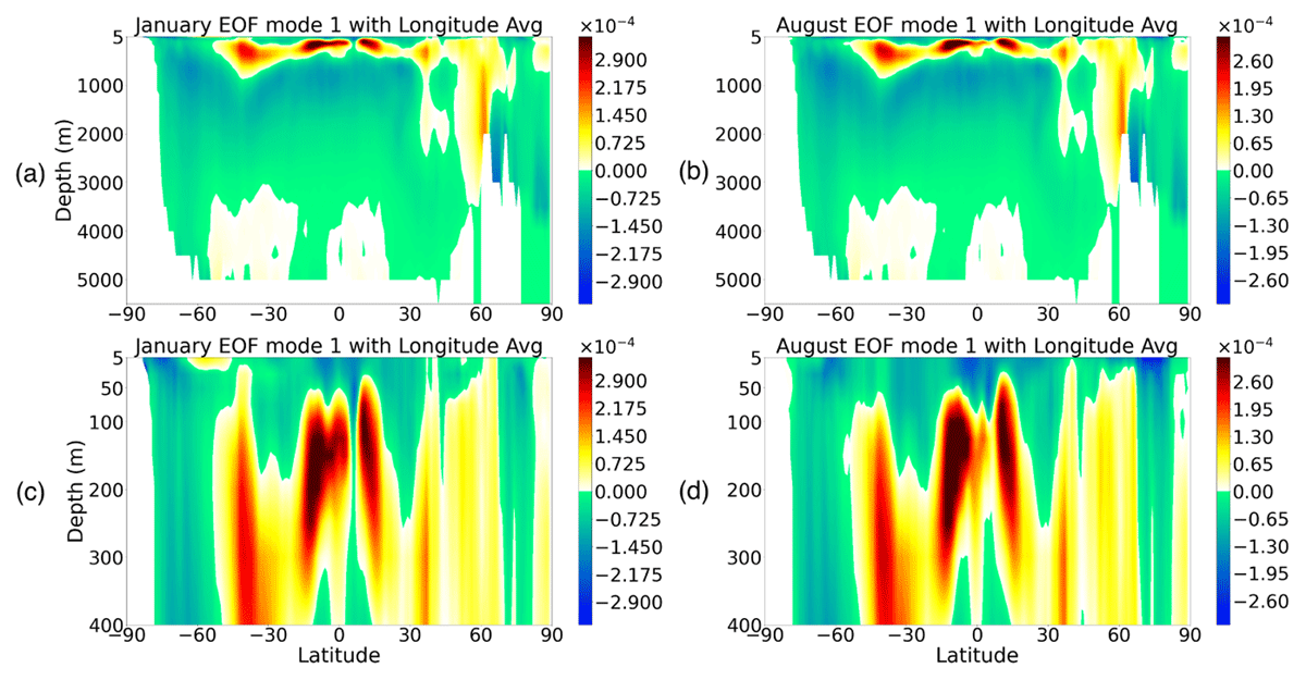
Figure 7
Cross-sectional map based on the zonal mean from 0 to 360° longitude degrees to show ocean ventilation at the high latitude regions.
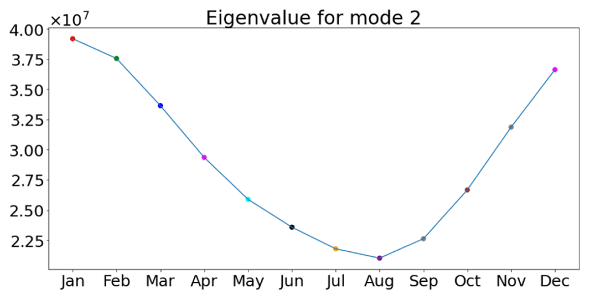
Figure 8
The second eigenvalue λ2 of the temporal covariance matrix for the weighted temperature anomalies. Units of the first eigenvalue are the same as the covariance matrix in equation 14. January has the largest value, while August has the smallest value.
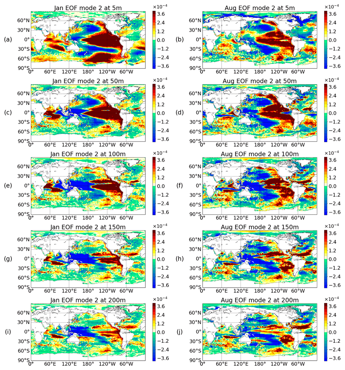
Figure 9
EOF2 for January and August showing the ENSO pattern. Depths are chosen to show the ENSO regions in different depths from surface to 100 meters. The ENSO pattern dies out approximately at levels deeper than 150 meters.
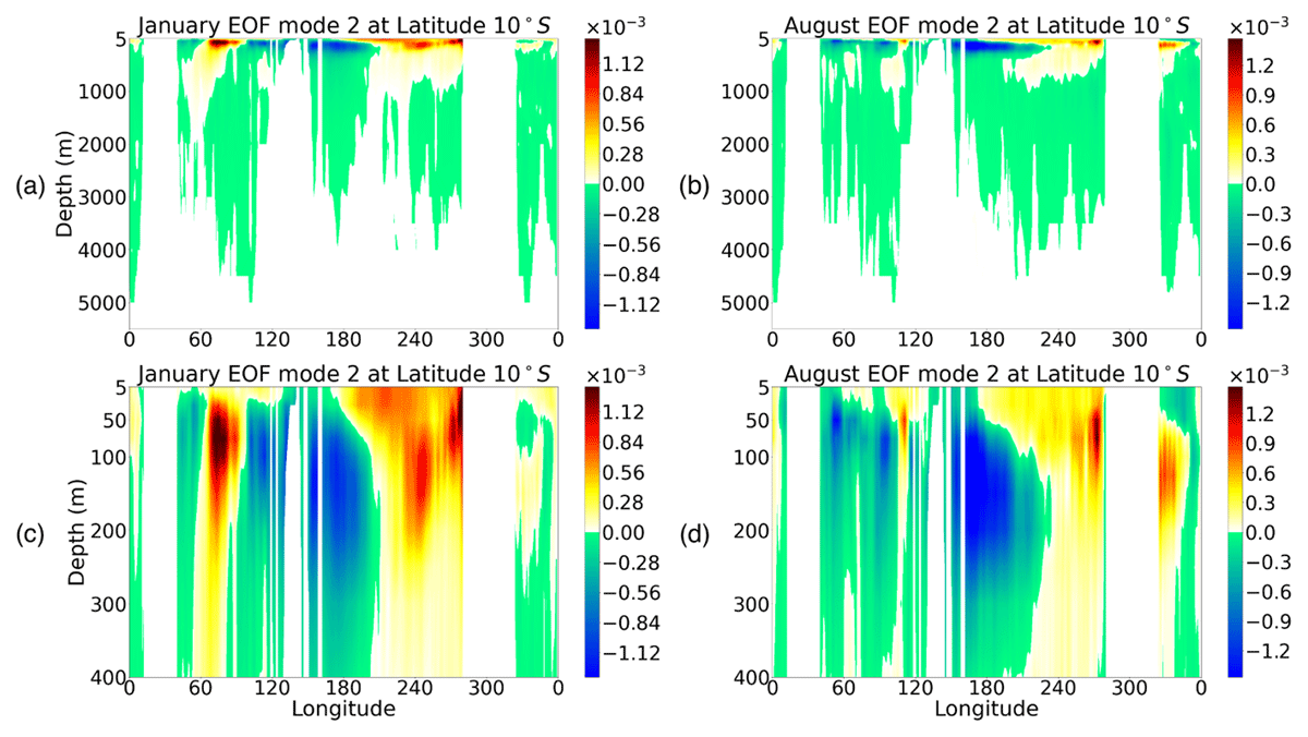
Figure 10
Cross section at latitude of 10°S that shows the separation of the warm and cold anomaly regions in the Pacific.
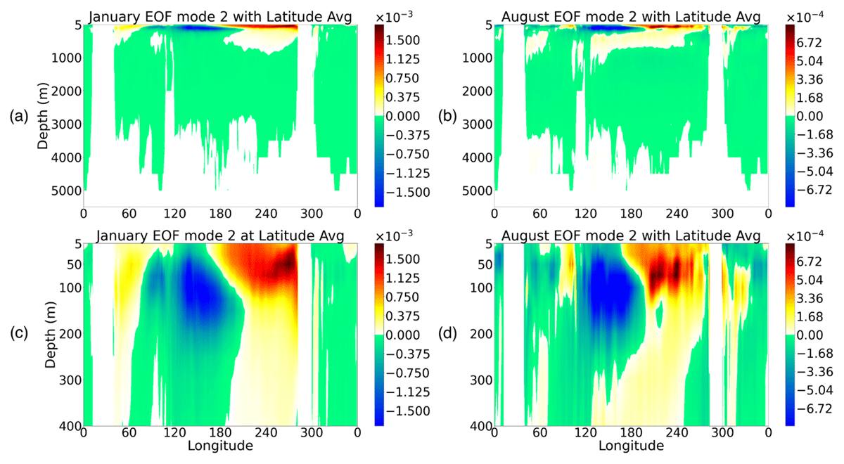
Figure 11
A zonal cross-sectional map based on the average from latitude 10°N to 10°S. The average and figure are to better show a robust 3D ENSO pattern with not only the surface warm region but also a depth structure.
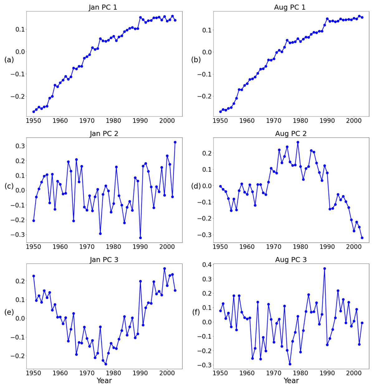
Figure 12
Principal components PC1, PC2, and PC3 of January and August from the weighted anomalies of the NASA JPL OGCM output from 1950 to 2003.
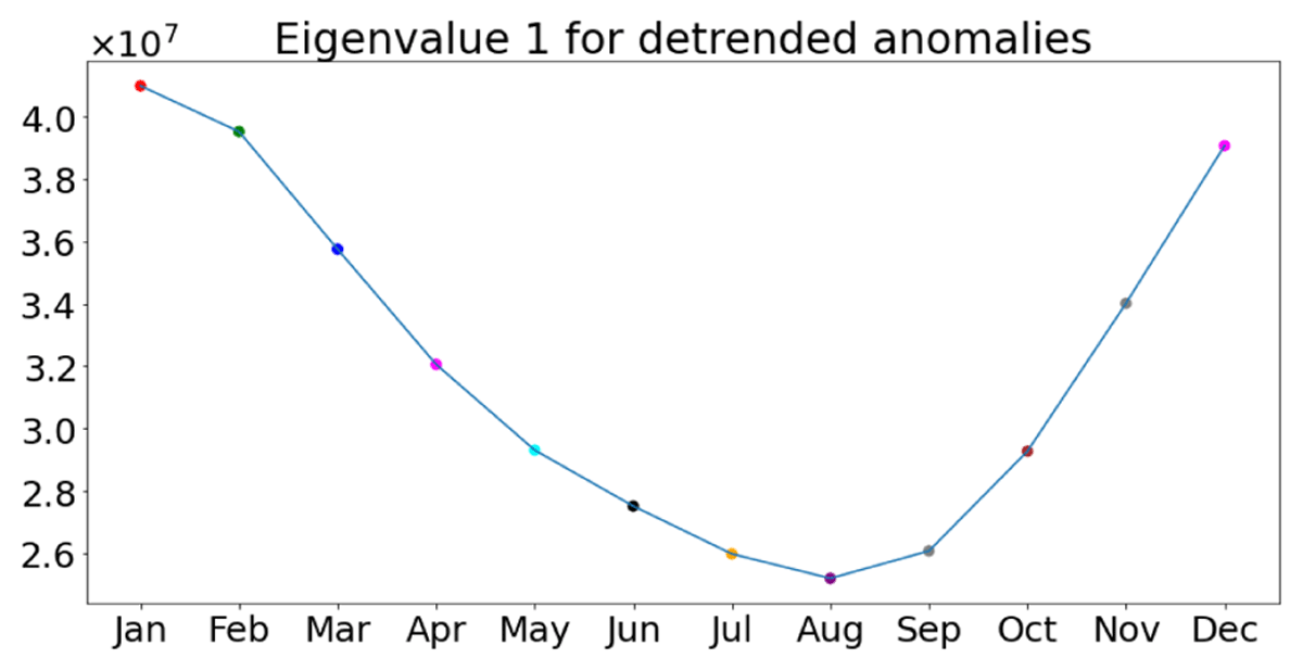
Figure 13
The first eigenvalue for the each month computed from the de-trended anomalies.
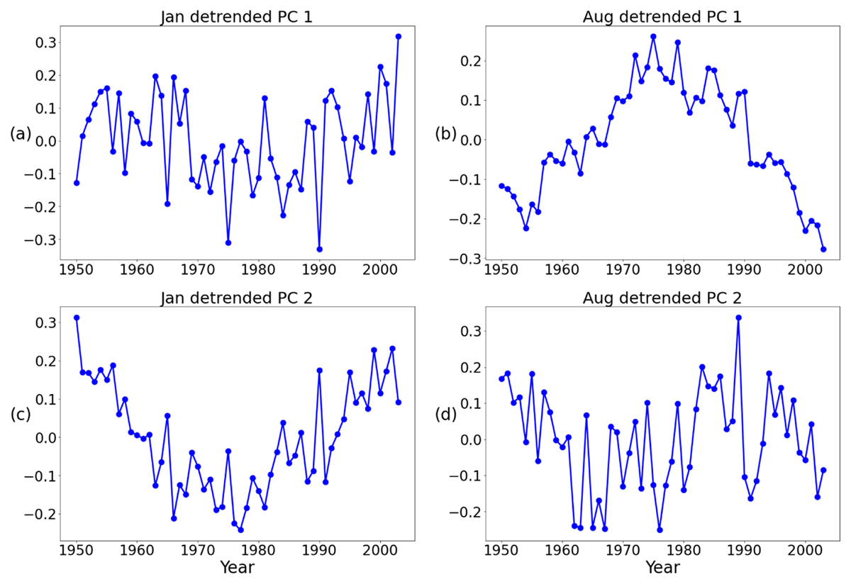
Figure 14
Principal components of January and August based on the de-trended anomalies.
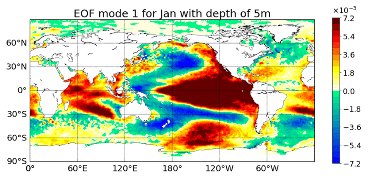
Figure 15
2D EOF1 for the top layer based on the area-weighted anomalies from the NASA JPL OGCM. ENSO signal is shown in this EOF1 for the surface layer. The 2D EOFs are computed layer by layer.