
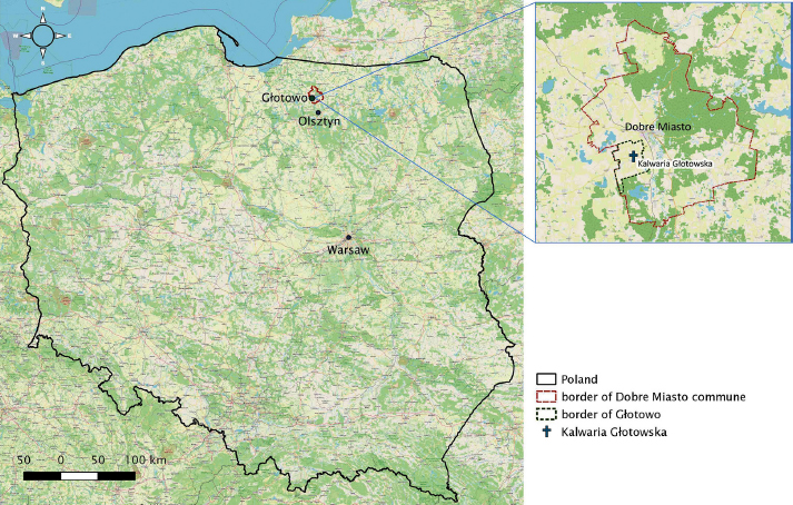
Fig. 1.
Location of Kalwaria Głotowska (based on Open Street Map).
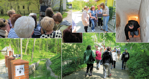
Fig. 2.
Field survey of the designed trails.
Table 1.
Guidelines for developing a geoportal and a mobile application for seniors and persons with physical disabilities.
| Design criterion | Recommendations |
|---|---|
| Graphic interface | 1.1. Toned down colours, with a predominance of grey, blue and green 1.2. Functions are described in large font 1.3. High contrast option for users with visual impairments |
| Menu screen – organisation and list of content | 2.1. Simplified and fixed toolbars that cannot be moved, minimised or removed from the application window 2.2. Minimal number of toolbars 2.3. Each taskbar icon performs only one function |
| Ergonomics | 3.1. One user interface without additional content, dynamic elements or advertisements 3.2. Menu items leading to submenu items are visibly marked with text and/or clear graphic symbols 3.3. Minimal number of items on each menu/submenu |
| Map and presentation of spatial data | 4.1. Simplified map with large graphic symbols that are explained in the legend; fixed legend in the map window 4.2. Simplified map functionalities, including zooming in and out, with large icons 4.3. Easy to use |
| Basic content | 5.1. Links to religious sites, museums, churches, chapels, cemeteries and parks 5.2. Optional items – text, map, cartographic symbols and icons, abbreviations, legend |
| Additional content | 6.1. Additional content, such as detailed maps, satellite and aerial images, is not required 6.2. Optional links to Websites with information about train and bus timetables, tourist information, weather forecasts 6.3. Additional tourist information is not required |
| Availability | 7.1. The application is optimised for mobile devices |
| Travel route and test area requirements | 8.1. Visiting sequence 8.2. Photographs, shopping for souvenirs and religious items 8.3. Terrain obstacles and other difficulties: lack of public toilets, lack of clear tourist signs, steep slopes, lack of rest areas, lack of paved trails 8.4. The route should be defined in the system and accurately marked on the map 8.5. The route should be adapted to the user’s capabilities; the route cannot be defined independently by the user in the system |
| Symbols | 9.1. Popular symbols or non-ambiguous symbols representing features on a map 9.2. Symbols and letters should have the same (large) size 9.3. Numerical terrain models and map layers should not be used to describe landform 9.4. Symbols and map icons should be simple 9.5. Obstacles should be represented by simple symbols 9.6. The level of difficulty and additional tourist attractions should be displayed on the trail |
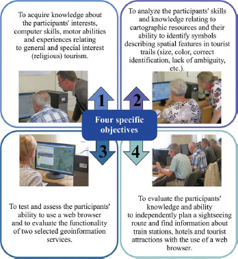
Fig. 3.
Four specific objectives of the research. A survey of seniors’ (60+) computer literacy skills conducted in the geoinformation technology laboratory.
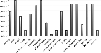
Fig. 4.
Map icons correctly identified by the testers.
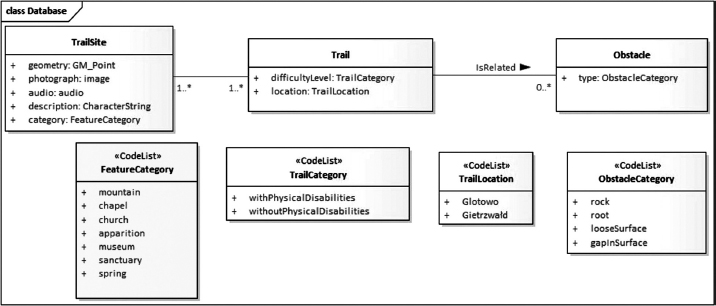
Fig. 5.
UML diagram presenting the structure of a spatial database – graphic representation of a thematic map in the application window.
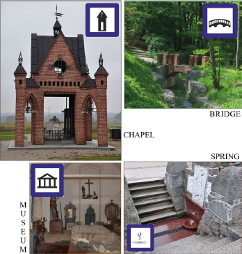
Fig. 6.
Example of graphic symbols of tourist attractions.
Table 2.
Difficulty levels of tourist trails.
| Symbol | Definition | Surface | Accessibility | Obstacles |
|---|---|---|---|---|
Very easy | Hard-top trail | Flat hard-top surface |  | None |
Easy | Flat and wide trail | Mud with occasional rough segments |  | Slope of 2° or less, rocks and ruts |
Moderately easy | Flat trail with varied width | Mud with occasional rough segments |  | Slope of <8°, rocks, ruts, loose surface |
Moderately difficult  | Uneven trail | Mud and rocks |  | Slope of 12°, rocks, ruts, loose surface |
Difficult | Rocky trail | Mud, loose stones, uneven surface |  | Slope of 12° or more, loose stones |
Very difficult | Rocky trail, possible gaps in the surface | Mud, loose stones, uneven surface |  | Slope of 12° or more, loose stones, possible gaps in the surface |
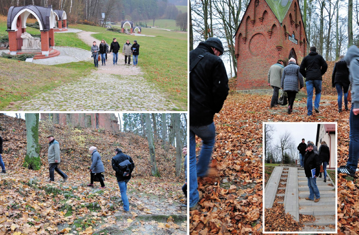
Fig. 7.
Photographs of the area where the field survey was conducted.

Fig. 8.
Selected geoportal functions: (a) and (b) the trail and landmark icons; (c) an icons with additional functionality – photographs, information about objects and sound information; (d) photographs.
Table 3.
Interpretation of the respondents’ behaviours and impressions.
| Issue | Interpretation |
|---|---|
| Trail accessibility for persons with mobility impairments (120’) | Fatigue, problems with traversing steep slopes (impossible for wheel-chair users), entering the church (stairs, no wheelchair ramp), visiting several chapels, crossing the bridge (wheelchair users) |
| Comparison of trails for users with and without mobility impairments (70’ – longer trail, 40’ – shorter trail) | The trail was evaluated as relatively easy. The respondents reported fatigue, and some participants had to take short breaks during the hike, including in sites that were landmarked in the application. The trail for mobility disabled users was evaluated as relatively easy. The multimedia application offered a valuable experience for users who were unable to visit the museum due to the absence of disability-friendly facilities. |
| Accessibility and visibility of symbols | The accessibility and visibility of symbols and QR codes were evaluated as satisfactory (signs were placed at an appropriate height and in convenient locations, which enabled the respondents to find the relevant content on the map). |
| Readability of symbols | The readability of the applied symbols was satisfactory. The symbols were interpreted intuitively. |
| Comprehension of cartographic symbols | The applied cartographic symbols were easy to understand. Different interpretations were proposed in a limited number of cases. |