
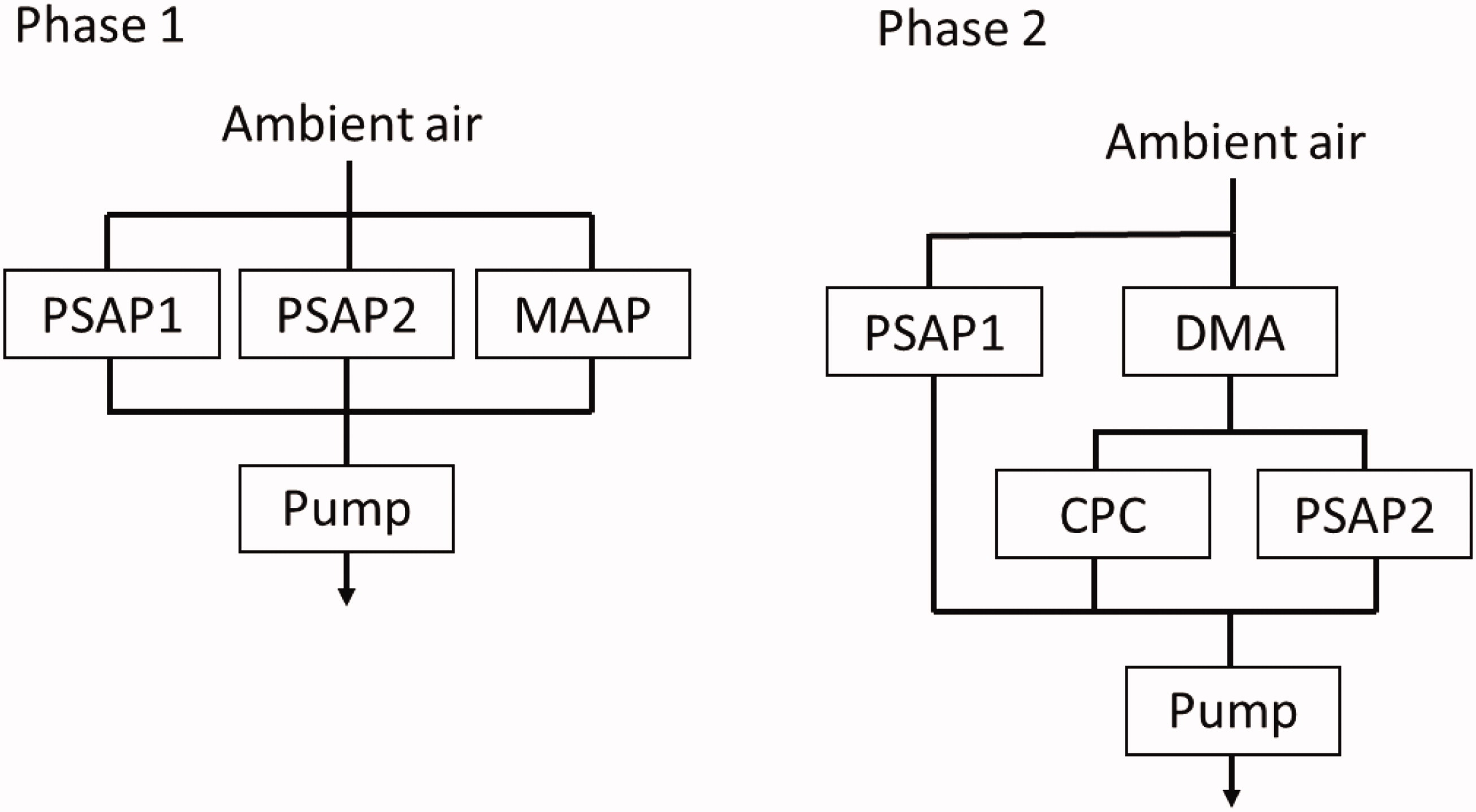
Fig. 1.
Experimental set up during the two phases of the laboratory experiments. Parallel measurements of ambient air during phase one and the PSAP2 instrument connected to the DMPS system during phase II.
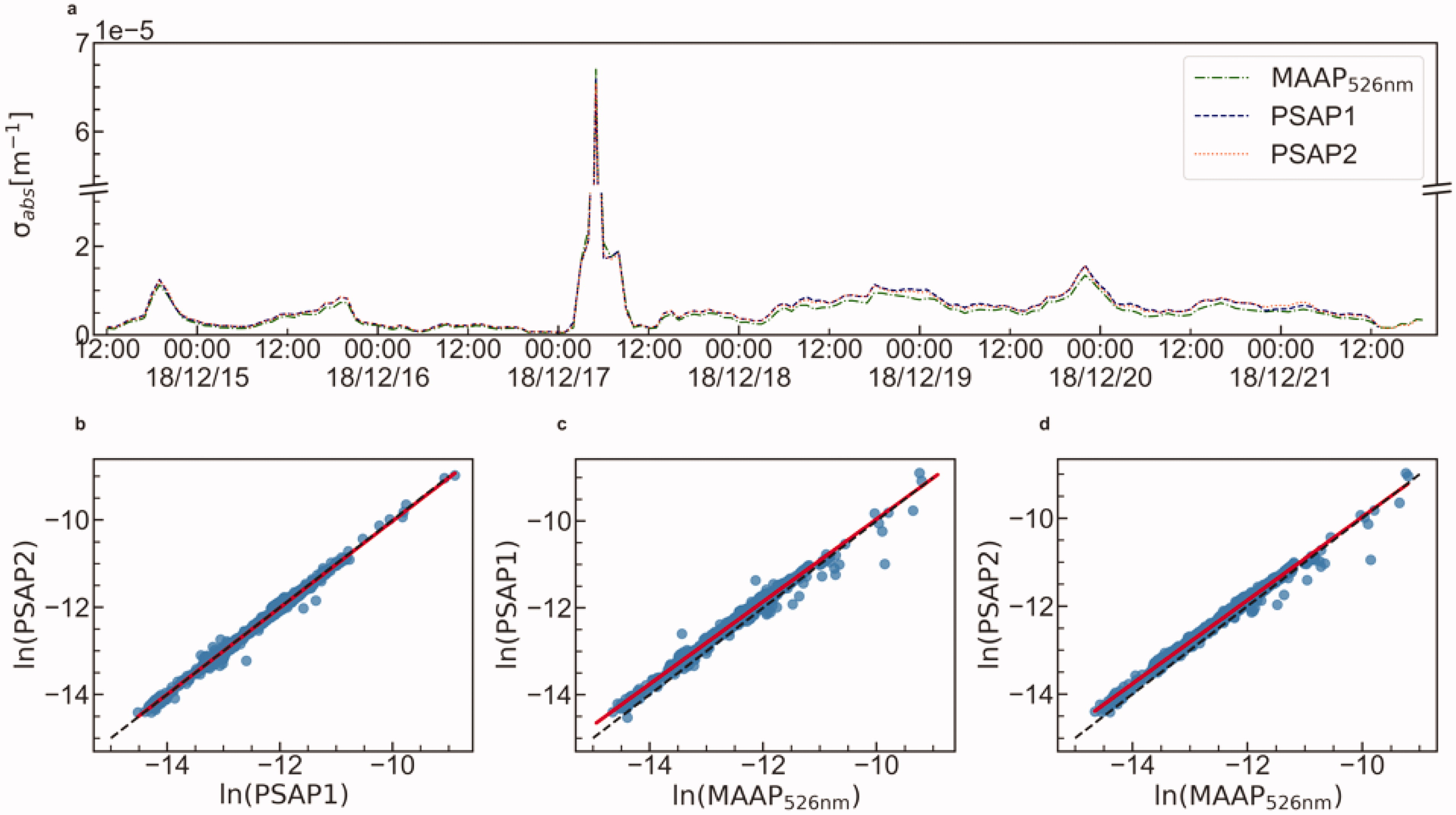
Fig. 2.
Times series of parallel observations of the absorption coefficient by the two PSAP’s and the MAAP, a). Figures b-d present the scatter plots for the naturally logged data of the three instruments with the linear fit (red) and the identity line (dashed black). The linear fits corresponding to correlations are (b) y = 0.99× – 0.04, (c) y = 0.95×-0.2 and (d) y = 0.95×-0.21.
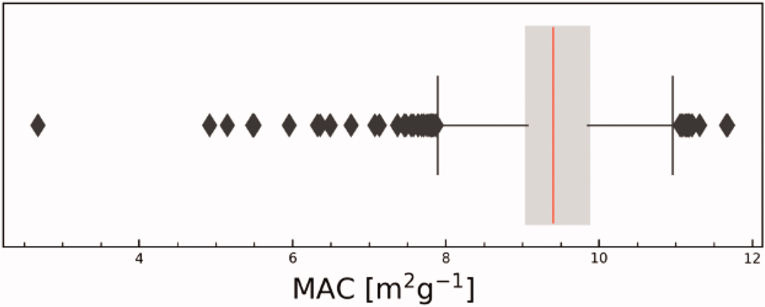
Fig. 3.
Box-whisker plot of the ratio between the absorption coefficient observed by PSAP1 and the eBC mass concentration observed by the MAAP based on 10-minute intervals. The ratio is expressed as a MAC (Mass Absorption Coefficient) m2g−1. The grey box shows the 25th and 75th percentile and the vertical lines indicate the minimum and maximum values.
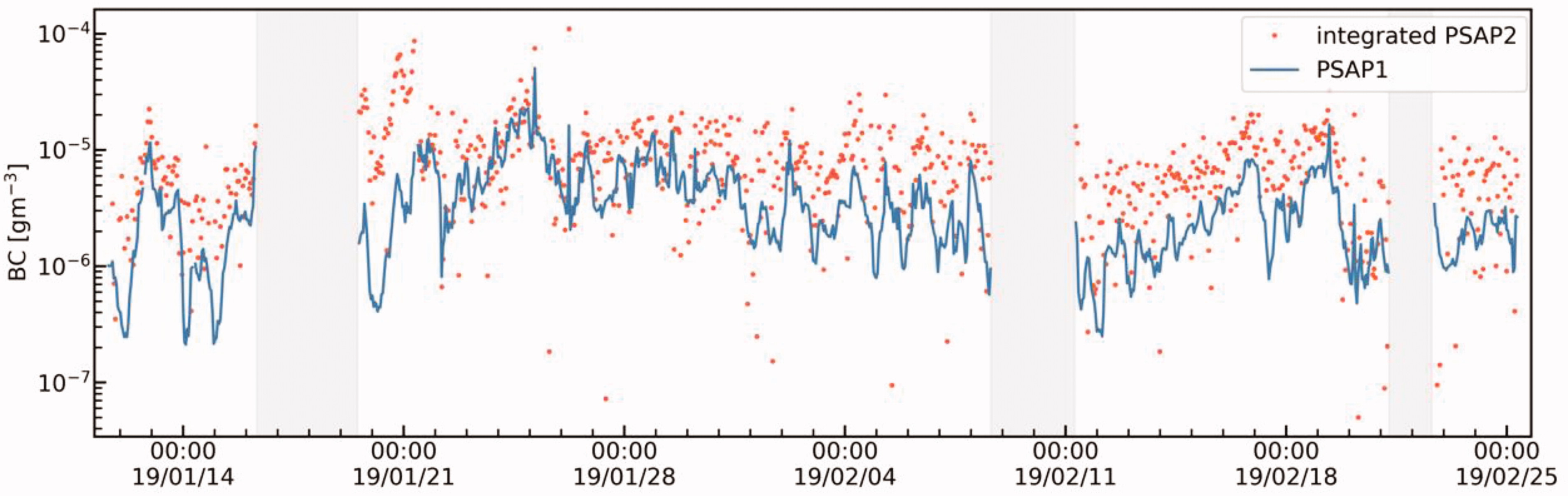
Fig. 4.
The time series observed by the PSAP1 instrument (blue line) and the hourly integrated σabs based on the PSAP2 instrument connected to the DMPS system (red dots). The grey areas indicate missing and incomplete size scans for PSAP2. See text for details.
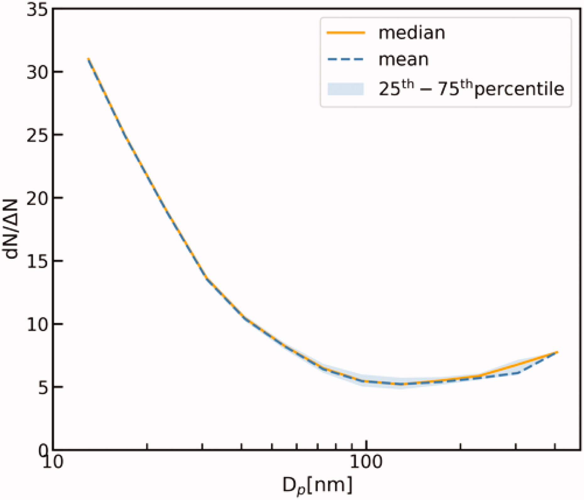
Fig. 5.
The median (orange line), the mean (dashed blue line) and quartile transformation factors derived from the ratio between raw ΔN CPC data entering the inversion software and dN from the inverted DMPS data.
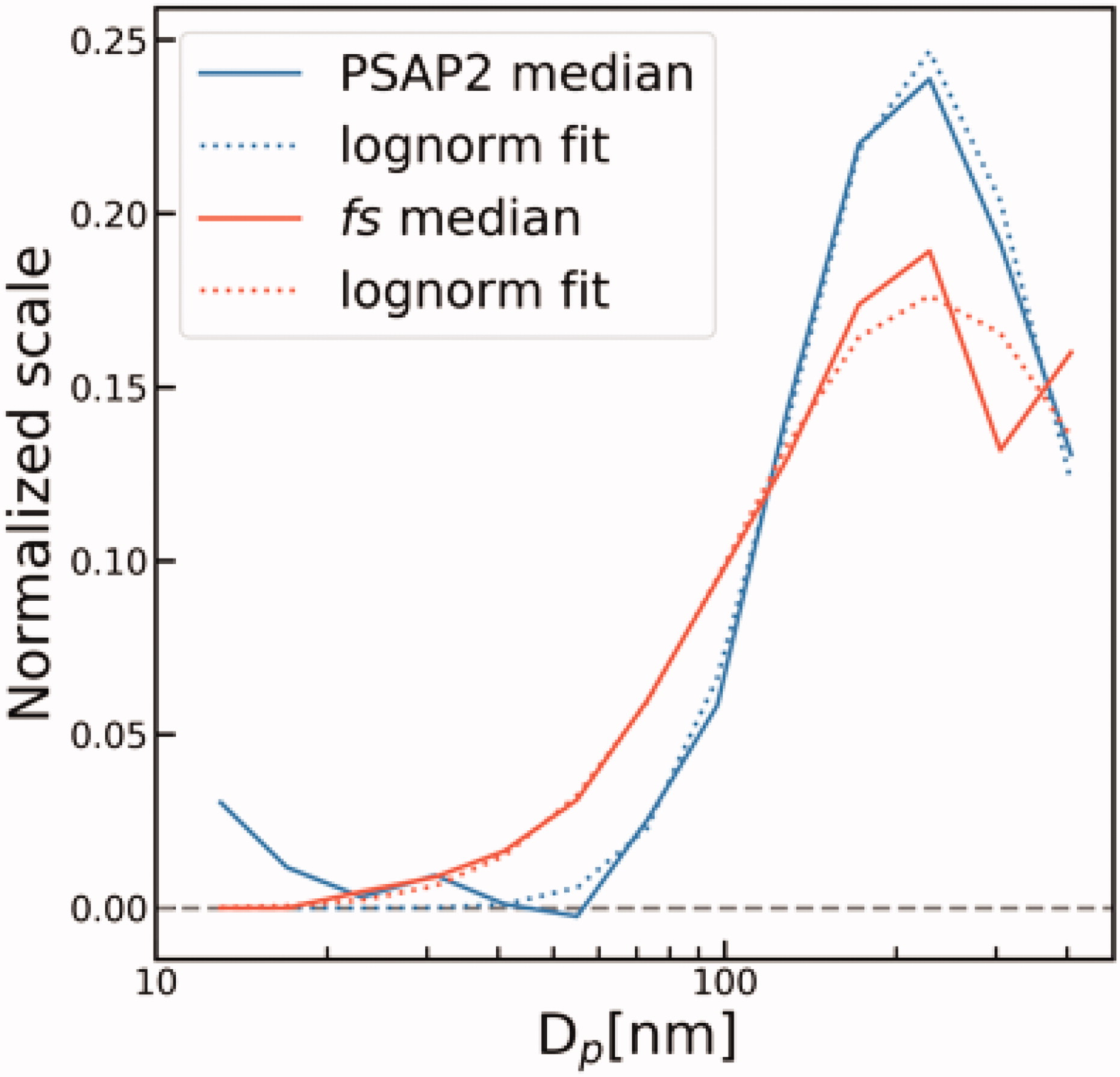
Fig. 6.
Comparison of the truncated and Normalized Pearson correlation scaling factor f s (see text for details) and the normalized median σabs distribution based on DMPS and PSAP2 measurements. The dotted lines are lognormal fitted distributions (Heintzenberg 1994) and the y-axis is normalized to 1. Geometric mean diameter and geometric standard deviation is 0.22 nm and 1.67, and 0.23 and 2.18 for observed distribution and derived distribution from correlations, respectively.
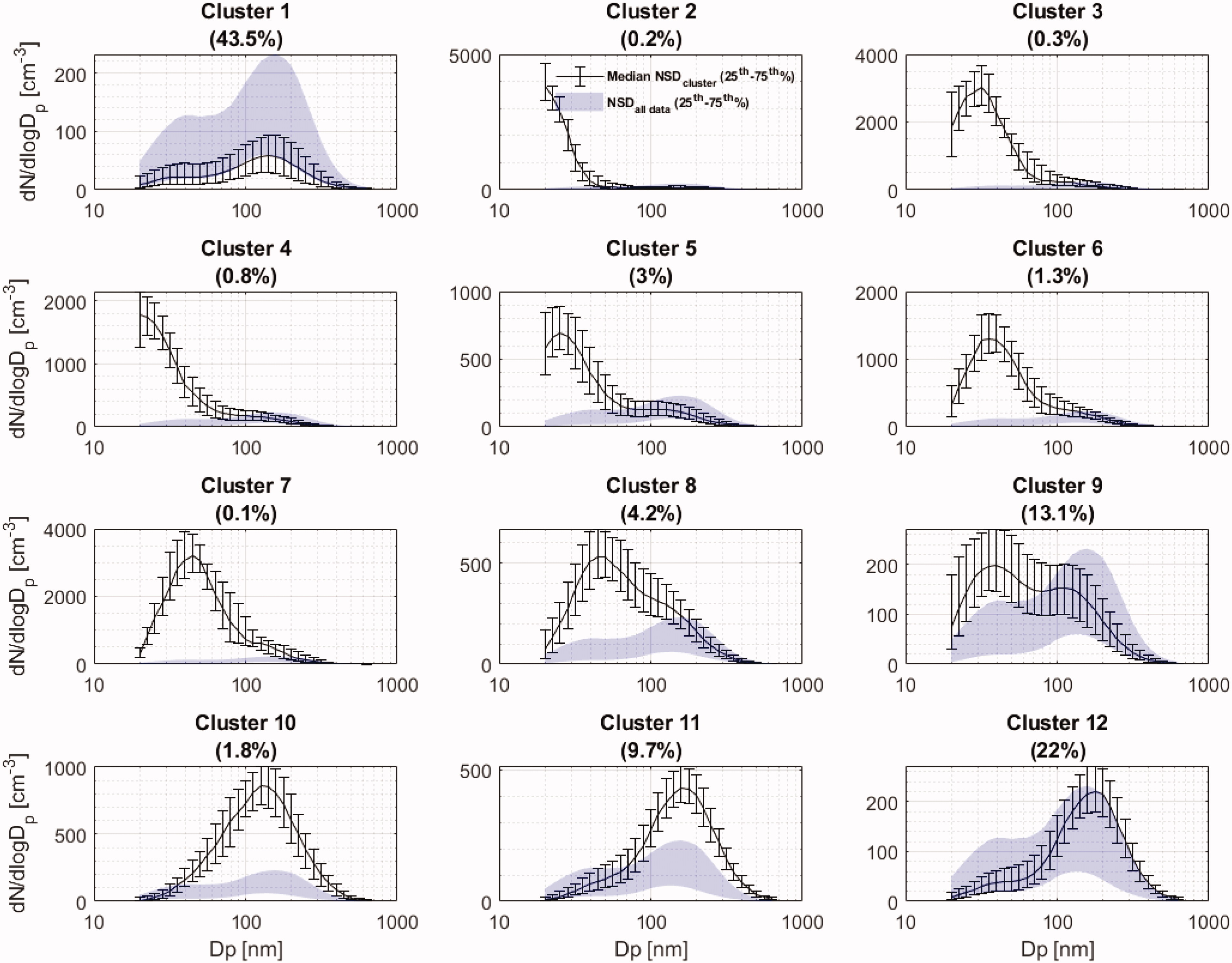
Fig. 7.
Clustering of hourly averaged DMPS NSD data from the available data after data reduction. Except for cluster 1, the distributions are organized according to geometric diameter from cluster 2 to cluster 12. Shaded area represents the quartile range for the full available data set. The solid lines represent medians and the error bars show the upper and lower quartiles.
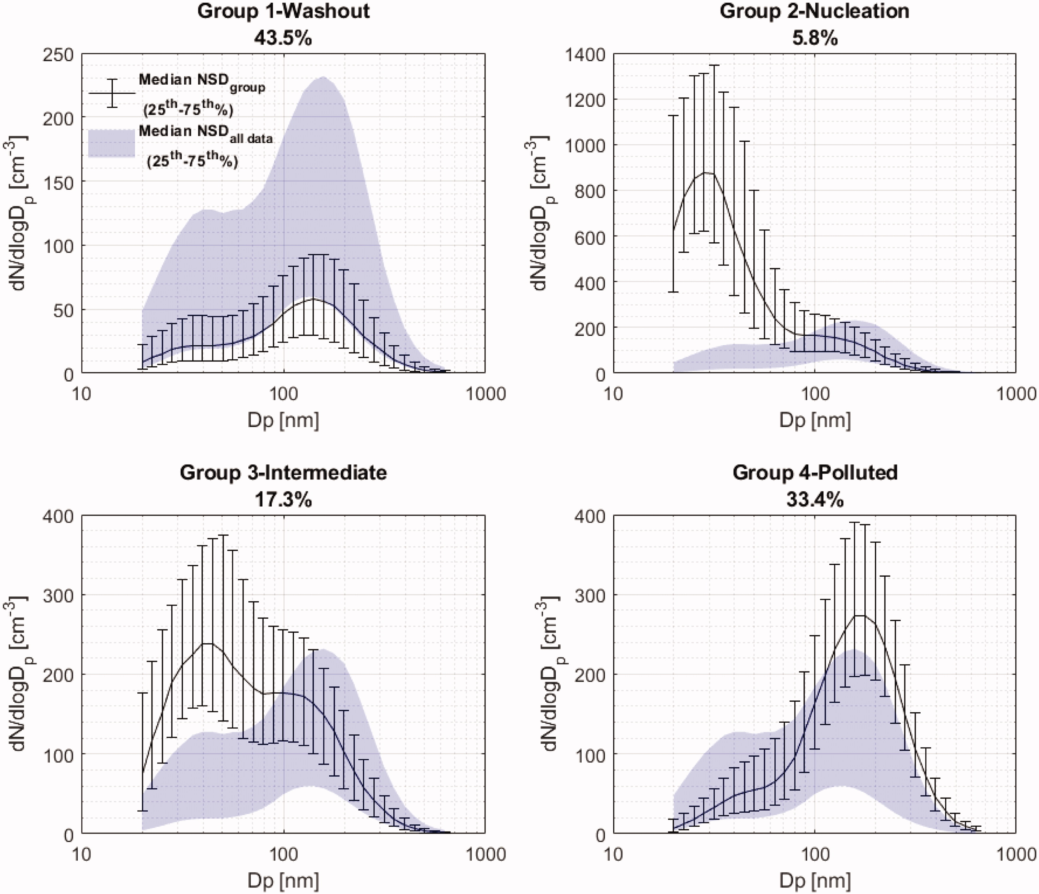
Fig. 8.
The four categories (groups) of NSD clusters referred to as Washout, Nucleation, Intermediate, and Polluted, respectively. The solid lines represent medians and the error bars show the upper and lower quartiles. The percent of NSD belonging to each cluster are presented in the headers. The shaded are represents the range of quartiles based on the full data set.
Table 1.
Statistics of major cluster groups. Absorption and calculated eBC represent median values. Values within parenthesis represent 25th-75th percentile range. See text for details.
(0.04–0.20)11.0
(4.3–22.3)Nucleation19745.80.10
(0.04–0.17)10
(4.4–18.4)Intermediate591717.30.10
(0.04–0.19)10.6
(4.6–20.3)Polluted1144733.40.42
(0.18–1.11)41.1
(19.3–118.0)
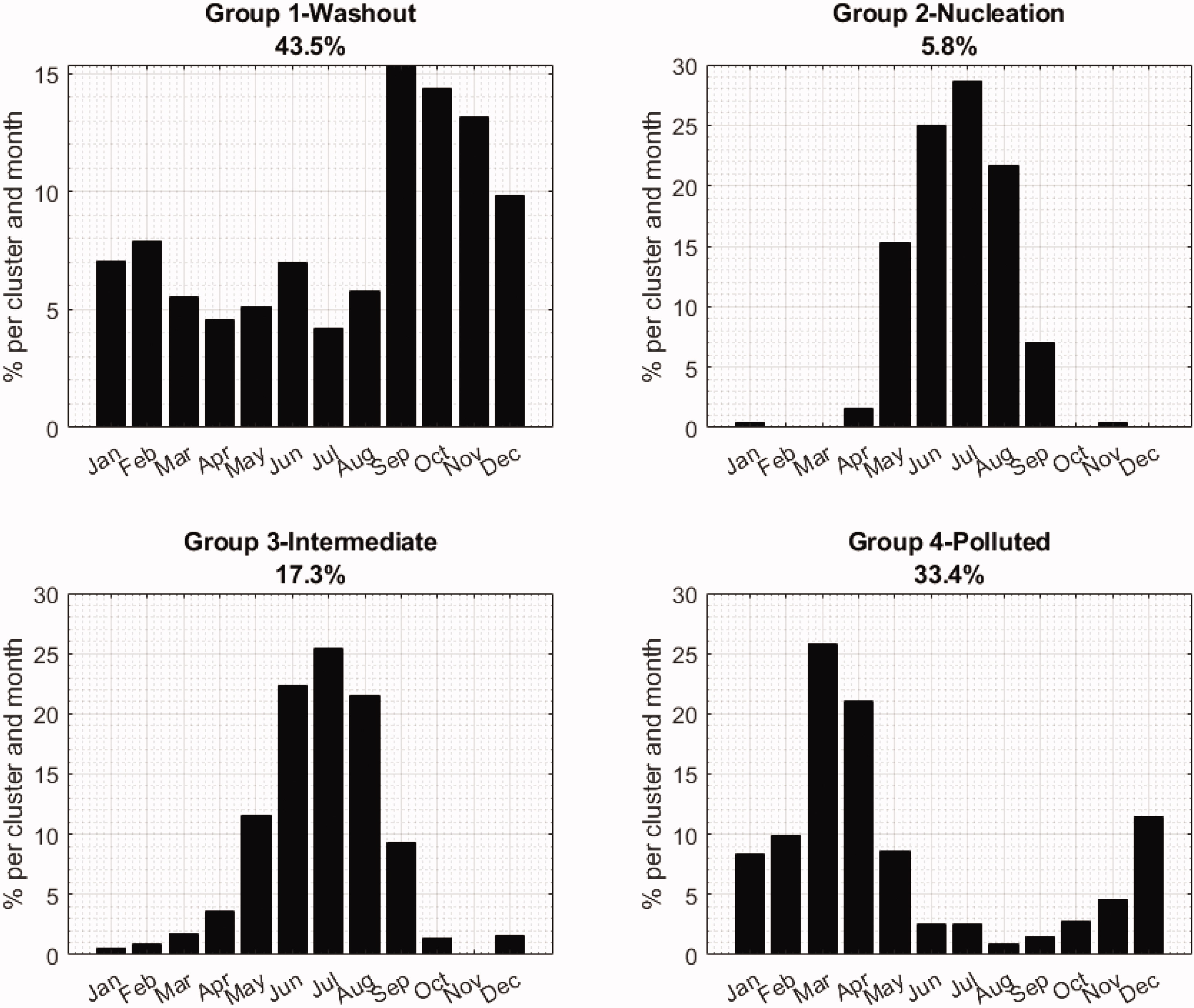
Fig. 9.
The relative distribution (%) per month of the categories/groups presented in Fig. 8. Percentage of members belonging to each group is indicated in the headers.
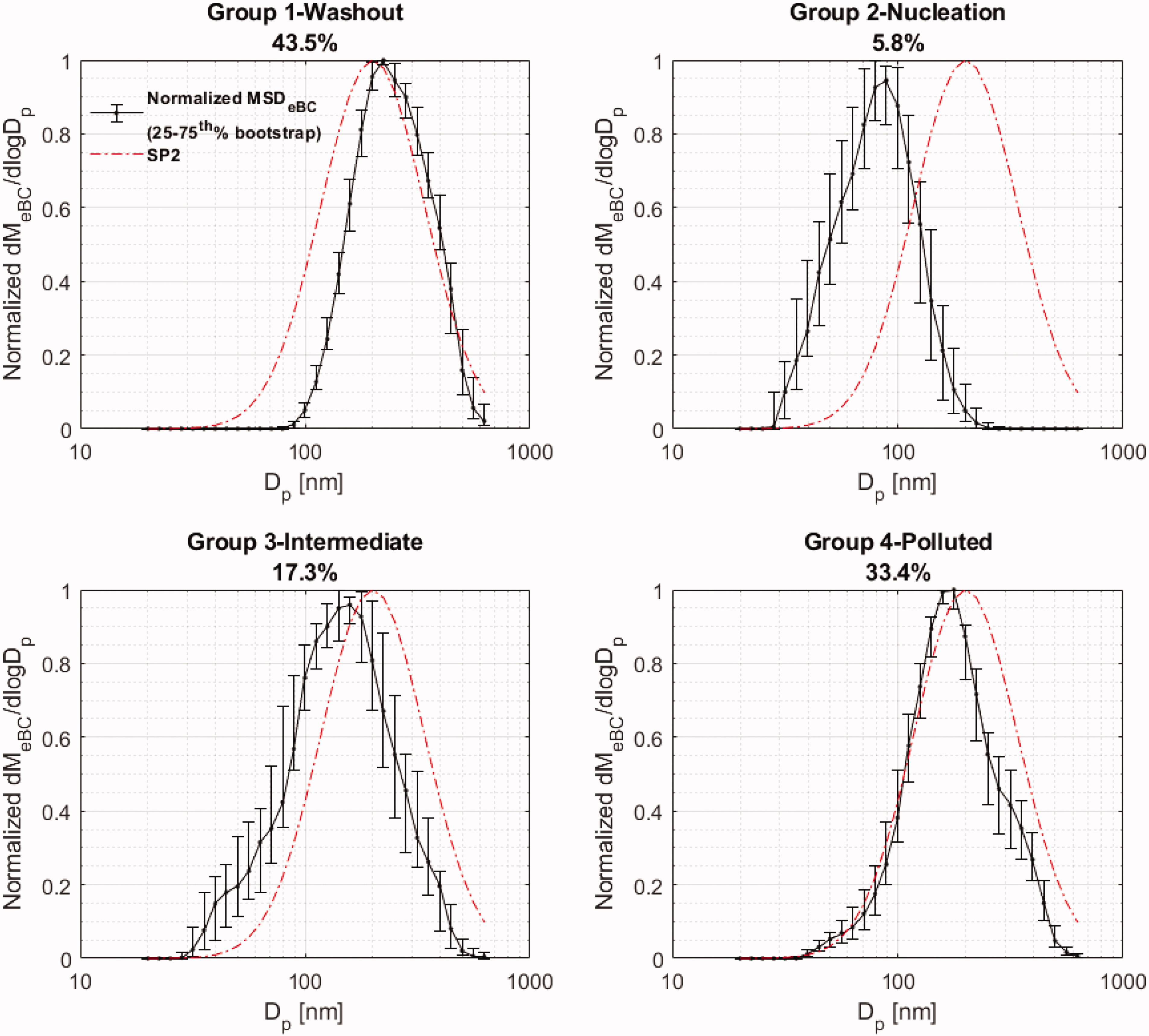
Fig. 10.
Derived dMeBC/dlogDp (MSD) of each major cluster group normalized to 1 (black line). Corresponding error bars indicate the 25th-75th percentile range resulting from bootstrapping procedure on 5% subsets of data (in total 20 subsets). Normalized (Dg = 200 nm, σ = 1.7) dMeBC/dlogDp is added from a typically logged-normal distribution of SP2 for comparison (typical SP2 distribution, red line).
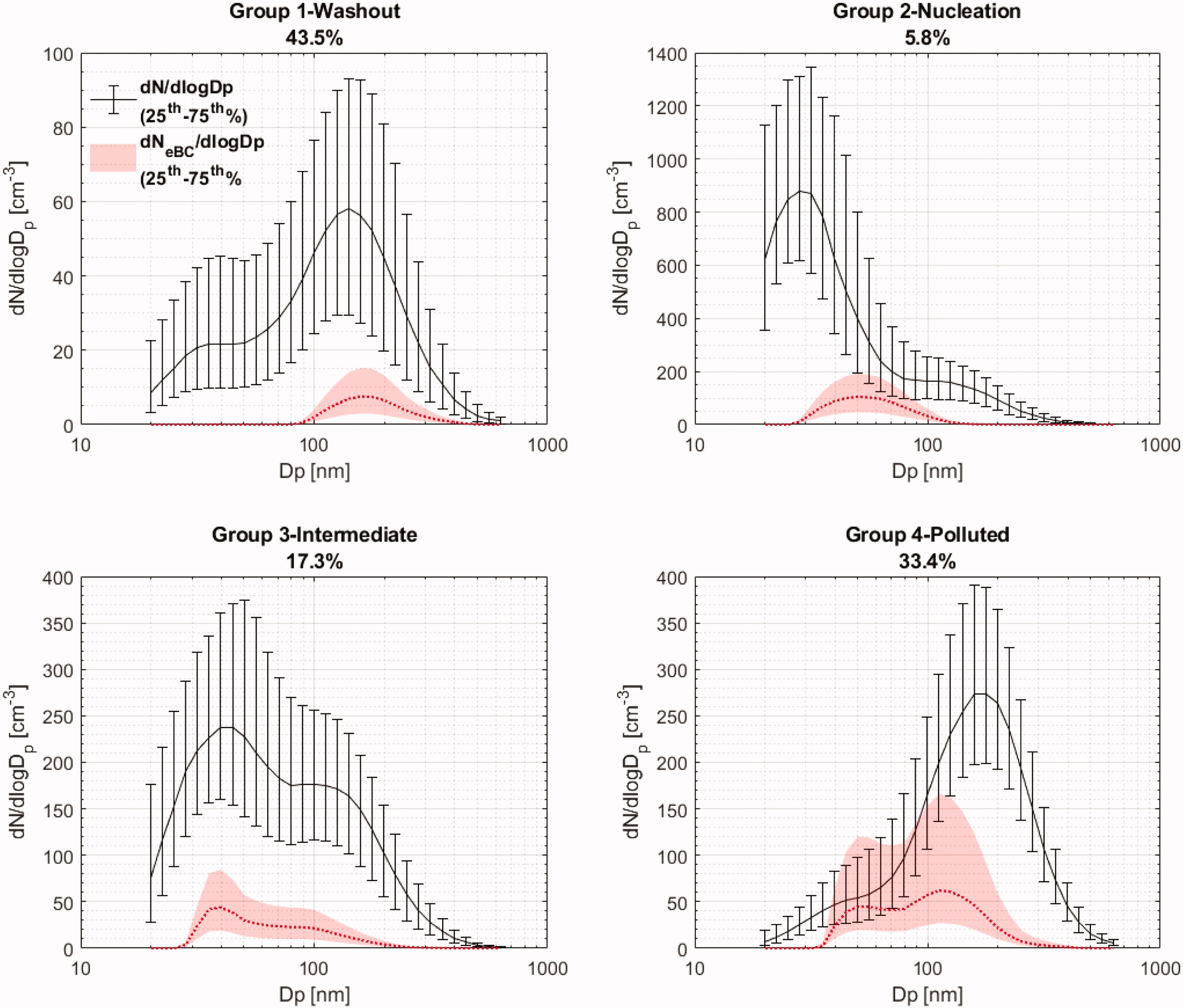
Fig. 11.
Comparison between observed particle size distributions and inferred dNeBC/dlogDp distributions assuming external mixtures and parameters described in the text. The solid red line is based on the median absorption coefficient for each category of clusters and the shaded area is based on the upper and lower quartiles. The DMPS is data is identical to Fig. 8.